
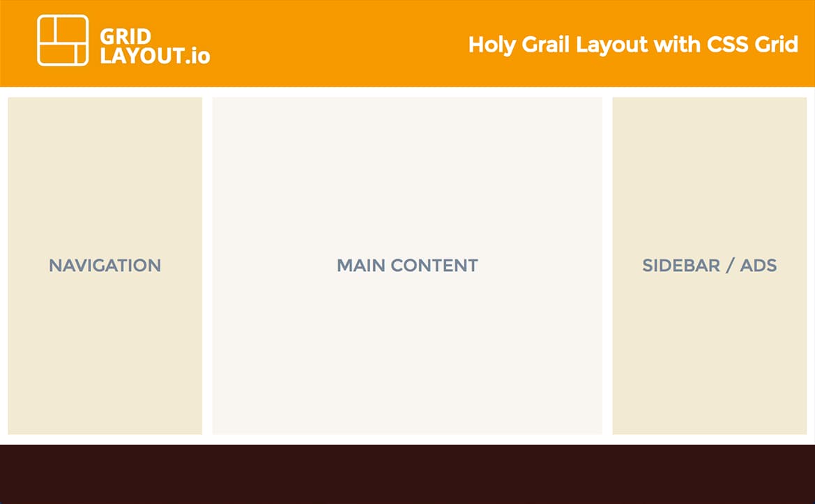
Holy Grail is a layout pattern that’s very common on the web. It consists of a header, a main content area with fixed-width navigation on the left, content in the middle and a fixed-width sidebar on the right and then a footer.
Holy Grail has been achieved using variety of methods, probably most notably recently with Flexbox. CSS Grid Layout is yet another method, and it should prove to be the most appropriate and straightforward way when browser support gets better. It was designed especially to easily accomplish full page layouts.
Live Demo
You can see this demo in action here if you have a supporting browser. Here are quick instructions on how to enable grid layout in Fixefox and Chrome.
Markup
The markup is really simple and the amount of elements needed to create the layout is minimal and semantic:
<div class="container">
  <header>
    <!-- Header content -->
  </header>

  <nav>
    <!-- Navigation -->
  </nav>

  <main>
    <!-- Main content -->
  </main>

  <aside>
    <!-- Sidebar / Ads -->
  </aside>

  <footer>
    <!-- Footer content -->
  </footer>
</div>
The grid
Using grid areas and the fr unit, here’s how we define the grid on the container:
.container {
  display: grid;

  grid-template-areas:
    "header header header"
    "nav content side"
    "footer footer footer";

  grid-template-columns: 200px 1fr 200px;
  grid-template-rows: auto 1fr auto;
  grid-gap: 10px;

  height: 100vh;
}
Notice the use of height: 100vh (100% viewport height) on the container to extend the grid to at least the full height of the viewport. Our grid’s middle row is set to a height of 1fr so that it picks up the extra space when needed.
Grid items
The grid items are very simple to place on the grid with the grid-area property:
header {
  grid-area: header;
}

nav {
  grid-area: nav;
  margin-left: 0.5rem;
}

main {
  grid-area: content;
}

aside {
  grid-area: side;
  margin-right: 0.5rem;
}

footer {
  grid-area: footer;
}
Bonus: Making it Responsive
It’s easy to use media queries and to change just a few properties on the grid container to collapse everything into one column on smaller devices:
@media (max-width: 768px) {
  .container {
    grid-template-areas:
      "header"
      "nav"
      "content"
      "side"
      "footer";

    grid-template-columns: 1fr;
    grid-template-rows:
      auto /* Header */
      minmax(75px, auto) /* Nav */
      1fr /* Content */
      minmax(75px, auto) /* Sidebar */
      auto; /* Footer */
  }

  nav, aside {
    margin: 0;
  }
}
Grid and Flexbox
Grid is not a replacement for Flexbox and Flexbox is still the right solution for one dimension placement and micro layouts. It’s very easy to combine grid and flexbox layouts and they are designed to work well together.
We can use flexbox on our header for example to have the elements inside the header container be evenly distributed on the horizontal axis:
header {
  grid-area: header;

  display: flex;
  justify-content: space-between;
  align-items: center;
}
Thanks for learning with the DigitalOcean Community. Check out our offerings for compute, storage, networking, and managed databases.
About the author
Alligator.io is a developer-focused resource that offers tutorials and insights on a wide range of modern front-end technologies, including Angular 2+, Vue.js, React, TypeScript, Ionic, and JavaScript.
Still looking for an answer?
This textbox defaults to using Markdown to format your answer.
You can type !ref in this text area to quickly search our full set of tutorials, documentation & marketplace offerings and insert the link!
Links to the demo and instructions are broken. Too bad, because this is a really clear intro.
CSS Grid is nowadays well supported across (almost) all browsers.
To have better up-to-date tutorials: The sentence ‘to be the most appropriate and straightforward way when browser support gets better’ should be adapted to this fact.
 This work is licensed under a Creative Commons Attribution-NonCommercial- ShareAlike 4.0 International License.
Become a contributor for community
Get paid to write technical tutorials and select a tech-focused charity to receive a matching donation.

DigitalOcean Documentation
Full documentation for every DigitalOcean product.

Resources for startups and AI-native businesses
The Wave has everything you need to know about building a business, from raising funding to marketing your product.
The developer cloud
Scale up as you grow — whether you're running one virtual machine or ten thousand.

Start building today
From GPU-powered inference and Kubernetes to managed databases and storage, get everything you need to build, scale, and deploy intelligent applications.
