
Android Toolbar widget is used to create menus in the apps. We will learn how to create a Toolbar using the XML layout and Kotlin code. We will implement various toolbar properties in an example Android app.
What is Android Toolbar?
Android Toolbar widget is generally found on the top of the screen. The application title, logo, navigation icon, and the menu bar is displayed inside the toolbar. The toolbar is the material design replacement for the old and now deprecated ActionBar.
Toolbar Gradle Dependencies
The toolbar is available with the following dependency.
implementation 'com.android.support:appcompat-v7:27.1.0'
Android Toolbar can be supplied either from the themes or from the layout.
Android Apps Default Toolbar
When you create a new android studio project, you might see that the activity_main.xml doesn’t have any Toolbar defined in the XML. Still, when you see the XML preview, there is a Toolbar with the application name by default at the top. This is because the following style is defined in the styles.xml, which is ultimately attached in the AndroidManifest.xml file. 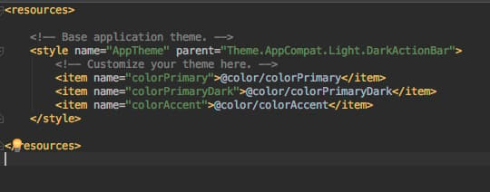
Toolbar from Themes
DarkActionBar theme adds the Toolbar at the top of the app by default. We can change the parent theme in the above image from Theme.AppCompat.Light.DarkActionBar to Theme.AppCompat.Light.NoActionBar to remove the Toolbar that is displayed as a part of the activity theme. Let’s change the theme and add the Toolbar in the activity_main.xml file.
Toolbar XML Layout
We have added the toolbar in our activity_main.xml layout file using the following code.
<?xml version="1.0" encoding="utf-8"?>
<LinearLayout xmlns:android="http://schemas.android.com/apk/res/android"
    android:orientation="vertical"
    xmlns:tools="http://schemas.android.com/tools"
    android:layout_width="match_parent"
    android:layout_height="match_parent"
    tools:context=".MainActivity">


    <android.support.v7.widget.Toolbar
        android:layout_width="match_parent"
        android:layout_height="wrap_content" />


</LinearLayout>
This will display a Transparent Toolbar with no text or any other items. We have to add more properties to utilize Toolbar effectively.
1. Setting Toolbar Background Color
We have to add the following XML attribute in our Toolbar tag for the background color.
android:background="@color/colorPrimary"
2. Setting the Theme
We can set the toolbar theme using the following code.
android:theme="@style/ThemeOverlay.AppCompat.Dark"
We are using a default theme for the layout. Dark indicates that the text colors would be light (generally white). We can also create our own custom themes in the styles.xml file.
3. Setting title, subtitle, icons
- Title:
app:title="Androidly Toolbar" - Subtitle:
app:subtitle="Sub" - Logo:
app:logo="@android:drawable/ic_menu_call" - Navigation Icon:
app:navigationIcon="@drawable/ic_menu_black_24dp"
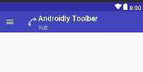
4. Toolbar Preview
Our toolbar looks like the below image after doing all the above changes. 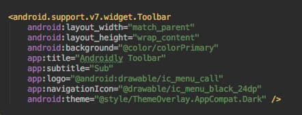
 Toggle the theme to
 @style/ThemeOverlay.AppCompat.Light and you shall see inverted colors. 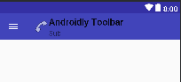
There are many XML attributes to customize the Toolbar properties. For example: titleTextColor, subtitleTextColor, subtitleTextAppearance, titleTextAppearance, etc.
Android Toolbar Themes
We can create our own custom styles and assign them as a theme on our Toolbar. This will be much easier than adding all those XML properties.
<resources>

    <style name="AppTheme" parent="Theme.AppCompat.Light.NoActionBar">
        <item name="colorPrimary">@color/colorPrimary</item>
        <item name="colorPrimaryDark">@color/colorPrimaryDark</item>
        <item name="toolbarStyle">@style/ToolBarStyle</item>
    </style>

    <style name="ToolBarStyle" parent="Widget.AppCompat.Toolbar">
        <item name="android:background">#EA8D8D</item>
        <item name="titleTextAppearance">@style/TitleTextAppearance</item>
        <item name="subtitleTextAppearance">@style/SubTitleTextAppearance</item>
    </style>

    <style name="TitleTextAppearance" parent="TextAppearance.Widget.AppCompat.Toolbar.Title">
        <item name="android:textSize">18sp</item>
        <item name="android:textColor">#38ADAE</item>
    </style>

    <style name="SubTitleTextAppearance" parent="TextAppearance.Widget.AppCompat.Toolbar.Subtitle">
        <item name="android:textSize">14sp</item>
        <item name="android:textColor">#00B7FF</item>
    </style>

</resources>
Let’s use the custom theme in the activity_main.xml file.
<?xml version="1.0" encoding="utf-8"?>
<LinearLayout xmlns:android="http://schemas.android.com/apk/res/android"
    xmlns:app="http://schemas.android.com/apk/res-auto"
    xmlns:tools="http://schemas.android.com/tools"
    android:layout_width="match_parent"
    android:layout_height="match_parent"
    android:orientation="vertical"
    tools:context=".MainActivity">


    <android.support.v7.widget.Toolbar
        android:layout_width="match_parent"
        android:layout_height="wrap_content"
        app:subtitle="Sub"
        app:title="AndroidlyToolbar" />


</LinearLayout>
The AppTheme style gets updated in the AndroidManifest.xml file. Our Toolbar will look like the below image. 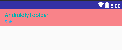
Android Custom Toolbar
We can define our own custom views inside a Toolbar. The following layout defines custom views within the toolbar.
<?xml version="1.0" encoding="utf-8"?>
<LinearLayout xmlns:android="http://schemas.android.com/apk/res/android"
    xmlns:app="http://schemas.android.com/apk/res-auto"
    xmlns:tools="http://schemas.android.com/tools"
    android:layout_width="match_parent"
    android:layout_height="match_parent"
    android:orientation="vertical"
    tools:context=".MainActivity">


    <android.support.v7.widget.Toolbar
        android:layout_width="match_parent"
        android:layout_height="wrap_content"
        app:subtitle="Sub"
        app:title="AndroidlyToolbar">

        <RelativeLayout
            android:layout_width="match_parent"
            android:layout_height="wrap_content">


            <TextView
                android:layout_width="wrap_content"
                android:layout_height="wrap_content"
                android:layout_centerVertical="true"
                android:text="Text" />

            <ImageView
                android:layout_width="wrap_content"
                android:layout_height="wrap_content"
                android:layout_centerInParent="true"
                android:src="@drawable/ic_menu_black_24dp" />

            <Button
                android:layout_width="wrap_content"
                android:layout_height="wrap_content"
                android:layout_alignParentEnd="true"
                android:layout_centerVertical="true"
                android:text="BUTTON" />

        </RelativeLayout>


    </android.support.v7.widget.Toolbar>


</LinearLayout>
Output: 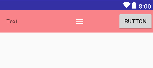
Creating Toolbar using Kotlin Code
We can create toolbars programmatically using Kotlin code. Each of the toolbar XML properties has its equivalent Kotlin methods. The following MainActivity.kt class is defined below.
package net.androidly.androidlytoolbar

import android.support.v7.app.AppCompatActivity
import android.os.Bundle
import android.support.v4.content.ContextCompat
import android.support.v7.widget.Toolbar
import android.widget.Toast


class MainActivity : AppCompatActivity() {

    override fun onCreate(savedInstanceState: Bundle?) {
        super.onCreate(savedInstanceState)
        setContentView(R.layout.activity_main)

        val toolbar = findViewById(R.id.toolbar) as Toolbar?
        setSupportActionBar(toolbar)
        toolbar?.title = "Androidly"
        toolbar?.subtitle = "Sub"
        toolbar?.navigationIcon = ContextCompat.getDrawable(this,R.drawable.ic_menu_black_24dp)
        toolbar?.setNavigationOnClickListener { Toast.makeText(applicationContext,"Navigation icon was clicked",Toast.LENGTH_SHORT).show() }
    }
}
Using the as operator, we safely typecast the XML view to the toolbar instance. The setNavigationOnClickListener triggers a toast message when the navigation icon is clicked from the menu.
You can download the Toolbar project from the following link: AndroidlyToolbar
Thanks for learning with the DigitalOcean Community. Check out our offerings for compute, storage, networking, and managed databases.
About the author
Still looking for an answer?
 This work is licensed under a Creative Commons Attribution-NonCommercial- ShareAlike 4.0 International License.
Become a contributor for community
Get paid to write technical tutorials and select a tech-focused charity to receive a matching donation.

DigitalOcean Documentation
Full documentation for every DigitalOcean product.

Resources for startups and AI-native businesses
The Wave has everything you need to know about building a business, from raising funding to marketing your product.
The developer cloud
Scale up as you grow — whether you're running one virtual machine or ten thousand.

Start building today
From GPU-powered inference and Kubernetes to managed databases and storage, get everything you need to build, scale, and deploy intelligent applications.
