By William Le, Anish Singh Walia and Vinayak Baranwal

Introduction
Default browser scrollbars often clash with a site’s visual design, and styling them requires two separate approaches: the W3C standard properties (scrollbar-width, scrollbar-color, scrollbar-gutter) and the -webkit-scrollbar pseudo-element family supported by Chromium and WebKit. The W3C published the CSS Scrollbars Level 1 specification in September 2018; both approaches are now broadly supported across current browsers.
Two rule sets are still needed because the standard properties and the -webkit-scrollbar approach cover overlapping but not identical feature sets. Live compatibility data is available at caniuse.com/css-scrollbar.
This tutorial covers both approaches, explains where they overlap and where they differ, and provides copy-ready patterns for common UI components including chat windows, sidebars, code blocks, and modals.
Key Takeaways
- The CSS Scrollbars Level 1 standard properties (
scrollbar-width,scrollbar-color,scrollbar-gutter) are the W3C-specified approach and are supported in Chrome 121+, Firefox 64+, Edge 121+, and current Safari. - The
-webkit-scrollbarpseudo-element approach is still required for rounded thumbs, custom track colors, and border-based padding in Chrome, Safari, and Chromium Edge. - Firefox does not support
-webkit-scrollbarpseudo-elements. Usescrollbar-widthandscrollbar-colorfor Firefox. - Use
@supports (scrollbar-color: auto)to detect standard property support and scope each block explicitly when isolation is needed. scrollbar-gutter: stableprevents layout shift when a scrollbar appears or disappears by reserving the gutter space in advance.- The scrollbar thumb color must achieve at least a 3:1 contrast ratio against the track color to meet WCAG 2.1 Non-text Contrast requirements.
Prerequisites
To follow along with this article, you will need:
- Familiarity with the concept of vendor prefixes
- Understanding of pseudo-elements
- Knowledge of graceful degradation
Browser Compatibility
| Feature | Chrome | Edge | Firefox | Safari |
|---|---|---|---|---|
scrollbar-width |
121 | 121 | 64 | 18.2† |
scrollbar-color |
121 | 121 | 64 | 18.2† |
scrollbar-gutter |
94 | 94 | 97 | 18.2† |
::-webkit-scrollbar family |
Yes | 79 | Not supported | Yes |
† Safari support for the standard scrollbar properties reached Baseline “newly available” status in December 2024. Confirm current behavior against caniuse.com/css-scrollbar before publishing, as implementation notes are still being updated.
The standard properties now work in all major browser engines. The ::-webkit-scrollbar pseudo-element family remains the only way to apply border-radius, custom track styling, or border-based thumb padding in Chromium and WebKit browsers.
The Standard CSS Scrollbars Specification
The CSS Scrollbars Level 1 specification defines three properties for controlling scrollbar appearance: scrollbar-width, scrollbar-color, and scrollbar-gutter. These properties are now supported in Chrome 121+, Edge 121+, Firefox 64+, and current Safari.
scrollbar-width
scrollbar-width controls the rendered size of the scrollbar. Accepted values are auto, thin, and none.
/* scrollbar-width: controls rendered size of the scrollbar */
/* Chrome 121+, Edge 121+, Firefox 64+, Safari - see compatibility table */
.scroll-area {
  scrollbar-width: thin; /* auto | thin | none */
  overflow: auto;
}
thin renders a narrower bar than the platform default; the exact width is determined by the browser and operating system and varies across environments. auto uses the native platform size. none hides the bar while leaving scroll functionality intact. The standard property cannot set an exact pixel width: for that you must use ::-webkit-scrollbar { width }, which is supported in Chromium and WebKit only.
Browsers enforce a minimum thumb height to keep the handle grabbable regardless of content length. In Chrome this floor is approximately 32px; in Firefox approximately 18px. A very thin scrollbar on a very long page will stop shrinking at that point.
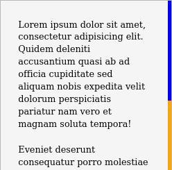
scrollbar-color
scrollbar-color sets the thumb and track colors using a two-value syntax. The first value is the thumb color; the second is the track color. border-radius and padding are not available through this property.
/* scrollbar-color: sets thumb and track colors */
/* see compatibility table */
.scroll-area {
  height: 200px;
  overflow: auto;
  scrollbar-color: blue orange; /* thumb track */
}
Here is a screenshot of the scrollbar produced with these CSS rules:
scrollbar-gutter
A panel that loads content dynamically, such as a chat feed, a comment list, or a filter dropdown, shifts its content sideways the moment a scrollbar appears. scrollbar-gutter: stable prevents that shift by reserving the gutter space before the scrollbar renders. The stable both-edges variant reserves equal space on both sides, which keeps the layout visually centered in containers where symmetry matters, such as a card grid or a centered dialog. Accepted values are auto, stable, and stable both-edges.
/* scrollbar-gutter: reserves space for the scrollbar to prevent layout shift */
/* Chrome 94+, Edge 94+, Firefox 97+, Safari - see compatibility table */
.scroll-area {
  scrollbar-gutter: stable;
  overflow: auto;
}
Styling Scrollbars in Chrome, Edge, and Safari
Styling scrollbars for Chrome, Edge, and Safari is available through the vendor-prefixed -webkit-scrollbar pseudo-element family. Here is a working example using the three most-used pseudo-elements:
body::-webkit-scrollbar {
  width: 12px;               /* width of the entire scrollbar */
}

body::-webkit-scrollbar-track {
  background: orange;        /* color of the tracking area */
}

body::-webkit-scrollbar-thumb {
  background-color: blue;    /* color of the scroll thumb */
  border-radius: 20px;       /* roundness of the scroll thumb */
  border: 3px solid orange;  /* creates padding around scroll thumb */
}
Here is a screenshot of the scrollbar produced with these CSS rules:
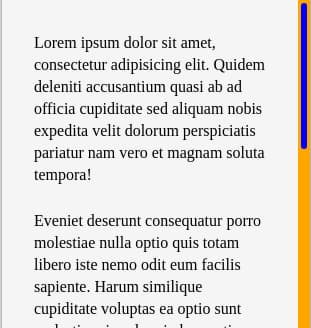
The border on ::-webkit-scrollbar-thumb is drawn in the track’s color, which insets the visible thumb and reads as padding. If you change the track color, change the thumb border color to match, or the inset effect breaks and the border becomes a visible ring around the thumb.
This code works in the latest releases of Chrome, Edge, and Safari. The -webkit-scrollbar pseudo-elements are non-standard and not on the W3C standards track. The CSS Scrollbars Level 1 properties (scrollbar-width, scrollbar-color, scrollbar-gutter) are the W3C-standardized approach and the recommended path going forward. Both can coexist in a stylesheet using feature queries.
The full pseudo-element family is listed below for reference:
| Pseudo-Element | Description |
|---|---|
::-webkit-scrollbar |
Sets the width (vertical) or height (horizontal) of the scrollbar |
::-webkit-scrollbar-track |
Styles the track, the channel the thumb moves within |
::-webkit-scrollbar-track-piece |
Styles the portion of the track not covered by the thumb |
::-webkit-scrollbar-thumb |
Styles the draggable thumb; supports border-radius and border |
::-webkit-scrollbar-button |
Styles the arrow buttons at each end of the scrollbar |
::-webkit-scrollbar-corner |
Styles the corner where vertical and horizontal scrollbars meet |
Hiding the arrow buttons at each end and styling the scrollbar corner are common needs that ::-webkit-scrollbar alone does not address:
/* Hide arrow buttons at each end of the scrollbar */
/* Chrome, Safari, Edge (Chromium) */
::-webkit-scrollbar-button {
  display: none;
}

/* Style the corner where both scrollbars meet */
/* Chrome, Safari, Edge (Chromium) */
.code-block::-webkit-scrollbar-corner {
  background: #1a1a1a;
}
Thumb Hover and Active States
To make the thumb respond to interaction, style ::-webkit-scrollbar-thumb:hover and ::-webkit-scrollbar-thumb:active. The standard scrollbar-color property has no hover or active equivalent, so this refinement is Chromium and WebKit only.
/* Thumb darkens on hover - Chrome, Safari, Edge (Chromium) only */
.scroll-area::-webkit-scrollbar-thumb {
  background-color: #888;
}

.scroll-area::-webkit-scrollbar-thumb:hover {
  background-color: #555;
}

.scroll-area::-webkit-scrollbar-thumb:active {
  background-color: #333;
}
Building Future-Proof Scrollbar Styles
One stylesheet can serve both engines. Each browser silently ignores rules for selectors it does not support, so placing the standard properties and the webkit pseudo-elements in two sequential blocks is all that is needed:
/* Standard properties: Chrome 121+, Edge 121+, Firefox 64+ */
body {
  scrollbar-width: thin;
  scrollbar-color: blue orange;
}

/* Webkit pseudo-elements: Chrome, Edge, Safari */
body::-webkit-scrollbar {
  width: 12px;
}

body::-webkit-scrollbar-track {
  background: orange;
}

body::-webkit-scrollbar-thumb {
  background-color: blue;
  border-radius: 20px;
  border: 3px solid orange;
}
Avoid using the * universal selector for scrollbar rules; it targets every element on the page, including nested scroll containers you may not intend to style. Scope rules to body for page-level styling or to a specific class for component-level styling.
Blink and WebKit browsers ignore rules they do not recognize and apply -webkit-scrollbar rules. Firefox ignores rules it does not recognize and applies CSS Scrollbars rules. The simple two-block pattern works because browsers silently skip selectors they do not support.
In Chromium, there is one additional precedence rule: once any ::-webkit-scrollbar pseudo-element is defined on an element, Chromium renders the webkit styling for that element and ignores scrollbar-color and scrollbar-width on it. This is element-level behavior in Chromium and is why the two-block pattern works cleanly: Firefox takes the standard properties and skips the webkit rules; Chromium takes the webkit rules and skips the standard properties.
For cases where explicit scoping is needed, use @supports feature queries:
/* Standard properties where supported: Chrome 121+, Edge 121+, Firefox 64+ */
@supports (scrollbar-color: auto) {
  .scroll-area {
    scrollbar-width: thin;
    scrollbar-color: #2563eb #e5e7eb;
  }
}

/* Webkit pseudo-elements where supported: Chrome, Safari, Edge (all Chromium) */
@supports selector(::-webkit-scrollbar) {
  .scroll-area::-webkit-scrollbar {
    width: 10px;
  }

  .scroll-area::-webkit-scrollbar-track {
    background: #e5e7eb;
  }

  .scroll-area::-webkit-scrollbar-thumb {
    background-color: #2563eb;
    border-radius: 8px;
    border: 2px solid #e5e7eb;
  }
}
The @supports version makes the scoping explicit and avoids cross-engine rule bleed. Use the simpler pattern when targeting modern browsers only; use @supports when you need to guarantee isolation.
Overlay and Classic Scrollbars
If your scrollbar styles appear to have no effect, the platform is likely using overlay scrollbars. Overlay scrollbars float over the content as a semi-transparent thumb with no track, appear only while scrolling, and take up no layout space. macOS defaults to overlay scrollbars for most users; Windows defaults to classic (always-visible) scrollbars.
In overlay mode, scrollbar-color and webkit track styling often produce no visible result, because the track is not rendered and the thumb appearance is managed by the OS. This is the most common cause of “why is my styling doing nothing on macOS Safari?” reports and is related to the open questions around Safari scrollbar-color behavior on recent macOS versions.
To reason about it: classic scrollbars, as seen on Windows or on macOS when the system preference is set to always show scrollbars, respond to both the standard properties and the webkit pseudo-elements. Overlay scrollbars largely do not. Test on both scrollbar modes before publishing, and do not assume styling will be visible to all users on all platforms.
Mobile and Touch Scrollbar Behavior
Custom scrollbar styling is largely a desktop concern. On iOS, Safari uses momentum-based overlay scrollbars during touch scrolling and does not apply -webkit-scrollbar styling to them. On Android, Chrome’s scrollbar support is partial and varies by version. In both cases, any styled scrollbar will silently fall back to the platform default.
Do not rely on a styled scrollbar as the only navigation affordance for touch users. Any component that requires custom scrollbar visibility for usability should have an alternative cue at the edge of the scroll container, such as a fade gradient:
/* Touch-friendly cue: fade the bottom edge to hint at more content */
.scroll-container {
  overflow-y: auto;
  -webkit-mask-image: linear-gradient(to bottom, black calc(100% - 24px), transparent);
          mask-image: linear-gradient(to bottom, black calc(100% - 24px), transparent);
}
Dark-Mode Theming with Custom Properties
Define scrollbar colors as CSS custom properties and swap them in a prefers-color-scheme: dark media query. This keeps the color values in one place and ensures the scrollbar follows the theme automatically.
/* Theme scrollbar colors once, swap them for dark mode */
:root {
  --sb-thumb: #888;
  --sb-track: #f0f0f0;
}

@media (prefers-color-scheme: dark) {
  :root {
    --sb-thumb: #555;
    --sb-track: #1e1e1e;
  }
}

.scroll-area {
  scrollbar-color: var(--sb-thumb) var(--sb-track);
}

.scroll-area::-webkit-scrollbar-thumb {
  background-color: var(--sb-thumb);
}

.scroll-area::-webkit-scrollbar-track {
  background: var(--sb-track);
}
Hide a Scrollbar While Keeping Scroll Functionality
Hiding a scrollbar without disabling scrolling requires a different approach depending on the browser.
Hide Scrollbar in Chrome and Safari
/* Hide scrollbar in Chrome, Safari, and Chromium-based Edge */
/* Scroll functionality is preserved */
.hide-scrollbar::-webkit-scrollbar {
  display: none;
}
Hide Scrollbar in Firefox
/* Hide scrollbar in Firefox */
/* Scroll functionality is preserved */
.hide-scrollbar {
  scrollbar-width: none;
}
Cross-Browser Hide Scrollbar Pattern
/* Cross-browser: hide scrollbar while preserving scroll */
/* Apply overflow: auto or scroll to the same element */
.hide-scrollbar {
  overflow: auto;
  scrollbar-width: none;      /* Firefox and standard */
  -ms-overflow-style: none;   /* IE and pre-Chromium Edge (legacy) */
}

.hide-scrollbar::-webkit-scrollbar {
  display: none;              /* Chrome, Safari, Edge (Chromium) */
}
Do not hide scrollbars on regions that depend on them for navigation unless the element is keyboard-accessible (focusable and scrollable with arrow keys or Page Up/Page Down). See the Accessibility Considerations section for WCAG guidance.
How to Style a Vertical Scrollbar with CSS
Both the standard properties and the webkit pseudo-elements use the width axis for vertical scrollbars. Use overflow-y: auto on the container to trigger them, then control appearance with scrollbar-width and scrollbar-color for cross-browser sizing and ::-webkit-scrollbar { width } for exact control in Chromium and WebKit.
Vertical Scrollbar Width and Color
/* Vertical scrollbar: standard properties */
/* Chrome 121+, Edge 121+, Firefox 64+, Safari - see compatibility table */
.vertical-scroll {
  overflow-y: auto;
  height: 300px;
  scrollbar-width: thin;
  scrollbar-color: #555 #f0f0f0;
}

/* Vertical scrollbar: webkit pseudo-elements */
/* Chrome, Safari, Edge (Chromium) */
.vertical-scroll::-webkit-scrollbar {
  width: 8px;
}

.vertical-scroll::-webkit-scrollbar-track {
  background: #f0f0f0;
}

.vertical-scroll::-webkit-scrollbar-thumb {
  background-color: #555;
}
Rounded Thumb Example with Code
border-radius on the thumb requires the ::-webkit-scrollbar-thumb pseudo-element. It is not available through the standard scrollbar-color property.
/* Rounded thumb: Chrome, Safari, Edge (Chromium) only */
.rounded-scroll::-webkit-scrollbar {
  width: 8px;
}

.rounded-scroll::-webkit-scrollbar-track {
  background: #f0f0f0;
  border-radius: 4px;
}

.rounded-scroll::-webkit-scrollbar-thumb {
  background-color: #0a84ff;
  border-radius: 20px;
  border: 2px solid #f0f0f0; /* border matches track to create visual padding */
}
The thumb accepts any CSS background value, including gradients. Because a gradient is an image, set it with background or background-image, not background-color. For example, background: linear-gradient(to bottom, #0a84ff, #0055cc) produces a gradient thumb in Chromium and WebKit.
How to Style a Horizontal Scrollbar with CSS
For the -webkit-scrollbar pseudo-element, height (not width) controls the horizontal scrollbar. width controls the vertical scrollbar.
/* Horizontal scrollbar: standard properties */
/* Chrome 121+, Edge 121+, Firefox 64+, Safari - see compatibility table */
.horizontal-scroll {
  overflow-x: auto;
  overflow-y: hidden;
  white-space: nowrap;
  scrollbar-width: thin;
  scrollbar-color: #0a84ff #e0e0e0;
}

/* Horizontal scrollbar: webkit pseudo-elements */
/* Chrome, Safari, Edge (Chromium) */
/* Use height, not width, for the horizontal bar */
.horizontal-scroll::-webkit-scrollbar {
  height: 6px;
}

.horizontal-scroll::-webkit-scrollbar-track {
  background: #e0e0e0;
}

.horizontal-scroll::-webkit-scrollbar-thumb {
  background-color: #0a84ff;
  border-radius: 10px;
}
Practical Use Cases
The following patterns are scoped to specific classes so they apply only to the intended container, not the entire page. Each pattern includes both standard properties and webkit pseudo-elements.
Chat Window or Message Feed
A chat feed’s scrollbar should stay unobtrusive until the user reaches for it. A transparent track keeps the bar invisible at rest; a narrow thumb that darkens on hover makes it appear only when needed. The hover state requires ::-webkit-scrollbar-thumb:hover and is Chromium and WebKit only.
/* Chat window: narrow scrollbar, transparent track, hover darkening */
/* Standard: Chrome 121+, Edge 121+, Firefox 64+ | Webkit: Chrome, Safari, Edge */
.chat-window {
  height: 400px;
  overflow-y: auto;
  scrollbar-width: thin;
  scrollbar-color: #b0b0b0 transparent;
}

.chat-window::-webkit-scrollbar {
  width: 6px;
}

.chat-window::-webkit-scrollbar-track {
  background: transparent;
}

.chat-window::-webkit-scrollbar-thumb {
  background-color: #b0b0b0;
  border-radius: 10px;
}

.chat-window::-webkit-scrollbar-thumb:hover {
  background-color: #888; /* darkens on hover so the bar surfaces on demand */
}
Sidebar Navigation
A sidebar that supports a switchable light/dark theme should define scrollbar colors as CSS custom properties on the component, not as hard-coded hex values. That way a single theme swap updates the scrollbar automatically without touching this block.
/* Sidebar navigation: dark theme, colors via CSS custom properties */
/* Standard: Chrome 121+, Edge 121+, Firefox 64+ | Webkit: Chrome, Safari, Edge */
.sidebar {
  --sb-thumb: #555;
  --sb-track: #1e1e1e;

  width: 240px;
  height: 100vh;
  overflow-y: auto;
  scrollbar-width: thin;
  scrollbar-color: var(--sb-thumb) var(--sb-track);
}

.sidebar::-webkit-scrollbar {
  width: 5px;
}

.sidebar::-webkit-scrollbar-track {
  background: var(--sb-track);
}

.sidebar::-webkit-scrollbar-thumb {
  background-color: var(--sb-thumb);
  border-radius: 4px;
}
Code Editor Block
Code blocks scroll on both axes and often sit inside a dark theme. Setting equal width and height on ::-webkit-scrollbar keeps both bars the same thickness. The ::-webkit-scrollbar-corner fills the gap where the two bars meet; without it, that corner renders as a white square against a dark background.
/* Code editor block: dark scrollbar on both axes with corner fill */
/* Standard: Chrome 121+, Edge 121+, Firefox 64+ | Webkit: Chrome, Safari, Edge */
.code-block {
  overflow: auto;
  max-height: 300px;
  scrollbar-width: thin;
  scrollbar-color: #4a4a4a #1a1a1a;
}

.code-block::-webkit-scrollbar {
  width: 8px;
  height: 8px; /* height controls the horizontal bar */
}

.code-block::-webkit-scrollbar-track {
  background: #1a1a1a;
}

.code-block::-webkit-scrollbar-thumb {
  background-color: #4a4a4a;
  border-radius: 4px;
  border: 2px solid #1a1a1a; /* border matches track; insets the thumb visually */
}

.code-block::-webkit-scrollbar-corner {
  background: #1a1a1a; /* fills the gap where both bars meet */
}
Modal or Dialog Overlay
When a modal opens and its body overflows, a scrollbar can appear and shift the text sideways. Adding scrollbar-gutter: stable reserves the gutter width before content renders, preventing the layout jump even when the scrollbar is not yet visible.
/* Modal content area: scoped scrollbar, gutter reserved to prevent layout shift */
/* Standard: Chrome 121+, Edge 121+, Firefox 64+ | Webkit: Chrome, Safari, Edge */
.modal-body {
  max-height: 60vh;
  overflow-y: auto;
  scrollbar-gutter: stable; /* reserves gutter so content does not shift on overflow */
  scrollbar-width: thin;
  scrollbar-color: #999 #f5f5f5;
}

.modal-body::-webkit-scrollbar {
  width: 6px;
}

.modal-body::-webkit-scrollbar-track {
  background: #f5f5f5;
}

.modal-body::-webkit-scrollbar-thumb {
  background-color: #999;
  border-radius: 6px;
}
How to Conditionally Hide/Show Scrollbars
Conditionally hiding or showing scrollbars can be achieved using CSS media queries or JavaScript. You might want to hide scrollbars on smaller screens where content fits within the viewport, but show them on larger screens where content overflows.
@media (max-width: 768px) {
  body {
    overflow: hidden; /* Disables scrolling entirely on smaller screens - not a scrollbar-hiding technique */
  }
}

@media (min-width: 769px) {
  body {
    overflow: auto; /* Shows the scrollbar on larger screens */
  }
}
To hide only the visible scrollbar bar while preserving scroll functionality, use the cross-browser .hide-scrollbar pattern from Hide a Scrollbar While Keeping Scroll Functionality. At a breakpoint, add that class to the scroll container so the rules above apply only where you need them:
/* Small viewports: add hide-scrollbar to the element (class rules defined above) */
@media (max-width: 768px) {
  .scroll-container {
    overflow: auto;
  }
}
Hide the scrollbar only when content does not overflow by toggling the class in JavaScript:
// Hide the scrollbar only when content does not overflow
const el = document.querySelector('.scroll-container');
el.classList.toggle('hide-scrollbar', el.scrollHeight <= el.clientHeight);
Using CSS Scrollbars with JavaScript Interactions
The simplest way to implement smooth scrolling is with CSS, requiring no JavaScript:
/* Smooth scrolling with CSS only - no JavaScript required */
html {
  scroll-behavior: smooth;
}
For programmatic smooth scroll to a target element on click:
// Smooth scroll to a target element on click (no library required)
document.getElementById('scroll-to-section').addEventListener('click', () => {
  document.getElementById('target-section').scrollIntoView({ behavior: 'smooth' });
});
Common Errors and Debugging
1. Page Width Shifts When a Scrollbar Appears
When a container transitions from no overflow to overflowing content, a classic scrollbar appears and takes approximately 15–17px from the layout width on Windows. The content area narrows, text reflows, and the layout jumps. This is most noticeable on containers set to full viewport width and on dynamically loaded lists where the scrollbar appears after the initial render.
The fix is scrollbar-gutter: stable, which reserves the scrollbar’s gutter space before the bar appears, so the content area width never changes:
CSS without gutter reservation (layout shifts when scrollbar appears):
.feed {
  overflow: auto;
  /* no scrollbar-gutter: content reflows when the bar appears */
}
CSS with gutter reservation (layout stays stable):
.feed {
  overflow: auto;
  scrollbar-gutter: stable; /* reserves gutter; content width does not change */
}
If you always want the scrollbar visible regardless of content length, overflow: scroll achieves the same stability without requiring scrollbar-gutter, because the scrollbar space is always occupied.
2. Scrollbar Disappearing with overflow: hidden Unintentionally
When the scrollbar disappears unexpectedly, check whether overflow: hidden is applied to a parent element. That property disables overflow scrolling entirely on the element and its children.
Incorrect HTML and CSS:
<div style="overflow: hidden;">
  <div style="overflow: auto;">
    <!-- Content that requires a scrollbar -->
  </div>
</div>
Corrected HTML and CSS:
<div>
  <div style="overflow: auto;">
    <!-- Content that requires a scrollbar -->
  </div>
</div>
3. Double Scrollbars from Nested overflow
Two scrollbars appear when a scroll container is nested inside another scroll container. The cause is overflow: auto (or scroll) set on both the parent and the child. The fix is to scroll on a single element, usually the inner content wrapper, and leave the parent at the default:
Symptom: nested overflow on parent and child:
/* Symptom: two scrollbars from nested overflow */
.outer { overflow: auto; }   /* parent scrolls */
.inner { overflow: auto; }   /* child also scrolls: double bars */
Fix: scroll on one element only:
/* Fix: scroll on one element only */
.outer { overflow: visible; }
.inner { overflow: auto; }
Accessibility Considerations
Color Contrast Requirements
WCAG 2.1 Success Criterion 1.4.11 (Non-text Contrast) requires a minimum contrast ratio of 3:1 between a UI component and adjacent colors. For a scrollbar, the thumb color must achieve at least 3:1 contrast against the track color.
- Thumb
#767676on track#ffffff: approximately 4.5:1. Passes. - Thumb
#ccccccon track#ffffff: approximately 1.6:1. Fails.
Use the WebAIM Contrast Checker to verify scrollbar color pairs before publishing.
Respecting User Scrollbar Preferences
Some users configure their operating system to always show scrollbars, or have accessibility settings that affect scrollbar rendering. Do not attempt to override OS-level accessibility settings with CSS.
When hiding a scrollbar with scrollbar-width: none or ::-webkit-scrollbar { display: none }, confirm that the element is keyboard-accessible: it must be focusable and respond to arrow keys, Page Up, and Page Down so keyboard-only users can navigate the content. Avoid hiding the scrollbar on elements where it is the only visible navigation affordance.
FAQ
1. What is the difference between -webkit-scrollbar and the CSS Scrollbars standard properties?
The -webkit-scrollbar approach uses vendor-prefixed pseudo-elements supported in Chrome, Safari, and Chromium-based Edge. It enables fine-grained styling such as border-radius on the thumb and border-based padding around the thumb. The CSS Scrollbars standard (scrollbar-width, scrollbar-color) is the W3C-specified approach, supported in Firefox and newer versions of Chrome and Edge. Both can coexist in a stylesheet using @supports feature queries.
2. Does CSS scrollbar styling work in Firefox?
Yes. Firefox supports scrollbar-width and scrollbar-color from the CSS Scrollbars Level 1 specification starting in version 64. Firefox does not support the -webkit-scrollbar pseudo-element family. Write Firefox styles using the standard properties only.
3. How do I hide a scrollbar in CSS without disabling scrolling?
Set overflow: auto on the container, then apply ::-webkit-scrollbar { display: none } for Chrome and Safari, and scrollbar-width: none for Firefox. Do not use overflow: hidden; it disables scrolling rather than hiding only the visible bar.
4. Can I use border-radius on a scrollbar thumb?
Yes, but only through the ::-webkit-scrollbar-thumb pseudo-element. Apply border-radius directly to ::-webkit-scrollbar-thumb. This property is not available through the standard scrollbar-color property.
5. Does scrollbar styling affect page layout?
Scrollbars take up layout space by default. The scrollbar-gutter property controls whether that space is reserved even when the scrollbar is not visible. Setting scrollbar-gutter: stable prevents content from reflowing when a scrollbar appears or disappears.
6. Are custom CSS scrollbars accessible?
Custom scrollbars must meet WCAG 2.1 color contrast requirements. The thumb color against the track background must have a contrast ratio of at least 3:1 for non-text UI components. Avoid removing scrollbars entirely on elements that require them for navigation unless a keyboard-accessible alternative is in place.
7. Does -webkit-scrollbar work in Edge?
Yes. Microsoft Edge is built on the Chromium engine and supports the full -webkit-scrollbar pseudo-element family. CSS written for Chrome applies to Edge without modification.
8. How do I apply a custom scrollbar to only one element?
Scope the pseudo-element selector to a specific class or ID:
/* Scoped custom scrollbar: applies only to .my-container */
.my-container::-webkit-scrollbar {
  width: 8px;
}

.my-container {
  scrollbar-width: thin;
  scrollbar-color: #555 #f0f0f0;
}
For standard properties, apply scrollbar-width and scrollbar-color directly to the element’s selector.
Conclusion
This tutorial covered how to style scrollbars using the CSS Scrollbars Level 1 standard properties (scrollbar-width, scrollbar-color, scrollbar-gutter) and the -webkit-scrollbar pseudo-element family. It included a cross-browser compatibility reference, the @supports feature detection pattern, vertical and horizontal scrollbar examples, the correct technique for hiding a scrollbar while preserving scroll functionality, and scoped styles for common UI patterns including chat windows, sidebars, code blocks, and modals.
You can now write scrollbar styles that target Chrome, Firefox, Safari, and Edge without duplicating effort, use @supports to write standards-first CSS with a webkit layer for visual refinement, scope custom scrollbar styles to individual components rather than the entire page, and apply color combinations that satisfy WCAG 2.1 contrast requirements.
To continue working with CSS pseudo-elements and layout properties, explore A CSS Selector Reference for a deeper reference on the selectors and pseudo-elements used throughout this tutorial, How To Prevent Line Breaks Using CSS for techniques on keeping content on a single line with white-space: nowrap, which pairs directly with horizontal scroll containers, and CSS Flexbox for layout techniques that pair with scrollbar-gutter to prevent content reflow.
Thanks for learning with the DigitalOcean Community. Check out our offerings for compute, storage, networking, and managed databases.
About the author(s)
I help Businesses scale with AI x SEO x (authentic) Content that revives traffic and keeps leads flowing | 3,000,000+ Average monthly readers on Medium | Sr Technical Writer(Team Lead) @ DigitalOcean | Ex-Cloud Consultant @ AMEX | Ex-Site Reliability Engineer(DevOps)@Nutanix
Building future-ready infrastructure with Linux, Cloud, and DevOps. Full Stack Developer & System Administrator. Technical Writer @ DigitalOcean | GitHub Contributor | Passionate about Docker, PostgreSQL, and Open Source | Exploring NLP & AI-TensorFlow | Nailed over 50+ deployments across production environments.
Still looking for an answer?
This textbox defaults to using Markdown to format your answer.
You can type !ref in this text area to quickly search our full set of tutorials, documentation & marketplace offerings and insert the link!
I find CSS scrollbars are useless and ugly. This is a stupid ideal that Apple created for MAC OS X Lion. What wrong with the classic scrollbars.
Hi William,
For a specific part of the screen like sidebars, I have turned it into a class, so I just have to put it in elements that overflow:
/* Scrollbar styling */

/* Works on Firefox */
.scroll-black * {
	scrollbar-width: thin;
	scrollbar-color: rgb(70, 70, 70) auto;
}

/* Works on Chrome, Edge, and Safari */
.scroll-black *::-webkit-scrollbar {
	width: 7px;
}

.scroll-black *::-webkit-scrollbar-track {
	background: transparent;
}

.scroll-black *::-webkit-scrollbar-thumb {
	background-color:rgb(70, 70, 70);
}

/* End scrollbar styling*/
 This work is licensed under a Creative Commons Attribution-NonCommercial- ShareAlike 4.0 International License.
Become a contributor for community
Get paid to write technical tutorials and select a tech-focused charity to receive a matching donation.

DigitalOcean Documentation
Full documentation for every DigitalOcean product.

Resources for startups and AI-native businesses
The Wave has everything you need to know about building a business, from raising funding to marketing your product.
The developer cloud
Scale up as you grow — whether you're running one virtual machine or ten thousand.

Start building today
From GPU-powered inference and Kubernetes to managed databases and storage, get everything you need to build, scale, and deploy intelligent applications.
