By Nicholas Cerminara and Bradley Kouchi

Introduction
A sticky sidebar is a web design technique to keep the sidebar on the screen even if the user has scrolled past the position where it initially displayed. This is useful for making sub-navigation easily accessible, highlighting your content in your sidebar more as a user scrolls, and potentially increasing your ad impressions, clicks, and page views.
In the past, this functionality was frequently accomplished through JavaScript calculations to detect the scroll position and to toggle an element’s position to absolute or fixed.
Presently, the W3C specification has defined sticky positioning, and many modern browsers have already adopted it.
In this tutorial, you will create a webpage with a sidebar that uses position: sticky and Bootstrap 4.
Prerequisites
This demonstration does not require any local environment set-up. You can follow along with a code editor and browser of your choice.
To complete this tutorial, you will need:
- Some knowledge of CSS and HTML will be required. In particular, some understanding of CSS behaviors and the limitations of
position: absoluteandposition: fixedmay be beneficial. - Familiarity with the Bootstrap framework and how to implement it in your project.
Step 1 — Using position: sticky
position: stickyThe specification for using position: sticky requires a direction like top or bottom to be specified with a value other than auto.
An example of CSS class using this property looks like this:
.sticky {
  position: sticky;
  top: 0;
}
To experience position: sticky, you can create a new project directory:
- mkdir position-sticky-example
And change into that directory:
- cd position-sticky-example
Inside this project directory, create an example.html file with the following code:
<!DOCTYPE html>
<html lang="en">
  <head>
    <meta charset="utf-8" />
    <title>Sticky Position Example</title>
    <style>
      * {
        box-sizing: border-box;
      }

      html,
      body {
        margin: 0;
        padding: 0;
      }

      .placeholder-example {
        background: lavender;
        height: 100vh;
        padding: 1em;
      }

      .sticky-example {
        background: cornflowerblue;
        padding: 1em;
      }

      .sticky {
        position: sticky;
        top: 0;
      }
    </style>
  </head>
  <body>
    <div class="sticky-example sticky">Sticky</div>
    <div class="placeholder-example">Placeholder</div>
  </body>
</html>
This code creates a div with the sticky class and another div with the placeholder class that is the full height of the viewport.
Open index.html in your web browser and observe how position: sticky behaves as you scroll up and down the page.
Checking Browser Support and Using Fallbacks
Before you adopt a new CSS property, you should research how well supported it is by various browsers. If a feature is not supported by your target audience’s browsers, then it may not be a good candidate for adopting in your project.
One tool for checking browser support is Can I Use. At this point in time, the Can I Use page for position: sticky reports that there is no support for position: sticky in Internet Explorer. There is support for modern versions of Edge, Firefox, Chrome, Safari, and Opera. And there are two noted known issues where certain aspects of position: sticky are not behaving as expected in some browsers.
A sensible fallback to position: sticky would be position: relative. It would not lead to an identical browser experience, but it would ensure that users with unsupported browsers would still have access to the content within position: sticky elements.
You may also want to consider using vendor-prefixes for CSS properties, like position: -webkit-sticky, to address older versions of Safari and iOS Safari.
The rewritten sticky class with fallback support will resemble:
.sticky {
  position: relative;
  position: -webkit-sticky;
  position: sticky;
  top: 0;
}
This code takes advantage of how a browser will ignore property values that it does not recognize and only use the last valid value.
This concludes a brief introduction to the position: sticky behavior. Let’s look at applying it to an advanced scenario.
Step 2 — Building a Sticky Sidebar with Bootstrap 4
The desired layout will have a sidebar that will sit adjacent to a long block of content. You can achieve this with the Bootstrap 4 library.
Here is a diagram of the intended layout:
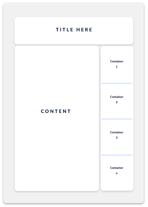
A title-section spans the top of the page. A content-section occupies a majority of the left side of the screen. Multiple sidebar elements occupy the right side of the screen: container 1, container 2, container 3, and container n.
Create a new index.html file and add the Bootstrap 4 library:
<!DOCTYPE html>
<html lang="en">
  <head>
    <meta charset="utf-8" />
    <title>Sticky Position Sidebar</title>
    <link
      rel="stylesheet"
      href="https://stackpath.bootstrapcdn.com/bootstrap/4.5.2/css/bootstrap.min.css"
      integrity="sha384-JcKb8q3iqJ61gNV9KGb8thSsNjpSL0n8PARn9HuZOnIxN0hoP+VmmDGMN5t9UJ0Z"
      crossorigin="anonymous"
    />
    <style>
    </style>
  </head>
<body>
</body>
</html>
In order to achieve the desired layout, your body content will need to adopt the Bootstrap markup structure:
<body>
  <article>
    <div class="container-fluid">
      <div class="row">
        <div class="col">
          <div class="title-section">
            <h1>Stacking Sticky Sidebars with Bootstrap 4</h1>
          </div>
        </div>
      </div>
      <div class="row">
        <div class="col-7">
          <div class="content-section">
            Content Section
          </div>
        </div>
        <div class="col-5">
          <div class="sidebar-section">
            <div class="sidebar-item">
              <div class="sidebar-content">
                Container 1
              </div>
            </div>
          </div>
        </div>
      </div>
    </div>
  </article>
</body>
This markup establishes a content-section that stretches 7 column widths and a Sidebar Section that stretches 5 column widths. This adds up to 12 columns, which is the default grid system in Bootstrap 4.
Applying sticky-top
Bootstrap 4 also comes with a utility class named sticky-top that is functionally the same as the sticky class you created earlier.
Before you apply sticky-top, add some styles to help make the the content and sidebar sections more visually apparent:
<style>
  .content-section {
    background: lavender;
    height: 1000px;
    min-height: 100vh;
    padding: 1em;
  }

  .sidebar-section {
    height: 100%;
  }

  .sidebar-content {
    background: cornflowerblue;
    padding: 1em;
  }
</style>
This code defines the background-color, height, and padding for the content and sidebar section.
Note: The height provided here for the content section is an arbitrary amount for demonstration purposes. If you had content that was large enough, you could rely upon it to define your layout and remove the height property.
When visiting index.html in your web browser, you should observe a content section and a smaller sidebar section.
Now, add the sticky-top class to the sidebar-item:
<div class="col-5">
  <div class="sidebar-section">
    <div class="sidebar-item sticky-top">
      <div class="sidebar-content">
        Container 1
      </div>
    </div>
  </div>
</div>
When scrolling down the page, the sidebar should have “sticky” behavior.
This is probably going to be the most common feature request for most scenarios. The next steps will explore more imaginative scenarios.
Step 3 — Experimenting with Advanced Scenarios
In the following section, you will take the index.html file you created earlier and explore adding multiple items, stacking sidebar items, and finally pushing sidebar items off the screen.
Experimenting with a Sticky Sidebar and Multiple Items
Building off the example, you can add additional items to the sidebar:
<div class="col-5">
  <div class="sidebar-section">
    <div class="sidebar-item sticky-top">
      <div class="sidebar-content">
        Container 1
      </div>
    </div>

    <div class="sidebar-item sticky-top">
      <div class="sidebar-content">
        Container 2
      </div>
    </div>

    <div class="sidebar-item sticky-top">
      <div class="sidebar-content">
        Container 3
      </div>
    </div>

    <div class="sidebar-item sticky-top">
      <div class="sidebar-content">
        Container 4
      </div>
    </div>
  </div>
</div>
When visiting index.html in your web browser, you should observe a content section and multiple sidebar items.
If you convert the sidebar section into a flexbox with items arranged in a column with space-between, you can create a more visually interesting sidebar:
<style>
  /* ... */

  .sidebar-section {
    display: flex;
    flex-direction: column;
    justify-content: space-between;
    height: 100%;
  }

  /* ... */
</style>
When visiting index.html in your web browser, you should observe a content section and multiple sidebar items with space between them. When scrolling down, you should observe the sidebar items becoming sticky to the top of the screen.
Experimenting with Stacking All Sidebar Items
A common feature request is to keep all the sidebar items “stacked” visually on the screen.
This would require knowing the height of each sidebar item and offsetting the sticky top value. Instead of the default top: 0 provided by sticky-top class, you would provide the sum of the height of the preceding sidebar items.
Since the number of sidebar items and their height is known in this demonstration, you can apply the offset to each sidebar item using nth-child:
<style>
  /* ... */

  .sidebar-item:nth-child(2) {
    top: 3.5em;
  }

  .sidebar-item:nth-child(3) {
    top: 7em;
  }

  .sidebar-item:nth-child(4) {
    top: 10.5em;
  }

  /* ... */
</style>
When visiting index.html in your web browser, you should observe a content section and multiple sidebar items with space between them. When scrolling down, you should observe the sidebar items stacking.
However, this is restricted to the scenario of knowing that your sidebar contains 4 sidebar items that are each 3.5em tall. Any additional complexity will be stressing the limitations of Pure CSS and your time may be better suited using a JavaScript solution.
Experimenting with Pushing Sidebar Items Offscreen
Continuing to build off the previous example, a less restricted alternative may be to “push” the previous sidebar item off the screen.
First, you should remove the previous experiments with nth-child.
This new configuration will use flex-grow property for the .sidebar-item:
<style>
  /* ... */

  .sidebar-item {
    flex-grow: 1;
  }

  /* ... */
</style>
Now, move the sticky-top class from the sidebar-item element to the sidebar-content element:
<div class="col-5">
  <div class="sidebar-section">
    <div class="sidebar-item">
      <div class="sidebar-content sticky-top">
        Container 1
      </div>
    </div>

    <div class="sidebar-item">
      <div class="sidebar-content sticky-top">
        Container 2
      </div>
    </div>

    <div class="sidebar-item">
      <div class="sidebar-content sticky-top">
        Container 3
      </div>
    </div>

    <div class="sidebar-item">
      <div class="sidebar-content sticky-top">
        Container 4
      </div>
    </div>
  </div>
</div>
When visiting index.html in your web browser, you should observe a content section and multiple sidebar items. When scrolling down, you should observe a “stacking” behavior as sidebar items “push” the previous sidebar items.
Note: The previous version of this tutorial used a position: absolute approach due to limitations experienced with display: flexbox and position: sticky in web browsers at the time.
This CodePen example depicts the position: absolute approach.
However, at the time of this revision, this flexbox approach offers greater flexibility and requires less handling of varying amounts of sidebar items, heights, and offsets.
There’s further experimentation that can be performed by adjusting widths, heights, and offsets.
Conclusion
In this tutorial, you learned about the CSS property position: sticky and how it can be used for sidebars in your layouts for web design.
Bear in mind that there are limitations due to browser support. You may need to fallback to a JavaScript or position: absolute alternative depending on the browser usage of your audience.
If you’d like to learn more about CSS, check out our CSS topic page for exercises and programming projects.
Thanks for learning with the DigitalOcean Community. Check out our offerings for compute, storage, networking, and managed databases.
About the author(s)
Former Technical Editor at DigitalOcean. Expertise in areas including Vue.js, CSS, React, and more.
Still looking for an answer?
This textbox defaults to using Markdown to format your answer.
You can type !ref in this text area to quickly search our full set of tutorials, documentation & marketplace offerings and insert the link!
 This work is licensed under a Creative Commons Attribution-NonCommercial- ShareAlike 4.0 International License.
Become a contributor for community
Get paid to write technical tutorials and select a tech-focused charity to receive a matching donation.

DigitalOcean Documentation
Full documentation for every DigitalOcean product.

Resources for startups and AI-native businesses
The Wave has everything you need to know about building a business, from raising funding to marketing your product.
The developer cloud
Scale up as you grow — whether you're running one virtual machine or ten thousand.

Start building today
From GPU-powered inference and Kubernetes to managed databases and storage, get everything you need to build, scale, and deploy intelligent applications.
