Introducing Walrus – DigitalOcean’s reimagined design system with accessibility & mobile-readiness at its core
By DigitalOcean
- Published:
- 3 min read
Introducing Walrus – DigitalOcean’s reimagined design system with accessibility & mobile-readiness at its core
A simple and intuitive user experience is what originally set DigitalOcean apart in a crowded product space. The DigitalOcean cloud empowers learners, small businesses, and independent developers to do complex tasks that were historically left to experts. This human-centered approach to design enabled more people and businesses to do even more with our technology, and remains one of the greatest strengths of DigitalOcean products today.
In early 2019, the DigitalOcean design and frontend engineering team embarked on a journey to revamp our design system – a user interface’s language, with the components of a design system forming sentences and paragraphs on a page. The result of our efforts – the Walrus Design System – is beginning to roll out to our cloud application UI.
We wanted to share parts of the process – including our successes and failures – with those who may be creating a design system from scratch or revamping one that already exists.
Naturally, our language should encompass DigitalOcean’s company values around simplicity, trust, respect, and love. Here’s how we created our new design system with those values in mind.
Guiding principles should be the framework for any design system**.** We began by establishing a set of principles to guide the design of individual components and foundations in the new system. These principles reflect our company values and the tenets of modern design.
Accessibility for all is critical
Because DigitalOcean products are designed to empower all people to build, create, and do great things, our first focal point was on making our user experiences accessible.
For the first iteration of UI components, we designed with W3C’s WCAG AA Accessibility Guidelines in mind, asked many questions in the A11Y Slack community, and scoured open source design systems. When components were placed in a view, we also made heavy use of Deque’s amazing Axe Pro Tool, which identified issues when there were gaps in our own knowledge.
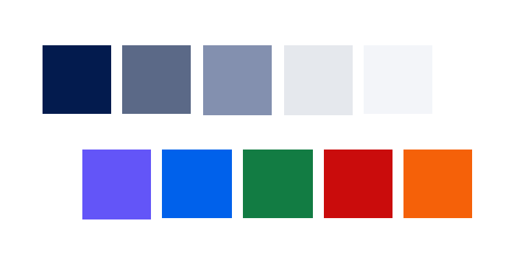
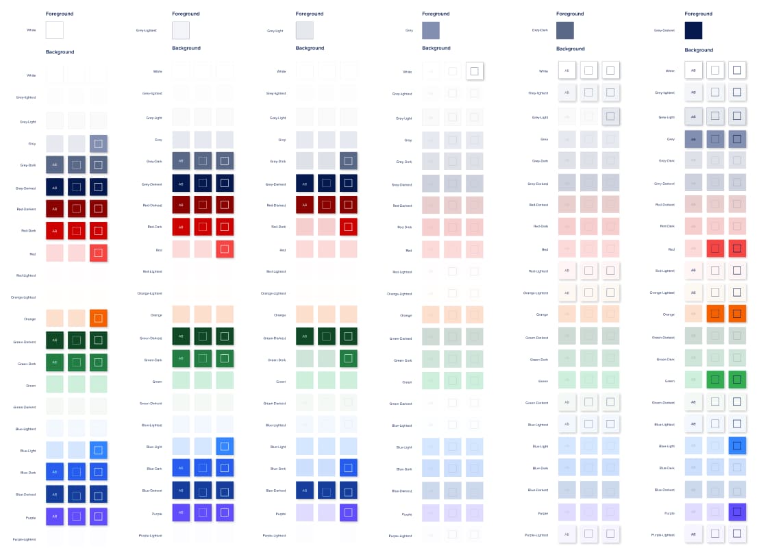
Our biggest areas of progress were in color contrast and usage. The color palette was chosen to clearly reflect statuses and interactive UI elements while maintaining appropriate contrast so that users of all vision levels could use our products. We developed a color reference that mapped all possible color combinations together and highlighted which ones passed WCAG contrast guidelines, making it easy for designers to put together components and elements quickly.
This year, we’re adding even more components and improving screen reader experiences. Our component design process now includes defining aria roles and screen reader behavior. As previously mentioned, we also leverage Axe Pro to test the screen reader experience and document/remediate any issues.
A mobile-first world calls for mobile-first experiences
We’ve heard your feedback for a mobile-friendly experience, and believe that Walrus will enable you to build your ideas and businesses from any device. While DigitalOcean’s original cloud UI did not have a mobile-friendly experience, we’ve addressed and overcome this critical roadblock. We did this by starting with the building blocks.
Walrus components are mobile-first, including adequate sizes and targets for smaller screens and responsive behavior. All the pages and user flows that consume the components are also designed for both mobile and desktop-sized windows.
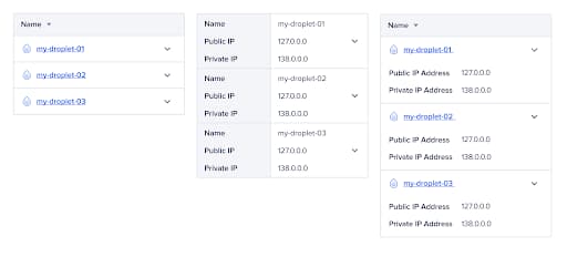
The table, for example, has several options for mobile screens. Designers can choose an option given the content.
Peer review is vital
Peer review is an important pillar in our design process. Once a component’s design is finished and documented, another designer reviews it against a set of criteria to ensure the component followed our principles. Any suggestions are then iterated on, and once the design is approved, we hand the assets over to the frontend engineering team for implementation. Once the component has been coded and added to the design library, designers test and review it again.
Keep an eye out for Walrus
You can check Walrus out right now in the Virtual Private Cloud section of Networking. We’ll gradually be rolling out more experiences leveraging Walrus in the coming months.
We’d eventually like to open source Walrus so anybody can create accessible, flexible, and beautiful web experiences.
We hope you’ll join us – amongst many other great companies – in correcting the mistake of not being inclusive from the very beginning. And if you’re using the DigitalOcean console with assistive technologies, we invite you to participate in research that will help improve the experience even more. If so, please reach out to amorozoff@digitalocean.com. And if you have any feedback or thoughts, we encourage you to share them!
With love,
The DigitalOcean Design and Engineering Team
About the author
Related Articles
Outperforming Fable 5 at half the price: meet model synthesis, a new server-side tool on DigitalOcean Inference Engine
- July 23, 2026
- 8 min read
Upcoming GPU Pricing Updates
- July 21, 2026
- 2 min read
Scale Faster with Managed Weaviate: Now in Public Preview on DigitalOcean
- July 9, 2026
- 4 min read