By Anupam Chugh

In this tutorial, we’ll be customizing the Buttons in our Android Application. If you aren’t aware of Android Buttons, check out this tutorial before proceeding. We’ll be setting selectors and shapes on our buttons in xml.
Android Button Design
A selector is used to define a different behaviour for different states of the Button. What are drawable states? Each of the following events of a view (Button or any other kind of view) are a type of state:
- state_pressed
- state_selected
- state_focused
- state_enabled
state_focused is when you hover over the widget. Typically works only on emulators. state_selected is meant to select the view. Doesn’t work with Buttons. Works with RadioButtons. Typically for a button, there are just three important states: normal, pressed and enabled. For each of the states of the selector, we can set a different drawable/color/shape on our button. Let’s get started with the implementation of each of these in a new Android Studio Project.
Android Custom Button Project Structure
 We’ll be looking at each of the drawable files one at a time. The colors are defined in the colors.xml file :
  A selector can be an xml file created inside the drawable folder.
 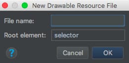 Selector for different background colors. The following selector file
 btn_bg_selector.xml contains the code for setting different background colors on a button for different states.
<?xml version="1.0" encoding="utf-8"?>
<selector xmlns:android="https://schemas.android.com/apk/res/android">
    <item android:state_pressed="true" android:drawable="@color/red"/>
    <item android:state_focused="true" android:drawable="@color/yellow"/>
    <item android:drawable="@color/green"/>
</selector>
In the above code, each of the states is represented using item tag. The selector tag behaves like an if - else if statement to an extent. It checks every condition from top to bottom. Whenever the condition matches, it sets the relevant things on the button and stops processing the next item tags. The third item tag is the default one. It’s important that we keep it at the last. Keeping it at the top would not allow the other two item tags to get executed ever. We set the above drawable selector file on our button in the activity_main.xml as:
<Button
            android:id="@+id/btnBgSelector"
            android:layout_width="wrap_content"
            android:layout_height="wrap_content"
            android:layout_margin="8dp"
            android:background="@drawable/btn_bg_selector"
            android:padding="8dp"
            android:text="Colored Selector" />
The selector is set on the background attribute of the button.
Selector for Disabled Button
The following selector btn_bg_selector_disabled.xml is used on a button which is not enabled.
<?xml version="1.0" encoding="utf-8"?>
<selector xmlns:android="https://schemas.android.com/apk/res/android">
    <item android:state_enabled="false" android:drawable="@color/yellow"/>
    <item android:state_pressed="true" android:drawable="@color/red"/>
    <item android:drawable="@color/green"/>
</selector>
For the above selector to work, we need to specify android:enabled as false.
<Button
            android:id="@+id/btnBgSelectorDisabled"
            android:layout_width="wrap_content"
            android:layout_height="wrap_content"
            android:layout_margin="8dp"
            android:background="@drawable/btn_bg_selector_disabled"
            android:enabled="false"
            android:padding="8dp"
            android:text="Color Selector Disabled" />
Selector with Different Drawables
We can set a different drawable image to be displayed based upon the state of the button. The selector code that does so is present in the file btn_drawable_selector.xml
<?xml version="1.0" encoding="utf-8"?>
<selector xmlns:android="https://schemas.android.com/apk/res/android">

    <item android:drawable="@drawable/sad" android:state_pressed="true"/>
    <item android:drawable="@drawable/happy" android:state_focused="true"/>
    <item android:drawable="@drawable/happy"/>

</selector>
Note: The focused state doesn’t work on smart phones. Now the drawable images when set as the button background can get stretched if it’s width/height is larger than the button’s. So we need to set the Button width/height in accordance with the drawable image. We can do so either by hardcoding in xml or getting the drawable dimensions programmatically and setting it over the button. For the sake of convenience we’ve done the former here:
<Button
            android:id="@+id/btnDrawableSelector"
            android:layout_width="48dp"
            android:layout_height="48dp"
            android:layout_margin="8dp"
            android:background="@drawable/btn_drawable_selector"
            android:padding="16dp" />
ImageButton is the ideal View to be used when you need to display a drawable as the button background only since it fits the drawable appropriately. ImageButton comes with the android:scale attribute to resize the drawable image.
<ImageButton
            android:id="@+id/imgButton"
            android:layout_width="wrap_content"
            android:layout_height="wrap_content"
            android:layout_margin="8dp"
            android:background="@color/green"
            android:padding="8dp"
            android:scaleType="center"
            android:src="@drawable/btn_drawable_selector" />
Android Button Color
We can change the text color on the button based on the state in the selector. The following code from btn_txt_selector.xml does so. We need to use android:color here in place of android:drawable.
<?xml version="1.0" encoding="utf-8"?>
<selector xmlns:android="https://schemas.android.com/apk/res/android">
    <item android:state_pressed="true" android:color="@color/red"/>
    <item android:state_focused="true" android:color="@color/yellow"/>
    <item android:color="@color/green"/>
</selector>
The button in the layout:
<Button
            android:id="@+id/btnTxtSelector"
            android:layout_width="wrap_content"
            android:layout_height="wrap_content"
            android:padding="8dp"
            android:text="Text Selector"
            android:textColor="@drawable/btn_txt_selector" />
Android Button Shapes
We can set custom shapes on our button using the xml tag <shape>. These xml files are created in the drawable folder too. shape can be used inside selectors. The shape can be set to rectangle(default), oval, ring, line. The most used tags inside the shape tag are:
- <gradient> - Setting start and end colors of the gradient along with the type(radius, linear, sweep)
- <stroke> - Setting border color and width
- <solid> - Setting the solid color on the button
- <corners>- Setting radius
Android Round Corner Button
The xml code for the btn_shape_round.xml file is given below:
<?xml version="1.0" encoding="utf-8"?>
<shape xmlns:android="https://schemas.android.com/apk/res/android"
    android:padding="16dp"
    android:shape="rectangle">
    <stroke
        android:width="1dp"
        android:color="@android:color/black" />
    <corners android:radius="10dp" />
</shape>
Just like selectors, we can set this on the android:background tag on the Button in our xml layout.
Android Button Shape With Gradient
In the following btn_shape_gradient.xml file, we’ve set the gradient as a radial one. We must set the gradient_radius attribute too.
<?xml version="1.0" encoding="utf-8"?>
<shape xmlns:android="https://schemas.android.com/apk/res/android"
    android:shape="rectangle">

    <gradient
        android:endColor="@color/green"
        android:gradientRadius="30dp"
        android:type="radial"
        android:startColor="@color/yellow" />

    <corners android:radius="@dimen/btn_corner_radius" />

    <stroke
        android:width="4dp"
        android:color="@android:color/black" />

</shape>
Android Button Shape and Selector Together
The btn_selector_shape.xml holds the selector. Each of the items has a shape specified.
<?xml version="1.0" encoding="utf-8"?>
<selector xmlns:android="https://schemas.android.com/apk/res/android">
    <item android:state_pressed="true">

        <shape android:shape="oval">
            <gradient android:angle="135" android:endColor="@color/jd_red" android:startColor="@color/green" />
            <corners android:radius="20dp" />
            <stroke android:width="2dp" android:color="@android:color/black" />
        </shape>

    </item>

    <item>
        <shape android:shape="rectangle">
            <gradient android:angle="225" android:endColor="@color/green" android:startColor="@color/jd_red" />
            <corners android:radius="@dimen/btn_corner_radius" />
            <stroke android:width="4dp" android:color="@android:color/black" />
        </shape>

    </item>
</selector>
Set this on the Button and the shape would change from rectangle to oval when the button is clicked. A linear gradient should have the angle specified in the multiples of 45, else it’ll crash. Setting the Button shape as capsule btn_shape_capsule.xml is where we set the shape inside the selectors as a capsule.
<?xml version="1.0" encoding="utf-8"?>
<selector xmlns:android="https://schemas.android.com/apk/res/android">

    <item android:state_pressed="true">
        <shape android:shape="rectangle">

            <solid android:color="@color/colorAccent" />
            <corners android:radius="10dp" />

        </shape>

    </item>
    <item>
        <shape android:shape="rectangle">
            <solid android:color="@color/yellow" />
            <corners android:radius="10dp" />
        </shape>

    </item>

</selector>
The code for the MainActivity.java class which hosts all of the above button examples is given below.
<?xml version="1.0" encoding="utf-8"?>
<LinearLayout xmlns:android="https://schemas.android.com/apk/res/android"
    android:layout_width="match_parent"
    android:layout_height="match_parent"
    android:gravity="center_vertical"
    android:orientation="horizontal"
    android:weightSum="2">


    <LinearLayout
        android:layout_width="0dp"
        android:layout_height="wrap_content"
        android:layout_weight="1"
        android:gravity="center"
        android:orientation="vertical">


        <TextView
            android:layout_width="wrap_content"
            android:layout_height="wrap_content"
            android:text="Selectors"
            android:textColor="@android:color/black"
            android:textSize="18sp"
            android:textStyle="bold|italic" />


        <Button
            android:id="@+id/btnBgSelector"
            android:layout_width="wrap_content"
            android:layout_height="wrap_content"
            android:layout_margin="8dp"
            android:background="@drawable/btn_bg_selector"
            android:padding="8dp"
            android:text="Colored Selector" />

        <Button
            android:id="@+id/btnBgSelectorDisabled"
            android:layout_width="wrap_content"
            android:layout_height="wrap_content"
            android:layout_margin="8dp"
            android:background="@drawable/btn_bg_selector_disabled"
            android:enabled="false"
            android:padding="8dp"
            android:text="Color Selector Disabled" />

        <Button
            android:id="@+id/btnDrawableSelector"
            android:layout_width="48dp"
            android:layout_height="48dp"
            android:layout_margin="8dp"
            android:background="@drawable/btn_drawable_selector"
            android:padding="16dp" />

        <ImageButton
            android:id="@+id/imgButton"
            android:layout_width="wrap_content"
            android:layout_height="wrap_content"
            android:layout_margin="8dp"
            android:background="@color/green"
            android:padding="8dp"
            android:scaleType="center"
            android:src="@drawable/btn_drawable_selector" />

        <Button
            android:id="@+id/btnTxtSelector"
            android:layout_width="wrap_content"
            android:layout_height="wrap_content"
            android:padding="8dp"
            android:text="Text Selector"
            android:textColor="@drawable/btn_txt_selector" />


    </LinearLayout>


    <LinearLayout
        android:layout_width="0dp"
        android:layout_height="wrap_content"
        android:layout_weight="1"
        android:gravity="center"
        android:orientation="vertical">

        <TextView
            android:layout_width="wrap_content"
            android:layout_height="wrap_content"
            android:text="Shapes+Selectors"
            android:textColor="@android:color/black"
            android:textSize="18sp"
            android:textStyle="bold|italic" />

        <Button
            android:id="@+id/btnRoundShape"
            android:layout_width="wrap_content"
            android:layout_height="wrap_content"
            android:layout_margin="8dp"
            android:background="@drawable/btn_shape_round"
            android:padding="8dp"
            android:text="ROUND SHAPE" />

        <Button
            android:id="@+id/btnBgShape"
            android:layout_width="wrap_content"
            android:layout_height="wrap_content"
            android:background="@drawable/btn_shape_gradient"
            android:padding="8dp"
            android:text="SHAPE WITH GRADIENT" />


        <Button
            android:id="@+id/btnSelectorShape"
            android:layout_width="wrap_content"
            android:layout_height="wrap_content"
            android:layout_margin="8dp"
            android:background="@drawable/btn_selector_shape"
            android:padding="8dp"
            android:text="SELECTOR SHAPE" />


        <ImageButton
            android:layout_width="wrap_content"
            android:layout_height="wrap_content"
            android:layout_margin="8dp"
            android:background="@drawable/btn_shape_gradient"
            android:padding="8dp"
            android:scaleType="center"
            android:src="@drawable/btn_drawable_selector" />

        <Button
            android:layout_width="wrap_content"
            android:layout_height="wrap_content"
            android:layout_margin="8dp"
            android:background="@drawable/btn_shape_capsule"
            android:padding="8dp"
            android:text="Text Selector"
            android:textColor="@drawable/btn_txt_selector" />


    </LinearLayout>


</LinearLayout>
Android Custom Button Design App Output
The output of the above application in action is given below. 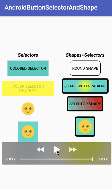 This brings an end to this tutorial on Button selectors and shapes. You can download the final android studio project from the below link.
Thanks for learning with the DigitalOcean Community. Check out our offerings for compute, storage, networking, and managed databases.
About the author
Still looking for an answer?
thank you very mach that mean we can put any picture as a button
- Abdulla Shiekh Abboud
what should we do when the xml is giving a error “Unfortunately , +xmlname+ has stopped.” This the error message which is getting displayed when we use material buttons in android studio. can you help me what to do ?
- Dheeraj K
 This work is licensed under a Creative Commons Attribution-NonCommercial- ShareAlike 4.0 International License.
Become a contributor for community
Get paid to write technical tutorials and select a tech-focused charity to receive a matching donation.

DigitalOcean Documentation
Full documentation for every DigitalOcean product.

Resources for startups and AI-native businesses
The Wave has everything you need to know about building a business, from raising funding to marketing your product.
The developer cloud
Scale up as you grow — whether you're running one virtual machine or ten thousand.

Start building today
From GPU-powered inference and Kubernetes to managed databases and storage, get everything you need to build, scale, and deploy intelligent applications.
