
Today we’ll dive deep into Android Buttons in Material Design and develop an application that showcases the different styles of a Button.
Android Material Design Button
Buttons in Android are used to communicate our actions with the application. The introduction of Material Design has brought along many different kinds of Button styles which are compatible with pre-Lollipop devices too. A basic Button in the layout is defined like this:
<LinearLayout xmlns:android="https://schemas.android.com/apk/res/android"
    xmlns:tools="https://schemas.android.com/tools"
    android:layout_width="match_parent"
    android:layout_height="match_parent"
    android:orientation="vertical"
    android:gravity="center"
    tools:context="com.journaldev.androidbuttonstyling.MainActivity">

    <Button
        android:layout_width="wrap_content"
        android:layout_height="wrap_content"
        android:text="NORMAL BUTTON"/>

</LinearLayout>
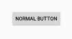 The above Button has the default style:
 Widget.AppCompat.Button To set a different style on the Button, we use the android:background attribute.
<Button
        android:layout_width="wrap_content"
        android:layout_height="wrap_content"
        android:background="@color/colorPrimary"
        android:textColor="@android:color/white"
        android:layout_margin="12dp"
        android:text="BACKGROUND COLOR BUTTON"/>
The output of both of the above Buttons looks like this: 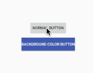 As it is visible, setting the background removes the click effect. Though there is the raised effect that’s a part of the style itself. So either we can create a drawable selector as we’d done in Android Button Selector Tutorial, or the other better approach is by setting styles. We’ll be looking at the later in the below section.
android:backgroundTint attribute can also be used to set the tint color on a Button. Though it’ll work only when for Android SDK > 21.
Android Button Styling
In Material Design, Buttons broadly fall under the following two categories.
- Raised Buttons - These are the default ones.
- Flat Buttons - These are borderless. They are typically used in dialogs
Following are the primary Button styles that are available.
style="@style/Widget.AppCompat.Button"
style="@style/Widget.AppCompat.Button.Colored"

style="@style/Widget.AppCompat.Button.Borderless"
style="@style/Widget.AppCompat.Button.Borderless.Colored"
The last two styles fall under the Flat Buttons category.
Android Colored Buttons
We can set the default colored Button style on a button in the following way:
<Button
        style="@style/Widget.AppCompat.Button.Colored"
        android:layout_width="wrap_content"
        android:layout_height="wrap_content"
        android:layout_margin="12dp"
        android:text="COLORED BUTTON"
        android:padding="8dp" />
This would give the following output:  Why is the color PINK? The Colored Button takes the color of the colorAccent attribute from the
 styles.xml file. 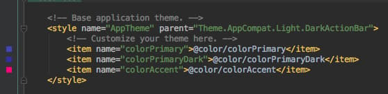 Change the color of colorAccent to one of your choice to get the desired background color. Now, there are two important attributes to style a button :
 colorButtonNormal: The normal color of the button. colorControlHighlight: The ripple color when the button is pressed. Setting these inside the AppTheme tag in the styles.xml would give the following output.
<resources>

    <!-- Base application theme. -->
    <style name="AppTheme" parent="Theme.AppCompat.Light.DarkActionBar">
        <!-- Customize your theme here. -->
        <item name="colorPrimary">@color/colorPrimary</item>
        <item name="colorPrimaryDark">@color/colorPrimaryDark</item>
        <item name="colorButtonNormal">@color/myBlue</item>
        <item name="colorControlHighlight">@color/myWhite</item>

    </style>

</resources>
 We’ve added a few colors to our
 colors.xml pallete as shown below. 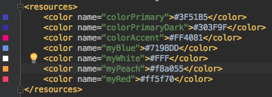 We’ve removed
 colorAccent, still the ColoredButton shows a different color. Why? colorButtonNormal and colorControlHighlight inside the Application’s theme are applicable only on the Buttons with default styles. It applies on ALL buttons with default style in the application. So let’s create a custom theme for the ColoredButton. Add the following in the styles.xml file:
<style name="PrimaryColoredButton" parent="Base.Widget.AppCompat.Button.Colored">
        <item name="colorButtonNormal">@color/myPeach</item>
        <item name="colorControlHighlight">@color/myRed</item>
</style>
Note: We need to set the style of the button as Colored as the parent. The following code is for the Button in the xml with the theme set.
<style name="PrimaryColoredButton" parent="Base.Widget.AppCompat.Button.Colored">
        <item name="colorButtonNormal">@color/myPeach</item>
        <item name="colorControlHighlight">@color/myRed</item>
</style>
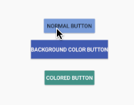
The output looks like this: 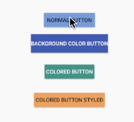
To change the default Button style of the application we can use the android:buttonStyle attribute in the AppTheme style inside the styles.xml.
[caption id=“attachment_19919” align=“aligncenter” width=“615”]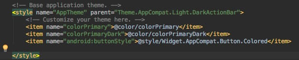 This sets default colored button to all. Overrriding Everything.[/caption]
Android Flat Buttons
Flat Buttons can be Borderless or Borderless.Colored Borderless.Colorless implies the text color should be colored. Not the background. Add the following style in the styles.xml file
<style name="FlatButton" parent="Theme.AppCompat.Light">
        <item name="android:textColor">@color/myPeach</item>
        <item name="colorControlHighlight">@color/myRed</item>
</style>
Now add the following Buttons in the xml layout.
<Button
        style="@style/Widget.AppCompat.Button.Borderless"
        android:layout_width="wrap_content"
        android:layout_height="wrap_content"
        android:layout_margin="12dp"
        android:padding="8dp"
        android:text="BORDERLESS BUTTON" />

    <Button
        android:theme="@style/FlatButton"
        style="@style/Widget.AppCompat.Button.Borderless.Colored"
        android:layout_width="wrap_content"
        android:layout_height="wrap_content"
        android:layout_margin="12dp"
        android:padding="8dp"
        android:text="BORDERLESS BUTTON STYLED" />
The output of the above application is given below.  The Button with the style Borderless doesn’t have the textcolor set from the theme, though the textColor attribute is present in the theme. Notice that the Button with the style Borderless.Colored has the text color set from the theme. This brings an end to this tutorial. All the styles are available in the Android ButtonStyling Project source code below.
Thanks for learning with the DigitalOcean Community. Check out our offerings for compute, storage, networking, and managed databases.
About the author
Still looking for an answer?
 This work is licensed under a Creative Commons Attribution-NonCommercial- ShareAlike 4.0 International License.
Become a contributor for community
Get paid to write technical tutorials and select a tech-focused charity to receive a matching donation.

DigitalOcean Documentation
Full documentation for every DigitalOcean product.

Resources for startups and AI-native businesses
The Wave has everything you need to know about building a business, from raising funding to marketing your product.
The developer cloud
Scale up as you grow — whether you're running one virtual machine or ten thousand.

Start building today
From GPU-powered inference and Kubernetes to managed databases and storage, get everything you need to build, scale, and deploy intelligent applications.
