
In this tutorial, we’ll implement Text Fields using the new Material Design Components Library. We have already implemented TextInputLayout here.
Material TextFields
TextInputLayout provides an implementation for Material text fields. We just need to use TextInputEditText! First and foremost, import the new material components dependency. Also, set the MaterialComponent theme in your Activity.
implementation 'com.google.android.material:material:1.1.0-alpha09'
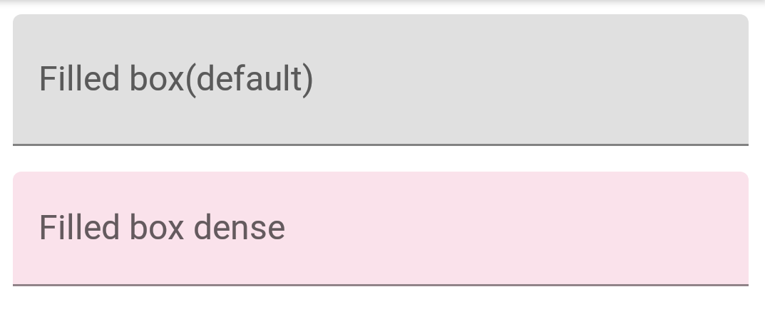
By default, an input text field has a filled background to draw users attention. Now let’s create a default text field:
 <com.google.android.material.textfield.TextInputLayout
            android:layout_width="match_parent"
            android:layout_height="wrap_content"
            android:layout_marginBottom="12dp"
            android:hint="Filled box(default)">

            <com.google.android.material.textfield.TextInputEditText
                android:layout_width="match_parent"
                android:layout_height="wrap_content" />

</com.google.android.material.textfield.TextInputLayout>
In the next few sections, we’ll customize text fields in different ways.
Standard and Dense Text Fields
Text Fields have two types of height variants:
- Standard - This is used by default if nothing else is there.
- Dense -
@style/Widget.MaterialComponents.TextInputLayout.FilledBox.Dense
The dense Text field is slightly shorter in height.
<com.google.android.material.textfield.TextInputLayout
            android:layout_width="match_parent"
            android:layout_height="wrap_content"
            android:layout_marginBottom="12dp"
            android:hint="Filled box(default)">

            <com.google.android.material.textfield.TextInputEditText
                android:layout_width="match_parent"
                android:layout_height="wrap_content" />

        </com.google.android.material.textfield.TextInputLayout>

        <com.google.android.material.textfield.TextInputLayout
            style="@style/Widget.MaterialComponents.TextInputLayout.FilledBox.Dense"
            android:layout_width="match_parent"
            android:layout_height="wrap_content"
            android:layout_marginBottom="12dp"
            android:hint="Filled box dense"
            app:boxBackgroundColor="#20D81B60">

            <com.google.android.material.textfield.TextInputEditText
                android:layout_width="match_parent"
                android:layout_height="wrap_content" />

        </com.google.android.material.textfield.TextInputLayout>
By default the FilledBox.Standard style is used app:boxBackgroundColor is used to set the filled box color. Here’s how this looks on the screen:
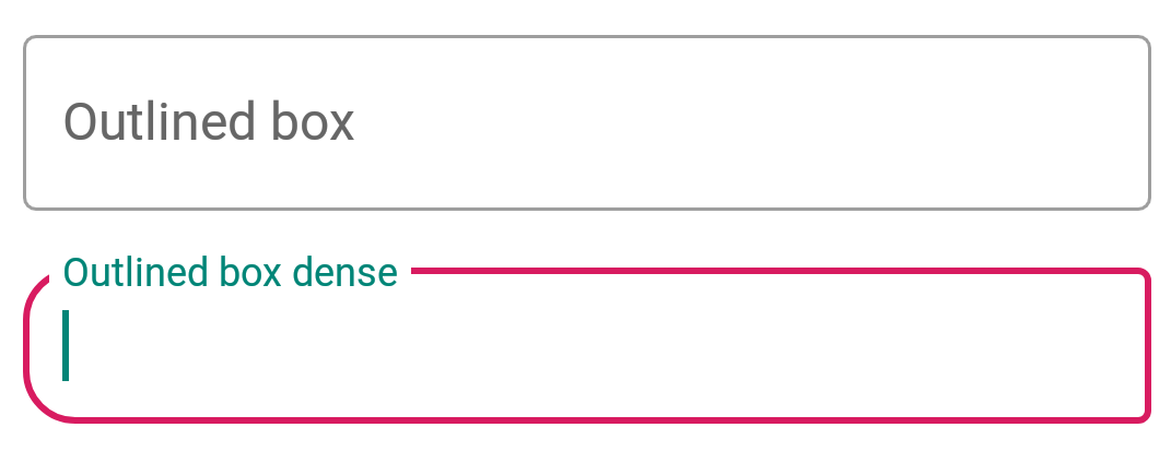
Outline Box Text Fields
Apply the following style on the TextInputLayout to get the outlined look text fields:
style="@style/Widget.MaterialComponents.TextInputLayout.OutlinedBox"
Similar to FilledBox, this has the two height variants as well - Standard and Dense. To set the corner radius, following attributes are used:
- boxCornerRadiusTopStart
- boxCornerRadiusTopEnd
- boxCornerRadiusBottomStart
- boxCornerRadiusBottomEnd
boxStrokeColor is used to set the stroke color of the outline. Here’s how it looks:
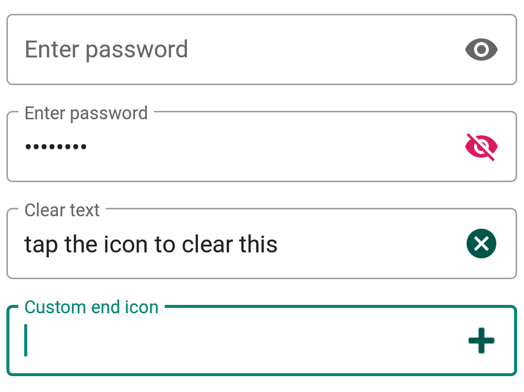
End Icon Modes
Moving forward, now let’s set end icon modes. These are basically icons set at the right of the text field. Currently, the three types of icons that are available built-in are :
password_toggleclear_textcustom
The above attributes are self-explanatory. We can set our own icon tint on these icons using endIconTint attribute. For the custom icon, we use the endIconDrawable attribute
<com.google.android.material.textfield.TextInputLayout
            style="@style/Widget.MaterialComponents.TextInputLayout.OutlinedBox.Dense"
            android:layout_width="match_parent"
            android:layout_height="wrap_content"
            android:layout_marginBottom="12dp"
            android:hint="Enter password"
            app:endIconMode="password_toggle">

            <com.google.android.material.textfield.TextInputEditText
                android:layout_width="match_parent"
                android:layout_height="wrap_content" />

        </com.google.android.material.textfield.TextInputLayout>

        <com.google.android.material.textfield.TextInputLayout
            style="@style/Widget.MaterialComponents.TextInputLayout.OutlinedBox.Dense"
            android:layout_width="match_parent"
            android:layout_height="wrap_content"
            android:layout_marginBottom="12dp"
            android:hint="Enter password"
            app:endIconMode="password_toggle"
            app:endIconTint="@color/colorAccent">

            <com.google.android.material.textfield.TextInputEditText
                android:layout_width="match_parent"
                android:layout_height="wrap_content" />

        </com.google.android.material.textfield.TextInputLayout>

        <com.google.android.material.textfield.TextInputLayout
            style="@style/Widget.MaterialComponents.TextInputLayout.OutlinedBox.Dense"
            android:layout_width="match_parent"
            android:layout_height="wrap_content"
            android:layout_marginBottom="12dp"
            android:hint="Clear text"
            app:endIconMode="clear_text"
            app:endIconTint="@color/colorPrimaryDark">

            <com.google.android.material.textfield.TextInputEditText
                android:layout_width="match_parent"
                android:layout_height="wrap_content" />

        </com.google.android.material.textfield.TextInputLayout>


        <com.google.android.material.textfield.TextInputLayout
            style="@style/Widget.MaterialComponents.TextInputLayout.OutlinedBox.Dense"
            android:layout_width="match_parent"
            android:layout_height="wrap_content"
            android:layout_marginBottom="12dp"
            android:hint="Custom end icon"
            app:endIconCheckable="true"
            android:id="@+id/custom_end_icon"
            app:endIconDrawable="@android:drawable/ic_input_add"
            app:endIconMode="custom"
            app:endIconTint="@color/colorPrimaryDark">

            <com.google.android.material.textfield.TextInputEditText
                android:layout_width="match_parent"
                android:layout_height="wrap_content" />

        </com.google.android.material.textfield.TextInputLayout>
Here’s how it looks on the screen:
For the custom icon, we can use setEndIconOnClickListener callback to listen to clicks and do stuff.
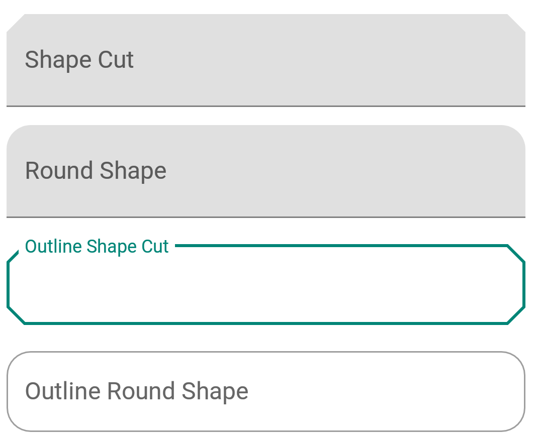
Shaped Text Fields
ShapeAppearance is a powerful style. It lets us customize the shape of the text field. We have two built-in shapes - cut and round.
<style name="Cut" parent="ShapeAppearance.MaterialComponents.MediumComponent">
        <item name="cornerFamily">cut</item>
        <item name="cornerSize">12dp</item>
    </style>

    <style name="Rounded" parent="ShapeAppearance.MaterialComponents.SmallComponent">
        <item name="cornerFamily">rounded</item>
        <item name="cornerSize">16dp</item>
    </style>
Setting the above styles in the shapeAppearance attributes gives us this -
That sums up Material Components Text Fields for now. In the below source code you’ll find all the above concepts.
Thanks for learning with the DigitalOcean Community. Check out our offerings for compute, storage, networking, and managed databases.
About the author
Still looking for an answer?
Hey Anupam, I Have been Following Your Posts and they are really awesome … Keep It Up and Thanks a lot .They are really good. Regards Mukul Nimker
- Mukul Nimker
How to extend TextInputLayout/TextInputEditText to make it more customise?
- Priyanka
 This work is licensed under a Creative Commons Attribution-NonCommercial- ShareAlike 4.0 International License.
Become a contributor for community
Get paid to write technical tutorials and select a tech-focused charity to receive a matching donation.

DigitalOcean Documentation
Full documentation for every DigitalOcean product.

Resources for startups and AI-native businesses
The Wave has everything you need to know about building a business, from raising funding to marketing your product.
The developer cloud
Scale up as you grow — whether you're running one virtual machine or ten thousand.

Start building today
From GPU-powered inference and Kubernetes to managed databases and storage, get everything you need to build, scale, and deploy intelligent applications.
