
Hello, folks! In this article, we will be having a look at an important error metric of Machine Learning – Plotting ROC curve in R programming, in detail.
So, let us begin!!
The necessity of the ROC curve
Error metrics enable us to evaluate and justify the functioning of the model on a particular dataset.
ROC plot is one such error metric.
ROC plot, also known as ROC AUC curve is a classification error metric. That is, it measures the functioning and results of the classification machine learning algorithms.
To be precise, ROC curve represents the probability curve of the values whereas the AUC is the measure of separability of the different groups of values/labels. With ROC AUC curve, one can analyze and draw conclusions as to what amount of values have been distinguished and classified by the model rightly according to the labels.
Higher the AUC score, better is the classification of the predicted values.
For example, consider a model to predict and classify whether the outcome of a toss is ‘Heads’ or ‘Tails’.
So, if the AUC score is high, it indicates that the model is capable of classifying ‘Heads’ as ‘Heads’ and ‘Tails’ as ‘Tails’ more efficiently.
In technical terms, the ROC curve is plotted between the True Positive Rate and the False Positive Rate of a model.
Let us now try to implement the concept of ROC curve in the upcoming section!
Method I: Using plot() function
We can use ROC plots to evaluate the Machine learning models as well as discussed earlier. So, let us try implementing the concept of ROC curve against the Logistic Regression model.
Let us begin!! :)
In this example, we would be using the Bank Loan defaulter dataset for modelling through Logistic Regression. We would be plotting the ROC curve using plot() function from the ‘pROC’ library. You can find the dataset here!
- Initially, we load the dataset into the environment using read.csv() function.
- Splitting of dataset is a crucial step prior to modelling. Thus, we sample the dataset into training and test data values using
createDataPartition() functionfrom the R documentation. - We have set certain error metrics to evaluate the functioning of the model which includes Precision, Recall, Accuracy, F1 score, ROC plot, etc.
- Finally, we use the R
glm() functionto apply Logistic Regression on our dataset. Further, we test the model on the testing data using predict() function and get the values for the error metrics. - At last, we calculate the roc AUC score for the model through
roc() methodand plot the same using plot() function available in the ‘pROC’ library.
rm(list = ls())
#Setting the working directory
setwd("D:/Edwisor_Project - Loan_Defaulter/")
getwd()
#Load the dataset
dta = read.csv("bank-loan.csv",header=TRUE)
### Data SAMPLING ####
library(caret)
set.seed(101)
split = createDataPartition(data$default, p = 0.80, list = FALSE)
train_data = data[split,]
test_data = data[-split,]
#error metrics -- Confusion Matrix
err_metric=function(CM)
{
TN =CM[1,1]
TP =CM[2,2]
FP =CM[1,2]
FN =CM[2,1]
precision =(TP)/(TP+FP)
recall_score =(FP)/(FP+TN)
f1_score=2*((precision*recall_score)/(precision+recall_score))
accuracy_model =(TP+TN)/(TP+TN+FP+FN)
False_positive_rate =(FP)/(FP+TN)
False_negative_rate =(FN)/(FN+TP)
print(paste("Precision value of the model: ",round(precision,2)))
print(paste("Accuracy of the model: ",round(accuracy_model,2)))
print(paste("Recall value of the model: ",round(recall_score,2)))
print(paste("False Positive rate of the model: ",round(False_positive_rate,2)))
print(paste("False Negative rate of the model: ",round(False_negative_rate,2)))
print(paste("f1 score of the model: ",round(f1_score,2)))
}
# 1. Logistic regression
logit_m =glm(formula = default~. ,data =train_data ,family='binomial')
summary(logit_m)
logit_P = predict(logit_m , newdata = test_data[-13] ,type = 'response' )
logit_P <- ifelse(logit_P > 0.5,1,0) # Probability check
CM= table(test_data[,13] , logit_P)
print(CM)
err_metric(CM)
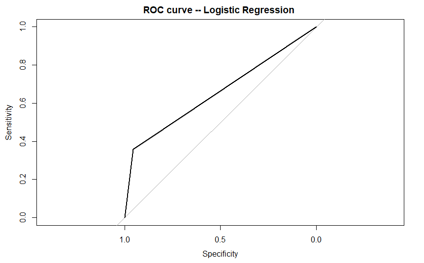
#ROC-curve using pROC library
library(pROC)
roc_score=roc(test_data[,13], logit_P) #AUC score
plot(roc_score ,main ="ROC curve -- Logistic Regression ")
Output:
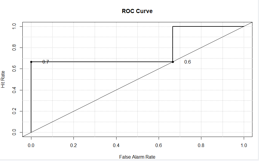
Method II: Using roc.plot() function
R programming provides us with another library named ‘verification’ to plot the ROC-AUC curve for a model.
In order to make use of the function, we need to install and import the 'verification' library into our environment.
Having done this, we plot the data using roc.plot() function for a clear evaluation between the ‘Sensitivity’ and ‘Specificity’ of the data values as shown below.
install.packages("verification")
library(verification)
x<- c(0,0,0,1,1,1)
y<- c(.7, .7, 0, 1,5,.6)
data<-data.frame(x,y)
names(data)<-c("yes","no")
roc.plot(data$yes, data$no)
Output:
Conclusion
By this, we have come to the end of this topic. Feel free to comment below, in case you come across any question.
Try implementing the concept of ROC plots with other Machine Learning models and do let us know about your understanding in the comment section.
Till then, Stay tuned and Happy Learning!! :)
Thanks for learning with the DigitalOcean Community. Check out our offerings for compute, storage, networking, and managed databases.
About the author
Still looking for an answer?
 This work is licensed under a Creative Commons Attribution-NonCommercial- ShareAlike 4.0 International License.
Become a contributor for community
Get paid to write technical tutorials and select a tech-focused charity to receive a matching donation.

DigitalOcean Documentation
Full documentation for every DigitalOcean product.

Resources for startups and AI-native businesses
The Wave has everything you need to know about building a business, from raising funding to marketing your product.
The developer cloud
Scale up as you grow — whether you're running one virtual machine or ten thousand.

Start building today
From GPU-powered inference and Kubernetes to managed databases and storage, get everything you need to build, scale, and deploy intelligent applications.
