By Alligator and Bradley Kouchi

Introduction
Flex Layout is a component engine that allows you to create page layouts using CSS Flexbox with a set of directives available to use in your templates.
The library is written in pure TypeScript, so no external stylesheets are needed. It also provides a way to specify different directives at different breakpoints to create responsive layouts.
In this tutorial, you will build an example Angular application and use Flex Layout to arrange items.
Prerequisites
To complete this tutorial, you will need:
- Node.js installed locally, which you can do by following How to Install Node.js and Create a Local Development Environment.
- Some familiarity with setting up an Angular project and using Angular components may be beneficial.
This tutorial was verified with Node v14.13.1, npm v6.14.8, angular v10.1.6, and @angular/flex-layout.
Step 1 — Setting Up the Project
You can use @angular/cli to create a new Angular Project.
In your terminal window, use the following command:
- npx @angular/cli new angular-flex-example --style=css --routing=false --skip-tests
This will configure a new Angular project with styles set to “CSS” (as opposed to “Sass”, “Less”, or “Stylus”), no routing, and will skip tests.
Navigate to the newly created project directory:
- cd angular-flex-example
From your project folder, run the following command to install Flex Layout:
- npm install @angular/flex-layout@10.0.0-beta.32
Next, import FlexLayoutModule in your app module:
import { BrowserModule } from '@angular/platform-browser';
import { NgModule } from '@angular/core';
import { FlexLayoutModule } from "@angular/flex-layout";

import { AppComponent } from './app.component';

@NgModule({
  declarations: [
    AppComponent
  ],
  imports: [
    BrowserModule,
    FlexLayoutModule
  ],
  providers: [],
  bootstrap: [AppComponent]
})
export class AppModule { }
Start the project to verify that there are no errors.
- npm start
If you visit the local app (typically at localhost:4200) in your web browser, you will see a "angular-flex-example app is running!" message.
With this scaffolding set in place, you can use Flex Layout in your templates.
Step 2 — Experimenting with Flex Layout
Next, you will modify the app.component.html template to use FlexLayoutModule.
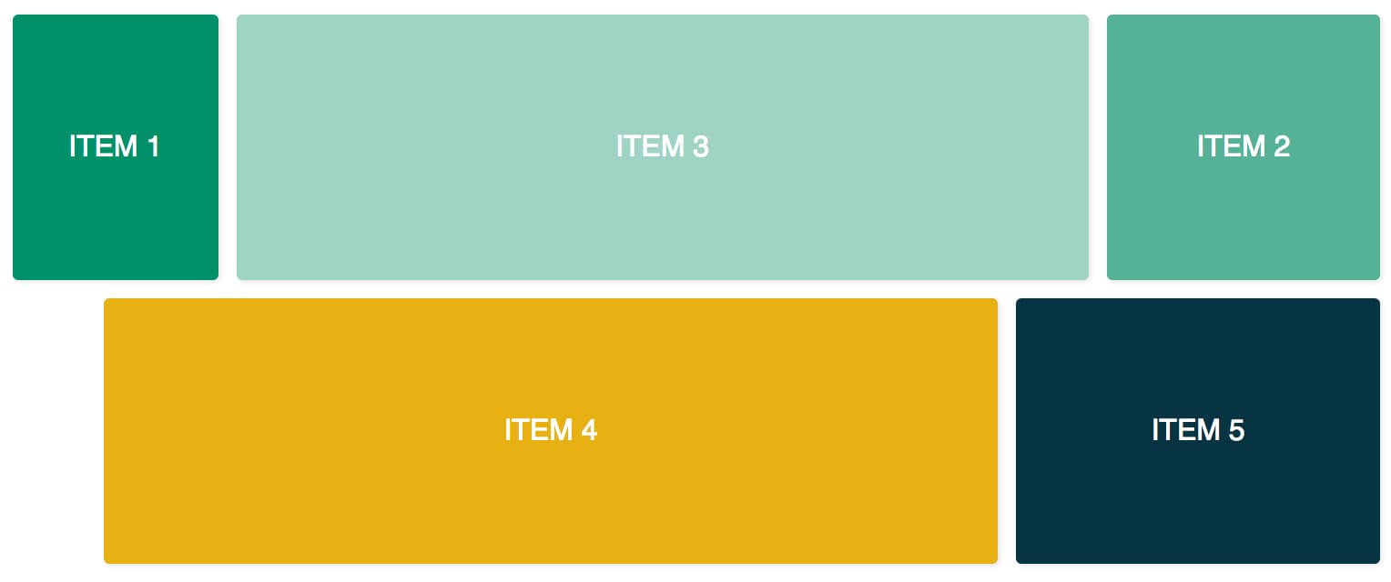
Here is a figure displaying the final result of experimenting with Flex Layout in this tutorial:
First, open app.component.css in your code editor and add the following lines of code:
.container {
  margin: 10px;
}

.item {
  border-radius: .2em;
  color: #ffffff;
  font-family: sans-serif;
  font-size: 2em;
  padding: 4em 1em;
  text-transform: uppercase;
}

.item-1 {
  background-color: #009169;
}

.item-2 {
  background-color: #55b296;
}

.item-3 {
  background-color: #9fd3c3;
}

.item-4 {
  background-color: #e7b013;
}

.item-5 {
  background-color: #073443;
}
Then, open app.component.html in your code editor and replace the code with two container divs and five inner item divs:
<div class="container">
  <div class="item item-1">
    Item 1
  </div>
  <div class="item item-2">
    Item 2
  </div>
  <div class="item item-3">
    Item 3
  </div>
</div>

<div class="container">
  <div class="item item-4">
    Item 4
  </div>
  <div class="item item-5">
    Item 5
  </div>
</div>
After recompiling, visit your application in a web browser. You will now have five divs stacked on top of each other.
Next, add fxLayout:
<div class="container"
     fxLayout
>
  <div class="item item-1">
    Item 1
  </div>
  <div class="item item-2">
    Item 2
  </div>
  <div class="item item-3">
    Item 3
  </div>
</div>

<div class="container"
     fxLayout
>
  <div class="item item-4">
    Item 4
  </div>
  <div class="item item-5">
    Item 5
  </div>
</div>
This code will apply the display: flex and flex-direction: row styles to the container divs.
After recompiling, visit your application in a web browser, you will observe three divs sharing the top row, and two divs sharing the bottom row.
Next, add fxLayoutAlign and fxLayoutGap:
<div class="container"
     fxLayout
     fxLayoutAlign="center"
     fxLayoutGap="10px"
>
  <div class="item item-1">
    Item 1
  </div>
  <div class="item item-2">
    Item 2
  </div>
  <div class="item item-3">
    Item 3
  </div>
</div>

<div class="container"
     fxLayout
     fxLayoutAlign="center"
     fxLayoutGap="10px"
>
  <div class="item item-4">
    Item 4
  </div>
  <div class="item item-5">
    Item 5
  </div>
</div>
This code will apply place-content: stretch center and align-items: stretch styles to the container div. It will also apply 10px of space between the flex items.
Note: In version 10.0.0-beta.32, fxLayoutGap uses the CSS property margin instead of using the CSS property gap.
Next, use responsive suffixes to change the flexbox styles at certain breakpoints:
<div class="container"
     fxLayout
     fxLayout.xs="column"
     fxLayoutAlign="center"
     fxLayoutGap="10px"
     fxLayoutGap.xs="0"
>
  <div class="item item-1">
    Item 1
  </div>
  <div class="item item-2">
    Item 2
  </div>
  <div class="item item-3">
    Item 3
  </div>
</div>

<div class="container"
     fxLayout
     fxLayout.xs="column"
     fxLayoutAlign="center"
     fxLayoutGap="10px"
     fxLayoutGap.xs="0"
>
  <div class="item item-4">
    Item 4
  </div>
  <div class="item item-5">
    Item 5
  </div>
</div>
This code will set breakpoints at xs (extra small) screen sizes. It will change the layout from the default "row" to "column" and the gap size from "10px" to "0".
After recompiling, visit your application in a web browser. Resize your browser window to the xs breakpoint (less than 599px wide) and observe the styles changing.
Breakpoint aliases are available for various screen sizes:
sm- smallmd- mediumlg- largexl- extra-large
There are also directives that can be added for child elements.
Next, add fxFlex:
<div class="container"
     fxLayout
     fxLayoutAlign="center"
     fxLayoutGap="10px"
     fxLayoutGap.xs="0"
>
  <div class="item item-1"
       fxFlex="15%"
  >
    Item 1
  </div>
  <div class="item item-2"
       fxFlex="20%"
  >
    Item 2
  </div>
  <div class="item item-3"
       fxFlex
  >
    Item 3
  </div>
</div>

<div class="container"
     fxLayout
     fxLayout.xs="column"
     fxLayoutAlign="center"
     fxLayoutGap="10px"
     fxLayoutGap.xs="0"
>
  <div class="item item-4"
       fxFlex
  >
    Item 4
  </div>
  <div class="item item-5"
       fxFlex="200px"
  >
    Item 5
  </div>
</div>
This code will apply flex-grow: 1, flex-shrink: 1, and flex-basis: 100%. By specifying a width value, it will apply a max-width property.
Next, add fxFlexOrder and fxFlexOffset:
<div class="container"
     fxLayout
     fxLayoutAlign="center"
     fxLayoutGap="10px"
     fxLayoutGap.xs="0"
>
  <div class="item item-1"
       fxFlex="15%"
  >
    Item 1
  </div>
  <div class="item item-2"
       fxFlex="20%"
       fxFlexOrder="3"
  >
    Item 2
  </div>
  <div class="item item-3"
       fxFlex
  >
    Item 3
  </div>
</div>

<div class="container"
     fxLayout
     fxLayout.xs="column"
     fxLayoutAlign="center"
     fxLayoutGap="10px"
     fxLayoutGap.xs="0"
>
  <div class="item item-4"
       fxFlex
       fxFlexOffset="50px"
       fxFlexOffset.xs="0"
  >
    Item 4
  </div>
  <div class="item item-5"
       fxFlex="200px"
  >
    Item 5
  </div>
</div>
This code will apply order: 3 to the second item. It will also apply margin-left: 50px to the fourth item.
After recompiling, visit your application in a web browser, you will notice that the second item is in the third position of the row, and the fourth item has 50px of spacing from the start of the flexbox.
That concludes a brief experimentation with Flex Layout.
Conclusion
In this tutorial, you used Flex Layout with an Angular application. It allowed you to build a layout using pre-configured Flexbox CSS styles without additional styling.
You can reference the API overview for a more in-depth look at the available directives.
In this example, you hard-coded the directive values. It is also possible to use data binding to bind to values in the component class (e.g., [fxLayout]="direction"). This will allow you to create highly dynamic layouts that the user can control and change.
Flex Layout can also be used in combination with Angular Material for Material Design components.
Thanks for learning with the DigitalOcean Community. Check out our offerings for compute, storage, networking, and managed databases.
About the author(s)
Alligator.io is a developer-focused resource that offers tutorials and insights on a wide range of modern front-end technologies, including Angular 2+, Vue.js, React, TypeScript, Ionic, and JavaScript.
Former Technical Editor at DigitalOcean. Expertise in areas including Vue.js, CSS, React, and more.
Still looking for an answer?
This textbox defaults to using Markdown to format your answer.
You can type !ref in this text area to quickly search our full set of tutorials, documentation & marketplace offerings and insert the link!
 This work is licensed under a Creative Commons Attribution-NonCommercial- ShareAlike 4.0 International License.
Become a contributor for community
Get paid to write technical tutorials and select a tech-focused charity to receive a matching donation.

DigitalOcean Documentation
Full documentation for every DigitalOcean product.

Resources for startups and AI-native businesses
The Wave has everything you need to know about building a business, from raising funding to marketing your product.
The developer cloud
Scale up as you grow — whether you're running one virtual machine or ten thousand.

Start building today
From GPU-powered inference and Kubernetes to managed databases and storage, get everything you need to build, scale, and deploy intelligent applications.
