
Introduction
PrimeNG from PrimeFaces is an alternative UI component library. It offers a selection of pre-built themes and UI components for data presentation, form inputs, menus, charts, overlays, and more.
In this article, you will set up PrimeNG in an Angular 4+ project and explore some of the main components.
Prerequisites
If you would like to follow along with this article, you will need:
- Node.js installed locally, which you can do by following How to Install Node.js and Create a Local Development Environment.
- This tutorial will also assume you have
@angular/cliinstalled globally.
This tutorial was verified with Node v16.6.1, npm v7.20.3, @angular/core v12.2.0, and primeng v12.0.1, and primeicons v4.1.0.
Setting Up the Project
You can use @angular/cli to create a new Angular Project.
In your terminal window, use the following command:
- ng new AngularPrimeNGExample --style=css --routing=false --skip-tests
This will configure a new Angular project with styles set to “CSS” (as opposed to “Sass”, Less", or “Stylus”), no routing, and skipping tests.
Navigate to the newly created project directory:
- cd AngularPrimeNGExample
To get started, install the required packages: primeng and primeicons into your project:
- npm install primeng@12.0.1 primeicons@4.1.0
At this point, you have a new Angular project with primeng and primeicons.
Adding PrimeNG Styles
Next, add the required CSS files as part of the styles loaded by the Angular CLI:
...
"styles": [
  "styles.css",
  "node_modules/font-awesome/css/font-awesome.min.css",
  "node_modules/primeng/resources/primeng.min.css",
  "node_modules/primeng/resources/themes/saga-blue/theme.css"
],
...
**Note: You will need to restart your local server after adding to the angular.json configuration file.
Here we’re using the saga-blue theme, but you can choose between available themes like nova, rhea or fluent-light.
Importing PrimeNG Components
Now let’s setup our app module to include the UI components we want:
import { NgModule } from '@angular/core';
import { BrowserModule } from '@angular/platform-browser';

import { BrowserAnimationsModule } from '@angular/platform-browser/animations';
import { FormsModule } from '@angular/forms';

import { AccordionModule } from 'primeng/accordion';
import { PanelModule } from 'primeng/panel';
import { ButtonModule } from 'primeng/button';
import { RadioButtonModule } from 'primeng/radioButton';

import { AppComponent } from './app.component';

@NgModule({
  declarations: [
    AppComponent
  ],
  imports: [
    BrowserModule,
    BrowserAnimationsModule,
    FormsModule,
    AccordionModule,
    PanelModule,
    ButtonModule,
    RadioButtonModule
  ],
  providers: [],
  bootstrap: [AppComponent]
})
export class AppModule { }
Notice how we also imported Angular’s BrowserAnimationsModule and FormsModule. The animation module is required by PrimeNG’s components and the form module will be needed to use form input components like the radio button component.
At this point, you have a new Angular project with support for AccordionModule, PanelModule, ButtonModule, and RadioButtonModule.
Building an App with PrimeNG Components
Here’s an example that uses PrimeNG’s accordion, panel, radio button, and button components.
Add pizzaSelection:
import { Component } from '@angular/core';

@Component({
  selector: 'app-root',
  templateUrl: './app.component.html',
  styleUrls: ['./app.component.css']
})
export class AppComponent {
  pizzaSelection = ''
}
Then add p-accordion, p-accordionTab, p-radioButton, p-panel, and pButton:
<p-accordion>
  <p-accordionTab header="Salads">
    Salads...
  </p-accordionTab>
  <p-accordionTab header="Pasta">
    Pasta...
  </p-accordionTab>
  <p-accordionTab header="Pizza" [selected]="true">
    <div>
      <p-radioButton
        label="Double cheese"
        name="pizza"
        value="double-cheese"
        [(ngModel)]="pizzaSelection">
      </p-radioButton>
    </div>

    <div>
      <p-radioButton
        label="Anchovy"
        name="pizza"
        value="anchovy"
        [(ngModel)]="pizzaSelection">
      </p-radioButton>
    </div>

    <div>
      <p-radioButton
        label="Meatlover's"
        name="pizza"
        value="meat-lover"
        [(ngModel)]="pizzaSelection">
      </p-radioButton>
    </div>
  </p-accordionTab>
</p-accordion>

<p-panel header="Extras" *ngIf="pizzaSelection && pizzaSelection.length">
  Would you like extra cheese on your pizza?
  <button pButton type="button" label="Ok, yeah!"></button>
</p-panel>
Notice how the components use the p- prefix.
Save the changes to your file and serve the application.
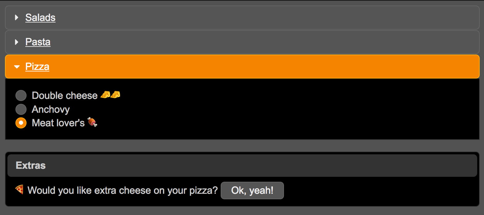
If you select a pizza, the Extras panel will appear and prompt users to add extra cheese.
Conclusion
In this article, you set up PrimeNG in an Angular 4+ project and explore some of the main components.
Continue your learning by consulting the official documentation for a showcase and documentation of all the available components.
Explore alternative UI component libraries with Angular Material 2.
Thanks for learning with the DigitalOcean Community. Check out our offerings for compute, storage, networking, and managed databases.
About the author
Alligator.io is a developer-focused resource that offers tutorials and insights on a wide range of modern front-end technologies, including Angular 2+, Vue.js, React, TypeScript, Ionic, and JavaScript.
Still looking for an answer?
This textbox defaults to using Markdown to format your answer.
You can type !ref in this text area to quickly search our full set of tutorials, documentation & marketplace offerings and insert the link!
 This work is licensed under a Creative Commons Attribution-NonCommercial- ShareAlike 4.0 International License.
Become a contributor for community
Get paid to write technical tutorials and select a tech-focused charity to receive a matching donation.

DigitalOcean Documentation
Full documentation for every DigitalOcean product.

Resources for startups and AI-native businesses
The Wave has everything you need to know about building a business, from raising funding to marketing your product.
The developer cloud
Scale up as you grow — whether you're running one virtual machine or ten thousand.

Start building today
From GPU-powered inference and Kubernetes to managed databases and storage, get everything you need to build, scale, and deploy intelligent applications.
