 and perspective()")
In this article, you’ll learn how to use the CSS translateZ() function. In many ways it’s a unique CSS function because it challenges the idea that the web page is just a 2D visual space.
The CSS transform property has a lot of functions for moving HTMLElements around. Among them are the translateX, translateY, and translateZ functions.
While translateX and translateY are pretty straightforward, translateZ is slightly more difficult to understand.
Let’s review how translateX and translateY work:
div#myCircle {
  background-color: gray;
  width: 20px;
  height: 20px;
  border-radius: 100%;
  transform: translateX(11px) translateY(20px);
}
The HTMLElement is moved 11px to the right, and down 20px.
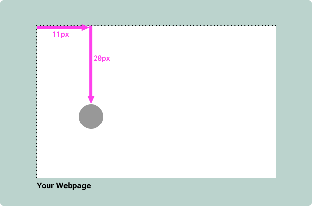
It’s moving it along x-axis and y-axis. You may remember these terms from Math classes in high school! Guess which axis the translateZ function moves?
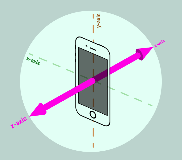
That’s right! The z-axis. Instead of moving HTMLElements horizontally/vertically it moves them closer to you, or further away from you.
Using translateZ()
Let’s try adding translateZ to the previous code snippet:
div#myCircle {
background-color: gray;
width: 20px;
height: 20px;
border-radius: 100%;
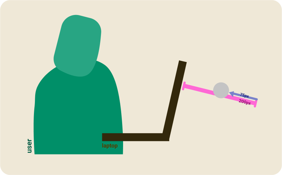
transform: translateX(11px) translateY(20px) translateZ(75px) perspective(200px);
}
You might have noticed another CSS function called perspective(). It’s actually required for translateZ to take effect. It’s common to forget it since neither translateX or translateY require it… But you gotta remember to use it with translateZ!
What does perspective() do?
The perspective() function defines the virtual distance between the plane of your computer screen and the HTMLElement you’re applying translateZ to.
This means perspective(200px) and translateZ(75px) creates a virtual space of 200px between the HTMLElement and the computer screen, and then moves it 75px closer to you.
This causes the HTMLElement to appear larger 💗
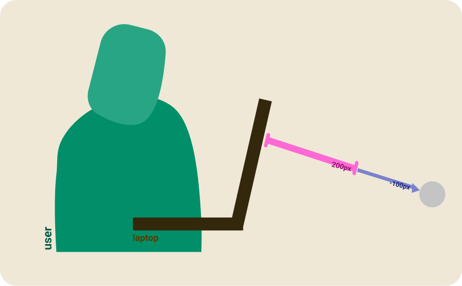
Likewise using a negative value in translateZ() moves it further away:
div#myCircle {
  background-color: gray;
  width: 20px;
  height: 20px;
  border-radius: 100%;
  transform: translateX(11px) translateY(20px) translateZ(-100px) perspective(200px);
}
Demo Time
Here’s a small demo that uses the translateZ CSS function. Try hovering your mouse over the buttons!
button {
  /* abridged css values */
  transform: perspective(100px) translateZ(0px);
  transition: transform 100ms linear;
}

button:hover {
  transform: perspective(100px) translateZ(5px);
}
It’s really easy to create compelling visual effects using translateZ!
Interesting Factoids about translateZ()
There are some unexpected behaviors with perspective and translateZ to keep in mind.
- If the value provided to translateZ() is equal or higher than the one provided to perspective(), it causes the HTMLElement to disappear. You can always set an infinitely lesser value in
translateZ()but the inverse is not true… Once you exceed the value ofperspective()the element will no longer be visible. - Applying perspective(0px). Any value for
perspective()will work… unless it’s a zero value (like0px,0,0em). This causes anytranslateZ()effects to be ignored.
Conclusion
Using translateZ is the stepping stone to seeing webpages as a 3D visual space… not just 2D! Hopefully you’ll add it to your toolbox and it’ll help you create compelling designs!
Visit MDN for documentation on translateZ and perspective 📦🔍
Thanks for learning with the DigitalOcean Community. Check out our offerings for compute, storage, networking, and managed databases.
About the author
Still looking for an answer?
This textbox defaults to using Markdown to format your answer.
You can type !ref in this text area to quickly search our full set of tutorials, documentation & marketplace offerings and insert the link!
In my tests its necesary to set the perspective before change Z depth.
DON’T WORK:
transform: translateX(11px) translateY(20px) translateZ(-100px) perspective(200px);
WORKS:
transform: translateX(11px) translateY(20px) perspective(200px) translateZ(-100px);
 This work is licensed under a Creative Commons Attribution-NonCommercial- ShareAlike 4.0 International License.
Become a contributor for community
Get paid to write technical tutorials and select a tech-focused charity to receive a matching donation.

DigitalOcean Documentation
Full documentation for every DigitalOcean product.

Resources for startups and AI-native businesses
The Wave has everything you need to know about building a business, from raising funding to marketing your product.
The developer cloud
Scale up as you grow — whether you're running one virtual machine or ten thousand.

Start building today
From GPU-powered inference and Kubernetes to managed databases and storage, get everything you need to build, scale, and deploy intelligent applications.
