
Introduction
Flutter is supported by user interfaces (UI) packages like the Material and Cupertino design systems. These design systems serve to provide a solution for a consistent and cohesive aesthetic throughout your application.
However, relying solely on default design patterns may not align closely with your needs from a branding perspective. You may instead wish to use the defaults as a base from which you can apply customizations on top of.
In this article, you will explore some of the methods for changing the overall look across your apps with Flutter themes.
Prerequisites
To follow along with this article, you will need:
- To download and install Flutter.
- To download and install Android Studio or Visual Studio Code.
- It is recommended to install plugins for your code editor:
This article was verified with Flutter v1.22.2, Android SDK v30.0.2, and Android Studio v4.1.
Step 1 — Setting Up the Project
For the purposes of this article, you will be relying upon the demo application that is generated when you create a new Flutter application.
Once you have your environment set up for Flutter, you can run the following to create a new application:
- flutter create flutter_themes_example
Navigate to the new project directory:
- cd flutter_themes_example
Using flutter create will produce a demo application that will display the number of times a button is clicked:
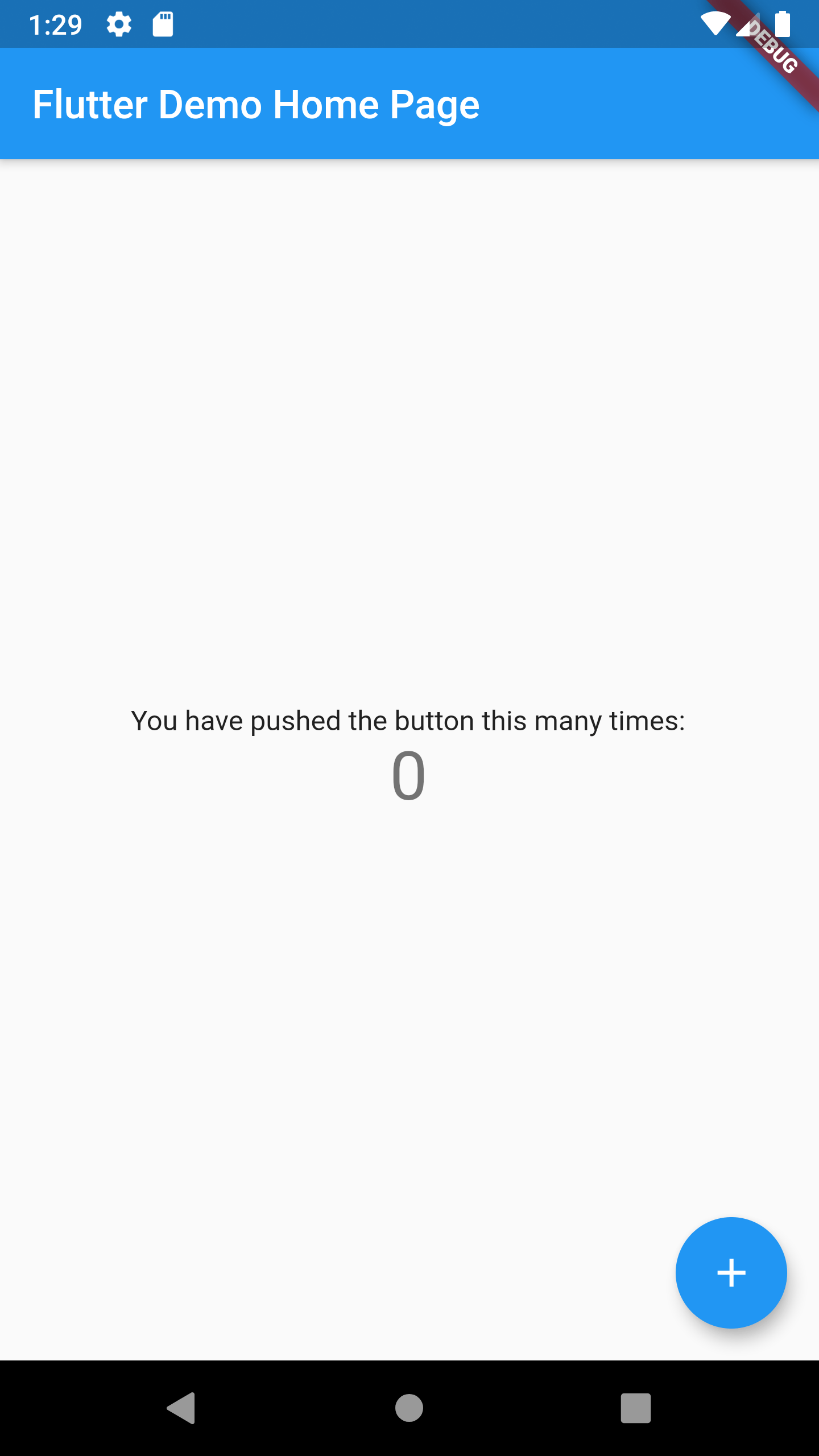
Now that you have a working Flutter application using the Material Design UI Components, you can apply the first customization to the theme.
Step 2 — Using Default Themes
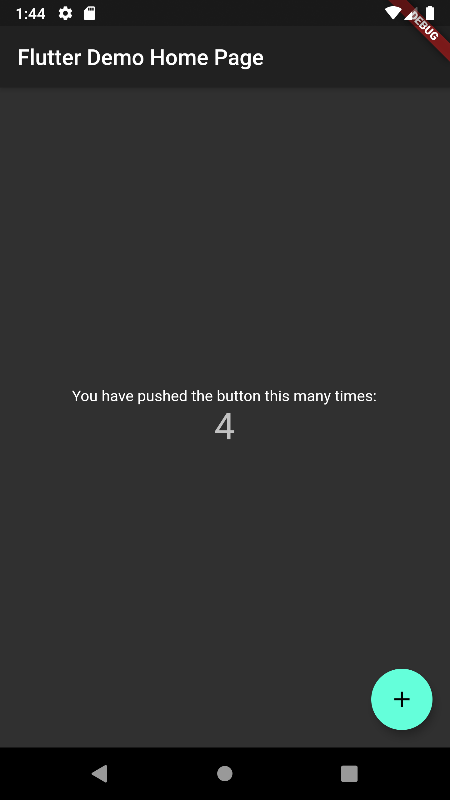
Google’s Material package comes with two baked-in themes - a light version (which is the default) and a dark version.
To set the styles across the entire app you will need to set the theme to a method on ThemeData in the MaterialApp widget, in this case, either the light() or dark() options.
Open main.dart in your code editor and modify the theme to ThemeData.dark():
// ...
class MyApp extends StatelessWidget {
Widget build(BuildContext context) {
return MaterialApp(
title: 'Flutter Demo',
theme: ThemeData.dark(),
home: MyHomePage(title: 'Flutter Demo Home Page'),
);
}
}
// ...
Compile your code and have it run in an emulator:
Next, you can try advanced theme customization.
Step 3 — Using Global Themes
It is also possible to pass parameters directly to ThemeData. The official documentation lists all the available properties which includes primaryColor, fontFamily, and cursorColor.
A few of the properties on ThemeData also have a brightness counterpart, these control the widgets on top of them. So accentColor would change the button but accentColorBrightness will change the text or icon on the button. You will need to use either the light or dark properties on Brightness to achieve that.
Open main.dart in a code editor and modify the ThemeData to use a custom primaryColor, accentColor, and accentColorBrightness:
// ...
class MyApp extends StatelessWidget {
Widget build(BuildContext context) {
return MaterialApp(
title: 'Flutter Demo',
theme: ThemeData(
primaryColor: Colors.purple[800],
accentColor: Colors.amber,
accentColorBrightness: Brightness.dark
),
home: MyHomePage(title: 'Flutter Demo Home Page'),
);
}
}
// ...
Compile your code and have it run in an emulator:
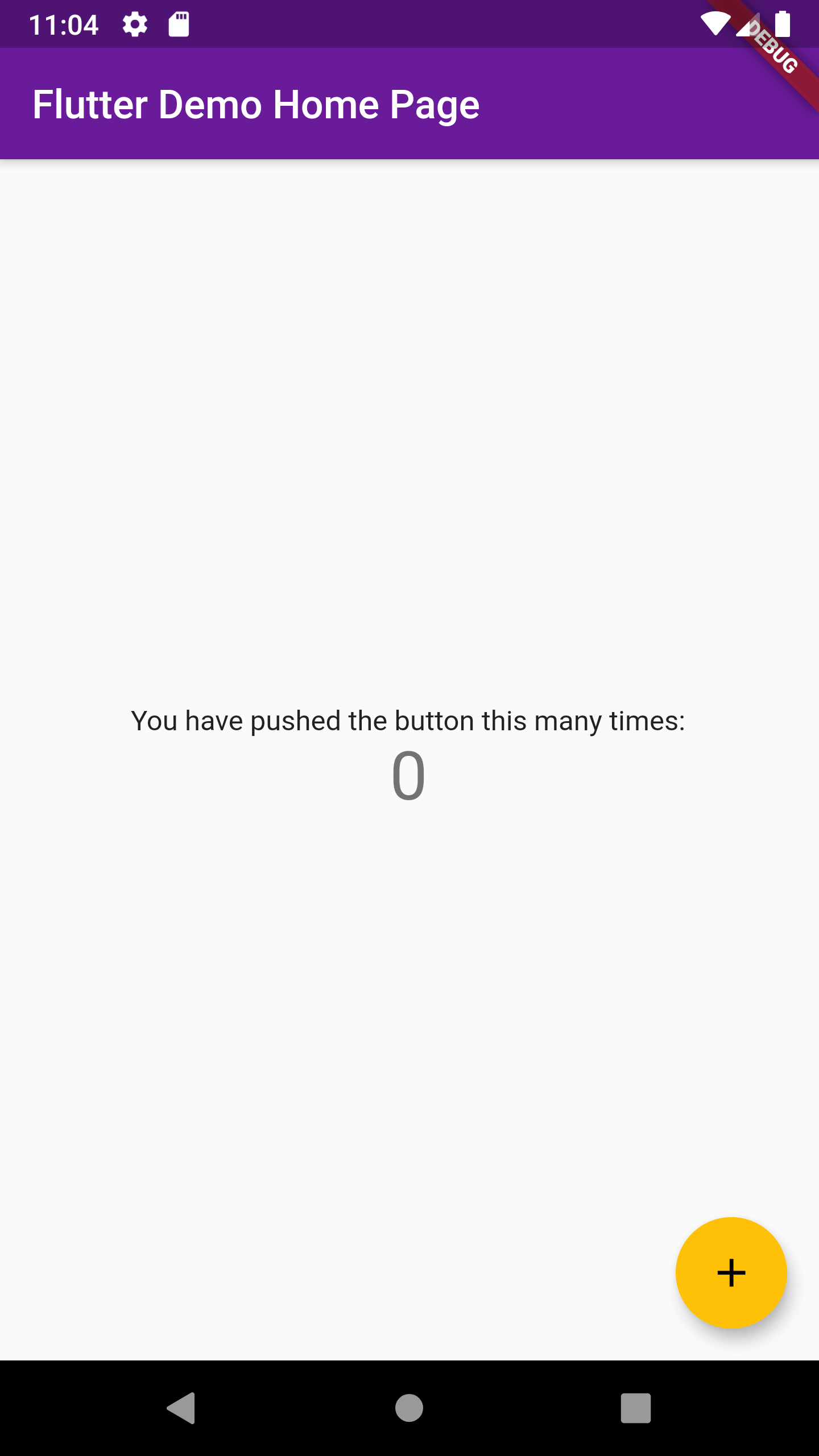
The AppBar appears in a hue of purple with white text. The button appears in amber with darkened symbols on it.
Next, you can try extending themes.
Step 4 — Adapting Themes
It is also possible to take an existing theme and overwrite only certain properties. To extend a theme, you can use the copyWith method to extend it and pass in your custom styles.
Open main.dart in a code editor and modify the ThemeData to extend the dark theme:
// ...
class MyApp extends StatelessWidget {
Widget build(BuildContext context) {
return MaterialApp(
title: 'Flutter Demo',
theme: ThemeData.dark().copyWith(
primaryColor: Colors.purple[800],
accentColor: Colors.amber,
),
home: MyHomePage(title: 'Flutter Demo Home Page'),
);
}
}
// ...
Compile your code and have it run in an emulator:
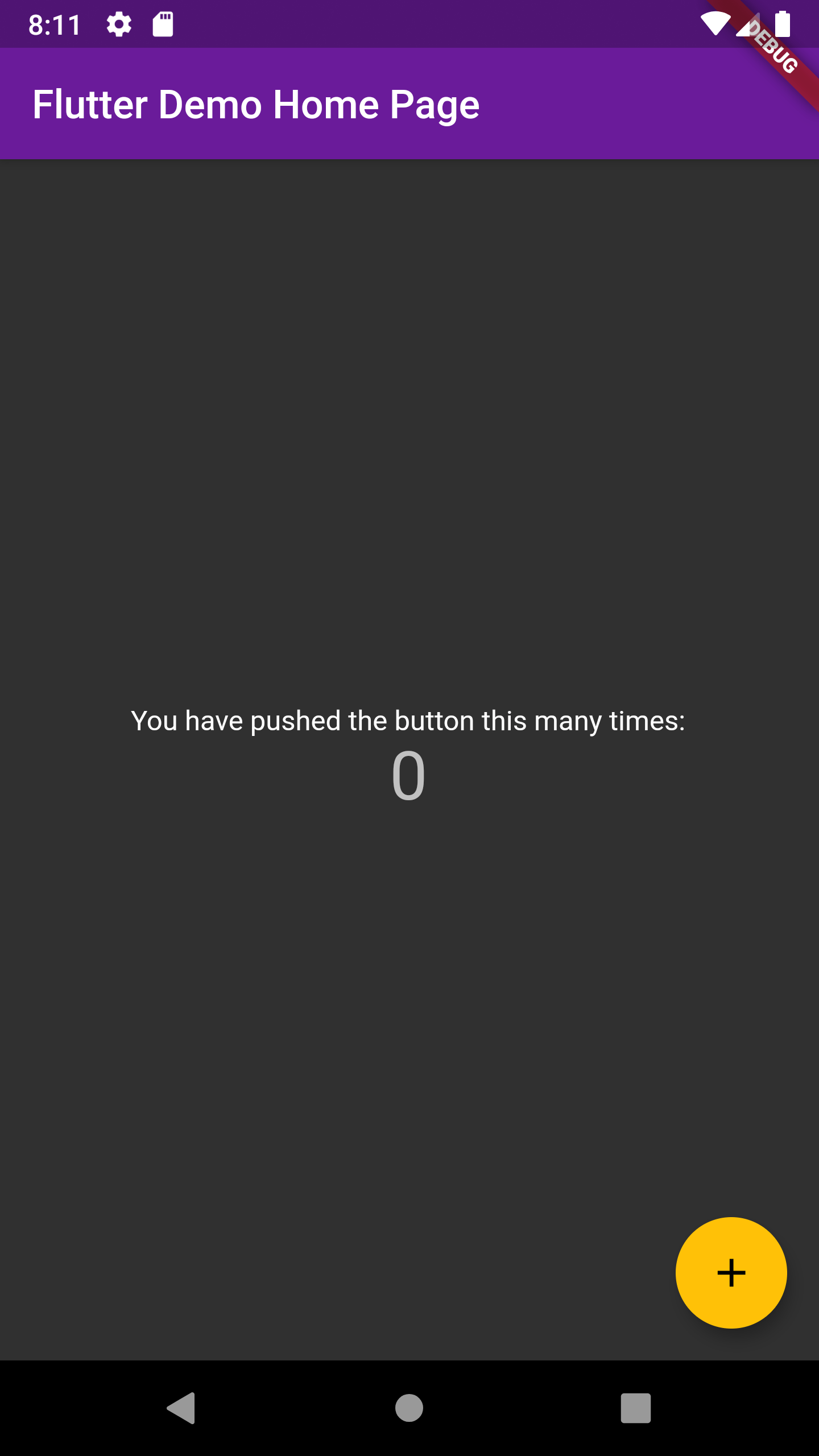
The main content of the application appears dark with light text. However, the AppBar is not black like the earlier dark theme experiment. The AppBar is purple. The button is not turquoise like the earlier dark theme experiment. The button is amber.
Next, you will look at applying themes to widgets.
Step 5 — Using Themes
The previous experiments have relied upon Material widgets. These widgets have been developed to use ThemeData. If you were to create a new custom widget, you would need to ensure that theme properties can be passed to it. You can use Theme.of() to access all of the properties on ThemeData.
Here is an example of modifying the existing button to use different theme properties from the ThemeData:
// ...
class _MyHomePageState extends State<MyHomePage> {
// ...
Widget build(BuildContext context) {
return Scaffold(
// ...
floatingActionButton: FloatingActionButton(
onPressed: _incrementCounter,
tooltip: 'Increment',
backgroundColor: Theme.of(context).primaryColor,
foregroundColor: Theme.of(context).primaryColorLight,
child: Icon(Icons.add),
),
);
}
}
Compile your code and have it run in an emulator.
Instead of a turquoise button, you should observe a dark button with a light icon.
Conclusion
In this article, you learned how to use, customize, and extend themes in Flutter.
Themes are a powerful tool for creating a consistent and cohesive aesthetic throughout your application.
Consult the official documentation for more information.
Thanks for learning with the DigitalOcean Community. Check out our offerings for compute, storage, networking, and managed databases.
About the author
Still looking for an answer?
This textbox defaults to using Markdown to format your answer.
You can type !ref in this text area to quickly search our full set of tutorials, documentation & marketplace offerings and insert the link!
 This work is licensed under a Creative Commons Attribution-NonCommercial- ShareAlike 4.0 International License.
Become a contributor for community
Get paid to write technical tutorials and select a tech-focused charity to receive a matching donation.

DigitalOcean Documentation
Full documentation for every DigitalOcean product.

Resources for startups and AI-native businesses
The Wave has everything you need to know about building a business, from raising funding to marketing your product.
The developer cloud
Scale up as you grow — whether you're running one virtual machine or ten thousand.

Start building today
From GPU-powered inference and Kubernetes to managed databases and storage, get everything you need to build, scale, and deploy intelligent applications.
