
Introduction
Reactstrap provides prebuilt Bootstrap 4 components that allow a great deal of flexibility and prebuilt validation. This allows us to quickly build beautiful forms that are guaranteed to impress and provide an intuitive user experience.
In this tutorial, you will use Reactstrap to build a sign-in form in a React application.
Prerequisites
- A local development environment for Node.js. Follow How to Install Node.js and Create a Local Development Environment.
- Some familiarity with React. You can read our How To Code in React.js series.
- Some familiarity with Bootstrap 4. You can read the official Bootstrap 4.6 documentation.
This tutorial was verified with Node v16.2.0, npm v7.14.0, react v17.0.2, and reactstrap v8.9.0, and bootstrap v4.6.0.
Step 1 — Setting Up the Project
Start with using create-react-app to generate a React App and then install dependecies:
- npx create-react-app reactstrap-example
Change into the new project directory:
- cd reactstrap-example
Now, you can run the React application:
- npm start
Fix any errors or issues with your project. And visit localhost:3000 in a web browser.
Once you have a working React application, you can install reactstrap:
- npm install reactstrap@8.9.0
Then, you can install bootstrap:
- npm install bootstrap@4
Note: It is important when using Reactstrap to specify the 4.x version of Bootstrap so the compatible version is installed. Not specifying a version will install the latest version of Bootstrap which is currently 5.x.
Next, open the src/index.js file in your code editor. Add the following line to use the Bootstrap styles in your project:
import 'bootstrap/dist/css/bootstrap.min.css';
At this point, you will have a new React application with the dependencies of Reactstrap and Bootstrap.
Step 2 — Using Form Components
Reactstrap allows us to have prebuilt Form components that include anything from your standard text Input to a more advanced file upload Input.
First, import the Components from reactstrap. In this example, we will import Button, Form, FormGroup, Input, and Label to use directly in our sign-in form.
import {
  Button,
  Form,
  FormGroup,
  Input,
  Label
} from 'reactstrap';
Now that we have the required components, let’s build the form.
Reactstrap takes in props such as type, name, id and placeholder.
typedefines the type of input such as file uploads, radio buttons, or even more specific text inputs such as email.nameis the key for the key-value pair that will eventually be sent to our backend.idis what we use when manipulating the DOM.placeholderallows us to add example text to the input.
Open App.js in your code editor and add the following lines of code:
import { Component } from 'react';
import {
  Button,
  Form,
  FormGroup,
  Input,
  Label
} from 'reactstrap';
import './App.css';

class App extends Component {
  render() {
    return (
      <div className="App">
        <h2>Sign In</h2>
        <Form className="form">
          <FormGroup>
            <Label for="exampleEmail">Username</Label>
            <Input
              type="email"
              name="email"
              id="exampleEmail"
              placeholder="example@example.com"
            />
          </FormGroup>
          <FormGroup>
            <Label for="examplePassword">Password</Label>
            <Input
              type="password"
              name="password"
              id="examplePassword"
              placeholder="********"
            />
          </FormGroup>
        <Button>Submit</Button>
      </Form>
    </div>
  );
}

export default App;
Then, open App.css in your code editor and replace it with the following styles:
.App {
  border: 2px solid #d3d3d3;
  border-radius: .5em;
  margin-bottom: 1em;
  margin-left: auto;
  margin-right: auto;
  margin-top: 100px;
  padding: 1em;
  text-align: left;
  width: 600px;
}

.form {
  padding: 1em;
}

label {
  font-weight: 600;
}
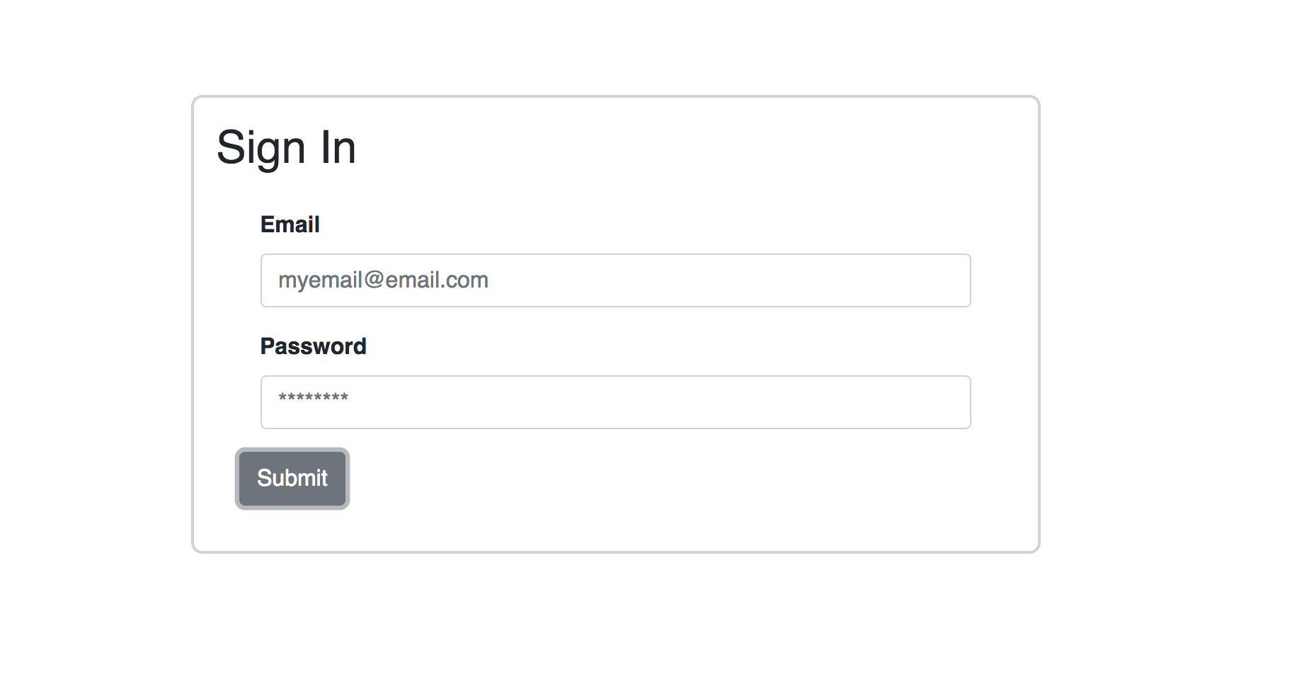
Save your changes and observe the application in your web browser:
Reactstrap provides multiple built-in ways to style our form components. Here are some of the key items that might come in handy:
- Colors: Reactstrap supports Bootstrap’s built-in colors when using
classNames likehas-success. - Inline Form: Within
<Form>we can add<Form inline>to place yourLabelandInputin the same row. - Containers, Row, and Columns:
<Col>is Reactstrap’s wrapper for Bootstrap’s Column. This allows us to format for not only desktop but also for mobile and tablet.
At this point, you have a React application with a sign-in form using Bootstrap styling.
Step 3 — Adding Validation and User Hints
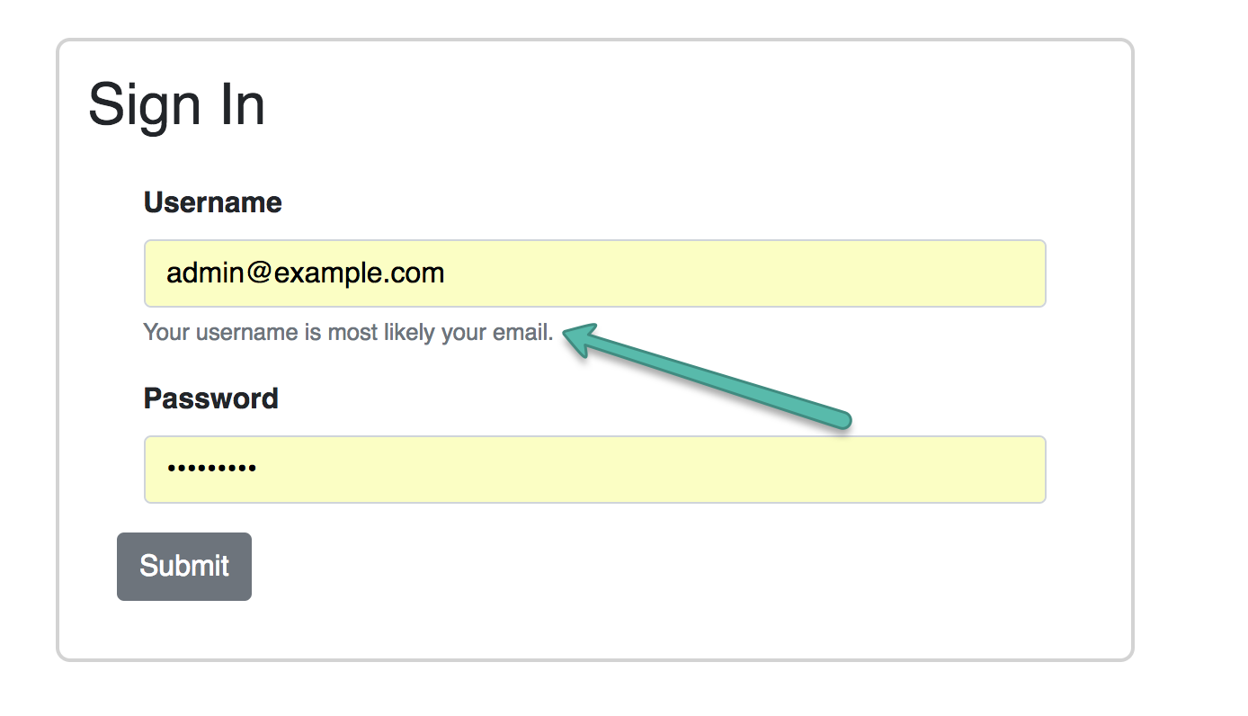
FormText allows us to add additional indicator text above or below the field.
For this example, the “Username” field will expect a value in the form of an email address. FormText was added to inform the user of the expected value.
<FormText>Your username is most likely your email.</FormText>
Save your changes and observe the application in your web browser:
Before you add FormFeedback to this example, you will need to manage state:
constructor(props) {
  super(props);
  this.state = {
    email: '',
    validate: {
      emailState: '',
    },
  };
}

render() {
  const { email } = this.state;
  // ...
}
And handle changes to the form:
constructor(props) {
  super(props);
  // ...
  this.handleChange = this.handleChange.bind(this);
}

handleChange = (event) => {
  const { target } = event;
  const value = target.type === 'checkbox' ? target.checked : target.value;
  const { name } = target;

  this.setState({
    [name]: value,
  });
};
FormFeedback instantly validates fields. You have the flexibility to customize your input validation. Add a function with Regex to validate the email on the onChange event, and set has-success or has-danger in state.
validateEmail(e) {
  const emailRegex = /^(([^<>()[\]\\.,;:\s@"]+(\.[^<>()[\]\\.,;:\s@"]+)*)|(".+"))@((\[[0-9]{1,3}\.[0-9]{1,3}\.[0-9]{1,3}\.[0-9]{1,3}\])|(([a-zA-Z\-0-9]+\.)+[a-zA-Z]{2,}))$/;

  const { validate } = this.state;

  if (emailRegex.test(e.target.value)) {
    validate.emailState = 'has-success';
  } else {
    validate.emailState = 'has-danger';
  }

  this.setState({ validate });
}
Warning: There is a standard specification for validating email addresses. This simplified regular expression is provided for tutorial purposes only.
To apply this to your Input, add the valid prop with your conditional:
valid={ this.state.validate.emailState === 'has-success' }
And the invalid prop with your conditional:
invalid={ this.state.validate.emailState === 'has-danger' }
/>
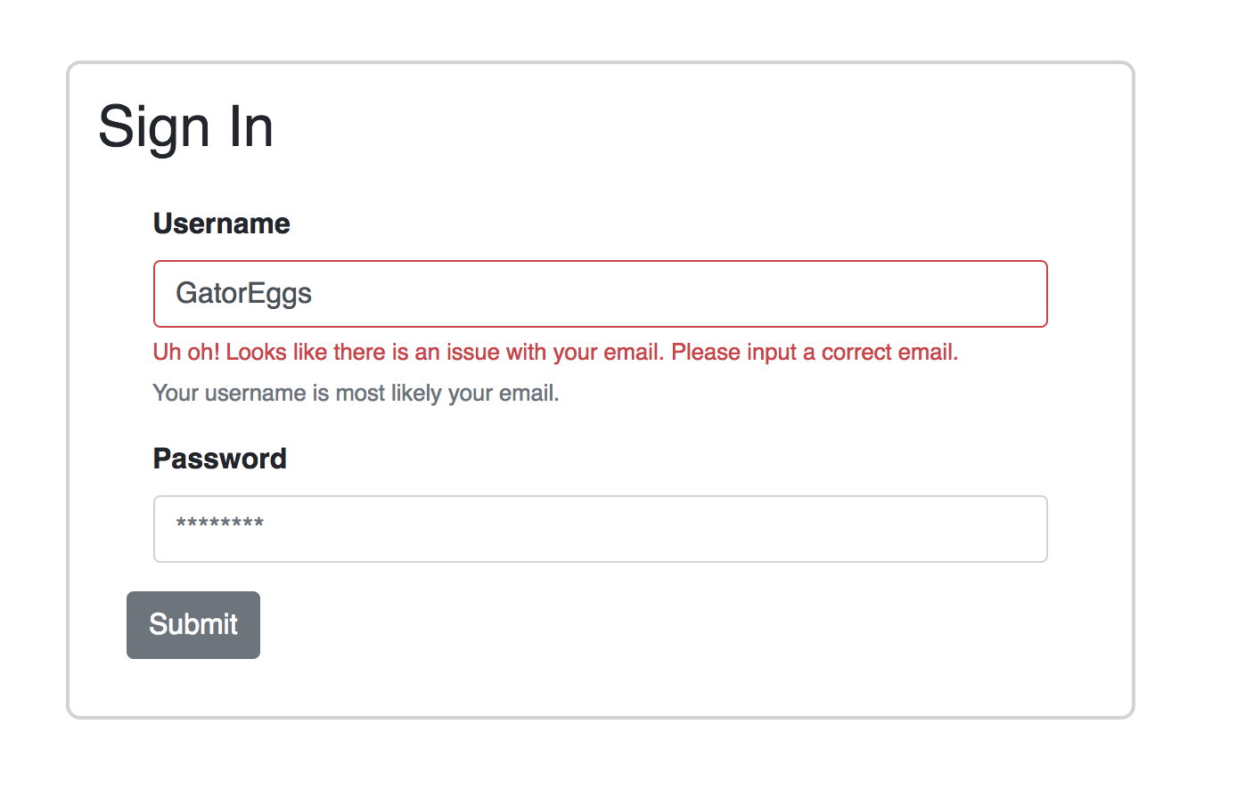
Create a FormFeedback to display the failure text by default:
<FormFeedback>
  Uh oh! Looks like there is an issue with your email. Please input a correct email.
</FormFeedback>
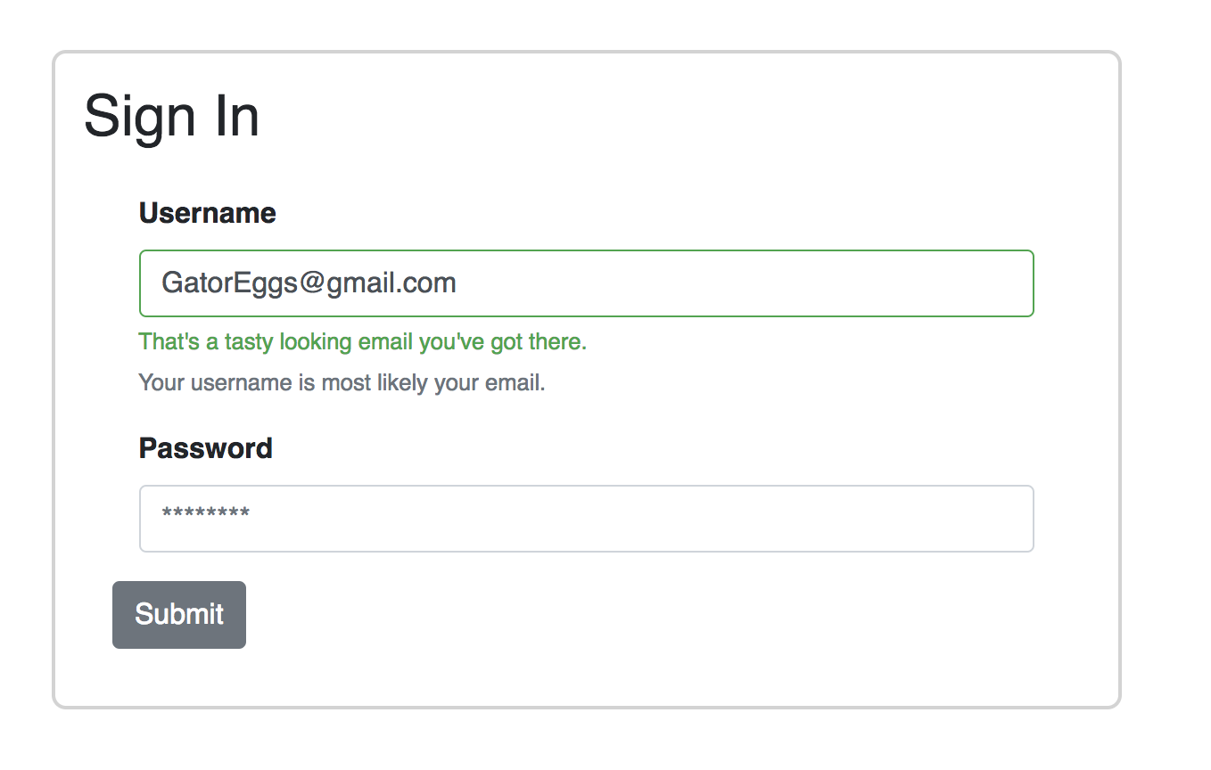
Create a second FormFeedback with a valid prop to display the success text:
<FormFeedback valid>
  That's a tasty looking email you've got there.
</FormFeedback>
Then, add value, validateEmail, and handleChange to your Input:
<Input
  type="email"
  name="email"
  id="exampleEmail"
  placeholder="example@example.com"
  valid={ this.state.validate.emailState === 'has-success' }
  invalid={ this.state.validate.emailState === 'has-danger' }
  value={ email }
  onChange={ (e) => {
                      this.validateEmail(e);
                      this.handleChange(e);
                    } }
/>
The user will get feedback with has-danger styles when they enter their username incorrectly:
And the user will get feedback with has-success styles when they enter their username correctly:
Now, your form uses FormText, FormFeedback, and validation.
Step 4 — Submitting the Form
Finally, on submit we would typically submit the data to our database but in our example, we will console log the email using a submitForm function.
submitForm(e) {
  e.preventDefault();
  console.log(`Email: ${ this.state.email }`);
}
With all the pieces in place, App.js will resemble the following:
import { Component } from 'react';
import {
  Form,
  FormFeedback,
  FormGroup,
  FormText,
  Label,
  Input,
  Button,
} from 'reactstrap';
import './App.css';

class App extends Component {
  constructor(props) {
    super(props);
    this.state = {
      email: '',
      password: '',
      validate: {
        emailState: '',
      },
    };
    this.handleChange = this.handleChange.bind(this);
  }

  handleChange = (event) => {
    const { target } = event;
    const value = target.type === 'checkbox' ? target.checked : target.value;
    const { name } = target;

    this.setState({
      [name]: value,
    });
  };

  validateEmail(e) {
    const emailRex =
      /^(([^<>()[\]\\.,;:\s@"]+(\.[^<>()[\]\\.,;:\s@"]+)*)|(".+"))@((\[[0-9]{1,3}\.[0-9]{1,3}\.[0-9]{1,3}\.[0-9]{1,3}\])|(([a-zA-Z\-0-9]+\.)+[a-zA-Z]{2,}))$/;

    const { validate } = this.state;

    if (emailRex.test(e.target.value)) {
      validate.emailState = 'has-success';
    } else {
      validate.emailState = 'has-danger';
    }

    this.setState({ validate });
  }

  submitForm(e) {
    e.preventDefault();
    console.log(`Email: ${this.state.email}`);
  }

  render() {
    const { email, password } = this.state;

    return (
      <div className="App">
        <h2>Sign In</h2>
        <Form className="form" onSubmit={(e) => this.submitForm(e)}>
          <FormGroup>
            <Label>Username</Label>
            <Input
              type="email"
              name="email"
              id="exampleEmail"
              placeholder="example@example.com"
              valid={this.state.validate.emailState === "has-success"}
              invalid={this.state.validate.emailState === "has-danger"}
              value={email}
              onChange={(e) => {
                this.validateEmail(e);
                this.handleChange(e);
              }}
            />
            <FormFeedback>
              Uh oh! Looks like there is an issue with your email. Please input
              a correct email.
            </FormFeedback>
            <FormFeedback valid>
              That's a tasty looking email you've got there.
            </FormFeedback>
            <FormText>Your username is most likely your email.</FormText>
          </FormGroup>
          <FormGroup>
            <Label for="examplePassword">Password</Label>
            <Input
              type="password"
              name="password"
              id="examplePassword"
              placeholder="********"
              value={password}
              onChange={(e) => this.handleChange(e)}
            />
          </FormGroup>
          <Button>Submit</Button>
        </Form>
      </div>
    );
  }
}

export default App;
Conclusion
In this tutorial, you used Reactstrap to build a sign-in form in a React application. This allows you to build with Bootstrap 4 elements with React components.
If you’d like to learn more about React, check out our React topic page for exercises and programming projects.
Thanks for learning with the DigitalOcean Community. Check out our offerings for compute, storage, networking, and managed databases.
About the author
Still looking for an answer?
This textbox defaults to using Markdown to format your answer.
You can type !ref in this text area to quickly search our full set of tutorials, documentation & marketplace offerings and insert the link!
Step 1 — Setting Up the Project. Start with using create-react-app to generate a React App and then install dependecies: … Step 2 — Using Form Components. … Step 3 — Adding Validation and User Hints. … Step 4 — Submitting the Form.
 This work is licensed under a Creative Commons Attribution-NonCommercial- ShareAlike 4.0 International License.
Become a contributor for community
Get paid to write technical tutorials and select a tech-focused charity to receive a matching donation.

DigitalOcean Documentation
Full documentation for every DigitalOcean product.

Resources for startups and AI-native businesses
The Wave has everything you need to know about building a business, from raising funding to marketing your product.
The developer cloud
Scale up as you grow — whether you're running one virtual machine or ten thousand.

Start building today
From GPU-powered inference and Kubernetes to managed databases and storage, get everything you need to build, scale, and deploy intelligent applications.
