By Thomas Vincent and Lisa Tagliaferri

Introduction
Time-series analysis belongs to a branch of Statistics that involves the study of ordered, often temporal data. When relevantly applied, time-series analysis can reveal unexpected trends, extract helpful statistics, and even forecast trends ahead into the future. For these reasons, it is applied across many fields including economics, weather forecasting, and capacity planning, to name a few.
In this tutorial, we will introduce some common techniques used in time-series analysis and walk through the iterative steps required to manipulate, visualize time-series data.
Prerequisites
This guide will cover how to do time-series analysis on either a local desktop or a remote server. Working with large datasets can be memory intensive, so in either case, the computer will need at least 2GB of memory to perform some of the calculations in this guide.
For this tutorial, we’ll be using Jupyter Notebook to work with the data. If you do not have it already, you should follow our tutorial to install and set up Jupyter Notebook for Python 3.
Step 1 — Installing Packages
We will leverage the pandas library, which offers a lot of flexibility when manipulating data, and the statsmodels library, which allows us to perform statistical computing in Python. Used together, these two libraries extend Python to offer greater functionality and significantly increase our analytical toolkit.
Like with other Python packages, we can install pandas and statsmodels with pip. First, let’s move into our local programming environment or server-based programming environment:
- cd environments
- . my_env/bin/activate
From here, let’s create a new directory for our project. We will call it timeseries and then move into the directory. If you call the project a different name, be sure to substitute your name for timeseries throughout the guide
- mkdir timeseries
- cd timeseries
We can now install pandas, statsmodels, and the data plotting package matplotlib. Their dependencies will also be installed:
- pip install pandas statsmodels matplotlib
At this point, we’re now set up to start working with pandas and statsmodels.
Step 2 — Loading Time-series Data
To begin working with our data, we will start up Jupyter Notebook:
- jupyter notebook
To create a new notebook file, select New > Python 3 from the top right pull-down menu:
This will open a notebook which allows us to load the required libraries (notice the standard shorthands used to reference pandas, matplotlib and statsmodels). At the top of our notebook, we should write the following:
import pandas as pd
import statsmodels.api as sm
import matplotlib.pyplot as plt
After each code block in this tutorial, you should type ALT + ENTER to run the code and move into a new code block within your notebook.
Conveniently, statsmodels comes with built-in datasets, so we can load a time-series dataset straight into memory.
We’ll be working with a dataset called “Atmospheric CO2 from Continuous Air Samples at Mauna Loa Observatory, Hawaii, U.S.A.,” which collected CO2 samples from March 1958 to December 2001. We can bring in this data as follows:
data = sm.datasets.co2.load_pandas()
co2 = data.data
Let’s check what the first 5 lines of our time-series data look like:
print(co2.head(5))
Output              co2
1958-03-29  316.1
1958-04-05  317.3
1958-04-12  317.6
1958-04-19  317.5
1958-04-26  316.4
With our packages imported and the CO2 dataset ready to go, we can move on to indexing our data.
Step 3 — Indexing with Time-series Data
You may have noticed that the dates have been set as the index of our pandas DataFrame. When working with time-series data in Python we should ensure that dates are used as an index, so make sure to always check for that, which we can do by running the following:
co2.index
OutputDatetimeIndex(['1958-03-29', '1958-04-05', '1958-04-12', '1958-04-19',
               '1958-04-26', '1958-05-03', '1958-05-10', '1958-05-17',
               '1958-05-24', '1958-05-31',
               ...
               '2001-10-27', '2001-11-03', '2001-11-10', '2001-11-17',
               '2001-11-24', '2001-12-01', '2001-12-08', '2001-12-15',
               '2001-12-22', '2001-12-29'],
              dtype='datetime64[ns]', length=2284, freq='W-SAT')
The dtype=datetime[ns] field confirms that our index is made of date stamp objects, while length=2284 and freq='W-SAT' tells us that we have 2,284 weekly date stamps starting on Saturdays.
Weekly data can be tricky to work with, so let’s use the monthly averages of our time-series instead. This can be obtained by using the convenient resample function, which allows us to group the time-series into buckets (1 month), apply a function on each group (mean), and combine the result (one row per group).
y = co2['co2'].resample('MS').mean()
Here, the term MS means that we group the data in buckets by months and ensures that we are using the start of each month as the timestamp:
y.head(5)
Output1958-03-01    316.100
1958-04-01    317.200
1958-05-01    317.120
1958-06-01    315.800
1958-07-01    315.625
Freq: MS, Name: co2, dtype: float64
An interesting feature of pandas is its ability to handle date stamp indices, which allow us to quickly slice our data. For example, we can slice our dataset to only retrieve data points that come after the year 1990:
y['1990':]
Output1990-01-01    353.650
1990-02-01    354.650
               ...
2001-11-01    369.375
2001-12-01    371.020
Freq: MS, Name: co2, dtype: float64
Or, we can slice our dataset to only retrieve data points between October 1995 and October 1996:
y['1995-10-01':'1996-10-01']
Output1995-10-01    357.850
1995-11-01    359.475
1995-12-01    360.700
1996-01-01    362.025
1996-02-01    363.175
1996-03-01    364.060
1996-04-01    364.700
1996-05-01    365.325
1996-06-01    364.880
1996-07-01    363.475
1996-08-01    361.320
1996-09-01    359.400
1996-10-01    359.625
Freq: MS, Name: co2, dtype: float64
With our data properly indexed for working with temporal data, we can move onto handling values that may be missing.
Step 4 — Handling Missing Values in Time-series Data
Real world data tends be messy. As we can see from the plot, it is not uncommon for time-series data to contain missing values. The simplest way to check for those is either by directly plotting the data or by using the command below that will reveal missing data in ouput:
y.isnull().sum()
Output5
This output tells us that there are 5 months with missing values in our time series.
Generally, we should “fill in” missing values if they are not too numerous so that we don’t have gaps in the data. We can do this in pandas using the fillna() command. For simplicity, we can fill in missing values with the closest non-null value in our time series, although it is important to note that a rolling mean would sometimes be preferable.
y = y.fillna(y.bfill())
With missing values filled in, we can once again check to see whether any null values exist to make sure that our operation worked:
y.isnull().sum()
Output0
After performing these operations, we see that we have successfully filled in all missing values in our time series.
Step 5 — Visualizing Time-series Data
When working with time-series data, a lot can be revealed through visualizing it. A few things to look out for are:
- seasonality: does the data display a clear periodic pattern?
- trend: does the data follow a consistent upwards or downward slope?
- noise: are there any outlier points or missing values that are not consistent with the rest of the data?
We can use the pandas wrapper around the matplotlib API to display a plot of our dataset:
y.plot(figsize=(15, 6))
plt.show()
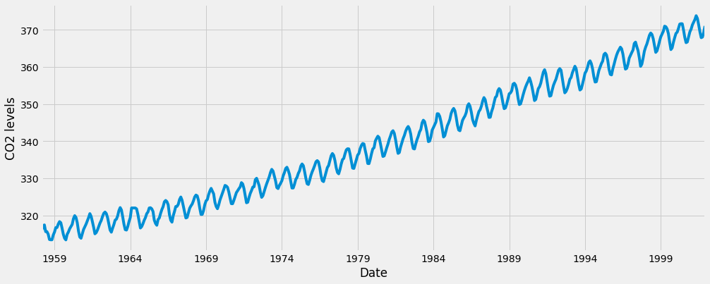
Some distinguishable patterns appear when we plot the data. The time-series has an obvious seasonality pattern, as well as an overall increasing trend. We can also visualize our data using a method called time-series decomposition. As its name suggests, time series decomposition allows us to decompose our time series into three distinct components: trend, seasonality, and noise.
Fortunately, statsmodels provides the convenient seasonal_decompose function to perform seasonal decomposition out of the box. If you are interested in learning more, the reference for its original implementation can be found in the following paper, “STL: A Seasonal-Trend Decomposition Procedure Based on Loess.”
The script below shows how to perform time-series seasonal decomposition in Python. By default, seasonal_decompose returns a figure of relatively small size, so the first two lines of this code chunk ensure that the output figure is large enough for us to visualize.
from pylab import rcParams
rcParams['figure.figsize'] = 11, 9

decomposition = sm.tsa.seasonal_decompose(y, model='additive')
fig = decomposition.plot()
plt.show()
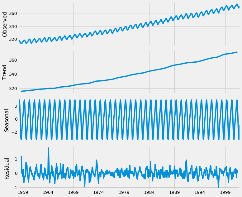
Using time-series decomposition makes it easier to quickly identify a changing mean or variation in the data. The plot above clearly shows the upwards trend of our data, along with its yearly seasonality. These can be used to understand the structure of our time-series. The intuition behind time-series decomposition is important, as many forecasting methods build upon this concept of structured decomposition to produce forecasts.
Conclusion
If you’ve followed along with this guide, you now have experience visualizing and manipulating time-series data in Python.
To further improve your skill set, you can load in another dataset and repeat all the steps in this tutorial. For example, you may wish to read a CSV file using the pandas library or use the sunspots dataset that comes pre-loaded with the statsmodels library: data = sm.datasets.sunspots.load_pandas().data.
Thanks for learning with the DigitalOcean Community. Check out our offerings for compute, storage, networking, and managed databases.
Tutorial Series: Time Series Visualization and Forecasting
Time series are a pivotal component of data analysis. This series goes through how to handle time series visualization and forecasting in Python 3.
About the author(s)
Statistician & data scientist. Strong background in whiskey.
Community and Developer Education expert. Former Senior Manager, Community at DigitalOcean. Focused on topics including Ubuntu 22.04, Ubuntu 20.04, Python, Django, and more.
Still looking for an answer?
This textbox defaults to using Markdown to format your answer.
You can type !ref in this text area to quickly search our full set of tutorials, documentation & marketplace offerings and insert the link!
Good tutorial, however, when following it with my own collected data, I’m getting an error saying
“ValueError: You must specify a freq or x must be a pandas object with a timeseries index witha freq not set to None”
And I’m forced to set a value for “freq” at line
“decomposition = sm.tsa.seasonal_decompose(y, model=‘additive’)”
I can see that my choice of value for freq has big impact on the residual, would there be an efficient way to find what the best frequency is for my time series?
Data is not loading:
#NOTE: this is how I got the missing values in co2.csv
TypeError: new() got an unexpected keyword argument ‘format’
 This work is licensed under a Creative Commons Attribution-NonCommercial- ShareAlike 4.0 International License.
Become a contributor for community
Get paid to write technical tutorials and select a tech-focused charity to receive a matching donation.

DigitalOcean Documentation
Full documentation for every DigitalOcean product.

Resources for startups and AI-native businesses
The Wave has everything you need to know about building a business, from raising funding to marketing your product.
The developer cloud
Scale up as you grow — whether you're running one virtual machine or ten thousand.

Start building today
From GPU-powered inference and Kubernetes to managed databases and storage, get everything you need to build, scale, and deploy intelligent applications.