By Alligator and Manikandan Kurup

CSS Grid is a tool for building two-dimensional web layouts. Understanding its alignment capabilities will help you control the position and spacing of elements, making it easier to build complex, responsive designs that work on any device. With just a single line of code, you can center elements or craft asymmetrical layouts with fine-tuned control.
In this article, we’ll explore how to justify and align content using CSS Grid. You’ll learn the difference between aligning the grid container itself (justify-content, align-content) and aligning individual items within their grid cells (justify-items, align-items, justify-self, align-self). We’ll walk through each property with clear explanations and practical examples, show how to combine them effectively, and cover common real-world use cases. We’ll also touch on best practices and accessibility considerations to help you build layouts that are both efficient and user-friendly.
Key Takeaways
- CSS Grid has two main categories of alignment: properties that align the grid container and those that align the grid items.
- The
justify-contentandalign-contentproperties distribute extra space for the entire grid within the container. - The
justify-itemsandalign-itemsproperties control the default alignment of items inside their individual grid cells. - You can override the alignment for a single item using the
justify-selfandalign-selfproperties. - Shorthand properties like
place-contentandplace-itemsmake code cleaner and more efficient. - Always maintain a logical HTML source order, as visual reordering with CSS can harm accessibility for screen readers.
Deploy your frontend applications from GitHub using DigitalOcean App Platform. Let DigitalOcean focus on scaling your app.
Prerequisites
To follow along with this article, you will need:
- An understanding of CSS property and values.
- A code editor.
- A modern web browser that supports CSS grid.
What is Introduction to CSS Grid Layout
CSS Grid Layout is a powerful two-dimensional layout system native to CSS. Unlike Flexbox, which is one-dimensional and designed for laying out items in either a row or a column, Grid is built to handle both rows and columns simultaneously. This makes it the perfect tool for creating complex web page layouts, from entire page structures to smaller-scale components like image galleries or forms.
At its core, Grid gives you a simple way to create a grid structure and place items precisely within it. A key to mastering this system is understanding its robust alignment capabilities. Properly aligning content and items is essential for building responsive, organized, and visually appealing designs that adapt seamlessly across different screen sizes.
Before we dive into the alignment properties, let’s quickly define two foundational concepts:
- Grid Container: The parent HTML element on which you apply
display: grid;. This element becomes the grid and establishes a new grid formatting context for its direct children. - Grid Item: The direct children of the Grid Container. These are the elements that you can arrange and align within the grid.
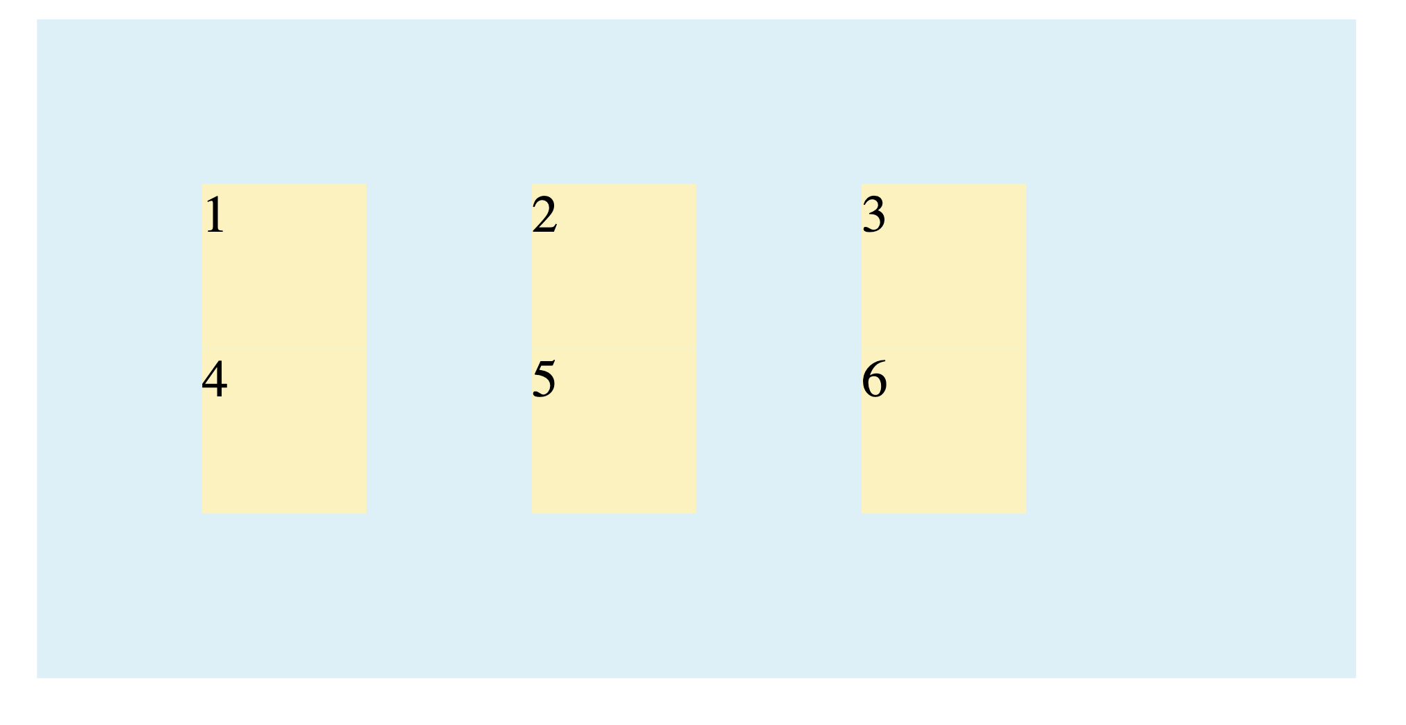
First, let’s create a common HTML structure for all our examples. It’s a container with six child items that we’ll turn into a grid.
<div class="grid-container">
  <div class="grid-item">1</div>
  <div class="grid-item">2</div>
  <div class="grid-item">3</div>
  <div class="grid-item">4</div>
  <div class="grid-item">5</div>
  <div class="grid-item">6</div>
</div>
With the following CSS:
.grid-container {
  display: grid;
  grid-template-columns: 100px 100px 100px;
  grid-template-rows: auto;

  box-sizing: border-box;
  width: 400px;
  height: 200px;
  margin-left: auto;
  margin-right: auto;

  background: #dceff7;
  border: 2px solid rgba(114, 186, 94, 0.35);
}

.grid-item {
  box-sizing: border-box;
  width: 50px;
  height: 50px;
  background: #FBF2C0;
  border: 2px solid rgba(236, 198, 48, 0.5);
}
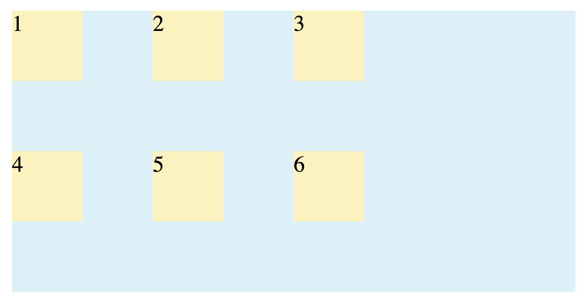
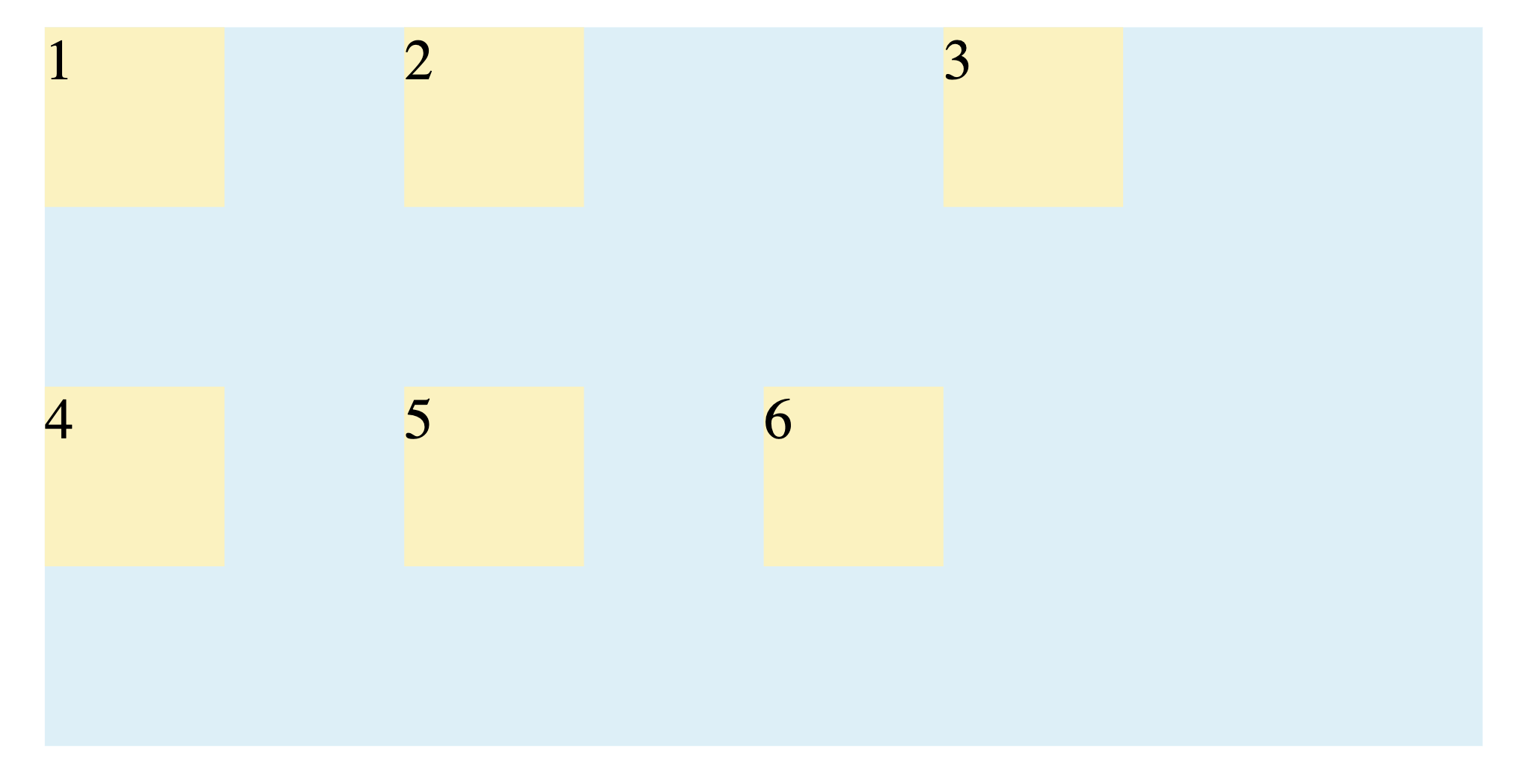
This code will produce a grid layout with three columns that are 100px wide. Each grid item will have a width of 50px and a height of 50px:
What is Aligning and Justifying the Grid Container
These properties distribute the space within the grid container itself. They only have a visible effect when the total size of your grid tracks (the columns and rows) is smaller than the grid container.
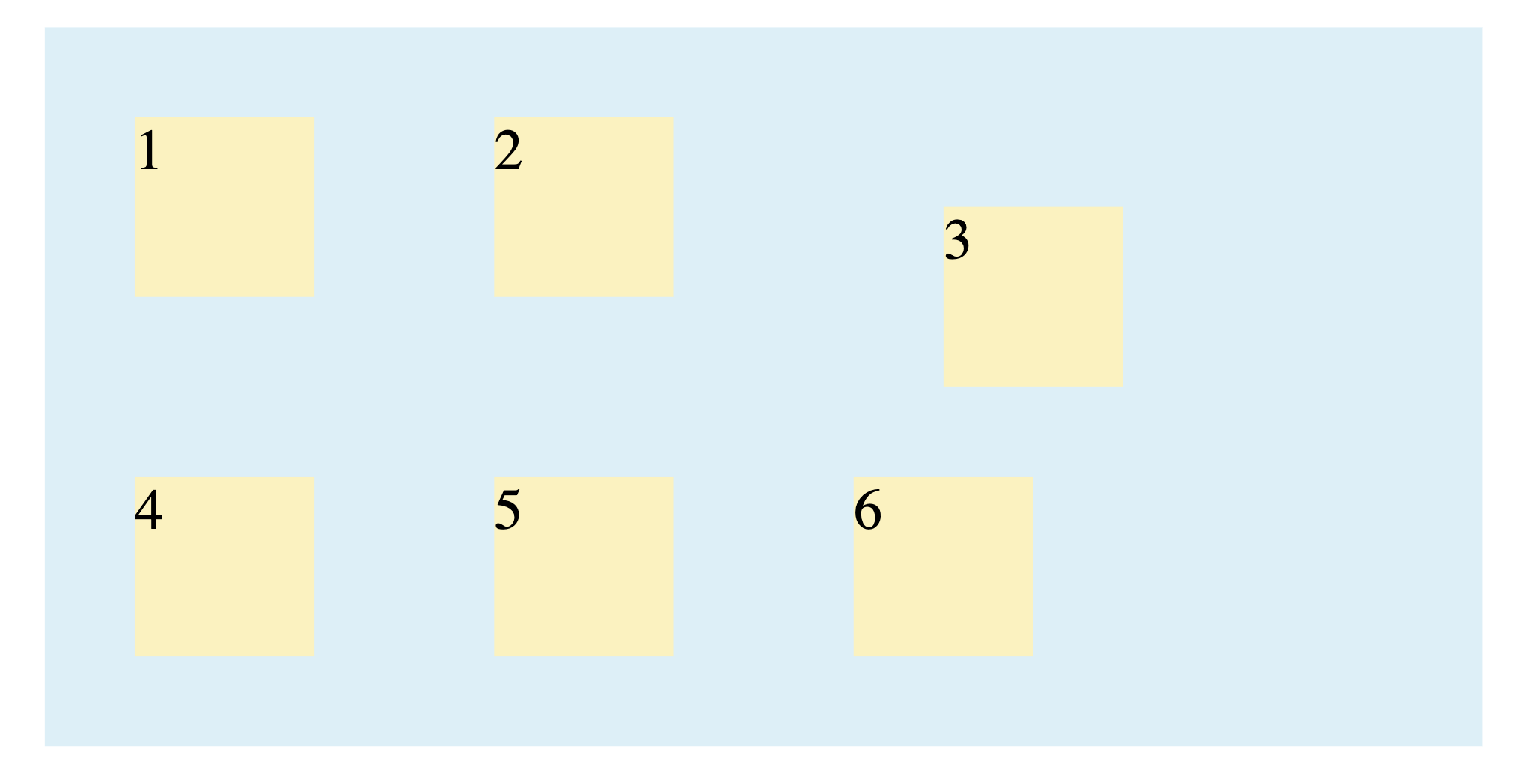
justify-content
This property aligns the grid along the row (inline) axis.
start: Packs the grid against the starting edge. (Default)end: Packs the grid against the ending edge.center: Centers the grid columns horizontally within the container.space-between: Distributes the grid with the first item on the start edge and the last item on the end edge, with even space between the others.space-around: Distributes the grid with equal space on each side of every column.space-evenly: Distributes the grid with equal space between each column and also between the first/last columns and the container edges.
Here’s an example of center:
.grid-container {
  justify-content: center;
}
Output:
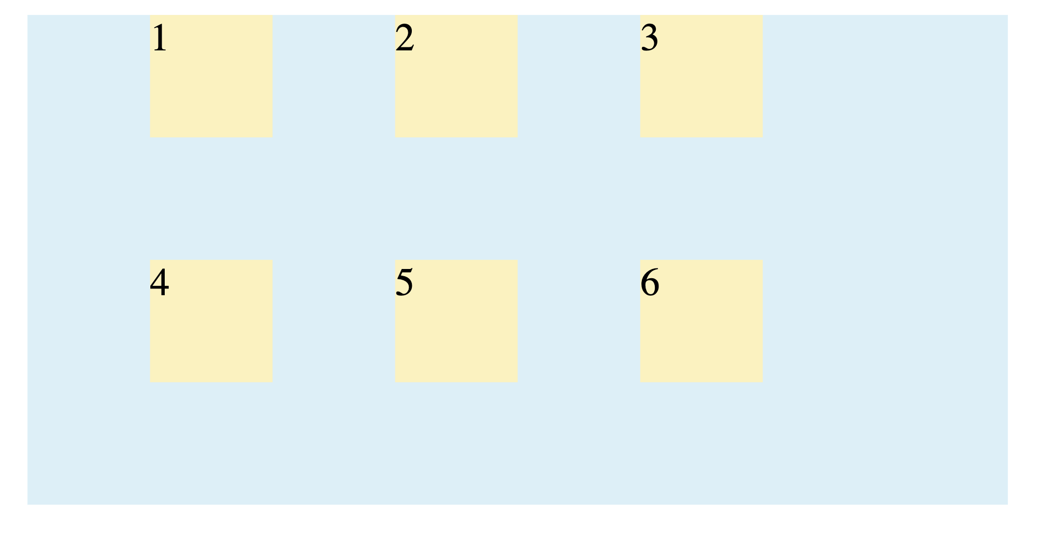
The grid items are aligned horizontally to the middle of the columns.
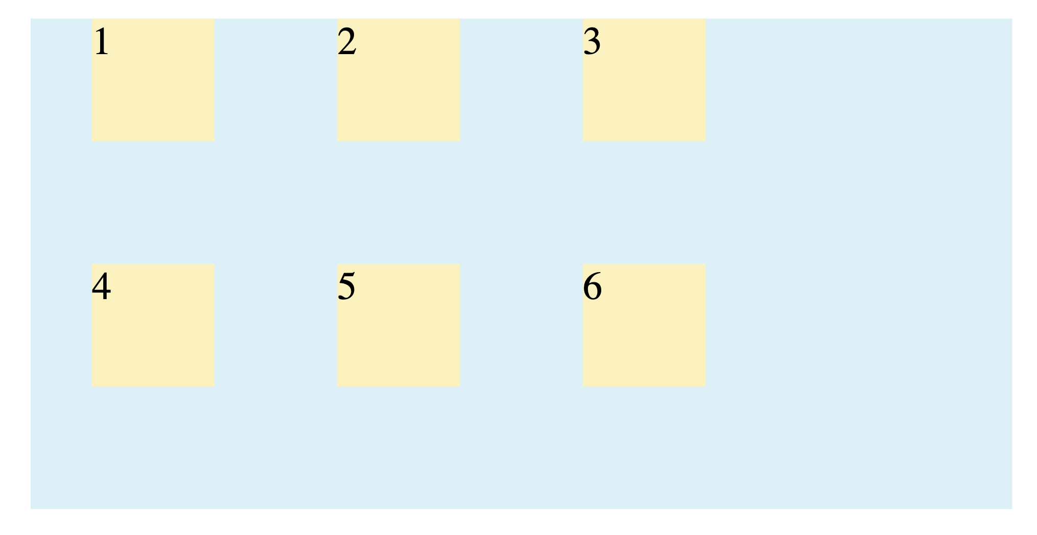
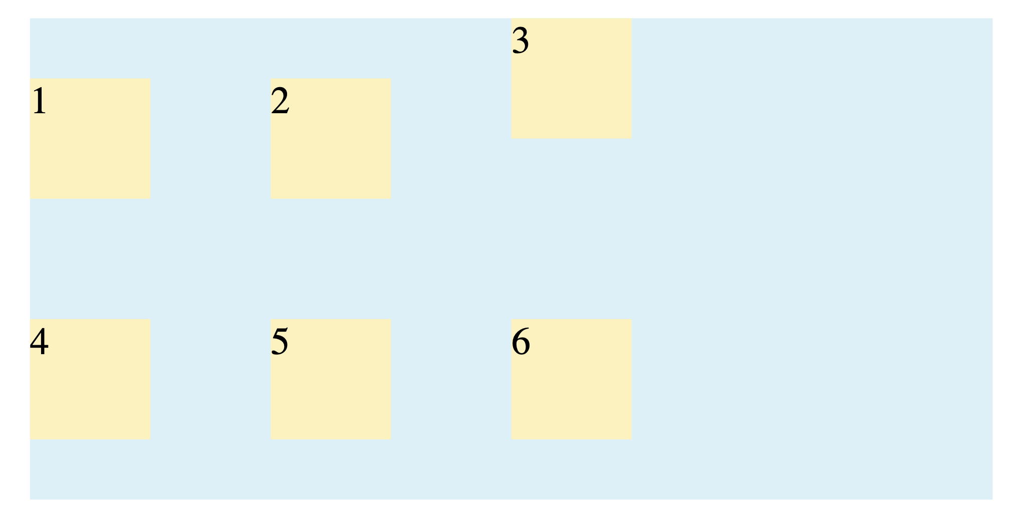
align-content
This property aligns the grid along the column (block) axis.
start: Packs the grid against the top edge. (Default)end: Packs the grid against the bottom edge.center: Centers the grid vertically.space-between: Distributes rows with the first row at the top and the last at the bottom.space-around: Distributes rows with equal space above and below each one.space-evenly: Distributes rows with equal space between each row and the container edges.
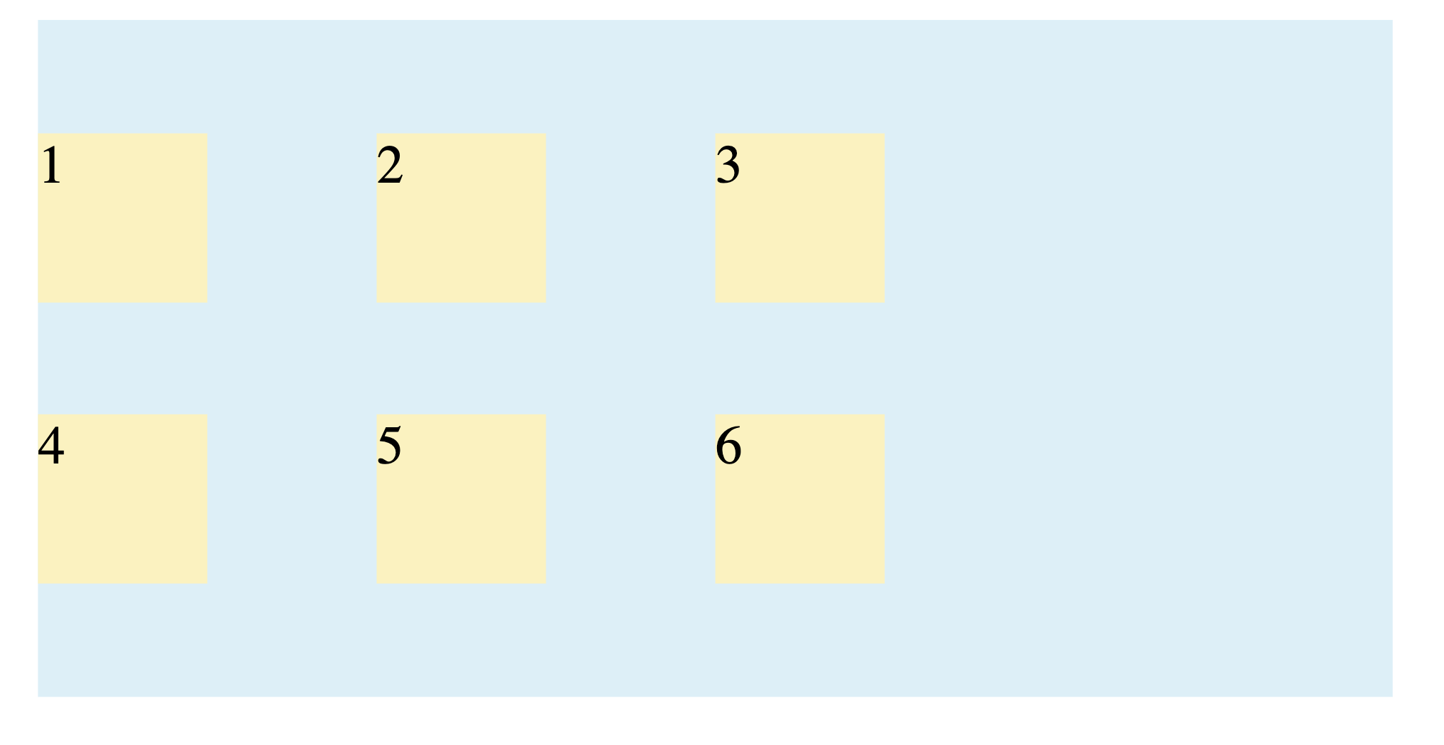
Example:
.grid-container {
  align-content: space-evenly;
}
Output:
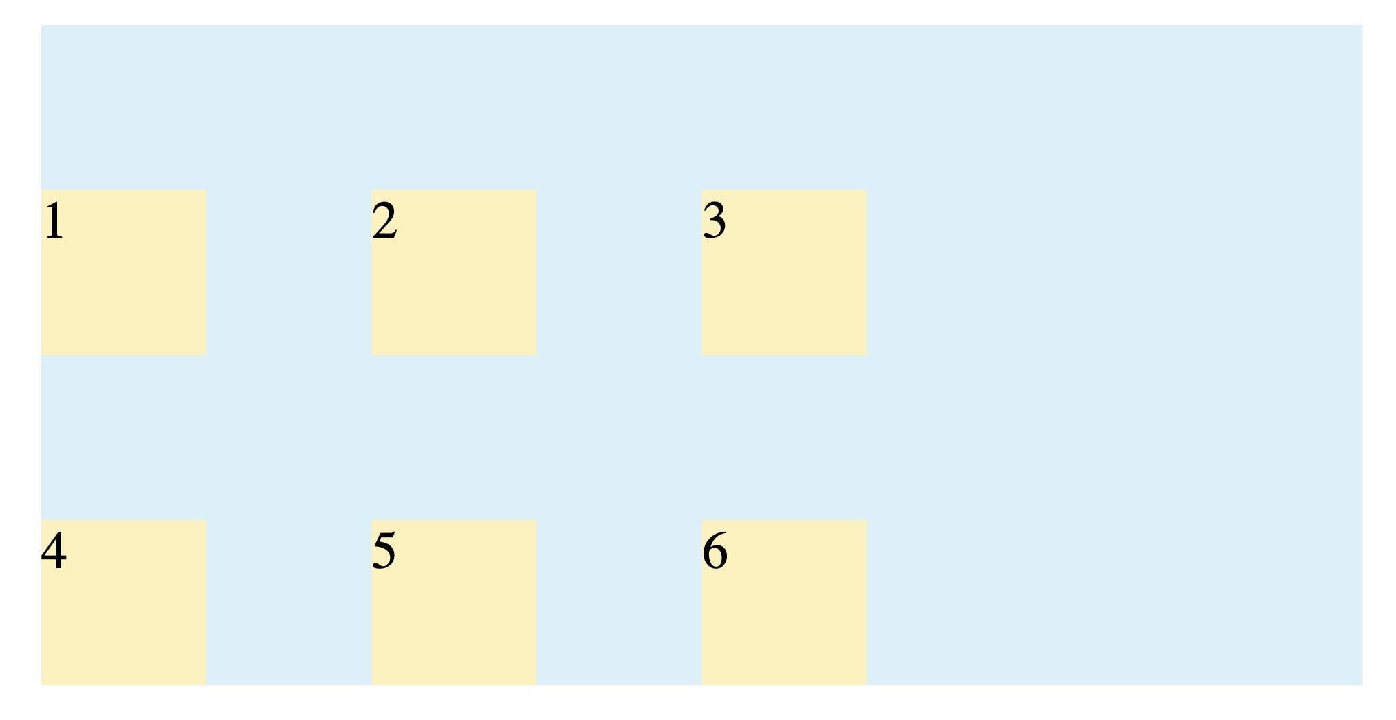
place-content (Shorthand)
This shorthand sets both align-content and justify-content. The first value is for align-content and the second is for justify-content:
.grid-container {
  place-content: end space-between;
}
Output:
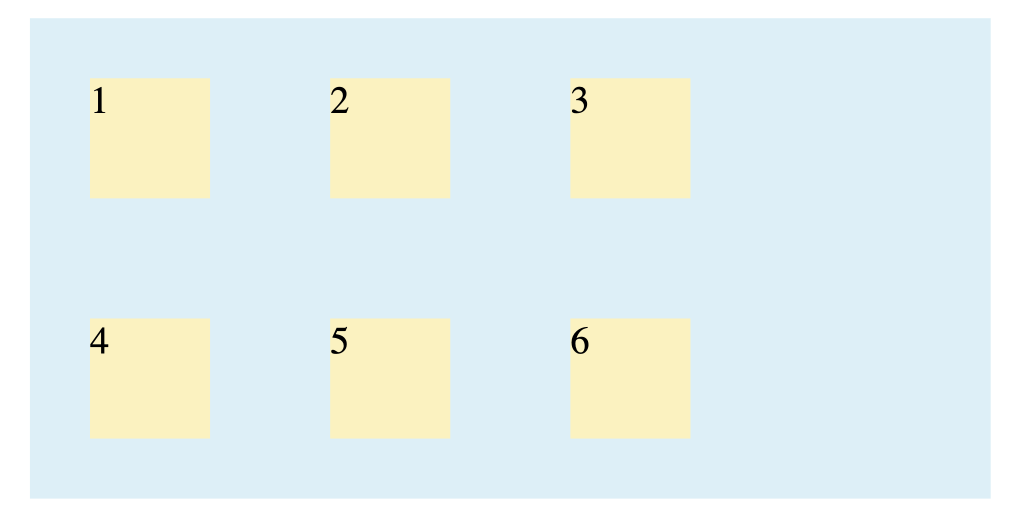
If only one value is provided, it applies to both:
.grid-container {
  place-content: center;
}
Output:
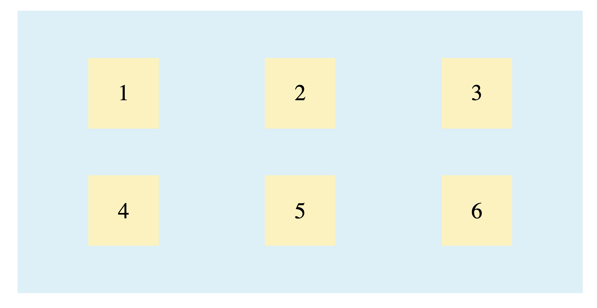
What is Aligning and Justifying the Grid Items
These properties are set on the grid container but affect how each individual grid item is positioned inside its cell.
justify-items
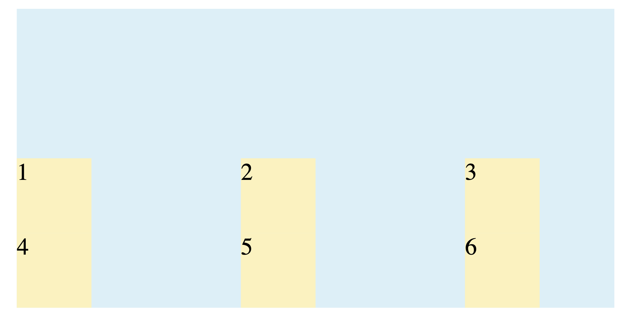
This property aligns items inside their cells along the row (inline) axis.
stretch: Stretches the item to fill the full width of the cell. (Default)start: Aligns the item to the left side of the cell.end: Aligns the item to the right side of the cell.center: Centers the item horizontally within the cell.
Example:
.grid-container {
  justify-items: center;
}
Output:
align-items
This property aligns items inside their cells along the column (block) axis.
stretch: Stretches the item to fill the full height of the cell. (Default)start: Aligns the item to the top of the cell.end: Aligns the item to the bottom of the cell.center: Centers the item vertically within the cell.
Example:
.grid-container {
  align-items: end;
}
Output:
place-items (Shorthand)
This shorthand sets both align-items and justify-items. The first value is for align-items and the second is for justify-items. It’s the easiest way to center items in their cells.
Example:
.grid-container {
  place-items: center;
}
Output:
What is Overriding Alignment for Individual Items
If you need one specific item to be aligned differently, you apply these properties directly to that grid item.
justify-self
This property overrides the container’s justify-items for a single item along the row axis. It accepts the same values: start, end, center, and stretch.
Example:
.grid-container {
  justify-items: start;
}

.grid-item:nth-child(3) {
  justify-self: end;
}
Output:
align-self
This property overrides the container’s align-items for a single item along the column axis. It accepts the same values: start, end, center, and stretch.
Example:
.grid-container {
  align-items: center;
}

.grid-item:nth-child(3) {
  align-self: start;
}
Output:
place-self (Shorthand)
This shorthand sets both align-self and justify-self on an individual item.
Example:
.grid-item:nth-child(3) {
  place-self: end end;
}
Output:
What is Combining Multiple Grid Alignment Properties
The CSS Grid alignment properties are not mutually exclusive; instead, they work together on different levels of your layout, giving you granular control over the final design.
The most important concept to remember is the division of responsibility:
*-contentproperties (justify-content,align-content) position the entire grid within the available space of the container.*-itemsproperties (justify-items,align-items) position the items inside their individual grid cells.
Here is an example that uses a combination of justify-content: space-evenly, justify-items: center, align-content: space-evenly, and align-items: center:
.grid-container {
  justify-content: space-evenly;
  justify-items: center;
  align-content: space-evenly;
  align-items: center;
  display: grid;
  grid-template-columns: 100px 100px 100px;
  grid-template-rows: auto;

  box-sizing: border-box;
  width: 400px;
  height: 200px;
  margin-left: auto;
  margin-right: auto;

  background: #dceff7;
  border: 2px rgba(114, 186, 94, 0.35);
}

.grid-item {
  box-sizing: border-box;
  width: 50px;
  height: 50px;
  background: #FBF2C0;
  border: 2px rgba(236, 198, 48, 0.5);
  display: flex;
  justify-content: center;
  align-items: center;
}
This code centers the entire grid within its container using place-content (a shorthand for justify-content and align-content) and also centers each item within its respective cell using place-items (a shorthand for justify-items and align-items):
Note: The display: flex properties on .grid-item are used here to center the text (the numbers) inside each square and are not part of the grid alignment itself.
Some Practical Real-World Examples
Let’s see some practical, real-world examples of how to use CSS Grid alignment properties to build common web components.
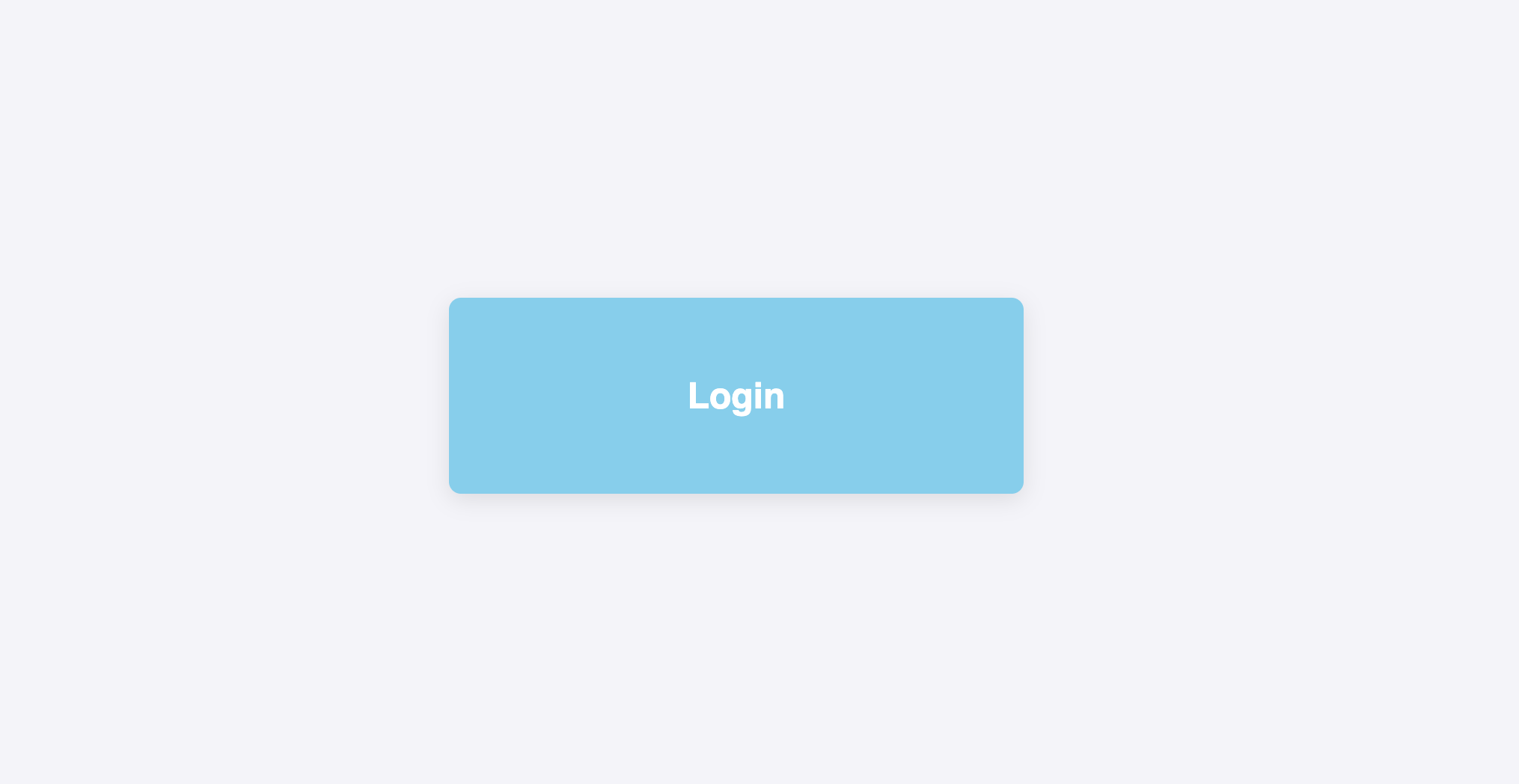
1. Perfectly Centering a Component (e.g., Login Form)
One of the most common layout tasks is centering a box in the middle of the page. CSS Grid makes this easy.
Let’s vertically and horizontally center a login form on the page.
HTML:
<!DOCTYPE html>
<html lang="en-US">
  <head>
    <meta charset="UTF-8">
    <meta name="viewport" content="width=device-width, initial-scale=1">
    <link rel="stylesheet" href="style.css">
  </head>
  <body>
    <div class="login-container">
      <h2>Login</h2>
    </div>
  </body>
</html>
CSS:
body {
  margin: 0;
  height: 100vh;
  display: grid;
  place-items: center;
  background-color: #f4f4f9;
}

.login-container {
  padding: 2rem;
  background: skyblue;
  color: white;
  box-shadow: 0 4px 15px rgba(0, 0, 0, 0.1);
  border-radius: 8px;
  width: 320px;
  display: flex;
  justify-content: center;
  align-items: center;
  font-family: sans-serif;
}
By setting the <body> to display: grid and giving it a height of 100vh, it becomes a single-cell grid that covers the entire screen. The place-items: center; shorthand then aligns the single grid item (our .login-container) to the absolute center of that cell. The display: flex properties on the .login-container itself are used to center the <h2> text inside the login box.
Here’s the output:
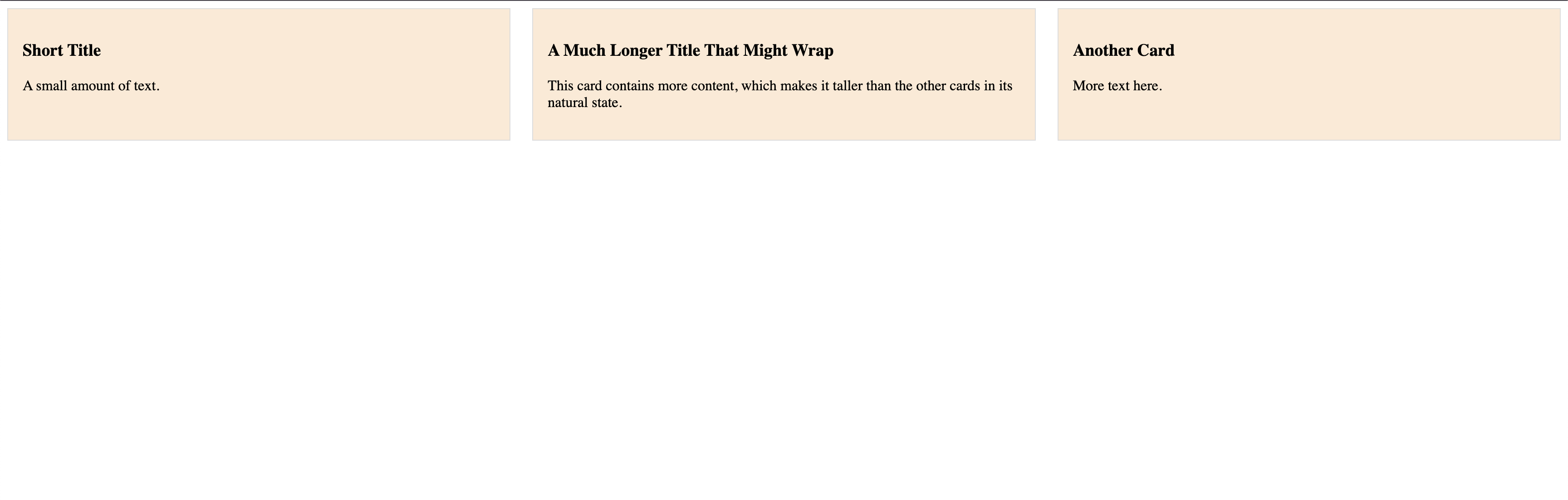
2. Creating a Responsive Card Layout
Grid is ideal for creating galleries or lists of cards that need to maintain a consistent alignment, especially when the content inside them varies in height.
Let’s create a responsive grid of cards where all cards in the same row have the same height.
HTML:
<div class="card-grid">
  <div class="card">
    <h3>Short Title</h3>
    <p>A small amount of text.</p>
  </div>
  <div class="card">
    <h3>A Much Longer Title That Might Wrap</h3>
    <p>This card contains more content, which makes it taller than the other cards in its natural state.</p>
  </div>
  <div class="card">
    <h3>Another Card</h3>
    <p>More text here.</p>
  </div>
</div>
CSS:
.card-grid {
  display: grid;
  grid-template-columns: repeat(auto-fit, minmax(250px, 1fr));
  gap: 1.5rem;
  align-items: stretch;
}

.card {
  background-color: antiquewhite;
  border: 1px solid #ddd;
  padding: 1rem;
}
align-items: stretch; is the default value for grid containers. It forces all items in a row to stretch vertically to match the height of the tallest item in that row. This creates clean, uniform rows even when the content length differs.
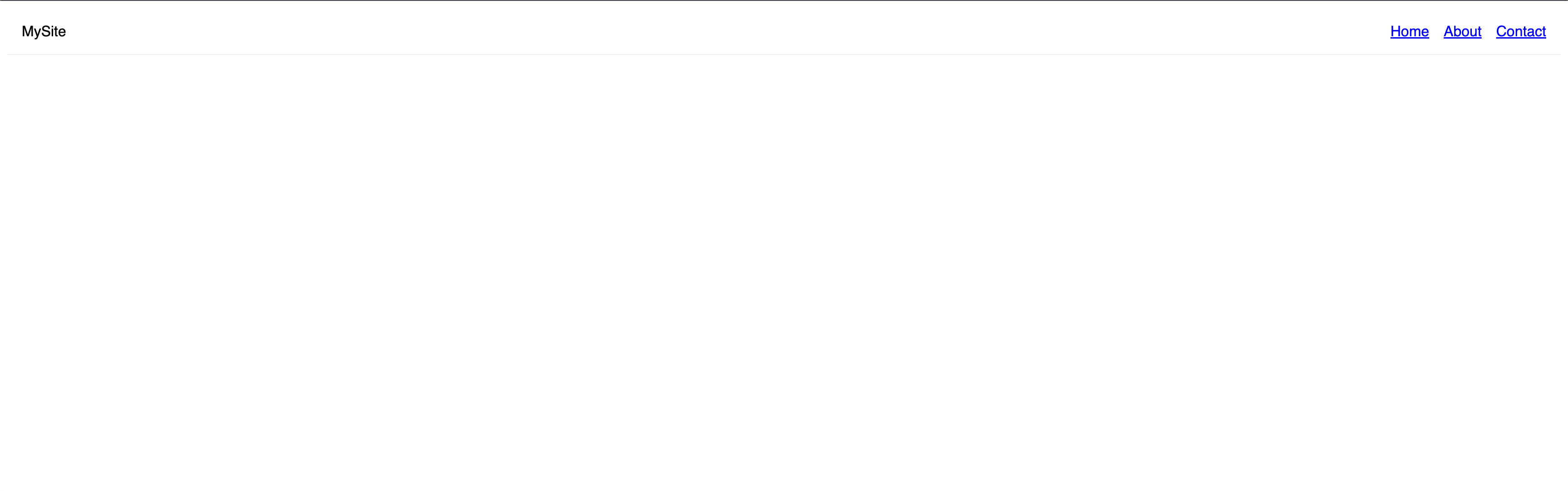
3. Website Header with Logo and Navigation
A common header layout has a logo on the left and navigation links on the right. This can be achieved easily by overriding the alignment for individual items.
Let’s align a logo to the left and a navigation menu to the right within a header.
HTML:
<header class="main-header">
  <div class="logo">MySite</div>
  <nav class="main-nav">
    <ul>
      <li><a href="#">Home</a></li>
      <li><a href="#">About</a></li>
      <li><a href="#">Contact</a></li>
    </ul>
  </nav>
</header>
CSS:
.main-header {
  font-family: sans-serif;
  display: grid;
  grid-template-columns: auto 1fr;
  align-items: center;
  padding: 1rem;
  border-bottom: 1px solid #eee;
}

.main-nav {
  justify-self: end;
}

.main-nav ul {
  list-style: none;
  margin: 0;
  padding: 0;
  display: flex;
  gap: 1rem;
}
The header is a grid with two columns. align-items: center; centers both the logo and the nav vertically. We then apply justify-self: end; directly to the <nav> element, which overrides the default alignment and pushes it to the end (the right side) of its grid area.
Accessibility and Performance Considerations
While CSS Grid is a powerful tool, it’s important to use it responsibly to ensure your layouts are accessible to all users and perform well on all devices.
Accessibility (a11y)
The most critical rule for accessibility in CSS Grid is to maintain a logical source order.
Screen readers and keyboard navigation (using the Tab key) follow the order of elements in your HTML document, not the visual order you create with CSS. Grid makes it easy to rearrange items visually, but doing so can create a confusing and frustrating experience for users who rely on assistive technologies.
Example of a Problematic Layout
Imagine a form where the HTML is structured logically, but CSS Grid rearranges it visually.
HTML:
<form class="bad-form">
  <label for="email">Email</label>
  <input type="email" id="email">
  <button>Submit</button>
</form>
CSS:
.bad-form {
  display: grid;
}
.bad-form button {
  grid-row: 1;
}
.bad-form label, .bad-form input {
  grid-row: 2;
}
Here, a sighted user sees the "Submit" button first. However, a keyboard user will Tab to the "Email" input first, because that’s its order in the HTML source. This disconnect between the visual order and the DOM order is a major accessibility issue.
Best Practice: Always ensure your HTML source order makes sense on its own. Use CSS Grid to enhance the layout, not to fundamentally change the logical flow of your content.
Performance
CSS Grid is highly optimized and generally very performant. The browser’s layout engine is designed to handle it efficiently. Most performance issues arise not from Grid itself, but from how it’s used.
-
Avoid Animating Grid Tracks: Do not try to animate the
grid-template-columnsorgrid-template-rowsproperties (e.g., trying to transition a column from1frto2fr). Animating these properties forces the browser to recalculate the entire grid layout on every frame of the animation, which is computationally expensive and leads to janky, slow animations.- Better Alternative: If you need to animate an item’s position or size, use the CSS
transformproperty (transform: translate(x, y);,transform: scale(n);). Transforms are handled by the browser’s compositor thread and are much cheaper to animate, resulting in smooth performance.
- Better Alternative: If you need to animate an item’s position or size, use the CSS
-
Keep Nesting Reasonable: While you can nest grids within grids, creating an excessively deep or complex nested structure can slow down the initial page render as the browser has more layout calculations to perform. This is a general best practice for any complex DOM, not just Grid.
Best Practices for Grid Alignment
To write clean, efficient, and maintainable layouts, keep these best practices in mind.
Prioritize a Logical Source Order
This is the most important rule. Always structure your HTML so it makes sense and is navigable without any CSS. Use Grid to visually enhance that logical flow, not to rearrange it. This ensures your site is accessible to keyboard and screen reader users.
Use Shorthand Properties
Embrace the shorthand properties for cleaner code.
- Use
place-contentto setalign-contentandjustify-contenttogether. - Use
place-itemsto setalign-itemsandjustify-itemstogether. This is the fastest way to center items in their cells (place-items: center;). - Use
place-selfto control an individual item’s alignment in one declaration.
Know the Difference: Container vs. Item
Always remember what you are trying to align:
- To position the entire grid within its container, use the
*-contentproperties. - To position items inside their cells, use the
*-itemsand*-selfproperties.
Let the Browser Do the Work with fr
For flexible and responsive layouts, use the fractional (fr) unit for your grid tracks (grid-template-columns and grid-template-rows). It automatically calculates space distribution, saving you from complex manual calculations.
Use the Right Tool for the Job
While Grid is powerful, it’s designed for two-dimensional layouts (rows and columns). For simple, one-dimensional layouts (just a row or just a column), Flexbox is often a more straightforward and appropriate tool.
Animate transform, Not Grid Tracks
If you need to animate an item’s position, always use the transform property (e.g., transform: translateX(10px);). Animating grid-template-columns or rows forces expensive browser recalculations and leads to poor performance.
Frequently Asked Questions (FAQs)
1. What’s the difference between justify-content and justify-items?
This is the most common point of confusion.
justify-contentaligns the entire grid inside the container along the row axis. It only works if there’s extra space in the container. Think of it as positioning a whole bookshelf in a room.justify-itemsaligns the individual items inside their respective grid cells along the row axis. Think of it as arranging the books on each shelf.
2. What is the easiest way to center a div on a page?
We can do this by making the div’s parent container a grid and using place-items: center. For example, to center a div in the middle of the screen:
body {
  height: 100vh;
  display: grid;
  place-items: center;
}
Alternatively, you can use place-content: center to center the entire grid within its container, or combine justify-items: center and align-items: center for more explicit control.
3. When to use Grid instead of Flexbox for alignment?
Use Grid for two-dimensional layouts: when you need to control alignment across both rows and columns at the same time. Use Flexbox for one-dimensional layouts: aligning items in a single line, either as a row or a column.
4. What’s the difference between place-items and place-content?
place-itemsis shorthand foralign-itemsandjustify-items- it controls how individual grid items are positioned within their grid areas.place-contentis shorthand foralign-contentandjustify-content- it controls how the entire grid is positioned within its container.
5. Is CSS Grid alignment supported in all browsers?
Yes, modern browsers (Chrome, Firefox, Safari, Edge) have excellent support for CSS Grid alignment properties. However, some older browsers (like Internet Explorer) may lack support for newer shorthand properties like place-items.
Use @supports or fallback techniques when targeting older environments.
Conclusion
You’ve now explored all of CSS Grid’s alignment properties, from positioning the entire grid with place-content to arranging items within their cells using place-items and place-self. By understanding the fundamental distinction between aligning the container and its items, you can now build complex, responsive, and pixel-perfect layouts with more control and cleaner code than ever before.
The next step is to experiment. Try building the practical examples, tweak the values, and begin applying these powerful tools to your own projects to truly master them.
To explore and learn more about CSS Grids, check out the following articles:
Thanks for learning with the DigitalOcean Community. Check out our offerings for compute, storage, networking, and managed databases.
About the author(s)
Alligator.io is a developer-focused resource that offers tutorials and insights on a wide range of modern front-end technologies, including Angular 2+, Vue.js, React, TypeScript, Ionic, and JavaScript.
With over 6 years of experience in tech publishing, Mani has edited and published more than 75 books covering a wide range of data science topics. Known for his strong attention to detail and technical knowledge, Mani specializes in creating clear, concise, and easy-to-understand content tailored for developers.
Still looking for an answer?
This textbox defaults to using Markdown to format your answer.
You can type !ref in this text area to quickly search our full set of tutorials, documentation & marketplace offerings and insert the link!
 This work is licensed under a Creative Commons Attribution-NonCommercial- ShareAlike 4.0 International License.
Become a contributor for community
Get paid to write technical tutorials and select a tech-focused charity to receive a matching donation.

DigitalOcean Documentation
Full documentation for every DigitalOcean product.

Resources for startups and AI-native businesses
The Wave has everything you need to know about building a business, from raising funding to marketing your product.
The developer cloud
Scale up as you grow — whether you're running one virtual machine or ten thousand.

Start building today
From GPU-powered inference and Kubernetes to managed databases and storage, get everything you need to build, scale, and deploy intelligent applications.
