
Introduction
The Python pandas package is used for data manipulation and analysis, designed to let you work with labeled or relational data in an intuitive way.
The pandas package offers spreadsheet functionality, but because you’re working with Python, it is much faster and more efficient than a traditional graphical spreadsheet program.
In this tutorial, we’ll go over setting up a large data set to work with, the groupby() and pivot_table() functions of pandas, and finally how to visualize data.
To get some familiarity on the pandas package, you can read our tutorial An Introduction to the pandas Package and its Data Structures in Python 3.
Prerequisites
This guide will cover how to work with data in pandas on either a local desktop or a remote server. Working with large datasets can be memory intensive, so in either case, the computer will need at least 2GB of memory to perform some of the calculations in this guide.
For this tutorial, we’ll be using Jupyter Notebook to work with the data. If you do not have it already, you should follow our tutorial to install and set up Jupyter Notebook for Python 3.
Setting Up Data
For this tutorial, we’re going to be working with United States Social Security data on baby names that is available from the Social Security website as an 8MB zip file.
Let’s activate our Python 3 programming environment on our local machine, or on our server from the correct directory:
- cd environments
- . my_env/bin/activate
Now let’s create a new directory for our project. We can call it names and then move into the directory:
- mkdir names
- cd names
Within this directory, we can pull the zip file from the Social Security website with the curl command:
- curl -O https://www.ssa.gov/oact/babynames/names.zip
Once the file is downloaded, let’s verify that we have all the packages installed that we’ll be using:
numpyto support multi-dimensional arraysmatplotlibto visualize datapandasfor our data analysisseabornto make our matplotlib statistical graphics more aesthetic
If you don’t have any of the packages already installed, install them with pip, as in:
- pip install pandas
- pip install matplotlib
- pip install seaborn
The numpy package will also be installed if you don’t have it already.
Now we can start up Jupyter Notebook:
- jupyter notebook
Once you are on the web interface of Jupyter Notebook, you’ll see the names.zip file there.
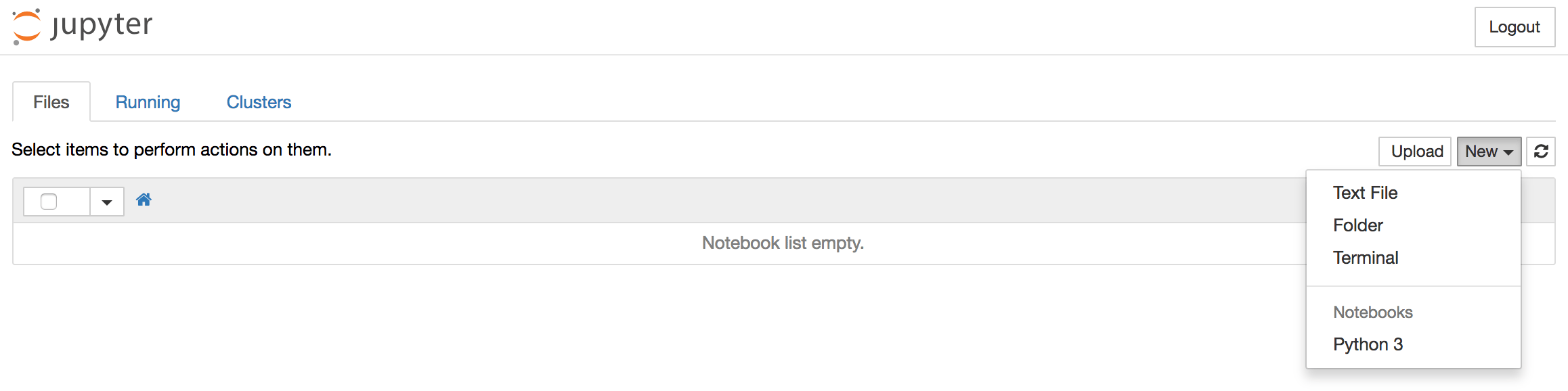
To create a new notebook file, select New > Python 3 from the top right pull-down menu:
This will open a notebook.
Let’s start by importing the packages we’ll be using. At the top of our notebook, we should write the following:
import numpy as np
import matplotlib.pyplot as pp
import pandas as pd
import seaborn
We can run this code and move into a new code block by typing ALT + ENTER.
Let’s also tell Python Notebook to keep our graphs inline:
matplotlib inline
Let’s run the code and continue by typing ALT + ENTER.
From here, we’ll move on to uncompress the zip archive, load the CSV dataset into pandas, and then concatenate pandas DataFrames.
Uncompress Zip Archive
To uncompress the zip archive into the current directory, we’ll import the zipfile module and then call the ZipFile function with the name of the file (in our case names.zip):
import zipfile
zipfile.ZipFile('names.zip').extractall('.')
We can run the code and continue by typing ALT + ENTER.
Now if you look back into your names directory, you’ll have .txt files of name data in CSV format. These files will correspond with the years of data on file, 1881 through 2015. Each of these files follow a similar naming convention. The 2015 file, for example, is called yob2015.txt, while the 1927 file is called yob1927.txt.
To look at the format of one of these files, let’s use Python to open one and display the top 5 lines:
open('yob2015.txt','r').readlines()[:5]
Run the code and continue with ALT + ENTER.
Output['Emma,F,20355\n',
 'Olivia,F,19553\n',
 'Sophia,F,17327\n',
 'Ava,F,16286\n',
 'Isabella,F,15504\n']
The way that the data is formatted is name first (as in Emma or Olivia), sex next (as in F for female name and M for male name), and then the number of babies born that year with that name (there were 20,355 babies named Emma who were born in 2015).
With this information, we can load the data into pandas.
Load CSV Data into pandas
To load comma-separated values data into pandas we’ll use the pd.read_csv() function, passing the name of the text file as well as column names that we decide on. We’ll assign this to a variable, in this case names2015 since we’re using the data from the 2015 year of birth file.
names2015 = pd.read_csv('yob2015.txt', names = ['Name', 'Sex', 'Babies'])
Type ALT + ENTER to run the code and continue.
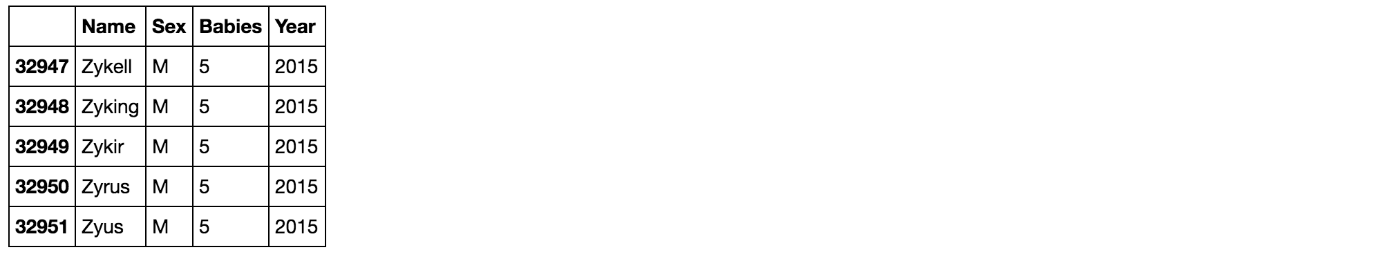
To make sure that this worked out, let’s display the top of the table:
names2015.head()
When we run the code and continue with ALT + ENTER, we’ll see output that looks like this:

Our table now has information of the names, sex, and numbers of babies born with each name organized by column.
Concatenate pandas Objects
Concatenating pandas objects will allow us to work with all the separate text files within the names directory.
To concatenate these, we’ll first need to initialize a list by assigning a variable to an unpopulated list data type:
all_years = []
Once we’ve done that, we’ll use a for loop to iterate over all the files by year, which range from 1880-2015. We’ll add +1 to the end of 2015 so that 2015 is included in the loop.
all_years = []

for year in range(1880, 2015+1):
Within the loop, we’ll append to the list each of the text file values, using a string formatter to handle the different names of each of these files. We’ll pass those values to the year variable. Again, we’ll specify columns for Name, Sex, and the number of Babies:
all_years = []

for year in range(1880, 2015+1):
    all_years.append(pd.read_csv('yob{}.txt'.format(year),
                                 names = ['Name', 'Sex', 'Babies']))
Additionally, we’ll create a column for each of the years to keep those ordered. This we can do after each iteration by using the index of -1 to point to them as the loop progresses.
all_years = []

for year in range(1880, 2015+1):
    all_years.append(pd.read_csv('yob{}.txt'.format(year),
                                 names = ['Name', 'Sex', 'Babies']))
    all_years[-1]['Year'] = year
Finally, we’ll add it to the pandas object with concatenation using the pd.concat() function. We’ll use the variable all_names to store this information.
all_years = []

for year in range(1880, 2015+1):
    all_years.append(pd.read_csv('yob{}.txt'.format(year),
                                 names = ['Name', 'Sex', 'Babies']))
    all_years[-1]['Year'] = year

all_names = pd.concat(all_years)
We can run the loop now with ALT + ENTER, and then inspect the output by calling for the tail (the bottom-most rows) of the resulting table:
all_names.tail()
Our data set is now complete and ready for doing additional work with it in pandas.
Grouping Data
With pandas you can group data by columns with the .groupby() function. Using our all_names variable for our full dataset, we can use groupby() to split the data into different buckets.
Let’s group the dataset by sex and year. We can set this up like so:
group_name = all_names.groupby(['Sex', 'Year'])
We can run the code and continue with ALT + ENTER.
At this point if we just call the group_name variable we’ll get this output:
Output<pandas.core.groupby.DataFrameGroupBy object at 0x1187b82e8>
This shows us that it is a DataFrameGroupBy object. This object has instructions on how to group the data, but it does not give instructions on how to display the values.
To display values we will need to give instructions. We can calculate .size(), .mean(), and .sum(), for example, to return a table.
Let’s start with .size():
group_name.size()
When we run the code and continue with ALT + ENTER, our output will look like this:
OutputSex  Year
F    1880      942
     1881      938
     1882     1028
     1883     1054
     1884     1172
...
This data looks good, but it could be more readable. We can make it more readable by appending the .unstack function:
group_name.size().unstack()
Now when we run the code and continue by typing ALT + ENTER, the output looks like this:
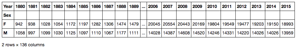
What this data tells us is how many female and male names there were for each year. In 1889, for example, there were 1,479 female names and 1,111 male names. In 2015 there were 18,993 female names and 13,959 male names. This shows that there is a greater diversity in names over time.
If we want to get the total number of babies born, we can use the .sum() function. Let’s apply that to a smaller dataset, the names2015 set from the single yob2015.txt file we created before:
names2015.groupby(['Sex']).sum()
Let’s type ALT + ENTER to run the code and continue:
![names2015.groupby(['Sex']).sum() output](https://assets.digitalocean.com/articles/eng_python/pandas/names2015-groupby-sex-sum-w.png)
This shows us the total number of male and female babies born in 2015, though only babies whose name was used at least 5 times that year are counted in the dataset.
The pandas .groupby() function allows us to segment our data into meaningful groups.
Pivot Table
Pivot tables are useful for summarizing data. They can automatically sort, count, total, or average data stored in one table. Then, they can show the results of those actions in a new table of that summarized data.
In pandas, the pivot_table() function is used to create pivot tables.
To construct a pivot table, we’ll first call the DataFrame we want to work with, then the data we want to show, and how they are grouped.
In this example, we’ll work with the all_names data, and show the Babies data grouped by Name in one dimension and Year on the other:
pd.pivot_table(all_names, 'Babies', 'Name', 'Year')
When we type ALT + ENTER to run the code and continue, we’ll see the following output:
Because this shows a lot of empty values, we may want to keep Name and Year as columns rather than as rows in one case and columns in the other. We can do that by grouping the data in square brackets:
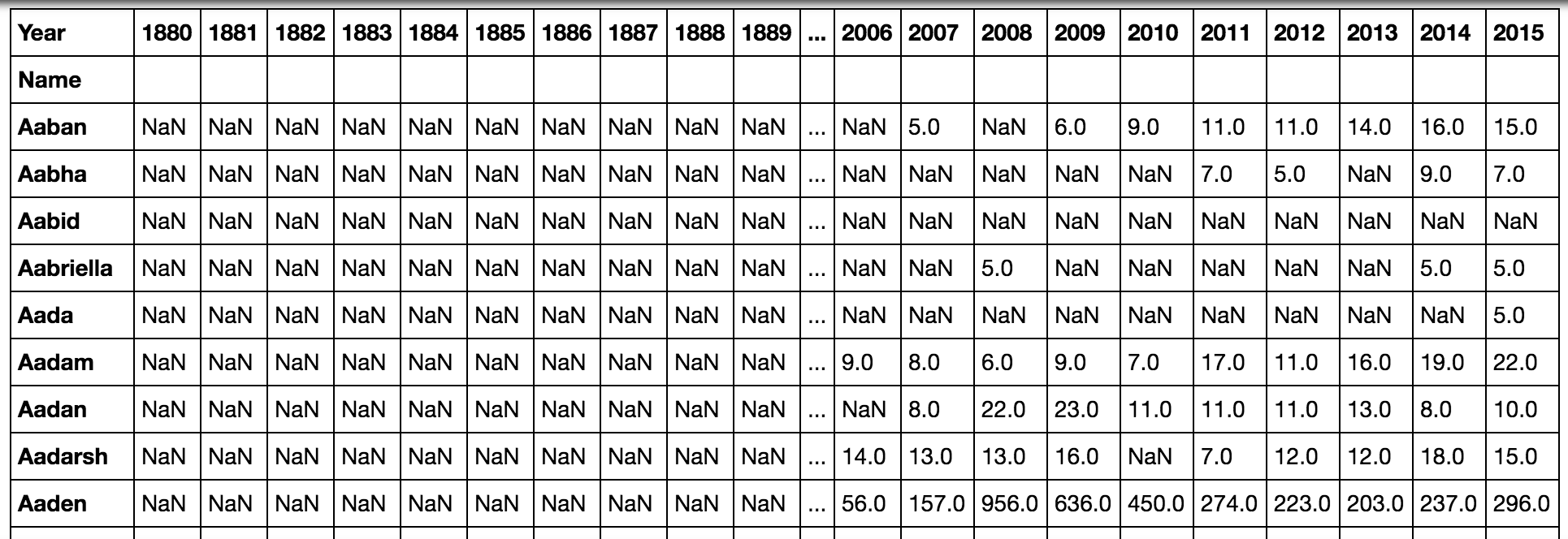
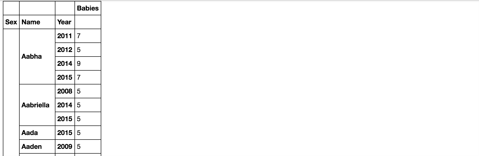
pd.pivot_table(all_names, 'Babies', ['Name', 'Year'])
Once we type ALT + ENTER to run the code and continue, this table will now only show data for years that are on record for each name:
OutputName       Year
Aaban      2007     5.0
           2009     6.0
           2010     9.0
           2011    11.0
           2012    11.0
           2013    14.0
           2014    16.0
           2015    15.0
Aabha      2011     7.0
           2012     5.0
           2014     9.0
           2015     7.0
Aabid      2003     5.0
Aabriella  2008     5.0
           2014     5.0
           2015     5.0
Additionally, we can group data to have Name and Sex as one dimension, and Year on the other, as in:
pd.pivot_table(all_names, 'Babies', ['Name', 'Sex'], 'Year')
When we run the code and continue with ALT + ENTER, we’ll see the following table:
![pd.pivot_table(all_names, 'Babies', ['Name', 'Sex'], 'Year') output](https://assets.digitalocean.com/articles/eng_python/pandas/pivot-babies-name-sex-year.png)
Pivot tables let us create new tables from existing tables, allowing us to decide how we want that data grouped.
Visualize Data
By using pandas with other packages like matplotlib we can visualize data within our notebook.
We’ll be visualizing data about the popularity of a given name over the years. In order to do that, we need to set and sort indexes to rework the data that will allow us to see the changing popularity of a particular name.
The pandas package lets us carry out hierarchical or multi-level indexing which lets us store and manipulate data with an arbitrary number of dimensions.
We’re going to index our data with information on Sex, then Name, then Year. We’ll also want to sort the index:
all_names_index = all_names.set_index(['Sex','Name','Year']).sort_index()
Type ALT + ENTER to run and continue to our next line, where we’ll have the notebook display the new indexed DataFrame:
all_names_index
Run the code and continue with ALT + ENTER, and the output will look like this:
Next, we’ll want to write a function that will plot the popularity of a name over time. We’ll call the function name_plot and pass sex and name as its parameters that we will call when we run the function.
def name_plot(sex, name):
We’ll now set up a variable called data to hold the table we have created. We’ll also use the pandas DataFrame loc in order to select our row by the value of the index. In our case, we’ll want loc to be based on a combination of fields in the MultiIndex, referring to both the sex and name data.
Let’s write this construction into our function:
def name_plot(sex, name):
    data = all_names_index.loc[sex, name]
Finally, we’ll want to plot the values with matplotlib.pyplot which we imported as pp. We’ll then plot the values of the sex and name data against the index, which for our purposes is years.
def name_plot(sex, name):
    data = all_names_index.loc[sex, name]

    pp.plot(data.index, data.values)
Type ALT + ENTER to run and move into the next cell. We can now call the function with the sex and name of our choice, such as F for female name with the given name Danica.
name_plot('F', 'Danica')
When you type ALT + ENTER now, you’ll receive the following output:
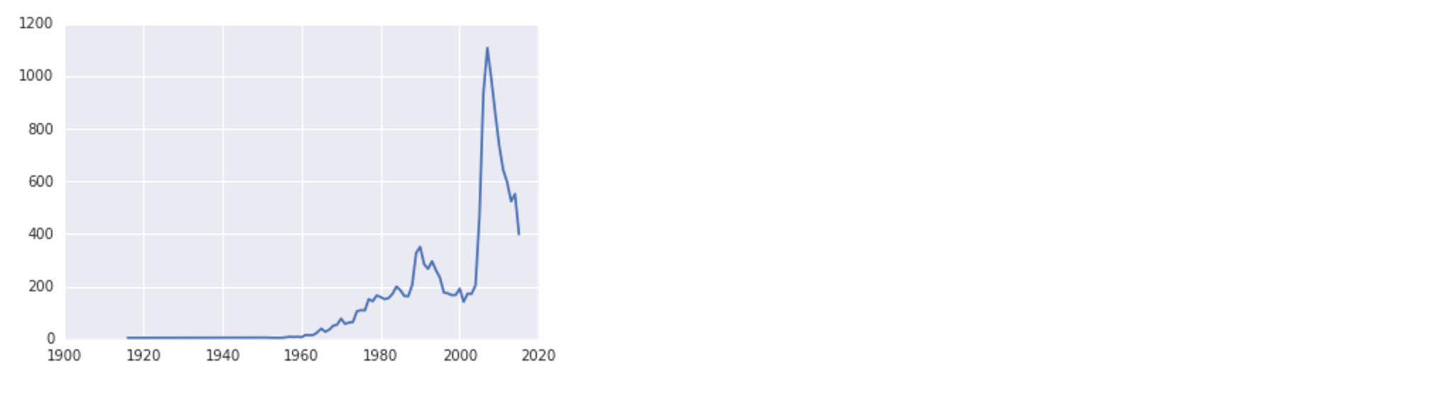
Note that depending on what system you’re using you may have a warning about a font substitution, but the data will still plot correctly.
Looking at the visualization, we can see that the female name Danica had a small rise in popularity around 1990, and peaked just before 2010.
The function we created can be used to plot data from more than one name, so that we can see trends over time across different names.
Let’s start by making our plot a little bit larger:
pp.figure(figsize = (18, 8))
Next, let’s create a list with all the names we would like to plot:
pp.figure(figsize = (18, 8))

names = ['Sammy', 'Jesse', 'Drew', 'Jamie']
Now, we can iterate through the list with a for loop and plot the data for each name. First, we’ll try these gender neutral names as female names:
pp.figure(figsize = (18, 8))

names = ['Sammy', 'Jesse', 'Drew', 'Jamie']

for name in names:
    name_plot('F', name)
To make this data easier to understand, let’s include a legend:
pp.figure(figsize = (18, 8))

names = ['Sammy', 'Jesse', 'Drew', 'Jamie']

for name in names:
    name_plot('F', name)

pp.legend(names)
We’ll type ALT + ENTER to run the code and continue, and then we’ll receive the following output:
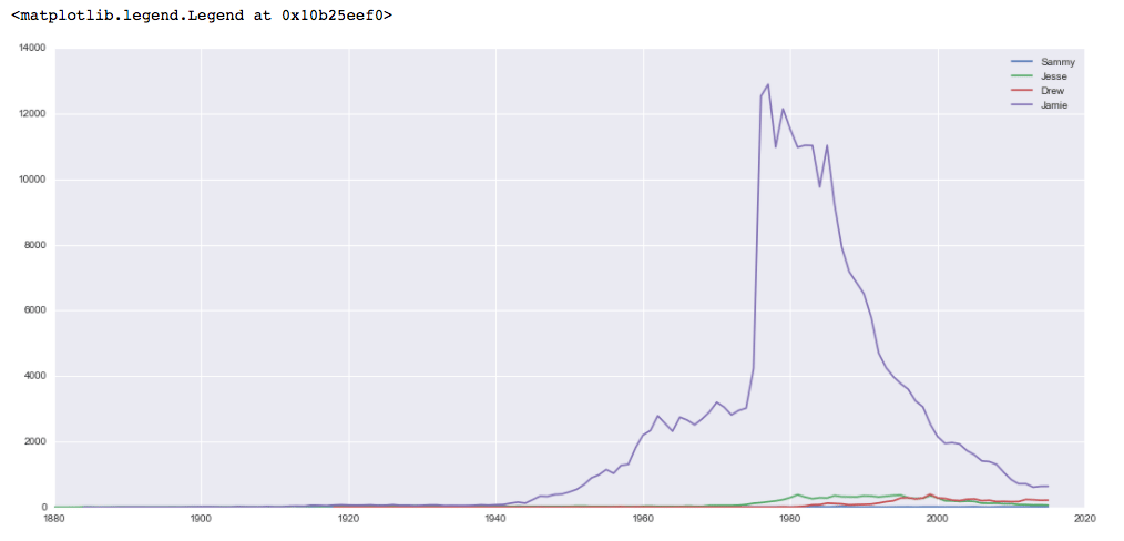
While each of the names has been slowly gaining popularity as female names, the name Jamie was overwhelmingly popular as a female name in the years around 1980.
Let’s plot the same names but this time as male names:
pp.figure(figsize = (18, 8))

names = ['Sammy', 'Jesse', 'Drew', 'Jamie']

for name in names:
    name_plot('M', name)

pp.legend(names)
Again, type ALT + ENTER to run the code and continue. The graph will look like this:
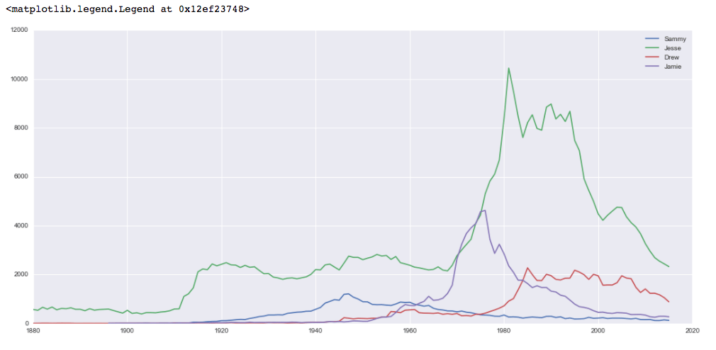
This data shows more popularity across names, with Jesse being generally the most popular choice, and being particularly popular in the 1980s and 1990s.
From here, you can continue to play with name data, create visualizations about different names and their popularity, and create other scripts to look at different data to visualize.
Conclusion
This tutorial introduced you to ways of working with large data sets from setting up the data, to grouping the data with groupby() and pivot_table(), indexing the data with a MultiIndex, and visualizing pandas data using the matplotlib package.
Many organizations and institutions provide data sets that you can work with to continue to learn about pandas and data visualization. The US government provides data through data.gov, for example.
You can learn more about visualizing data with matplotlib by following our guides on How to Plot Data in Python 3 Using matplotlib and How To Graph Word Frequency Using matplotlib with Python 3.
Thanks for learning with the DigitalOcean Community. Check out our offerings for compute, storage, networking, and managed databases.
About the author
Community and Developer Education expert. Former Senior Manager, Community at DigitalOcean. Focused on topics including Ubuntu 22.04, Ubuntu 20.04, Python, Django, and more.
Still looking for an answer?
This textbox defaults to using Markdown to format your answer.
You can type !ref in this text area to quickly search our full set of tutorials, documentation & marketplace offerings and insert the link!
Thank you very much for this wonderful illustration of Python Pivot based Data Analysis
Loving this series! But when I define the name_plot func and call it, I get the following dump in Jupyter. If you monitor this and could take a look I’d appreciate it :D Thanks!
def name_plot(sex, name): data = all_names_index.loc[sex, name]
pp.plot(data.index, data.values)
name_plot(‘F’, ‘Danica’)
IndexError Traceback (most recent call last) <ipython-input-41-7fd3b7ee1305> in <module> ----> 1 name_plot(‘F’, ‘Danica’)
<ipython-input-40-05b95fd22389> in name_plot(sex, name) 2 data = all_names_index.loc[sex, name] 3 ----> 4 pp.plot(data.index, data.values)
~/deeplearning/deeplearning/lib/python3.6/site-packages/matplotlib/pyplot.py in plot(scalex, scaley, data, *args, **kwargs) 2793 return gca().plot( 2794 *args, scalex=scalex, scaley=scaley, **({“data”: data} if data -> 2795 is not None else {}), **kwargs) 2796 2797
~/deeplearning/deeplearning/lib/python3.6/site-packages/matplotlib/axes/_axes.py in plot(self, scalex, scaley, data, *args, **kwargs) 1664 “”" 1665 kwargs = cbook.normalize_kwargs(kwargs, mlines.Line2D._alias_map) -> 1666 lines = [*self._get_lines(*args, data=data, **kwargs)] 1667 for line in lines: 1668 self.add_line(line)
~/deeplearning/deeplearning/lib/python3.6/site-packages/matplotlib/axes/_base.py in call(self, *args, **kwargs) 223 this += args[0], 224 args = args[1:] –> 225 yield from self._plot_args(this, kwargs) 226 227 def get_next_color(self):
~/deeplearning/deeplearning/lib/python3.6/site-packages/matplotlib/axes/_base.py in _plot_args(self, tup, kwargs) 397 func = self._makefill 398 –> 399 ncx, ncy = x.shape[1], y.shape[1] 400 if ncx > 1 and ncy > 1 and ncx != ncy: 401 cbook.warn_deprecated(
IndexError: tuple index out of range
 This work is licensed under a Creative Commons Attribution-NonCommercial- ShareAlike 4.0 International License.
Become a contributor for community
Get paid to write technical tutorials and select a tech-focused charity to receive a matching donation.

DigitalOcean Documentation
Full documentation for every DigitalOcean product.

Resources for startups and AI-native businesses
The Wave has everything you need to know about building a business, from raising funding to marketing your product.
The developer cloud
Scale up as you grow — whether you're running one virtual machine or ten thousand.

Start building today
From GPU-powered inference and Kubernetes to managed databases and storage, get everything you need to build, scale, and deploy intelligent applications.
