
Material Design is Google’s design language for the web centered around cards, grid-based layouts, and responsive animations. With Material-UI, a compact, customizable, and beautiful collection of components and utilities for React, putting the Material Design spec to use in your React app is a breeze.
This post will cover the setup, usage, and theming of Material-UI with its custom approach to styling components with CSS-in-JS. This post covers Material-UI v1.x.
Setup
Use npm or yarn to install @material-ui/core.
$ yarn add @material-ui/core

# or, using npm:
$ npm install @material-ui/core
After installation, material-ui is available for import:
import Button from '@material-ui/core/Button';
import Card from '@material-ui/core/Card';
Fonts
As the Material Design spec was created with Roboto and Material Icons in mind, you might want to include them in your design. In this example, we’ll load them both from Google Fonts.
<link rel="stylesheet"
  href=“https://fonts.googleapis.com/css?family=Roboto:400,500">
<link rel="stylesheet"
  href=“https://fonts.googleapis.com/icon?family=Material+Icons">
Usage
The Material-UI library is composed of React components for layout, forms, navigation, and miscellaneous widgets. Let’s go over some of them here.
Button
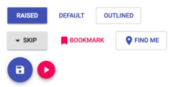
The simplest of these components is the Button, imported from @material-ui/core/Button, which produces a nifty ripple effect when clicked. Like the native HTML <button>, Buttons may contain text, icons, or any other React nodes. In the following example, the icons are imported from @material-ui/core/Icon.
<Button variant="outlined" color="primary" onClick={…}>
  <Icon>location_on</Icon>
  Find me
</Button>
Notable props for the Button component include:
- variant: The visual style of the component, either
contained,outlined,fab, or empty for the default link-style. - color: One of
primary,secondary, ordefault, which is the same color as if it’s left empty. We’ll cover the customization of these colors later. - mini: If the variant is set to
fab(floating action button), then the size of the button is reduced.
All of the styles in the picture above were achieved using only these three props! The Button component also supports common props like className, aria-label, disabled, and href.
TextField
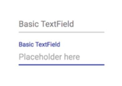
<TextField
  label="Basic TextField" />
<TextField
  placeholder="Placeholder here"
  label="Basic TextField" />
The TextField, imported from @material-ui/core/TextField, behaves like your standard React input component and supports the following props (among others):
- label: The animated label above the text input. When the component is focused, it moves above the input like the second example in the above screenshot.
- placeholder: The gray text placeholder inside of the input.
- InputProps: Props to pass to the contained Input component.
Below is an example of using the InputProps prop to pass props to the Input component:
<TextField label="Length"
  InputProps={{
    endAdornment: <InputAdornment position="end">in.</InputAdornment>,
  }}
/>
As you can see, the inner Input component can take a startAdornment and endAdornment: Cosmetic nodes at the left and right of the input such as icons or labels.
The adornments take an <InputAdornment> element as a prop. The above example is a text input with an in. cosmetic adornment on the right side.
Theming
Material-UI uses a JavaScript-based approach to theming its components called CSS-in-JS. With this approach, CSS classnames are generated using JavaScript objects. If you’ve ever used React’s style prop, these objects might look familiar to you.
const styles = theme => ({
  container: {
    backgroundColor: 'blue',
    color: 'red',
    width: '75%',
    height: 5 * theme.spacing.unit
  }
});
In this example, styles is a function that takes the theme as a parameter and returns a style object named container. Camel-cased CSS keys are assigned to string or numeric values, and the theme has customizable spacing.
Using generated classes
To pass the styles object to our component, we use the withStyles function to return a higher-order component that passes our classnames as a prop called classes.
const MyComponent = (props) => {
  const classes = props.classes;
  return (
    <div className={classes.container}>
      // stuff
    </div>
  );
}

export default withStyles(styles)(MyComponent);
Creating a custom theme
To create a custom theme, use the createMuiTheme function and pass its return value to an MuiThemeProvider element at the root of your App.
import { createMuiTheme, MuiThemeProvider } from '@material-ui/core/styles';

const theme = createMuiTheme();

const App = props => (
  <MuiThemeProvider theme={theme}>
    // your app
  </MuiThemeProvider>
);
Now all children of the MuiThemeProvider have a uniformly customizable style!
The createMuiTheme function usually takes an object to define the theme:
const theme = createMuiTheme({
  palette: {
    primary: '#e89eef',
    secondary: '#336b87'
  }
});
All colors, including the primary and secondary colors we used earlier in the tutorial, are themeable. The full range of options can be found in the theming documentation.
Material-UI is a great way to add a polished look and feel to the controls of your React site with little effort. If you’d like to learn more about the project, you can visit the official documentation here, or learn about contributing here.
Thanks for learning with the DigitalOcean Community. Check out our offerings for compute, storage, networking, and managed databases.
About the author
Still looking for an answer?
This textbox defaults to using Markdown to format your answer.
You can type !ref in this text area to quickly search our full set of tutorials, documentation & marketplace offerings and insert the link!
 This work is licensed under a Creative Commons Attribution-NonCommercial- ShareAlike 4.0 International License.
Become a contributor for community
Get paid to write technical tutorials and select a tech-focused charity to receive a matching donation.

DigitalOcean Documentation
Full documentation for every DigitalOcean product.

Resources for startups and AI-native businesses
The Wave has everything you need to know about building a business, from raising funding to marketing your product.
The developer cloud
Scale up as you grow — whether you're running one virtual machine or ten thousand.

Start building today
From GPU-powered inference and Kubernetes to managed databases and storage, get everything you need to build, scale, and deploy intelligent applications.
