By Erin Glass
Senior Manager, DevEd
")
Introduction
In this tutorial, you will recreate the “Employment” section of the demonstration website (or fourth section) using HTML tables and CSS classes. Feel free to switch out Sammy’s information with your own if you wish to personalize the size. The methods you use here can be applied to other CSS/HTML website projects.
To build this section, you will add and style a section heading, add and style a wide column, and add and style an HTML table inside of the column.
Prerequisites
To follow this tutorial, make sure you have set up the necessary files and folders as instructed in a previous tutorial in this series How To Set Up You CSS and HTML Practice Project.
Creating a Section Break and Section Title
To get started, create a class that will add space between the content in the prior “Projects" section and this “Employment" section. Add the following CSS comments and CSS ruleset to the bottom of your styles.css file:
. . .

/* Section 4 */

/* Add space between sections */
.section-break {
  margin:50px;
  height:500px;
}
In this code snippet you have added a CSS comment labeling the CSS rulesets for “Section 4” and a CSS comment explaining the purpose of the section-break class. You will assign this class to an empty <div> in the index.html file, which will give it a height of 500 pixels and a margin of 50 pixels. Though the <div> will be invisible, it’s height will act as a section break by pushing subsequent content 500 pixels down the page.
Return to your index.html file and add the following code snippet:
. . .

<!--Section 4: Employment—>

<div class="section-break"> </div>
<h2 class="section-heading">Experience</h2>
This code snippet adds an HTML comment to label the HTML code used for the fourth section of the website, and adds a <div> container assigned the section-break class that you just created. The code snippet also adds the “Experience” section heading and styles it using the class section-heading that you created in the previous tutorial [How To Build a Tiled Layout With CSS] (https://www.digitalocean.com/community/tutorials/how-to-build-a-tiled-layout-with-css-section-3).
Note: If you have not been following along with this tutorial series, you can add the section-heading class to your styles.css file by adding the following code snippet to the bottom of the file:
. . .
.section-heading {
  text-align:center;
  color:#102C4E;
  margin-top: 150px;
  margin-bottom:70px;
  font-size: 35px;
}
Save your index.html file and load it in the browser. You should now have a section heading named “Experience” following a section break:

Styling a Wide Column and Table
Next, you will create classes that will allow you to style the wide white column and the table you will place inside it. Add the following code snippet at the bottom of the styles.css file:
. . .

/* Wide column */
.column-1 {
  width: 90%;
  height: auto;
  padding-top:70px;
  padding-left:70px;
  padding-bottom:70px;
  margin:auto;
  margin-bottom:50px;
  margin-top: 75px;
  background-color:white;
}

/* Table formatting */
.table-style {
  width:100%;
  border-spacing: 24px;
}
In the first ruleset, you have declared a number of style rules for the class column-1. Note that you have specified the width in a percentage so that the column will change size according to the width of the viewport. You have specified the height to auto, which will allow the table to adjust its height according to the height needs of the HTML content you place inside. You have also created a rule to make the background color of a <div> assigned this class white.
If you want to learn more about the other declarations in this ruleset, please review the previous sections in this tutorial series on setting the sizes of content, padding, and margins.
In the second ruleset, you have defined the class table-style and declared a number of rules. The width:100% declaration makes the table’s width take up the entire width of the container in which it’s situated, which will be the wide column you’re creating. The border-spacing:24px; declaration puts 24 pixels of space between the cells of the table, allowing the content of the table to take up the width of the column. If you didn’t include this rule, each of the table cells would be much closer together.
Adding the Column and Table
Now you will add the column and table to the HTML file. Save your styles.css file, return to the index.html file and add the following code snippet just below the HTML line of code <h2 class="section-heading">Experience</h2>:
. . .

<div class="column-1">
  <h2>Employment</h2>
  <table class="table-style">
    <tr>
      <td>Freelance designer</td>
      <td>Seven Seas</td>
      <td>2015-present</td>
   </tr>
    <tr>
      <td>Associate Sea Creature</td>
      <td>Small Pond Productions</td>
      <td>2019-2020</td>
   </tr>
   <tr>
      <td>Associate Surfer</td>
      <td>Open Watery Web</td>
      <td>2018-2019</td>
   </tr>
   <tr>
      <td>Open Web Advocate</td>
      <td>Kiddie Pool Kubernetes</td>
      <td>2017-2018</td>
   </tr>
   <tr>
      <td>Assistant Shark</td>
      <td>Small Pond Pictures</td>
      <td>2016-2017</td>
   </tr>
  </table>
 </div>
</div>
In this code snippet, you have added a <div> container styled according to the column-1 class and placed an HTML table inside styled with the table-style class. Inside the table, you have placed the Employment history content. The <tr> tag opens up a table row where the following three sets of table data (marked up with the <td> tag) are inserted. To read more about how HTML tables work, please visit our tutorial How To Create Tables With HTML
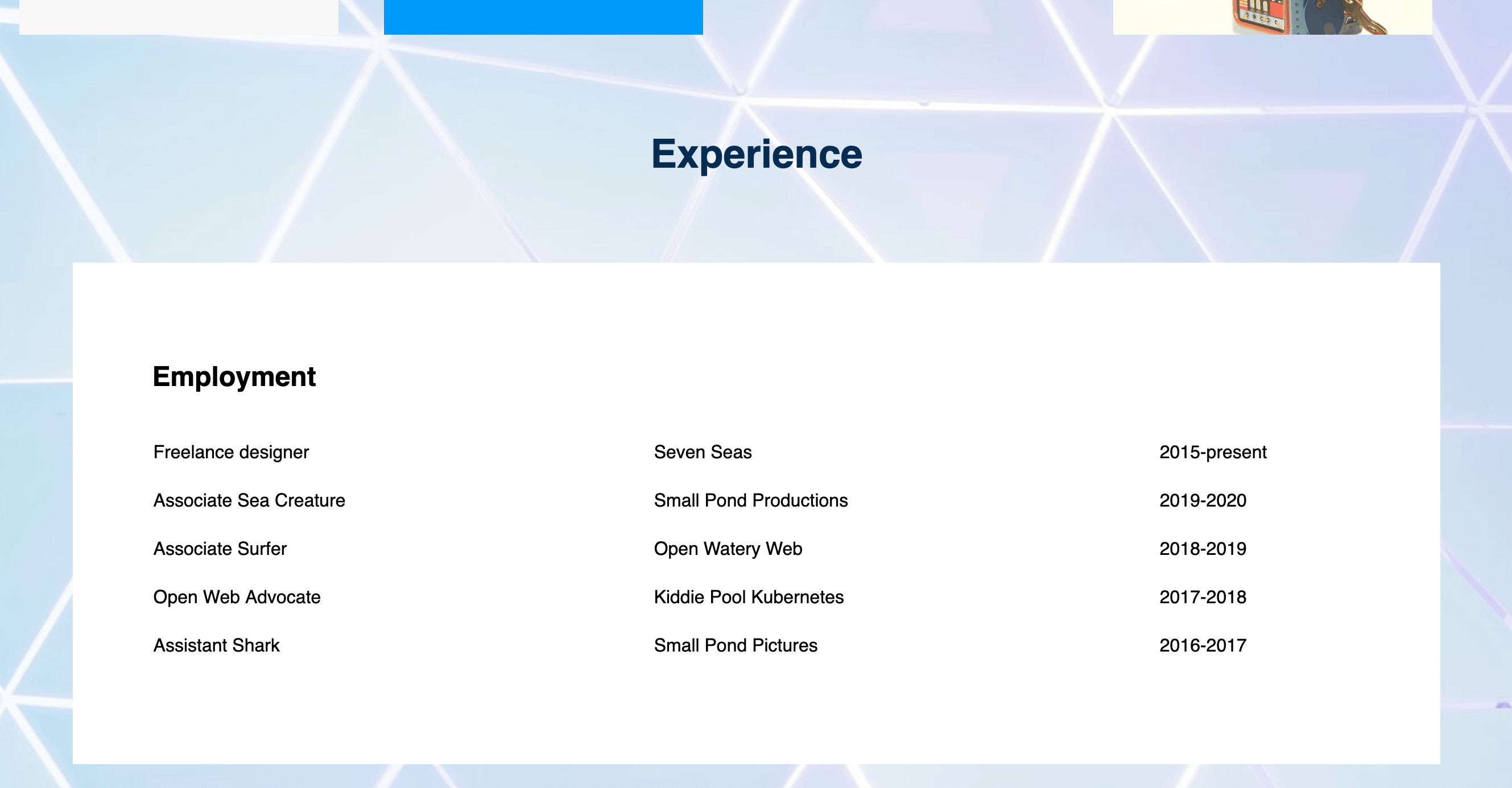
Save both files and reload your web page in the browser. Your webpage should now have a single wide column that contains a table with four rows and three columns as pictured at the beginning of this tutorial.
Note that the first three <td> elements are inserted between the first opening and closing set of <tr> tags. You can continue to add rows by using the same table row and data format and the column’s height will adjust accordingly because you have set the height to auto for the column-1 class. Or, you can add additional columns by adding <td> elements inside the <tr> rows.
Conclusion
You have now created and styled a table with CSS to display employment history content in a structured layout. Experiment with sizing and adding rows and columns to customize tables for different purposes. In the next tutorial, you will continue exploring table layout possibilities by creating a table for “Education" and “Skills".
Thanks for learning with the DigitalOcean Community. Check out our offerings for compute, storage, networking, and managed databases.
Tutorial Series: How To Build a Website With CSS
This tutorial is part of a series on creating and customizing this website with CSS, a stylesheet language used to control the presentation of websites. You may follow the entire series to recreate the demonstration website and gain familiarity with CSS or use the methods described here for other CSS website projects.
Before proceeding, we recommend that you have some knowledge of HTML, the standard markup language used to display documents in a web browser. If you don’t have familiarity with HTML, you can follow the first ten tutorials of our series How To Build a Website With HTML before starting this series.
Browse Series: 20 tutorials
About the author
Open source advocate and lover of education, culture, and community.
Still looking for an answer?
This textbox defaults to using Markdown to format your answer.
You can type !ref in this text area to quickly search our full set of tutorials, documentation & marketplace offerings and insert the link!
 This work is licensed under a Creative Commons Attribution-NonCommercial- ShareAlike 4.0 International License.
Become a contributor for community
Get paid to write technical tutorials and select a tech-focused charity to receive a matching donation.

DigitalOcean Documentation
Full documentation for every DigitalOcean product.

Resources for startups and AI-native businesses
The Wave has everything you need to know about building a business, from raising funding to marketing your product.
The developer cloud
Scale up as you grow — whether you're running one virtual machine or ten thousand.

Start building today
From GPU-powered inference and Kubernetes to managed databases and storage, get everything you need to build, scale, and deploy intelligent applications.
