By Erin Glass
Senior Manager, DevEd
")
Introduction
In this tutorial, you will recreate the tiled layout of the “Projects” section of the demonstration website by styling eight HTML <div> containers with CSS classes. You will also add the hover pseudo-class to these elements so that they change color when a user hovers over them. Feel free to switch out Sammy’s information with your own if you wish to personalize the size. The methods you use here can be applied to other CSS/HTML website projects.
Prerequisites
To follow this tutorial, make sure you have set up the necessary files and folders as instructed in a previous tutorial in this series How To Set Up You CSS and HTML Practice Project.
Adding and Styling a Header Title
To get started, add the heading title “Projects" to a new section on the webpage, making sure not to delete any content you’ve added from the previous tutorials. Add the following code snippet after the last closing </div> tag in the index.html file:
. . .
<!--Section 3: Projects-->

  <h2 >Projects</h2>
. . .
The first line of this code snippet is a comment to label the code you will add to create the third section of the website. A comment is used to save explanatory notes on your code for future reference and is not displayed by the browser to site visitors (unless they view the source code of the webpage). The second line adds the title text “Projects” and assigns it the heading element <h2>.
Next, you will style the heading title by creating a section-heading class. Return to the styles.css file and copy and paste the following code snippet at the bottom of the file:
. . .

/*  Section 3  */

.section-heading {
  text-align:center;
  color:#102C4E;
  margin-top: 150px;
  margin-bottom:70px;
  font-size: 35px;
}
This code snippet defines the style for the section-heading class. Please review the previous sections in this tutorial series on setting the sizes of content, padding, and margins.
Next you will add the “section-heading” class to the header title “Projects" in the HTML file. Return to the index.html file and add the class to the HTML element like so:
<!--Section 3: Projects—>

  <h2 class="section-heading">Projects</h2>
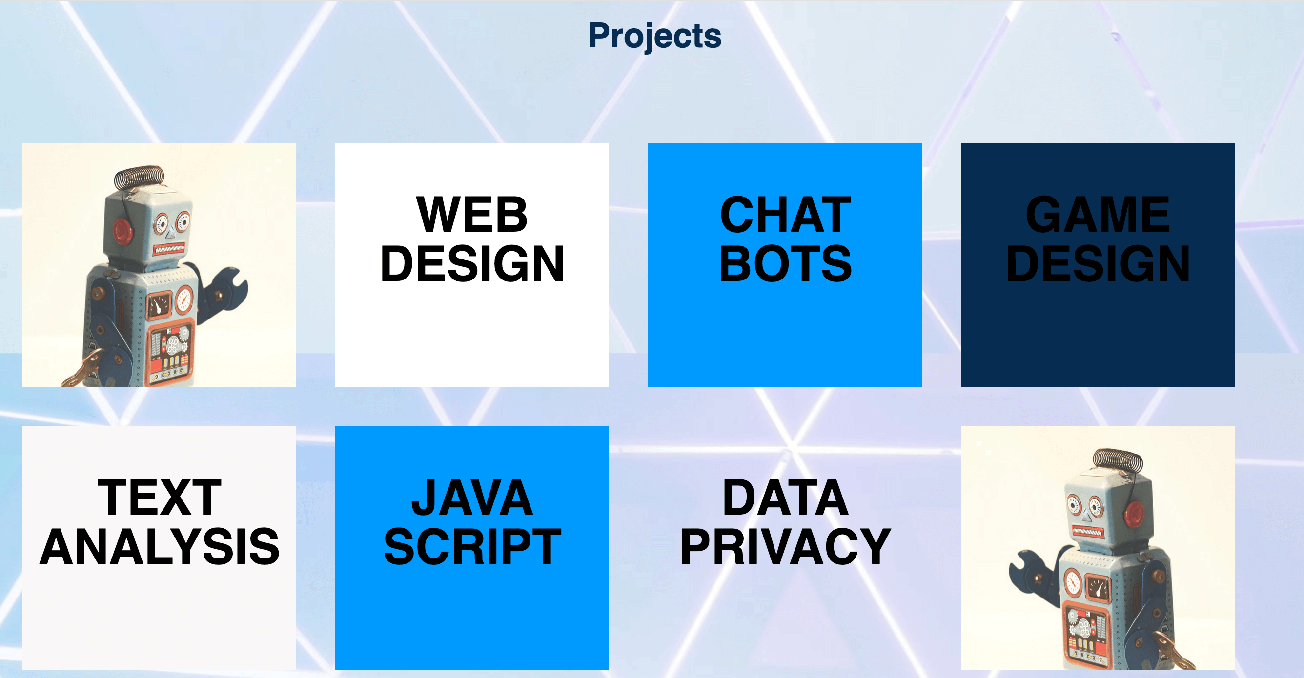
Save both files and load your web page in the browser. For instructions on loading an HTML file, please visit our tutorial step How To View An Offline HTML File In Your Browser. The header should now be centered on the page and its size, positioning, and color should be adjusted like in the following image:
Adding and Styling Tiled Project Boxes
Now you will add the eight project boxes below the section header. To get started, you’ll create a CSS class that allows us to style <div> containers in a way that will allow four of them to fit side by side on the webpage.
Return to the styles.css file and add the following code snippet at the bottom of the document:
. . .
/* Sizing for Project Containers  */

.column-4 {
  float: left;
  width: 21%;
  padding: 10px;
  margin:20px;
  height: 250px;
}
In this code snippet you have defined the class column-4 and specified values that allow for four columns to be displayed side by side on the page:
- The
float: left;declaration instructs the element to float to the left side of the container it’s inside (in this case the webpage) while allowing surrounding content (in this case the other project boxes) to rest on its right side. - The
width: 21%;declaration sets the element’s width to 21% of the width of its container, which in this case is the webpage. Setting sizes (such as width) in percentages instead of pixels can be useful when you want the element to resize according to the size of the container it’s inside. Note, however, that dynamic sizing can be a tricky process—there are multiple methods for creating responsive elements which can be implemented after establishing a foundation in CSS. - If you want to learn more about the other declarations, please review the previous sections in this tutorial series on setting the sizes of content, padding, and margins.
Next, you will create a class for each of the eight boxes so that you can style them differently, as well as add a featured image to the first and last box to match the demonstration site. To get started, save one or two images to use as a featured image in your images folder. If you don’t have an image, you can download the image of a right-facing robot and left-facing robot that you used in the demonstration site.
Note: To download the robot images, visit links and click CTRL + Left Click (on Macs) or Right Click (on Windows) on the image and select “Save Image As” and save it as project-left.jpeg and ‘project-right.jpeg’ to your images folder.
To create a class for each project box, add the following code snippet to the bottom of your styles.css file:
. . .

/* Color and Images for Project Containers  */

.project-1 {
  background: url('../images/project-left.jpeg');
  background-size: cover;
}

.project-2 {
  background-color:white;
}

.project-3 {
  background-color:#209BFF;
}

.project-4 {
  background-color:#112d4e;
}

.project-5 {
  background-color:#F9F7F7;
}

.project-6 {
  background-color:#209BFF;
}

.project-7 {
    background-color:#ffffff00;
}

.project-8 {
  background: url('../images/project-right.jpeg');
  background-size: cover;
}
If you are using your own images, make sure you have saved them to your images folder and that you have specified the correct file path in the highlighted area in the ruleset for class project-1 and class project-8.
Let’s pause briefly to review the code we’ve just written. In the rulesets for class project-1 and project-8, you have added a background image, specified its file path location and declared that the background image should be fitted to “cover” the entire element.
In the rulesets for project-2 through project-7, you have specified different background colors using HTML color codes. Note that you have made the background color transparent for project-7 as a design choice, but you can change this as you wish. You can also explore different background images and colors for each of these classes by experimenting with their values.
Next you will add a ruleset that changes the font size and positioning of the text that will be added to these project boxes. Add the following ruleset to the bottom of the styles.css file:
. . .
.project-text {
  text-align:center;
  font-size:50px;
}
Save your styles.css file. Now you will add <div> containers to the HTML document and style them with the CSS classes you just defined. Return to the index.html file and add the following code snippet below this line: <h2 class="section-heading">Projects</h2>:
. . .
<div class="column-4 project-1">
</div>

<div class="column-4 project-2">
  <h2 class="project-text">WEB <br>DESIGN</h2>
</div>

<div class="column-4 project-3">
  <h2 class="project-text">CHAT <br>BOTS</h2>
</div>

<div class="column-4 project-4">
  <h2 class="project-text">GAME <br> DESIGN</h2>
</div>

<div class="column-4 project-5">
  <h2 class="project-text">TEXT <br> ANALYSIS</h2>
</div>

<div class="column-4 project-6">
  <h2 class="project-text">JAVA <br> SCRIPT</h2>
</div>

<div class="column-4 project-7">
  <h2 class="project-text">DATA <br> PRIVACY</h2>
</div>

<div class="column-4 project-8">
</div>
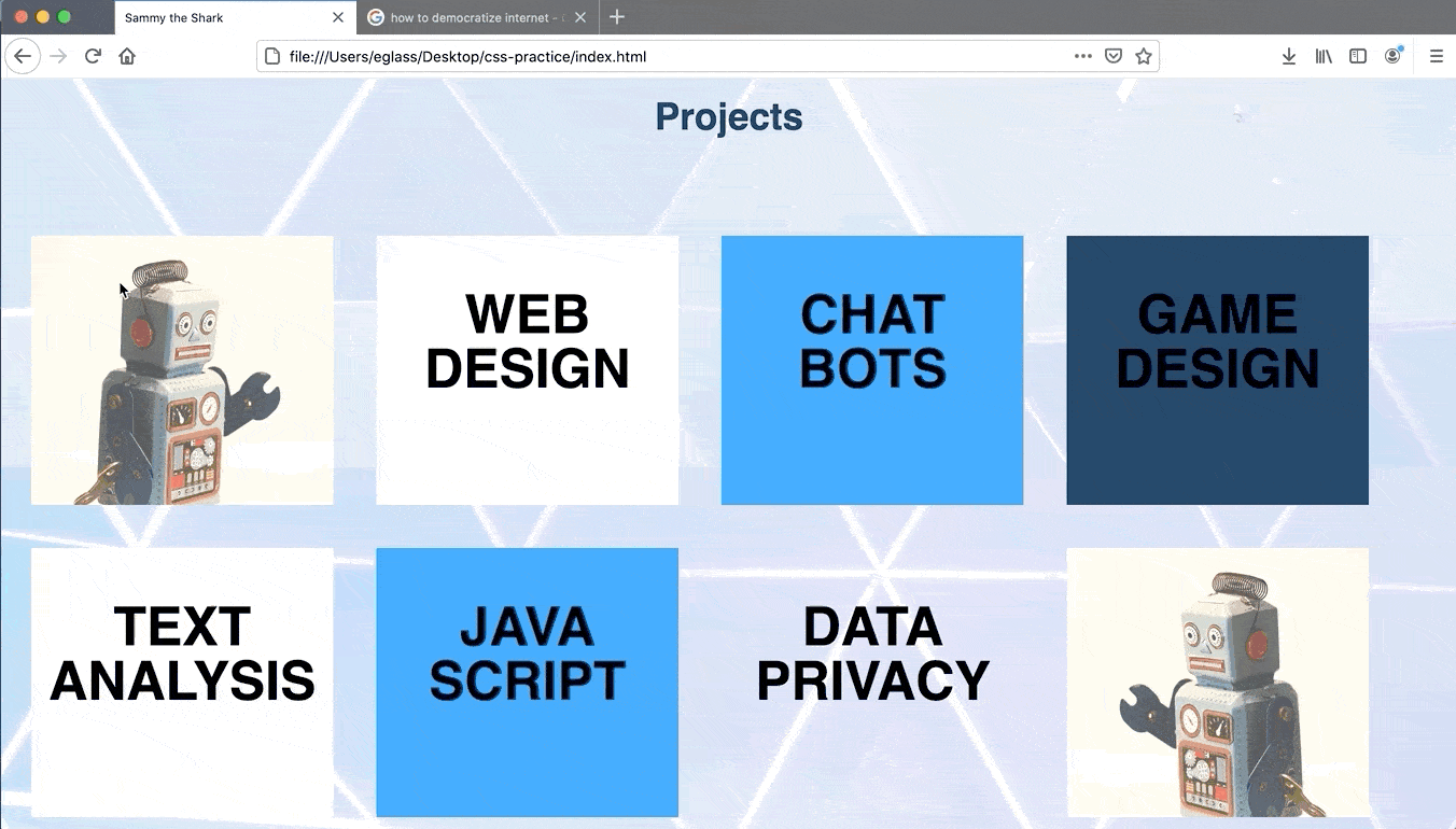
Save your index.html file and reload it in the browser. You should receive output like the following image:
You should have two rows of four boxes, each styled according to the column-4 and project-x classes they’ve been assigned with the class attribute. In the HTML code, you have also added text content (such as “CHAT BOTS") and assigned all text content the class project-text.
You have also added the HTML line break element (<br>) to create a line break between the two words in each box. Feel free to change this text now or later on if you wish to personalize your website. You can also use the HTML hyperlink element <a> to link this text to new pages you create for your website. You’ll explore this option in more detail at the end of the tutorial series.
Next, you will add a pseudo-class to make the boxes change color when the user hovers their cursor over them.
Changing Content Color With User Interaction
If you return to the demonstration website and hover your cursor over the boxes in the “Projects" section, you’ll notice that they change color. This color change is achieved by adding the hover pseudo-class to each of project classes.
As you may recall if you followed the tutorial on pseudo-classes earlier in this series, pseudo-classes are created by appending a colon and the pseudo-class name to the name of the class you are trying to modify. To add the :hover pseudo-class to the project classes, add the following rulesets at the bottom of your styles.css file:
. . .

/* Hover classes for individual project boxes */

.project-2:hover {
  background-color:#FEDE00;
}

.project-3:hover {
   background-color: #FEDE00;
}

.project-4:hover {
   background-color: #FEDE00;
}

.project-5:hover {
   background-color: #FEDE00;
}

.project-6:hover {
   background-color: #FEDE00;
}

.project-7:hover {
   background-color: #FEDE00;
}
In this code snippet you created hover classes for six of the eight project classes. This hover class instructs the element to change its color to the HTML color code #FEDE00 when the user hovers the cursor over the box. Note that you have only added the hover class to the project boxes that contain text (and not to the project boxes that contain background images).
Save the styles.css file and reload index.html in the browser. Check to make sure that the hover pseudo-class is working by hovering your cursor over the project boxes. They should change color when your cursor passes over them:
Conclusion
You have now laid out HTML content in boxes using CSS classes and added a hover pseudo-class to change their appearance when a user’s cursor hovers over them. You can continue to experiment with these methods by changing the style declarations in these classes or changing the size and quantity of boxes you use to organize the layout of your page.
In the next tutorial, you will add an “Employment" section to a website using HTML tables.
Thanks for learning with the DigitalOcean Community. Check out our offerings for compute, storage, networking, and managed databases.
Tutorial Series: How To Build a Website With CSS
This tutorial is part of a series on creating and customizing this website with CSS, a stylesheet language used to control the presentation of websites. You may follow the entire series to recreate the demonstration website and gain familiarity with CSS or use the methods described here for other CSS website projects.
Before proceeding, we recommend that you have some knowledge of HTML, the standard markup language used to display documents in a web browser. If you don’t have familiarity with HTML, you can follow the first ten tutorials of our series How To Build a Website With HTML before starting this series.
Browse Series: 20 tutorials
About the author
Open source advocate and lover of education, culture, and community.
Still looking for an answer?
This textbox defaults to using Markdown to format your answer.
You can type !ref in this text area to quickly search our full set of tutorials, documentation & marketplace offerings and insert the link!
 This work is licensed under a Creative Commons Attribution-NonCommercial- ShareAlike 4.0 International License.
Become a contributor for community
Get paid to write technical tutorials and select a tech-focused charity to receive a matching donation.

DigitalOcean Documentation
Full documentation for every DigitalOcean product.

Resources for startups and AI-native businesses
The Wave has everything you need to know about building a business, from raising funding to marketing your product.
The developer cloud
Scale up as you grow — whether you're running one virtual machine or ten thousand.

Start building today
From GPU-powered inference and Kubernetes to managed databases and storage, get everything you need to build, scale, and deploy intelligent applications.
