By Joe Morgan and Timothy Nolan

The author selected Creative Commons to receive a donation as part of the Write for DOnations program.
Introduction
In this tutorial, you’ll create custom components by passing props to your component. Props are arguments that you provide to a JSX element. They look like standard HTML props, but they aren’t predefined and can have many different JavaScript data types including numbers, strings, functions, arrays, and even other React components. Your custom components can use props to display data or use the data to make the components interactive. Props are a key part of creating components that are adaptable to different situations, and learning about them will give you the tools to develop custom components that can handle unique situations.
After adding props to your component, you will use PropTypes to define the type of data you expect a component to receive. PropTypes are a simple type system to check that data matches the expected types during runtime. They serve as both documentation and an error checker that will help keep your application predictable as it scales.
By the end of the tutorial, you’ll use a variety of props to build a small application that will take an array of animal data and display the information, including the name, scientific name, size, diet, and additional information.
Note: The first step sets up a blank project on which you will build the tutorial exercise. If you already have a working project and want to go directly to working with props, start with Step 2.
Prerequisites
-
You will need a development environment running Node.js; this tutorial was tested on Node.js version 10.20.1 and npm version 6.14.4. To install this on macOS or Ubuntu 18.04, follow the steps in How to Install Node.js and Create a Local Development Environment on macOS or the Installing Using a PPA section of How To Install Node.js on Ubuntu 18.04.
-
In following this tutorial, you will use Create React App. You can find instructions for installing an application with Create React App at How To Set Up a React Project with Create React App. This tutorial also assumes a knowledge of React components, which you can learn about in our How To Create Custom Components in React tutorial.
-
You will also need to know the basics of JavaScript, which you can find in How To Code in JavaScript, along with a basic knowledge of HTML and CSS. A good resource for HTML and CSS is the Mozilla Developer Network.
Step 1 — Creating an Empty Project
In this step, you’ll create a new project using Create React App. Then you will delete the sample project and related files that are installed when you bootstrap the project. Finally, you will create a simple file structure to organize your components.
To start, make a new project. In your command line, run the following script to install a fresh project using create-react-app:
- npx create-react-app prop-tutorial
After the project is finished, change into the directory:
- cd prop-tutorial
In a new terminal tab or window, start the project using the Create React App start script. The browser will autorefresh on changes, so leave this script running the whole time that you work:
- npm start
You will get a running local server. If the project did not open in a browser window, you can open it by navigating to http://localhost:3000/. If you are running this from a remote server, the address will be http://your_domain:3000.
Your browser will load with a simple React application included as part of Create React App:

You will be building a completely new set of custom components. You’ll start by clearing out some boilerplate code so that you can have an empty project.
To start, open src/App.js in a text editor. This is the root component that is injected into the page. All components will start from here. You can find more information about App.js at How To Set Up a React Project with Create React App.
Open src/App.js with the following command:
- nano src/App.js
You will see a file like this:
import React from 'react';
import logo from './logo.svg';
import './App.css';

function App() {
  return (
    <div className="App">
      <header className="App-header">
        <img src={logo} className="App-logo" alt="logo" />
        <p>
          Edit <code>src/App.js</code> and save to reload.
        </p>
        <a
          className="App-link"
          href="https://reactjs.org"
          target="_blank"
          rel="noopener noreferrer"
        >
          Learn React
        </a>
      </header>
    </div>
  );
}

export default App;
Delete the line import logo from './logo.svg';. Then replace everything in the return statement to return a set of empty tags: <></>. This will give you a validate page that returns nothing. The final code will look like this:
import React from 'react';
import './App.css';

function App() {
  return <></>;
}

export default App;
Save and exit the text editor.
Finally, delete the logo. You won’t be using it in your application and you should remove unused files as you work. It will save you from confusion in the future.
In the terminal window type the following command:
- rm src/logo.svg
If you look at your browser, you will see a blank screen.

Now that you have cleared out the sample Create React App project, create a simple file structure. This will help you keep your components isolated and independent.
Create a directory called components in the src directory. This will hold all of your custom components.
- mkdir src/components
Each component will have its own directory to store the component file along with the styles, images if there are any, and tests.
Create a directory for App:
- mkdir src/components/App
Move all of the App files into that directory. Use the wildcard, *, to select any files that start with App. regardless of file extension. Then use the mv command to put them into the new directory.
- mv src/App.* src/components/App
Finally, update the relative import path in index.js, which is the root component that bootstraps the whole process.
- nano src/index.js
The import statement needs to point to the App.js file in the App directory, so make the following highlighted change:
import React from 'react';
import ReactDOM from 'react-dom';
import './index.css';
import App from './components/App/App';
import * as serviceWorker from './serviceWorker';

ReactDOM.render(
  <React.StrictMode>
    <App />
  </React.StrictMode>,
  document.getElementById('root')
);

// If you want your app to work offline and load faster, you can change
// unregister() to register() below. Note this comes with some pitfalls.
// Learn more about service workers: https://bit.ly/CRA-PWA
serviceWorker.unregister();
Save and exit the file.
Now that the project is set up, you can create your first component.
Step 2 — Building Dynamic Components with Props
In this step, you will create a component that will change based on the input information called props. Props are the arguments you pass to a function or class, but since your components are transformed into HTML-like objects with JSX, you will pass the props like they are HTML attributes. Unlike HTML elements, you can pass many different data types, from strings, to arrays, to objects, and even functions.
Here you will create a component that will display information about animals. This component will take the name and scientific name of the animal as strings, the size as an integer, the diet as an array of strings, and additional information as an object. You’ll pass the information to the new component as props and consume that information in your component.
By the end of this step, you’ll have a custom component that will consume different props. You’ll also reuse the component to display an array of data using a common component.
Adding Data
First, you need some sample data. Create a file in the src/App directory called data.
- touch src/components/App/data.js
Open the new file in your text editor:
- nano src/components/App/data.js
Next, add an array of objects you will use as sample data:
export default [
  {
    name: 'Lion',
    scientificName: 'Panthero leo',
    size: 140,
    diet: ['meat'],
  },
  {
    name: 'Gorilla',
    scientificName: 'Gorilla beringei',
    size: 205,
    diet: ['plants', 'insects'],
    additional: {
      notes: 'This is the eastern gorilla. There is also a western gorilla that is a different species.'
    }
  },
  {
    name: 'Zebra',
    scientificName: 'Equus quagga',
    size: 322,
    diet: ['plants'],
    additional: {
      notes: 'There are three different species of zebra.',
      link: 'https://en.wikipedia.org/wiki/Zebra'
    }
  }
]
The array of objects contains a variety of data and will give you an opportunity to try a variety of props. Each object is a separate animal with the name of the animal, the scientific name, size, diet, and an optional field called additional, which will contain links or notes. In this code, you also exported the array as the default.
Save and exit the file.
Creating Components
Next, create a placeholder component called AnimalCard. This component will eventually take props and display the data.
First, make a directory in src/components called AnimalCard then touch a file called src/components/AnimalCard/AnimalCard.js and a CSS file called src/components/AnimalCard/AnimalCard.css.
- mkdir src/components/AnimalCard
- touch src/components/AnimalCard/AnimalCard.js
- touch src/components/AnimalCard/AnimalCard.css
Open AnimalCard.js in your text editor:
- nano src/components/AnimalCard/AnimalCard.js
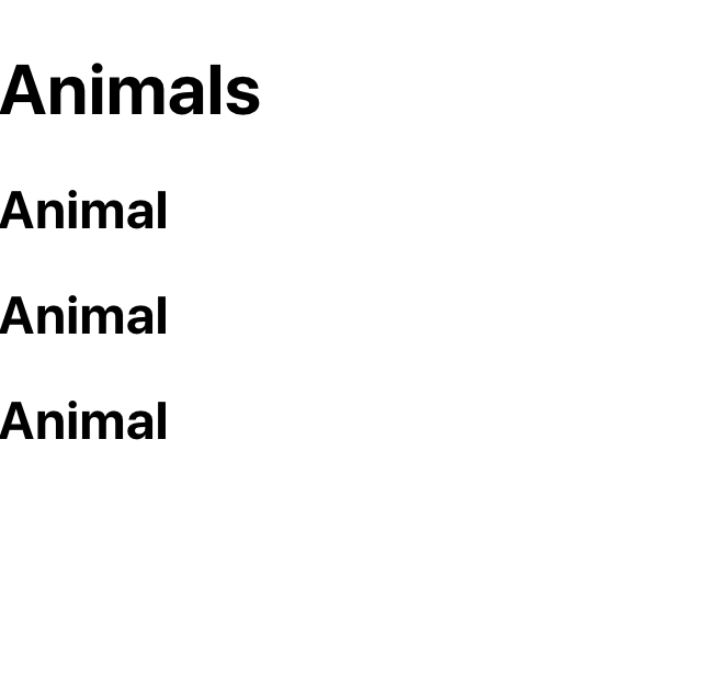
Add a basic component that imports the CSS and returns an <h2> tag.
import React from 'react';
import './AnimalCard.css'

export default function AnimalCard() {
  return <h2>Animal</h2>
}
Save and exit the file. Now you need to import the data and component into your base App component.
Open src/components/App/App.js:
- nano src/components/App/App.js
Import the data and the component, then loop over the data returning the component for each item in the array:
import React from 'react';
import data from './data';
import AnimalCard from '../AnimalCard/AnimalCard';
import './App.css';

function App() {
  return (
    <div className="wrapper">
      <h1>Animals</h1>
      {data.map(animal => (
        <AnimalCard key={animal.name}/>
      ))}
    </div>
  )
}

export default App;
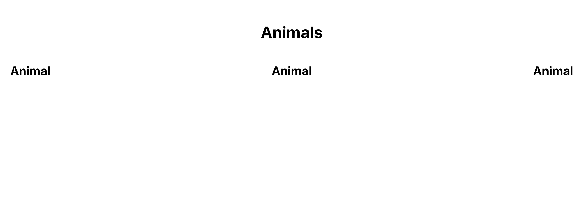
Save and exit the file. Here, you use the .map() array method to iterate over the data. In addition to adding this loop, you also have a wrapping div with a class that you will use for styling and an <h1> tag to label your project.
When you save, the browser will reload and you’ll see a label for each card.
Next, add some styling to line up the items. Open App.css:
- nano src/components/App/App.css
Replace the contents with the following to arrange the elements:
.wrapper {
    display: flex;
    flex-wrap: wrap;
    justify-content: space-between;
    padding: 20px;
}

.wrapper h1 {
    text-align: center;
    width: 100%;
}
This will use flexbox to rearrange the data so it will line up. The padding gives some space in the browser window. justify-content will spread out the extra space between elements, and .wrapper h1 will give the Animal label the full width.
Save and exit the file. When you do, the browser will refresh and you’ll see some data spaced out.
Adding Props
Now that you have your components set up, you can add your first prop. When you looped over your data, you had access to each object in the data array and the items it contained. You will add each piece of the data to a separate prop that you will then use in your AnimalCard component.
Open App.js:
- nano src/components/App/App.js
Add a prop of name to AnimalCard.
import React from 'react';
...
function App() {
  return (
    <div className="wrapper">
      <h1>Animals</h1>
      {data.map(animal => (
        <AnimalCard
          key={animal.name}
          name={animal.name}
        />
      ))}
    </div>
  )
}

export default App;
Save and exit the file. The name prop looks like a standard HTML attribute, but instead of a string, you’ll pass the name property from the animal object in curly braces.
Now that you’ve passed one prop to the new component, you need to use it. Open AnimalCard.js:
- nano src/components/AnimalCard/AnimalCard.js
All props that you pass into the component are collected into an object that will be the first argument of your function. Destructure the object to pull out individual props:
import React from 'react';
import './AnimalCard.css'

export default function AnimalCard(props) {
  const { name } = props;
  return (
    <h2>{name}</h2>
  );
}
Note that you do not need to destructure a prop to use it, but that this is a useful method for dealing with the sample data in this tutorial.
After you destructure the object, you can use the individual pieces of data. In this case, you’ll use the title in an <h2> tag, surrounding the value with curly braces so that React will know to evaluate it as JavaScript.
You can also use a property on the prop object using dot notation. As an example, you could create an <h2> element like this: <h2>{props.title}</h2>. The advantage of destructring is that you can collect unused props and use the object rest operator.
Save and exit the file. When you do, the browser will reload and you’ll see the specific name for each animal instead of a placeholder.

The name property is a string, but props can be any data type that you could pass to a JavaScript function. To see this at work, add the rest of the data.
Open the App.js file:
- nano src/components/App/App.js
Add a prop for each of the following: scientificName, size, diet, and additional. These include strings, integers, arrays, and objects.
import React from 'react';
...

function App() {
  return (
    <div className="wrapper">
      <h1>Animals</h1>
      {albums.map(album => (
        <AnimalCard
          additional={animal.additional}
          diet={animal.diet}
          key={animal.name}
          name={animal.name}
          scientificName={animal.scientificName}
          size={animal.size}
        />
      ))}
    </div>
  )
}

export default App;
Since you are creating an object, you can add them in any order you want. Alphabetizing makes it easier to skim a list of props especially in a larger list. You also can add them on the same line, but separating to one per line keeps things readable.
Save and close the file. Open AnimalCard.js.
- nano src/components/AnimalCard/AnimalCard.js
This time, destructure the props in the function parameter list and use the data in the component:
import React from 'react';
import './AnimalCard.css'
export default function AnimalCard({
additional,
diet,
name,
scientificName,
size
}) {
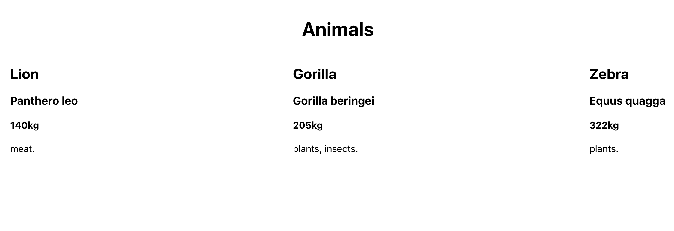
return (
<div>
<h2>{name}</h2>
<h3>{scientificName}</h3>
<h4>{size}kg</h4>
<div>{diet.join(', ')}.</div>
</div>
);
}
After pulling out the data, you can add the scientificName and size into heading tags, but you’ll need to convert the array into a string so that React can display it on the page. You can do that with join(', '), which will create a comma separated list.
Save and close the file. When you do, the browser will refresh and you’ll see the structured data.
You could create a similar list with the additional object, but instead add a function to alert the user with the data. This will give you the chance to pass functions as props and then use data inside a component when you call a function.
Open App.js:
- nano src/components/App/App.js
Create a function called showAdditionalData that will convert the object to a string and display it as an alert.
import React from 'react';
...

function showAdditional(additional) {
  const alertInformation = Object.entries(additional)
    .map(information => `${information[0]}: ${information[1]}`)
    .join('\n');
  alert(alertInformation)
};

function App() {
  return (
    <div className="wrapper">
      <h1>Animals</h1>
      {data.map(animal => (
        <AnimalCard
          additional={animal.additional}
          diet={animal.diet}
          key={animal.name}
          name={animal.name}
          scientificName={animal.scientificName}
          showAdditional={showAdditional}
          size={animal.size}
        />
      ))}
    </div>
  )
}

export default App;
The function showAdditional converts the object to an array of pairs where the first item is the key and the second is the value. It then maps over the data converting the key-pair to a string. Then it joins them with a line break—\n—before passing the complete string to the alert function.
Since JavaScript can accept functions as arguments, React can also accept functions as props. You can therefore pass showAdditional to AnimalCard as a prop called showAdditional.
Save and close the file. Open AnimalCard:
- nano src/components/AnimalCard/AnimalCard.js
Pull the showAdditional function from the props object, then create a <button> with an onClick event that calls the function with the additional object:
import React from 'react';
import './AnimalCard.css'

export default function AnimalCard({
  additional,
  diet,
  name,
  scientificName,
  showAdditional,
  size
}) {
  return (
    <div>
      <h2>{name}</h2>
      <h3>{scientificName}</h3>
      <h4>{size}kg</h4>
      <div>{diet.join(', ')}.</div>
      <button onClick={() => showAdditional(additional)}>More Info</button>
    </div>
  );
}
Save the file. When you do, the browser will refresh and you’ll see a button after each card. When you click the button, you’ll get an alert with the additional data.
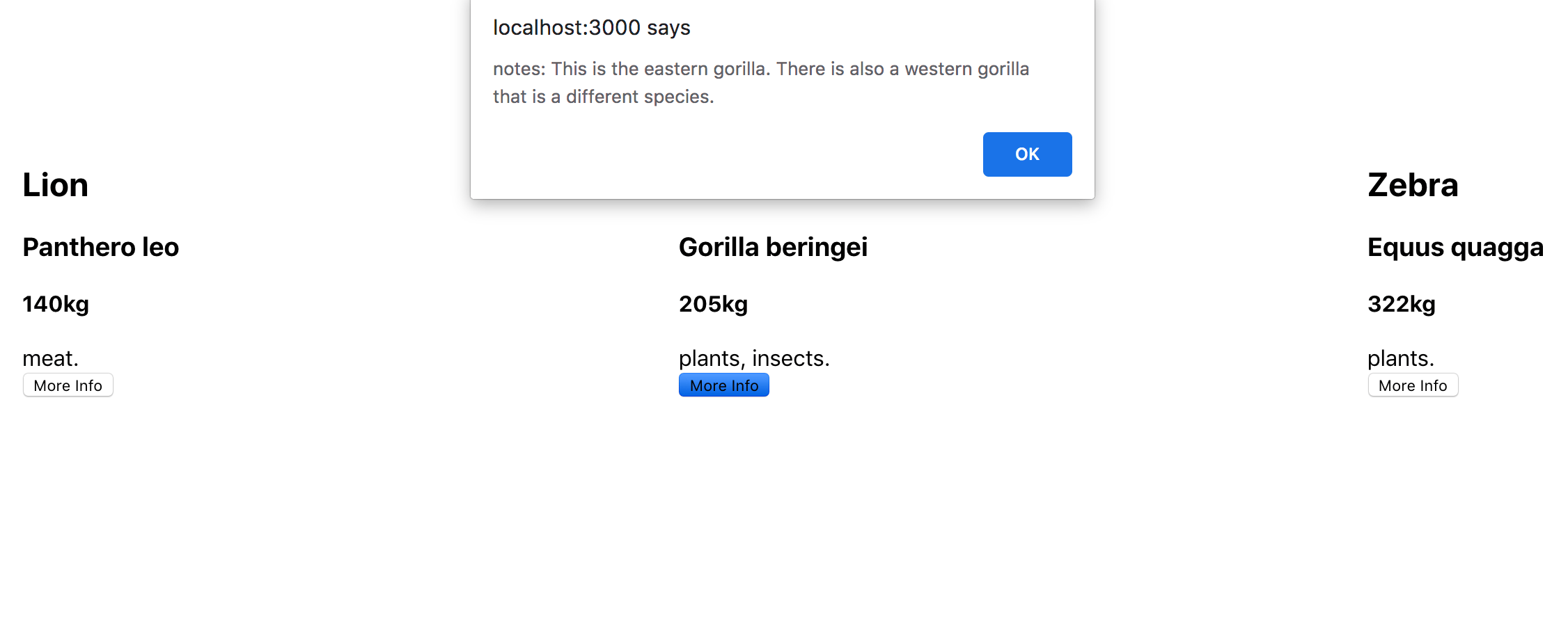
If you try clicking More Info for the Lion, you will get an error. That’s because there is no additional data for the lion. You’ll see how to fix that in Step 3.
Finally, add some styling to the music card. Add a className of animal-wrapper to the div in AnimalCard:
import React from 'react';
import './AnimalCard.css'

export default function AnimalCard({
...
  return (
    <div className="animal-wrapper">
...
    </div>
  )
}
Save and close the file. Open AnimalCard.css:
- nano src/components/AnimalCard/AnimalCard.css
Add CSS to give the cards and the button a small border and padding:
.animal-wrapper {
    border: solid black 1px;
    margin: 10px;
    padding: 10px;
    width: 200px;
}

.animal-wrapper button {
    font-size: 1em;
    border: solid black 1px;
    padding: 10;
    background: none;
    cursor: pointer;
    margin: 10px 0;
}
This CSS will add a slight border to the card and replace the default button styling with a border and padding. cursor: pointer will change the cursor when you hover over the button.
Save and close the file. When you do the browser will refresh and you’ll see the data in individual cards.
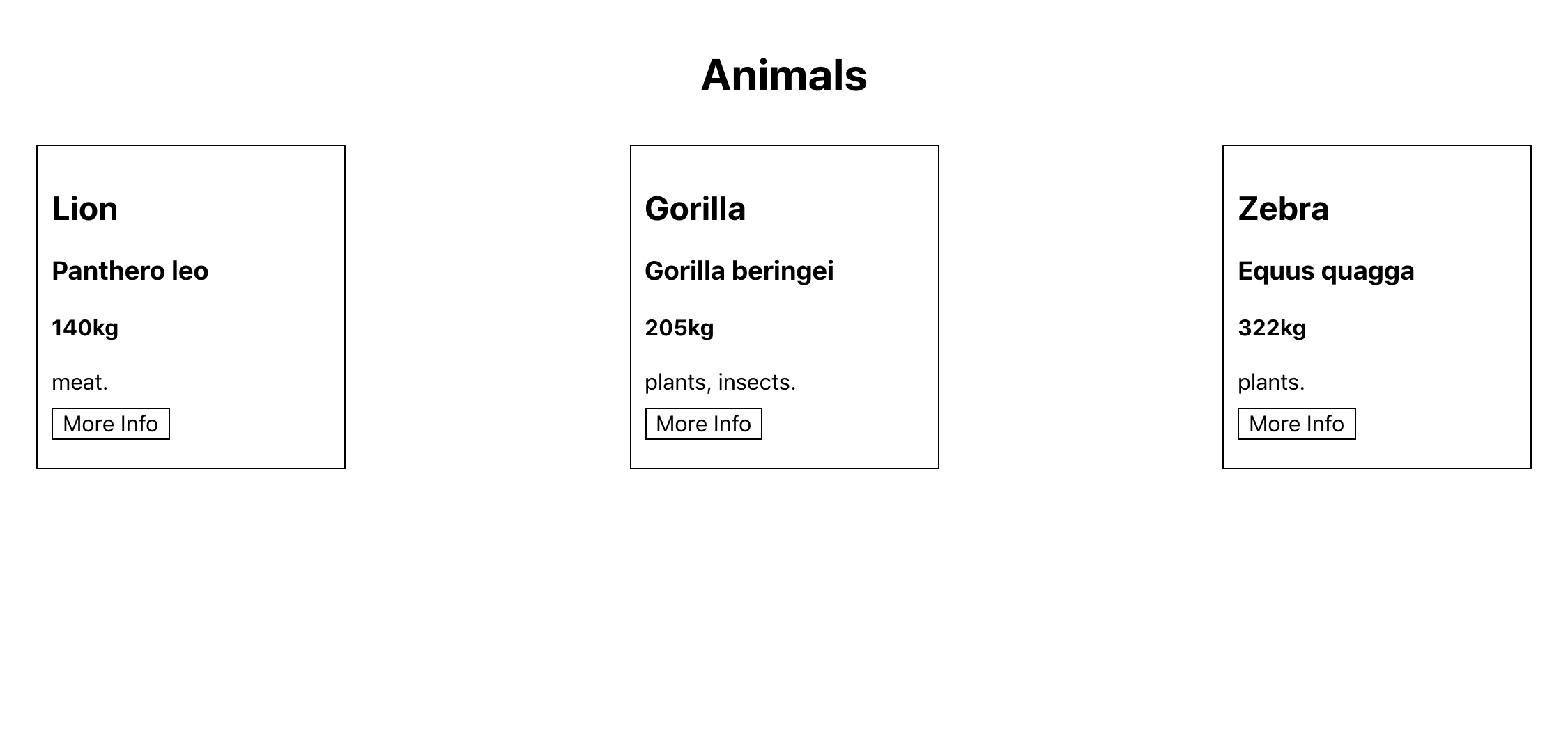
At this point, you’ve created two custom components. You’ve passed data to the second component from the first component using props. The props included a variety of data, such as strings, integers, arrays, objects, and functions. In your second component, you used the props to create a dynamic component using JSX.
In the next step, you’ll use a type system called prop-types to specify the structure your component expects to see, which will create predictability in your app and prevent bugs.
Step 3 — Creating Predictable Props with PropTypes and defaultProps
PropTypes and defaultPropsIn this step, you’ll add a light type system to your components with PropTypes. PropTypes act like other type systems by explicitly defining the type of data you expect to receive for a certain prop. They also give you the chance to define default data in cases where the prop is not always required. Unlike most type systems, PropTypes is a runtime check, so if the props do not match the type the code will still compile, but will also display a console error.
By the end of this step, you’ll add predictability to your custom component by defining the type for each prop. This will ensure that the next person to work on the component will have a clear idea of the structure of the data the component will need.
The prop-types package is included as part of the Create React App installation, so to use it, all you have to do is import it into your component.
Open up AnimalCard.js:
- nano src/components/AnimalCard/AnimalCard.js
Then import PropTypes from prop-types:
import React from 'react';
import PropTypes from 'prop-types';
import './AnimalCard.css'

export default function AnimalCard({
...
}
Add PropTypes directly to the component function. In JavaScript, functions are objects, which means you can add properties using dot syntax. Add the following PropTypes to AnimalCard.js:
import React from 'react';
import PropTypes from 'prop-types';
import './AnimalCard.css'

export default function AnimalCard({
...
}

AnimalCard.propTypes = {
  additional: PropTypes.shape({
    link: PropTypes.string,
    notes: PropTypes.string
  }),
  diet: PropTypes.arrayOf(PropTypes.string).isRequired,
  name: PropTypes.string.isRequired,
  scientificName: PropTypes.string.isRequired,
  showAdditional: PropTypes.func.isRequired,
  size: PropTypes.number.isRequired,
}
Save and close the file.
As you can see, there are many different PropTypes. This is only a small sample; see the official React documentation to see the others you can use.
Let’s start with the name prop. Here, you are specifying that name must be a string. The property scientificName is the same. size is a number, which can include both floats such as 1.5 and integers such as 6. showAdditional is a function (func).
diet, on the other hand, is a little different. In this case, you are specifying that diet will be an array, but you also need to specify what this array will contain. In this case, the array will only contain strings. If you want to mix types, you can use another prop called oneOfType, which takes an array of valid PropTypes. You can use oneOfType anywhere, so if you wanted size to be either a number or a string you could change it to this:
size: PropTypes.oneOfType([PropTypes.number, PropTypes.string])
The prop additional is also a little more complex. In this case, you are specifying an object, but to be a little more clear, you are stating what you want the object to contain. To do that, you use PropTypes.shape, which takes an object with additional fields that will need their own PropTypes. In this case, link and notes are both PropTypes.string.
Currently, all of the data is well-formed and matches the props. To see what happens if the PropTypes don’t match, open up your data:
- nano src/components/App/data.js
Change the size to a string on the first item:
export default [
  {
    name: 'Lion',
    scientificName: 'Panthero leo',
    size: '140',
    diet: ['meat'],
  },
...
]
Save the file. When you do the browser will refresh and you’ll see an error in the console.
Errorindex.js:1 Warning: Failed prop type: Invalid prop `size` of type `string` supplied to `AnimalCard`, expected `number`.
    in AnimalCard (at App.js:18)
    in App (at src/index.js:9)
    in StrictMode (at src/index.js:8)
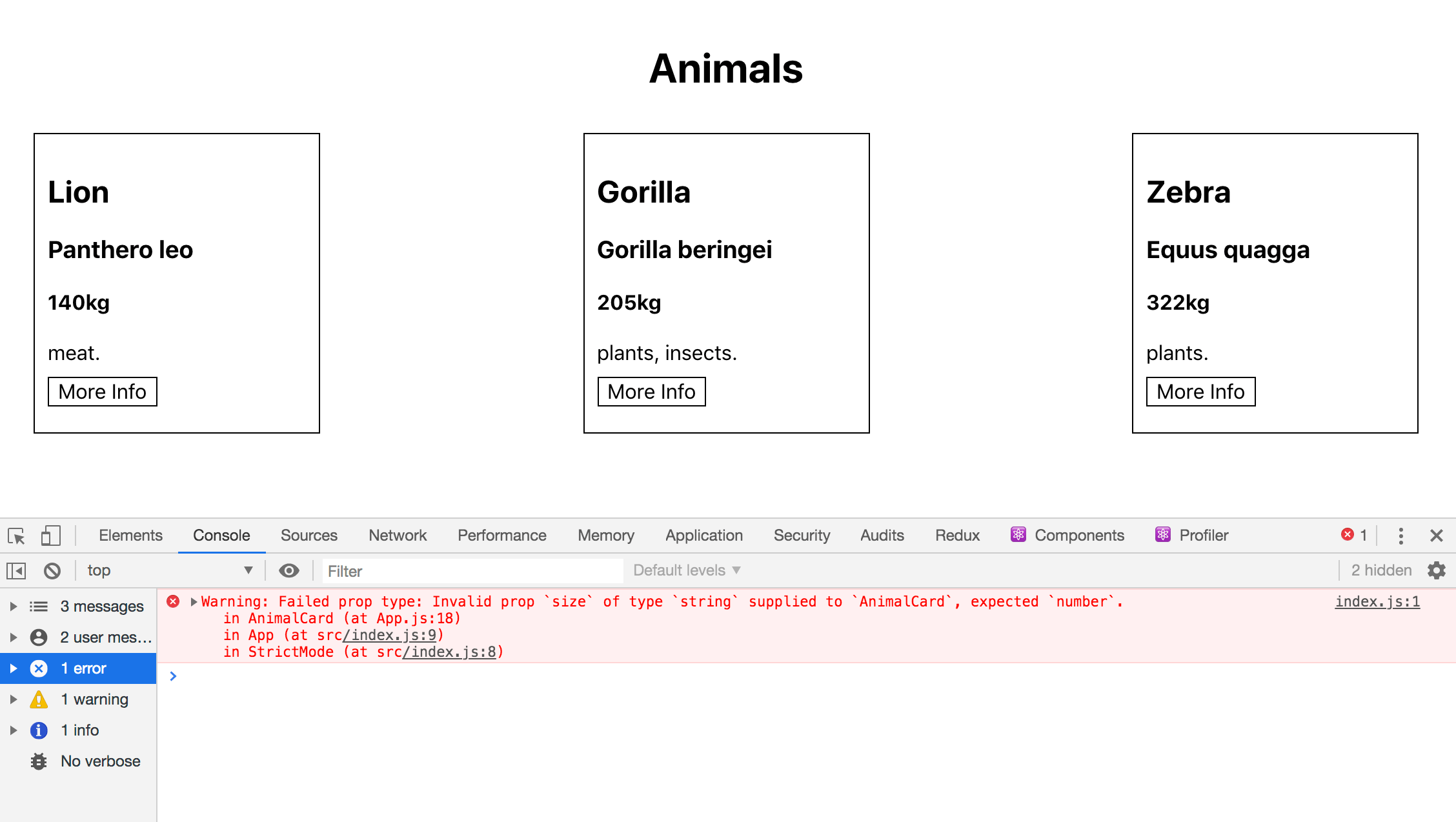
Unlike other type systems such as TypeScript, PropTypes will not give you a warning at build time, and as long as there are no code errors, it will still compile. This means that you could accidentally publish code with prop errors.
Change the data back to the correct type:
export default [
  {
    name: 'Lion',
    scientificName: 'Panthero leo',
    size: 140,
    diet: ['meat'],
  },
...
]
Save and close the file.
Open up AnimalCard.js:
- nano src/components/AnimalCard/AnimalCard.js
Every prop except for additional has the isRequired property. That means, that they are required. If you don’t include a required prop, the code will still compile, but you’ll see a runtime error in the console.
If a prop isn’t required, you can add a default value. It’s good practice to always add a default value to prevent runtime errors if a prop is not required. For example, in the AnimalCard component, you are calling a function with the additional data. If it’s not there, the function will try and modify an object that doesn’t exist and the application will crash.
To prevent this problem, add a defaultProp for additional:
import React from 'react';
import PropTypes from 'prop-types';
import './AnimalCard.css'
export default function AnimalCard({
...
}
AnimalCard.propTypes = {
additional: PropTypes.shape({
link: PropTypes.string,
notes: PropTypes.string
}),
...
}
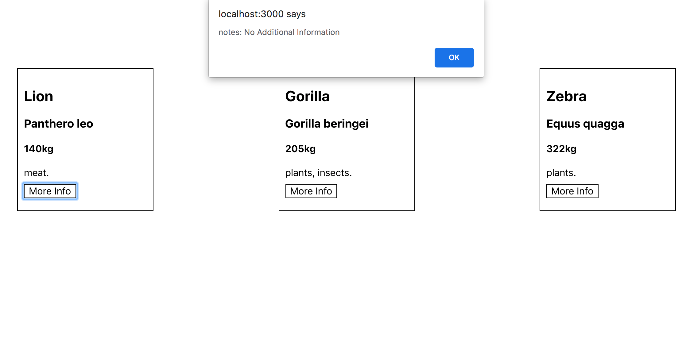
AnimalCard.defaultProps = {
additional: {
notes: 'No Additional Information'
}
}
You add the defaultProps to the function using dot syntax just as you did with propTypes, then you add a default value that the component should use if the prop is undefined. In this case, you are matching the shape of additional, including a message that the there is no additional information.
Save and close the file. When you do, the browser will refresh. After it refreshes, click on the More Info button for Lion. It has no additional field in the data so the prop is undefined. But AnimalCard will substitute in the default prop.
Now your props are well-documented and are either required or have a default to ensure predictable code. This will help future developers (including yourself) understand what props a component needs. It will make it easier to swap and reuse your components by giving you full information about how the component will use the data it is receiving.
Conclusion
In this tutorial, you have created several components that use props to display information from a parent. Props give you the flexibility to begin to break larger components into smaller, more focused pieces. Now that you no longer have your data tightly coupled with your display information, you have the ability to make choices about how to segment your application.
Props are a crucial tool in building complex applications, giving the opportunity to create components that can adapt to the data they receive. With PropTypes, you are creating predictable and readable components that will give a team the ability to reuse each other’s work to create a flexible and stable code base. If you would like to look at more React tutorials, take a look at our React Topic page, or return to the How To Code in React.js series page.
Thanks for learning with the DigitalOcean Community. Check out our offerings for compute, storage, networking, and managed databases.
Tutorial Series: How To Code in React.js
React is a popular JavaScript framework for creating front-end applications, such as user interfaces that allow users to interact with programs. Originally created by Facebook, it has gained popularity by allowing developers to create fast applications using an intuitive programming paradigm that ties JavaScript with an HTML-like syntax known as JSX.
In this series, you will build out examples of React projects to gain an understanding of this framework, giving you the knowledge you need to pursue front-end web development or start out on your way to full stack development.
Browse Series: 21 tutorials
About the author(s)
Author of Simplifying JavaScript. Writing featured in Slate, FreeCodeCamp, and here! I like to break things and put them back together. 🛠
Former Senior Technical Editor at DigitalOcean, fiction writer and podcaster elsewhere, always searching for the next good nautical pun! Areas of expertise include Node.js, PostgreSQL, CSS, JavaScript.
Still looking for an answer?
This textbox defaults to using Markdown to format your answer.
You can type !ref in this text area to quickly search our full set of tutorials, documentation & marketplace offerings and insert the link!
import React from 'react';
import PropTypes from 'prop-types';
import './AnimalCard.css'

export default function AnimalCard({
    additional,
    diet,
    name,
    scientificName,
    showAdditional,
    size
  }


AnimalCard.propTypes = {
  additional: PropTypes.shape({
    link: PropTypes.string,
    notes: PropTypes.string
  }),
  diet: PropTypes.arrayOf(PropTypes.string).isRequired,
  name: PropTypes.string.isRequired,
  scientificName: PropTypes.string.isRequired,
  showAdditional: PropTypes.func.isRequired,
  size: PropTypes.number.isRequired,
}

AnimalCard.defaultProps = {
  additional: {
    notes: 'No Additional Information'
  }
}
Line 15:1: Parsing error: Unexpected token, expected “,”
How do I fix this error? I copied the code from the tutorial and I still receive this error.
import React from 'react';
...

function App() {
  return (
    <div className="wrapper">
      <h1>Animals</h1>
      {albums.map(album => (
        <AnimalCard
          additional={animal.additional}
          diet={animal.diet}
          key={animal.name}
          name={animal.name}
          scientificName={animal.scientificName}
          size={animal.size}
        />
      ))}
    </div>
  )
}

export default App;
Please change the album to data as we are mapping the data
 This work is licensed under a Creative Commons Attribution-NonCommercial- ShareAlike 4.0 International License.
Become a contributor for community
Get paid to write technical tutorials and select a tech-focused charity to receive a matching donation.

DigitalOcean Documentation
Full documentation for every DigitalOcean product.

Resources for startups and AI-native businesses
The Wave has everything you need to know about building a business, from raising funding to marketing your product.
The developer cloud
Scale up as you grow — whether you're running one virtual machine or ten thousand.

Start building today
From GPU-powered inference and Kubernetes to managed databases and storage, get everything you need to build, scale, and deploy intelligent applications.
