Developer

The author selected the Diversity in Tech Fund to receive a donation as part of the Write for DOnations program.
Introduction
When styling HTML with CSS, there are multiple ways to adjust the opacity of elements, and multiple reasons to employ this effect in a design. Opacity can help soften a shadow, de-emphasize non-essential content during a specific task, or fade content in or out of view. You can accomplish these effects with the opacity property, the transparent color name, or alpha channels, which are an extension of color values with an additional segment for controlling opacity.
Throughout this tutorial, you will use various ways to apply opacity and extra properties to effectively accomplish certain effects. You will create a modal that appears with a no-JavaScript approach using the :target pseudo class and the opacity, pointer-events, and transition properties. Then you will use each of the alpha channel color values to create shadow, border, and content overlays. You will also use the transparent color value to help make a gradient animate colors on a :hover event.
Prerequisites
- An understanding of CSS’s cascade and specificity features, which you can get by reading How To Apply CSS Styles to HTML with Cascade and Specificity.
- Knowledge of type selectors, combinator selectors, and selector groups, which you can find in How To Select HTML Elements to Style with CSS.
- An understanding of
colorproperties. See How To Use Color Values with CSS to learn more about working with color in CSS. - Knowledge of CSS gradients with the
backgroundproperties. Check out How To Apply Background Styles to HTML Elements with CSS to gain experience creating gradient backgrounds. - Experience with the
box-shadowproperty, which you can learn more about in How To Style the Edges of HTML Elements with Borders, Shadows, and Outlines in CSS. - An empty HTML file saved on your local machine as
index.htmlthat you can access from your text editor and web browser of choice. To get started, check out our How To Set Up Your HTML Project tutorial, and follow How To Use and Understand HTML Elements for instructions on how to view your HTML in your browser. If you’re new to HTML, try out the whole How To Build a Website in HTML series.
Setting Up the Base HTML and CSS
In this first section, you will set up the HTML for the visual styles you will write throughout the tutorial. You will also create your styles.css file and add styles that set the layout of the content.
To begin, open the index.html file in your text editor. Then, add the following HTML to the file:
<!doctype html>
<html>
  <head>
    <meta charset="utf-8" />
    <title>Destination: Moon</title>
    <link rel="preconnect" href="https://fonts.googleapis.com">
    <link rel="preconnect" href="https://fonts.gstatic.com" crossorigin>
    <link href="https://fonts.googleapis.com/css2?family=MuseoModerno:wght@400;700&display=swap" rel="stylesheet">
    <link href="styles.css" rel="stylesheet" />
  </head>
  <body>
  </body>
</html>
Several page settings are defined inside the <head> element of the HTML. The <meta> element defines the character set to use for the text, which tells the browser how to interpret special characters in the code without using HTML character codes. The <title> element provides the browser with the title of the page. The <link> elements load in the page styles. The first three load in the font, Museo Moderno, from Google Fonts, and the last one loads the styles you will add to styles.css.
Next, the page will need content to style. You will use sample content from Sagan Ipsum as filler copy to use with the styles. You will also apply HTML for a site header, containing the site name and a small navigation bar. Return to index.html in your text editor and add the highlighted HTML from the following code block:
<!doctype html>
<html>
  <head>
    ...
  </head>
  <body>
    <header class="site-header">
      <h1 class="site-name">Destination: <strong>Moon</strong></h1>
      <nav>
        <ul class="nav-list">
          <li><a href="#" class="nav-link">Base Station</a></li>
          <li><a href="#" class="nav-link">Travel Packages</a></li>
          <li><a href="#" class="nav-link">Accommodations</a></li>
          <li><a href="#" class="nav-link">Plan Your Trip</a></li>
      </ul>
      </nav>
    </header>
    <main>
      <section>
        <h2>Schedule Your Trip</h2>
        <p>Sea of Tranquility great turbulent clouds with pretty stories for which there's little good evidence extraordinary claims require extraordinary evidence. Citizens of distant epochs rings of Uranus intelligent beings birth take root and flourish across the centuries. Corpus callosum invent the universe as a patch of light the only home we've ever known a mote of dust suspended in a sunbeam made in the interiors of collapsing stars. Kindling the energy hidden in matter Orion's sword.</p>
        <p>Vastness is bearable only through love emerged into consciousness not a sunrise but a galaxyrise emerged into consciousness courage of our questions across the centuries and billions upon billions upon billions upon billions upon billions upon billions upon billions.</p>
          <a href="#" class="button">Read the Disclaimer!</a>
      </section>
    </main>
  </body>
</html>
Be sure to save your index.html file and leave it open in your text editor. Next, create a new file called styles.css and open it in the text editor. This is the file that is referenced in the <head> element of index.html. In the styles.css file, add the following code:
body {
  margin: 0;
  font: 100%/1.5 sans-serif;
}

main {
  margin: 6rem auto;
  width: 75ch;
  font-size: 1.125rem;
}

h2 {
  font: 400 1.875rem/1.25 MuseoModerno, sans-serif;
  color: #6b2d6b;
}

.site-header {
  font: 1.125rem / 1.25 MuseoModerno, sans-serif;
  display: flex;
  align-items: center;
  justify-content: space-between;
  padding: 0 2rem;
  color: white;
  background: linear-gradient(135deg, #8e3d8e, #230f23);
}

.site-name {
  margin: 0;
  font-size: 1.75rem;
  font-weight: 400;
}

.nav-list {
  margin: 0;
  padding: 0;
  list-style: none;
  display: flex;
  align-items: stretch;
}

.nav-link {
  color: inherit;
  display: block;
  text-decoration: none;
  padding: 1.25rem 1.5rem;
}

.nav-link:hover,
.nav-link:focus {
  color: #230f23;
  background-color: white;
}

.button {
  text-decoration: none;
  display: inline-block;
  padding: 0.5rem 1.25rem;
  color: white;
  background: #4c90b2;
  border: 1px solid #2d566b;
  border-radius: 0.5rem;
}

.button:hover,
.button:focus {
  background-color: #2d566b;
}
These styles set up the general aesthetic and layout of the page, with the styles applied to the body and main elements. The .site-header, .site-name, .nav-list, and .nav-link selectors all define the styles on the page header. The .button and .button:hover rules change an <a> element to appear like a large, clickable button.
Save your changes to styles.css, then open a web browser. Select the File menu item and then select the Open option. Next, navigate to your project folder and load your index.html file in the browser. The following image demonstrates how the page will render in the browser:
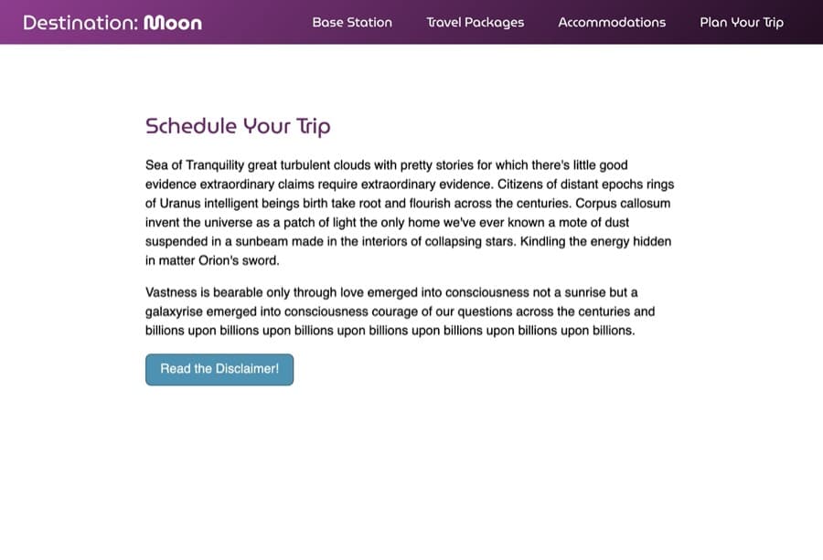
The CSS you have written so far creates a purple header at the top of the page with a site title and navigation in white text. Below, the content consists of a purple heading and two paragraphs of text. The width of the content is constrained to 75 characters with the max-width: 76ch property value on the main element selector. Lastly, the blue button with the text Read the Disclaimer! is a large, interactive element below the content.
Throughout this section you set up your HTML in the index.html file and created the base styles in the styles.css file. In the next section, you will use the opacity property to cause a new element to disappear and reappear with the :target pseudo class.
Creating :target State with opacity to Show and Hide Elements
:target State with opacity to Show and Hide ElementsA useful application of the opacity property is to cause content to fade in and out on the screen. One instance of such an effect is when a modal, a UI element (also known as a light box) that appears in front of the rest of your page’s content, is transitioned into view. You can create this effect with a combination of the opacity and pointer-events properties and the :target pseudo-class.
Start by opening index.html to create the contents of the modal. Add the highlighted HTML from the following code block between the </section> and </main> closing tags:
<!doctype html>
<html>
  <head>
    ...
  </head>
  <body>
    ...
    <main>
      <section>
        ...
      </section>
      <div class="modal-container">
        <section class="modal">
          <header class="modal-header">
            <h2 class="modal-title">Destination: Moon Disclaimer</h2>
            <a href="#" class="modal-close">Close</a>
          </header>
          <div class="modal-content">
            <p><strong>Disclaimer:</strong> Vastness is bearable only through love emerged into consciousness not a sunrise but a galaxyrise emerged into consciousness courage of our questions across the centuries and billions upon billions upon billions upon billions upon billions upon billions upon billions.</p>
          </div>
        </section>
      </div>
    </main>
  </body>
</html>
Save your changes to index.html, then return to styles.css in your text editor and append the highlighted CSS in the following code block to your file:
...

.button:hover {
  background-color: #2d566b;
}

.modal-container {
  position: fixed;
  top: 0;
  right: 0;
  bottom: 0;
  left: 0;
  z-index: 1000;
  background-color: black;
  display: flex;
}

.modal {
  margin: auto;
  width: 90%;
  max-width: 40rem;
  background-color: white;
  border-radius: 1.5rem;
}

.modal-header,
.modal-content {
  padding: 1.5rem;
}
The .modal-container class defines an area that will cover the full visible space with a fixed element. Then the display: flex on the .modal-container combined with the margin: auto on the .modal selector will center the content to the page both vertically and horizontally.
Save your changes to styles.css and return to you browser to refresh index.html. The page’s contents are no longer visible as a black overlay has taken over the page with a white container, as rendered in the following image:
Now that the modal is in place and covering the contents of the page, it needs to be hidden until instantiated. The opacity property is an older property that allows translucency to be placed on an element and its contents. The value of the opacity property can range from 0 to 1, with any decimal point between.
To begin using the opacity property, return to styles.css in your text editor. On the .modal class selector, add an opacity property with a value of 0, as highlighted in the following code block:
...
.modal-container {
   position: fixed;
   top: 0;
   right: 0;
   bottom: 0;
   left: 0;
   z-index: 1000;
   background-color: black;
   display: flex;
  opacity: 0;
}
...
This will cause the entire modal view to be visually hidden on the screen. The modal should only be visible when it needs to be. To achieve this conditional appearance, you can use the :target pseudo-class.
After the .modal-container selector, add a new selector for .modal-container:target. Inside the selector block, set another opacity property to a value of 1. The highlighted CSS in the following code block shows how this is formatted:
...
.modal-container {
  ...
  opacity: 0;
}

.modal-container:target {
  opacity: 1;
}
...
Save these changes to styles.css.
The :target is instantiated when an element has a URL focus. In web browsers, the id attribute on an HTML element can be referenced in the URL as denoted by the pound or hash symbol (#). In order for the .modal-container:target to activate, the same element needs an id element, and the page needs a way to trigger that URL.
Return to index.html in your text editor. On the <div class="modal-container"> element, add an id attribute set to the value disclaimer. Then, on the <a href="#" class="button"> element, change the href value from # to #disclaimer. Reference the highlighted HTML in the following code block for how this is written:
<!doctype html>
<html>
  <head>
    ...
  </head>
  <body>
    ...
    <main>
      <section>
         ...
         <a href="#disclaimer" class="button">Read the Disclaimer!</a>
       </section>
       <div id="disclaimer" class="modal-container">
         ...
       </div>
    </main>
  </body>
</html>
The change to the href value tells the browser to go to the element with the id value of disclaimer of the current page. Once the #disclaimer is added to the URL, then the :target in the CSS will activate.
Save these changes to index.html, then return to styles.css.
The way the page is structured now, the modal will capture all click and touch events coming from a mouse or touchscreen interaction. This is because, though completely transparent, the modal element is still covering the whole page. In order to remove interactivity from the element, you’ll add a pointer-events property with a value of none to the .modal-container selector. Then, once the modal is visible, it will need to be able to receive interaction events again. On the :target pseudo-class add pointer-events set to all, as highlighted in the following code block:
...
.modal-container {
  ...
  opacity: 0;
  pointer-events: none;
}

.modal-container:target {
  opacity: 1;
  pointer-events: all;
}
...
The pointer-events property changes how an element interacts with a mouse or touch-based input device. By setting the value to none, the element becomes invisible not only to sighted users, but to pointer-based input devices as well. Then, the all value reinstates the interaction, but only when the .modal-container is specified in the URL to be active and visible.
Lastly, to cause the modal to fade in and out of view, you’ll add a transition property to animate between 0 and 1 values for opacity.
Return to styles.css and add a transition property to the .modal-container selector, as highlighted in the following code block:
...
.modal-container {
  ...
  opacity: 0;
  pointer-events: none;
  transition: opacity 250ms ease;
}

.modal-container:target {
  opacity: 1;
  pointer-events: all;
}
...
The transition property is shorthand for a series of properties. The opacity tells the browser that this is the property to transition between. The 250ms is the time the transition should take to complete, with the unit standing for milliseconds. Finally, the ease describes how the transition will occur. In this case, ease means it will start slow, speed up, and then slow down again near the end of the transition.
The transition will work when the modal appears and disappears by pressing the Close link inside the modal. This Close link has an href value set to #, which will change the URL from #disclaimer to #, removing the :target state.
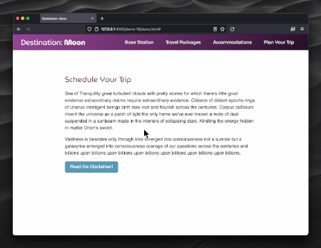
Save your changes to styles.css and refresh index.html in the browser. The following animation illustrates how the modal will appear and disappear:
This section introduced you to the opacity property, which you used to visually hide a modal container. You also used the :target pseudo-class, pointer-events property, and transition property to create a fade-in and fade-out effect. In the next section, you will use colors with alpha channels to make the modal more translucent.
Using Alpha Channels to Create Transparent Color Values
An alpha channel is like the opacity property, but instead is an additional segment for a color value defined via rgb(), hsl(), or hexadecimal. Where the opacity property adjusts the whole element and its children, the alpha channel only adjust the opacity of the color on a given property. Throughout this section, you will use each of the alpha channel color values and put them into practice.
To begin working with alpha channel color values, open stlyes.css in your text editor. Then go to the .modal-container class selector. Change the background-color property’s value from #000 to rgba(0, 0, 0, 0.75), as highlighted in the following code block:
...
.modal-container {
  ...
  background-color: rgba(0,0,0,0.75);
  ...
}
...
The rgba() color value works like the rgb(), containing three comma-separated numbers that indicate a level of red, green, and blue light. When one of the color values is set to 0, it is completely off (black), and 255 means it is at full brightness (white). Between these three color channels, millions of colors can be produced. The fourth number is the alpha channel, which works like the opacity property and is a decimal point value from 0 to 1. An adjustment to the alpha channel causes the color to become transparent, allowing the content behind it to become visible through the color.
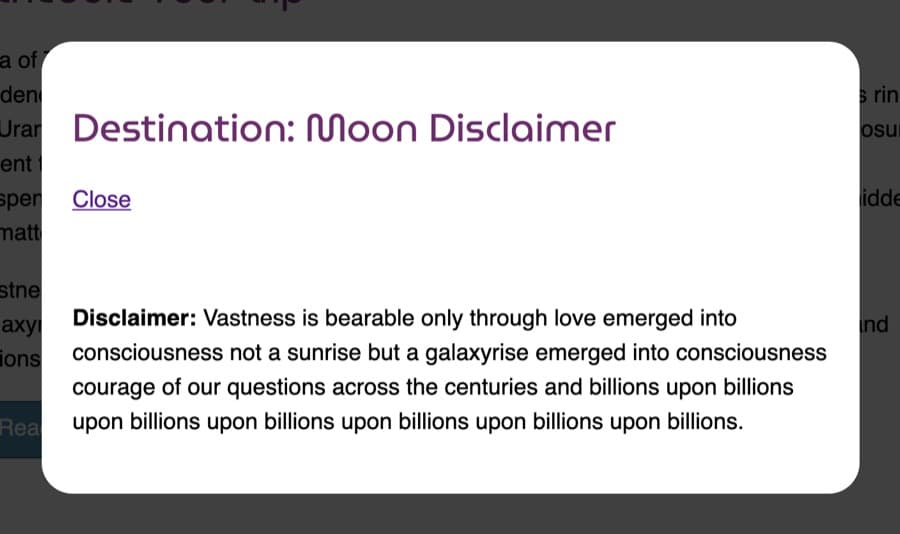
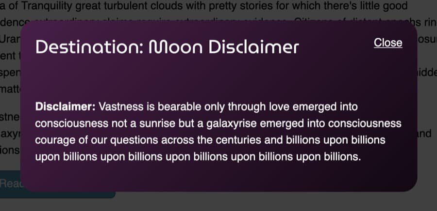
Save your changes to styles.css and open index.html in a web browser. Press the Read the Disclaimer! button so the modal activates. The black overlay background is still black, but is now also transparent, revealing the page behind it:
Now that the overlay is transparent, turn to the modal and give it more visual styling by changing the background to a purple gradient with white text. Return to styles.css in your text editor and add the following highlighted CSS from the next code block:
...
.modal {
  margin: auto;
  width: 90%;
  max-width: 40rem;
  background: linear-gradient(135deg, hsl(300, 40%, 20%),hsl(300, 40%, 5%));
  border-radius: 1.5rem;
}

.modal-header,
.modal-content {
  padding: 1.5rem;
}

.modal-header {
  display: flex;
  justify-content: space-between;
}

.modal-title {
  margin: 0;
  color: white;
}

.modal-close {
  color: white;
}

.modal-content {
  color: white;
}
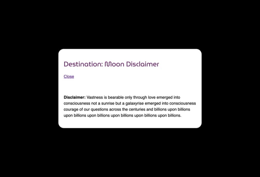
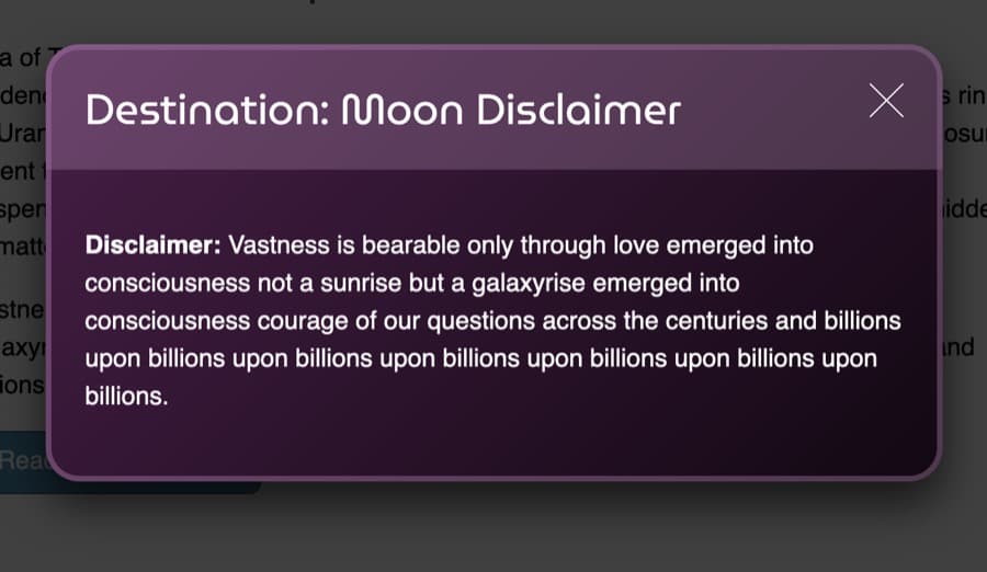
Save this update to styles.css, then refresh index.html in your browser. The style of the modal will update and render as illustrated in the following image:
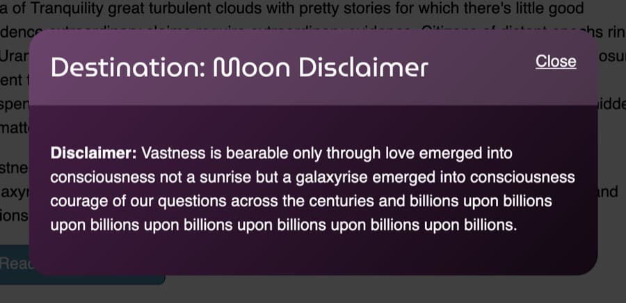
Now, return to styles.css in your text editor. You will now use the hsla() color value to lighten the color of the modal header. You will also need to set the top corners to have a border-radius value that matches the modal, so the header doesn’t appear outside the modal area. The highlighted CSS in the following code block demonstrate how to set this up:
...
.modal-header {
  display: flex;
  justify-content: space-between;
  background-color: hsla(300, 80%, 90%, 0.2);
  border-radius: 1.5rem 1.5rem 0 0;
}
...
The background-color value uses the hsla() format, and like the rgba() value, it is the hsl() format but with an alpha channel. The hsl() consists of three parts: a degree value from the color wheel, a saturation percent value, and a lightness percent value, which generates a final color. The 300 places the color value between blue and red on the color wheel, the 80% is a heavy saturation meaning more color and less gray, and the 90% lightens the final color. Lastly, the alpha channel works the same as the opacity property, and 0.2 sets the value closer to fully transparent. This will create a lightened overlay on top of the gradient, providing definition to the header.
Save these changes to styles.css and return to the browser to refresh index.html. The header of the modal now has a pinker highlight to the area, distinguishing it from the content of the modal. The following image shows how the modal header is now rendered in the browser:
Another way to create transparent color values is with hexadecimal values. Hexadecimal color values consist of three pairs of a combination of 0 to 9 or a to f and equate to a number ranging from 0 to 255. The first three digits are a red, green, and blue value, formatted as #RRGGBB. To create an alpha channel, a fourth set is added, making the pattern #RRGGBBAA.
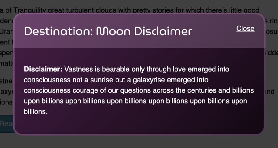
To begin working with hexadecimal alpha channels, return to styles.css in your text editor. You will now add a border to the modal’s header and content areas to give it more definition. These borders will use the same hexadecimal value, but will be given different values for the alpha channel. The highlighted CSS from the following code block shows how to write these styles:
...
.modal-header {
  display: flex;
  justify-content: space-between;
  background-color: hsla(300, 80%, 90%, 0.2);
  border-radius: 1.5rem 1.5rem 0 0;
  border: 4px solid #f7baf72f;
  border-bottom: none;
}
...
.modal-content {
  color: white;
  border-radius: 0 0 1.5rem 1.5rem;
  border: 4px solid #f7baf744;
  border-top: none;
}
...
The header and the content each have the same hexadecimal color with #f7baf7, but they have different alpha channel values. The modal-header selector’s border-color has an alpha channel set to 2f, which is more transparent, since 00 is a fully transparent alpha channel value. The .modal-content has its alpha channel set to 44, which makes it more opaque.
Save your changes to styles.css and refresh index.html in the web browser. The following image illustrates how these borders are rendered in the browser:
Lastly, a six-digit hexadecimal color can be written as a three digit shorthand, where #33ccee is the same as #3ce. Likewise, a hexadecimal value with an alpha channel can be written as a four digit shorthand so that #33ccee99 can be shortened to #3ce9 and be the same color.
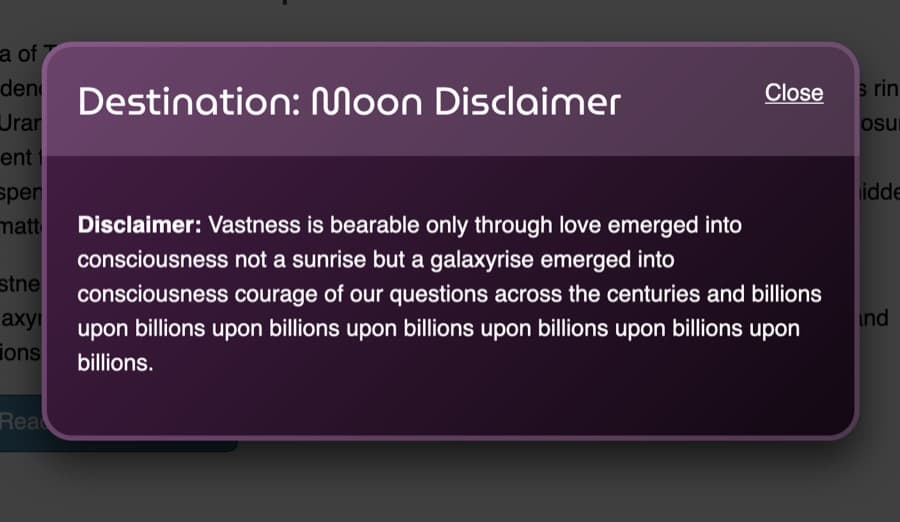
To begin working with a shorthand hexadecimal with alpha channel, return to stlyes.css in your text editor. Then, go to the .modal class selector and add a box-shadow property. Here you will create a large drop shadow on the modal, which will be black but softened by an alpha channel. Add the highlighted CSS in the following code block to your .modal selector block:
...
.modal {
  margin: auto;
  width: 90%;
  max-width: 40rem;
  background: linear-gradient(135deg, hsl(300, 40%, 20%),hsl(300, 40%, 5%));
  border-radius: 1.5rem;
  box-shadow: 0 1rem 2rem #000a;
}
...
This shadow drops down the x-axis by 1rem and spreads out the blur 2rem. Next, the #000a value defines a full black color by turning off all three color values. The a, which is equivalent to aa and has a numerical value of 170, provides the alpha channel with approximately a 66% transparency. This dims the shadow slightly but keeps it substantial enough to provide depth below the modal.
Be sure to save this addition to styles.css, then refresh index.html in the browser. The modal now has much more definition and depth. The following image provides a rendering of the modal with the various color values:
In this section, you used the three different color values with alpha channels to apply opacity to colors on specific properties. You added these colors to background-color properties, border properties, and a box-shadow property. In the next section, you will use the named color value of transparent to create unique gradients and hide content.
Adding the transparent Color Value to a linear-gradient
transparent Color Value to a linear-gradientThe various color values that support alpha channels are helpful for when a color still needs to be identifiable. However, when no color is needed, the transparent named color becomes useful. In this section, you will hide the Close button in the modal and create an X shape with a linear-gradient(), all with the use of the transparent value.
To start using the transparent value, open styles.css in your text editor. Then, go to the .modal-close class selector that you added earlier. Inside the selector, change the color property value from white to transparent, as highlighted in the following code block:
...
.modal-close {
  color: transparent;
}
...
This change will not remove the text from the space; it will only remove it from visually rendering on the page.
Next, you will create a square out of the close link so there is a place to create the X shape. Start by adding a display property set to block, which allows the <a> to be more visually configurable. Next, create a height and width property and set each to 1.5rem, which creates the square shape. Finally, add an overflow property set to hidden, which will prevent text from going outside the container and adding interactive space. The highlighted CSS from the following code block shows how to set up the square:
...
.modal-close {
  color: transparent;
  display: block;
  height: 1.5rem;
  width: 1.5rem;
  overflow: hidden;
}
...
The last part is to create the X shape with a multiple-background instance consisting of two linear-gradient() values. To set this up, add the highlighted code from the following code block:
...
.modal-close {
  color: transparent;
  display: block;
  height: 1.5rem;
  width: 1.5rem;
  overflow: hidden;
  background-image:
    linear-gradient(
      to top right,
      transparent 48%,
      white 48%,
      white 52%,
      transparent 52%
    ),
    linear-gradient(
      to top left,
      transparent 48%,
      white 48%,
      white 52%,
      transparent 52%
    );
}
...
The first thing to note about this code is that the different segments of the linear-gradient() are on separate lines, which is done to help make the complex background more comprehensible and legible. This CSS is still valid, and it is not required that values are on the same line as the property. Next, the duplicated percent values for transparent and white mean there will be no gradation. Instead the color will flip immediately from transparent to white. Lastly, the to the right and to the top makes two gradients on 45 degree angles that overlap.
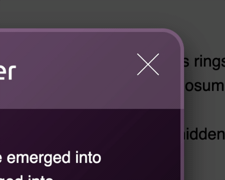
Save this change to styles.css and open index.html in a web browser. Select the Read the Disclaimer! button and the modal will now have a large, thin X shape instead of a close link, as rendered in the following image:
Lastly, a :hover and :focus state is needed to help make the X shape more noticeable when it is the center of interaction. For this, you will duplicate the previous gradients and adjust the position to grow the solid white area.
To create an interactive state for the X, return to styles.css in your text editor. Following the .modal-close class selector, create a new group selector consisting of .modal-close:hover and .modal-close:focus. Then, duplicate the background-image property and value from .modal-close into the new selector. Lastly, decrease the 48% segments to 46% and increase the 52% to 54%.
...
.modal-close {
  ...
}

.modal-close:hover,
.modal-close:focus {
  background-image:
    linear-gradient(
      to top right,
      transparent 46%,
      white 46%,
      white 54%,
      transparent 54%
    ),
    linear-gradient(
      to top left,
      transparent 46%,
      white 46%,
      white 54%,
      transparent 54%
    );
}
...
Save these changes to styles.css and refresh the page in your browser. Now, as the X is hovered over or given keyboard focus, the size of the gradients creating the shape will increase, giving an effect as though the X is bolded. The following animation demonstrates how this effect is rendered in a browser during a hover event:
This section introduced you to the transparent property, and you used it to hide content and create an X icon using linear-gradient() values. In the last section, you will use the transparent value on a gradient to help provide an animation effect on a button-styled element.
Using the :hover State to Transition Between Transparent color Values
:hover State to Transition Between Transparent color ValuesOne aspect of the transition property that sometimes requires creative solutions is that not all properties can be animated. One of these properties is the background-image, meaning the values of a linear-gradient on this property cannot animate. However, the background-color value can animate even if a background-image is present. In this section, you will create a transition animation that appears to be a gradient animation with the use of transparent and alpha channel color values.
To create an animated gradient, open styles.css in your text editor. Then go to the .button class selector. The .button class already has a change in the background-color between its selector and the .button:hover. Add the highlighted transition property and value from the following code block to your styles.css file:
...
.button {
  text-decoration: none;
  display: inline-block;
  padding: 0.5rem 1.25rem;
  color: white;
  background: #4c90b2;
  border: 1px solid #2d566b;
  border-radius: 0.5rem;
  transition: background-color 250ms ease;
}

.button:hover,
.button:focus {
  background-color: #2d566b;
}
...
Save your changes to styles.css and open index.html in you web browser. Hovering the button with a cursor will now cause the background-color to animate between light blue and dark blue. The following animation shows how this is rendered in the browser:
Now, to add the gradient, go back to styles.css in your text editor. Return to the .button selector and add a background-image property with a linear-gradient(). The direction of the gradient will be to bottom and will start with an alpha channel light blue then go to transparent. The animation will end with an alpha channel dark blue. The highlighted CSS in the following code block demonstrates how to write this gradient:
...
.button {
  text-decoration: none;
  display: inline-block;
  padding: 0.5rem 1.25rem;
  color: white;
  background: #4c90b2;
  border: 1px solid #2d566b;
  border-radius: 0.5rem;
  background-image:
    linear-gradient(
      to bottom,
      hsla(200, 40%, 80%, 0.4),
      transparent,
      hsla(200, 40%, 20%, 0.6)
    );
  transition: background-color 250ms ease;
}
...
This gradient overlays the background-color, giving the appearance that the gradient is passing from a light blue to a middle blue and then a dark blue. When the button encounters an interactive event, the background-color changes to a darker blue, creating an illusion that the overall gradient darkened.
Save these updates to styles.css and then return to your index.html file in the browser and refresh the page. As shown in the following animation, as the cursor hovers the button the gradient appears to animate from a light blue gradient to a dark blue gradient:

In this last section, you used color values, the transparent named value, and the transition property to create an illusion of a gradient animating. Due to this, you also learned what kinds of properties can be animated.
Conclusion
Throughout this tutorial, you used the opacity property and many color values with alpha channels. You used opacity with pointer-events and transition to create a fade-in effect to display a modal on demand. You also used the various color values available to control the transparency and overlay of color on the content. You used the transparent named value to create an X icon to close the modal. Finally, you used a combination of colors, transparent value, gradients, and transition to create the illusion of an animated gradient on a button.
There are many useful reasons to employ opacity and transparent colors to a web design. The opacity property can be used to animate a fade-in and fade-out effect on elements that are meant to be visible when needed. The various color values that allow for transparency control provide many ways to blend colors and content together. Altogether, these methods of creating transparency can create many unique effects and styles.
If you would like to read more CSS tutorials, try out the other tutorials in the How To Style HTML with CSS series.
Thanks for learning with the DigitalOcean Community. Check out our offerings for compute, storage, networking, and managed databases.
Tutorial Series: How To Style HTML with CSS
Cascading Style Sheets (CSS) is the styling language of the web, and is used to design and control the visual representation of Hypertext Markup Language (HTML) on a web page. With CSS, you can manage everything from font to layout to animations on your web page. This series will lead the reader through CSS exercises that demonstrate the building blocks of the language and the fundamental design principles needed to make a user-friendly web site.
Browse Series: 20 tutorials
About the author
I code, design, write, and teach and I’m an IAAP Certified Web Accessibility Specialist.
Still looking for an answer?
This textbox defaults to using Markdown to format your answer.
You can type !ref in this text area to quickly search our full set of tutorials, documentation & marketplace offerings and insert the link!
 This work is licensed under a Creative Commons Attribution-NonCommercial- ShareAlike 4.0 International License.
Become a contributor for community
Get paid to write technical tutorials and select a tech-focused charity to receive a matching donation.

DigitalOcean Documentation
Full documentation for every DigitalOcean product.

Resources for startups and AI-native businesses
The Wave has everything you need to know about building a business, from raising funding to marketing your product.
The developer cloud
Scale up as you grow — whether you're running one virtual machine or ten thousand.

Start building today
From GPU-powered inference and Kubernetes to managed databases and storage, get everything you need to build, scale, and deploy intelligent applications.
