Developer

The author selected the Diversity in Tech Fund to receive a donation as part of the Write for DOnations program.
Introduction
When building a website, background styling plays a large role in the visual aesthetic of the design. Whether you are building out a button or a large interactive area, background styles provide definition and can distinguish areas for particular purposes. Understanding what is possible with the background family of properties in CSS will help you create more efficient code and visually interesting designs.
In this tutorial, you will create a grid of elements, each showcasing different ways of applying a background to the element. By creating a grouped series of examples, you will end up with a reference tool and a place to experiment with different background properties. You will create a sheet of 18 background color, image, and gradient variations. Each variation will use background-related properties to achieve a particular effect. The last variation will combine many approaches on a single element, creating a multiple-background effect.
Prerequisites
- An understanding of CSS’s cascade and specificity features, which you can get by reading How To Apply CSS Styles to HTML with Cascade and Specificity.
- Knowledge of type selectors, combinator selectors, and selector groups, which you can find in How To Select HTML Elements to Style with CSS.
- Familiarity with color values, which you can find in How To Use Color Values with CSS.
- An empty HTML file saved on your local machine as
index.htmlthat you can access from your text editor and web browser of choice. To get started, check out our How To Set Up Your HTML Project tutorial, and follow How To Use and Understand HTML Elements for instructions on how to view your HTML in your browser. If you’re new to HTML, try out the whole How To Build a Website with HTML series.
Setting Up the Initial HTML and CSS
To start working with background styling, you will first set up the HTML and CSS code that you will work on through the rest of the tutorial. In this section, you will write out all the necessary HTML and some initial CSS styles that will handle layout and set the groundwork for the visual aesthetic.
Begin by opening index.html in your text editor. Then, add the following HTML to the file:
<!doctype html>
<html>
  <head>
  </head>
  <body>
  </body>
</html>
Next, go to the <head> tag and add a <meta> tag to define the character set for the HTML file. Set the title of the page, add a <meta> tag defining how mobile devices should render the page, and finally load the CSS file that you will make later with a <link> tag.
These additions are highlighted in the following code block. You will encounter this highlighting method throughout the tutorial as code is added and changed:
<!doctype html>
<html>
  <head>
    <meta charset="utf-8">
    <meta name="viewport" content="width=device-width, initial-scale=1">
    <title>Background Styles Resource</title>
    <link rel="stylesheet" href="styles.css">
  </head>
  <body>
  </body>
</html>
After adding the <head> content, move to the <body> element where you will add a title and the base <div> for our grid. Add the highlighted section from this code block to your index.html file in your text editor:
<!doctype html>
<html>
  <head>
    <meta charset="utf-8">
    <meta name="viewport" content="width=device-width, initial-scale=1">
    <title>Background Styles Resource</title>
    <link rel="stylesheet" href="styles.css" />
  </head>
  <body>
    <h1>Background Styles Resource</h1>
    <div class="grid">
    </div>
  </body>
</html>
The <h1> provides a heading describing the contents of the page. The <div> element with the grid class attribute will contain all the remaining HTML added throughout the tutorial.
Save your changes to index.html and leave it open in your text editor. Then, go ahead and open index.html in your web browser. During the tutorial, you will switch back and forth between your text editor and your browser to verify the changes made to your code.
Next, return to your text editor and create a file called styles.css. This is the file that you referenced in the <head> element in your index.html. In the styles.css file, add the following code:
body {
  font-family: system-ui, sans-serif;
  color: #333;
}

h1 {
  text-align: center;
}
The body element selector changes the font for the page from the default serif to the operating system’s font, if supported, and then falls back to a sans-serif font. The h1 selector centers the text on the page.
Next, you will add a CSS Grid, a collection of comprehensive layout properties, to the .grid class selector. The highlighted CSS of the following code block indicates what will be added to styles.css:
...
h1 {
  text-align: center;
}

.grid {
  width: 90%;
  max-width: 80rem;
  margin: 2rem auto;
  display: grid;
  grid-template-columns: repeat(3, minmax(100px, 1fr));
  grid-gap: 1.5rem;
}
The properties on this selector will set a flexible width with a max-width so you can resize the page and have the width adapt. It will also set a margin property to set space above and below the grid. Then you will apply the properties needed to define the grid.
The display property makes the element use CSS grid with the grid value. Once that is set, the other two properties, grid-template-columns and grid-gap, will now affect the contents of the .grid element, which you will add later. The grid-template-columns states that there will be 3 columns and that they must have a minimum width of 100px and a maximum width of 1fr (fraction) of the whole width. Since there are three columns, that fraction will be 33.333%. Lastly, the grid-gap defines that between each row and column of the grid, there is 1.5rem spacing.
Next, you will add two more class selectors for HTML you will write in later sections. Add an .item class selector, which will apply to grid items of each variation. Then, add a .preview class selector, which will contain the background style demo. The highlighted CSS in the following code block demonstrates how to set this up:
...
.grid {
  ...
}

.item {
  border: 1px solid #999;
  background-color: white;
}

.preview {
  height: 16rem;
  border-bottom: 1px solid #999;
}
You have now set up the starting points for your index.html and styles.css files. Be sure to save the changes to both files before continuing.
For the last part of the setup for this tutorial, create a new directory (or folder) alongside your index.html and styles.css files called images. Download each of the following images and add them to this newly created images directory:
- Repeatable Pattern: Save as
pattern.png. - X-Axis Repeatable Pattern: Save as
pattern-x.png. - Y-Axis Repeatable Pattern: Save as
pattern-y.png. - Hummingbird Photo: Save as
photo.jpg. (Photo by Mark Olsen on Unsplash)
In this section you prepared the HTML and CSS that will support your code throughout the rest of the tutorial. You also downloaded demo images and added them to an images directory alongside your index.html and styles.css files. In the next section, you will set a background-color and a background-image.
Using background-color and background-image on Elements
background-color and background-image on ElementsYou can fill an HTML element with one of two types of backgrounds: a color or an image. CSS-generated gradients are a type of image, and will be covered later in the tutorial. In this section, you will work with applying a color background to an element and then load an image file as a background on an element.
Start by opening index.html in your text editor and adding the highlighted HTML from the following code block inside the <div class="grid"> element:
...
<div class="grid">
  <div class="item">
    <div class="preview style-01"></div>
    <div class="item-info">
      <h2>Background Color</h2>
    </div>
  </div>
</div>
...
You will use this HTML format for each variation you create throughout the tutorial. What will change from variation to variation is the class attribute value, which will increment the number for each variation. The <h2> element will have a corresponding title for that variation.
Save your changes to index.html and then open styles.css in your text editor.
After the .preview class selector, add a new class selector called .style-01. Then, in the new selector block, add a background-color property with a named value of deeppink. The highlighted CSS in the following code block shows how this will look:
...
.preview {
  height: 16rem;
}

.style-01 {
  background-color: deeppink;
}
Save your changes to styles.css and then return to your web browser and refresh index.html. You will now have a pink image in the first variation, as shown in the following image:

The background-color property will accept any valid CSS color, including colors that have an alpha channel, such as RGBA and HSLA. You can use the alpha channel to provide transparency to the background color.
Next, return to index.html and add a new variation, this time incrementing the class to style-02. Also set the <h2> element’s text to Background Image. The highlighted HTML in the following code block demonstrate how this will appear in your file:
...
<div class="grid">
  ...
  <div class="item">
    <div class="preview style-02"></div>
    <div class="item-info">
      <h2>Background Image</h2>
    </div>
  </div>
</div>
...
Save your changes to index.html, then open styles.css in your text editor. Add a .style-02 class selector, then add a background-image property. To load the photo.jpg file as the background, first create a url() function as the value. Then, inside the parentheses of the url() function, add a path to the file, as the highlighted CSS in the following code block demonstrates:
...
.style-01 {
  ...
}

.style-02 {
  background-image: url("./images/photo.jpg");
}
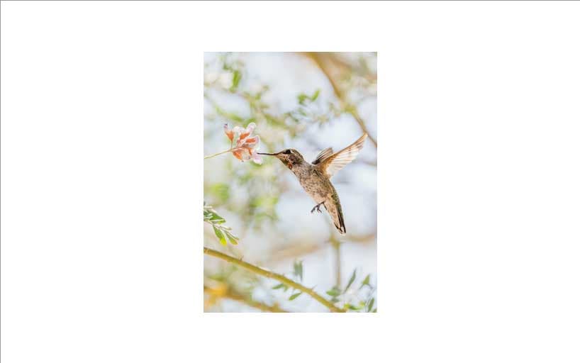
Save your changes to styles.css and then refresh index.html in your web browser. The preview area will only display a portion of the photo.jpg image, as the image’s size is larger than the size of the preview area. A background image, by default, is shown at its original pixel dimensions, leading to an image that is not fully visible. The following image demonstrates how this will appear in your browser:

In this section you set up your first two background variations. The first used a background-color property, and the second used the background-image property. Next, you will create four variations to use different values for the background-repeat property.
Tiling Images With the background-repeat Property
background-repeat PropertyNow that you can load background images onto an element, you will now work with different ways of tiling images with a repeating pattern image. By default, a background-image repeats as a tiled pattern along the x- and y-axis, but you can control that repetition to only repeat along a single axis, or to not repeat at all. In this section, you will use the background-repeat property to control four different repeating scenarios.
First, open index.html in your text editor and add a new item to the grid with a class of style-03 and an <h2> with Background Repeat. The highlighted HTML from the following code block shows how this will appear in your file:
...
<div class="grid">
  ...
  <div class="item">
    <div class="preview style-03"></div>
    <div class="item-info">
      <h2>Background Repeat</h2>
    </div>
  </div>
</div>
...
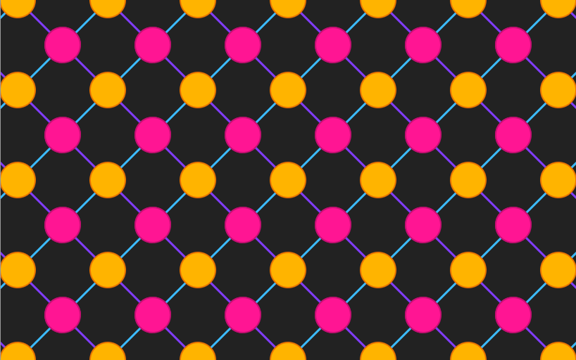
Next, save your changes to index.html and open styles.css in your text editor. Create a class selector for .style-03. Inside the selector block, add a background-image with a url() function that loads the pattern.png image from your images folder, as highlighted in the following code block:
...
.style-02 {
  ...
}

.style-03 {
  background-image: url("./images/pattern.png");
}
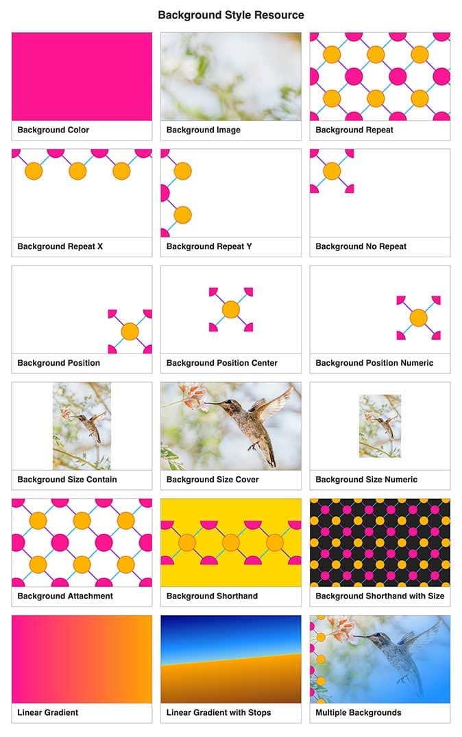
Save your changes to styles.css and then return to your web browser and refresh index.html. The pattern.png image will be set up as a repeatable tile that looks like an unending image that fills the whole element. The style for this element will appear in the browser as shown in the following image:
It is important to note that this image is repeating from the top left corner and expanding continuously toward the right and bottom. This is the default state of any background-image, which can create a seamless pattern like this or a more rigid repetition. The property creating this default is background-repeat set to a value of repeat.
With the background-repeat property, you also can create a seamless pattern repeating only from the left to the right. There are all kinds of effects that can use this kind of repeat, such as a jagged shape along the top of the container like a torn perforated edge. You could also use this to make a stylized double line graphic span from end to end on the bottom. By setting the background-repeat property to repeat-x, you can tell the browser to repeat the background along only the x-axis.
To start working along the x-axis, return to index.html in your text editor. Then, add a new HTML block to the grid with a class of style-04 and an <h2> with Background Repeat X. The highlighted HTML from the following code block demonstrates how this will appear in your file:
...
<div class="grid">
  ...
  <div class="item">
    <div class="preview style-04"></div>
    <div class="item-info">
      <h2>Background Repeat X</h2>
    </div>
  </div>
</div>
...
Save your changes to index.html and open styles.css in your text editor. Create a .style-04 class selector with a background-image property loading the pattern-x.png file in your images directory. This image is designed to repeat along the top x-axis of the element. Next, add a background-repeat property with a value set to repeat-x, as highlighted in the following code block:
...
.style-03 {
  ...
}

.style-04 {
  background-image: url("./images/pattern-x.png");
  background-repeat: repeat-x;
}
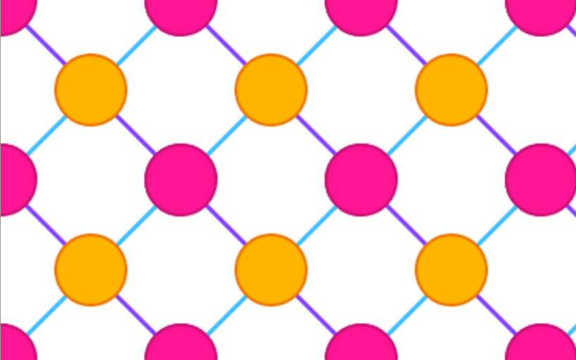
Save your changes to styles.css and then return to your web browser and refresh index.html. By default, repeating background images start in the top left corner of the element. Thus, the pattern will repeat along the top portion of the preview element’s area from left to right, as shown in the following image:
Just as a background can be set to repeat from left to right, it can also be set to repeat from top to bottom. You can do this by setting the background-repeat property to repeat-y, which will repeat the image along the y-axis in a single column. This can be useful for creating visual effects along the left or right side edge of a container.
To start using the y-axis, open index.html in your text editor and add a new item to the grid with a class of style-05 and an <h2> with Background Repeat Y. The highlighted HTML from the following code block shows how this will appear in your file:
...
<div class="grid">
  ...
  <div class="item">
    <div class="preview style-05"></div>
    <div class="item-info">
      <h2>Background Repeat Y</h2>
    </div>
  </div>
</div>
...
Then, save your changes to index.html and open styles.css in your text editor. As with the x-axis example, create a class selector for .style-05 and add a background-image property. This time, set the background-image value to point to the pattern-y.png image. Then, add the background-repeat property and set the value to repeat-y, as highlighted in the following code block:
...
.style-04 {
  ...
}

.style-05 {
  background-image: url("./images/pattern-y.png");
  background-repeat: repeat-y;
}
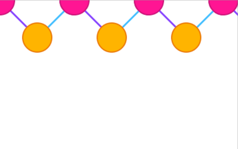
Save your changes to styles.css and then return to your web browser and refresh index.html. The pattern will now repeat down along the left edge of the preview element, as demonstrated in the following image:
Often it’s useful to not have a background image repeating at all. This could happen in instances where a visual graphic is added as a background instead of as HTML <img />, such as is done sometimes with logos or icons. The repetition can be disabled entirely by setting the background-repeat property to the no-repeat value.
To start, return to index.html in your text editor and add another item to the grid with a class of style-06 and an <h2> element with Background No Repeat. The highlighted HTML from the following code block shows how this will appear in your file:
...
<div class="grid">
  ...
  <div class="item">
    <div class="preview style-06"></div>
    <div class="item-info">
      <h2>Background No Repeat</h2>
    </div>
  </div>
</div>
...
Save your changes to index.html and open styles.css in your text editor. Add the .style-06 class selector and, as with the first variation of the section, create a background-image property that loads the pattern.png file as the background image. Next, add a background-repeat property set to the value no-repeat. The image will only show once, instead of the continuous tiled repetition. The highlighted CSS of the following code block demonstrates how this will appear in your styles.css file:
...
.style-05 {
  ...
}

.style-06 {
  background-image: url("./images/pattern.png");
  background-repeat: no-repeat;
}
Save your changes to styles.css and then return to your web browser and refresh index.html. There will now be a single instance of the pattern.png image in the top left corner of the preview element, as shown in the following image:
In this section you used the background-repeat property’s default value of repeat. You also repeated a tiled image horizontally with the repeat-x value and vertically with the repeat-y value. Lastly, you prevented an image from repeating at all with the no-repeat value. In the next section, you will use the background-position property to set where on the element the background image is anchored.
Adjusting Placement of a Background Image With background-position
background-positionWhen working with background-image, it is important to know that images are positioned in the top left corner of the element by default. However, that might not be where you want to set the background image within the element, especially if the image does not repeat. In this section, you will use the background-position property to change where the initial instance of the image is anchored in the element.
To begin working with background-position, open index.html in your text editor and add a new item to the grid with a class of style-07 and an <h2> with Background Position. The highlighted HTML from the following code block shows how this will appear in your file:
...
<div class="grid">
  ...
  <div class="item">
    <div class="preview style-07"></div>
    <div class="item-info">
      <h2>Background Position</h2>
    </div>
  </div>
</div>
...
Next, save your changes to index.html and open styles.css in your text editor.
Create a class selector for .stlye-07. For each of the CSS blocks in this section, load the pattern.png file for the background-image and set the background-repeat property to no-repeat, so that the positioning is more identifiable. Lastly, add a background-position property and use the named values of bottom right together to anchor the image to the adjacent corner from the default. The highlighted CSS of the following code block indicates how this is to be written:
...
.style-06 {
  ...
}

.style-07 {
  background-image: url("./images/pattern.png");
  background-repeat: no-repeat;
  background-position: bottom right;
}
Save your changes to styles.css and then return to your web browser and refresh index.html. There is now a single instance of the pattern.png file displaying in the bottom right corner of the preview element, as shown in the following image:
The background-position property can accept two named values, one for each axis. For the x-axis, these values are left, center, and right. For the y-axis, the values are top, center, and bottom. The center named value is present for both axes and can be combined to position a background image in the absolute middle of an element.
To center a background image, start by opening index.html in your text editor and add a new item to the grid with a class of style-08 and an <h2> element with Background Position Center. The highlighted HTML from the following code block shows how this will appear in your file:
...
<div class="grid">
  ...
  <div class="item">
    <div class="preview style-08"></div>
    <div class="item-info">
      <h2>Background Position Center</h2>
    </div>
  </div>
</div>
...
Next, save your changes to index.html and open styles.css in your text editor. Create a .style-08 class selector and add the background-image property loading pattern.png and the background-repeat property set to no-repeat as with the previous variation. You can set the background-position property to a single named value of center and the browser will understand to use this name for both the x- and y-axis positions. The highlighted CSS of the following code block shows how this is set up:
...
.style-07 {
  ...
}

.style-08 {
  background-image: url("./images/pattern.png");
  background-repeat: no-repeat;
  background-position: center;
}
Save your changes to styles.css and then return to your web browser and refresh index.html. The single instance of pattern.png is now floating in the center of the preview element, as shown in the following image:
You can also use numeric values along with named values to define a starting position for a background-image. This can be useful when you want to offset the background image from the element’s edge by a set or relative amount.
First, return to index.html in your text editor and add another item to the grid with a class of style-09 and an <h2> element with Background Position Numeric. The highlighted HTML from the following code block shows how this will appear in your file:
...
<div class="grid">
  ...
  <div class="item">
    <div class="preview style-09"></div>
    <div class="item-info">
      <h2>Background Position Numeric</h2>
    </div>
  </div>
</div>
...
Save your changes to index.html and open styles.css in your text editor. Next, create a .style-09 class selector with a background-image property that loads the pattern.png file and a background-repeat property with the no-repeat value. Then, add a background-position property with a value of right 10% bottom 40px, as highlighted in the following code block:
...
.style-08 {
  ...
}

.style-09 {
  background-image: url("./images/pattern.png");
  background-repeat: no-repeat;
  background-position: right 10% bottom 40px;
}
The right 10% portion of the background-position property will anchor the background-image 10% of the element’s width from the right. Then, the bottom 40px will set the background-image 40px from the bottom of the element.
Save your changes to styles.css and then return to your web browser and refresh index.html. The pattern image will now be in the bottom right portion of the element, but with some spacing from the edges, as shown in the following image:
In this section, you used the background-position property to anchor a background image to various positions using word values, such as bottom and center, as well as numeric values combined with the word values. In the next section, you will use the background-size property to resize a background image within the element.
Resizing a Background Image With the background-size Property
background-size PropertyImages loaded as backgrounds on an element are placed at their full pixel dimensions. For example, if the image file used for the background has a pixel dimension of 800⨉600, but the element it is applied to is 400⨉300, then 25% of the background image will be visible. In this section, you will use the background-size property to resize a background-image file.
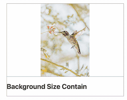
To begin resizing a background-image, open index.html in your text editor. Then, add a new item to the grid with a class of style-10 and an <h2> with Background Size Contain. The highlighted HTML from the following code block shows how this will appear in your file:
...
<div class="grid">
  ...
  <div class="item">
    <div class="preview style-10"></div>
    <div class="item-info">
      <h2>Background Size Contain</h2>
    </div>
  </div>
</div>
...
Next, save your changes to index.html and open styles.css in your text editor.
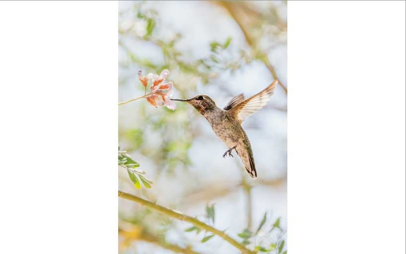
Create a class selector for .style-10. Inside the selector block, load the photo.jpg image of a hummingbird as the background-image. Next, set the background-repeat property to no-repeat and the background-position to center, so you only have one iteration of the image centered to the element. Lastly, add a background-size property and use the named value contain, as highlighted in the following code block:
...
.style-09 {
  ...
}

.style-10 {
  background-image: url("./images/photo.jpg");
  background-repeat: no-repeat;
  background-position: center;
  background-size: contain;
}
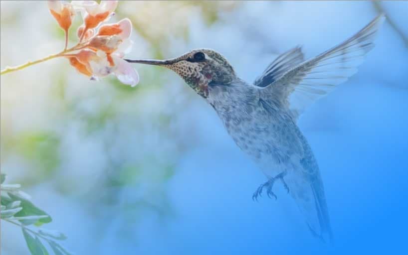
Save your changes to styles.css and then return to your web browser and refresh index.html. The image will now be scaled down to be fully contained within the element, as the background-size named value of contain implies. The image of a hummingbird is now fully visible, whereas without the background-size only a fraction was displayed. The following image demonstrates how this will appear in your browser:
Next, you will set the background-size value to resize so it fully covers the element’s background space. Start by opening index.html in your text editor and add another item to the grid with a class of style-11 and an <h2> element with Background Size Cover. The highlighted HTML from the following code block shows how this will appear in your file:
...
<div class="grid">
  ...
  <div class="item">
    <div class="preview style-11"></div>
    <div class="item-info">
      <h2>Background Size Cover</h2>
    </div>
  </div>
</div>
...
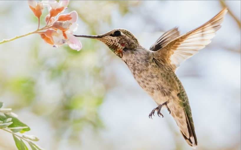
Save your changes to index.html and open styles.css in your text editor. Next, create a .style-11 class selector and copy over the same background-image, background-repeat, and background-position properties from the .style-10 selector block. Then, add a background-size property using the named value cover. The highlighted CSS in the following code block demonstrates how to write this in your text editor:
...
.style-10 {
  ...
}

.style-11 {
  background-image: url("./images/photo.jpg");
  background-repeat: no-repeat;
  background-position: center;
  background-size: cover;
}
Save your changes to styles.css and then return to your web browser and refresh index.html.
The background-image will now fill the whole element, but be scaled down to fit. The cover value will resize the background-image according to the orientation of the element. If the element is a landscape orientation, meaning it is wider than it is tall, then the background-image will be resized so the width is the same as the element. This causes the height of the background-image in this case to be taller than the element and therefore cut off by the bounds of the element. The following image demonstrates how background-image with a background-size of cover will appear in the browser:
Lastly, the background-size value can also accept numeric values. To use a numeric value, return to index.html in your text editor. Next, add a new item to the grid with a class of style-12 and an <h2> element with Background Size Numeric. The highlighted HTML from the following code block shows how this will appear in your file:
...
<div class="grid">
  ...
  <div class="item">
    <div class="preview style-12"></div>
    <div class="item-info">
      <h2>Background Size Numeric</h2>
    </div>
  </div>
</div>
...
Next, save your changes to index.html and open styles.css in your text editor. Create a .style-12 class selector. Once again, copy over the same background-image, background-repeat, and background-position properties used on .style-10 and .style-11 and add them to the selector block for .style-12.
Then, add the background-size property with a numeric value of 30%. When you provide the background-size property as a single numeric value, it will apply the same value to both the height and width of the image. To maintain the image’s aspect ratio, add the word auto after the 30%, which will then set the image’s width to 30% and set the height in proportion. The highlighted CSS indicates how the .style-12 selector block and properties will appear in your text editor:
...
.style-11 {
  ...
}

.style-12 {
  background-image: url("./images/photo.jpg");
  background-repeat: no-repeat;
  background-position: center;
  background-size: 30% auto;
}
Save your changes to styles.css and then return to your web browser and refresh index.html. The image of the hummingbird is now proportionally scaled by 30% of its width in the center of the element, as displayed in the following image:
In this section, you used the backround-size property to scale the background image to be fully visible within the element with the contain value. You used the cover property to scale the background image to resize so as much of the image could be shown while covering the whole element. Lastly, you used a numeric value to scale the background image to a set size and used the auto value to keep the scaling proportional. In the next section, you will use the background-attachment property to prevent the background image from scrolling with its element.
Affixing a Background Image With the background-attachment Property
background-attachment PropertyThe background-attachement property makes a background-image stationary. This creates an effect where the content slides over the image as though it were floating above it. In this section, you will use the background-attachment property to create this effect.
To begin, open index.html in your text editor and add a new item to the grid with a class of style-13 and an <h2> with Background Attachment. The highlighted HTML from the following code block shows how this will appear in your file:
...
<div class="grid">
  ...
  <div class="item">
    <div class="preview style-13"></div>
    <div class="item-info">
      <h2>Background Attachment</h2>
    </div>
  </div>
</div>
...
Next, save your changes to index.html and open styles.css in your text editor.
Create a .style-13 class selector. In the selector block, add a background-image property that loads the pattern.png file from your images directory. Use this image with the defaults, so that the image repeats to fill the whole element. Lastly, add the background-attachment property with a named value of fixed, as highlighted in the following code block:
...
.style-12 {
  ...
}

.style-13 {
  background-image: url("./images/pattern.png");
  background-attachment: fixed;
}
Save your changes to styles.css and then return to your web browser and refresh index.html. As you scroll down the page, the preview area for this variation may seem more like a window looking out to a background behind it. The important thing to consider when using this property is that the image is fixed to the browser viewport, not to the element. This will affect the background-position as it changes the origin point that determines the position. The following animation demonstrates this effect in the browser:
In this section, you used the background-attachment property with the fixed value to prevent the background image from scrolling with its element. In the next section, you will combine all the previous properties into the background shorthand property.
Combining Properties Into the background Property
background PropertyAll the CSS properties up to this point can be combined into a single background shorthand property. In this section, you will create two variations using this shorthand property to understand normal usage and the special considerations when applying a background-size value.
Note: Remember that using the background shorthand can override some property values, even if not explicitly declared. For example, background will override a background-image value even if no image is provided in the shorthand value.
To begin using the shorthand, open index.html in your text editor and add a new item to the grid with a class of style-14 and an <h2> with Background Shorthand. The highlighted HTML from the following code block shows how this will appear in your file:
...
<div class="grid">
  ...
  <div class="item">
    <div class="preview style-14"></div>
    <div class="item-info">
      <h2>Background Shorthand</h2>
    </div>
  </div>
</div>
...
Next, save your changes to index.html and open styles.css in your text editor. Create a .style-14 class selector and add the background shorthand property in the selector block. For the value, add a url() function that loads pattern.png from your images directory. After the function, add a space and add the named value center, which will apply a background-position value. Next, add another space with the named value repeat-x. Lastly, add a named color value of gold and finish the line with a semicolon, as highlighted in the following code block:
...
.style-13 {
  ...
}

.style-14 {
  background: url("./images/pattern.png") center repeat-x gold;
}
Save your changes to styles.css and then return to your web browser and refresh index.html. The pattern.png image is loaded and, due to the center and repeat-x values, is only repeating from left to right in the vertical center of the preview element. Additionally, the preview element is filled with a solid gold color, as shown in the following image:
For the background shorthand, the values can be in any order. The image does not have to come first, nor does the color need to come last. But there is one exception to this rule when applying a background-size to the shorthand. In this case, the background-size value must come after the background-position value and be separated not by a space but a forward slash symbol (/).
Return to the index.html file in your text editor. Then, add a new item to the grid with a class of style-15 and an <h2> with Background Shorthand with Size. The highlighted HTML from the following code block shows how this will appear in your file:
...
<div class="grid">
  ...
  <div class="item">
    <div class="preview style-15"></div>
    <div class="item-info">
      <h2>Background Shorthand with Size</h2>
    </div>
  </div>
</div>
...
Save your changes to index.html and open styles.css in your text editor. Then, add a .style-15 class selector with a background shorthand property. Use the same url('./images/pattern.png) for the image. Then set the position value to center, followed by a space then a forward slash (/). After the forward slash, add another space then 64px as the value for the background-size. Since a single value is used for the background-size value, both the height and the width of the background image will be set to 64px. Lastly, add a space and the shorthand hexadecimal value for a dark gray: #222. The highlighted CSS shows how this will appear in your styles.css file:
...
.style-14 {
  ...
}

.style-15 {
  background: url("./images/pattern.png") center / 64px #222;
}
Save your changes to styles.css and then return to your web browser and refresh index.html. The preview element for this variation will now have the pattern image scaled to approximately half its size and repeating with a dark gray background color. The following image shows how this background style is rendered in the browser:
In this section you used the background property, which is a shorthand property combining all of the properties used in this tutorial. In the next section, you will try out a CSS gradient with the linear-gradient() function.
Creating a Gradient With the linear-gradient Function
linear-gradient FunctionYou can supply the background-image property with values other than a url() image file; it can also create gradients. CSS currently has three different gradient functions, linear-gradient(), radial-gradient(), and conic-gradient(). In this section, you will use the linear-gradient() function to create a linear gradient between two colors, as well as a more complex gradient with multiple colors and a defined angle.
From a design perspective, gradients can have many uses. They provide a visual aesthetic that is more dynamic than a solid color, but not as complex as a photograph. A gradient can also be used with opacity to make a photo more subdued, improving the legibility of any overlaying text.
First, open index.html in your text editor and add a new item to the grid with a class of style-16 and an <h2> with Linear Gradient. The highlighted HTML from the following code block shows how this will appear in your file:
...
<div class="grid">
  ...
  <div class="item">
    <div class="preview style-16"></div>
    <div class="item-info">
      <h2>Linear Gradient</h2>
    </div>
  </div>
</div>
...
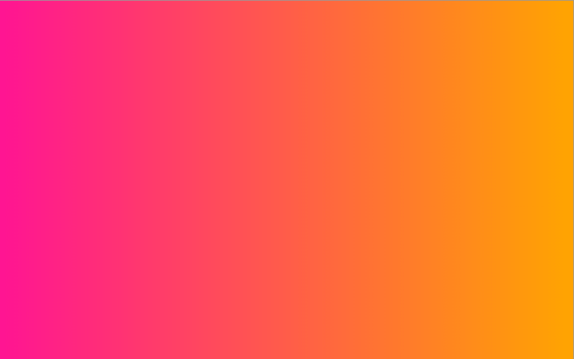
Save your changes to index.html and open styles.css in your text editor. Next, create a background-image property. For the value, add the linear-gradient() function. Within the function’s parentheses, start by adding a direction, which can use a word value of to right. This word value tells the browser to draw the gradient from left to right. Next, add a comma followed by the named color deeppink. After that, add another comma and the named color orange, as highlighted in the following code block:
...
.style-15 {
  ...
}

.style-16 {
  background-image: linear-gradient(to right, deeppink, orange);
}
Save your changes to styles.css and then return to your web browser and refresh index.html. The browser will draw a gradient with deeppink on the left and transition the color to orange on the right, as shown in the following image:
All gradients allow for multiple color values and stopping points that can be either a fixed value or a percentage. To begin, return to index.html in your text editor and add another item to the grid with a class of style-17 and an <h2> with Linear Gradient with Stops. The highlighted HTML from the following code block shows how this will appear in your file:
...
<div class="grid">
  ...
  <div class="item">
    <div class="preview style-17"></div>
    <div class="item-info">
      <h2>Linear Gradient with Stops</h2>
    </div>
  </div>
</div>
...
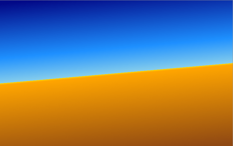
Next, save your changes to index.html and open styles.css in your text editor. Add a background-image property with a linear-gradient() value. Inside the function’s parentheses, add a direction of 175deg. The linear-gradient() function accepts numeric degree values in addition to word directions. The first color is navy, but before adding a comma for the next color, add a space instead and set this color’s position on the gradient to 0%. Next, add the comma, followed by the color dodgerblue at 35% followed by a comma. Continue this process for skyblue 50%, then gold 50%, which sets a hard line between the two colors. Then finish out the gradient with orange 51% followed by saddlebrown 100%, as depicted in the highlighted CSS in the following code block:
...
.style-16 {
  ...
}

.style-17 {
  background-image: linear-gradient(175deg, navy 0%, dodgerblue 35%, skyblue 50%, gold 50%, orange 51%, saddlebrown 100%);
}
Save these changes to styles.css and then refresh the page in your web browser. This progression of colors and stop points creates an intricate gradient that may appear similar to a desert horizon image. The following image shows the rendering of this gradient in the browser:
In this section you used the linear-gradient() CSS function to create a two color gradient and a more complex gradient consisting of several colors and stop points. In the last section, you will create multiple backgrounds on one element.
Mixing an Image With a Gradient Using the Multiple Background Method
In this last section, you will combine everything you have worked with in this tutorial to apply multiple backgrounds to a single preview element. Multiple backgrounds can help create visually complex styles while using a minimal amount of HTML elements.
To start, open index.html in your text editor and add the last item to the grid with a class of style-18 and an <h2> with Multiple Backgrounds. The highlighted HTML from the following code block shows how this will appear in your file:
...
<div class="grid">
  ...
  <div class="item">
    <div class="preview style-18"></div>
    <div class="item-info">
      <h2>Multiple Backgrounds</h2>
    </div>
  </div>
</div>
...
Next, save your changes to index.html and open styles.css in your text editor. Create a .style-18 class selector and add a background property. Since multiple backgrounds can get long, it can be helpful to put the property values on their own line separate from the property name. For this first part, load the hummingbird image again, photo.jpg. Then add center / cover no-repeat, which will center the image to the element and scale the image to fill the space while not repeating the image. The highlighted CSS in the following code block demonstrates how to write this in your text editor:
...
.style-17 {
  ...
}

.style-18 {
  background:
      url("./images/photo.jpg") center / cover no-repeat
  ;
}
Save these changes to styles.css, then return to your web browser and refresh the page. The hummingbird image will be centered in the element and scaled to fit, as shown in the following image:

Multiple background images are layered as they are read by the browser. To add a gradient above the image of the hummingbird, the gradient will need to come before the image in the background value. Each layer of the multiple backgrounds is separated by a comma, which allows multiple sets of background shorthand values.
In order to add a gradient overlaying the hummingbird image, return to your styles.css file and to the .style-18 selector. Add a new line between the background property and the url("./images/photo.jpg") center / cover no-repeat. Then, add a linear-gradient() with a word direction of to top left in the parentheses. Add a comma followed by dodgerblue 10%, then transparent 80%. Lastly, after the closing parenthesis of the linear-gradient() add another comma to distinguish it as a multiple background, as demonstrated in the following highlighted code:
...
.style-18 {
  background:
    linear-gradient(to top left, dodgerblue 10%, transparent 80%),
    url("./images/photo.jpg") center / cover no-repeat
  ;
}
Save your changes to styles.css and then refresh index.html in your web browser. The gradient overlays the hummingbird image progressing from a full blue in the bottom right corner to transparent in the top left corner, as rendered in the browser in the following image:
Next, you’ll add one more background overlay of repeating images down the left side of the preview element.
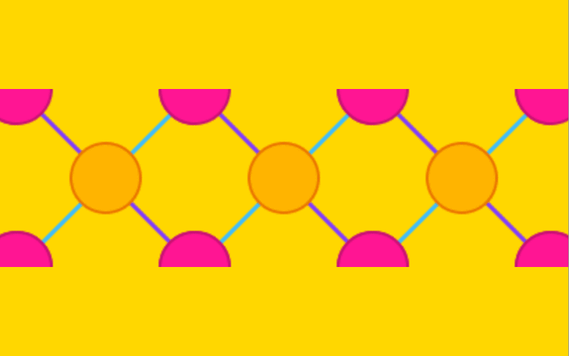
Return to styles.css in your text editor and add a new line after the background: property. Use the url() function to load in pattern-y.png from the images directory. After this, set the position of the background to be center left and add a forward slash to set the size of the background image to 64px. Lastly, set the background to repeat-y so that it repeats vertically and end the background set with a comma. The highlighted CSS in the following code block demonstrates how this is written:
...
.style-18 {
  background:
    url("./images/pattern-y.png") center left / 64px repeat-y,
    linear-gradient(to top left, dodgerblue 10%, transparent 80%),
    url("./images/photo.jpg") center / cover no-repeat
  ;
}
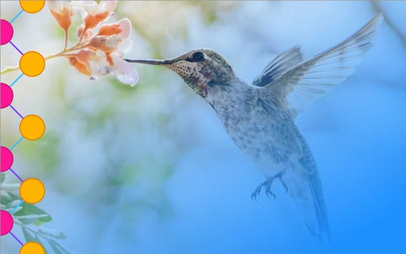
Save your changes to styles.css and then return to your web browser and refresh index.html. The new top layer background is the pink and orange dot pattern on the left side of the element. The pattern is overlaying both the gradient and the hummingbird image, as shown in the following image:
In this section, you used the skills you developed in preceding sections to apply multiple backgrounds to a single element. Multiple backgrounds are a useful tool for creating intricate styles without extra HTML overhead. This same effect without multiple background would take at minimum three HTML elements with several additional styling properties in order to have the elements layered on top of one another and have the same dimensions.
Conclusion
In this tutorial, you ran through examples of many properties to control how a background is presented on an HTML element. You applied solid colors, loaded image resources, and created gradients. You adjusted how an image tiles and repeats on an element and resized background images to fit differently in the space. You also combined all of these properties into the background shorthand and composed multiple backgrounds. Out of this tutorial, you created a resource you can reference again and again on how to work with and combine these many background properties to create something new.
If you would like to read more CSS tutorials, try out the other tutorials in the How To Style HTML with CSS series.
Thanks for learning with the DigitalOcean Community. Check out our offerings for compute, storage, networking, and managed databases.
Tutorial Series: How To Style HTML with CSS
Cascading Style Sheets (CSS) is the styling language of the web, and is used to design and control the visual representation of Hypertext Markup Language (HTML) on a web page. With CSS, you can manage everything from font to layout to animations on your web page. This series will lead the reader through CSS exercises that demonstrate the building blocks of the language and the fundamental design principles needed to make a user-friendly web site.
Browse Series: 20 tutorials
About the author
I code, design, write, and teach and I’m an IAAP Certified Web Accessibility Specialist.
Still looking for an answer?
This textbox defaults to using Markdown to format your answer.
You can type !ref in this text area to quickly search our full set of tutorials, documentation & marketplace offerings and insert the link!
 This work is licensed under a Creative Commons Attribution-NonCommercial- ShareAlike 4.0 International License.
Become a contributor for community
Get paid to write technical tutorials and select a tech-focused charity to receive a matching donation.

DigitalOcean Documentation
Full documentation for every DigitalOcean product.

Resources for startups and AI-native businesses
The Wave has everything you need to know about building a business, from raising funding to marketing your product.
The developer cloud
Scale up as you grow — whether you're running one virtual machine or ten thousand.

Start building today
From GPU-powered inference and Kubernetes to managed databases and storage, get everything you need to build, scale, and deploy intelligent applications.
