Developer

The author selected the Diversity in Tech Fund to receive a donation as part of the Write for DOnations program.
Introduction
HTML and CSS work together to render visual elements of a web page in the browser. HTML elements carry computational and hierarchical meaning and have default styles the browsers apply to these elements. Among these default styles is the display property. The value of this property affects the box model, the mechanism that determines how elements interact with one another on a page. Using the display property, you can efficiently control how an element interacts with the layout of your web page, allowing you to create more flexible solutions for situations like responsive mobile web design.
In this tutorial, you will work through multiple demos using the display property and learn how it determines flow interactions with other elements. You will begin with the foundational values of display: block and inline. You will then use the combination value of inline-block to learn about the possibilities of the inline- prefixed values. Next, you will learn about the power and danger of using the none value. Lastly, you will use a max-width media query to transform a table into a display: block view on a small screen.
Prerequisites
- Knowledge of type selectors, combinator selectors, and selector groups, which you can find in How To Select HTML Elements to Style with CSS.
- Knowledge of the CSS box model, which you can find in the How To Work with the Box Model in CSS tutorial.
- Understanding of HTML table elements and their visual properties as context for the refactoring of the sample table later in the tutorial. You can learn about tables in the How To Style a Table with CSS tutorial.
- An empty HTML file saved on your local machine as
index.htmlthat you can access from your text editor and web browser of choice. To get started, check out our How To Set Up Your HTML Project tutorial, and follow How To Use and Understand HTML Elements for instructions on how to view your HTML in your browser. If you’re new to HTML, try out the whole How To Build a Website in HTML series.
Setting Up the Initial HTML and CSS files
To begin, you will set up the HTML and CSS files that you will use throughout the tutorial. You will also explore the default display values of text-containing elements.
Start by opening index.html in your text editor and adding the following code to your file:
<!doctype html>
<html>
  <head>
    <meta charset="utf-8" />
    <meta name="viewport" content="width=device-width, initial-scale=1" />
    <title>The Terrestrial Planets</title>
    <link href="styles.css" rel="stylesheet" />
  </head>
  <body>
  </body>
</html>
This code sets up the framework necessary for every HTML document. The information contained in the <head> element defines the page’s name in the <title> element and where to load the stylesheet, which is determined in the <link> element. The <meta> tags define the character encoding and small screen device handling, respectively. The main content of the page will be added inside the <body> tags throughout the tutorial.
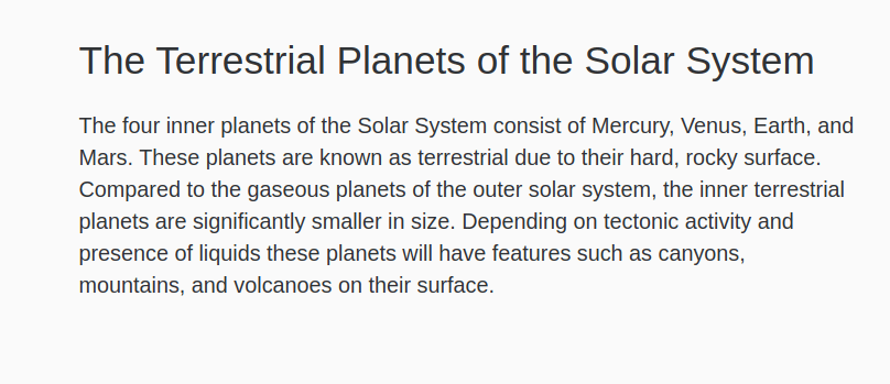
Next, inside the <body> element, create a <main> element with a class attribute set to content-width. You will use this element to handle the layout of the content within the page. Inside the <main> element, create an <h1> tag pair followed by a <p>. Within the <h1> and <p> elements, add the content shown in the following code block:
<!doctype html>
<html>
<head>
...
</head>
<body>
<main class="content-width">
<h1>The Terrestrial Planets of the Solar System</h1>
<p>
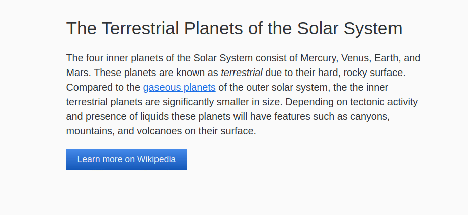
The four inner planets of the Solar System consist of Mercury, Venus, Earth, and Mars. These planets are known as terrestrial due to their hard, rocky surface. Compared to the gaseous planets of the outer solar system, the inner terrestrial planets are significantly smaller in size. Depending on tectonic activity and presence of liquids these planets will have features such as canyons, mountains, and volcanoes on their surface.
</p>
</main>
</body>
</html>
Highlighted code, like that in the previous code block, is used throughout this tutorial to emphasize changes to the code.
Save your changes to index.html, then create a new file called styles.css and open it in your editor as well.
In your styles.css file, you will add selectors for the elements you created in index.html. Create a selector for body and .content-width, then add the styling properties as demonstrated in the following code block:
body {
  margin: 0;
  font-family: sans-serif;
  line-height: 1.5;
  color: hsl(215, 5%, 20%);
  background-color: hsl(215, 5%, 98%);
}

.content-width {
  margin: 2rem auto;
  width: 90%;
  max-width: 40rem;
}
The styles for the body element reset some default layout and text styling with the margin, font-family, and line-height properties. The color and background color add a dark-gray blue and a light-gray blue to the page. The .content-width properties will keep it centered to the page, taking up 90% of the screen width until it reaches a maximum size of 40rem, or 640px.
Next, add some font styling to make the text more legible:
...
.content-width {
  margin: 2rem auto;
  width: 90%;
  max-width: 40rem;
}

h1 {
  font-size: 2rem;
  font-weight: 400;
  line-height: 1.2;
}

p {
  font-size: 1.125rem;
}
The h1 properties define the size and weight of the text and bring the line-height property down to a better spacing for headings. Lastly, the p element selector bumps up the font-size to 1.125rem, or 18px.
Save your changes to styles.css, then open your web browser. Open index.html in the browser by dragging the file into the browser window or using the browser’s Open File option. The browser will render the HTML and CSS code to produce a page like the following image:
So far, the HTML elements that you have worked with are known as block elements. These are elements that create defined areas of content that take up the full width of the parent container. Additionally, block elements are usually rendered by themselves on a new line. This means that added block elements stack toward the end of the page. For a top-to-bottom, left-to-right language like English, block elements stack toward the bottom of the browser window.
Next, you will add inline elements, which are elements that exist within the flow of text content. Since inline elements do not take up the entire width of their parent, and since they are not rendered on their own lines, they are added in the direction of the text flow. For English, this is a left-to-right direction.
Where block elements define the meaning and group of content, like a paragraph, inline elements provide context about a word or group of words, such as an emphasis.
Return to index.html in your text editor. In the second sentence, wrap the word terrestrial in the emphasis tag, <em>. Then, in the third sentence, wrap the phrase gaseous planets in an anchor tag, <a>. In the opening <a> tag add an href attribute with a value of https://en.wikipedia.org/wiki/Giant_planet. This will link to the Wikipedia page on the topic. The highlighted HTML in the following code block demonstrates how this is set up:
...
<p>
  The four inner planets of the Solar System consist of Mercury, Venus, Earth, and Mars. These planets are known as <em>terrestrial</em> due to their hard, rocky surface. Compared to the <a href="https://en.wikipedia.org/wiki/Giant_planet">gaseous planets</a> of the outer solar system, the inner terrestrial planets are significantly smaller in size. Depending on tectonic activity and presence of liquids these planets will have features such as canyons, mountains, and volcanoes on their surface.
</p>
...
Save these additions to index.html then, return to styles.css in your text editor. To demonstrate the difference between block and inline elements, create an a element selector. Inside the selector add the display property set to block, as demonstrated in the following code block:
...
p {
  font-size: 1.125rem;
}

a {
  display: block;
}
Save your change to styles.css, then return to the page in your web browser. Refresh the page to load the latest version of your code. The page demonstrates the key difference between a block and an inline element, as the link set to display: block now occupies its own line. This is demonstrated in the following image:
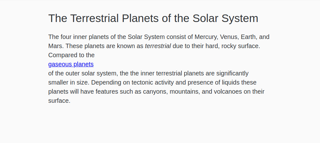
The primary difference between a block and an inline value is that a block breaks the current content flow while inline maintains it. Additionally, if a width property were applied to the a selector, it would not change the layout. When the content flow is disrupted by a block element, it remains broken, and the width always takes up the entire parent container width.
inline and block are the most common browser default values. While the display property has many values, with a few exceptions, all remaining elements use one of these two values.
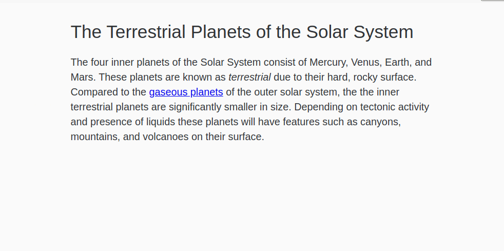
Now that you have explored the differences between block and inline, return to styles.css in your text editor. In the a selector, remove the display: block and replace it with a color property with a value of hsl(215, 80%, 50%), which is a richer version of the blue used on the body. Then create an a:hover selector with a text-decoration property set to none. This will remove the underline when the link is hovered. The highlighted CSS in the following code block shows how this is written:
...
a {
  color: hsl(215, 80%, 50%);
}

a:hover {
  text-decoration: none;
}
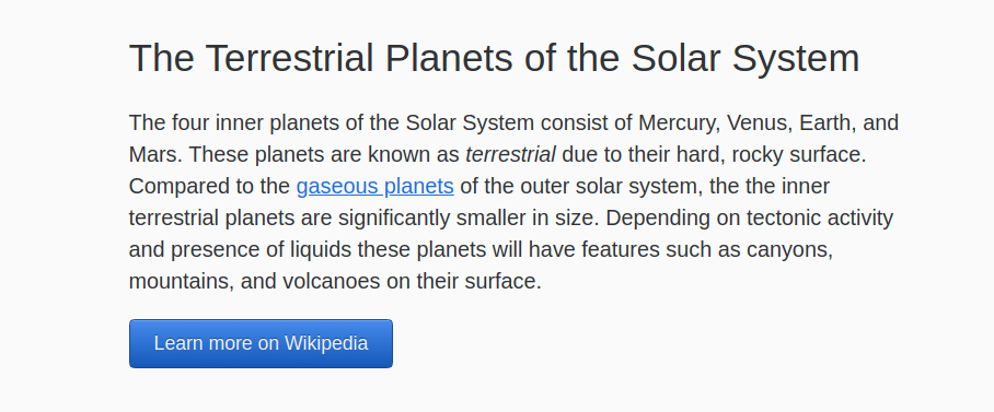
Save your changes to styles.css and refresh index.html in your web browser. The link will once again be inline with the text and will now be a lighter blue color, as shown in the following image:
In this section, you set up the HTML and CSS files you will use throughout the tutorial. These files will be amended and modified regularly, so keep both files open in your text editor and remember to save regularly. You also learned about the default display values, inline and block, and changed the value of an inline element to block. In the next section, you will use the inline-block value, which combines the capabilities of inline and block.
Using the inline-block Value
inline-block ValueNext, you will create a button element with a customizable width, rather than a button that takes up the whole width of the parent container. To do this, you will use the inline-block value, which maintains box model properties of the block value like margin and padding while also having the content flow properties of the inline value.
The inline- prefix is available on several display values, including inline-flex, inline-grid, and inline-table. The inline-block value defines the box model of the element as a block, but it does not disrupt the content flow. Additionally, inline-block does not take up the full parent width, as block does. Instead, the inline-block element condenses down to only the width of its content. For shorter content, such as a button, this makes for a useful resizing of the element with block box model properties, such as margin.
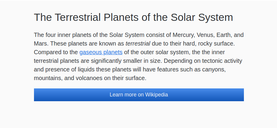
To begin working with inline-block, open index.html in your text editor. After the closing <p> tag, add an <a> tag with a class attribute set to button and an href attribute set to https://en.wikipedia.org/wiki/Terrestrial_planet. Inside that tag, add the text Learn more on Wikipedia. The highlighted HTML in the following code block demonstrates how this is written:
<div class="content-width">
  <h1>The Terrestrial Planets of the Solar System</h1>

  <p>
    ...
  </p>

  <a href="https://en.wikipedia.org/wiki/Terrestrial_planet" class="button">Learn more on Wikipedia</a>
</div>
Save your changes to index.html, then open styles.css in your text editor.
In your styles.css file, add a class selector for .button. This will style the link you created in your index.html file. By default, an <a> has a display value of inline. For this step, change the display value to block for the button class, then add the additional highlighted styles from the following code block:
...
a:hover {
  text-decoration: none;
}

.button {
  display:block;
  padding: 0.5rem 1.25rem;
  text-align: center;
  text-decoration: none;
  color: hsl(215, 20%, 95%);
  background: linear-gradient(to bottom, hsl(215, 80%, 60%), hsl(215, 80%, 40%));
}
The additional styles added to the .button element add padding, center the text, and remove the link underline. Additionally, the styles add a blue gradient of the same hue as the earlier versions of this blue with a near white text color.
Save these changes to the styles.css, then return to your browser and refresh index.html. The button will fill the full width of the content area with a blue gradient. The following image shows how this will render in the browser:
Next, you will change the block value for the display property to inline-block. Return to styles.css in your text editor and change the display property value from block to inline-block, as highlighted in the following code block:
...
.button {
  display: inline-block;
  padding: 0.5rem 1.25rem;
  text-align: center;
  text-decoration: none;
  color: hsl(215, 20%, 95%);
  background: linear-gradient(to bottom, hsl(215, 80%, 60%), hsl(215, 80%, 40%));
}
Save these changes to styles.css and then refresh index.html in your web browser. The width of the button has condensed from extending the full width of its parent to being just as wide as its content, plus the padding value. The following image demonstrates how the inline-block element renders in the browser:
Finally, return to styles.css to add in some last styling for the button. You will add styles to apply a 3D effect to the button by adding a border-radius, border, text-shadow, and box-shadow. Also, create a .button:hover selector and add a box-shadow and linear-gradien() that make a darker hover state. The highlighted CSS in the following code block show how to write these styles:
...
.button {
  display: inline-block;
  padding: 0.5rem 1.25rem;
  text-align: center;
  text-decoration: none;
  color: hsl(215, 20%, 95%);
  background: linear-gradient(to bottom, hsl(215, 80%, 60%), hsl(215, 80%, 40%));
  border-radius: 0.25rem;
  border: 1px solid hsl(215, 80%, 35%);
  text-shadow: 0 -1px hsl(215, 80%, 35%);
  box-shadow: 0 1px hsl(215, 80%, 70%) inset;
}

.button:hover {
  box-shadow: 0 1px hsl(215, 80%, 60%) inset;
  background: linear-gradient(to bottom, hsl(215, 80%, 50%), hsl(215, 80%, 30%));
}
Save your changes to styles.css and then refresh the page in your web browser. Visually, the button now has more definition and depth, as shown in the following image:
In this section, you used the inline-block value on a link to create a button that is large and clickable, but only as wide as the link’s text. You also learned how there are other inline- prefixed display values that allow for various display types that do not disrupt the content flow. In the next section, you will continue changing display values by switching table elements to block.
Changing a Table to Use display: block
display: blockNext, you will convert a whole table to use the display: block property value. A table requires HTML specific to the table element, and each child element of the table has its own default display value. For example, the <table> element has a display value of table, and the table cell, <td>, has a display value of table-cell. There can be many reasons why a table might need to change its display value, but most often it is for a small-screen device solution where the table doesn’t fit well.
To begin working with a table’s display property, open index.html in your text editor. After the button link, add the highlighted HTML from the following code block:
...
<a href="https://en.wikipedia.org/wiki/Terrestrial_planet" class="button">Learn more on Wikipedia</a>

<table>
  <caption>
    Terrestrial Planets Statistics
  </caption>
  <thead>
    <tr>
      <th>Name</th>
      <th>Radius</th>
      <th>Moons</th>
      <th>Gravity</th>
      <th>Wikipedia</th>
    </tr>
  </thead>
  <tbody>
    <tr>
      <th>Mercury</th>
      <td>2,439.7 km</td>
      <td>0</td>
      <td>3.7 m/s<sup>2</sup></td>
      <td>
        <a href="https://en.wikipedia.org/wiki/Mercury_(planet)" class="button">
          Learn More
        </a>
      </td>
    </tr>
    <tr>
      <th>Venus</th>
      <td>6,051.8 km</td>
      <td>0</td>
      <td>8.87 m/s<sup>2</sup></td>
      <td>
        <a href="https://en.wikipedia.org/wiki/Venus_(planet)" class="button">
          Learn More
        </a>
      </td>
    </tr>
    <tr>
      <th>Earth</th>
      <td>6,371.0 km</td>
      <td>1</td>
      <td>9.80665 m/s<sup>2</sup></td>
      <td>
        <a href="https://en.wikipedia.org/wiki/Earth_(planet)" class="button">
          Learn More
        </a>
      </td>
    </tr>
    <tr>
      <th>Mars</th>
      <td>3,389.5 km</td>
      <td>2</td>
      <td>3.72076 m/s<sup>2</sup></td>
      <td>
        <a href="https://en.wikipedia.org/wiki/Mars_(planet)" class="button">
          Learn More
        </a>
      </td>
    </tr>
  </tbody>
</table>
...
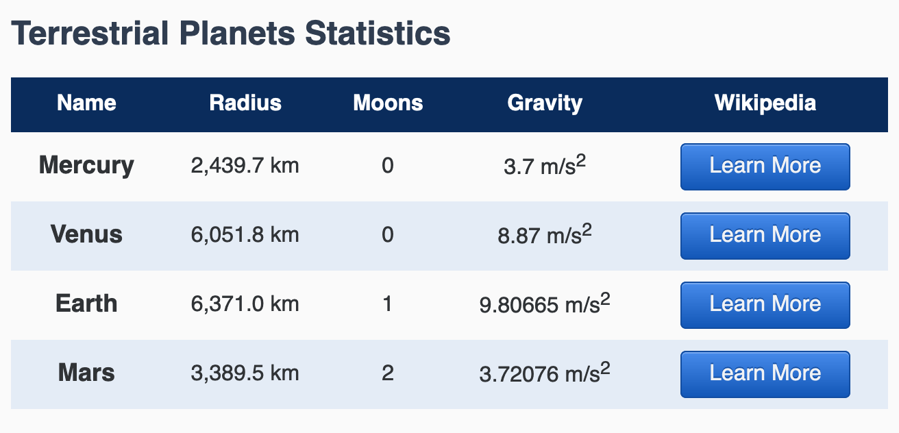
This table HTML creates a table called “Terrestrial Planets Statistics” by putting that name in the <caption> element, a necessary component of screen-reader accessible tables. Then the HTML creates a five-column table consisting of a header row and four data rows.
Next, to add some visual styles to the table, open styles.css in your text editor. You will create a visual style that makes the caption like a header for the table. The table header row will become more distinct with a dark background, and you will create a zebra stripe effect with alternating background colors on the data rows. The highlighted CSS in the following code block demonstrates how these styles are written:
...
table {
  border-collapse: collapse;
  width: 100%;
  margin: 3rem 0;
}

caption {
  font-size: 1.5rem;
  font-weight: 700;
  color: hsl(215, 25%, 25%);
  text-align: left;
  margin-bottom: 0.5em;
}

tr {
  text-align: center;
}

thead > tr {
  color: hsl(215, 25%, 100%);
  background-color: hsl(215, 80%, 20%);
}

tbody > tr:nth-child(even) {
  background-color: hsl(215, 50%, 93%);
}

tbody th {
  font-size: 1.125rem;
}

td, th {
  padding: 0.5rem;
}
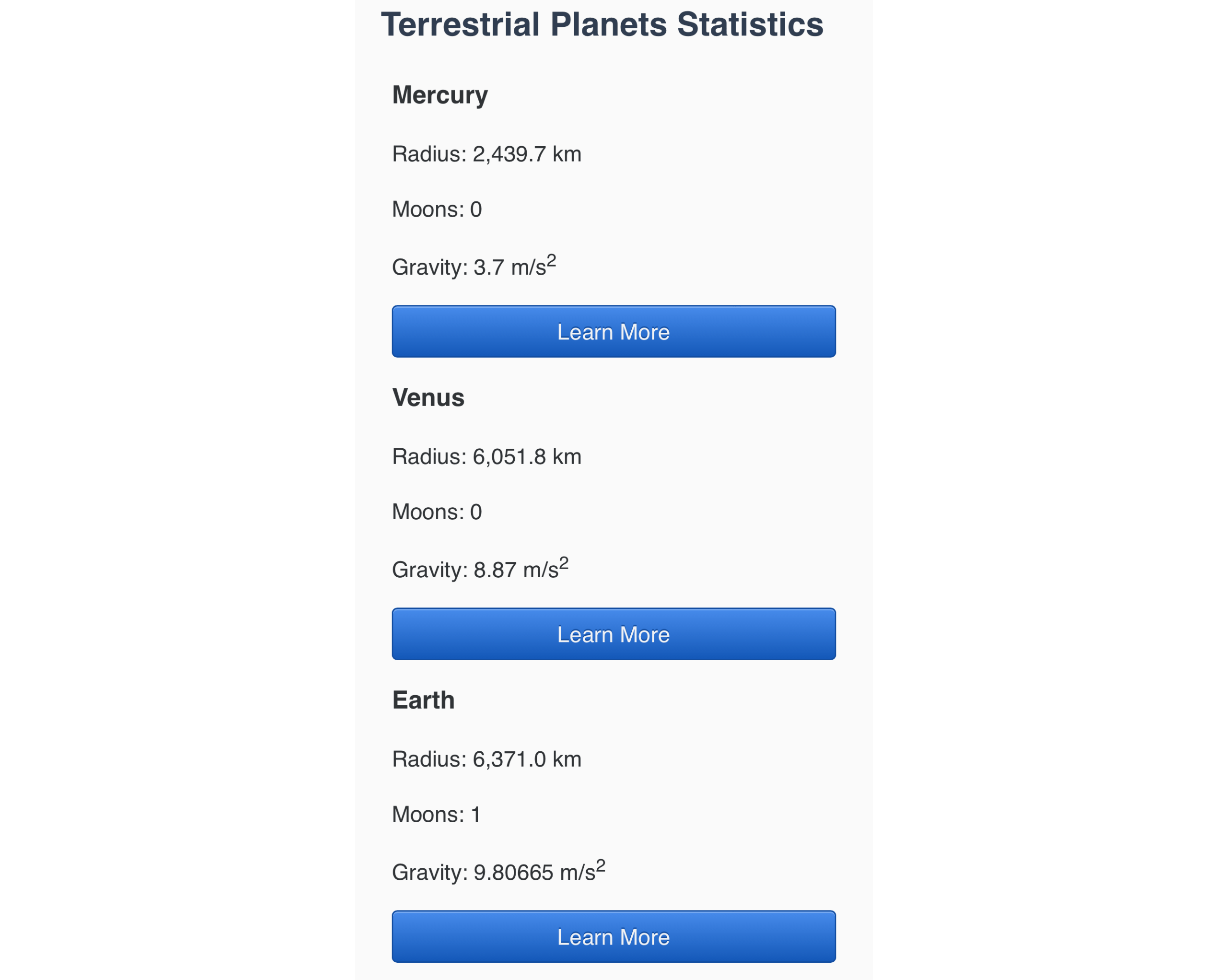
Save your changes to styles.css and open index.html in your web browser. The table is styled with clear data and alignment, as shown in the following image:
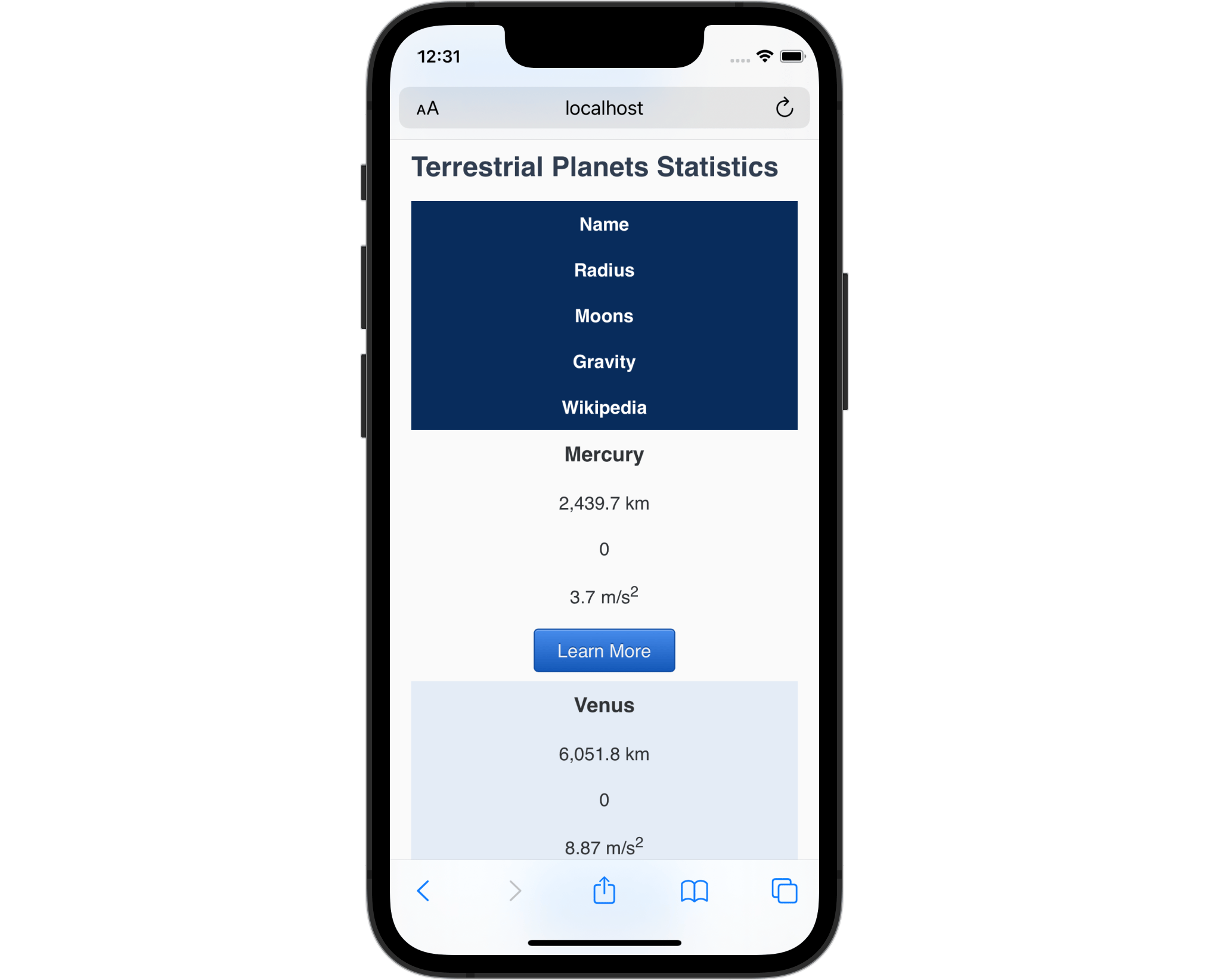
Open your local version of index.html on a smart phone, or scale your browser’s window down to about the size of a smart phone. The table will eventually start going off screen and will only be viewable by scrolling horizontally, as demonstrated in the following image:
This is a situation where changing the display value of the table elements can help provide a better viewing experience for those on smaller screens.
Return to styles.css in your text editor and create a media query set to a max-width of 60rem. Normally, you would use min-width instead of max-width in your media queries to follow a mobile first design flow. However, since you will only change the style on small screens and then return to the browser default at a given screen size, in this example situation max-width requires the least work. Inside the media query, create a group combinator consisting of table, caption, thead, tbody, tr, th, and td. Then set the display property to block, as highlighted in the following code block:
@media (max-width: 60rem) {
  table,
  caption,
  thead,
  tbody,
  tr,
  th,
  td {
    display: block;
  }
}
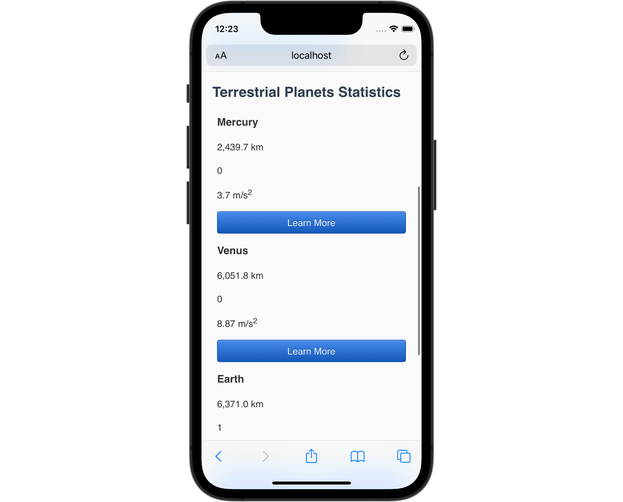
Save your changes to styles.css and return to index.html on your smartphone or in a small-size browser window. All the contents of the table are now stacked in one large column, with each row’s contents grouped together. The following image shows how this is rendered on a mobile phone:
This change to the table’s display value creates two issues. The first is that the browser no longer recognizes the table as a table, and therefore will not be read to a screen reader as a table. The second is that some of the contents and styles are now not providing useful information. For starters, the table headers no longer provide visual connection to the data types. Secondly, the zebra stripes don’t provide as much information in this scenario.
Return to styles.css in your text editor. First, remove thead from the group combinator. Next, create a new selector for the thead element and give it a display property set to a value of none. The display: none value completely removes an element visually from rendering in the browser. It is important to know that the none value also removes the element from the screen reader DOM, so the element is hidden from all users. The highlighted CSS in the following code block shows how this is set up:
@media (max-width: 60rem) {
  table,
  caption,
  tbody,
  tr,
  th,
  td {
    display: block;
  }

  thead {
    display: none;
  }
}
Next, to begin addressing the style changes, start by adding a text-align property to the large group combinator with a value of left. Next, duplicate the selector used for the zebra stripes, tbody> tr:nth-child(even), and set the background-color to transparent. This will remove the zebra stripe effect on screens and windows smaller than 60rem, or 960px, wide. Then, make the Learn More button work as a full-width button on small screens. Create a table .button descendant selector with the display property set to block, which will cause the button to fill the width of the container. The highlighted CSS in the following code block illustrates how this looks:
@media (max-width: 60rem) {
  table,
  caption,
  tbody,
  tr,
  th,
  td {
    display: block;
    text-align: left;
  }

  thead {
    display: none;
  }

  tbody > tr:nth-child(even) {
    background-color: transparent;
  }

  table .button {
    display: block;
  }
}
Save your changes to styles.css in your text editor and then refresh index.html in your browser. On small-screen devices, the content of the tables are now all left-aligned with the button spanning the width of the content. The following image shows how this is rendered in Safari on a mobile phone:
In this section, you converted a table to a block element to make it more visually usable when the screen or browser window small. In the last section, you will improve the accessibility of the table both for sighted users and those using screen readers.
Adding Small-Screen Context Elements
Now that you have changed the display values for the table elements on a small screen, you can add some enhancements to make this view as useful as the large screen version. You will add some HTML that will help make the information more understandable on small screens. Then you will provide styling specifically for the small screen experience of the table information.
To begin, open index.html in your text editor. To provide the table’s contextual information lost by hiding the thead element, you will add that header value to each cell inside a <span> element. For example, you will add <span>Radius: </span> before the value in the column containing the Radius information for the planet in each <td> element. Additionally, each <span> element will have a class attribute set to a value of label, so these elements can be quickly styled. The highlighted HTML in the following code block shows how to write the markup:
...
  <tbody>
    <tr>
      <th>Mercury</th>
      <td><span class="label">Radius: </span>2,439.7 km</td>
      <td><span class="label">Moons: </span>0</td>
      <td><span class="label">Gravity: </span>3.7 m/s<sup>2</sup></td>
      <td>
        <a href="https://en.wikipedia.org/wiki/Mercury_(planet)" class="button">
          Learn More
        </a>
      </td>
    </tr>
    <tr>
      <th>Venus</th>
      <td><span class="label">Radius: </span>6,051.8 km</td>
      <td><span class="label">Moons: </span>0</td>
      <td><span class="label">Gravity: </span>8.87 m/s<sup>2</sup></td>
      <td>
        <a href="https://en.wikipedia.org/wiki/Venus_(planet)" class="button">
          Learn More
        </a>
      </td>
    </tr>
    <tr>
      <th>Earth</th>
      <td><span class="label">Radius: </span>6,371.0 km</td>
      <td><span class="label">Moons: </span>1</td>
      <td><span class="label">Gravity: </span>9.80665 m/s<sup>2</sup></td>
      <td>
        <a href="https://en.wikipedia.org/wiki/Earth_(planet)" class="button">
          Learn More
        </a>
      </td>
    </tr>
    <tr>
      <th>Mars</th>
      <td><span class="label">Radius: </span>3,389.5 km</td>
      <td><span class="label">Moons: </span>2</td>
      <td><span class="label">Gravity: </span>3.72076 m/s<sup>2</sup></td>
      <td>
        <a href="https://en.wikipedia.org/wiki/Mars_(planet)" class="button">
          Learn More
        </a>
      </td>
    </tr>
  </tbody>
...
Save your changes to index.html and return to your browser to examine the small-screen view. The contextual information around what each data point means is now visually recognizable. The following image shows how this will render in the browser:
Next, return to styles.css in your text editor. These labels will be present on larger screens when they are no longer necessary, so they will need some styling to fix this issue. Due to the max-width media query approach, this means that the default styles for .label outside the query need to be set to display: none in order to hide the content on large screens. Then inside the media query, create a .label selector with a display property set to inline, since it should be in the content flow containing the value. To create a visual separation between the label and data point, add a font-weight property set to 700. The highlighted CSS in the following code block demonstrates how and where to apply these additions:
...
td, th {
  padding: 0.5rem;
}

.label {
  display: none;
}

@media (max-width: 60rem) {
  ...
  .label {
    display: inline;
    font-weight: 700;
  }
}
Save your changes to styles.css and once again return to your browser and refresh index.html. The browser will render the labels as inline content that is bold, as shown in the following image:
While still in your web browser on a large screen, expand the window out until the table returns to the tabular style. The labels are now hidden providing distinctive visual and accessible information for each scenario. The following image shows how the large screen version of the table is now rendered:

Finally, you will provide additional styling for each table row that will make them appear as their own little tables.
Open styles.css in your text editor. Inside the media query, add a tbody th descendant selector and add the color properties and values from the thead > tr selector. This will give the same dark blue background and near-white text color for each planet name. Then, add a border-radius property set to 0.5rem 0.5rem 0 0 to create a rounded top to the heading. The highlighted CSS of the following code block shows how to style the planet name:
...
@media (max-width: 60rem) {
  ...
  .label {
    display: inline;
    font-weight: 700;
  }

  tbody th {
    color: hsl(215, 25%, 100%);
    background-color: hsl(215, 80%, 20%);
    border-radius: 0.5rem 0.5rem 0 0;
  }
}
Next, you will add some definition to the datasets and give some spacing between each grouping. First, create a tbody > tr selector inside the media query with a border property set to 1px solid hsl(215, 80%, 20%). Then add a border-radius property with a value of 0.5rem, which will round the corner of all sides of the container. Lastly, create a tbody > tr + tr adjacent sibling combinator, with a margin-top property set to 1rem, which will give space between each group of data. The highlighted CSS in the following code block demonstrates how this is written:
...
@media (max-width: 60rem) {
  ...
  tbody th {
    color: hsl(215, 25%, 100%);
    background-color: hsl(215, 80%, 20%);
    border-radius: 0.5rem 0.5rem 0 0;
  }

  tbody > tr {
    border: 1px solid hsl(215, 80%, 20%);
    border-radius: 0.5rem;
  }

  tbody > tr + tr {
    margin-top: 1rem;
  }
}
Finally, you will add in a zebra stripe effect specifically for each td element. This is done by creating a td:nth-child(even) pseudo-class selector. Then use the same background-color property and value from before, as highlighted in the following code block:
...
@media (max-width: 60rem) {
  ...
  tbody > tr + tr {
    margin-top: 1rem;
  }

  td:nth-child(even) {
    background-color: hsl(215, 50%, 93%);
  }
}
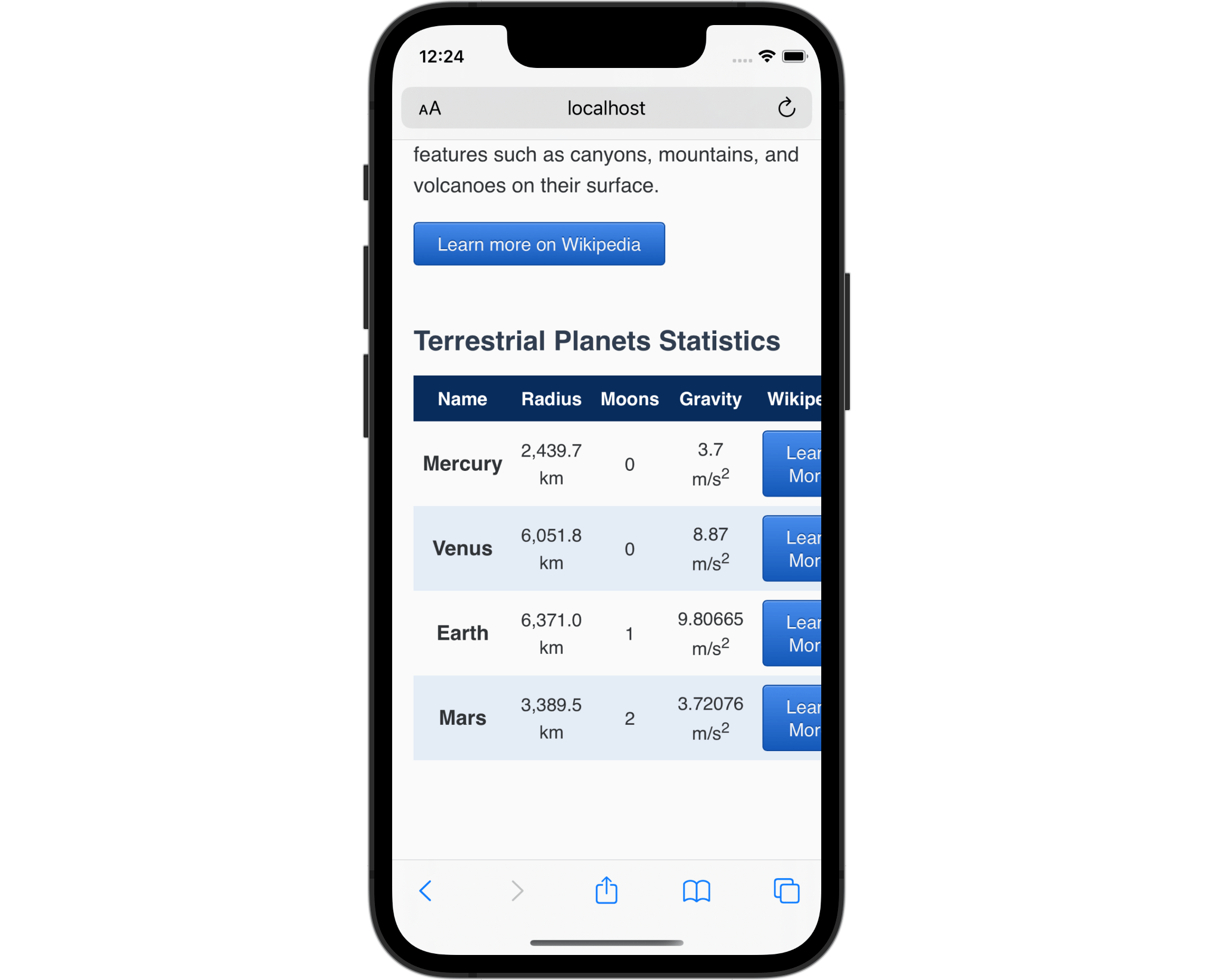
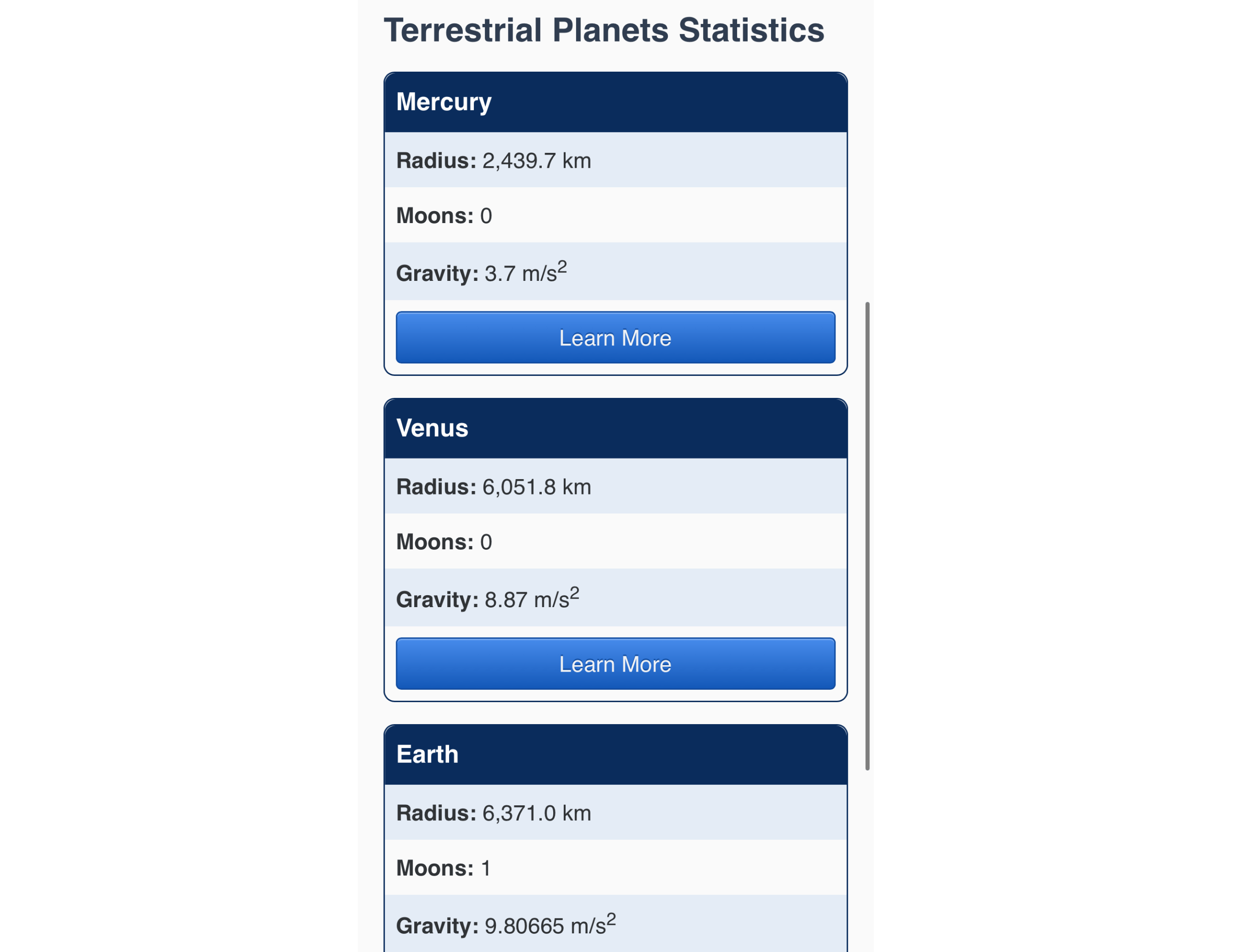
Save your changes to styles.css and open index.html on a small-width browser or smartphone. Each row from the table will now appear as though it were a table with a header, data points, and a button to learn more. The following image shows how this is rendered in on a smartphone browser:
In this last section, you used the display property to show and hide pertinent information that was contextual to the viewing scenario of a small-screen device. You also provided styling to the small-screen table to make it more accessible and usable.
Conclusion
There are many possibilities when working with the display property. In this tutorial, you learned about the default values of block and inline. You changed an <a> element to inline-block, which gave it a special combination of both block and inline. You then changed all the elements of a <table> to be block on a small screen and set them to return to their default table display values on a large screen. Lastly, you used the none value to hide content when and where necessary to users of all abilities. The display property is a powerful feature and has even more values available to further manipulate how the box model functions and affects elements.
If you would like to read more CSS tutorials, try out the other tutorials in the How To Style HTML with CSS series.
Thanks for learning with the DigitalOcean Community. Check out our offerings for compute, storage, networking, and managed databases.
Tutorial Series: How To Style HTML with CSS
Cascading Style Sheets (CSS) is the styling language of the web, and is used to design and control the visual representation of Hypertext Markup Language (HTML) on a web page. With CSS, you can manage everything from font to layout to animations on your web page. This series will lead the reader through CSS exercises that demonstrate the building blocks of the language and the fundamental design principles needed to make a user-friendly web site.
Browse Series: 20 tutorials
About the author
I code, design, write, and teach and I’m an IAAP Certified Web Accessibility Specialist.
Still looking for an answer?
This textbox defaults to using Markdown to format your answer.
You can type !ref in this text area to quickly search our full set of tutorials, documentation & marketplace offerings and insert the link!
 This work is licensed under a Creative Commons Attribution-NonCommercial- ShareAlike 4.0 International License.
Become a contributor for community
Get paid to write technical tutorials and select a tech-focused charity to receive a matching donation.

DigitalOcean Documentation
Full documentation for every DigitalOcean product.

Resources for startups and AI-native businesses
The Wave has everything you need to know about building a business, from raising funding to marketing your product.
The developer cloud
Scale up as you grow — whether you're running one virtual machine or ten thousand.

Start building today
From GPU-powered inference and Kubernetes to managed databases and storage, get everything you need to build, scale, and deploy intelligent applications.
