By Philip Zastrow and Timothy Nolan

The author selected the Diversity in Tech Fund to receive a donation as part of the Write for DOnations program.
Introduction
The box model is the ruleset a browser uses to determine an element’s size and how it interacts with other elements. The contents of the HTML element, as well as several CSS properties, all contribute to the calculations a browser uses to turn HTML and CSS code into a final, rendered web page. Knowing how the box model works and how to manipulate it effectively can be the difference between a well-aligned design and a web page with unwanted horizontal scrolling and extra space between content. Understanding how the box model works will help you write CSS more efficiently and find solutions to rendering issues in the browser.
Note: Most HTML elements fall in to one of two categories of boxes, an inline or a block. A <span> element is a generic inline element, as it stays inline with the text content. The <div> element, is a generic block element. This tutorial will focus on how the box model affects block elements, as it is the broadest use of the box model ruleset.
Be aware that changes to the display property can result in changes to how the box model functions in ways outside of the goals of this tutorial, especially when working with tables, Flexbox, and CSS Grid.
In this tutorial, you will use the margin, padding, border, width, and height properties, which are the primary properties the box model uses. You will also work with the box-sizing properties to understand how the box model can be changed. Lastly, you will use your browser’s developer tools to inspect the box model.
Prerequisites
- An HTML file saved on your local machine as
index.htmlthat you can access from your text editor and web browser of choice. To get started, check out our How To Set Up Your HTML Project tutorial, and follow How To Use and Understand HTML Elements for instructions on how to view your HTML in your browser. If you’re new to HTML, try out the How To Build a Website in HTML series. - Familiarity with your browser’s developer tools. This tutorial will use the Firefox developer tools. If you are using Google Chrome, this SparkBox article is a useful introduction to its developer tools.
Setting Up the HTML and Developer Tools
In this section, you will set up the HTML base for use throughout the tutorial. You will also access your browser’s developer tools and begin to use them to help identify the properties that make up the box model.
To start, open up index.html in your text editor and add the following HTML to the file:
<!doctype html>
<html>
	<head>
		<title>Box Model</title>
	    <link href="styles.css" rel="stylesheet" />
	</head>
	<body>
	</body>
</html>
The HTML includes a reference to a styles.css file in the <link /> tag. Go ahead and create that file; you will begin to edit that in the next section.
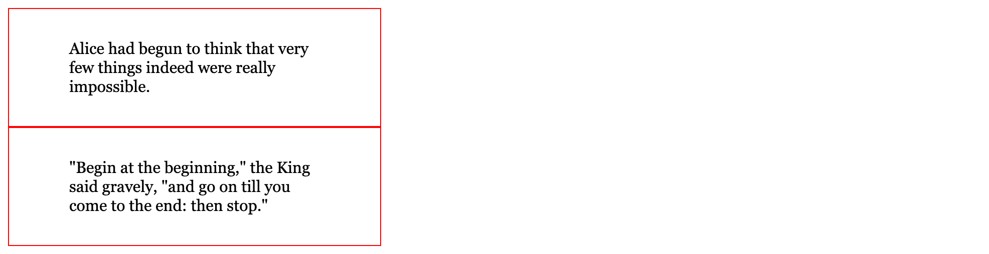
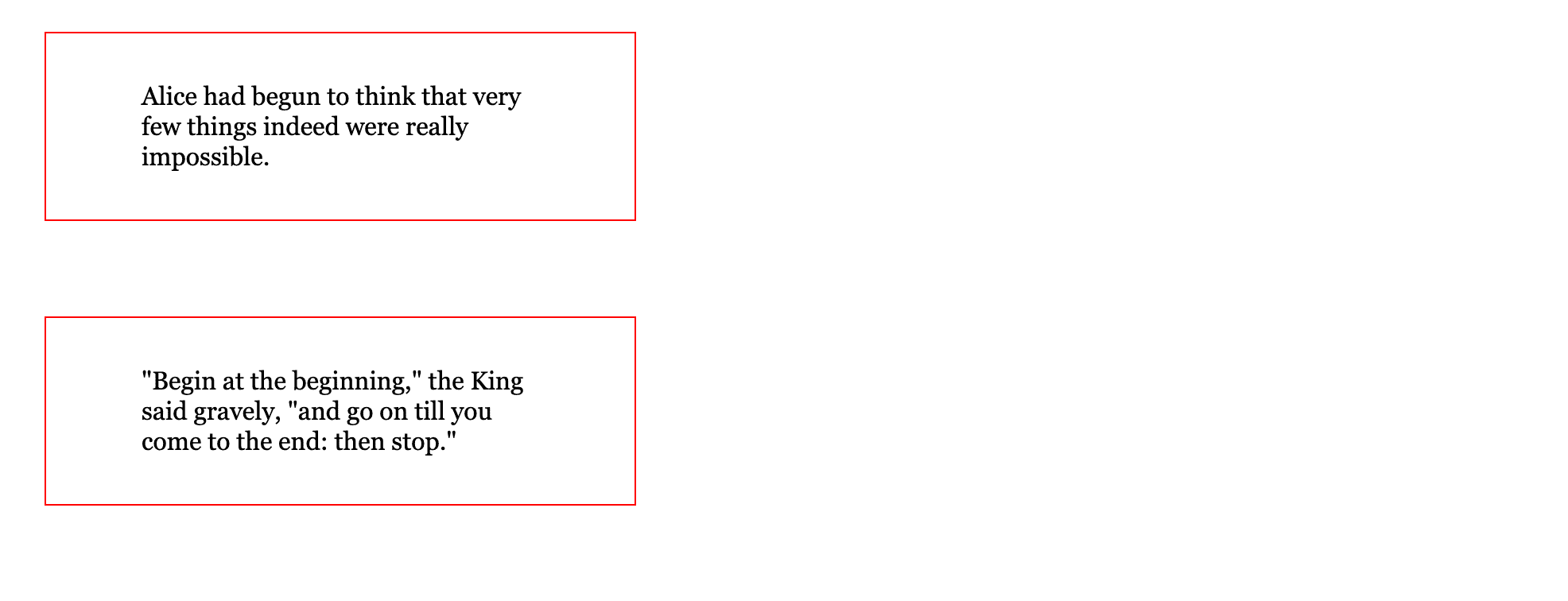
Next, you will need content to apply styles to and start to work with the box model. In the next code block, add the highlighted code within the <body> tag. Highlighted code like this will be used throughout the tutorial to identify changes and additions to the code. For the content, create two <div> elements and fill them with the following two quotes from Alice’s Adventures in Wonderland, by Lewis Carol:
...
<body>
	<div>
		Alice had begun to think that very few things indeed were really impossible.
	</div>

	<div>
		"Begin at the beginning," the King said gravely, "and go on till you come to the end: then stop."
	</div>
</body>
...
Next, open up index.html in your browser of choice and open the browser’s developer tools. This can often be accomplished by right-clicking on the page and selecting Inspect or Inspect Element. Once you have opened the developer tools, inspect the first <div> element. In both Firefox and Chrome a visual diagram of the box model will be visible. The following is what you would find in the Firefox developer tools:
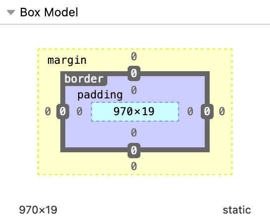
Looking closer at the box model visualization from Firefox, the properties that make up the box model are show from the center outward as width, height, padding, border, and margin. These five properties make up the box model and provide the dimensional characteristics of the element. As you work with each of the properties and refresh your changes in the browser, be sure to keep the developer tools open to reference this box model visualization of your elements.
In this section, you set up your HTML for the tutorial, opened up your browser’s developer tools, and accessed the box model visualization guide. In the next section you will begin writing CSS for the border property, which will provide a beginning visual style of the box model for your <div> elements.
Using the border Property to Visualize Containers
border Property to Visualize ContainersNow that you have your HTML set up, you will begin applying the properties of the box model, beginning with the border property. In this section you will use the border property to create a visual outline of the <div> elements and see how the property affects the box model.
The border property is what is known as a shorthand property, as it is a combination of three different properties: border-width, border-style, and border-color. Additionally, there are more border properties that allow for specifying sides, like border-right, which functions like border and is a shorthand combination of border-right-width, border-right-style, and border-right-color.
border-width, border-style, and border-color also behave as shorthand for their border-top, border-right, border-bottom, and border-left counterparts and apply the styles clockwise from top to right, then bottom, and lastly the left side. For example, border-width: 10px 2px 8px 4px; would apply a 10px border to the top, a 2px border to the right, an 8px border to the bottom, and a 4px border to the left side of the box.
Open styles.css in your text editor, write a type selector for the div element, and add the border property. For the value, the order is not critical, though a common ordering tends to be width, style, and color. With that in mind, set the value for the border property to 1px solid red:
div {
	border: 1px solid red;
}
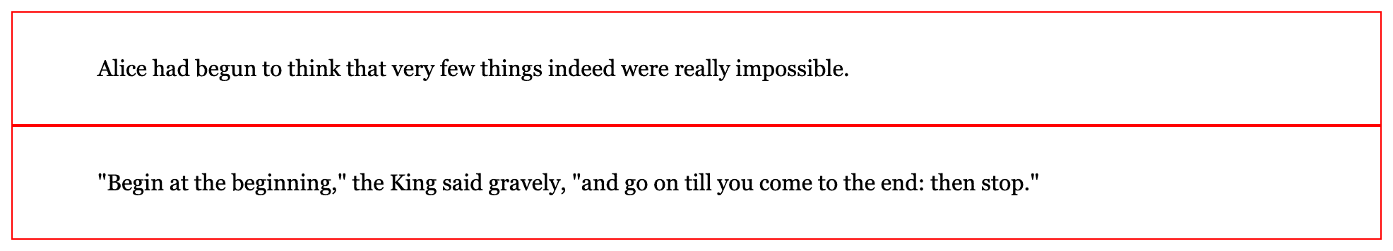
Save your changes to styles.css then open index.html in your browser. The content of the <div> elements will be wrapped tightly by a thin red line on the perimeter of the box. Between the two lines of text, there will be a thicker border. This occurs when borders from two different elements are set side-by-side, doubling the visual size of the border. The changes will look like this in your browser:

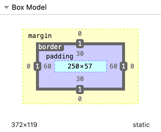
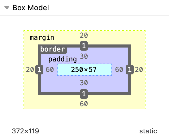
With index.html open in your browser, return to the browser developer tools and inspect one of the two <div> elements. Return to the view in the developer tools that shows the box model of the element. In the inner-most box is the width by height of the element, then the padding, and finally the border, noted to have 1 on each side of its box. See the following image from the Firefox developer tools:
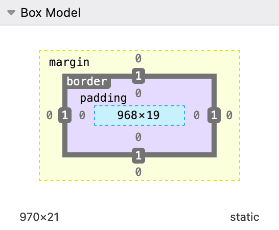
With the Firefox window set at 986px wide, the width of the inner box of the box model diagram is 968 by 19, but following the diagram is another value that is 970 by 21. This is the computed width and height, which is the final pixel size the browser renders, combining height, width, border, and padding property values together. This difference in size is two more in either dimension, which coincides with the size the border adds to the height and width.
In this section, you created a border on the <div> elements and saw how this one property affects the computed dimensions of those elements. In the next section, you will expand on your styles by applying inner spacing between the border and the text with the padding property.
Using the padding Property to Create Space Inside the Container
padding Property to Create Space Inside the ContainerYour work with the border property in the previous section gave a visual boundary to the box, but it is very close to the text. Next you will use the padding property to add space on the interior of the box, providing room between the text and box’s border.
Similar to the border property, the padding property is also a shorthand property. However, padding is shorthand only for the sides, such as the padding-bottom property. When a single value is used, the same value will be applied to all sides. For example, padding: 20px; applies a 20px padding to all sides. When two values are used, then the first value is applied to the top and bottom sides, while the second value is applied to the left and right. For instance, the following padding: 20px 40px; will apply 20px padding to the top and bottom of the box, while the 40px padding is on the left and right sides. This progresses to three values that follow top side, left and right sides, then the bottom. At four values each side is represented as top, right, bottom, and left.
Open your styles.css file in your text editor and, after the border property, add a padding property with a value of 30px 60px. It is important to put a space between the values, as that is how CSS delineates between multiple values.
div {
	border: 1px solid red;
	padding: 30px 60px;
}
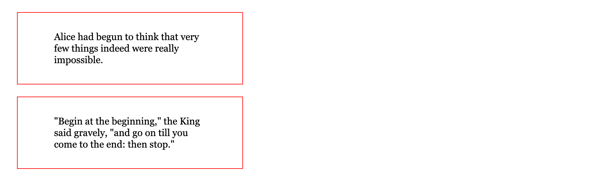
Save the latest change to your styles.css file, then return to your index.html file in your browser and refresh the page. The two elements have grown in height and the positioning of the text within the red boxes has shifted down and to the right with extra space below the text. See the following image for what the browser is expected to render:
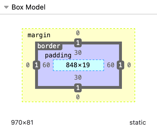
Once again, return to the browser developer tools and inspect one of the two boxes. The box model diagram now displays the padding with a 30 on the top and bottom and a 60 on the left and right of the box.
You expanded on the complexities of the box model by using the padding property on the <div> elements to give visual space between the border and the text. The box model visual guide in your browser’s developer tools showcased these changes and their effects on the dimensional values displayed. Next you will work with the width and height properties to see how they further affect the box model and how these two properties are changed by the padding property.
Using the width and height Properties to Limit the Dimension Width
width and height Properties to Limit the Dimension WidthThis section will focus on using defined width and height property values to enforce dimensions on the <div> elements and how those properties are treated in the box model. This section will use pixel units for the width and height values, which is often referred to as fixed dimensions, as well as percent units, which are called fluid dimensions. Unlike the previous two properties, width and height are not shorthand. These apply a defined value. However, setting dimension values with CSS causes a questionable effect that goes back to the early specifications of the language. The width and height are the set dimensions of the visible content before padding and border values are applied. This results in a box that is larger than expected.
To try out this aspect of the box model, return to the styles.css file in your text editor and add the width property with a value of 250px:
div {
	...
	width: 250px;
}
Save your changes to styles.css, switch to your browser, and refresh index.html. When the page reloads, the content will be much more narrow and wrapped into multiple lines of text. See the following image for how this will appear in your browser:
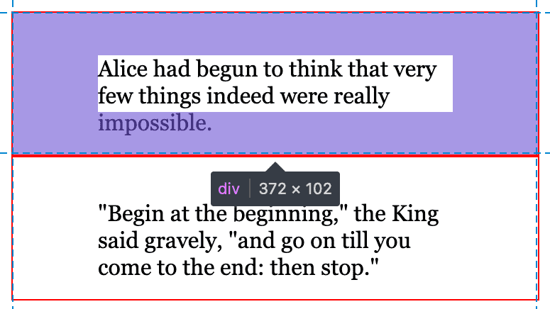
Open up the browser developer tools and inspect one of the two <div> elements. At the center of the box is the value defined by the width property with 250 by 57. However, as the image from the Firefox box model diagram shows, the full width of the element is not 250, but instead 372.
The computed width is determined by the width, which sets the width of the content, followed by the size of the right and left padding values, then by the right and left border-width values. This construct of the box model was devised early in CSS’s development and requires developers to remember that the width and height properties define the dimensions of the content, not the box. This is the default behavior and understanding it as such will help debug problems in the future.
Instead of using a fixed pixel value for the width, use a fluid percent for the width of 100%. By default, a <div> element extends the full width, but there is a difference here between extending the default full width and having a declared width value of 100%. In your styles.css, change 250px to 100%:
div {
	...
	width: 100%;
}
Save the styles.css file and refresh index.html in your browser. The <div> elements now extend past the viewport’s edge, no matter the size of the window. What is happening is the same as what happened with 250 becoming 372: The full width of the element is now 100% of the available width plus the 122 pixels created with the padding and border values.
Return to your styles.css file and start by returning the width value to 250px. Next, add a height property and add a value you know will be smaller than the content height. 40px will be sufficient with this content:
div {
	...
	width: 250px;
	height: 40px;
}
Save these changes to the styles.css file and refresh index.html in your browser. The padding will now appear as though it is smaller on the bottom, when in fact the browser is being posed with a dilemma: The height is explicitly set, but the content is larger than the container. The rules the browser follows use the defined height value, and if there were longer content it would extend outside the box.
With the browser developer tools open, inspect one of the <div> elements and the element will be highlighted in the rendered view. Hover over the padding area of the box model diagram to highlight the padding area of the element. The text content is going into the padding area. See the following image for what you will find in your browser:
In situations where the content can be variable in length, it is best to avoid a defined height value and instead let the natural height of the content determine the height. Web browsers are built to grow downward and scroll vertically by default, making height the unpredictable and least controllable dimension.
For this situation, it is best to remove the height attribute altogether. Return to styles.css in your text editor and remove the height property and its value from the file and save your changes. Removing the height value makes the height dependent on the amount of content inside the container. Your CSS will now look like the following:
div {
  border: solid red 1px;
  padding: 30px 60px;
  width: 250px;
}
In this section, you applied the width and height properties to the <div> elements. You discovered how the height property can be difficult to implement due to the flowing nature of web content. Lastly you learned how these dimension properties are applied to an element before the padding property, leading to a larger dimension than intended. Next, you will work with the spacing on the outside of the elements with the margin property.
Using the margin Property to Create Space Outside the Container
margin Property to Create Space Outside the ContainerIn this next, section you will use the margin property to apply spacing on the outside of the border to provide spacing between other boxes. The margin property functions similarly to the padding property, with the same long- and short-hand property variations. You will use margin to provide space between the two <div> elements on the page and find how margin differs from padding.
To start, open styles.css in your text editor, add a margin property to the div type selector and give a value of 20px. This will apply a 20px space on each side of the <div> elements on the page:
div {
	...
	margin: 20px;
}
Save your changes to styles.css then open your browser and load or refresh your index.html file. You will find that the containers have moved to the right and down by 20 pixels. See the following image for what this will look like:
Take a look at the spacing between the two <div> elements in your browser. The spacing between these is 20px and not 40px, even though there is margin on the bottom of the first <div> and a margin on the top of the second <div>. This is due to a feature of the margin property where adjacent containers overlap their margin properties, taking the value from the larger margin. This may not make sense at first, but it can be helpful to think of the box model as describing a physical object and then defining how much space you want around each one of those objects. For example, if you have 10 people and you want 2 meters of space around each person, the space from one person to the next will be 2 meters, not 4 meters.
Since the largest margin value is taken as the outside spacing value, change the value of the property so the top and bottom are different. You can do this with the shorthand by making sure the first and third values in the list are different, or by using the margin-top and margin-bottom properties. Keep the top, right, and left values at 20px, but change the bottom value to be 60px.
div {
	...
	margin: 20px 20px 60px;
}
The first value in the shorthand list for a margin defines the top value, the second value defines the right and left, and the third defines the bottom value. Save your changes to styles.css and refresh index.html in your browser. There will now be much more space between the two containers as shown in the following image:
Now, inspect one of the two <div> elements with the browser developer tools. Unlike all the other properties, the margin values do not change the computed height or the width of the container:
The margin property has two special features that padding does not. First, margin accepts negative values, meaning it can move closer to adjacent elements and cause them to overlap. Additionally, the margin property accepts a value of auto, which can be used for centering content. Due to how the browser defaults work, this auto value will only center content horizontally and only if a defined width property is less than 100% of the total available space.
Return to the styles.css file in your text editor and change the second value of the margin property from 20px to auto:
div {
	...
	margin: 20px auto 60px;
}
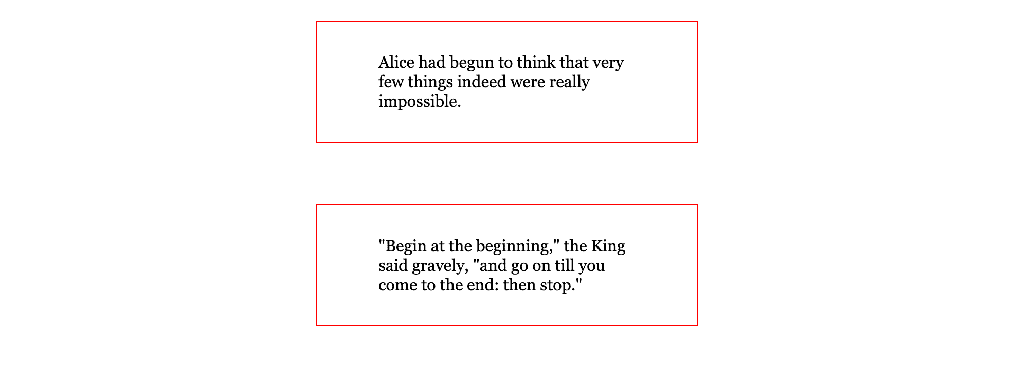
Save this change to styles.css and reload index.html in your browser. The <div> containers will now appear horizontally centered, as in the next image:
You used the margin property in this section to add space between the quotes in the <div> elements. You changed the margin to show how it overlaps and defers to the largest of the adjacent values. Also, you set the value for the margin-left and margin-right properties to auto, which centered the containers. In the last section you will use the box-sizing property to change how the box model behaves and the properties relate to one another.
Using the box-sizing Property to Change the Box Model Behavior
box-sizing Property to Change the Box Model BehaviorIn this final section, you will use the box-sizing property, which allows the box model to change how it is formulated. As you have worked with the box model, the width, height, padding, and border properties have contributed to the overall dimensions of the box model. Now with the box-sizing property, you will be able to have the padding and border calculated by the browser to enforce the values set to the width and height values.
Up to this point, you have worked with the default state of the box-sizing property, which is content-box. The content-box box model determines the width dimension by adding the width, padding-right, padding-left, border-right-width, and border-left-width to be the final computed width value of the box. Likewise, the content-box finds the height dimension by adding the height, padding-top, padding-bottom, border-top-width, and border-bottom-width to arrive at the final computed height value for the box. As discussed in previous sections, this results in a larger than intended box that can disrupt layout and design.
The alternative to the content-box value for the box-sizing property is border-box. Instead of adding padding and border properties to the declared width and height values to get the computed value, it subtracts the values. This means that the width of a box with a border-box box model is the width property minus the sum of the left and right padding values and the left and right border-width values. The result is a computed width equal to the width property value.
Open styles.css in your text editor and add a box-sizing property with a value of border-box to the div type selector:
div {
	...
	box-sizing: border-box;
}
Return to your browser and reload index.html. The size of the containers will now be smaller, as the browser is now decreasing the box model’s width so that the computed width of width, padding, and border does not exceed the width value defined in the CSS file.
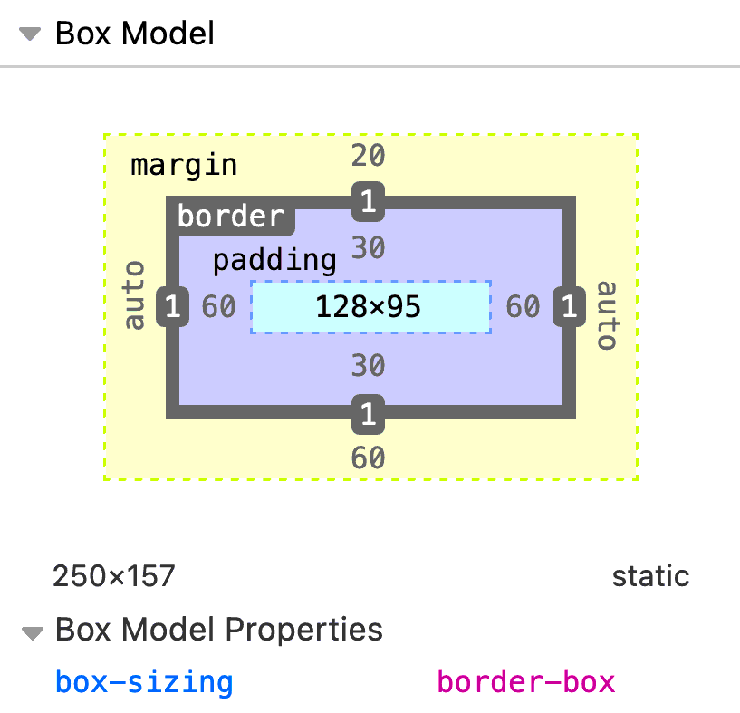
Inspect one of the <div> elements with the browser developer tools to find how the box-sizing property has affected the box model. In the Firefox developer tools, width is defined as 128px, even though the width property in styles.css has a value of 250px. The computed value of the element is 250px, calculated by adding 128px plus 60px from the right padding, 60px from the left padding, 1px from the right border width, and 1px from the left border width. The Firefox developer tools box model is shown in the following image:
The box-sizing property can be changed on all elements of a web page by using the universal selector (*), also known as the star selector. This selector applies the styles to all elements on a page. This selector should be used with caution, since it does effect all elements and can potentially cause performance issues on pages that have a substantial amount of elements.
Open styles.css and remove the box-sizing property from the div type selector. Then add a universal selector before the div selector with a box-sizing property set to border-box:
* {
	box-sizing: border-box;
}
...
Save these changes to styles.css and reload index.html. You will find no difference visually. The responsibility of changing the box model has moved from an explicit setting to a universal setting.
In this section, you used the box-sizing property to change how the box model behaves with the border-box value, creating a more comprehensive way of working with the box model. You also learned about the universal selector and how to apply the box-sizing property to all elements on a web page.
Conclusion
The box model is necessary to understand how styles are applied to elements and how styles affect the flow of content. In this tutorial, you learned how to use the border, padding, margin, height, and width properties and how they relate to each other in the box model. You used the default box model of the box-sizing property, which will help you plan and debug styling situations. Also, you learned about the border-box value that changes how the box model functions and allows for a more intuitive method of working with the box model. Remember that leaning into browser defaults helps maintain good performance, so changing the box model should be done as needed instead of universally.
If you would like to read more CSS tutorials, try out the other tutorials in the How To Style HTML with CSS series.
Thanks for learning with the DigitalOcean Community. Check out our offerings for compute, storage, networking, and managed databases.
Tutorial Series: How To Style HTML with CSS
Cascading Style Sheets (CSS) is the styling language of the web, and is used to design and control the visual representation of Hypertext Markup Language (HTML) on a web page. With CSS, you can manage everything from font to layout to animations on your web page. This series will lead the reader through CSS exercises that demonstrate the building blocks of the language and the fundamental design principles needed to make a user-friendly web site.
Browse Series: 20 tutorials
About the author(s)
I code, design, write, and teach and I’m an IAAP Certified Web Accessibility Specialist.
Former Senior Technical Editor at DigitalOcean, fiction writer and podcaster elsewhere, always searching for the next good nautical pun! Areas of expertise include Node.js, PostgreSQL, CSS, JavaScript.
Still looking for an answer?
This textbox defaults to using Markdown to format your answer.
You can type !ref in this text area to quickly search our full set of tutorials, documentation & marketplace offerings and insert the link!
 This work is licensed under a Creative Commons Attribution-NonCommercial- ShareAlike 4.0 International License.
Become a contributor for community
Get paid to write technical tutorials and select a tech-focused charity to receive a matching donation.

DigitalOcean Documentation
Full documentation for every DigitalOcean product.

Resources for startups and AI-native businesses
The Wave has everything you need to know about building a business, from raising funding to marketing your product.
The developer cloud
Scale up as you grow — whether you're running one virtual machine or ten thousand.

Start building today
From GPU-powered inference and Kubernetes to managed databases and storage, get everything you need to build, scale, and deploy intelligent applications.
