By Philip Zastrow and Timothy Nolan

The author selected the Diversity in Tech Fund to receive a donation as part of the Write for DOnations program.
Introduction
Cascading Style Sheets (CSS) is a language designed for two disciplines: that of the programmer and that of the designer. Working with text on the web is one of the clearest examples of this broad accessibility to the language. Styling text uses concepts from the graphic design world but adjusts naming conventions to be more broadly implemented.
In this tutorial you will learn about web typography, the art of styling text. Similar to working with a printing press, you will set out your content, apply visual style to help communicate the content, and adjust the content for legibility and emphasis. The intent with styling text on the web is to create a visual hierarchy through color, size, shape, and space. This way, headings stand out from sub-headings, which stand out from paragraphs. These concepts help make text more readable and scannable for readers.
You will start the tutorial by writing the HTML structure, which will consist of placeholder content from Cupcake Ipsum. You will work with different heading levels (h1-h6) and content types (p, strong, and em) to apply multiple text-related CSS properties, including font-family, font-size, and color. You will also load custom fonts from Google Fonts, a third-party font-hosting service. Each step of this tutorial will introduce a new concept or set of properties to apply to the content. By the end you will have a custom-styled web page.
Prerequisites
- An HTML file saved on your local machine as
index.htmlthat you can access from your text editor and web browser of choice. To get started, check out our How To Set Up Your HTML Project tutorial, and follow How To Use and Understand HTML Elements for instructions on how to view your HTML in your browser. If you’re new to HTML, try out the How To Build a Website in HTML series.
Setting Up the Example HTML
In this first step you will set up the HTML that you will style throughout the rest of the tutorial. The purpose of the HTML in this tutorial is to provide various elements and situations for you to practice styling.
Open up the index.html file using a text editor, such as nano, Vim, or Visual Studio Code. Add the following boilerplate HTML to give the file necessary baseline code:
<!doctype html>
<html>
  <head>
    <link href="styles.css" rel="stylesheet" />
  </head>
  <body>
  </body>
</html>
The <link /> element already loads in the styles.css file, so be sure to have that file ready as well.
Next, you need some content to style. When creating text styles, often a project needs styles before the content is ready. In the graphic design world, placeholder content is used for this purpose. Designers will often use Latin text as a placeholder, known as Lorem Ipsum. There are many modern renditions of this placeholder text, including Cupcake Ipsum. This will be the reference copy used throughout the HTML.
To start, the HTML needs to depict hierarchy, a clear distinction and order of content. In HTML that is done with heading tags, which span from <h1>, the top most heading, through <h6>, the bottom most heading. The browser default styles for the headings define the visual hierarchy by size alone, with the <h1> element’s default font-size being significantly larger than that of the <h6>. Throughout this tutorial you will use other principles of design, such as color and space, to provide visual hierarchy to the content.
To create this hierarchical content, you will write out various headings and fill each heading with a few words from Cupcake Ipsum within the <body> tags in index.html. You will follow proper HTML semantics, which provide accurate meaning to the browser.
To have proper HTML semantics:
- There will only be one
<h1>element on the page. This will usually be the title. - Subsequent heading levels will only be one lesser, equal, or any greater level. For example, the only heading level that comes after an
<h3>will be either<h4>, another<h3>, or an<h2>, but never an<h5>or<h6>.
With the rules of heading semantics, add the following highlighted HTML to index.html:
...
<body>
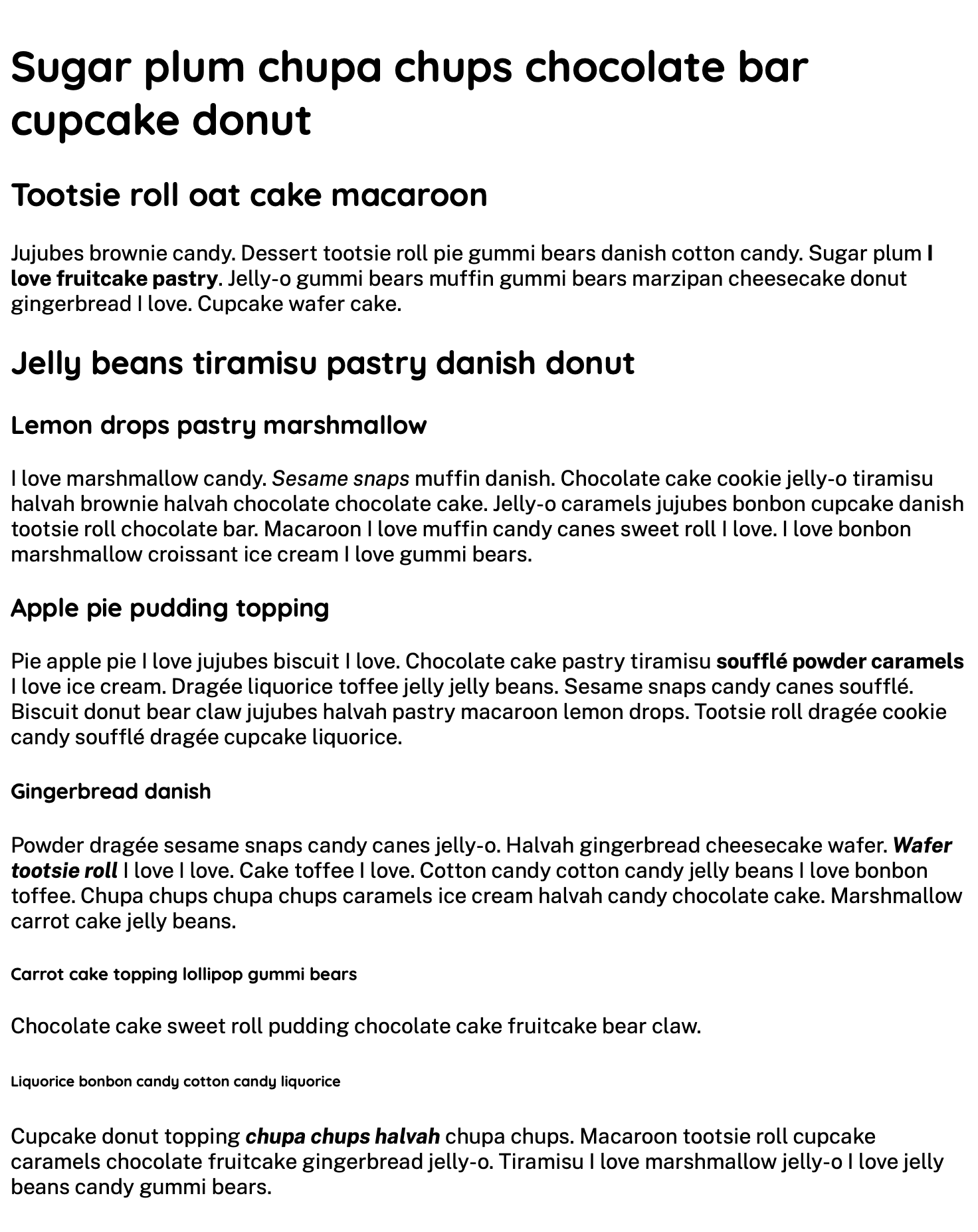
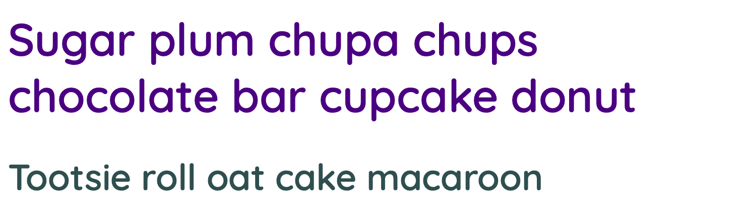
<h1>Sugar plum chupa chups chocolate bar cupcake donut</h1>
<h2>Tootsie roll oat cake macaroon</h2>
<h2>Jelly beans tiramisu pastry danish donut</h2>
<h3>Lemon drops pastry marshmallow</h3>
<h3>Apple pie pudding topping</h3>
<h4>Gingerbread danish</h4>
<h5>Carrot cake topping lollipop gummi bears</h5>
<h6>Liquorice bonbon candy cotton candy liquorice</h6>
</body>
...
Next, you need some content to fill in space between each heading. These will be paragraphs of text designated by the <p> element to hold each paragraph. Use Cupcake Ipsum again to generate this content and place the paragraphs throughout the page.
Add the highlighted portions of the following code block. This tutorial will use this format for code blocks throughout:
...
<body>
<h1>Sugar plum chupa chups chocolate bar cupcake donut</h1>
<h2>Tootsie roll oat cake macaroon</h2>
<p>Jujubes brownie candy. Dessert tootsie roll pie gummi bears danish cotton candy. Sugar plum I love fruitcake pastry. Jelly-o gummi bears muffin gummi bears marzipan cheesecake donut gingerbread I love. Cupcake wafer cake.</p>
<h2>Jelly beans tiramisu pastry danish donut</h2>
<h3>Lemon drops pastry marshmallow</h3>
<p>I love marshmallow candy. Sesame snaps muffin danish. Chocolate cake cookie jelly-o tiramisu halvah brownie halvah chocolate chocolate cake. Jelly-o caramels jujubes bonbon cupcake danish tootsie roll chocolate bar. Macaroon I love muffin candy canes sweet roll I love. I love bonbon marshmallow croissant ice cream I love gummi bears.</p>
<h3>Apple pie pudding topping</h3>
<p>Pie apple pie I love jujubes biscuit I love. Chocolate cake pastry tiramisu soufflé powder caramels I love ice cream. Dragée liquorice toffee jelly jelly beans. Sesame snaps candy canes soufflé. Biscuit donut bear claw jujubes halvah pastry macaroon lemon drops. Tootsie roll dragée cookie candy soufflé dragée cupcake liquorice.</p>
<h4>Gingerbread danish</h4>
<p>Powder dragée sesame snaps candy canes jelly-o. Halvah gingerbread cheesecake wafer. Wafer tootsie roll I love I love. Cake toffee I love. Cotton candy cotton candy jelly beans I love bonbon toffee. Chupa chups chupa chups caramels ice cream halvah candy chocolate cake. Marshmallow carrot cake jelly beans.</p>
<h5>Carrot cake topping lollipop gummi bears</h5>
<p>Chocolate cake sweet roll pudding chocolate cake fruitcake bear claw.</p>
<h6>Liquorice bonbon candy cotton candy liquorice</h6>
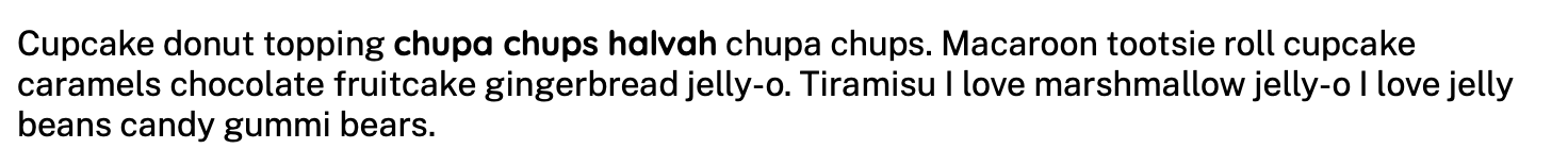
<p>Cupcake donut topping chupa chups halvah chupa chups. Macaroon tootsie roll cupcake caramels chocolate fruitcake gingerbread jelly-o. Tiramisu I love marshmallow jelly-o I love jelly beans candy gummi bears.</p>
</body>
...
Finally, add in <strong>, <em>, and a combination of the two elements together. This will provide examples of phrases that are emphasized in the content:
...
    <h2>Tootsie roll oat cake macaroon</h2>

    <p>Jujubes brownie candy. Dessert tootsie roll pie gummi bears danish cotton candy. Sugar plum <strong>I love fruitcake pastry</strong>. Jelly-o gummi bears muffin gummi bears marzipan cheesecake donut gingerbread I love. Cupcake wafer cake.</p>

    <h2>Jelly beans tiramisu pastry danish donut</h2>

    <h3>Lemon drops pastry marshmallow</h3>

    <p>I love marshmallow candy. <em>Sesame snaps</em> muffin danish. Chocolate cake cookie jelly-o tiramisu halvah brownie halvah chocolate chocolate cake. Jelly-o caramels jujubes bonbon cupcake danish tootsie roll chocolate bar. Macaroon I love muffin candy canes sweet roll I love. I love bonbon marshmallow croissant ice cream I love gummi bears.</p>

    <h3>Apple pie pudding topping</h3>

    <p>Pie apple pie I love jujubes biscuit I love. Chocolate cake pastry tiramisu <strong>soufflé powder caramels</strong> I love ice cream. Dragée liquorice toffee jelly jelly beans. Sesame snaps candy canes soufflé. Biscuit donut bear claw jujubes halvah pastry macaroon lemon drops. Tootsie roll dragée cookie candy soufflé dragée cupcake liquorice.</p>

    <h4>Gingerbread danish</h4>

    <p>Powder dragée sesame snaps candy canes jelly-o. Halvah gingerbread cheesecake wafer. <strong><em>Wafer tootsie roll</em></strong> I love I love. Cake toffee I love. Cotton candy cotton candy jelly beans I love bonbon toffee. Chupa chups chupa chups caramels ice cream halvah candy chocolate cake. Marshmallow carrot cake jelly beans.</p>

    <h5>Carrot cake topping lollipop gummi bears</h5>

    <p>Chocolate cake sweet roll pudding chocolate cake fruitcake bear claw.</p>

    <h6>Liquorice bonbon candy cotton candy liquorice</h6>

    <p>Cupcake donut topping <em><strong>chupa chups halvah</strong></em> chupa chups. Macaroon tootsie roll cupcake caramels chocolate fruitcake gingerbread jelly-o. Tiramisu I love marshmallow jelly-o I love jelly beans candy gummi bears.</p>
...
Now that you have the HTML written, save index.html and open it in your browser to see what the page looks like with the browser default styles:
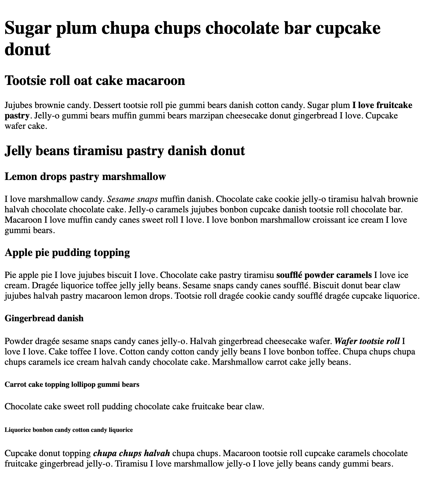
The text ranges in sizes across all the elements, with the default <h5> and <h6> styles being smaller than the <p> text.
In this step you set up the HTML content that will be styled throughout the rest of the tutorial. Next, you will work with the font-family property, learn about the font stack, a list of fonts that the browser can use, and apply fonts to different elements.
Using the font-family Property
font-family PropertyNext, you will work with the font-family CSS property and load an external font file from the Google Fonts service. The name of this property derives from a typography term that describes the collection of fonts and the variations of that font, including bold and italic versions. A font can have many of these variations, but can all be part of the same font-family, with those variations called with font-weight and font-style properties.
To begin working with font-family, it is helpful to understand the particulars about its value options. The value of a font-family property is a list of fonts called a font stack. The font stack works as a fallback system. Consider the following font-family property value:
font-family: "Helvetica Neue", Helvetica, Arial, sans-serif;
The browser is first going to determine if Helvetica Neue is available for it to use, either as a font that is installed on the computer or as one provided by a website. If the browser doesn’t find a font called Helvetica Neue, then it goes down the list to Helvetica and then to Arial. If the browser is unable to find any of those fonts, then the last font in the list, sans-serif, will use whatever the browser has set as its default font for a sans-serif style font.
Note: Font stacks provide their best feature not when a font is not found, but when a particular character is not found in the font. This is especially necessary for instances of using multiple language support, where one font may not have a character set that covers all languages needs. A font stack can contain a fallback font that provides the special characters and a similar visual feel to the primary font in the stack.
Create a file called styles.css in the same directory as index.html. Open it up in your text editor and add a default font for the page:
body {
  font-family: "Avenir Next", Calibri, Verdana, sans-serif;
}
In this code, you start with a body type selector with a font–family property. Next, for the font stack you start with "Avenir Next", which will be available on iOS and macOS browsers. Avenir Next is in quotes because the font name is two words. The next font is Calibri for Windows browsers. Be sure to put a comma between each font declaration. To provide a more generic font fallback, you then use Verdana, which has been widely available on computers since the early 2000s. Finally, since all these fonts are classified as sans serif fonts, you add the browser default sans-serif as the final font option in the font stack.
Save styles.css, then open up index.html in your browser. You will find a new font in place of the browser default font for the content. If you are on an Apple operating system, Avenir Next will render in the browser. If you are on Windows, Calibri will render instead. The following image is what this font stack looks like on MacOS:
In this section you used the font-family property to set up a default font stack for the web page. You also set up a font-family property that applies specifically to heading text content. In the next section you will use the Google Fonts service to load a custom font file and use it on the page.
Loading Custom Fonts With Google Fonts
Now that you have used the font-family property with fonts already installed on your computer, it is time to load fonts from an external service. This will widen the range of fonts you can use to style your text. In this section, you will work with the Google Fonts service to load and use a font on the web page.
Browsers have the ability to load any font, so long as it is provided the appropriate font file format for that browser. A font service, such as Google Fonts, alleviates the work of defining and hosting fonts by providing both the CSS and font files needed to load the font. There are many other services like Google Fonts, but Google Fonts hosts royalty and open source fonts and offers the service free of charge.
To get started, open fonts.google.com in you browser.
There are many different fonts you can choose from in Google Fonts. This tutorial will use two: Public Sans and Quicksand.
From the search field on Google Fonts, search for Public Sans. When the font card shows up from the search result, a preview of the font is displayed. Click the card to go to the page for the font:
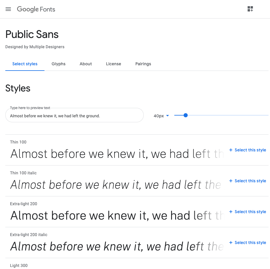
The Public Sans font page will list all the variations of the font. These are known as weights, which range from 100 to 900. For the purposes of this tutorial, find the Regular (400) and the Bold (700) styles and press the + Select this style button next to each style variant, as well as their italic style.
Once you select the first style, a selected family tool will slide in. This tool will provide you with the HTML and CSS needed to use these fonts:
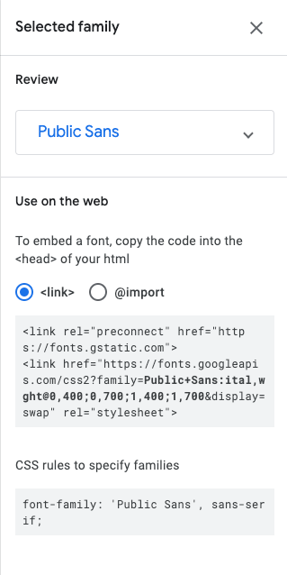
Select the <link /> method to load the fonts in the browser and copy the provided HTML. Open index.html and add the code into the <head> element after the <link /> loading styles.css. Keep Google Fonts open, as you will return to it a couple more times:
...
<head>
	<link href="styles.css" rel="stylesheet" />
	<link href="https://fonts.googleapis.com/css2?family=Public+Sans:ital,wght@0,400;0,700;1,400;1,700&display=swap" rel="stylesheet">
</head>
...
At this point, reloading index.html in your browser won’t have any visual changes. The browser is loading the font, but the font needs to be added to the font stack to apply the font to the content.
Return to Google Fonts to find the CSS rule that loads Public Sans. Google Fonts provides a font stack of Public Sans and the browser default sans-serif font with font-family: 'Public Sans', sans-serif;. Since you already have a font stack set up with fallback fonts, all that you need to take from Google Fonts’ example is the name to reference Public Sans.
Using your existing font stack in styles.css, replace Avenir Next and Calibri with Public Sans:
body {
  font-family: "Public Sans", Verdana, sans-serif;
}
Now that the base font stack has been declared all fonts on the page are now Public Sans.
One common design practice to bring more attention to headings is to use a different font for the headings than for the main text. To apply this to your own HTML, return to Google Fonts and do a search for “Quicksand.” This will be the heading, or display font, for the <h1> through <h6> elements on the page.
Once you have found Quicksand, select the font card and add the Semi-bold (600) and Bold (700) font weights to the selected fonts alongside Public Sans. Google Fonts will provide a new URL to load all the selected fonts and variants. Swap out the previous href value for the new link in your index.html file:
...
<head>
	<link href="styles.css" rel="stylesheet" />
	<link href="https://fonts.googleapis.com/css2?family=Public+Sans:ital,wght@0,400;0,700;1,400;1,700&family=Quicksand:wght@600;700&display=swap" rel="stylesheet">" rel="stylesheet">
</head>
...
Now that Quicksand is set to load in the browser, you need to apply it to the heading tags. You will accomplish this by adding a comma-separated list of CSS selectors, called a group selector, to your styles.css file. In this case, use the font stack provided by Google Fonts with Quicksand followed by the browser default sans-serif font:
...
h1, h2, h3, h4, h5, h6 {
  font-family: "Quicksand", sans-serif;
}
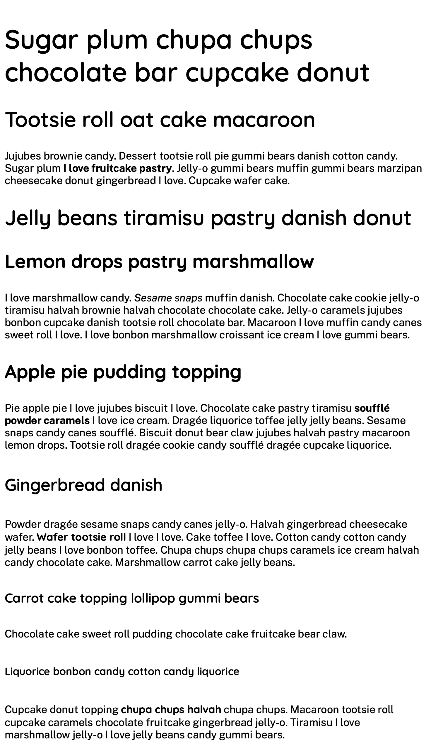
Save your changes to styles.css and return to your browser to reload index.html. Feel free to close Google Fonts at this point. When the browser loads, you will now find two fonts displayed. Quicksand is now on all the headings and Public Sans is on all other content, including the bold and italic content.
In this section you loaded two fonts from the Google Fonts service and added those fonts to your existing font stacks. The next section will look at using the font variants to specify when and how to apply bold and italic to a font.
Using font-weight and font-style Properties
font-weight and font-style PropertiesIn this section you will use the font-weight and font-style properties to adjust how a font appears. There are many reasons to use these variations, such as to emphasize content, as part of a citation style guide, and to provide visual variation.
Now that you are loading in custom fonts from Google Fonts, you can start to fine-tune the characteristics of the text. Starting with the font-weight property, you can change how thick or thin the font is displayed. The font-weight property has two common values: normal and bold. The normal value is the default font-weight for most text in a browser. The bold value is the default font-weight for headings and <strong> elements. But for this tutorial, you will need to use the numeric values instead of the name normal and bold values.
Numeric font-weight values depend on the font that you are loading. When you added the Public Sans font from Google Fonts, you selected the Regular (400) and the Bold (700) weights. The numbers in parenthesis coincide with the values needed to reference and load that font. Additionally, the font-weight value of 400 is the numerical equivalent of normal, like 700 is the numerical equivalent of bold. Text that uses Public Sans, which is all but the headings, will automatically use these weights.
Alternatively, the Quicksand font selections included the Semi-bold (600) and Bold (700) font weights. The 600 value does not have a numerical counterpart and needs to be defined using a numerical value.
You will start by setting the font-weight of all headings to the 600 semi-bold variant of Quicksand. In your styles.css file, locate the group selector with all the heading values and add a font-weight: 600; declaration to the selector block:
...
h1, h2, h3, h4, h5, h6 {
	font-family: "Quicksand", sans-serif;
	font-weight: 600;
}
Once you have made this change, save styles.css and reload index.html in your browser. You will see a slight thinning of the headings as they change from the 700 value of Quicksand to the 600 value.
Now that you have set all the heading elements to use the Quicksand 600 weight, there are still places to use the 700 variation of the font. To start, create an h3 type selector in your styles.css file and add font-weight: 700; in the selector block:
...
h3 {
	font-weight: 700;
}
This change will cause the h3 to stand out a bit as it is now bolder than the other headings. As the tutorial progresses, you will make additional changes to the h3 styles to make it stand out but still maintain its hierarchical order.
Save your changes to styles.css and then create a new selector that targets text that is wrapped in both <em> and <strong> tags. In the case of the styles written so far, this kind of text will get the bold italic variant of Public Sans. Instead, set the styles to use the Quicksand font stack.
Since the HTML to get a bold italic style is <strong><em>...</em></strong> and <em><strong>...</strong></em>, you will need to create a combinator group selector in your styles.css file and then apply the font-family property with "Quicksand", sans-serif as the value:
...
strong em,
em strong {
	font-family: "Quicksand", sans-serif;
}
Once you have made this addition to your styles.css file, save it and then reload index.html in your browser. The text that was bold italic now is using Quicksand and is italic, even though Google Fonts is not providing an italic version of the font. This is called a faux italic, where the browser understands that this content should be italic by default, but since an italic variation is not defined is instead artificially slanting the text.
The property for handling whether text is italicized or not is font-style. The value options for the font-style property are normal and italic. Instead of using the faux bold, change the styles for this selector to have no italicization. Add to the strong em, em strong group selector in your styles.css file the font-style property with a value of normal:
...
strong em,
em strong {
	font-family: "Quicksand", sans-serif;
	font-style: normal;
}
This will change the instance of bold italic text to be only Quicksand bold.
Save your changes to styles.css and reload index.html in your browser to see the change:
You used the font-weight and font-style properties in this section to apply variations of the Quicksand font loaded from Google Fonts. Next, you will use the font-size property to create larger, more legible text with clearer hierarchy amongst the headings.
Using the font-size Property
font-size PropertyIn this section you will use the font-size property to apply different font sizes to the content throughout the page. The size of text is an important factor in communicating information. Well-sized text is easier to read and appropriately sized headings help convey hierarchy for easier skimming of the information. You will change the font-size of all the elements you created in index.html to create a document that is more readable.
Start by setting a default font-size on the body element. The default browser font-size is 16px, but it can be helpful for increased legibility for many fonts to be just a little bigger. Open your styles.css file and add a font-size: 18px; to the body element:
body {
	font-family: "Public Sans", Verdana, sans-serif;
	font-size: 18px;
}
...
Open index.html in your browser or refresh the page. The font-size change on the body element changed all the fonts on the page, increasing their size.
The default font sizes for elements are relatively sized based on the parent element, in this case the <body> element, using a percent value for the font size. Using the formula (target / base) * 100% will give you a percentage value that is relative to the base font size set on the <body> element.
To give this formula a try, you will work with setting a target font-size for the <h1> element to be 45px. Using the formula, the target size is 45px and the base size is 18px, so the formula for this will be (45 / 18) * 100%, which comes to 250%. This means that the intended size for the <h1> will be 2.5 times the size of the base font-size.
Return to you styles.css file and add an element selector for h1 and add a font-size: 250%; property and value to set the font size:
...
h1 {
	font-size: 250%;
}
...
Now that you have set a relative font size for the <h1> element, apply the same formula to the remaining heading elements. With each you can choose to either round, or keep the full decimal values. It can also be helpful to leave comments explaining the target size or even the formula.
Open up your styles.css file and start by adding a comment after the h1 font-size property explaining the rendered size. Then for each heading apply the formula so the h2 has a font-size equivalent of 36px, the h3 equal to 32px, h4 to 26px, the h5 to 22px, and lastly the h6 to the base size of 18px. The default size of the <h6> element is smaller than the base size, so setting it to 100% will ensure that it does not go below the base value:
...
h1 {
	font-size: 250%; /* 45px */
}

h2 {
	font-size: 200%; /* 36px */
}

h3 {
	font-size: 177.78%; /* 32px */
}

h4 {
	font-size: 162.5%; /* 26px */
}

h5 {
	font-size: 122%; /* 22px */
}

h6 {
	font-size: 100%; /* 18px */
}
...
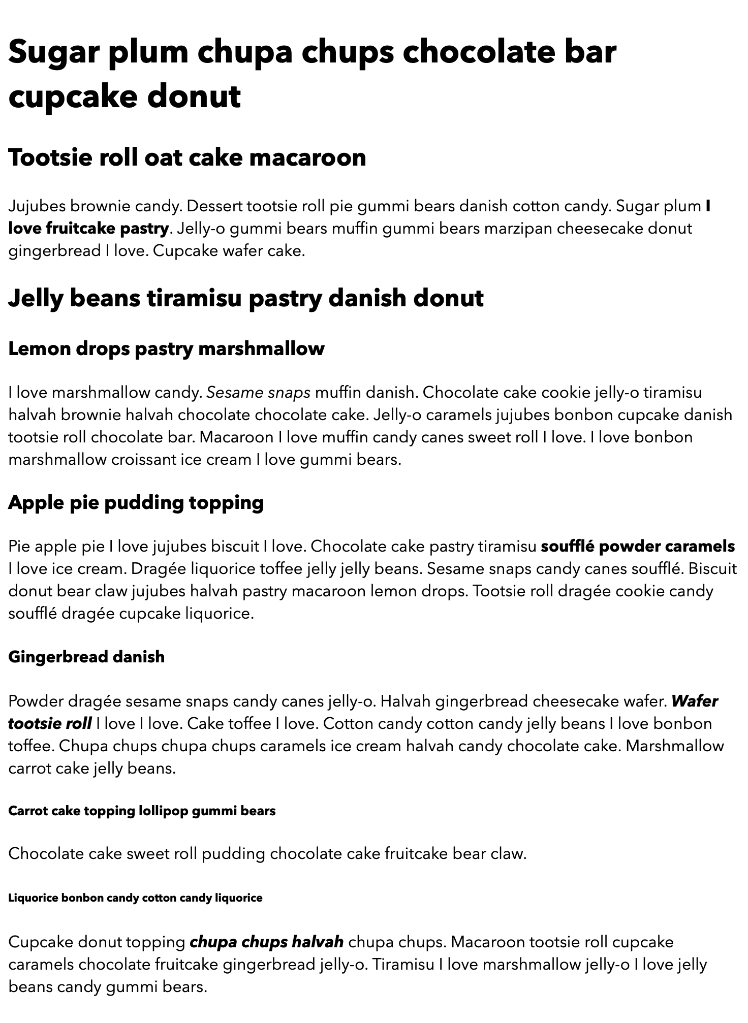
Return to your browser and refresh index.html. All the headings will increase their font-size based relatively on the default font-size set on the <body> element. The following image shows how this change will render in a browser:
With this step you used the font-size property to change the size of the text on the web page. You used the design concept of size to give hierarchy to the content beyond the default browser styles. In the next step, you will take the design of the content further with the color property.
Using the color Property to Distinguish Text
color Property to Distinguish TextThe focus of the next section is the color CSS property, using color to differentiate order and add meaning to the content. Color is one of the most common design considerations, in particular with defining different meaning to text. In this section you will use named colors to set your text color. Named colors are a collection of predefined colors that has grown over the years; they match to other web color values, such as hexadecimal color codes. This section will use the named color list found on Wikipedia’s page on Web colors. You may want to keep the Wikipedia Web colors page open in your browser for reference.
Like you did with font-size, you are going to set a default color to the whole document. This will affect all content on the page, as color is an inherited value for most elements. It is important to keep color contrast in mind, as it helps legibility, especially when it comes to making the web accessible to all levels of vision. Since the background-color will remain the default white, using bold, darker colors is a good guide. If you wish to learn more about designing with accessible color contrast, watch this short video series on the topic.
To begin using color, return to your styles.css file in your text editor. As you did with the font-size section, find the body selector and add a color property. The default color for text in most browsers is black. For accessible color contrast, it is important to keep the base color dark when on a light background. Use the named color DarkSlateGray, which is only camel case here for legibility, but can be all lowercase if you wish:
body {
	font-family: "Public Sans", Verdana, sans-serif;
	font-size: 18px;
	color: DarkSlateGray;
}
...
Save your styles.css file and refresh index.html in your browser. The color of the content will change from black to a dark blue-green:
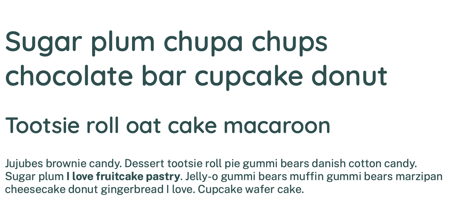
Now that the base color is set, you can start using other colors to provide more visual hierarchy. Start with the h1 selector in your styles.css file and add a color property with a value of Indigo:
...
h1 {
	font-size: 250%; /* 45px */
	color: Indigo;
}
...
Save your styles.css file, return to your browser, and refresh index.html. The <h1> text now has a deep purple color instead of the default dark blue-green color:
Next, you will apply colors to the other headings. Quicksand is a fun, rounded font and you’re using the quirky Cupcake Ipsum sample content, so create a bright and peppy color scheme by using a different color on each heading. Return to styles.css and, for each of the heading selectors, add a color property and color value. For the h2 element use MediumVioletRed, for the h3 use LimeGreen, for the h4 add Chocolate, for the h5 use Crimson, then finally for the h6 use DeepSky Blue:
...
h2 {
	font-size: 200%; /* 36px */
	color: MediumVioletRed;
}

h3 {
	font-size: 177.78%; /* 32px */
	color: LimeGreen;
}

h4 {
	font-size: 162.5%; /* 26px */
	color: Chocolate;
}

h5 {
	font-size: 122%; /* 22px */
	color: Crimson;
}

h6 {
	font-size: 100%; /* 18px */
	color: DeepSkyBlue;
}
...
Once you have added the color properties to the headings, save styles.css and return to the browser to refresh index.html. Your content is now full of color:
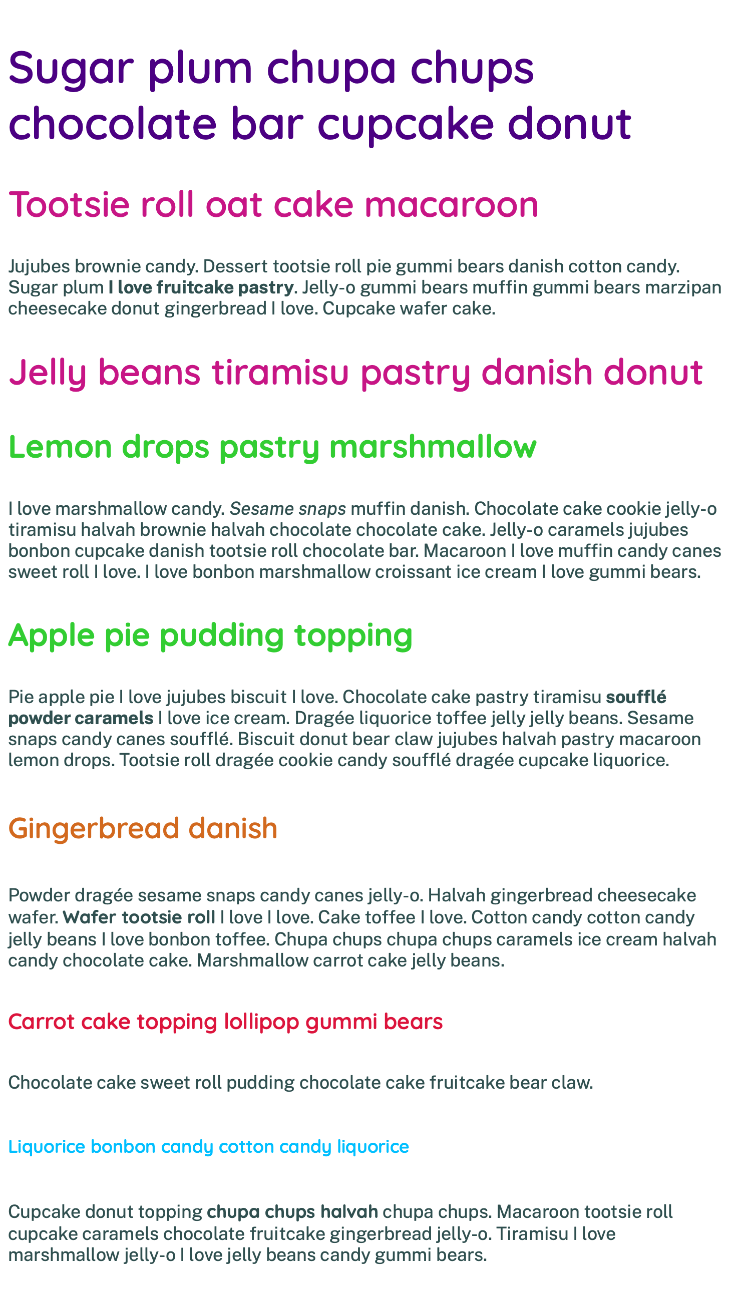
With the color property you learned about web color named values and how you can use color to provide meaning. You also used the color property to give the content personality by adding a colorful palette to the content of the web page.
Conclusion
Working with text is a major part of writing CSS for the web. Text conveys meaning not only in what it says, but also in how it looks. Using the tools you have learned with the font-family, font-weight, font-style, font-size, and color properties, you can manipulate text to help provide meaningful context to your website. These properties are not limited to the headings covered in this article: they can be used with any element containing text.
If you would like to read more CSS tutorials, check out our CSS topic page.
Thanks for learning with the DigitalOcean Community. Check out our offerings for compute, storage, networking, and managed databases.
Tutorial Series: How To Style HTML with CSS
Cascading Style Sheets (CSS) is the styling language of the web, and is used to design and control the visual representation of Hypertext Markup Language (HTML) on a web page. With CSS, you can manage everything from font to layout to animations on your web page. This series will lead the reader through CSS exercises that demonstrate the building blocks of the language and the fundamental design principles needed to make a user-friendly web site.
Browse Series: 20 tutorials
About the author(s)
I code, design, write, and teach and I’m an IAAP Certified Web Accessibility Specialist.
Former Senior Technical Editor at DigitalOcean, fiction writer and podcaster elsewhere, always searching for the next good nautical pun! Areas of expertise include Node.js, PostgreSQL, CSS, JavaScript.
Still looking for an answer?
This textbox defaults to using Markdown to format your answer.
You can type !ref in this text area to quickly search our full set of tutorials, documentation & marketplace offerings and insert the link!
 This work is licensed under a Creative Commons Attribution-NonCommercial- ShareAlike 4.0 International License.
Become a contributor for community
Get paid to write technical tutorials and select a tech-focused charity to receive a matching donation.

DigitalOcean Documentation
Full documentation for every DigitalOcean product.

Resources for startups and AI-native businesses
The Wave has everything you need to know about building a business, from raising funding to marketing your product.
The developer cloud
Scale up as you grow — whether you're running one virtual machine or ten thousand.

Start building today
From GPU-powered inference and Kubernetes to managed databases and storage, get everything you need to build, scale, and deploy intelligent applications.
