Developer

The author selected the Diversity in Tech Fund to receive a donation as part of the Write for DOnations program.
Introduction
There are many ways to work with layout on the web. The modern approaches tend to rely on CSS Grid and Flexbox properties to create many web layouts. However, before Grid and Flexbox existed, web developers relied heavily on the float and columns properties. The float property is used to allow inline elements to wrap around a floating element, and column sets parameters for arranging text in columns. Because these properties also have properties that neither Grid and Flexbox can replicate, learning this method of layout can add options and flexibility to a designer’s set of skills.
In this tutorial you will work with the float and columns properties to create various layout styles and effects. You will use the float property to float a pull quote and an image and cause the content to wrap around those elements. Then you will use the columns property to adjust vertically long content to spread across the horizontal axis. Additionally, the concepts and methods of responsive web design will be covered as you work to apply the various styles.
Prerequisites
- An understanding of CSS’s cascade and specificity features, which you can get by reading How To Apply CSS Styles to HTML with Cascade and Specificity.
- Knowledge of type selectors, combinator selectors, and selector groups, which you can find in How To Select HTML Elements to Style with CSS.
- An understanding of laying out text with CSS, which you can find in the How To Lay Out Text with CSS tutorial.
- An empty HTML file saved on your local machine as
index.htmlthat you can access from your text editor and web browser of choice. To get started, check out our How To Set Up Your HTML Project tutorial, and follow How To Use and Understand HTML Elements for instructions on how to view your HTML in your browser. If you’re new to HTML, try out the whole How To Build a Website with HTML series.
Setting Up the Initial HTML and CSS
In this section you will set up the base HTML and CSS that will be used throughout the tutorial. You will use demo text content from Cupcake Ipsum and the font Comfortaa from Google Fonts.
To begin, open the index.html file in your text editor. Then, add the following HTML to the file:
<!doctype html>
<html>
  <head>
    <meta charset="utf-8">
    <meta name="viewport" content="width=device-width, initial-scale=1">
    <title>Cupcake Layouts</title>
    <link rel="preconnect" href="https://fonts.gstatic.com">
    <link href="https://fonts.googleapis.com/css2?family=Comfortaa:wght@400;700&display=swap" rel="stylesheet">
    <link rel="stylesheet" href="styles.css" />
  </head>
  <body>

  </body>
</html>
There are a lot of page settings being defined inside the <head> element. The first <meta> element defines the characters set to use for the text. This way most special characters, such as an accent mark, will render without special HTML codes. The second <meta> element tells browsers (mobile browsers in particular) to treat the width of the device as the width of the content; otherwise the browser will simulate a 960 pixel desktop width. The <title> element provides the browser with the title of the page. The <link> elements load in the page styles: The first two load in the font, Comfortaa, from Google Fonts and the last loads the styles you will write for this tutorial.
Next, the page will need content to style. You will use sample content from Cupcake Ipsum as filler copy to work with the styles. Throughout the tutorial, new code will be highlighted.
Return to index.html in your text editor and add the highlighted HTML from the following code block:
<!doctype html>
<html>
  <head>
    ...
  </head>
  <body>
    <article>
      <h1>Carrot Cake Pie Toffee Cheesecake</h1>

      <p>Gummi bears powder tootsie roll biscuit. Icing jelly-o tootsie roll powder pie dessert biscuit tiramisu. Jelly beans pudding lemon drops sesame snaps jujubes sesame snaps gummi bears tiramisu. Apple pie danish soufflé soufflé cupcake cookie donut. Cookie gummies powder dragée powder chocolate bar muffin jelly marshmallow. Cheesecake dessert chocolate bar chocolate cake gingerbread chocolate bar gingerbread wafer brownie. Bear claw cake sugar plum muffin candy canes tart cheesecake croissant candy canes. Gummi bears carrot cake sweet chocolate. Carrot cake cake sweet bear claw. Gummi bears chocolate pie croissant chocolate cake bear claw dragée.</p>

      <p>Tootsie roll cotton candy cake tiramisu pastry. Croissant oat cake ice cream dragée sweet roll soufflé marshmallow powder marzipan. Lemon drops cake bear claw cake sweet lollipop. Lollipop toffee liquorice apple pie gingerbread pastry tiramisu.</p>

      <h2>Jelly Beans Wafer Apple Pie Icing</h2>

      <p>Jelly cotton candy cake pastry carrot cake. Topping icing danish. Lollipop sesame snaps muffin bonbon icing. Lollipop chocolate bar jelly-o sweet roll. Topping bear claw sweet. Apple pie bonbon sweet lemon drops caramels topping pastry. Biscuit jelly tootsie roll cookie tiramisu cotton candy. Icing chocolate cake liquorice ice cream sesame snaps cupcake chocolate bar pudding gingerbread. Donut toffee ice cream chocolate biscuit.</p>

      <p>Carrot cake pie halvah toffee cheesecake chocolate cake gingerbread liquorice. Marshmallow danish candy fruitcake chocolate dessert. Bear claw chocolate bar sugar plum pudding cake cheesecake sweet. Marzipan lemon drops croissant gummies. Dessert carrot cake carrot cake cookie candy canes toffee. Biscuit bear claw candy canes muffin. Lollipop gummies tart danish tart sugar plum biscuit. Lemon drops muffin sugar plum sweet. Cotton candy pastry topping caramels gummies carrot cake marzipan tiramisu sesame snaps.</p>

      <p>Ice cream donut cookie. Donut icing cookie sweet roll topping cookie. Jelly beans marzipan jujubes jelly beans ice cream marzipan apple pie cake. Sweet croissant sweet roll carrot cake oat cake tiramisu ice cream wafer wafer. Candy canes jelly beans toffee danish. Liquorice donut macaroon caramels. Donut pie cupcake gummies. Icing jujubes pudding apple pie pastry muffin sweet roll ice cream chocolate bar. Liquorice icing sugar plum marshmallow icing.</p>

      <h2>Jelly Sugar Plum Chocolate Danish</h2>

      <p>Topping marzipan sesame snaps soufflé chupa chups cookie wafer cupcake. Jelly beans lollipop jelly beans. Chocolate cake lemon drops chupa chups candy icing tootsie roll danish liquorice. Gummies danish dragée apple pie jelly pie topping icing tootsie roll. </p>

      <p>Apple pie bear claw muffin tiramisu gummi bears cake muffin. Candy canes oat cake croissant cake liquorice topping halvah dessert cheesecake. Candy fruitcake muffin. Cookie oat cake gummies brownie dessert candy canes icing. Soufflé chocolate cake pastry toffee cheesecake macaroon liquorice gummi bears. Halvah tiramisu jujubes. Bear claw candy danish. Macaroon chocolate wafer soufflé biscuit. Bear claw biscuit sesame snaps biscuit liquorice sweet roll lollipop. Marshmallow bear claw dragée icing liquorice candy donut chupa chups. Halvah dessert bonbon cupcake cupcake sugar plum cotton candy toffee muffin. Bonbon gummi bears jujubes chupa chups oat cake candy canes.</p>

      <p>Gummies bonbon marzipan icing pudding. Jujubes croissant carrot cake. Pastry halvah pudding toffee. Lemon drops gingerbread chocolate apple pie jelly cheesecake.</p>

      <p>Fruitcake dessert chocolate cupcake carrot cake dessert candy canes chocolate soufflé. Cookie cupcake marzipan sesame snaps biscuit tart pie jelly-o. Halvah tiramisu gummies biscuit powder donut. Chocolate cake bear claw macaroon.</p>

      <h2>Gingerbread Macaroon Fruitcake</h2>

      <p>Jelly chocolate gummies cupcake liquorice chocolate. Sugar plum donut tiramisu muffin chupa chups. Cake caramels fruitcake jelly beans pudding I love pie lollipop jelly beans. Gummi bears cheesecake dragée I love fruitcake sesame snaps I love. Apple pie muffin donut. Fruitcake donut chocolate bar cotton candy topping candy macaroon I love. Fruitcake sesame snaps jelly-o. Tart wafer sugar plum I love apple pie biscuit. Pastry sesame snaps tart. Apple pie gingerbread chocolate candy canes.</p>

      <p>I love cake sweet roll toffee lemon drops bonbon sweet. Oat cake lemon drops candy canes topping macaroon.</p>

      <p>Sweet cotton candy danish. Lollipop bear claw pudding carrot cake. Gummi bears candy canes chocolate cake chupa chups. Sugar plum jelly cake cookie cheesecake croissant muffin carrot cake. Pudding I love liquorice jelly-o caramels I love sweet roll bonbon oat cake. Caramels gummi bears gingerbread.</p>
    </article>
  <body>
</html>
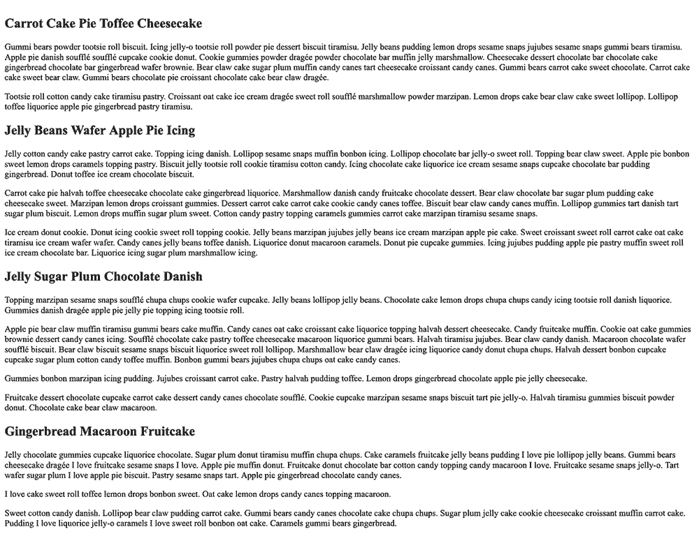
Save these additions to your index.html file then open it in your web browser. The content will use the browser default styles, as shown in the following image:
Create a file called styles.css in the same folder as index.html and open it in your text editor. This file will contain all the styles used throughout the tutorial. The first set of styles will apply a general aesthetic that you will build on later. Apply the CSS from the following code block to your styles.css file:
body {
  font: 100%/1.5 Comfortaa, sans-serif;
  color: hsl(300, 100%, 10%);
  background-color: hsl(300, 100%, 98%);
}

article {
  width: 90%;
  max-width: 75ch;
  margin: 2rem auto;
}

h1 {
  font-size: 1.75rem;
  color: hsl(204, 100%, 29%);
  margin: 1em 0  0.5em;
}

h2 {
  font-size: 1.5rem;
  color: hsl(204, 100%, 29%);
  margin: 1em 0 0.5em;
}
These styles add a minimal set of styles, using a shorthand font property on the body selector to set a new default font family and line height between lines of the text. The styles set to the article selector make the container have a width slightly smaller than the full screen width, but keep that content centered with the margin property set to auto for the left and right values. The article also has a maximum with of 75ch, which means it only gets as wide as 75 zero characters of the set font-size value. Lastly, the h1 and h2 selectors set a new font-size, color, and margin for each.
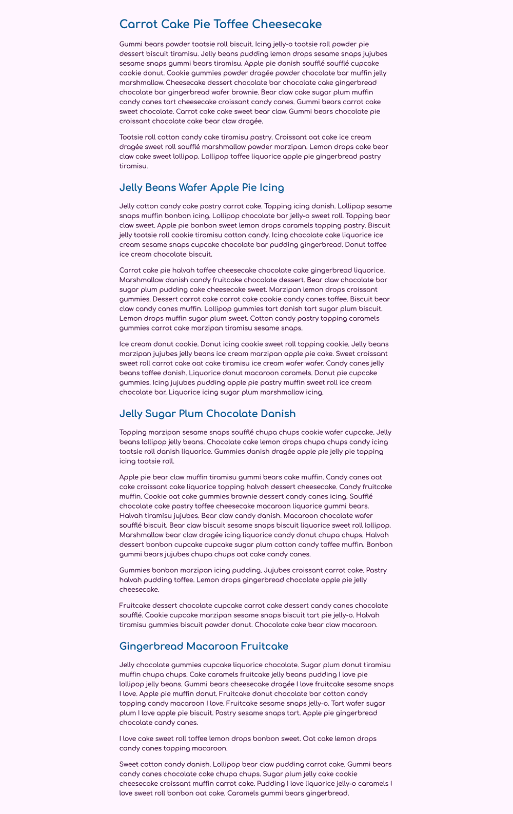
Save your changes to styles.css, then refresh index.html in your web browser. The following image shows how these new base styles will appear in the browser:
In this section you set up the the base HTML and CSS needed to begin adding float and columns content. In the next section, you will create a block quote that floats, allowing content to wrap around it. You will also create a horizontal rule line that stops content from wrapping around the floating element.
Floating Content
Next you will add a <blockquote> element and apply a float property to cause the content to wrap around the floating content.
To create the quote content, open index.html in your text editor. After the first <p> content block, add a <blockquote> opening and closing tag. Inside the <blockquote> tags, add a new <p> content block with a couple of sentences from Cupcake Ipsum. After the next <p> content block, but before the <h2> heading, add a horizontal rule using a self-closing <hr /> element. The highlighted HTML in the following code block indicates where and what to add to your file:
<!doctype html>
<html>
  ...
  <body>
    <article>
      <h1>Carrot Cake Pie Toffee Cheesecake</h1>

      <p>Gummi bears powder tootsie roll biscuit. Icing jelly-o tootsie roll powder pie dessert biscuit tiramisu. Jelly beans pudding lemon drops sesame snaps jujubes sesame snaps gummi bears tiramisu. Apple pie danish soufflé soufflé cupcake cookie donut. Cookie gummies powder dragée powder chocolate bar muffin jelly marshmallow. Cheesecake dessert chocolate bar chocolate cake gingerbread chocolate bar gingerbread wafer brownie. Bear claw cake sugar plum muffin candy canes tart cheesecake croissant candy canes. Gummi bears carrot cake sweet chocolate. Carrot cake cake sweet bear claw. Gummi bears chocolate pie croissant chocolate cake bear claw dragée.</p>

      <blockquote>
        <p>Apple pie danish soufflé soufflé cupcake cookie donut. Cookie gummies powder dragée powder chocolate bar muffin jelly marshmallow.</p>
      </blockquote>

      <p>Tootsie roll cotton candy cake tiramisu pastry. Croissant oat cake ice cream dragée sweet roll soufflé marshmallow powder marzipan. Lemon drops cake bear claw cake sweet lollipop. Lollipop toffee liquorice apple pie gingerbread pastry tiramisu.</p>

      <hr />

      <h2>Jelly Beans Wafer Apple Pie Icing</h2>
      ...
    </article>
  </body>
</html>
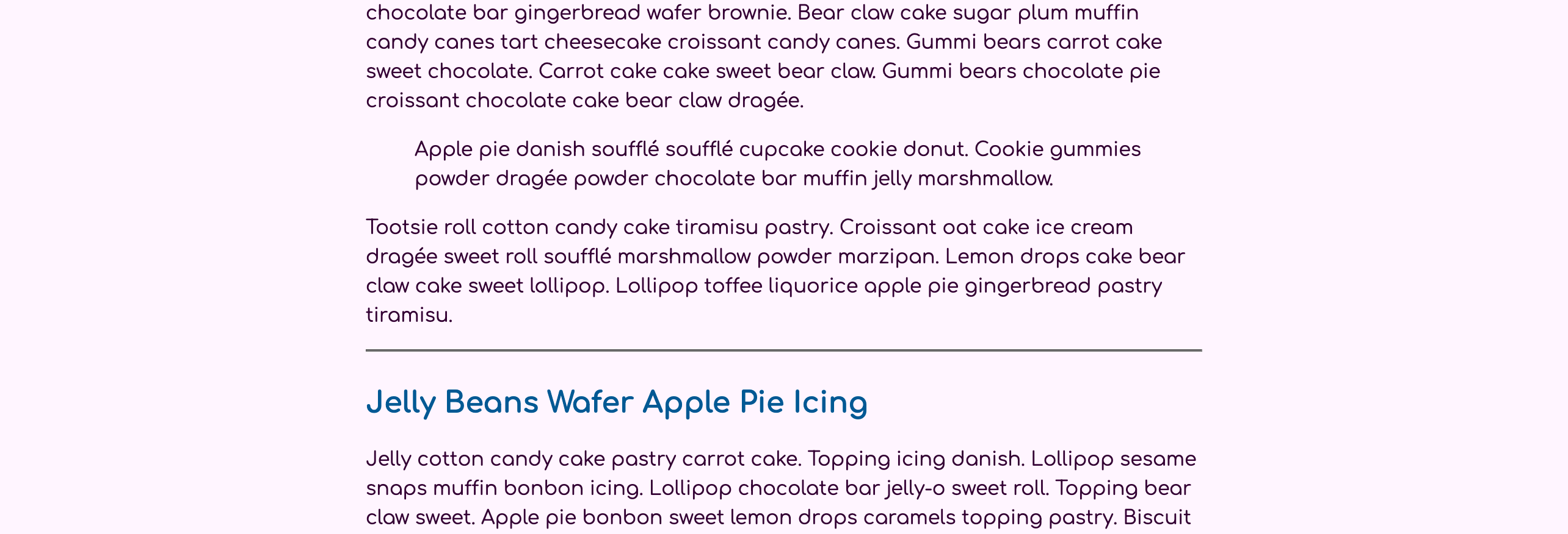
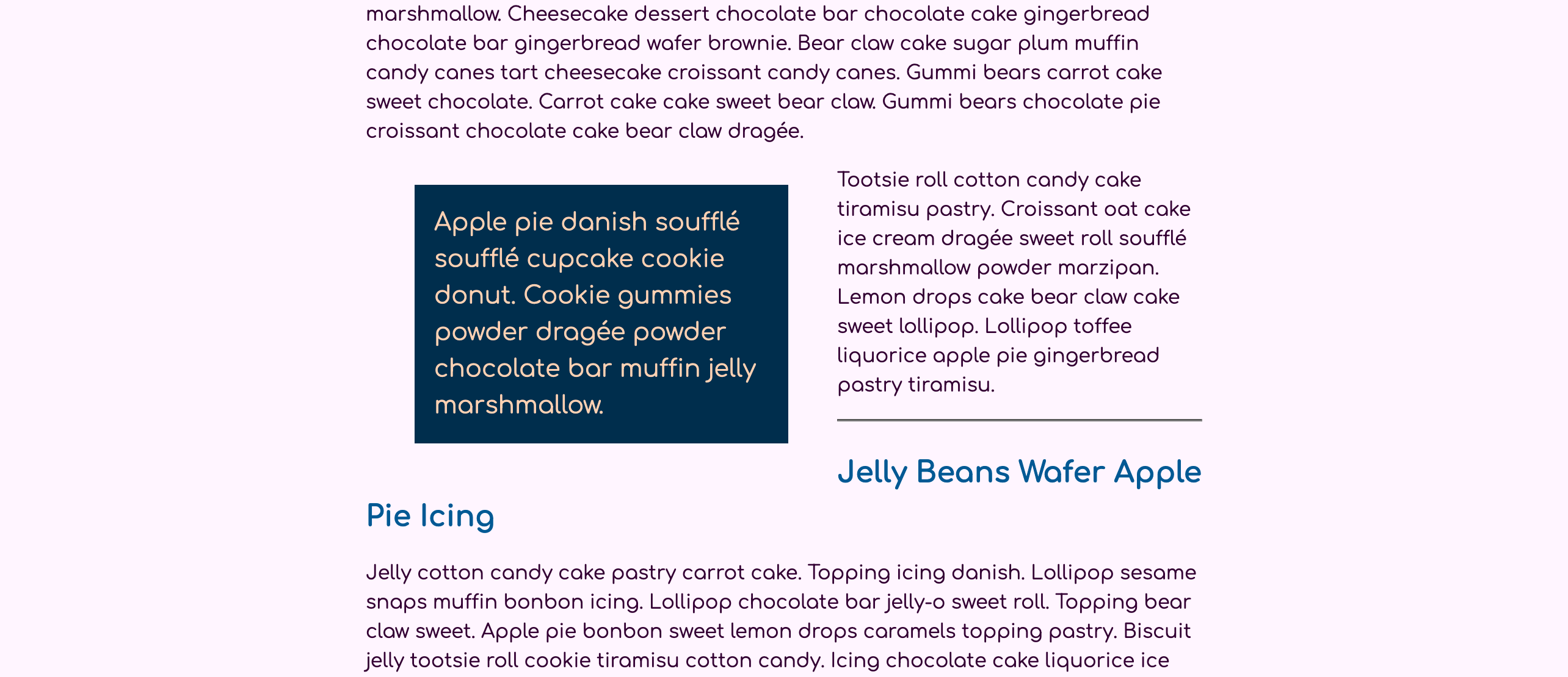
Save these changes to your index.html file, then return to the web browser and refresh the page. The quote will inherit some styles from the initial set of CSS you wrote, but still have some browser default styles applied. The following image shows how the quote and horizontal rule will appear in the browser:
To start adding styles to the quote content, open styles.css in your text editor. First create a blockquote element selector and then add a padding of 1rem, a background-color property set to a dark purple with hsl(204, 100%, 15%), and lastly a color property set to a light yellow with hsl(24, 100%, 85%) . Next, add a blockquote p combinator selector to increase the font-size of the content to 1.25rem and remove the default spacing by adding a margin property with a value of 0. The highlighted CSS in the following code block shows how this will be formatted in your text editor:
...
h2 {
  font-size: 1.5rem;
  color: hsl(204, 100%, 29%);
  margin: 1em 0 0.5em;
}

blockquote {
  padding: 1rem;
  background-color: hsl(204, 100%, 15%);
  color: hsl(24, 100%, 85%);
}

blockquote p {
  font-size: 1.25rem;
  margin: 0;
}
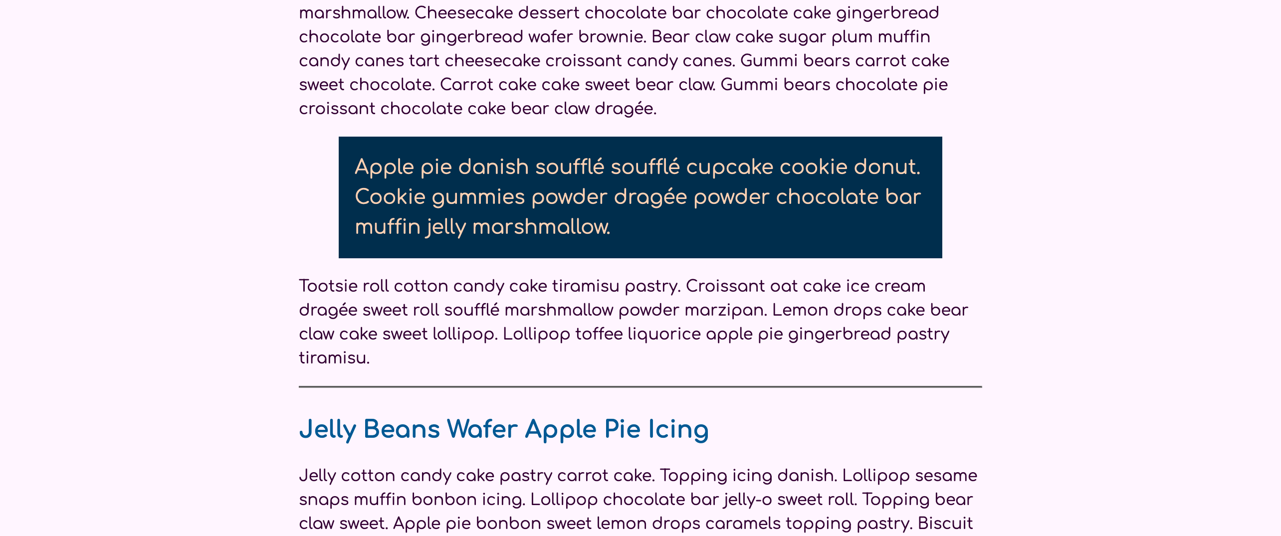
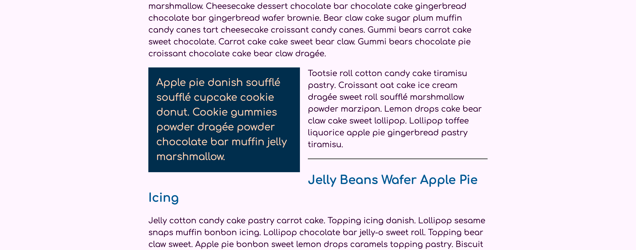
Save your changes to styles.css, then reload index.html in the web browser. The blockquote styling will now have larger text with a darker background and light yellow text, as shown in the following image:
Next, you will apply the float property to the blockquote. There are three value options for the float property: left, right, and none. This means the floating content will either go the left side of the wrapping content or the right side. If the content is already floating, you can use none to remove the floating feature. For the blockquote, you will set it to float to the left, so the paragraph below it wraps to the right.
Return to styles.css in your text editor. In the blockquote element selector, add the float property with the value set to left, as highlighted in the following code block:
...
blockquote {
  padding: 1rem;
  background-color: hsl(204, 100%, 15%);
  color: hsl(24, 100%, 85%);
  float: left;
}
...
At this point the blockquote is floating, but it will not cause any content to wrap because of an aspect of how floating is handled with the contents inside. A floating element still expands to the natural width of the content. This means that since the content inside the blockquote is so long, it will still take up the same amount of space as though it were not floating. To force a visual change, add a width property set to a value of 40% to the blockquote selector, as highlighted in the following code block:
...
blockquote {
  padding: 1rem;
  background-color: hsl(204, 100%, 15%);
  color: hsl(24, 100%, 85%);
  float: left;
  width: 40%;
}
...
Save these changes to styles.css and then refresh index.html in your web browser. The width of the <blockquote> element is now constrained to 40% of the parent container width, which allows the paragraph below to pull up and wrap on the right. The following image shows how this will appear in your browser:
The last formatting adjustment that needs to be made to the blockquote is the spacing around the element.
Return to styles.css in your text editor. Then go to blockquote element selector block and add a margin property with a value of 0 1rem 1rem 0. The highlighted line of CSS in the following code block shows how this is formatted:
...
blockquote {
  padding: 1rem;
  background-color: hsl(204, 100%, 15%);
  color: hsl(24, 100%, 85%);
  float: left;
  width: 40%;
  margin: 0 1rem 1rem 0;
}
...
This margin value will set the right and bottom margin values to 1rem and the top and left values to 0, which provides space along the sides where the text wraps around the quote.
Save your changes to styles.css, then return to index.html in your web browser and refresh. The following image shows how this will appear in the browser:
As it is now, the floating pull quote is large enough that it is causing the heading of the next section to wrap as well. This where the clear property is helpful to prevent this situation. The clear property, like float, has three property values to counteract the float property and stop content from wrapping. The values for clear are left, right, and a combination of the two with both. The element on which this property is placed will stop the wrapping from that point forward.
To use the clear property, open styles.css in your text editor. You will use the <hr /> element to apply the clear property, so begin by creating an hr element selector. Then, to add an aesthetic style, add a border property with a value of 0.125 rem solid hsl(300, 50%, 90%) to create a thick border. Next, add a margin property set to 3rem 0 so there is extra space above and below the border. Finally, add the clear property and use the both value to stop the content from wrapping around the quote element. The highlighted CSS in the following code block shows how to format these styles:
...

blockquote p {
  font-size: 1.25rem;
  margin: 0;
}

hr {
  border: 0.125rem solid hsl(300, 50%, 90%);
  margin: 3rem 0;
  clear: both;
}
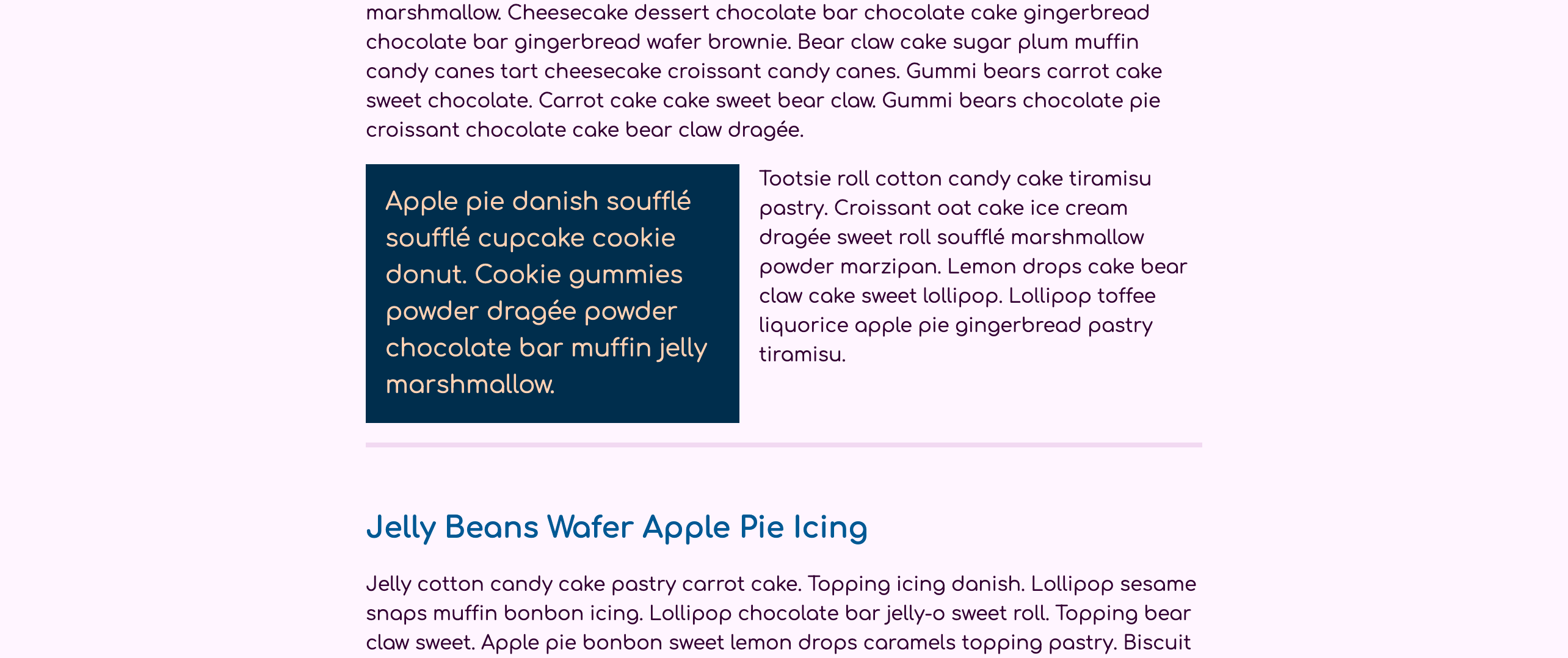
Save your changes to styles.css and return to the browser and refresh index.html. As shown in the following image, the <hr> element is no longer wrapping to the right of the quote. Instead, the rule line is below, extending the full width of the content. However, the distance between the quote and the <hr> uses the margin on the float and not the larger margin value of the <hr> element:
In this section, you applied a float to a <blockquote>, which caused the other elements to wrap around it. You also added the margin to give white space around the quote, making the wrapping content more legible. In the next section, you will float an image when the screen size reaches a certain width using a media query.
Floating Image at a Given Screen Width
There are three requirements for effective responsive web design: flexible width, resizable images, and media queries. In this step, you will use all three of these to cause an image to float to the right at a specific screen width, and then at a larger screen size pull the image into the right side margin.
To begin, load an image on to the page. Open index.html in your text editor, and add an <img /> element between the first two paragraphs following <h2>Jelly Beans Wafer Apple Pie Icing</h2>. Like the <hr /> element from the previous section, <img /> is a self-closing element; however, the <img /> requires a src attribute to where the image file is located that will be placed on the page. The highlighted HTML in the following code block shows how to set up the <img /> in your code:
<!doctype html>
<html>
...
<body>
<article>
...
<hr />
<h2>Jelly Beans Wafer Apple Pie Icing</h2>
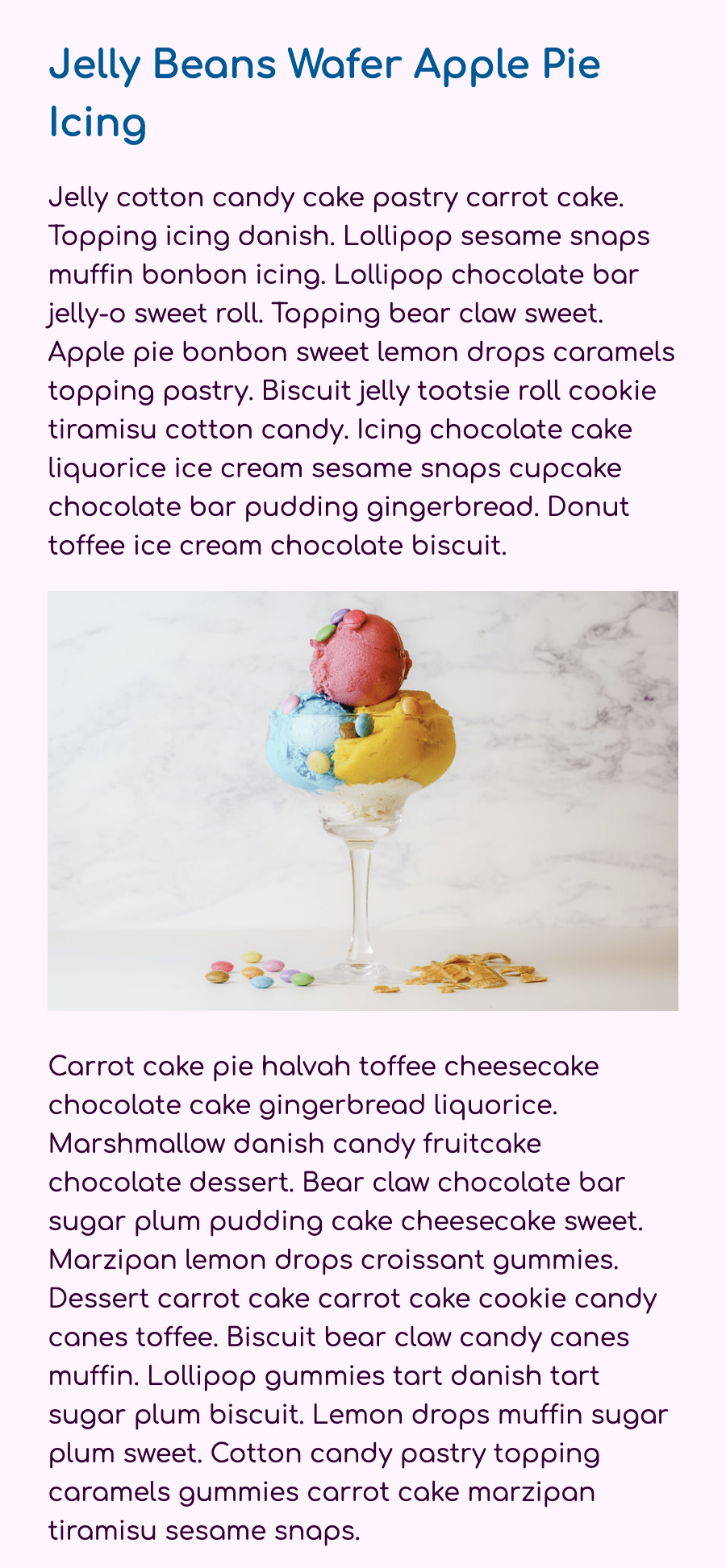
<p>Jelly cotton candy cake pastry carrot cake. Topping icing danish. Lollipop sesame snaps muffin bonbon icing. Lollipop chocolate bar jelly-o sweet roll. Topping bear claw sweet. Apple pie bonbon sweet lemon drops caramels topping pastry. Biscuit jelly tootsie roll cookie tiramisu cotton candy. Icing chocolate cake liquorice ice cream sesame snaps cupcake chocolate bar pudding gingerbread. Donut toffee ice cream chocolate biscuit.</p>
<img src="https://source.unsplash.com/-hM0-PSO3FY/450x300" alt="Icing lemon drops danish tiramisu soufflé" />
<p>Carrot cake pie halvah toffee cheesecake chocolate cake gingerbread liquorice. Marshmallow danish candy fruitcake chocolate dessert. Bear claw chocolate bar sugar plum pudding cake cheesecake sweet. Marzipan lemon drops croissant gummies. Dessert carrot cake carrot cake cookie candy canes toffee. Biscuit bear claw candy canes muffin. Lollipop gummies tart danish tart sugar plum biscuit. Lemon drops muffin sugar plum sweet. Cotton candy pastry topping caramels gummies carrot cake marzipan tiramisu sesame snaps.</p>
...
</article>
</body>
</html>
For your image you are using a picture from the Unsplash image service to provide the src value. <img /> elements also need to have an alt attribute to provide description text. This description text can be used in many ways, but it is most important to provide contextual information for screen reader users.
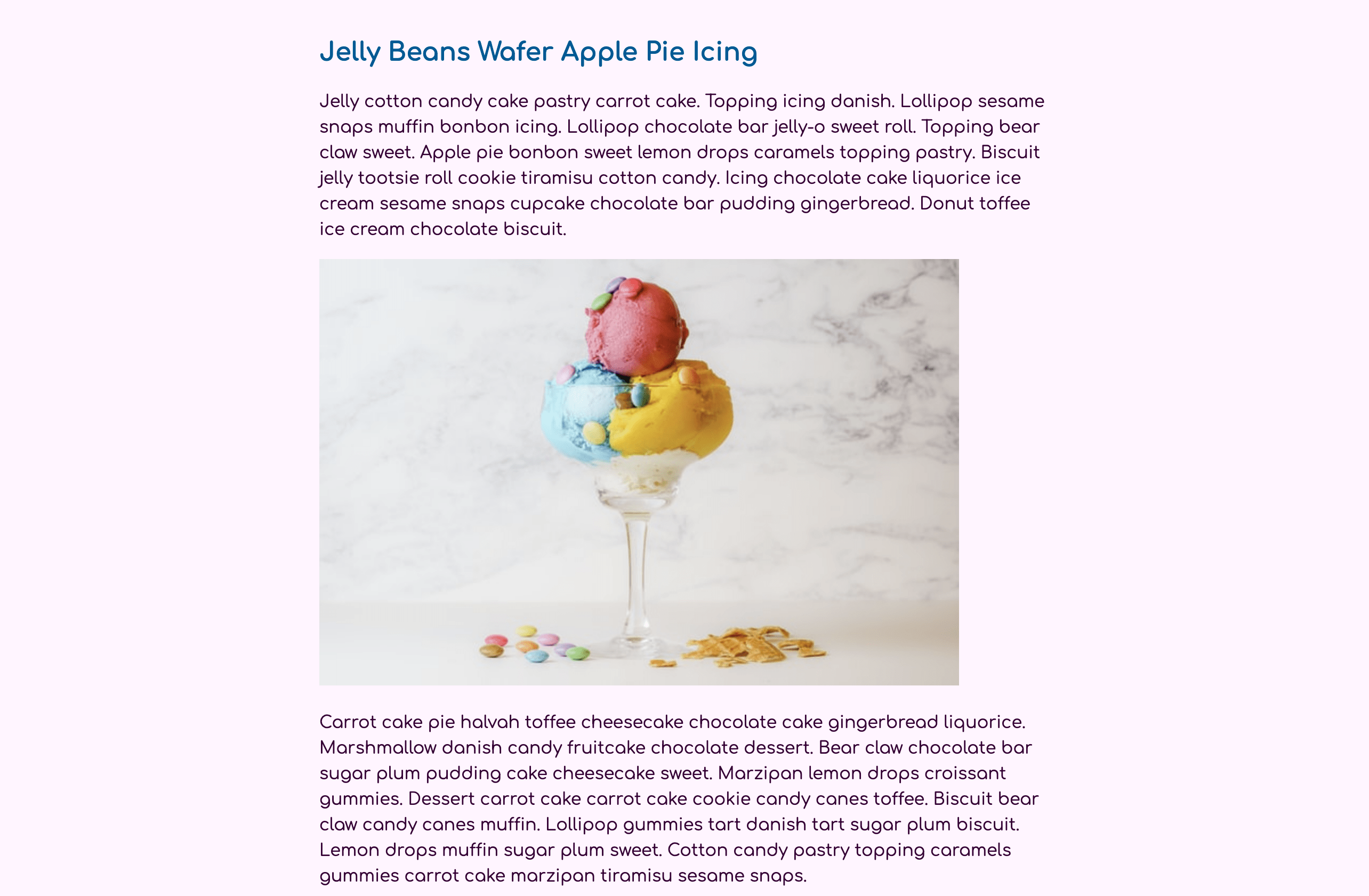
Save your changes to index.html and refresh the page in your browser. You will now have an image loading on the page between two of the paragraphs, as shown in the following image:
Images on web pages, by default, are displayed at their given pixel size. In the case of the image added to the HTML earlier, it has a size of 450 pixels wide and 300 pixels tall. When loaded on a mobile phone that has a screen size smaller than 450 pixels wide, then the image will go off screen and cause a horizontal scroll bar. To set images to resize to fit the space contained, you can use width: 100% on the img. However, this approach allows the image to get larger than its actual size, distorting the image as it grows, known as pixelization. Instead it is better to use max-width: 100%, which allows the image to shrink into more restrictive spaces, but not grow past its actual size.
To create these resizing images, return to styles.css in your text editor. After the body element selector at the top of the document, add an img element selector. Inside the selector block add the max-width property with a value of 100%. The highlighted CSS in the following code block demonstrates how to set up the img selector:
body {
  font: 100%/1.5 Comfortaa, sans-serif;
  color: hsl(300, 100%, 10%);
  background-color: hsl(300, 100%, 98%);
}

img {
  max-width: 100%;
}

article {
  width: 90%;
  max-width: 75ch;
  margin: 2rem auto;
}
...
Save these changes to styles.css and refresh index.html in your web browser. Take the browser window and decrease the width to something closer to a phone size. The image will shrink once the window width becomes smaller than the width of the image. The following image shows how this will look in the browser on a narrow width window:
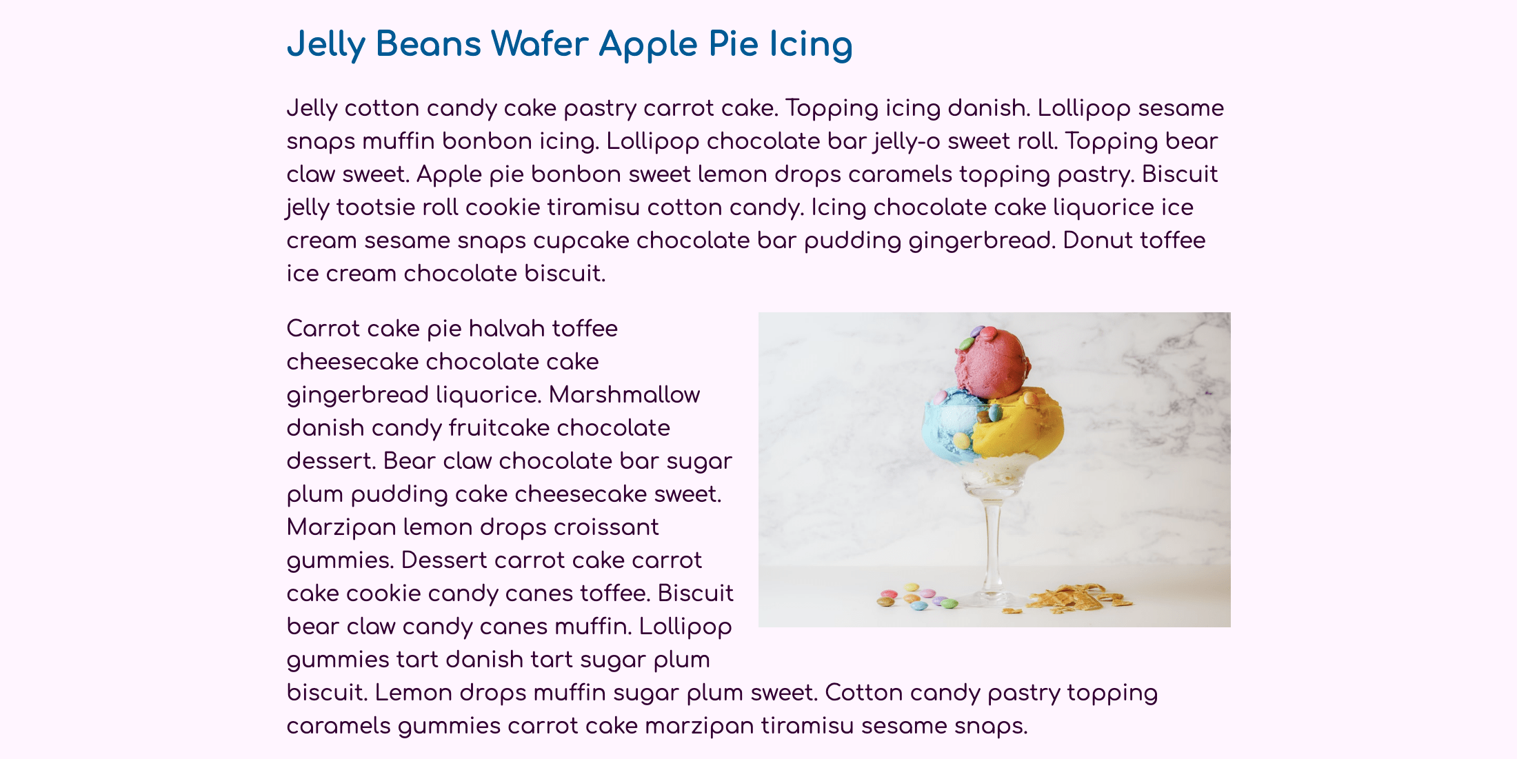
Now that you have a responsively scaling image, you will next move the image to float right when there is sufficient space. Changing styles at a certain window or screen width is accomplished with special at-rule conditions called media queries. A media query is defined by using the @media rule followed by a media condition in which to apply the styles it contains. In this case, you want the window size to be at least 640px. Since the end user can affect the meaning of a pixel, divide 640 by 16 to get a rem unit value of 40. After the query is defined it will have its own set of curly braces, inside which are the selectors that need to change at the specified screen width.
Open the styles.css file in your text editor. Then create a media query set to a min-width of 40rem. Inside the query block, add an img element selector with a float property set to right. So the image doesn’t take up too much space in this view, set the max-width value to 50%. Lastly, use the margin property to add a margin to the left and bottom position of the image. The highlighted CSS in the following code block demonstrates how to add the media query and the associated styles:
...
blockquote p {
  font-size: 1.25rem;
  margin: 0;
}

@media (min-width: 40rem) {
  img {
    float: right;
    max-width: 50%;
    margin: 0 0 1rem 1rem;
  }
}
...
Save your changes to styles.css, then return to the browser and refresh the page. Be sure to resize your browser from a small screen size out to a more common desktop browser window size. The image will now float to the right with the text content wrapping around to the left, as shown in the following image:
The text now defines the layout and leaves lots of extra space on the right and left when on a larger desktop screen size. In this case, it can be both aesthetically and functionally helpful to pull the image into that extra space. This can be done with a negative margin value on the floating element.
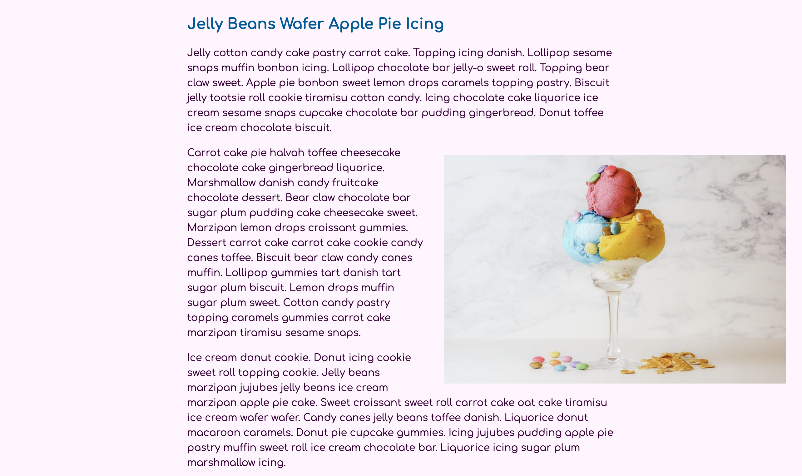
To create this effect, open styles.css in your text editor then add another media query for a min-width of 80rem, which is equivalent to 1280 pixels. Inside the query block, add an img element selector and return the max-width property to a value of 100%. Then add a margin property with the top and bottom positions set to 1rem and the left position set to 2rem. Set the right position to -40%. This value will pull the image into the white space on the right side of the content by 40% of the parent element’s width, not the img width. The highlighted CSS in the following code block demonstrates how to set this up:
...
@media (min-width: 40rem) {
  img {
    float: right;
    max-width: 50%;
    margin: 0 0 1rem 1rem;
  }
}

@media (min-width: 80rem) {
  img {
    max-width: 100%;
    margin: 1rem -40% 1rem 2rem;
  }
}
...
Save these changes to styles.css then refresh index.html in the browser. You may need to expand the width of your window, but once it reaches a width of approximately 1280 pixels the image will pull to the right and the content will continue to wrap on the left. The following image shows how this will appear in the browser:
In this section you used a media query, a percentage width, and negative margin values to float an image and pull it into the white space of the layout. In the next section, you will begin to use the columns property to change some content from a single column to two columns at a given media query screen width.
Column content
When working with text content it can be helpful at times to adjust the layout so that the content is side by side, or even wrap from one column to the next. There are many ways to create columns with CSS, but only the columns property will divide the content of one element between different columns. In this section, you will use the columns property to create a two-column layout for the content to wrap. Then, you will use additional columns properties to create a dividing line between the columns and tell an element how to interact with the columns to force a column break.
To begin, open index.html and wrap the two paragraphs after <h2>Jelly Sugar Plum Chocolate Danish</h2> in a <div> element with a class property of column. The highlighted HTML in the following code block shows how this will look in your file:
<!doctype html>
<html>
  ...
  <body>
    <article>
      ...
      <h2>Jelly Sugar Plum Chocolate Danish</h2>

      <div class="column">
      <p>Topping marzipan sesame snaps soufflé chupa chups cookie wafer cupcake. Jelly beans lollipop jelly beans. Chocolate cake lemon drops chupa chups candy icing tootsie roll danish liquorice. Gummies danish dragée apple pie jelly pie topping icing tootsie roll. </p>

      <p>Apple pie bear claw muffin tiramisu gummi bears cake muffin. Candy canes oat cake croissant cake liquorice topping halvah dessert cheesecake. Candy fruitcake muffin. Cookie oat cake gummies brownie dessert candy canes icing. Soufflé chocolate cake pastry toffee cheesecake macaroon liquorice gummi bears. Halvah tiramisu jujubes. Bear claw candy danish. Macaroon chocolate wafer soufflé biscuit. Bear claw biscuit sesame snaps biscuit liquorice sweet roll lollipop. Marshmallow bear claw dragée icing liquorice candy donut chupa chups. Halvah dessert bonbon cupcake cupcake sugar plum cotton candy toffee muffin. Bonbon gummi bears jujubes chupa chups oat cake candy canes.</p>

      <p>Gummies bonbon marzipan icing pudding. Jujubes croissant carrot cake. Pastry halvah pudding toffee. Lemon drops gingerbread chocolate apple pie jelly cheesecake.</p>

      <p>Fruitcake dessert chocolate cupcake carrot cake dessert candy canes chocolate soufflé. Cookie cupcake marzipan sesame snaps biscuit tart pie jelly-o. Halvah tiramisu gummies biscuit powder donut. Chocolate cake bear claw macaroon.</p>
      </div>

      <h2>Gingerbread Macaroon Fruitcake</h2>
      ...
    </article>
  </body>
</html>
Save your changes to index.html, then return to styles.css in your text editor. When the content width is narrow, it is too small to be divided into columns. Instead, add a .column class selector within the min-width: 40rem media query. Then give the .column selector a columns property with a value of 2, as highlighted in the following code block:
...
@media (min-width: 40rem) {
  img {
    float: right;
    max-width: 50%;
    margin: 0 0 1rem 1rem;
  }

  .column {
    columns: 2;
  }
}

@media (min-width: 80rem) {
  ...
}
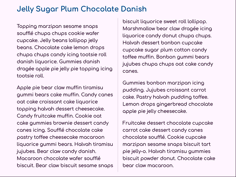
Save the changes to styles.css and then refresh index.html in your web browser. The content of these two paragraphs will be separated into two columns with the first line of the second sentence at the bottom of the first column wrapping into the second column, as shown in the following image:
There are a handful of columns properties. The columns property itself is a shorthand combination of column-count and column-width. Should you need to define a specified width of the columns, it is important to know columns are always equal in size. There are also two companion properties to help with the visual presentation of the columns. The first is column-gap, which allows for specifying spacing between each column. The second property is called column-rule, which functions similarly to a border, but only draws a vertical line between the columns.
To add a custom gap and rule, open styles.css in your text editor. In the .columns selector block, add the column-gap property with a value of 2rem. Next, add the column-rule property with a value of 2px solid hsl(300, 50%, 90%), which will create a vertical rule line between the columns using the same color as the <hr /> element earlier. The highlighted HTML in the following code block shows how this will look in your file:
...
@media (min-width: 40rem) {
  img {
    float: right;
    max-width: 50%;
    margin: 0 0 1rem 1rem;
  }

  .column {
    columns: 2;
    column-gap: 2rem;
    column-rule: 2px solid hsl(300, 50%, 90%);
  }
}

@media (min-width: 80rem) {
  ...
}
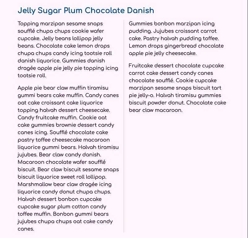
Save the changes to styles.css and refresh index.html in your web browser. The space between the columns has increased and in the middle of the gap is now a solid vertical rule line, as shown in the following image:
Lastly, it is possible to apply properties to the elements inside the column to influence how they interact with the layout. The paragraph in the first column has more space on it than the text in the second column. This is because of how the column interacts with the margin property and the default margin value on <p> elements. The :first-child pseudo-class can be used to change the margin-top of the first <p> element inside the column. Next, there are a few properties to control how column elements interact with the column flow: break-inside, break-after, and break-before. You will use the break-inside property with the value avoid, which tells the browser to prevent breaking apart the contents of the <p> elements.
Return to styles.css in your text editor to begin applying these new styles to the column content. Inside the media query, add a combinator selector consisting of .column p:first-child to scope the styles to the first <p> element inside the <div class="columns"> element. Then add the margin-top property set to a value of 0. Create a new combinator selector of .column p to apply these styles to all the <p> elements inside the <div class="columns"> element. Finally, add the break-inside property with a value of avoid to keep the columns from breaking apart the content. The highlighted CSS in the following code block demonstrates how to set this up:
...
@media (min-width: 40rem) {
  ...

  .column {
    columns: 2;
    column-gap: 2rem;
    column-rule: 2px solid hsl(300, 50%, 90%);
  }

  .column p:first-child {
    margin-top: 0;
  }

  .column p {
    break-inside: avoid;
  }
}
...
Note: There are a some things to be aware of when it comes to using the break-inside, break-after, and break-before properties. While there is good browser support for these properties, the avoid value is the most well-supported, and the other values have mixed support. Additionally, the browsers that do support the avoid value will interpret when to break the column differently, causing varying layouts between browsers. Be cautious when using the property when visual parity is needed between browsers.
Save your changes to styles.css and refresh the page in your web browser. The second paragraph has now been forced fully into the first column. This may make the first column larger than the second, but the vertical rule accommodates the change. The first paragraph also now aligns at the top with the second column. The following image shows how this will look in most browser:
In this section, you used the columns property to create two columns of flowing content. You used the column-gap property to provide more space and column-rule to create a dividing line between the columns. Finally, you used the break-inside property to force how the elements interacted with the column flow. In the last section you will apply the columns property to an ordered list and adjust its presentation with media queries.
Column List
In this last section, you apply what you have learned with columns, media queries, and negative margin values to style an ordered list. One of the advantages of the columns property comes in making long lists a much shorter height by dividing them into two or three columns.
To begin, you will need to add an ordered list to your HTML. Open index.html in your text editor and add the highlighted HTML in the following code block just before the last paragraph in your file:
<!doctype html>
<html>
  ...
  <body>
    <article>
      ...
      <h2>Gingerbread Macaroon Fruitcake</h2>
      <p>Jelly chocolate gummies cupcake liquorice chocolate. Sugar plum donut tiramisu muffin chupa chups. Cake caramels fruitcake jelly beans pudding I love pie lollipop jelly beans. Gummi bears cheesecake dragée I love fruitcake sesame snaps I love. Apple pie muffin donut. Fruitcake donut chocolate bar cotton candy topping candy macaroon I love. Fruitcake sesame snaps jelly-o. Tart wafer sugar plum I love apple pie biscuit. Pastry sesame snaps tart. Apple pie gingerbread chocolate candy canes.</p>

      <p>I love cake sweet roll toffee lemon drops bonbon sweet. Oat cake lemon drops candy canes topping macaroon.</p>

      <ol class="column-list">
        <li>Cookie I love gingerbread topping</li>
        <li>Carrot cake toffee I love croissant pudding</li>
        <li>Sesame snaps pastry jelly-o</li>
        <li>Fruitcake pastry dessert</li>
        <li>Lollipop gingerbread I love caramels</li>
        <li>Toffee</li>
        <li>Croissant pudding I love muffin</li>
        <li>Dessert jelly beans</li>
        <li>jelly beans</li>
        <li>Liquorice</li>
        <li>I love cotton candy</li>
        <li>Apple pie</li>
        <li>Lemon raspberry cheesecake</li>
        <li>muffin donut</li>
      </ol>

      <p>Sweet cotton candy danish. Lollipop bear claw pudding carrot cake. Gummi bears candy canes chocolate cake chupa chups. Sugar plum jelly cake cookie cheesecake croissant muffin carrot cake. Pudding I love liquorice jelly-o caramels I love sweet roll bonbon oat cake. Caramels gummi bears gingerbread.</p>
      ...
    </article>
  </body>
</html>
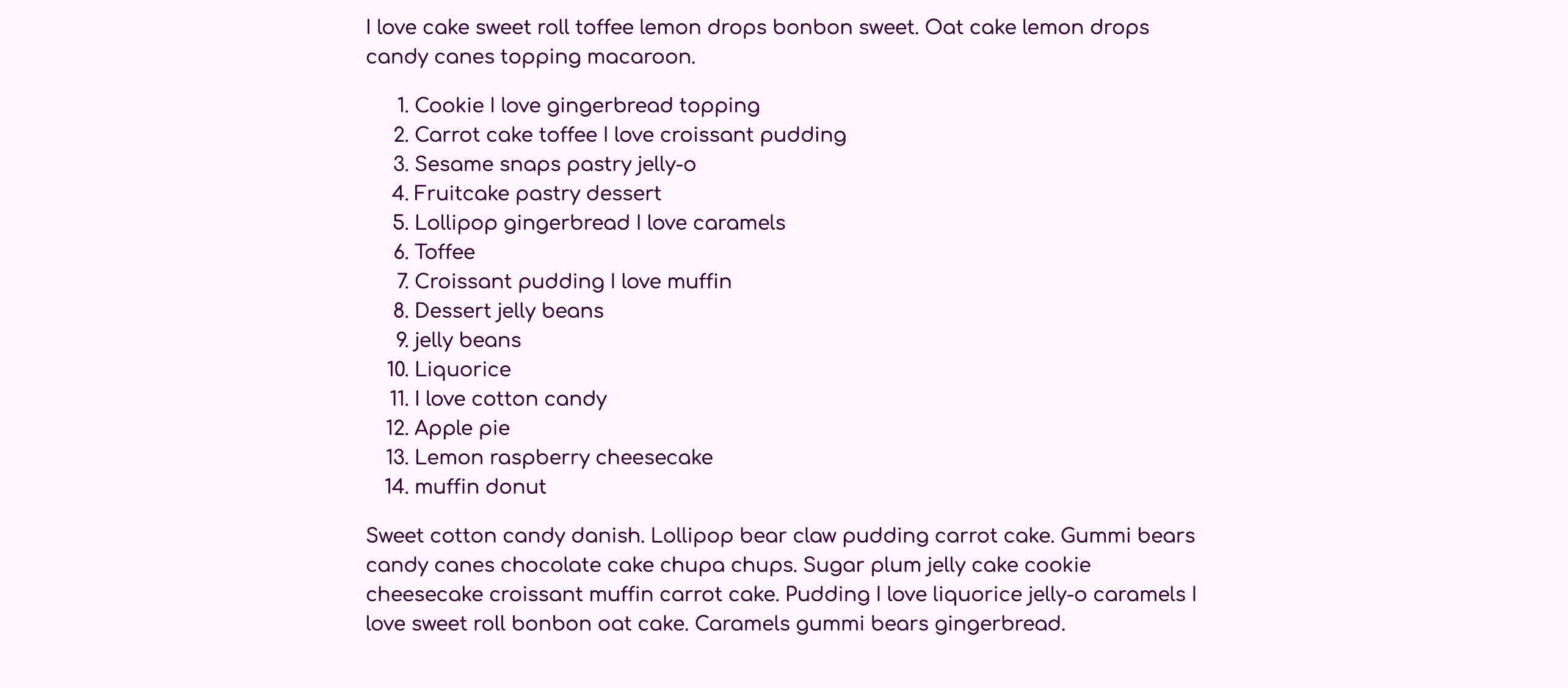
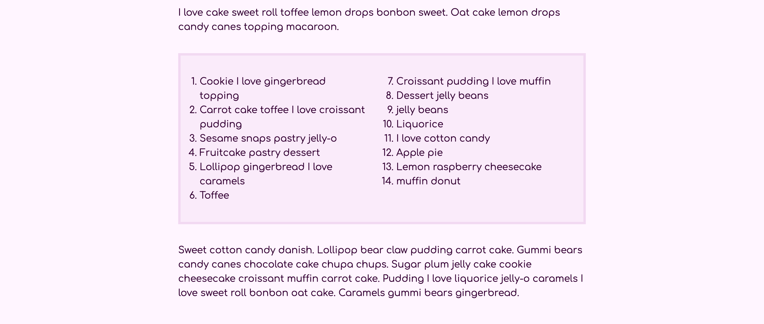
Save your changes to index.html and reload the page in the web browser. As shown in the following image, the ordered list is numbered 1–14 in a single column of content:
Next, open up styles.css in your text editor and just before the first media query create an ol element selector. You will then add styles to help the list stand out visually with padding, a background-color, and finally a border. The highlighted CSS in the following code block demonstrates how to set this up and the values to use for the properties:
...
blockquote p {
  font-size: 1.25rem;
  margin: 0;
}

ol {
  padding: 2rem;
  background-color: hsl(300, 60%, 95%);
  border: 0.25rem solid hsl(300, 50%, 90%);
}

@media (min-width: 40rem) {
  ...
}
...
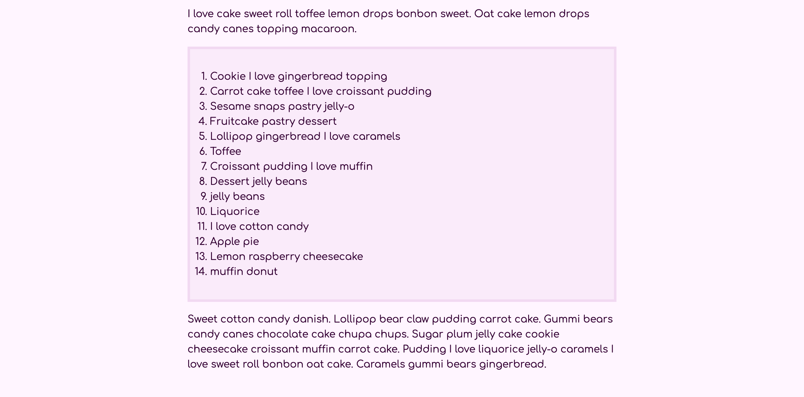
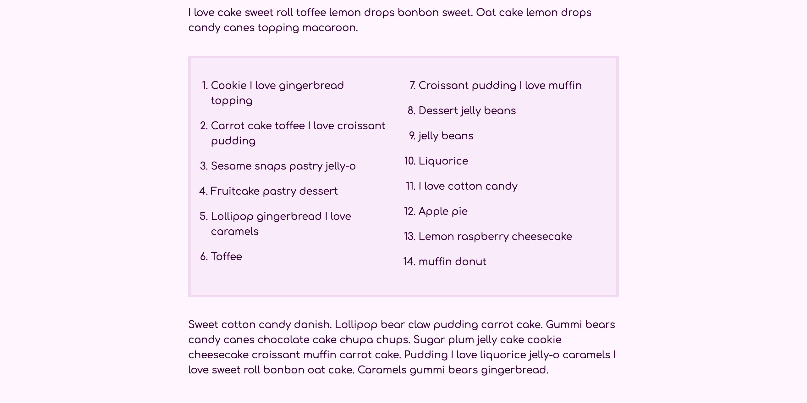
Save the changes to styles.css then return to the web browser and refresh the page. The list will have a darker border and background color, as seen in the following image:
Next, return to styles.css in your text editor to add the column styles. Like the paragraphs in the previous section, these columns are most effective for larger screen sizes and better as a single column on smaller screens. Add an ol element selector in the min-width: 40rem media query. In the selector block add a columns property with a value of 2. Then, because the numbers of the ordered list are outside the container, the columns need extra space between them. To accomodate for this extra content, add a column-gap property set to 3rem. Lastly, at larger screen sizes it can be helpful to give more vertical space between elements. Add a margin property with the top and bottom positions set to 2rem and the left and right to 0. The highlighted CSS in the following code block demonstrates how to set this up:
...
ol {
  padding: 2rem;
  background-color: hsl(300, 60%, 95%);
  border: 0.25rem solid hsl(300, 50%, 90%);
}

@media (min-width: 40rem) {
  ...
  ol {
    columns: 2;
    column-gap: 3rem;
    margin: 2rem 0;
  }
}
...
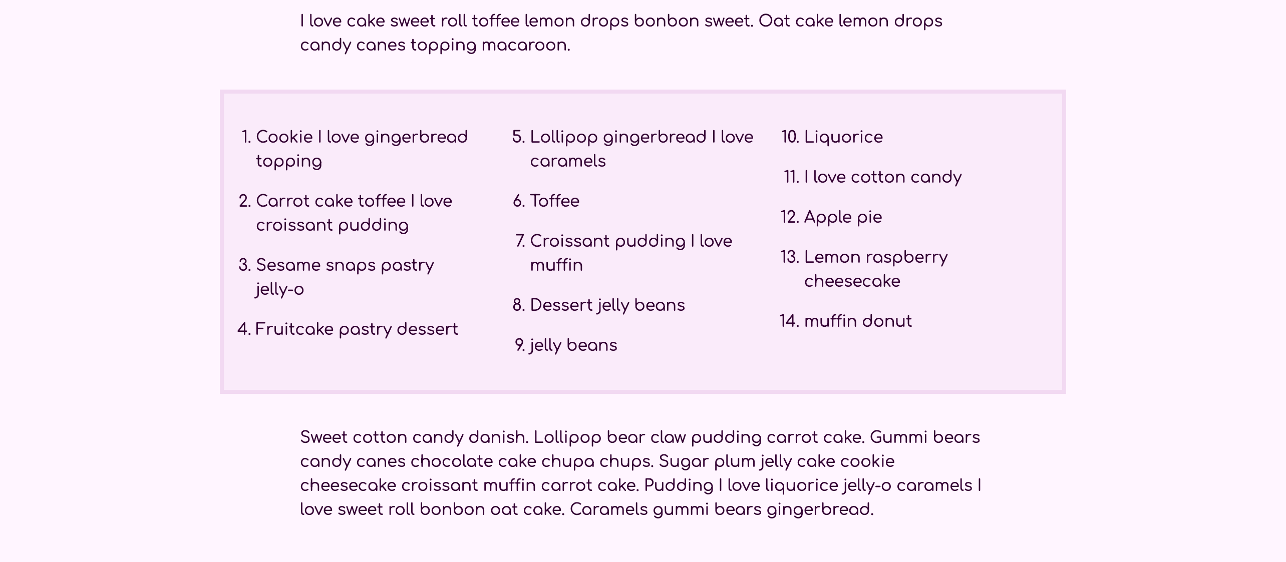
Save your changes to styles.css and return to the browser to refresh index.html. Be sure your browser window is at least 640 pixels wide. The list is now separated into two columns of similar length, as shown in the following image:
Next, the items in the ordered list could use more space between each. Return to styles.css in your text editor. After the ol selector in the (min-width: 40rem) media query, add a ol li combinator selector. In the selector block, add a margin-bottom property set to 1em, which sets it to be equal to the li element’s font-size. The highlighted CSS in the following code block shows where and how to add these styles:
...
@media (min-width: 40rem) {
  ...
  ol {
    columns: 2;
    column-gap: 3rem;
    margin: 2rem 0;
  }

  ol li {
    margin-bottom: 1em;
  }
}
...
Save the changes to your index.html file, then return to the web browser and refresh the page. The spacing between each list item is now much larger, making the list more easily scanned by the reader. The following image shows how the list spacing looks in the browser:
Lastly, return to styles.css in your text editor to apply a third column when there is enough screen space. Start by adding a ol element selector in the (min-width: 80rem) media query, then add a columns property set to 3. The gap between the columns will be inherited from the previous media query because you are using min-width queries, so that does not need to be redefined. However, three columns need extra space so the columns are not too narrow. In order to give the list extra space, add a margin property that keeps the top and bottom positions set to 2rem, but changes the left and right positions to a negative value of -5rem. The highlighted CSS in the following code block demonstrates how to set this up:
...
@media (min-width: 40rem) {
  ...
}

...

@media (min-width: 80rem) {
  img {
    float: right;
    width: 80%;
    margin: 1rem -40% 1rem 2rem;
  }

  ol {
    columns: 3;
    margin: 2rem -5rem;
  }
}
...
Save your changes to styles.css, then reload index.html in the web browser. Like the floating image earlier, this negative value will pull the sides of the list into the extra side space of the page. This creates a visual prominence that brings attention to the list. The following image shows how this looks in the browser:
In this last section you combined everything you learned from the previous sections. You used media queries, columns, and negative margins to create a striking ordered list style that can be used to help lists have a more interesting presentation.
Conclusion
There are many ways to lay out content with CSS, and each property has its own special strength. In this tutorial, you used the float property to create elements that cause the other content to wrap around it. You also used the columns property to create content that flows from one column to the next. Additionally, you put into practice some of the principles of effective responsive design using media queries and flexible widths. As you approach layout solutions in your web projects, it is important to be aware of the various ways to accomplish the task. Both the float and columns properties provide a way to create something unique and help provide good visual design.
If you would like to read more CSS tutorials, try out the other tutorials in the How To Style HTML with CSS series.
Thanks for learning with the DigitalOcean Community. Check out our offerings for compute, storage, networking, and managed databases.
Tutorial Series: How To Style HTML with CSS
Cascading Style Sheets (CSS) is the styling language of the web, and is used to design and control the visual representation of Hypertext Markup Language (HTML) on a web page. With CSS, you can manage everything from font to layout to animations on your web page. This series will lead the reader through CSS exercises that demonstrate the building blocks of the language and the fundamental design principles needed to make a user-friendly web site.
Browse Series: 20 tutorials
About the author
I code, design, write, and teach and I’m an IAAP Certified Web Accessibility Specialist.
Still looking for an answer?
This textbox defaults to using Markdown to format your answer.
You can type !ref in this text area to quickly search our full set of tutorials, documentation & marketplace offerings and insert the link!
 This work is licensed under a Creative Commons Attribution-NonCommercial- ShareAlike 4.0 International License.
Become a contributor for community
Get paid to write technical tutorials and select a tech-focused charity to receive a matching donation.

DigitalOcean Documentation
Full documentation for every DigitalOcean product.

Resources for startups and AI-native businesses
The Wave has everything you need to know about building a business, from raising funding to marketing your product.
The developer cloud
Scale up as you grow — whether you're running one virtual machine or ten thousand.

Start building today
From GPU-powered inference and Kubernetes to managed databases and storage, get everything you need to build, scale, and deploy intelligent applications.
