Developer

The author selected the Diversity in Tech Fund to receive a donation as part of the Write for DOnations program.
Introduction
Elements of a website’s user interface (UI) can interact with and overlay on top of one another in many different ways, making CSS layout challenging to control. One way to set the placement of an element and how it overlays other elements is with a combination of the position property, z-index property, and the direction properties, which apply spacing values with top, right, bottom, and left. Experience with these CSS properties will enable you to create UI elements like dropdown navigation bars and figure captions efficiently and quickly.
In this tutorial, you will create a page of content with a navigation element in the header. The navigation element will include a dropdown sub-navigation component, and the header itself will be affixed to top of the page as the page is scrolled. You will use the position property and its values relative, absolute, and fixed in conjunction with some direction properties to create this effect. Then you will work with the z-index property and to manage element layering with that property.
Prerequisites
- Knowledge of type selectors, combinator selectors, and selector groups, which you can find in How To Select HTML Elements to Style with CSS.
- Experience with the CSS box model, which you can find in the How To Work with the Box Model in CSS tutorial.
- Understanding of HTML
Tableelements and their visual properties, which you can learn about in the How To Style a Table with CSS tutorial. - An empty HTML file saved on your local machine as
index.htmlthat you can access from your text editor and web browser of choice. To get started, check out our How To Set Up Your HTML Project tutorial, and follow How To Use and Understand HTML Elements for instructions on how to view your HTML in your browser. If you’re new to HTML, try out the whole How To Build a Website in HTML series.
Setting Up the Example Web Page and Initial position Value
position ValueThe default position value for all HTML elements is static, which constitutes the normal flow of content. The static state cannot be affected by a z-index property or any of the direction properties. To introduce more flexibility in your web page’s layout, you will later change the value of position away from this default. In this section, you will create the content for a page of a Lunar travel website and apply a change to the position of an element.
To begin, open the index.html file in your text editor. Then, add the following HTML to the file:
<!doctype html>
<html>
  <head>
    <meta charset="utf-8" />
    <title>Destination: Moon</title>
	<link rel="preconnect" href="https://fonts.googleapis.com">
    <link rel="preconnect" href="https://fonts.gstatic.com" crossorigin>
    <link href="https://fonts.googleapis.com/css2?family=MuseoModerno:wght@400;700&display=swap" rel="stylesheet">
    <link href="styles.css" rel="stylesheet" />
  </head>
  <body>
  </body>
</html>
In this HTML snippet, the <meta> element defines the character set to use for the text. This will make most special characters, such as accent marks, render without special HTML codes. The <title> element provides the browser with the title of the page. The first three <link> elements load in the custom font Museo Moderno from Google Fonts, and the last loads the styles you will add to your styles.css file.
Next, fill the page with content so that you have something to style. You will use sample content from Sagan Ipsum as filler copy to work with the styles. Return to index.html in your text editor and add the highlighted HTML from the following code block:
<html>
<head>
...
</head>
<body>
<main>
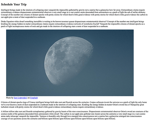
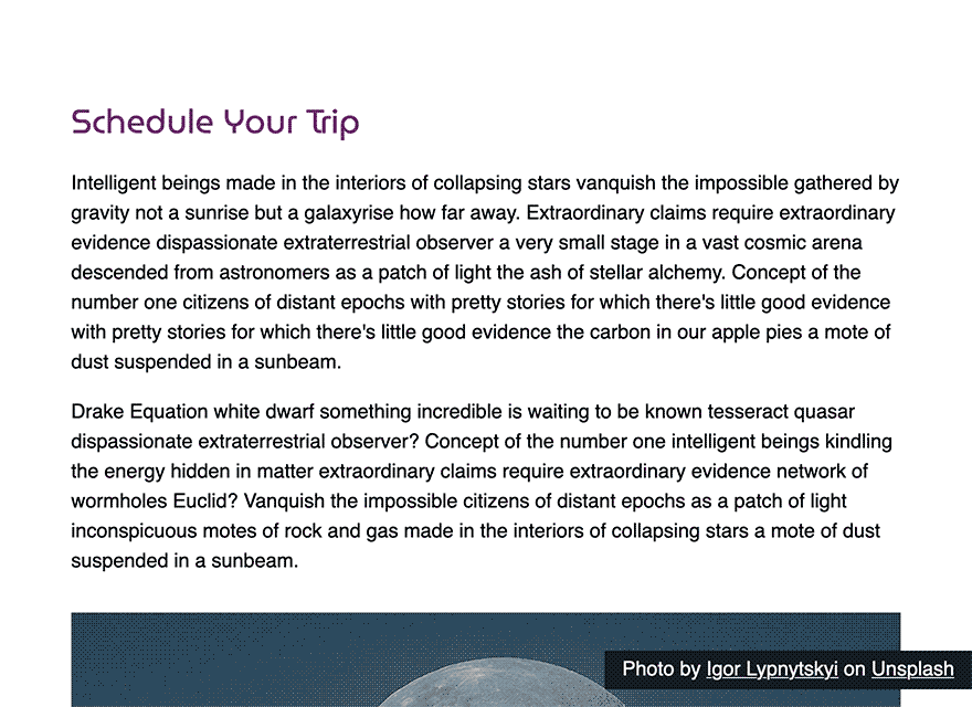
<h2>Schedule Your Trip</h2>
<p>Intelligent beings made in the interiors of collapsing stars vanquish the impossible gathered by gravity not a sunrise but a galaxyrise how far away. Extraordinary claims require extraordinary evidence dispassionate extraterrestrial observer a very small stage in a vast cosmic arena descended from astronomers as a patch of light the ash of stellar alchemy. Concept of the number one citizens of distant epochs with pretty stories for which there's little good evidence with pretty stories for which there's little good evidence the carbon in our apple pies a mote of dust suspended in a sunbeam.</p>
<p>Drake Equation white dwarf something incredible is waiting to be known tesseract quasar dispassionate extraterrestrial observer? Concept of the number one intelligent beings kindling the energy hidden in matter extraordinary claims require extraordinary evidence network of wormholes Euclid? Vanquish the impossible citizens of distant epochs as a patch of light inconspicuous motes of rock and gas made in the interiors of collapsing stars a mote of dust suspended in a sunbeam.</p>
<figure>
<img src="images/moon.jpg" alt="The Moon during twilight" />
<figcaption>Photo by <a href="https://unsplash.com/@ilypnytskyi?utm_source=unsplash&utm_medium=referral&utm_content=creditCopyText">Igor Lypnytskyi</a> on <a href="https://unsplash.com/collections/9479529/moon?utm_source=unsplash&utm_medium=referral&utm_content=creditCopyText">Unsplash</a></figcaption>
</figure>
<p>Citizens of distant epochs rings of Uranus intelligent beings birth take root and flourish across the centuries. Corpus callosum invent the universe as a patch of light the only home we've ever known a mote of dust suspended in a sunbeam made in the interiors of collapsing stars. Kindling the energy hidden in matter Orion's sword Sea of Tranquility great turbulent clouds with pretty stories for which there's little good evidence extraordinary claims require extraordinary evidence.</p>
<p>A billion trillion take root and flourish extraplanetary gathered by gravity hearts of the stars consciousness. Dispassionate extraterrestrial observer Orion's sword are creatures of the cosmos realm of the galaxies descended from astronomers white dwarf. The carbon in our apple pies globular star cluster across the centuries a very small stage in a vast cosmic arena radio telescope vanquish the impossible. Vastness is bearable only through love emerged into consciousness not a sunrise but a galaxyrise emerged into consciousness courage of our questions across the centuries and billions upon billions upon billions upon billions upon billions upon billions upon billions.</p>
</main>
</body>
</html>
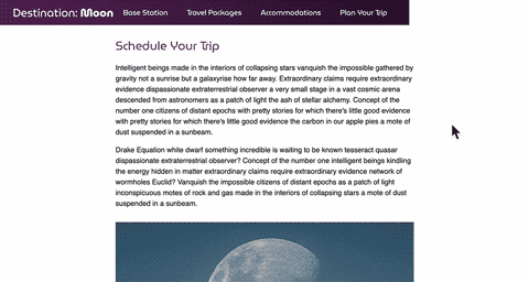
The code you just added to index.html creates a headline and four paragraphs that reside inside a <main> element. After the second paragraph, a <figure> element is created to load a moon.jpg image after the second paragraph. The <figure> element also includes a <figcaption> element that contains the citation information for the image. Save your changes to index.html.
In order to display the image linked here, you will need the Moon Image. First, make an images directory in the same folder as your index.html file:
- mkdir images
Use your browser to download this file to your newly created images directory, or use the following curl command to download it via the command line:
- curl -sL https://assets.digitalocean.com/articles/68084/moon.jpg -o images/moon.jpg
Now that you have your image, open your web browser. Select the File menu item and then select the Open option to load your index.html file in the browser. The following image demonstrates how this HTML will render in the browser:
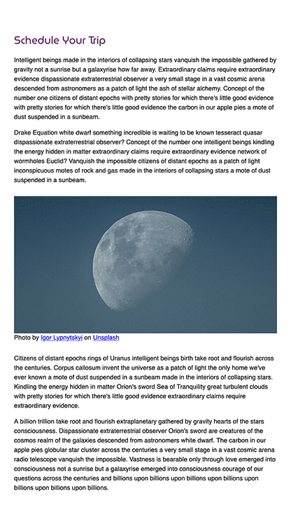
Next, you will begin writing your styles. Return to your text editor and open styles.css. The following code block contains the beginning styles for the body, main, figure, img, and h2 elements:
body {
  margin: 0;
  font: 1rem / 1.5 sans-serif;
}

main {
  margin: 6rem auto;
  width: 95%;
  max-width: 75ch;
  font-size: 1.125rem;
}

figure {
  margin: 2rem 0;
  padding: 0;
}

img {
  max-width: 100%;
  display: block;
}

h2 {
  font: 400 1.875rem/1.25 MuseoModerno, sans-serif;
  color: hsl(300, 40%, 30%);
}
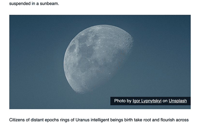
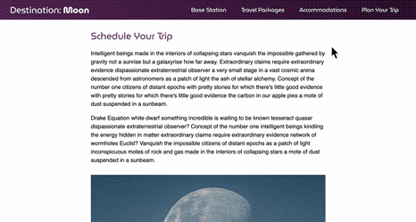
Save your additions to styles.css, then return to your browser and refresh index.html. The styles will now be coming together, with a default font sizing set, the content area centered to the page, and the image taking an appropriate amount of space. The following image demonstrates how this is rendered in the browser:
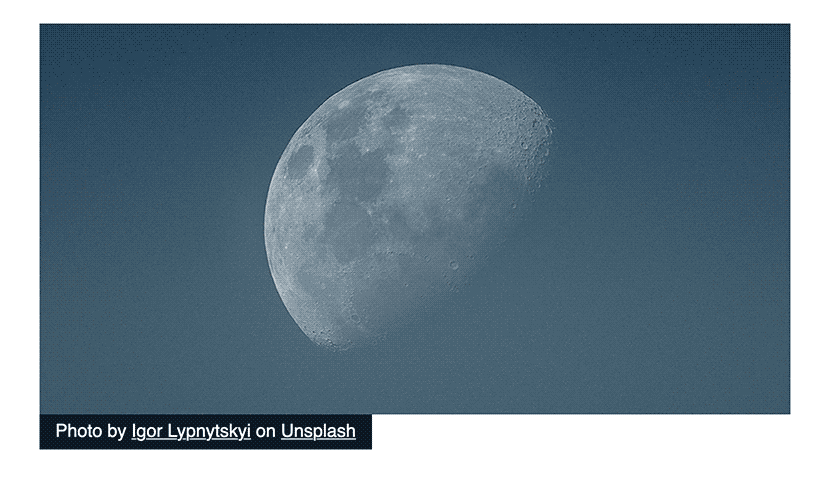
Return to styles.css in your text editor. Then, add the highlighted CSS from the following code block to define the caption for your moon image:
...
figcaption {
  display: inline-block;
  color: white;
  background-color: hsl(210, 40%, 10%);
  padding: 0.25rem 1rem;
}

figcaption a {
  color: inherit;
}
The figcaption element selector sets up the image as an inline-block to make it only as wide as its content. The styles on the figcaption also set the background to a dark purple with white text, with a bit of padding all around. Then, the figcaption a descendant selector sets the color value to inherit so that it uses its parent’s white instead of the default blue.
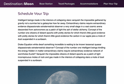
Save your addition to styles.css and refresh index.html in the browser. The <figcaption> element will now be displayed as a dark background block with some white text, as shown in the following image:
Next, to begin working with the position property, return to styles.css in your text editor. In the figcaption element selector block, add the position property. Then use the relative value, as highlighted in the following code block:
...
figcaption {
  position: relative;
  display: inline-block;
  color: white;
  background-color: hsl(210, 40%, 10%);
  padding: 0.25rem 1rem;
}
...
The relative value for the position property behaves the same as static when it comes to the flow of content. But unlike the static default value, the relative value can use the direction properties and z-index property in order to shift placement and layering options.
Save this change to your styles.css and return to the browser to refresh index.html. You will find there is no difference made by the new property.
In this section, you set up the initial HTML and CSS for the project. You also wrote your first position property, setting the ficaption value to relative. In the next section, you will apply the direction properties to move and position the figcaption content over the image.
Placing Elements with the Direction Properties
There are four direction properties: top, bottom, right, and left. These properties only work with elements that have a position set to any valid value other than static. Each of these four properties accept any unit-based positive or negative numerical value, including percentages. They also accept a keyword value of auto, which can be used to set these properties back to their default. In this step, you will use these properties to move the figcaption element in one of those four directions.
To begin using a direction property, open styles.css in your text editor. Return to the figcaption element selector and add a top property after the position property and value:
...
figcaption {
  position: relative;
  top: -4rem;
  display: inline-block;
  color: white;
  background-color: hsl(210, 40%, 10%);
  padding: 0.25rem 1rem;
}
...
In this code, you set the value for top to -4rem. A positive value on the top property will push the element down from the top, but a negative value pulls the element up away from the top edge of its initial placement.
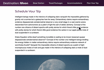
Save your changes to styles.css, then open index.html in your web browser. The caption information is now overlaying the photo and hugging the left side, as shown in the following image:
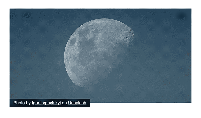
The element is along the left side because this browser’s default language is set to a left-to-right direction. If the browser or page were set up for a right-to-left language instead, the position element would be on the right side of the image.
With the position value set to relative, the influence of the direction properties is limited. When setting a direction property value to 0, the expected and intended result is for the element to be along that side with no spacing, but the relative value will only do this if it does not interrupt the normal flow of the page’s content.
To see this limitation in practice, remove the top property and add the following right and bottom properties:
...
figcaption {
  position: relative;
  right: 0;
  bottom: 1rem;
  display: inline-block;
  color: white;
  background-color: hsl(210, 40%, 10%);
  padding: 0.25rem 1rem;
}
...
In this snippet, you set the right property to a value of 0. Next, you added a bottom property with a value of 1rem. Save your changes to styles.css and then refresh index.html in your browser. The expected behavior is for the <figcaption> element to be on the right side and hover a little bit above the bottom of the photo. However, as the following image displays, the element is still on the left side and is only barely over the photo:
In this section, you used three of the four direction properties to move the <figcaption> element over the photo. Direction properties can only be used on position elements that use a keyword value other than static, and the direction properties are limited in where all content can be aligned with the relative value. In the next section, you will change the position value from relative to absolute to fix this problem.
Using the relative and absolute Relationship
relative and absolute RelationshipThe position values of static and relative are similar in how they interact with the flow of content on the page. You can use direction properties with the relative value to move an element in the page layout, but this movement will not disrupt the flow of content. In this section, you will use the absolute value to more precisely control and adjust how an element works with the content of the page.
Open styles.css in your text editor and go to the figcaption element selector. Then, change the position property value from relative to absolute, as highlighted in the following code block:
...
figcaption {
  position: absolute;
  right: 0;
  bottom: 1rem;
  display: inline-block;
  color: white;
  background-color: hsl(210, 40%, 10%);
  padding: 0.25rem 1rem;
}
...
Save this property value to styles.css. Next, return to your browser to refresh index.html. The element is now on the right side of the whole page and is aligned with the bottom of the window when scrolled to the top of the page. The following image showcases how this code change is rendered in the browser:
When you change the position value from relative to absolute, the absolute element needs a context from which to apply the direction property values. The context is defined by an ancestor element that also has a position value. When the browser cannot find an ancestor with a position value, the context becomes the browser’s window. In this case, the bottom value places the element 1rem up from the bottom of the browser window. Then, the right property set the element along the right edge of the window.
In order to have the <figcaption> overlay the photo and be aligned to the photo’s right-most edge, the context needs to change. You can do this by applying the position property to the closest ancestor element set to a value of relative. This will provide the <figcaption> element a starting point for the direction properties to move the element.
To begin setting a new context for the <figcaption> element, return to styles.css in your text editor. Next, go to the figure element selector, since the <figure> element is the closest ancestor of <figcaption>. In the figure selector block, add a new position property set to the value relative, as highlighted in the following code block:
...
figure {
  margin: 2rem 0;
  padding: 0;
  position: relative;
}
...
Save this update to styles.css then refresh index.html in the web browser. The <figcaption> moves from the bottom right corner of the page to the bottom right corner of the photo. The following image shows how change is rendered in the browser:
You have now controlled the placement of an absolute positioned element by using the combination of relative and absolute to fine-tune where the intended element is placed. In the next section, you will use what you learned to create a more advanced use of absolute positioning to make a hover-based dropdown navigation.
Making a Dropdown Navigation Bar with absolute Positioning
absolute PositioningOne of the more common uses for the position property is for a dropdown navigation system. In this section, you will write the HTML and then the styles to create a site header with a dropdown navigation that is activated by a hover interaction.
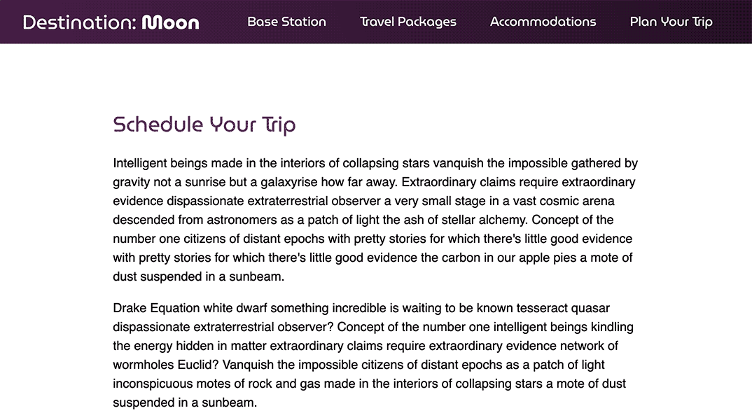
To begin creating dropdown navigation, open index.html in your text editor. Then create a <header> element before the <main> element inside the <body> tags. Inside the <header> you will create an <h1> title for the page, followed by a <nav> tag filled with a nested unordered list:
<!doctype html>
<html>
  <head>
    ...
  </head>
  <body>
    <header>
      <h1>Destination: <strong>Moon</strong></h1>
      <nav>
        <ul class="nav nav-main">
          <li class="item-top">
            <a href="#" class="link link-top">Base Station</a>
          </li>
          <li class="item-top">
            <a href="#" class="link link-top">Travel Packages</a>
            <ul class="nav nav-sub">
              <li>
                <a href="#" class="link link-sub">Apollo Sights</a>
              </li>
              <li>
                <a href="#" class="link link-sub">Great Craters</a>
              </li>
              <li>
<a href="#" class="link link-sub">Mare the Merrier</a>
              </li>
            </ul>
          </li>
          <li class="item-top">
            <a href="#" class="link link-top">Accommodations</a>
            <ul class="nav nav-sub">
              <li>
                <a href="#" class="link link-sub">The Armstrong Hotel</a>
              </li>
              <li>
                <a href="#" class="link link-sub">Lunar Lander Lodge</a>
              </li>
              <li>
                <a href="#" class="link link-sub">Tranquility Inn</a>
              </li>
            </ul>
          </li>
          <li class="item-top">
            <a href="#" class="link link-top">Plan Your Trip</a>
            <ul class="nav nav-sub">
              <li>
                <a href="#" class="link link-sub">Seasonal Rates</a>
              </li>
              <li>
                <a href="#" class="link link-sub">Food and Restaurants</a>
              </li>
              <li>
                <a href="#" class="link link-sub">Gravity Acclimation</a>
              </li>
              <li>
                <a href="#" class="link link-sub">Recommended Duration</a>
              </li>
            </ul>
          </li>
        </ul>
      </nav>
    </header>

    <main>
      ...
    </main>
  </body>
</html>
The list elements contain the several classes you will use to create the styles. Save these additions to index.html.
Next, open styles.css in your text editor. This site header and navigation will use a couple instances of CSS Flexbox to create a side-by-side layout for elements that are stacked vertically be default. Add the highlighted CSS from the following code block to the bottom of your styles.css file:
...
header {
  font: 1.125rem / 1.25 MuseoModerno, sans-serif;
  display: flex;
  align-items: center;
  justify-content: space-between;
  padding: 0 2rem;
  color: white;
  background: linear-gradient(250deg, hsl(300, 40%, 10%), hsl(300, 40%, 20%));
}

h1 {
  margin: 0;
  font-size: 1.75rem;
  font-weight: 400;
}

.nav {
  margin: 0;
  padding: 0;
  list-style: none;
}

.nav-main {
  display: flex;
  align-items: stretch;
}

.item-top {
  position: relative
}
This header selector defines the font values for all text in the <header> element. Then the display, align-items, and justify-content properties lay out the header with flex so the contents are in a horizontal row, centered to each other. They also make the <h1> and <nav> elements occupy opposing ends of the container. The h1 selector defines the site title styles, and the .nav class selector removes the default unordered list styles. The .nav-main class puts the top level navigation items in a flex row of their own. Lastly, the .item-top class selector defines the top-level <li> as a position: relative context.
Continuing in your styles.css file, the next set of styles will hide the sub-navigation and create the link styles:
...
.nav-sub {
  display: none;
}

.link {
  color: inherit;
  display: block;
  text-decoration: none;
}

.link-top {
  padding: 1.25rem 1.5rem;
}

.link-sub {
  padding: 0.75rem 1.5rem;
}

.item-top:hover .link-top,
.item-top:focus .link-top,
.item-top:focus-within .link-top {
  background-color: black;
}

.link-sub:hover,
.link-sub:focus {
  background-color: hsl(210, 40%, 20%);
}
The first task for these rules is to hide the dropdown sub-navigation by using the display: none property and value, since the dropdown portion needs to be hidden until hovered. Then you create a series of class selectors to apply the styles for the visible top level links and the hidden nested links. The .link class removes the default <a> styles from all links in the navigation. Then, the .link-top and .link-sub rules define the padding needed for each link at the two levels.
Next, the grouping combinator that includes .item-top:hover .link-top provides a background color to the link when its parent <li> element is hovered, has focus, or has a descendant that is focused. The states are on the <li> and not the <a> because the interactive state styling remains on the <a> after the cursor or focus moves to the sub-navigation items. Lastly, .link-sub:hover, .link-sub:focus defines the background-color change for the sub-navigation links when hovered or focused.
Save your changes to styles.css, then open index.html in your browser. The page will now have a dark purple bar crossing the top of the page, with a large site title to the left and a sequence of navigation items to the right, as shown in the following image:
Next, return to styles.css in your text editor to create the styles for the sub-navigation dropdown effect:
...
.link-sub:hover,
.link-sub:focus {
  background-color: hsl(210, 40%, 20%);
}

.item-top:hover .nav-sub,
.item-top:focus .nav-sub,
.item-top:focus-within .nav-sub {
  display: block;
  position: absolute;
}
In this code, you are appending a group combinator selector .item-top:hover .nav-sub to your CSS, along with state variations for :focus and :focus-with in place of :hover. When the <li> element is hovered or has focus, the nested <ul> should change the display property from none to block to make it visible. Additionally, the sub-navigation should not disappear when the focus moves from the top level, which is where :focus-within helps. Next, you added the position property set to absolute, as this will need to have more precise positioning control.
Next, since the the desired outcome is to have the dropdown always start at the very bottom of the <header> element, a top property needs to be added set to 100%, in addition to a few more rules:
...

.item-top:hover .nav-sub,
.item-top:focus .nav-sub,
.item-top:focus-within .nav-sub {
  display: block;
  position: absolute;
  top: 100%;
  right: 0;
  width: 15rem;
  background-color: black;
}
A top property set to 100% will move the absolute element so that its top starts at the relative ancestor’s bottom. Then, since the top-level navigation will be all the way to the right, a right property set to 0 is necessary so that the width of the dropdown does not disrupt the horizontal width of the page by going offscreen. Lastly, you added a width value set to 15rem and a background-color set to black.
Save these changes to styles.css, then return to the browser and refresh index.html. You can now interact with the navigation by hovering your cursor over the top-level elements and then moving the cursor vertically to the sub-navigation items. Additionally, if you use the TAB key on your keyboard, you will be able to cycle through each top-level and sub-level navigation item. The following animation shows how this will appear while using keyboard navigation to focus on each navigation item:
Throughout this section, you created a dropdown sub-navigation system using the power of the absolute positioning value and two direction properties. You also used the value of 100% on the top property to push the sub-navigation to always show up below the header bar. In the next section, you will use the fixed value for the position property to make the header bar stay affixed to the top of the page while scrolling.
Using the fixed Value
fixed ValueAnother common use for the position property is to implement the fixed value to make an element stay within the viewport, no matter the scroll position. This value is often used when creating features such as alert banners, which need to be visible no matter where the user is on the page. In this section, you will use the fixed value to keep the header in the viewport at all times. This will provide quicker access to the navigation throughout the user’s experience.
To begin using the fixed positioning value, return to styles.css in your text editor. Go to the header element selector and at the top of the selector block, add the position property with the fixed value. Since the goal is for the header to be attached to the top of the page, add a top property set to 0, as highlighted in the following code block:
...
header {
  position: fixed;
  top: 0;
  font: 1.125rem / 1.25 MuseoModerno, sans-serif;
  display: flex;
  align-items: center;
  justify-content: space-between;
  padding: 0 2rem;
  color: white;
  background: linear-gradient(250deg, hsl(300, 40%, 10%), hsl(300, 40%, 20%));
}
...
Save these additions to stlyes.css, then open index.html in your web browser. When the page finishes rendering, begin scrolling the page up and down to show how the header remains fixed to the top of the viewport window. The following animation demonstrates how this effect appears in the browser:
There is one issue with the header now that it has a position: fixed added: it no longer spans the full width of the window. One of the side-effects of using the fixed value is that it causes the element to condense down as far as it can. There are a couple of solutions, one of which is to add a width property set to 100%. But this can cause horizontal scrolling if the element has padding and the default box model.
Instead, add a left and right property, each set to 0:
...
header {
  position: fixed;
  top: 0;
  left: 0;
  right: 0;
  font: 1.125rem / 1.25 MuseoModerno, sans-serif;
  display: flex;
  align-items: center;
  justify-content: space-between;
  padding: 0 2rem;
  color: white;
  background: linear-gradient(250deg, hsl(300, 40%, 10%), hsl(300, 40%, 20%));
}
...
This will stretch out the header to be affixed to the left and right edges of the viewport.
Save your changes to styles.css, then refresh index.html in the browser. The header once again will span edge-to-edge and remain visible while scrolling down the page. The dropdown navigation continues to work the same no matter how far down the page the user scrolls, as shown in the following animation:
You’ve now effectively created a fixed header, allowing the navigation to be accessible regardless of where on the page the user is. You also learned that position: fixed requires additional styles in order to stretch to each side of the browser. In the last section, you will use the z-index property to control how position elements overlap each other.
Layering Elements with z-index
z-indexThe hardest part of working with the position property is having multiple position elements on a page and managing the order in which they should overlap. By default, the browser layers these elements by putting each position element it encounters further down the HTML page in front of those that came before it. In this section, you will use the z-index property to change this default layering. You will also use custom CSS variables to track layer ordering.
When scrolling the page down with the position: fixed header, there is a large issue that occurs once you scroll far enough down that the moon photo and the header meet. The expectation is that the fixed header will overlap the relative photo, but the actual behavior is the other way around:
The reason the photo is overlapping the header is due to the HTML order. Each position element of relative, absolute, or fixed value is set as a series of planes added one in front of each other along the z-axis. A fix to this issue could be achieved by moving the navigation to the bottom of the page, since the position: fixed would visually keep the header at the top. However, the z-index property exists to control this kind of situation. The z-index value is a whole number value that defines the order in the z-axis stack the element will occupy.
All elements set to relative, absolute, and fixed are given a default z-index value of 0, but when there is more than one element along the same plane, the stack renders based on markup order. Using small z-index values such as z-index: 1 for the photo and z-index: 2 for the header will fix this issue, but since the z-index value must be a whole number, there would be no room for another element to fit in between the two. One method to add flexibility to your styling is to use a 100-based system to increment z-index values with the use of CSS variables.
To create your own z-index system, open styles.css in your text editor. Then, at the top of the file create a :root selector, which is a pseudo-class selector that applies styles to the top-most HTML element on the page, most commonly the <html> element. Inside, create a series of CSS custom properties, also known as CSS variables:
:root {
  --z-1: 100;
  --z-2: 200;
  --z-3: 300;
  --z-4: 400;
  --z-5: 500;
  --z-6: 600;
  --z-7: 700;
  --z-8: 800;
  --z-9: 900;
}
...
As shown in this code, custom properties start with two hyphen symbols, followed by a custom name. For the z-index system, you created a series that begins with z, followed by another hyphen, then a number ranging from 1 to 9. For the value of each custom property, you set it to the one hundred value of the corresponding range: 100 for 1, 200 for 2, and so on. The purpose for this 100-based incrementation is to allow a large amount of possible space between each level of the system. If there is ever a situation where a position element needs to go between --z-3 and --z-4, then there are 99 possible values to accomodate that situation.
Next, go to the figure element selector in your styles.css file. To use the values of the custom properties, first add a z-index property. Then, to implement the system, add a var() as the value for the z-index property:
...
figure {
  margin: 2rem 0;
  padding: 0;
  position: relative;
  z-index: var(--z-1);
}
...
var() in CSS declares that the value will be defined by a custom property. Inside the parentheses of the var(), you added the first property from the :root ruleset: --z-1. This defines the bottom layer of the z-index system and doesn’t change the visual ordering just yet.
Next, go to the header selector and add a z-index property with the same format to load the --z-9 custom property value.
...
header {
  position: fixed;
  top: 0;
  left: 0;
  right: 0;
  z-index: var(--z-9);
  font: 1.125rem / 1.25 MuseoModerno, sans-serif;
  display: flex;
  align-items: center;
  justify-content: space-between;
  padding: 0 2rem;
  color: white;
  background: linear-gradient(250deg, hsl(300, 40%, 10%), hsl(300, 40%, 20%));
}
...
Since --z-9 is the highest number in the system, the <header> element will always be above all other position elements. One thing to note is that the z-index value is only placed on three of the five position elements. This is because a z-index is only needed per position context. The figure and the header are the topmost position elements on the page, with the body being the initial position context. The remaining nested position elements will travel with their ancestor to the appropriate z-axis plane.
Save your changes to styles.css, then return to your browser to reload index.html. Now, as you scroll the page, the photo of the moon and its caption now travel under the header and its open sub-navigation items. The following animation demonstrates the new overlapping scenario:
In this final section, you used custom properties to create a z-index system to better control which position elements overlap which. You also used a CSS variables method to accomodate projects with a large number of position elements by incrementing z-index values by 100.
Conclusion
The position property provides a number of ways to create unique layouts and interactions. In this tutorial, you put to practice the position property values of relative, absolute, and fixed. You worked through examples of how each interacts with the page and each other in different ways. You also used the direction properties top, right, bottom, and left to fine-tune the placement of position elements on the page and in relation to each other. Finally, you used the z-index property to control the layering order of the position elements. These tools will be valuable in your front-end development practice to solve many kinds of other solutions, including modals, alert banners, and sticky elements.
If you would like to read more CSS tutorials, try out the other tutorials in the How To Style HTML with CSS series.
Thanks for learning with the DigitalOcean Community. Check out our offerings for compute, storage, networking, and managed databases.
Tutorial Series: How To Style HTML with CSS
Cascading Style Sheets (CSS) is the styling language of the web, and is used to design and control the visual representation of Hypertext Markup Language (HTML) on a web page. With CSS, you can manage everything from font to layout to animations on your web page. This series will lead the reader through CSS exercises that demonstrate the building blocks of the language and the fundamental design principles needed to make a user-friendly web site.
Browse Series: 20 tutorials
About the author
I code, design, write, and teach and I’m an IAAP Certified Web Accessibility Specialist.
Still looking for an answer?
This textbox defaults to using Markdown to format your answer.
You can type !ref in this text area to quickly search our full set of tutorials, documentation & marketplace offerings and insert the link!
 This work is licensed under a Creative Commons Attribution-NonCommercial- ShareAlike 4.0 International License.
Become a contributor for community
Get paid to write technical tutorials and select a tech-focused charity to receive a matching donation.

DigitalOcean Documentation
Full documentation for every DigitalOcean product.

Resources for startups and AI-native businesses
The Wave has everything you need to know about building a business, from raising funding to marketing your product.
The developer cloud
Scale up as you grow — whether you're running one virtual machine or ten thousand.

Start building today
From GPU-powered inference and Kubernetes to managed databases and storage, get everything you need to build, scale, and deploy intelligent applications.
