Developer

The author selected the Diversity in Tech Fund to receive a donation as part of the Write for DOnations program.
Introduction
There are a lot of size units to choose from when styling HTML with CSS. These units help determine how big or small text appears, how wide a container is, or how much space is between columns. Each of the various units has functional strengths that are valuable to a developer and the design of a website. Knowing which unit will work best for a situation will help you write websites that are flexible and accessible.
In this tutorial you will learn about the pixel (px), percent (%), em, and rem units. You will use these units in conjunction with several properties, including font-size, padding, border, margin, width, and max-width to learn the differences and strengths of each unit.
Prerequisites
- An HTML file saved on your local machine as
index.htmlthat you can access from your text editor and web browser of choice. To get started, check out our How To Set Up Your HTML Project tutorial, and follow How To Use and Understand HTML Elements for instructions on how to view your HTML in your browser. If you’re new to HTML, try out the How To Build a Website in HTML series. - Knowledge of the CSS box model, which you can find in the How To Work with the Box Model in CSS tutorial.
- Experience using selectors to find and apply styles to HTML elements with CSS. For more information on this, check out How To Select HTML Elements to Style with CSS tutorial.
- Knowledge of CSS font properties, which you can get by reading the How To Style Text Elements with Font, Size, and Color in CSS tutorial.
Setting Up the HTML and CSS
In the first section, you will set up the HTML as the basis for all styling throughout the tutorial. Additionally, you will create the CSS file you will use to write your styles for the tutorial.
To start, open up index.html in your text editor and add the following HTML to the file:
<!doctype html>
<html>
	<head>
	</head>
	<body>
	</body>
</html>
Next in the <head> tag, you will add in a meta tag to declare the character set used in this HTML, the title of the page, a meta tag defining how the page should be handled on mobile devices, and the CSS files to load, which include a font from Google Fonts, and the styles.css file you will create in the next section.
The additions to the <head> tag are highlighted in the following code block. You will find this designation throughout the tutorial as code is added and changed:
<!doctype html>
<html>
	<head>
		<meta charset="UTF-8" />
		<title>CSS Units</title>
		<meta name="viewport" content="width=device-width, initial-scale=1" />
		<link rel="preconnect" href="https://fonts.gstatic.com" />
		<link href="https://fonts.googleapis.com/css2?family=Averia+Serif+Libre:ital,wght@0,400;0,700;1,400;1,700&display=swap" rel="stylesheet" />
		<link href="styles.css" rel="stylesheet" />
	</head>
	<body>
	</body>
</html>
Now that the <head> information is in place, the next step is to add in the content you will style in the <body> tag. This content is an excerpt from Lewis Carroll’s Alice’s Adventures in Wonderland, where Alice is speaking with the Caterpillar about size. The content is contained within a <figure> element with a heading and a <blockquote> containing the excerpt. A <figcaption> element ends the content, providing citation to the original literary work. Additionally, a few <span> tags are within the dialog, which you will style for emphasis and effect.
Add the highlighted sections from the following code to your index.html file:
<!doctype html>
<html>
	<head>
		<meta charset="UTF-8" />
		<title>CSS Units</title>
		<meta name="viewport" content="width=device-width, initial-scale=1" />
		<link rel="preconnect" href="https://fonts.gstatic.com" />
		<link href="https://fonts.googleapis.com/css2?family=Averia+Serif+Libre:ital,wght@0,400;0,700;1,400;1,700&display=swap" rel="stylesheet" />
		<link href="styles.css" rel="stylesheet" />
	</head>
	<body>
		<figure>
			<h3>Advice from a Caterpillar</h3>
			<blockquote>
				<p>The Caterpillar was the first to speak.</p>
				<p>“What <span>size</span> do you want to be?” it asked.</p>
				<p>“Oh, I’m not particular as to <span>size</span>,” Alice hastily replied; “only one doesn't like changing so often, <span>you know</span>.”</p>
			</blockquote>
			<figcaption>Excerpt from <cite>Alice’s Adventures in Wonderland</cite> by Lewis Carroll.</figcaption>
		</figure>
	</body>
</html>
The last step in preparing your HTML for styling is to apply class attributes and values to the HTML elements of the page content. You will use class selectors in your CSS to target and apply styles. The class names used are descriptive of the task and intent of each element:
<!doctype html>
<html>
	<head>
		<meta charset="UTF-8" />
		<title>CSS Units</title>
		<meta name="viewport" content="width=device-width, initial-scale=1" />
		<link rel="preconnect" href="https://fonts.gstatic.com" />
		<link href="https://fonts.googleapis.com/css2?family=Averia+Serif+Libre:ital,wght@0,400;0,700;1,400;1,700&display=swap" rel="stylesheet" />
		<link href="styles.css" rel="stylesheet" />
	</head>
	<body>
		<figure class="excerpt">
			<h3 class="title">Advice from a Caterpillar</h3>
			<blockquote class="quote">
				<p class="quote-text">The Caterpillar was the first to speak.</p>
				<p class="quote-text">“What <span class="large">size</span> do you want to be?” it asked.</p>
				<p class="quote-text">“Oh, I’m not particular as to <span class="large">size</span>,” Alice hastily replied; “only one doesn't like changing so often, <span class="small">you know</span>.”</p>
			</blockquote>
			<figcaption class="citation">Excerpt from <cite>Alice’s Adventures in Wonderland</cite> by Lewis Carroll.</figcaption>
		</figure>
	</body>
</html>
Be sure to save these changes to your index.html file, then open the file in your web browser. As is shown in the following image, there are already a number of styles the browser applies by default. Also, the font from Google Fonts is not visible yet, since it is not defined in the CSS, despite being included in the <head> tag.
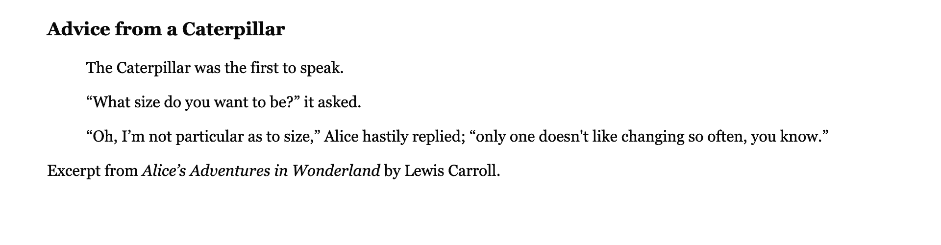
Finally, create the styles.css file and open it in your editor. This will be the file you work with for the remainder of the tutorial. Set the font on the body selector to have a font-family: 'Averia Serif Libre', serif;. This will apply the font to all the elements on the page:
body {
	font-family: 'Averia Serif Libre', serif;
}
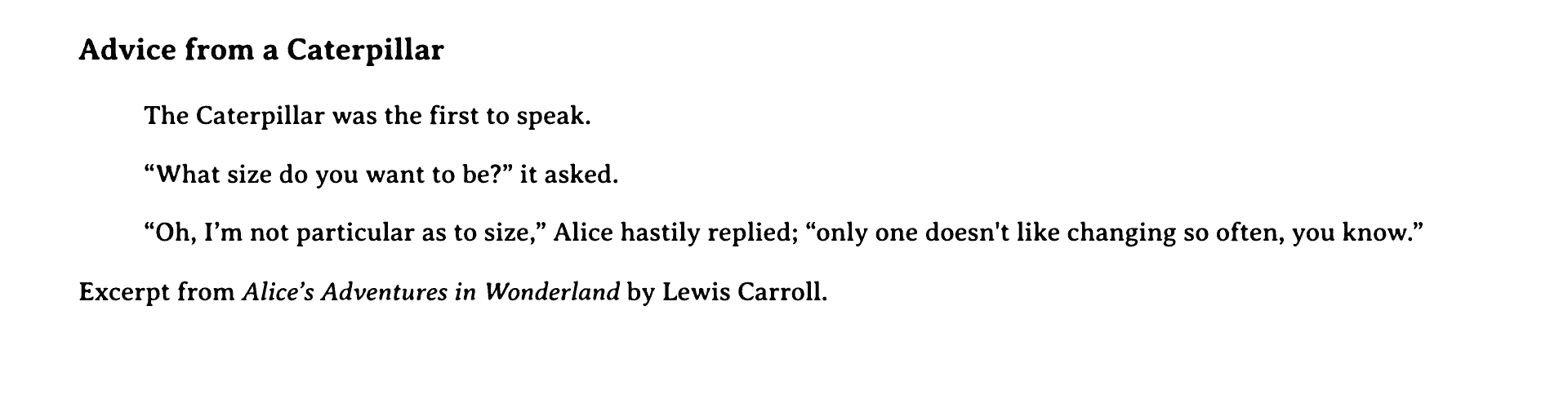
Save your changes to styles.css then reload index.html in your browser. The content will now use a font that looks like an older printed book, as shown in the following image:
In this section, you set up your HTML with all the content and markup you will need to work with units in CSS. You also created your styles.css file and added in the new font that is used on all the content. In the next section, you will use the px unit to begin applying styles to the content.
Using the Pixel Unit px
pxIn this section, you will focus on coding the initial styles using the pixel (px) unit. px is a well-known unit on the web. Unlike the other units covered in this tutorial, the px unit is a physically based unit, as its size is determined by the physical size of a single pixel of the device’s display.
Open styles.css in your text editor and create a class selector for the <figure> element’s class with .element. In this selector block you will define layout and aesthetic styles with a margin property set to 20px auto, padding set to 20px, a border set to 1px solid black, a max-width of 480px, and finally a box-sizing property set to border-box:
body {
	font-family: 'Averia Serif Libre', serif;
}

.excerpt {
	margin: 20px auto;
	padding: 20px;
	border: 1px solid black;
	max-width: 480px;
	box-sizing: border-box;
}
The margin applies 20px to the top and bottom of the container and the auto sets the container to be horizontally centered once a width value is declared. Next, the padding property provides 20px of space on each side of the interior of the container. Then, the border: 1px solid black; applies a 1px thick black border around the whole container as a defined perimeter for the content. The max-width allows the container to be flexible in width when the screen is smaller than 480px, but to stop growing once the container is 480px wide. Lastly, box-sizing: border-box; changes the box model of the container to ensure the maximum width is 480px.
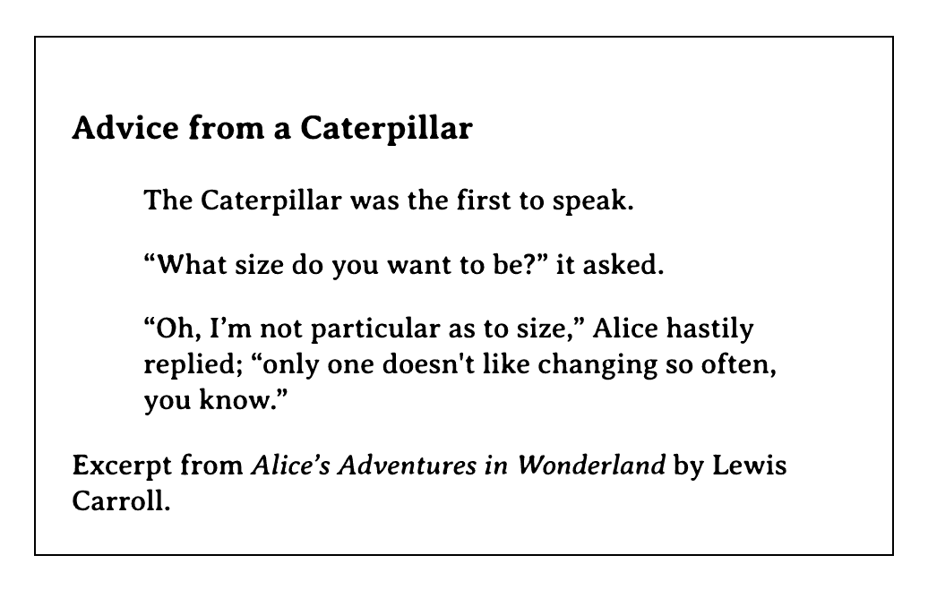
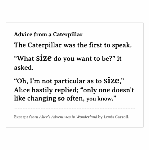
Save these additions to your styles.css file and then jump over to your browser and refresh index.html. There will be extra space on the top inside of the container, which is coming from the defaults for the .title element. Examine the following image for what this will look like in your browser:
Next, return to styles.css in your editor and create a class selector for the <h3> element with a class value of title. Currently the content has the browser’s default values for font-size, font-weight, and margin. First, change the font-size to 20px, which is a little larger than the browser default size. Then add a margin property with a value of 0 0 10px, which will apply a margin of 0 to the top, then a margin of 0 to the right and left, and finally a 10px margin to the bottom of the title. No unit is required when the value is 0 in CSS:
...
.title {
	font-size: 20px;
	margin: 0 0 10px;
}
The <blockquote> content is indented on the right and left with a browser default margin value. For the needs of this design, the margin can be removed. Create a class selector targeting .quote and give it a margin property with a value of 0. This will allow the content to expand to the full content width of the <figure> container:
...
.quote {
	margin: 0;
}
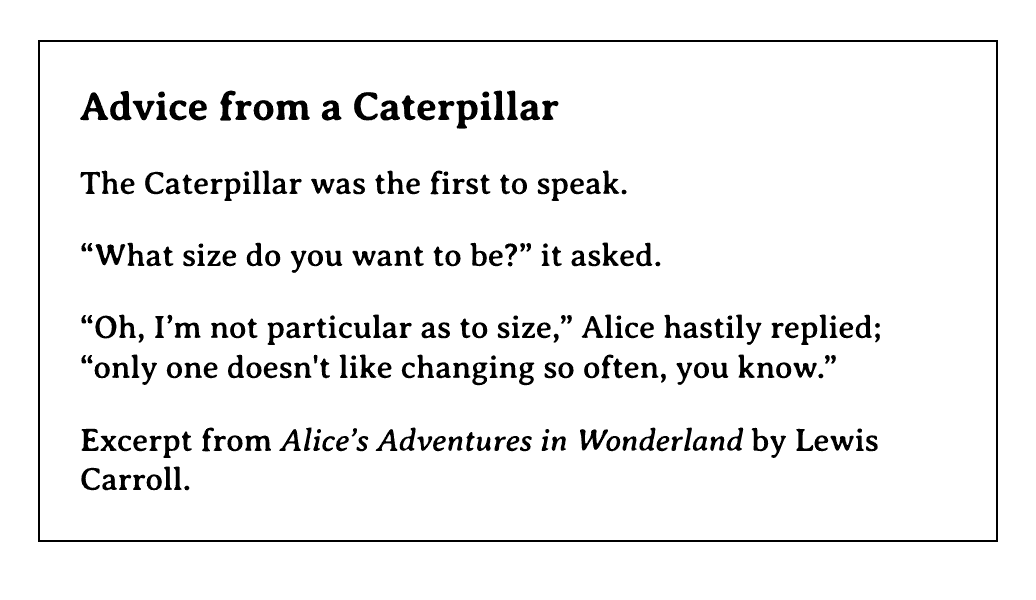
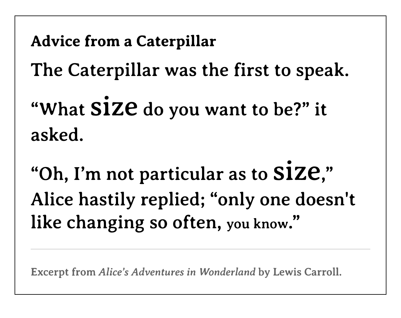
Save your change to the styles.css file and return to your browser, then refresh the index.html file. The .title will now be a little larger and the gap above it much smaller. The quote content is also now expanded to fill the space. Review the following image of what will change in your browser:
Return to styles.css in your text editor. Since the blockquote content is the primary focus of the <figure>, make it stand out by targeting the quote-text and applying a font-size of 24px. Then, make a narrow break between each line by setting the top and bottom margin to 10px, using the margin short hand 10px 0. This will set the top and bottom to 10px and the right and left to a value of 0:
...
.quote-text {
	font-size: 24px;
	margin: 10px 0;
}
Next, to apply visual emphasis inspired by the excerpt, target the <span> with the class attribute of large and set a font-size of 32px:
...
.large {
	font-size: 32px;
}
After setting the .large text, create a class selector to target .small and give it a font-size property with a value of 20px:
...
.small {
	font-size: 20px;
}
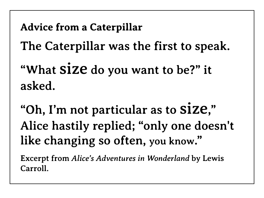
Save these changes to your styles.css file and refresh index.html in your browser. The content of the excerpt will grow in size and be brought a bit closer together. Additionally, the word “size” will appear larger than the primary text, while the phrase “you know” will appear a little smaller. The following image shows what this will look like in the browser:
For the last styling of this section, return to your styles.css file in your text editor. Create a class selector that targets the citation class that is applied to the <figcaption> element. This content describes the contents of the <figure>, so visually it should not be as prominent and needs to be distinctively separate from the quote.
Add a border-top with a value of 1px solid #ccc to give it a light gray border. Then apply a margin-top: 20px; and a padding-top: 20px; to set the border equidistant from the last line of the quote and the first line of the citation. This will provide the visual separation needed. Finally, to deemphasize the content of the citation, set the color property to have a value of #555 and a font-size of 14px. This will set the content to be less noticeable by making it a lighter gray in contrast to the other black text:
...
.citation {
	border-top: 1px solid #ccc;
	margin-top: 20px;
	padding-top: 20px;
	color: #555;
	font-size: 14px;
}
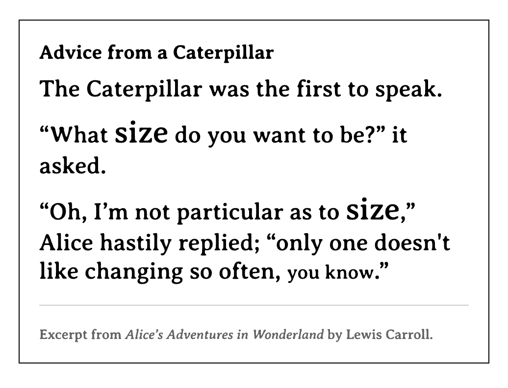
Save this addition to your styles.css file in your editor. Then, return to your browser and refresh the index.html page to view the changes as shown in the following image:
The px began as a unit that was defined by the physical pixel of a computer screen. This means a 10px wide and 10px high box used 100 pixels on the computer screen it displayed on. With high resolution displays, pixels are much smaller and so pixel values are often doubled, meaning 1px occupies 4 pixels on the screen. This is a software manipulation of the size of a pixel. Pixel doubling can occur on standard resolution displays imitating non-native screen resolutions, meaning the resolution is higher or lower than the physical number of pixels on the screen.
Due to pixel doubling and user preferences on devices, px is not an ideal unit of measure. Though it is meant to be a physical unit, it can be manipulated by the computer and can cause elements to appear too small or become blurry. Sub-pixel rendering is the term for when a computer encounters a pixel calculation involving a decimal point and blends the color between pixels to apply a value less than 1px, causing a blurry edge.
In this section, you used the px unit to set the value on properties to the content of the page. You learned that the px unit is a physical unit, though the computer can manipulate that value. In the next section, you will refactor your code where possible to use the percent value.
Using the Percent Unit %
%In this section you will use the percent unit (%) to apply dimensional values to elements on the HTML page. Unlike the px unit, the percent unit is a relative unit and does not rely on the screen’s physical attributes. Instead, the percent unit provides the browser with a relationship of values it must compute to produce a pixel value. The percent unit, as with other relative units, has an advantage over the pixel unit where it can scale based on many factors, including the user’s personal browser settings. This makes relative units advantageous for accessibility and providing the best options for users to interact and use the content.
One of the most useful applications of the percent unit is as a width property value. Open your styles.css file in your text editor and add a width: 80%, and for organizational purposes add that line just above your max-width property:
...
.excerpt {
	margin: 20px auto;
	padding: 20px;
	border: 1px solid black;
	width: 80%;
	max-width: 480px;
	box-sizing: border-box;
}
...
This is a powerful combination as the container will be 80% of its parent’s width until it reaches a width of 480px, at which point it will stop growing. If you are familiar with Responsive Web Design, much of the concept is predicated on this combination. The 80% value also allows the container to have spacing on the left and right, no matter the screen size’s width.
Now that you have used the percent unit, try applying it in more places to see how it works. Start by swapping out the .excerpt selector’s margin and padding pixel values for percents. This requires a formula you will use throughout the remainder of this tutorial: size / context = result.
The size in this case is 20 for the 20px value on the margin and padding. Since percent units on margin and padding are a percentage of the width, the max-width value can help determine the approximate context. This makes the necessary equation 20/480, which results in 0.041666667. When dealing with percents, the result must always be multiplied by 100 before using, making the final value 4.1666667%. Change the 20px values in the .excerpt selector to 4.1666667% instead, as shown in the highlighted sections of the code block:
...
.excerpt {
	margin: 4.1666667% auto;
	padding: 4.1666667%;
	border: 1px solid black;
	width: 80%;
	max-width: 480px;
	box-sizing: border-box;
}
...
Save your changes to styles.css and reload index.html in your browser. Try changing the size of the browser window’s width and watch how the padding value continues to grow even after the .excerpt container has hit its max-width. See the following animation for a demonstration of this effect in action.
This not likely to be the desired effect, but it is good to know and see which properties work best with the percent unit.
Return to your styles.css file in your editor and revert the 4.1666667% back to 20px:
...
.excerpt {
	margin: 20px auto;
	padding: 20px;
	border: 1px solid black;
	width: 80%;
	max-width: 480px;
	box-sizing: border-box;
}
...
The next area the percent unit can be quite useful is as a font-size value. Using percents on the font-size properties uses the same formula to find the value. Go to the .title selector block in your styles.css document and the font-size is 20px. From the formula size / context = result, this 20px is the size. The context in this scenario is browser default font-size for the document, which is 16px. The formula then is 20 / 16, and since this is a percent the result must be multiplied by 100, giving a final value of 125%. Add the 125% value in place of the 20px. It can be helpful to add a comment in the code to explain the intended size:
...
.title {
	font-size: 125%; /* target size: 20px */
	margin: 0 0 10px;
}
...
Next, apply this same formula to the .quote-text selector, which has a font-size of 24px. The result for this value is 150%, as 24 is 150% larger than 16. Add this to your styles.css file in your editor:
...
.quote-text {
	font-size: 150%; /* target size: 24px */
	margin: 10px 0;
}
...
Next, to apply percent values to the .large and .small selectors requires an understanding of how the context value can change in the formula. The browser default font-size is 16px, but both .large and .small only occur inside of an element with the quote-text class. This means their context is no longer 16px, but instead 24px. The current font-size for .large is 32px, which being twice the size of 16px would typically mean the font-size would be 200%. Since the context has changed, that would be double 24 and not 16. Therefore, the appropriate formula needs to be 32 / 24, which comes out to 1.333333333.
Take the result and multiply by 100, then feel free to round the decimal places to 133.3% for the new font-size value:
...
.large {
	font-size: 133.3%; /* target size: 32px */
}
...
The .small selector has a similar situation as the .large and is no longer a factor of 16, but 24. For this the formula is 20 / 24, then times 100. The result is 83.3%:
...
.small {
	font-size: 83.3%; /* target size: 20px */
}
...
Lastly, apply the same formula to the .citation selector’s font-size. Since this container returns to the default font-size of 16, the equation is now 14 / 16. After multiplying the result by 100, the final value is 87.5%:
...
.citation {
	border-top: 1px solid #ccc;
	margin-top: 20px;
	padding-top: 20px;
	color: #555;
	font-size: 87.5%; /* target size: 14px */
}
Save your changes to styles.css in your text editor, then reload index.html in your browser. You will find no difference between the pixel version of the font-size values and the percent version. However, from an accessibility standpoint this is much more versatile, since operating systems and browsers provide tools for users to change the default font-size. Using a relative unit like the percent allows the font-size to scale proportionately to the user’s preference.
In this section, you used the percent unit to make padding, margin, font-size, and width properties relative. You learned how font-size is relative to the parent element’s font-size and the formula to calculate a desired ratio. You also learned that a percent value is not always the best choice, such as with border width values. In the next section, you will take what you have learned with the percent unit and apply it to the more versatile em unit.
Using the em Unit
em UnitIn this section, you will refactor the CSS to use the em unit. Like the percent unit, the em unit is a relative unit, but it has a more common base compared to the percent’s base being different from width or font-size. The em is wholly relative to the font-size, or the inherited font-size of the element. For example, the default font-size in a browser is 16px, making 1em equivalent to 16px. From the percent unit the 1em is similar to a font-size: 100%;; however, if a width is set to 1em, then the computed width would be 16px instead of the full available width.
Note: There are a couple of ways the em unit can be a bit confusing. The first is in regard to print typography, which also has an em unit. This is based on the size of the lower case “m” character in the font. The web em unit is based on the font-size value instead. The second area of note is that there is also an <em> HTML element. This element does not have to do with the em unit, but rather is short for “emphasis”, as it is used to italicize and emphasize text.
To begin using the em unit, open styles.css in your text editor.
Since the em is relative to only the font-size, it can be used on more properties reliably than the percent unit. Go to the .excerpt selector block and use the formula size / context = result, where context is 16. Apply this to the values on the margin, padding, border, and max-width properties:
...
.excerpt {
	margin: 1.25em auto;
	padding: 1.25em;
	border: 0.0625em solid black;
	width: 80%;
	max-width: 30em;
	box-sizing: border-box;
}
...
Unlike the percent formula, the result does not need to be multiplied by 100. Instead, take the result and add the em unit at the end. For the 20px on the margin and padding, the equation 20 / 16 results in 1.25em. For the border thickness of 1px, that means 1 / 16, which is 0.0625em. When dealing with a value of 1px it is up to you if it is necessary for the thickness to scale. If it does not need to, feel free to leave it as 1px. Lastly, the max-width of 480px becomes 480 / 16, which results in 30em.
Save these changes to styles.css and reload index.html in your browser. There will be no visual change, as these values are the same as the pixel value.
Next, go to the .title selector in styles.css in your editor. From the previous section, the font-size value is 125%. Since the formula is the same for em as it is for percent unit except for multiplying by 100, you can divide instead to return the decimal point. This means the font-size value will change from 125% to 1.25em. Since the em value is defined by the font-size of the given element, every other instance of em has changed. This means 1em now is equivalent to 1.25em and all other uses of em inside of the .title selector are relative to the font-size:
...
.title {
	font-size: 1.25em; /* target size: 20px */
	margin: 0 0 10px;
}
...
You can see this in practice by applying an em value to the margin. Here, there is a bottom margin of 10px. Since 10px is half the size of 20px, and 1em is equal to whatever the font-size value is, then 0.5em will always be half of the font-size. You can swap out 10px for 0.5em in the margin property. The advantage here is that if the design changes and the font-size needs to increase, the proportion is maintained, and the bottom margin will always be half of the font-size value:
...
.title {
	font-size: 1.25em; /* target size: 20px */
	margin: 0 0 0.5em; /* target size: 10px */
}
...
Taking the concepts of em to the .quote-text and the <span> sizing classes will require more use of the equation. Use the size / context = result formula on the font-size, where the intended value is equivalent to 24px. This results in a value of 1.5em:
...
.quote-text {
	font-size: 1.5em; /* target size: 24px */
	margin: 10px 0;
}
...
Regardless of if the font-size was an em, a percent, or a pixel, the font-size defines the size of 1em. This mean that the context for the formula now equals 24px for applying the same formula to the margin of .quote-text and the .large and .small classes, since they are used inside of the .quote-text element:
...
.quote-text {
	font-size: 1.5em; /* target size: 24px */
	margin: 0.41667em 0; /* target size: 24px */
}

.large {
	font-size: 1.333em; /* target size: 32px */
}

.small {
	font-size: 0.8333em; /* target size: 20px */
}
...
As you do these equations, feel free to round to your preferred decimal point.
Lastly, apply the em value to the .citation selector. Start by setting the font-size to 0.875em, which will keep it at a size of 14px. Even though the font-size property is at the bottom of the selector block, it still determines the value of 1em on all other properties in the selector block. This means the context for all the other properties is 14 and not 16. The 1px thickness on the border would become 0.071428571em, or 0.071em if you round to the nearest thousandth. In turn, the padding and margin values of 20px will become 1.428571429em, or 1.43em when rounding:
...
.citation {
	border-top: 0.071em solid #ccc;  /* target size: 1px */
	margin-top: 1.43em; /* target size: 20px */
	padding-top: 1.43em; /* target size: 20px */
	color: #555;
	font-size: 0.875em; /* target size: 14px */
}
Be sure to save your changes to styles.css before moving on to the final section.
In this section you learned about the em unit and how it is based on the font-size of an element. Unlike the percent unit, em can be applied predictably on more properties and provides a way for properties to change in proportion to one another. In the last section, you will learn about a variant of the em unit: rem.
Using the rem Unit
rem UnitIn the last section, you will use the rem unit, which is a close relative to the em unit. The “R” in rem stands for root element, which is the topmost element of the webpage, most likely <html> or <body>. Where the em value can change based on font-size values, the rem has a consistent size based on the root element’s font-size, which is by default 16px. This makes the equation have a constant and predictable result, while having the scalable benefits of the em.
To begin working with the rem value, open styles.css in your text editor and go to the .excerpt selector. Since all the values are set to an em using the default font-size of 16px, these can all be changed from em to rem with no repercussions. The advantage here, too, is if a font-size is ever added to this selector or the font-size of the parent container is changed, these values won’t change since they are now based on the root font-size:
...
.excerpt {
	margin: 1.25rem auto;
	padding: 1.25rem;
	border: 0.0625rem solid black;
	width: 80%;
	max-width: 30rem;
	box-sizing: border-box;
}
...
Next, move to the .title selector in styles.css and change the font-size to be a rem. Since the em on this selector was already calculated using the default font-size, no other change is necessary. In the case of the margin, you can leave this as an em value and it will continue to size itself in proportion to the font-size:
...
.title {
	font-size: 1.25rem; /* target size: 20px */
	margin: 0 0 0.5em; /* target size: 10px */
}
...
Be sure to save your changes to styles.css. At this point, no visual changes have been done that will change how index.html will appear in the browser, but it is always good to check periodically. Go ahead and return to your browser and refresh index.html to verify nothing has visually changed.
Return to styles.css in your text editor and then go to the .quote-text selector. The font-size here is already set based on a 16px context, so the unit can be changed from em to rem with no further adjustments. The margin here, however, is not intended to be proportional to the .quote-text font-size, but rather the root font-size. This means calculating 10 / 16 to get a constant relationship to the root font-size, making the margin value 0.625rem:
...
.quote-text {
	font-size: 1.5rem;
	margin: 0.625rem 0;
}
...
The .large and .small selector font-size properties can remain as em values since they provide a proportional sizing compared to the font-size of the .quote-text. It may be worthwhile to change those values to something a little easier to understand, although it will change the design slightly. Change the .large font-size to 1.5em and the .small font-size to 0.875em. This will change the size, but it will now read similar to 150% for the .large and 75% for the .small:
...
.large {
	font-size: 1.5em;
}

.small {
	font-size: 0.75em;
}
...
Save these changes to styles.css and refresh index.html in your browser. The size of the text using these selectors will render like what is in the following image.

Next, adjust the .citation selector to use rem instead of em on all properties. Since the border-top, margin-top, and padding-top were all calculated to a font-size equivalent of 14px, you need to recalculate each for the root font-size of 16px. This will make the 1px border-top thickness 1 / 16, or 0.0625rem. Then the 20px desired value for the margin-top and padding-top will be 20 / 16, which results in 1.25rem. Lastly, since the font-size was already based on the default 16px value, the em can be changed to rem:
...
.citation {
	border-top: 0.0625rem solid #ccc;
	margin-top: 1.25rem;
	padding-top: 1.25rem;
	color: #555;
	font-size: 0.875rem;
}
Save your changes to styles.css and verify there were no visual changes in your index.html by refreshing the page in your browser.
Lastly, the root font-size can be changed using the :root selector and changing the font-size value. This will change the definition of 1rem to whatever value you wish to try.
Open your styles.css file and at the top add a :root selector, then set the font-size to 20px:
:root{
	font-size: 20px;
}

body {
	font-family: 'Averia Serif Libre', serif;
}
...
Save this change to styles.css, then return to your browser and refresh index.html. The following image shows what this will look like in a browser.
All of you styles will grow a little in size. This can be very useful if providing accessibility tools or making broad adjustments to a website. It is advisable to maintain the default 16px size as it is more common, but if you are changing the size it is better to go larger than smaller. This is the font-size that is used by elements, and smaller content or content lacking a defined size is less accessible than larger.
In this section, you used the rem value in several scenarios and learned where it is useful to use an em alongside a rem. You also learned about the :root selector and how to use it to target the default font-size.
Conclusion
These four units, pixel (px), percent (%), em, and rem, are some of the most common units found on the web. They each have their strengths, and understanding how they all work and work together will help you decided the best situation for your needs. You learned that the pixel unit is based on a physical screen attribute that can be manipulated by the computer. The percent unit varies on what the base value is, but its biggest strength is when used as width. The em value provides more control with a common baseline of the font-size of an element, allowing for proportional sizing amongst related properties. Lastly, rem takes the advantages of the em, but sets the value to a global font-size of the page’s root element.
If you would like to read more CSS tutorials, try out the other tutorials in the How To Style HTML with CSS series.
Thanks for learning with the DigitalOcean Community. Check out our offerings for compute, storage, networking, and managed databases.
Tutorial Series: How To Style HTML with CSS
Cascading Style Sheets (CSS) is the styling language of the web, and is used to design and control the visual representation of Hypertext Markup Language (HTML) on a web page. With CSS, you can manage everything from font to layout to animations on your web page. This series will lead the reader through CSS exercises that demonstrate the building blocks of the language and the fundamental design principles needed to make a user-friendly web site.
Browse Series: 20 tutorials
About the author
I code, design, write, and teach and I’m an IAAP Certified Web Accessibility Specialist.
Still looking for an answer?
This textbox defaults to using Markdown to format your answer.
You can type !ref in this text area to quickly search our full set of tutorials, documentation & marketplace offerings and insert the link!
 This work is licensed under a Creative Commons Attribution-NonCommercial- ShareAlike 4.0 International License.
Become a contributor for community
Get paid to write technical tutorials and select a tech-focused charity to receive a matching donation.

DigitalOcean Documentation
Full documentation for every DigitalOcean product.

Resources for startups and AI-native businesses
The Wave has everything you need to know about building a business, from raising funding to marketing your product.
The developer cloud
Scale up as you grow — whether you're running one virtual machine or ten thousand.

Start building today
From GPU-powered inference and Kubernetes to managed databases and storage, get everything you need to build, scale, and deploy intelligent applications.
