Developer

The author selected the Diversity in Tech Fund to receive a donation as part of the Write for DOnations program.
Introduction
An important part of web development is providing feedback when a user interacts with an element. This interaction is accomplished through changing state, which indicates how the user is using or has used a given element on the page. In CSS, there are special variations on selectors called a pseudo-class, which allow state changes to initiate style changes.
In this tutorial, you will use the :hover, :active, and :focus user actions and the :visited location pseudo-classes. You will use <a> and <button> as the interactive elements in the tutorial. Both of these elements have similar interactive states and are functionally identical to the user. From a development standpoint, <a> elements are specifically for interacting with URLs, whereas the <button> element is used to trigger forms or JavaScript functions. In addition to working with these four distinct states, you will use the transition property to animate the styles between these states of interactivity.
Prerequisites
- An understanding of CSS’s cascade and specificity features and the box model.
- Knowledge of type selectors, combinator selectors, and selector groups.
- Familiarity with text layout and color properties.
- An empty HTML file saved on your local machine as
index.htmlthat you can access from your text editor and web browser of choice. To get started, check out our How To Set Up Your HTML Project tutorial, and follow How To Use and Understand HTML Elements for instructions on how to view your HTML in your browser. If you’re new to HTML, try out the whole How To Build a Website in HTML series. - An empty CSS file called
styles.cssand an empty HTML file calledindex.html, both saved on your local machine in the same directory.
Setting Up the Initial HTML and CSS
To begin working with links and buttons, you will first set up the HTML and CSS needed as a foundation for the tutorial. In this section, you will write out all the necessary HTML and some initial CSS styles that will handle layout and start the visual aesthetic.
To begin, open index.html in your text editor. Then, add the following highlighted HTML to the file:
<!doctype html>
<html>
  <head>
  </head>
  <body>
  </body>
</html>
Next, go to the <head> tag and add a <meta> tag to define the character set for the HTML file. Then set the title of the page, add a <meta> tag defining how mobile devices should render the page, and finally load the CSS file with a <link> tag. These additions are highlighted in the following code block. You will encounter this highlighting method throughout the tutorial as code is added and changed:
<!doctype html>
<html>
  <head>
    <meta charset="utf-8">
    <meta name="viewport" content="width=device-width, initial-scale=1">
    <title>Link and Buttons with State</title>
    <link rel="stylesheet" href="styles.css">
  </head>
  <body>
  </body>
</html>
After adding the <head> content, next move to the <body> element where content is added to make an informational block with <a> and <button> tags as interactive elements. Add the highlighted section from this code block to your index.html file in your text editor:
<!doctype html>
<html>
  <head>
    <meta charset="utf-8">
    <meta name="viewport" content="width=device-width, initial-scale=1">
    <title>Link and Buttons with State</title>
    <link rel="stylesheet" href="styles.css">
  </head>
  <body>
    <section>
      <header>
        <button class="link" type="button">
          Close Window
        </button>
      </header>
      <div>
        <p>
          This is a demo paragraph for some demo content for a tutorial. By reading this text you are now informed that this is text for the demo in <a href="https://do.co/tutorials">this tutorial</a>. This means you can agree to use this content for the demo or not. If you wish to continue with this tutorial demo content, please select the appropriately styled interactive element below.
        </p>
        <div>
          <button class="button" type="button">
            Yes, Please
          </button>
          <a class="button" href="#">
            No, Thank you
          </a>
        </div>
      </div>
    </section>
  </body>
</html>
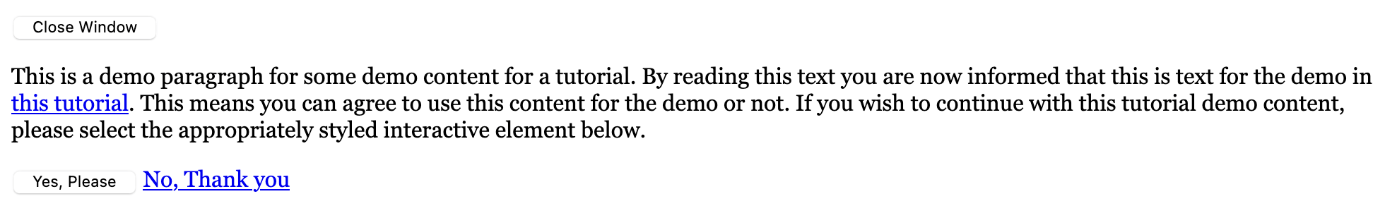
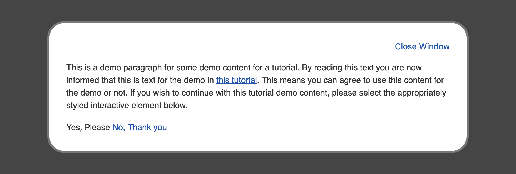
Save your changes to index.html and open your web browser to open the index.html file there. The content of the page will appear in a black serif font on a white background. The <button> element styles will vary based on your browser and operating system, but the page will look similar to the following image:
Next, create a file called styles.css in the same directory as the index.html file. The following styles in the code block will set up a base style for the container holding the <button> and <a> elements you will be styling throughout the remainder of the tutorial. Add the following code to your styles.css file:
body {
  background-color: #454545;
  color: #333;
  font-family: sans-serif;
  line-height: 1.5;
}

section {
  margin: 2rem auto;
  width: 90%;
  max-width: 50rem;
  box-sizing: border-box;
  padding: 2rem;
  border-radius: 2rem;
  border: 0.25rem solid #777;
  background-color: white;
}

header {
  text-align: right;
}
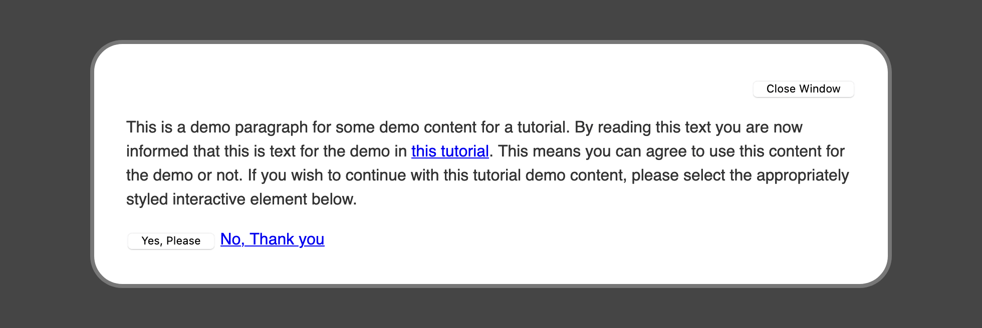
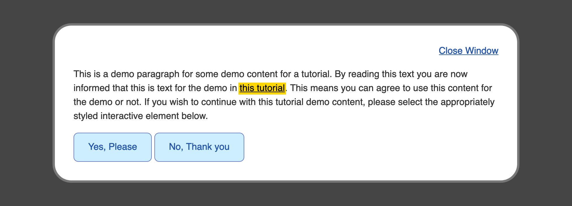
The CSS in this code block adds styles for three portions of the demo content area. The first is the body selector, which applies a dark gray background and then defines default font properties. The second selector focuses on the <section> element, which is the primary container for the demo content and creates a white block with big, rounded corners and a maximum width so it will only grow to a specified amount. Lastly, the header element selector sets the text alignment to the right so the Close Window button is to the far top right corner of the <section> container.
If you’d like to learn more about how to use CSS element selectors, check out How To Select HTML Elements to Style with CSS.
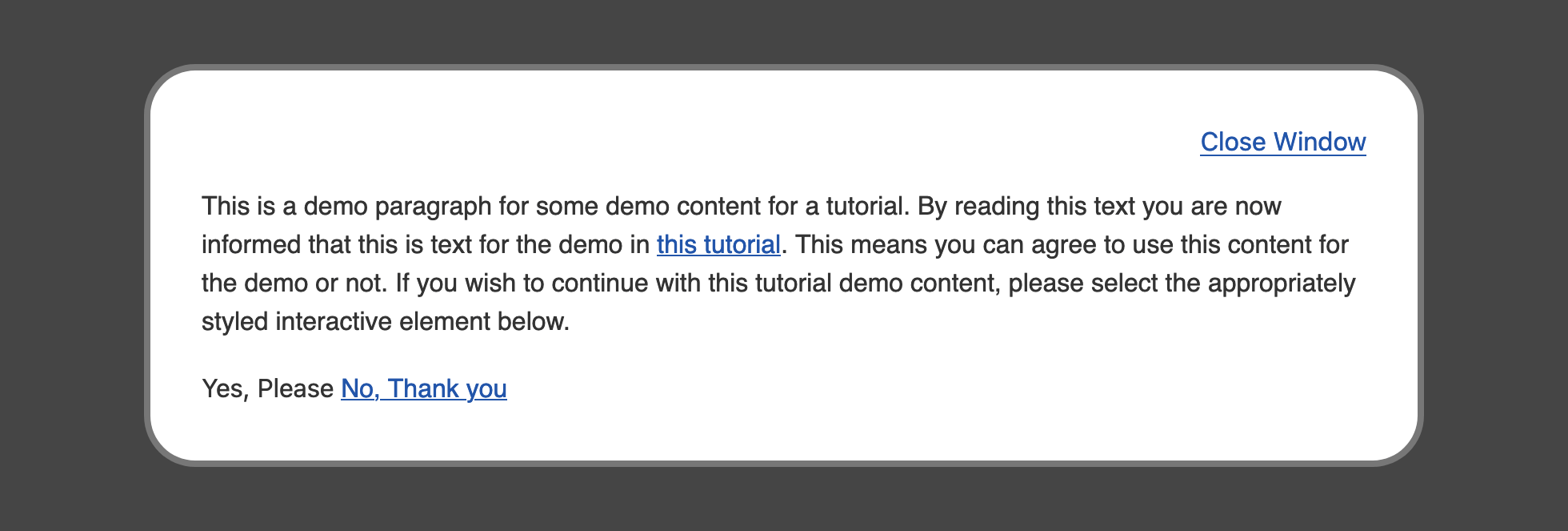
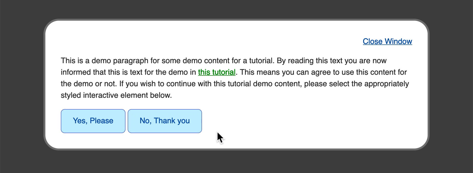
Save your changes to the styles.css file and reload the index.html file in your browser. The page styles will have transformed from the browser defaults to a customized style, as demonstrated in the following image:
You have set up your HTML and loaded in the base styles for the contents of the page. Next you will create a custom default link style and provide a way for that default style to be applied to button elements.
Creating Styles for Text Links
In this section, you will create a custom default link style by setting a new color. Then you will remove default button styles in order to make the button look like a default link. a and button have distinct purposes, but website users interact with both in a similar way. Sometimes, these two elements need to appear similar to help explain an interaction to the user or match a design aesthetic.
For the first part of this section, you will set up the default link style that will be used on the generic <a> element and a class of .link, which can then apply the generic link styles to the <button> element. Start by creating a group selector containing an a element selector and a .link class selector with a color property and value of #25a:
...
a,
.link {
  color: #25a;
}
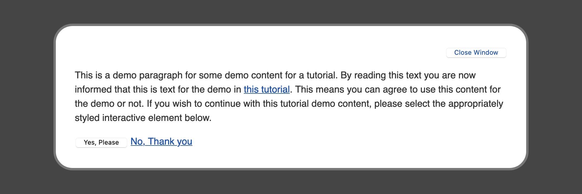
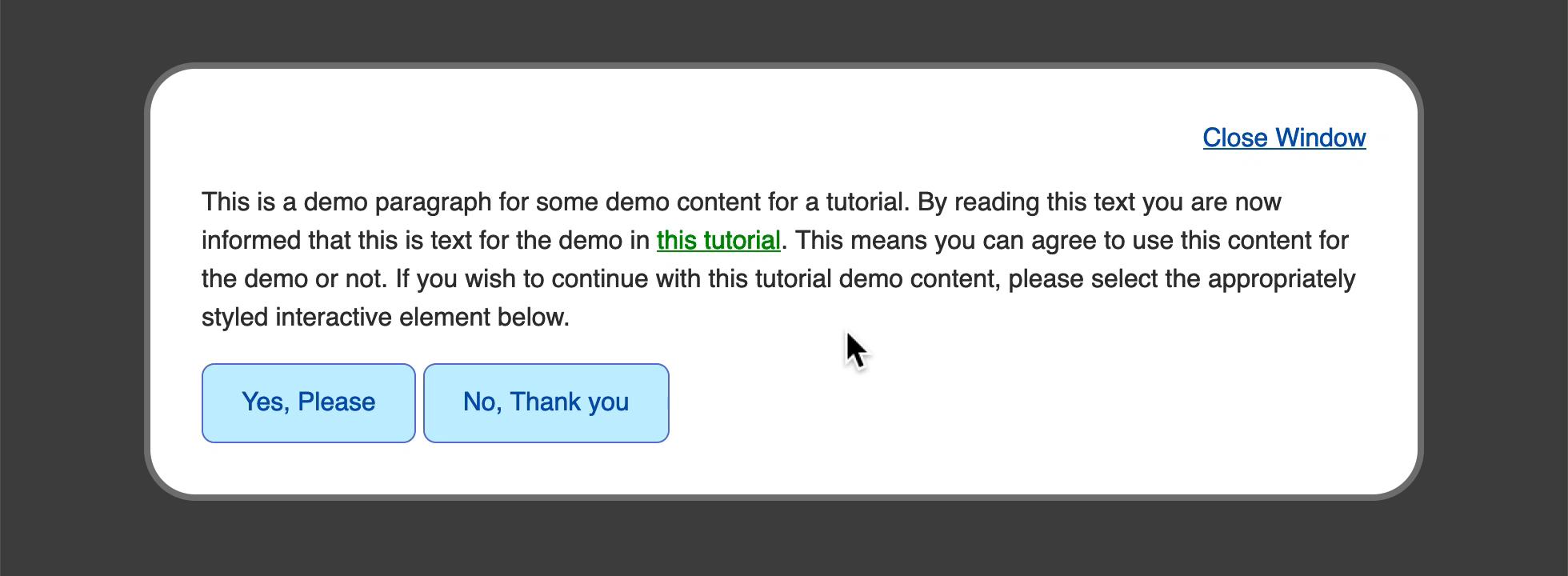
Save your changes to styles.css and open index.html in your browser. The <a> elements on the page are now a deeper blue color than the browser default link blue. Also, the <button> element with the class="link" has the same blue color text in the button. The appearance of change in the browser is demonstrated in the following image:
Next, begin removing the default appearance of a button. By default, browsers add a lot of customization to the look and feel of <button> elements to make sure that they are distinguishable as interactive elements. To remove the extra styling that browsers add to these elements, return to styles.css in your text editor, create a button element selector, and add two similar properties as shown in the following code block:
...
a,
.link {
  color: #25a;
}

button {
  -webkit-appearance: none;
  appearance: none;
}
The first property is -webkit-appearance: none;, which is known as a vendor prefix property. The -webkit- position of the property is only read by browsers built on a derivative of the WebKit browser engine, such as Safari or Chrome. Some versions of these browsers don’t support the appearance property by themselves and need the -webkit- prefix in order to work.
Vendor prefix usage is on the decline, but still occurs. It is important to put any vendor prefixed properties before the non-prefixed to avoid overriding properties on browsers that support both the prefixed and non-prefixed variants.
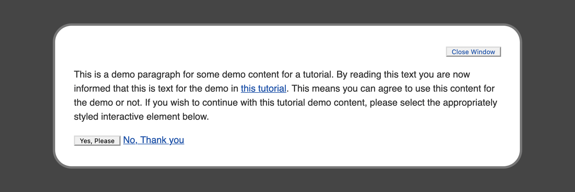
Save your changes to styles.css and refresh index.html in your browser. The button element will not lose all its styles; instead, it will become simplified to default styles expected of the web specification. The following image demonstrates how this will appear in the browser:
To remove the remaining default styles of the button, you will need to add several more properties. Return to your styles.css file in your text editor and go to the button selector. Next, you will add the properties to remove the background-color, border, margin, and padding. Then you’ll remove the properties for the button element, color, font, and text-align, to inherit the value of the page.
The following code block demonstrates how to set this up:
...
button {
  -webkit-appearance: none;
  appearance: none;
  background-color: transparent;
  border: none;
  margin: 0;
  padding: 0;
  color: inherit;
  font: inherit;
  text-align: center;
}
Save these changes to styles.css and refresh index.html in your web browser. Both buttons have now lost their default styles, with the Close Window button being closer in styles to the link. The Yes, Please button styles will be addressed in the next section. The following image demonstrates how this will appear in the browser:
To finish making the Close Window button look like a text link, open styles.css in your text editor. Below the a, .link group selector, add a new class selector for only the .link class. Add to that a text-decoration property with a value of underline. Then add a property called cursor, which defines how the mouse cursor appears when on that element, and set the value to pointer. The pointer value styles cursor is the hand-style that appears over a link by default:
...
a,
.link {
...
}

.link {
  text-decoration: underline;
  cursor: pointer;
}
...
Save these changes to your styles.css file and then return to your browser and refresh index.html. The Close Window button will now appear and behave in a similar manner to the generic <a> element styles. The following animation demonstrates how the cursor changes when moving over the Close Window button:
In this section, you created a custom default style for the <a> element and created a .link class to apply link styling to a <button> element. In the next section, you will create a custom, button-like style that can be applied to both <button> and <a> elements.
Creating Styles for a Button
Next, you will create a custom, button-like style with a class selector so the styles can be used on either a <button> or an <a> element. Unlike <a> elements, which are used throughout text content, the <button> element has a more intentional purpose. This makes it less necessary to create generic styles for the <button> element, and instead allows you to always add a class attribute.
Start by opening up styles.css in your text editor. Create a new class selector called .button. The styles here will redefine many of the properties that were reset in the previous step on the button element selector. You will add color to the text with the color property, fill the shape with the background-color property, then provide some definition with the border property. Afterward you will give a rounded corner to the button with the border-radius property. Finally, you will use the padding shorthand to give space above and below the text, then double that amount on the left and right.
The following code block contains these values:
...
.button {
  color: #25a;
  background-color: #cef;
  border: 1px solid #67c;
  border-radius: 0.5rem;
  padding: 0.75rem 1.5rem;
}
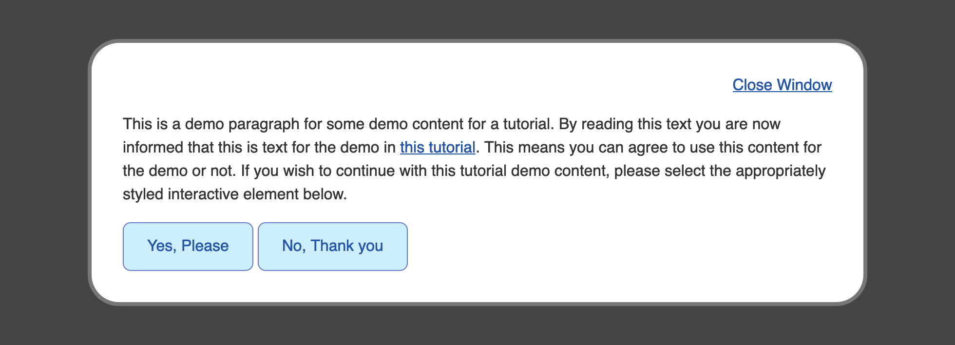
Save your changes to styles.css and return to your browser to refresh the index.html file. The look of the Yes, Please and No, Thank you buttons will change to match the properties. The text is the same blue as the default a style, with a much lighter blue in the background, and another deep blue for the border. The next image demonstrates how this will appear in the browser:

There is a noticeable difference in size between the two buttons. Since the No, Thank you button is using an <a> element instead of a <button>, there are a few additional properties that need to be added to the .button selector to equalize the defaults between these two elements.
Return to styles.css in your text editor and go to the .button class selector. To begin, add a display: inline-block, which is the default style on button elements. Next, add a text-decoration: none to remove the underline from the <a> element. As you did with the .link selector, add a cursor: pointer to the selector to get the pointing hand icon when a mouse cursor is over the element. Lastly, add a vertical-align: bottom rule. This last property isn’t necessary for all browsers, but it defines where the bottom of elements are positioned on a line:
...
.button {
  color: #25a;
  background-color: #cef;
  border: 1px solid #67c;
  border-radius: 0.5rem;
  padding: 0.75rem 1.5rem;
  display: inline-block;
  text-decoration: none;
  cursor: pointer;
  vertical-align: bottom;
}
Save these additions to styles.css and then refresh index.html in your browser. The two buttons are now equivalent in visual appearance and have borrowed default attributes from one another, so they are perceived to have a similar interaction.
You created a custom class selector to style both <button> and <a> elements with a button-like style in this section. Next, you will create a conditional style when a mouse cursor is on top of the interactive elements.
Applying the :hover Pseudo-Class to the Link and Button
:hover Pseudo-Class to the Link and ButtonNow you will use the :hover pseudo-class to create an alternative style that displays when the cursor is on the element. Pseudo-classes are a special group of conditions that are defined by a colon (:) and the name of the condition appended to the selector. For example, the a element selector with a hover pseudo-class becomes a:hover.
Open styles.css in your text editor. Below the group selector for a, .link, add a new selector for the hover state by appending each selector with the :hover pseudo-class: a:hover, .link:hover. Then, to make a noticeable change when the cursor hovers over the element, add a color property with a value of #b1b, which is a dark pink color:
...
a,
.link {
  ...
}

a:hover,
.link:hover {
  color: #b1b;
}
...
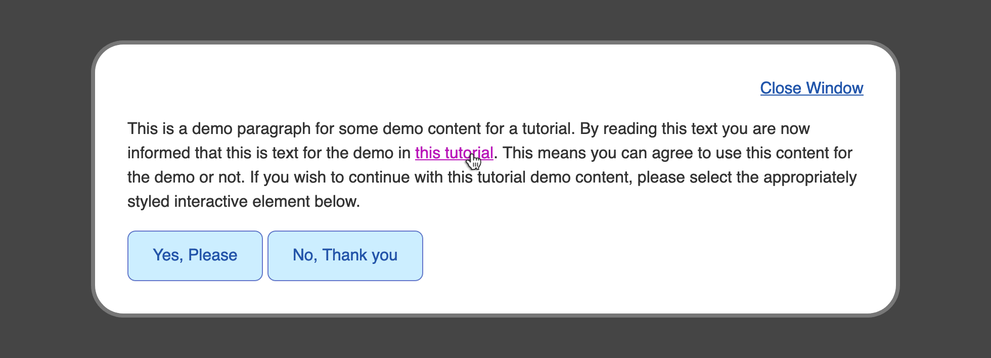
Save the changes to your styles.css file and refresh index.html in your browser. Hover over either the this tutorial link or the Close Window button to initiate the color change on hover. The following image shows what the hover state looks like when the cursor is over the this tutorial link.

Next, to add a hover state to the .button elements, return to styles.css in your text editor. Below the .button class selector, add a .button:hover selector to create styles specifically for hover interaction. Next, within the selector, add color properties that will change the button appearance when the cursor is on the buttons. Set a color property to white, then create a background-color and a border-color with both properties set to #25a:
...
.button {
  ...
}

.button:hover {
  color: white;
  background-color: #25a;
  border-color: #25a;
}
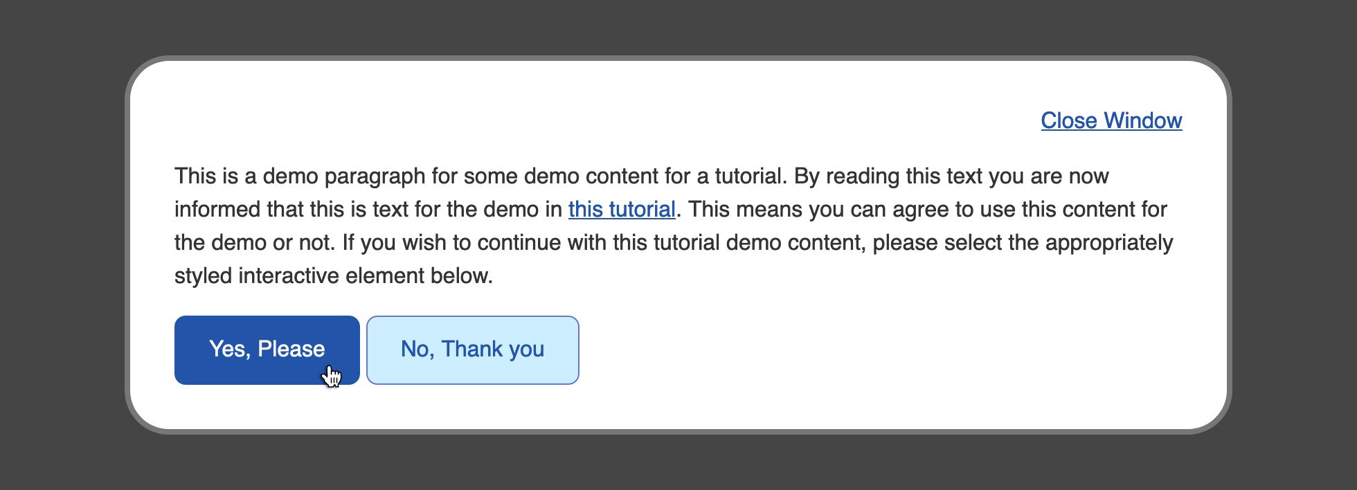
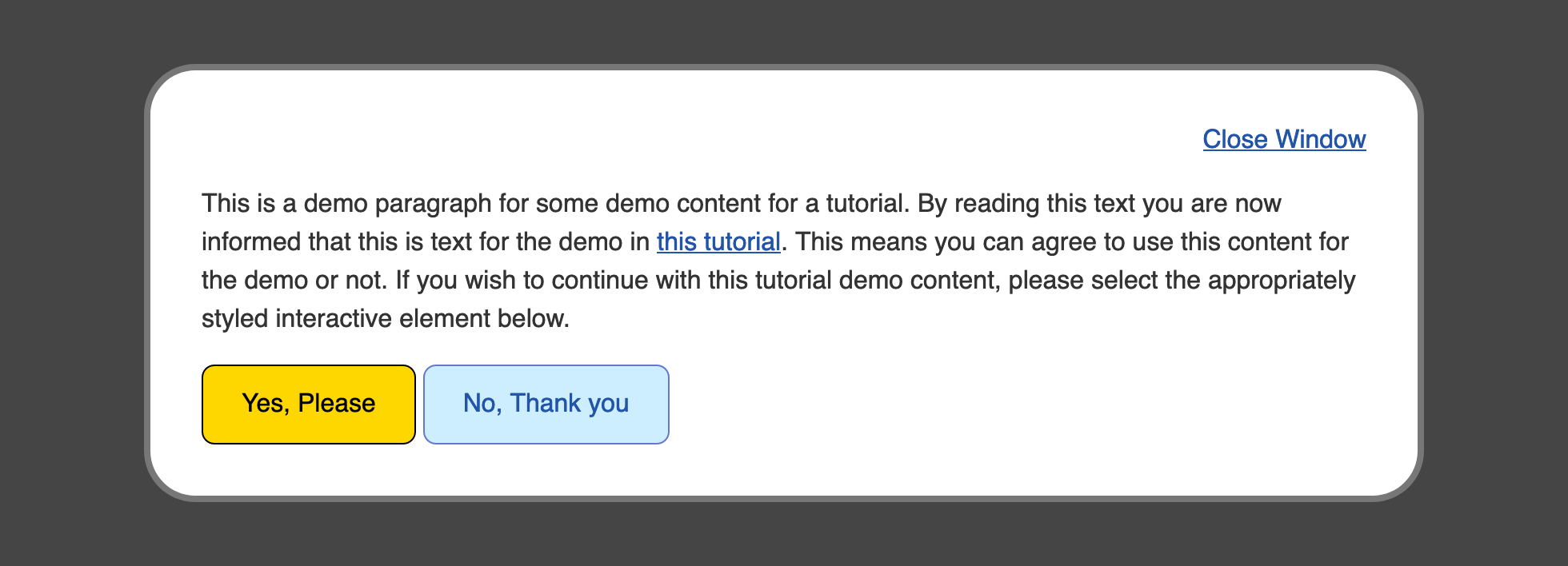
Save these changes to your styles.css file and return to your browser to refresh the index.html file. Now, take your mouse cursor and hover over one of the two buttons on the bottom. The styles change from the light blue background with a deep blue text and border to a deep blue background with white text. The following image shows what the hover style looks like when the mouse cursor is over the Yes, Please button.
You used the :hover pseudo-class in this section to create style changes to the element based on the cursor being positioned on top of the element. In the next section, you will apply this same concept to a condition when a keyboard is used to navigate through the page.
Applying the :focus Pseudo-Class
:focus Pseudo-ClassInstead of using a mouse or a touch screen, website visitors will sometimes use their keyboard to navigate and interact with elements of a page. This is most often done by using the TAB key, which will cycle through the interactive elements on the page. The default style uses the outline property to give a visual indicator that the element has focus. This style can be customized by using the :focus pseudo-class to apply property values for this situation.
To begin working with the focus state of the elements on the page, open your styles.css file in your text editor. Start with a new selector below the a:hover, .link:hover group selector with a new group selector for the focus state: a:focus, .link:focus.
The most important part of customizing the focus state is to make sure it is noticeably different from the default state. Here, you will make the :focus pseudo-class styles have black text with a gold background:
...
a:hover,
.link:hover {
  ...
}

a:focus,
.link:focus {
  color: black;
  outline: 2px solid gold;
  background-color: gold;
}
...
In this case, you set the color property to black and the background-color property to gold. You also used the outline property, which added some gold color around the edges of the text, outside where the background-color property can reach.
The outline property works similar to the border shorthand property, as it accepts a width, a style, and a color. However, unlike the border properties, outline always goes around the whole element and can not be set to a specific side. Also, unlike border, the outline does not affect the box-model; the shape is only applied visually and does not change the flow of content.
Save your changes to styles.css and refresh index.html in your web browser. Begin pressing the TAB key until the browser brings focus to the Close Window and this tutorial elements highlight with a gold background. The following image shows what the this tutorial link looks like in the browser when it has focus:
Next, to apply a similar custom focus style to the .button class elements, begin by creating a .button:focus class and pseudo-class selector. Since the .button element is already using a border, you will use that to indicate focus, and so remove the outline default by setting the property to have a value of none. Like the link before, the color property will be set to black and the background-color property will be set to gold. Last, set the border-color property to have a value of black:
...
.button:hover {
  ...
}

.button:focus {
  outline: none;
  color: black;
  background-color: gold;
  border-color: black;
}
Be sure to save your additions to styles.css and then return to you browser to refresh your index.html file. Again, using the TAB key, cycle through the keyboard-focusable elements on the page until you reach the .button elements. They will now light up with a gold background and black text with a black border. The following image demonstrates how the Yes, Please button appears in the browser when focused:
In this section, you used the :focus pseudo-class to create custom styles that appear when the website visitor uses their keyboard to navigate the page. In the next section, you will use the :active pseudo-class to indicate when a user is interacting with an element via a mouse click or a keypress.
Applying the :active Pseudo-Class
:active Pseudo-ClassThe next pseudo-class that you will work with is the :active state of an interactive element. The active state is the state at which an element is interacted with, typically via a mouse down or mouse click action. This provides the opportunity to give the visitor a clear state to indicate a successful mouse click and button press.
To begin working with the :active pseudo-class, open styles.css in your text editor. Following the group selector block for a:focus, .link:focus, add a new selector block with the group selector a:active, .link:active. Give color a value of #808, which will create a darker pink than the :hover state.
Note that some browsers will mix the styles of a :focus pseudo-class and an :active pseudo-class. To prevent this, you will need to remove the outline and background-color properties by setting them to none and transparent, respectively:
...
a:focus,
.link:focus {
  ...
}

a:active,
.link:active {
  color: #808;
  outline: none;
  background-color: transparent;
}
...
Save the addition of the :active pseudo-class to your styles.css file, then reload index.html in your web browser. The following animation shows how the :active state changes from the pink to darker pink as the mouse is clicked while over the this tutorial link.
Next, to apply an active state to .button, return to styles.css in your text editor. Add a .button:active pseudo-class selector and apply styles that are dark variants of the :hover styles. For the color property, set the value to a light gray with #ddd. For both the background-color and border-color properties, set the value to a dark blue with a value of #127. The highlighted sections of the following code block demonstrate how this is written:
...
.button:focus {
  ...
}

.button:active {
  color: #ddd;
  background-color: #127;
  border-color: #127;
}
Be sure to save these changes to styles.css, then return to your browser to refresh index.html. Hover your mouse cursor over one of the two buttons in the bottom of the content and then click down. The button will change from a light blue background with blue text and border to a full blue button with white text when hovered, then to a dark blue button with light gray text when clicked. The following animation demonstrates how this change from the :hover to the :active state appears as the mouse button is clicked:

You created a visual indicator of a mouse button press event by using the :active pseudo-class to change the styles when that event occurs. In the next section, you will use the :visited pseudo-class to provide an indicator of which <a> elements with a href attribute have visited that link.
Applying the :visited Pseudo-Class
:visited Pseudo-ClassThe :visited pseudo-class is unlike the previous pseudo-classes covered in this tutorial. Where the previous pseudo-classes involve an active interaction of the user with the element, the :visited pseudo-class indicates that an element was previously interacted with. Specifically, the :visited pseudo-class indicates which <a> with an href attribute are present in the browser history, meaning those links have been visited.
To create a customized :visited indicator on the text links, open your styles.css file in your text editor. Below the a:active, .link:active group selector, add a new group selector targeting a a:visited, .link:visted group selector. The default :visited link style is commonly a purple color. For the purposes of the demo, the :visited color will be a dark green.
Add a color property with a value of #080, as shown in the following highlighted code:
...
a:active,
.link:active {
  ...
}

a:visited,
.link:visited {
  color: #080;
}
...
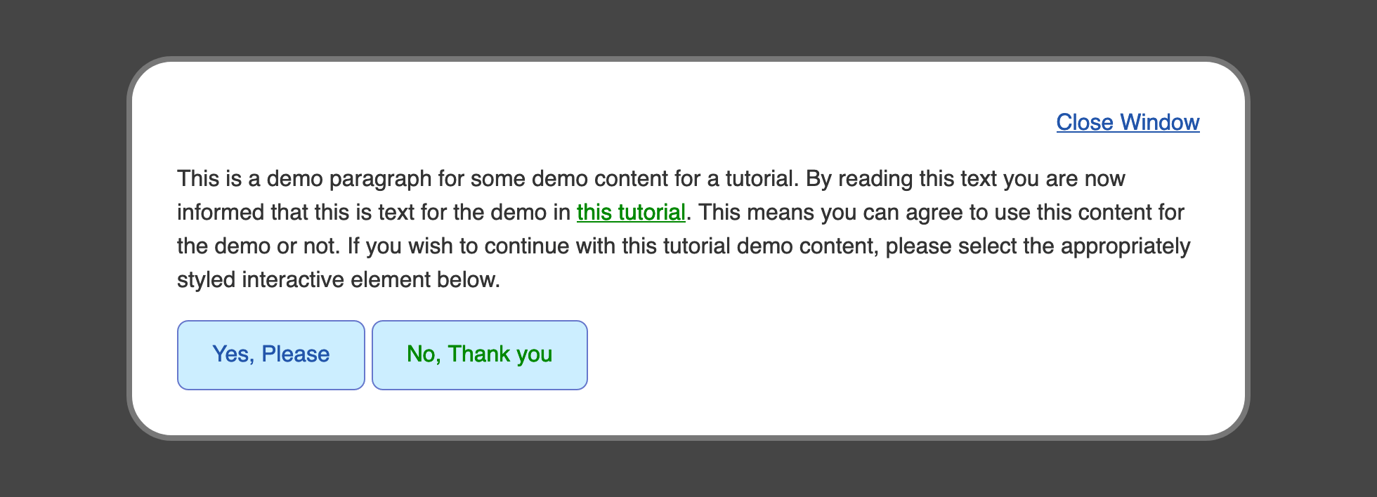
Save this change to the styles.css file and then open index.html in your web browser. If you haven’t, go ahead and click the this tutorial and No, Thank you <a> element links. Both of these links will have a text color of dark green, as shown in the following image:
Now, the green text in the button distracts from the purpose of the No, thank you button. Additionally, when the visited links are interacted with again with a :hover or :active state, the dark green remains instead of the defined colors for each respective state.
To address these scenarios, return to your styles.css file in your text editor. First, append the a:hover, .link:hover group selector with the added scenario of a :visited element that has an active :hover state by adding a:visited:hover, .link:visited:hover. Likewise, expand the a:active, .link:active selector block with a:visited:active, .link:visited:active. Lastly, the desired visited state for the .button element is to be styled the same as the default state. As such, the .button selector needs to become a group selector of .button, .button:visited, so the visited state appears the same as the default state:
...
a:hover,
.link:hover,
a:visited:hover,
.link:visited:hover {
  color: #b1b;
}
...
a:active,
.link:active,
a:visited:active,
.link:visited:active {
  color: #808;
}

a:visited,
.link:visited {
  color: #080;
}
...
.button,
.button:visited {
  ...
}

.button:hover,
.button:visited:hover {
  color: white;
  background-color: #25a;
  border-color: #25a;
}
...
Save your changes to the styles.css file and reload index.html in the web browser. The text default :visited link now appears in the desired dark green color, while the button-style link retains the button look. The following image demonstrates how this will appear in the browser.

You used the :visited pseudo-class to create styles specific to when a link is present in the browser history, indicating to the user links that have been visited. This section concludes the work on pseudo-classes and using them to define specific styles for a given state. In the final section of this tutorial, you will use the transition property to create a seamless animation between these different pseudo-class states.
Using transition to Animate Between States
transition to Animate Between StatesWhen working with states of elements, a shift in styles between the states can be abrupt. The transition property is used to blend and animate the styles from one state to the next state to avoid this abruptness. The transition property is a shorthand property that combines the transition-property, transition-duration, and transition-timing-function properties.
The transition-property can be any property that has a value calculated between two given values. Colors are included in this, as they are numerical values, even when a color name is used. The transition-duration property is a numeric value for how long the transition should occur. The value for the duration is often represented in seconds, with the s unit, or milliseconds, with the ms unit. Lastly, the transition-timing-function controls how the animation will play out over time, enabling you to make subtle changes to enhance the animation.
To begin working with the transition property, open your styles.css file and go to the a, .link group selector and the .button, .button:visited group selector. Add a transition property with a value of all 0.5s linear. The all is the value for the transition-property, which tells the browser to animate all the properties that change between the states. The 0.5s is the transition-duration value and equates half a second; this can also be represented as 500ms. Lastly, the linear position is the transition-timing-function value, which tells the browser to move from one value to the next in a constant increment throughout the duration:
...
a,
.link {
  ...
  transition: all 0.5s linear;
}
...
.button,
.button:visited {
  ...
  transition: all 0.5s linear;
}
Save your changes to styles.css and then open index.html in your web browser. Once the page loads, begin interacting with the link and button elements and pay attention to how the styles animate between the different states. The following animation shows the button style transitioning from the default state to the :hover pseudo-class state:
To make the animations feel more snappy and natural, return to your styles.css file and adjust the transition property values. For the a,.link group selector, change the duration from 0.5s to 250ms, which is half the duration compared to what it was before. Then change the linear timing function value to ease-in-out. This will create an animation that starts off slow, speeds up in the middle, and slows down to the end. Then, for the .button,.button:visited group selector, change the duration to a quicker 180ms and set the timing function to the same ease-in-out value as the link:
...
a,
.link {
  ...
  transition: all 250ms ease-in-out;
}
...
.button,
.button:visited {
  ...
  transition: all 180ms ease-in-out;
}
Save these changes to your styles.css file and then refresh the index.html page in your web browser. The transition animations between states will still animate, but are now much quicker and feel faster, too. With the transition property, it is important to play around with the values to find an animation that fits the design. The following animation demonstrates the faster transition of the button from the default state to the :hover state to the :active state.
You have now created an animation between states. The transition property helps make changes between states more engaging and fun.
Conclusion
Providing clear differences between interactive element states is a valuable asset to a website. States help communicate important concepts to the website’s visitor by providing visual feedback to an interaction.
In this tutorial, you have successfully used the primary state pseudo-classes to create multiple styles for different interactive elements. You also learned that there are different purposes behind the <button> and <a> elements, but visually they can communicate similar concepts. Lastly, you used the transition property to provide smooth animations between these states to create more engaging interactive elements. It is important to keep these four states in mind when creating a website so the visitor is given this important interactive feedback.
If you would like to read more CSS tutorials, try out the other tutorials in the How To Style HTML with CSS series.
Thanks for learning with the DigitalOcean Community. Check out our offerings for compute, storage, networking, and managed databases.
Tutorial Series: How To Style HTML with CSS
Cascading Style Sheets (CSS) is the styling language of the web, and is used to design and control the visual representation of Hypertext Markup Language (HTML) on a web page. With CSS, you can manage everything from font to layout to animations on your web page. This series will lead the reader through CSS exercises that demonstrate the building blocks of the language and the fundamental design principles needed to make a user-friendly web site.
Browse Series: 20 tutorials
About the author
I code, design, write, and teach and I’m an IAAP Certified Web Accessibility Specialist.
Still looking for an answer?
This textbox defaults to using Markdown to format your answer.
You can type !ref in this text area to quickly search our full set of tutorials, documentation & marketplace offerings and insert the link!
 This work is licensed under a Creative Commons Attribution-NonCommercial- ShareAlike 4.0 International License.
Become a contributor for community
Get paid to write technical tutorials and select a tech-focused charity to receive a matching donation.

DigitalOcean Documentation
Full documentation for every DigitalOcean product.

Resources for startups and AI-native businesses
The Wave has everything you need to know about building a business, from raising funding to marketing your product.
The developer cloud
Scale up as you grow — whether you're running one virtual machine or ten thousand.

Start building today
From GPU-powered inference and Kubernetes to managed databases and storage, get everything you need to build, scale, and deploy intelligent applications.
