Developer

The author selected the Diversity in Tech Fund to receive a donation as part of the Write for DOnations program.
Introduction
Web forms are a common element of website design, ranging in complexity from a search form field to contact forms and complex data filtering. Knowing how to use CSS to style and work with these elements helps provide better solutions to these everyday problems, and can improve your user’s experience of your website.
This tutorial covers the creation and styling of a web form that requests various data from the user. The form will use text fields, radio buttons, checkboxes, drop-down selections, a text area, and submit and reset buttons. You will create and style this form and its elements
by resetting the styles with the appearance property, setting up your own consistent style for the form, adding placeholder answers for the text fields, and customizing the radio buttons and checkboxes with various pseudo-classes and pseudo-elements.
Prerequisites
- Experience using advanced selectors to find and apply styles to HTML elements with CSS. For more information on this, check out How To Select HTML Elements Using ID, Class, and Attribute Selectors in CSS tutorial.
- Knowledge of the CSS box model, which you can find in the How To Work with the Box Model in CSS tutorial.
- Familiarity with pseudo-classes in CSS. Check out How To Use Links and Buttons with State Pseudo-Classes in CSS for an introduction.
- An empty HTML file saved on your local machine as
index.htmlthat you can access from your text editor and web browser of choice. To get started, check out our How To Set Up Your HTML Project tutorial, and follow How To Use and Understand HTML Elements for instructions on how to view your HTML in your browser. If you’re new to HTML, try out the whole How To Build a Website with HTML series.
Setting Up the Base HTML and CSS
In this first section, you will set up the HTML and initial styles that you will work with throughout the rest of the tutorial. This HTML will set up the scaffolding of the page and create the form fields you will style later.
Begin by opening the index.html file in your editor. Then, add the following HTML to provide a base structure for the file:
<!doctype html>
<html>
  <head>
    <meta charset="utf-8">
    <meta name="viewport" content="width=device-width, initial-scale=1">
    <title>CSS Form</title>
    <link rel="stylesheet" href="styles.css" />
  </head>
  <body>
    <main>
    </main>
  </body>
</html>
The elements contained in the <head> element define the page’s name with the <title> element and where to load the stylesheet via the <link> element. The <meta> tags define the character encoding and instruct the browser on how to display the site on small-screen device. The main form contents will reside inside the <body> and <main> tags.
Next, inside the <main> element, create a <form> element. Inside <form> you will add various form elements and <div> elements to help with layout. In this tutorial, additions to code from prior steps are highlighted. Add the highlighted HTML from the following code block to your index.html file:
...
<main>
  <form>
    <div>
      <label for="name">Name</label>
      <input id="name" type="text" />
    </div>
    <div>
      <label for="email">Email</label>
      <input id="email" type="email" />
    </div>
    <div>
      <label for="comp">Favorite CSS Compiler</label>
      <select id="comp">
        <option value="sass">Sass</option>
        <option value="less">Less</option>
        <option value="stylus">Stylus</option>
        <option value="postcss">PostCSS</option>
        <option value="other">Other</option>
      </select>
    </div>
    <div>
      <fieldset>
        <legend>Are you familiar with CSS Grid?</legend>
        <input type="radio" name="grid" id="yes" value="yes" />
        <label for="yes">Yes</label>
        <input type="radio" name="grid" id="no" value="no" />
        <label for="no">No</label>
      </fieldset>
    </div>
    <div class="full-width">
      <label for="message">Message</label>
      <textarea id="message"></textarea>
    </div>
    <div class="full-width">
      <input type="checkbox" id="newsletter" />
      <label for="newsletter">Receive our newsletter?</label>
    </div>
    <div class="full-width">
      <button type="submit">Send Response</button>
      <button type="reset">Clear Form</button>
    </div>
  </form>
</main>
...
HTML form structure consists of inter-connected attribute values in order to function correctly. This code creates a form that asks a user for their name and email, asks for their favorite CSS compiler and if they know CSS grid, provides a field for a user-generated message, and has a checkbox to sign the user up for a newsletter. To learn more about how to structure forms in HTML, see the Mozilla Web Docs page on web form structure.
Be sure to save your changes to index.html, then create a new file in the same directory called styles.css.
Open styles.css in your text editor. This file provides the styles that the browser will apply to the contents of index.html. Add the following CSS code to your styles.css file:
body {
  margin: 0;
  background-color: hsl(0, 0%, 98%);
  color: #333;
  font: 100% / normal sans-serif;
}

main {
  margin: 0 auto;
  padding: 4rem 0;
  width: 90%;
  max-width: 60rem;
}

form {
  box-sizing: border-box;
  padding: 2rem;
  border-radius: 1rem;
  background-color: hsl(0, 0%, 100%);
  border: 4px solid hsl(0, 0%, 90%);
  display: grid;
  grid-template-columns: 1fr 1fr;
  gap: 2rem;
}

.full-width {
  grid-column: span 2;
}
The body and the main element selectors create some initial text styling and layout for the overall page. The form element selector creates the styles for the overall form container and then defines a CSS Grid consisting of two columns of equal size with grid-template-columns: 1fr 1fr;. Then, the gap: 2rem provides 2rem spacing between each row and column in the grid. Lastly, the .full-width class selector allows containers with this class to extended between the two columns instead of staying in one column.
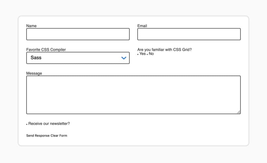
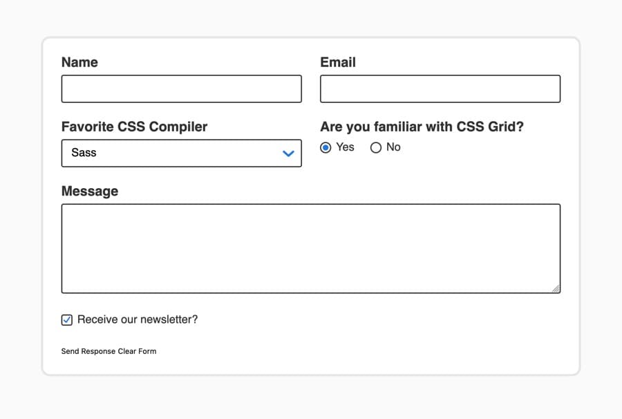
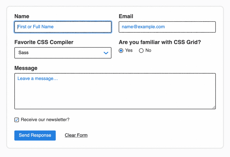
Save your changes to styles.css. Next, open a web browser of your choice. Select the File menu item in the browser and then select the Open option. Next, navigate to your project folder and load your index.html file in the browser. The following image demonstrates how the page will render in the browser:
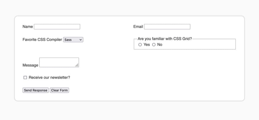
The form is displayed in a white box on a light gray background. Each form element is dispersed across the grid with the top four items alternating between the two columns and the last three stacked, spanning the two columns. The default styling of the form elements are as they appear in Firefox; each browser has a different default for styling form elements.
In this section, you set up the initial HTML and CSS needed to work with form elements. You also learned that each browser handles the styling of these elements in a different way. In the next section, you will use the appearance property to equalize the styling of form elements across all browsers.
Resetting Form Styling with the appearance Property
appearance PropertyEvery browser handles the visual styling of form elements in a different manner. Often the styling of these elements goes beyond the initial capabilities of CSS and follows the aesthetic of the operating system or the browser’s own design language. In order to create consistent styling for all browsers, in this section you will use the appearance property and other properties to remove the default browser styles.
To begin, open styles.css in your text editor. Create a new group selector consisting of button, fieldset, input, legend, select, and textarea. Then inside the selector block, add the appearance property set to none, as highlighted in the following code block:
...
button,
fieldset,
input,
legend,
select,
textarea {
  appearance: none;
}
The appearance property is the intended way to remove the special styling from form elements. However, due to the age and implementation of this property, most browsers still require a vendor prefix added to the property name. A vendor prefix is a special coded addition prepended to the property name as an identifier for a specific browser. For Chrome, Safari, and recent versions of Edge and Opera, that prefix is -webkit-. Firefox uses the -moz- prefix.
When working with vendor prefixes, it is important to put the vendor prefix versions of a property first and end with the non-prefixed version. This way, older browsers that only support the prefixed property will use the prefix, but new browsers that support both prefix and the non-prefix versions will use the non-prefixed standard version. Add the highlighted prefix appearance properties as formatted in the following code block:
legend,
fieldset,
select,
textarea,
input,
button {
  -webkit-appearance: none;
  -moz-appearance: none;
  appearance: none;
}
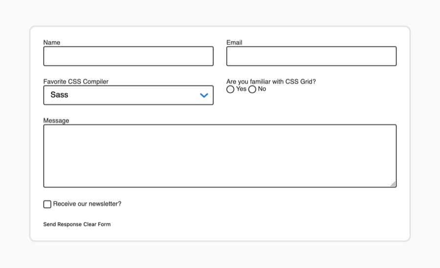
Save your changes to styles.css and then open index.html in your browser. The appearance properties have removed the embellished styling and have gone to a simpler style, as rendered in the following image:
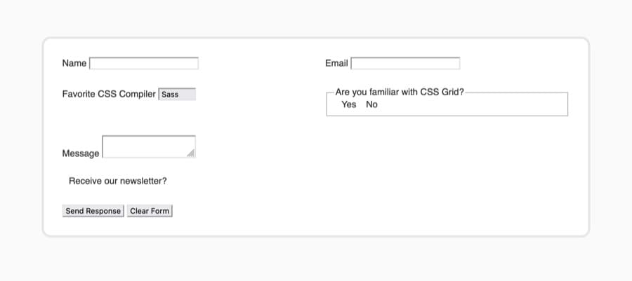
The appearance property only allows you to change the browser-specific styling. The biggest change the appearance: none property value made was to remove the radio buttons and checkbox completely. For the rest of the form elements, a few more properties are needed to completely remove the default styles. The highlighted CSS properties in the following code block add the necessary styles to remove the default styles:
...
button,
fieldset,
input,
legend,
select,
textarea {
  -webkit-appearance: none;
  -moz-appearance: none;
  appearance: none;
  background-color: transparent;
  border: none;
  padding: 0;
  margin: 0;
  box-sizing: border-box;
}
This CSS removes the background color and resets the parameters of the box model. Not all of these styles are necessary for all the elements, but it is acceptable to group these reset styles across all the elements.
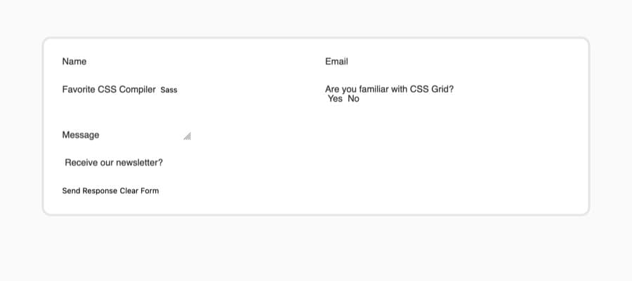
Save your changes to styles.css, then refresh index.html in the browser. The form elements have visually disappeared from the page, as shown in the following image:
In this section, you used appearance and additional properties to completely remove the default styles from the form elements. You also used vendor prefixes to appropriately order apply the property for future browser versions. In the next section, you will begin customizing the visual styling of the form fields.
Setting Consistent Styles Across Form Fields
Now that the default browser styles have been completely removed, you will apply a consistent custom aesthetic across all the form elements. This will involve creating various group selectors that target specific form characteristics to receive the appropriate styles.
To begin, open styles.css in your text editor. Then, create a group selector consisting of input, select, and textarea. Add the highlighted styles from the following code block:
...
legend,
fieldset,
select,
textarea,
input,
button {
  ...
}

input,
select,
textarea {
  border: 2px solid #333;
  background-color: white;
  border-radius: 0.25rem;
}
These styles add a 2px dark gray border around each of the data entry elements, along with a white background and rounded corners.
Next, you will apply styles for the data entry elements that contain text inside. You will use an attribute selector to specify which input elements to target based on their type attribute value. The highlighted CSS in the following code block provide the styles for the necessary elements:
...
input,
textarea,
select {
  ...
}

input[type="text"],
input[type="email"],
select,
textarea {
  font: 1.25rem / 1.5 sans-serif;
  display: block;
  box-sizing: border-box;
  width: 100%;
  padding: 0.5rem 0.75rem;
}
These styles apply a consistent font size and family across all elements. The <textarea> element, for example, does not inherit the font settings from the body element. The display, box-sizing, width, and padding properties provide a consistent layout and structure for each of these data entry elements.
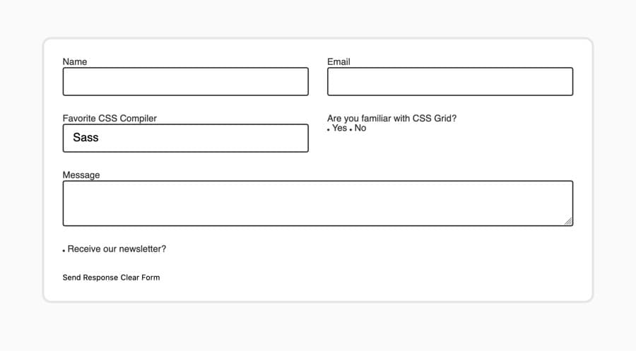
Save your changes to styles.css and then open index.html in your web browser. As rendered in the following image, the fields now have a thicker dark gray border around them and the text of the <select> element is now much larger:
Next, there are two elements that need some special styling in addition to the broad styling you’ve already written. The first is to give more height to the textarea, and the second is to apply a custom drop-down arrow to the <select> element.
Return to styles.css and add a textarea element selector. Inside the selector block, create a min-height property set to a value of 10rem. This will create a larger initial area for the form user to fill in text. The highlighted CSS in the following code block illustrates how this is written:
...
input[type="text"],
input[type="email"],
select,
textarea {
  ...
}

textarea {
  min-height: 10rem;
}
After adding the styles for the textarea, the next thing to accomplish is to make an image directory. That can be done by running the following in your command prompt from within the same directory as your index.html and styles.css files:
- mkdir images
Next, run the following curl command to download the first image you will work with into the new images directory:
- curl -sL https://assets.digitalocean.com/articles/68129/down-arrow.svg -o images/down-arrow.svg
The image you downloaded is an SVG, which is a markup language similar to HTML with the purpose of drawing shapes.
To add this new image to the <select> element, return to styles.css. Then, create a select element selector and add a background property with the highlighted value from the following code block:
...
textarea {
  min-height: 10rem;
}

select {
  background: url("images/down-arrow.svg") no-repeat center right 0.75rem;
}
This background property loads the image into the <select> element’s background and does not repeat the image. Then it centers the image vertically with center and offsets it from the right side with right 0.75rem.
Save your changes to styles.css, then return to your browser to refresh the page. The <textarea> is now about twice its original height and the <select> element has a blue downward-facing arrow on the right side. The following image illustrates how this is rendered in the browser:
Throughout this section you created a custom aesthetic for the form’s data entry elements. You also created a background for the <select> element to replace the default arrow. In the next section, you will create custom radio buttons and checkboxes and apply selected states when they are checked.
Customizing Radio Buttons and Checkboxes with the :checked Pseudo Class
:checked Pseudo ClassNow that you have created the base aesthetic of the form, it’s time to apply that visual style to the interactive input items of a radio button and checkbox.
Start by opening styles.css in your text editor. You will change the input elements with a type attribute of radio or checkbox to have an equal height and width value. Then you will turn the radio buttons into circles. The highlighted portions of the following code block show how this is formatted:
...
select {
  ...
}

input[type="radio"],
input[type="checkbox"] {
  height: 1.5em;
  width: 1.5em;
  vertical-align: middle;
}

input[type="radio"] {
  border-radius: 50%;
}
The vertical-align property is meant for aligning inline text items. By setting this to middle, the input fields will sit in the middle of the text align. Then, the radio input with a border-radius property of 50% will create a circle because the height and width are the same.
Save your changes to styles.css and then open index.html in your browser. The two radio buttons and the checkbox are now larger and more noticeable as rendered in the following image:
If you were to interact with the radio buttons or checkbox, nothing visible would happen. The appearance property also removes the selected indicators for these types of input. Next, you will use the :checked psuedo-class selector to apply styles to the selected input item.
Return to styles.css and create a new selector for the radio button input with a :checked pseudo class. Then, inside the selector block, add a background-image with a radial-gradient so a filled-in style can be applied to selected radio buttons. The highlighted CSS from the following code block shows how this is formatted:
...
input[type="radio"] {
  border-radius: 50%;
}

input[type="radio"]:checked {
  background-image: radial-gradient(
    hsl(213, 73%, 50%) 40%,
    transparent calc(40% + 1px)
  );
}
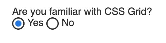
The calc() function allows the transparent property to be set 1px after the color value, creating a solid blue circle inside the input field.
Save your changes to styles.css and return to index.html in your browser. The radio buttons now have a solid blue circle surrounded by white inside the input. The following image shows the Yes radio button selected:
Next, the checkbox will use a background image to indicate its :checked state, similar to the <select> dropdown’s arrow.
Run the following curl command to download the checkmark image to your images directory:
- curl -sL https://assets.digitalocean.com/articles/68129/check.svg -o images/check.svg
Now that you have the image downloaded and ready to use, return to styles.css in your text editor.
Next, add a input[type="checkbox"] selector with a :checked pseudo-class attached. In the selector block, add a background property that loads the check.svg image and scales it down to fit in the box. The highlighted CSS in the following code block indicates how this is written:
...
input[type="radio"]:checked {
  ...
}

input[type="checkbox"]:checked {
  background: url('images/check.svg') no-repeat center / 75% auto;
}
The background property values ensure that the checkmark image is centered to the container, does not repeat, and is scaled down 75% proportionally.
Save your changes to styles.css then refresh the page in the browser. When selecting the Receive our newsletter check box, now a checkmark appears inside, as illustrated in the following image:

In this section, you created custom radio buttons and input fields and made them adjust their selected state through the use of the :checked pseudo-class. In the next section, you will style the <label> and <legend> elements on the page.
Adding Special Styles to Labels and Legends
The next elements to style are the <label> and <legend> elements in the form. There are two different styles that will be used: a small label style for the radio button and checkboxes and a large label style for the remaining elements.
Open index.html in your text editor. You will add a class attribute to each <label> and <legend> with a value of either large-label or small-label, as highlighted in the following code block:
...
<form>
  <div>
    <label for="name" class="large-label">Name</label>
    <input id="name" type="text" />
  </div>
  <div>
    <label for="email" class="large-label">Email</label>
    <input id="email" type="email" />
  </div>
  <div>
    <label for="comp" class="large-label">Favorite CSS Compiler</label>
    ...
  </div>
  <div>
    <fieldset>
      <legend class="large-label">Are you familiar with CSS Grid?</legend>
      <input type="radio" name="grid" id="yes" value="yes" />
      <label for="yes" class="small-label">Yes</label>
      <input type="radio" name="grid" id="no" value="no" />
      <label for="no" class="small-label">No</label>
    </fieldset>
  </div>
  <div class="full-width">
    <label for="message" class="large-label">Message</label>
    <textarea id="message"></textarea>
  </div>
  <div class="full-width">
    <input type="checkbox" id="newsletter" />
    <label for="newsletter" class="small-label">Receive our newsletter?</label>
  </div>
  ...
</form>
...
Save these additions to index.html, then open styles.css in your text editor.
In styles.css, add a .large-label class selector and add the following properties as highlighted in the following code block:
...
.full-width {
  grid-column: span 2;
}

.large-label {
  display: inline-block;
  font: bold 1.5rem sans-serif;
  margin-bottom: 0.5rem;
}
...
These styles set the large-label elements to be large and bold with a font size of 1.5rem, which is equivalent to 24px. Then the margin-bottom property provides some space between the label and its counterparts.
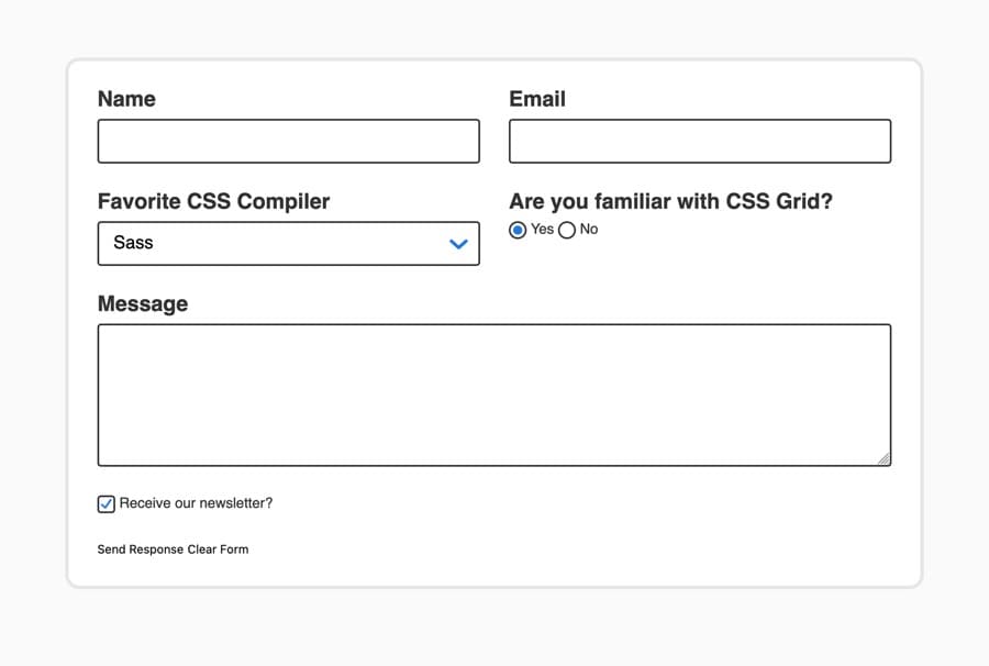
Save this change to styles.css and open index.html in your web browser. The label text above the data entry field will be large and bold, as rendered in the following image:
Return to styles.css and create another class selector for .small-label. Since these are the labels that are to the right of a radio button or checkbox, they will need some different spacing and sizing styles compared to the .large-label. Add the highlighted CSS to your styles.css from the following code block:
...
.large-label {
  display: inline-block;
  font: bold 1.5rem sans-serif;
  margin-bottom: 0.5rem;
}

.small-label {
  vertical-align: middle;
  display: inline-block;
  margin-left: 0.25rem;
  margin-right: 1.5rem;
  font: 1.25rem sans-serif;
}
...
The vertical-align: middle will offset the text slightly. The font is set to 1.25rem, the equivalent of 20px, with sans-serif font. The margin properties on the left and right provide space between the input fields and the label.
Save your updates to styles.css and refresh index.html in the browser. The labels next to the radio buttons and checkbox are now larger and provide more spacing, as rendered in the following image:
In this section, you created styles for two different types of labels based on where they were in relation to their input value. The labels now stand out, providing easier legibility and navigation throughout the form. In the next section, you will provide example data formatting through using the placeholder attribute.
Providing Placeholder Content with the ::placeholder Pseudo-Element
::placeholder Pseudo-ElementPlaceholder content on an input or textarea element provides form users with a visual demonstration of what kind of information is being requested and how to format it. The placeholder attribute is added to the HTML with a value describing it. Then the ::placeholder pseudo-element allows for customizing the look of the text.
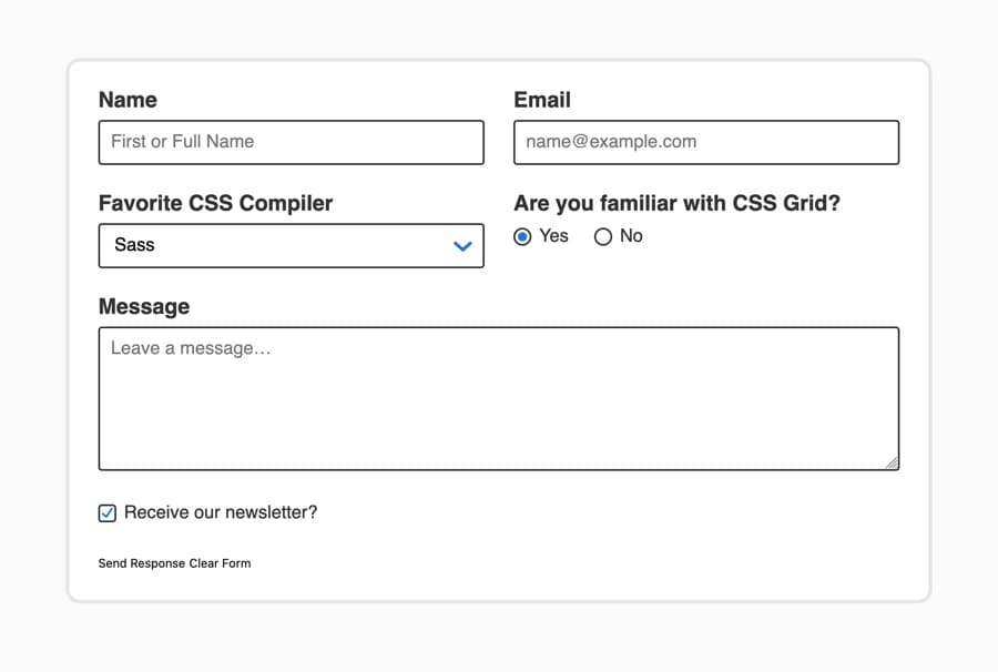
To begin making placeholder content, open index.html in your text editor. Add a placeholder attribute to the name text <input />, the email <input />, and the <textarea> elements. The highlighted HTML in the following code block indicates where to add the placeholder and the value to use:
...
<form>
  <div>
    <label for="name" class="large-label">Name</label>
    <input id="name" type="text" placeholder="First or Full Name" />
  </div>
  <div>
    <label for="email" class="large-label">Email</label>
    <input id="email" type="email" placeholder="name@example.com" />
  </div>
  ...
  <div class="full-width">
    <label for="message" class="large-label">Message</label>
    <textarea id="message" placeholder="Leave a message…"></textarea>
  </div>
  ...
</form>
...
Save your changes to index.html, then open the page in a web browser. These three text entry areas now have content inside them. Once these text entry fields are selected and content is added, the placeholder text will be removed by the browser. The following image illustrates how the default placeholder styles appear in the browser:
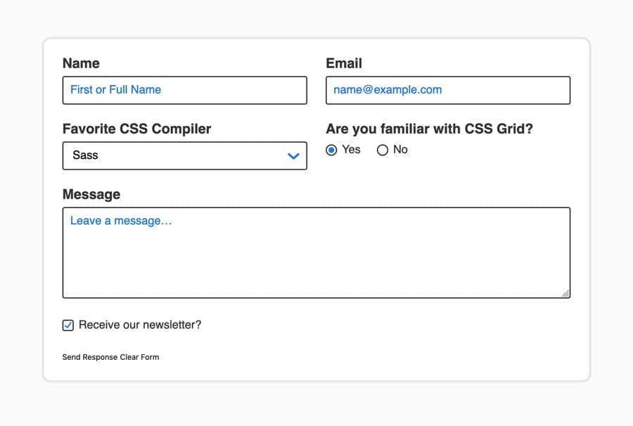
In order to style the placeholder, open styles.css in your text editor. Add a group selector for input::placeholder and textarea::placeholder. Be sure to use double colons between the selector and the pseudo-element, as this is how the browser recognizes the difference between a pseudo-class and a pseudo-element. The highlighted CSS in the following code block shows how this is written:
...
textarea {
  min-height: 10rem;
}

input::placeholder,
textarea::placeholder {
  opacity: 1; /* Firefox */
  color: hsl(213, 73%, 50%);
}

select {
  background: url("images/down-arrow.svg") no-repeat center right 0.75rem;
}
...
The one thing to note is that Firefox requires an opacity value set to 1 in order to have the full color value. Otherwise Firefox reduces the opacity, dimming the text color and causing accessible color contrast issues depending on the color value. Because this is a Firefox-only situation, a comment is there to explain the purpose of the opacity property’s presence.
Save your changes to styles.css and return to the browser to refresh index.html. The placeholder text is now the same blue color used for the drop-down arrow and selected states for the radio button and checkbox. The following image illustrates how the browser renders the placeholder content:
With this section, you created placeholder content on text entry fields and styled them with the use of the ::placeholder pseudo-element. In the next section, you will create custom styles for form <button> elements.
Creating Interactive Button Styles
In web forms, <button> elements are often used to submit or reset a form. In index.html, there are two buttons, one with a type of submit and the other of reset. Both are functionally useful, but perform opposing actions. The submit button will send the form along to a processor, while the reset button clears all entered data from the form. Due to these different actions, the <button> elements need to look visibly different as well.
To begin, open styles.css in your text editor and create a button element selector. In this selector block, you will add the styles that are shared between the submit and reset <button> elements, as highlighted in the following code block:
...
input[type="checkbox"]:checked {
  background: url("images/check.svg") no-repeat center / 75% auto;
}

button {
  font: 1.25rem sans-serif;
  border-radius: 0.25rem;
  cursor: pointer;
  padding: 0.75rem 1.25rem;
}
The font sets both buttons to have the same font style and size. Then the border-radius adds a rounded corner to both buttons. The cursor property changes the style of the cursor to be the hand-style pointer. Lastly, the padding property defines the space around the inside of the button.
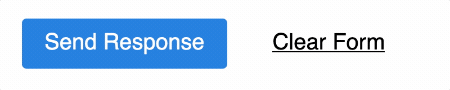
Save your changes to styles.css and then open index.html in your web browser. The text in the button will grow and the spacing between the text will increase visually due to the padding. The following image shows how the buttons are rendered in the browser:

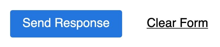
Next, return to styles.css to add styles for each button type by using an attribute selector targeting each. For the submit button, add a blue background-color and white text color. The reset button will gain a link-like underline and a margin to add more space between the buttons. Add the highlighted CSS from the following code block to your styles.css file:
...
button {
  ...
}

button[type="submit"] {
  background-color: hsl(213, 73%, 50%);
  color: white;
}

button[type="reset"] {
  text-decoration: underline;
  margin-left: 1rem;
}
Save these additions to styles.css then refresh index.html in your text editor. The submit button is now a prominent blue and white, while the reset is subdued underlined text, as rendered in the following image:
The <button> element does not have a :hover state by default, so you will now add this to your style. A :hover state is useful to help cursor users have visual feedback that the cursor is situated on the buttons.
To create :hover states for these <button> elements, return to styles.css in your text editor. Set the submit button’s backgound-color to darken on hover. Then, make the reset button drop the underline when hovered. The highlighted HTML in the following code block indicates how to write these styles:
...
button[type="submit"] {
  background-color: hsl(213, 73%, 50%);
  color: white;
}

button[type="submit"]:hover {
  background-color: hsl(213, 73%, 40%);
}

button[type="reset"] {
  text-decoration: underline;
  margin-left: 1rem;
}

button[type="reset"]:hover {
  text-decoration: none;
}
Save your changes to styles.css and then return to the browser to refresh index.html. As the following animation portrays, the <button> elements shift their styles when the mouse cursor hovers over them:
In this section, you created styles for the <button> elements so to make their differences visually noticeable. You changed how the cursor appears on hover by adjusting the cursor property. You also created custom styles to apply to each button to provide further visual feedback. In the last section, you will provide further visual activity feedback by creating styles when a form element is presently in use with the :focus pseudo-class.
Clarifying the Active Form Fields With :focus
:focusWhen filling out a form, it is important for the user to know what field they are currently working on. You can accomplish this with the use of the :focus pseudo-class. By default, browsers employ an outline property to indicate when an element has :focus, but at times it may not be a noticeable indicator, or it may clash with other visual aspects of the design. In this section, you will create a custom :focus state that matches your form’s aesthetic.
To begin working with form field :focus states, open styles.css in your text editor. Create a group selector for input, select, and textarea, all with a :focus pseudo-class, as highlighted in the following code block:
...
input,
select,
textarea {
  ...
}

input:focus,
select:focus,
textarea:focus {
  outline: none;
  box-shadow: 0 0 0 4px hsl(213, 90%, 70%);
}

input[type="text"],
input[type="email"],
select,
textarea {
  ...
}
...
These styles remove the browser default outline value and replace the style with a thick blue stroke created with the box-shadow property. The first three values of the box-shadow are for the shadow’s placement and blur amount. The fourth is called the spread, which in this case creates a 4px stroke around the focused element.
Next, the buttons will receive a slightly different focus state, since the submit button is the same blue color. The purpose and intent of a focus state is to bring noticeable attention to the focused element, so you will distinguish these outlines in a different ways.
Add a button:focus selector to styles.css. In the selector block, disable the outline default and add a box-shadow property. The placement, blur, and spread values will remain the same as the entry fields, but the color will be black instead of blue, as highlighted in the following code block:
...
button {
  ...
}

button:focus {
  outline: none;
  box-shadow: 0 0 0 4px black;
}

button[type="submit"] {
  ...
}
...
Save your changes to styles.css and return to your browser. Refresh index.html and begin hitting the Tab key for the focus to shift between each element in the form. The following animation shows how the focus style is applied as the focus changes with the Tab key:
In this section, you created focus state styles that provide clear visual feedback when a form element has focus. This visual styling is helpful for mouse, touch, and keyboard input users.
Conclusion
Forms are a common element of web design. They allow users to interact with apps, search content, and provide feedback. In this tutorial, you created and styled a full-fledged form. You removed the browser default styles with the appearance property, and created a new custom aesthetic across various elements. You used the :checked pseudo-class to make selected states for radio buttons and checkboxes. Then you added placeholder content and matched the styling with the ::placeholder pseudo-element. After you created custom button styles, you applied :focus styles giving valuable visual interaction feedback to the form users.
If you would like to read more CSS tutorials, try out the other tutorials in the How To Style HTML with CSS series.
Thanks for learning with the DigitalOcean Community. Check out our offerings for compute, storage, networking, and managed databases.
Tutorial Series: How To Style HTML with CSS
Cascading Style Sheets (CSS) is the styling language of the web, and is used to design and control the visual representation of Hypertext Markup Language (HTML) on a web page. With CSS, you can manage everything from font to layout to animations on your web page. This series will lead the reader through CSS exercises that demonstrate the building blocks of the language and the fundamental design principles needed to make a user-friendly web site.
Browse Series: 20 tutorials
About the author
I code, design, write, and teach and I’m an IAAP Certified Web Accessibility Specialist.
Still looking for an answer?
This textbox defaults to using Markdown to format your answer.
You can type !ref in this text area to quickly search our full set of tutorials, documentation & marketplace offerings and insert the link!
 This work is licensed under a Creative Commons Attribution-NonCommercial- ShareAlike 4.0 International License.
Become a contributor for community
Get paid to write technical tutorials and select a tech-focused charity to receive a matching donation.

DigitalOcean Documentation
Full documentation for every DigitalOcean product.

Resources for startups and AI-native businesses
The Wave has everything you need to know about building a business, from raising funding to marketing your product.
The developer cloud
Scale up as you grow — whether you're running one virtual machine or ten thousand.

Start building today
From GPU-powered inference and Kubernetes to managed databases and storage, get everything you need to build, scale, and deploy intelligent applications.
