Technical Writer II

JavaScript charting libraries have become essential tools for modern web development, enabling developers to create powerful data visualizations that drive insights and decision-making. Whether you’re building business dashboards, analyzing scientific data, or explaining AI model behavior, the right charting library can transform complex datasets into clear, interactive stories.
In this tutorial, we will explore five leading JavaScript charting libraries - Chart.js for simplicity, D3.js for complete customization, ECharts for enterprise needs, ApexCharts for modern dashboards, and Plotly.js for scientific visualization. We’ll help you understand their strengths and use cases so you can choose the best tool for your specific requirements.
Key Takeaways
- Quick wins: Chart.js and ApexCharts are ideal for dashboards that need rapid, out‑of‑the‑box results.
- Performance matters: Canvas‑based libraries handle large datasets better; always throttle real‑time updates and test on mobile.
- Custom Visualization Engine: D3.js is the go-to tool for developers who need total design freedom and logic-driven visuals.
- Enterprise muscle: ECharts delivers rich features and blazing performance for large‑scale apps, while Plotly.js excels at scientific and 3‑D plots.
- Choose wisely: Library choice hinges on chart complexity, dataset size, performance, and UX requirements.
Prerequisites
- General knowledge on how to work with HTML, CSS, and JS (ES6+).
- A code editor (like VS Code or Cursor) and a Browser with DevTools.
- Node.js (LTS) and a package manager like npm, Yarn, bun or pnpm.
- Optional but helpful: a bundler/build tool (Vite, Webpack, or Rollup).
- A sample dataset (CSV or JSON) to experiment with while following this guide.
What is a JavaScript Chart Library?
JavaScript chart libraries are tools that make it easy to create charts and graphs on websites. Instead of drawing everything from scratch with code, you can use these libraries to quickly build bar charts, line charts, pie charts, and even more advanced charts like heatmaps or 3D graphs. They handle the hard work behind the scenes, so you don’t need to know how to use Canvas or SVG directly. Most chart libraries also let you add interactive features (like tooltips or clicking on data points) and work well with popular web frameworks, making them a great choice for adding data visualizations to your projects.
What are the core features of top JavaScript chart libraries?
When evaluating JavaScript chart libraries, it’s important to consider a range of features that impact usability, performance, and integration. The following core aspects distinguish leading libraries and should guide your selection process, especially as your project’s requirements grow in complexity or scale.
Interactivity:
Top chart libraries excel at providing interactive experiences for users. This includes features like tooltips that appear on hover, zooming and panning to explore data, and filtering to focus on specific subsets. D3.js, for instance, allows developers to craft highly customized interactions by directly handling events, while ApexCharts comes with built-in options for zooming and brush selection, making it easy to add interactivity without much extra code.
Responsiveness:
In today’s mobile-first landscape, charts must look good and function well on any device. Leading libraries such as Chart.js and ECharts automatically adjust their size and layout based on the container or screen, using CSS and JavaScript resize observers. This ensures that charts remain legible and visually appealing whether viewed on a desktop monitor or a smartphone, reducing the need for manual adjustments and improving user experience across platforms.
Ease of Use:
The ease with which you can get started and build charts varies between libraries. Chart.js is known for its straightforward, declarative API and sensible defaults, allowing developers to quickly prototype and deploy charts with minimal setup. In contrast, D3.js has a steeper learning curve, requiring a solid understanding of data binding and SVG manipulation, but it rewards this investment with unmatched flexibility for creating custom visualizations.
Performance:
Handling large datasets or real-time data streams demands efficient rendering. Canvas-based libraries like Chart.js and ApexCharts typically offer better raw rendering speed than SVG-based solutions such as D3.js, especially when dealing with thousands of data points. However, D3.js stands out for its ability to efficiently process and transform complex data, making it suitable for advanced data manipulation tasks even if rendering is not always as fast.
Framework Compatibility:
Seamless integration with modern JavaScript frameworks is essential for many projects. Chart.js and ApexCharts provide official wrappers for frameworks like React, Vue, and Angular, simplifying their use in component-based architectures. D3.js, on the other hand, is more commonly integrated manually, giving developers fine grained control but requiring more effort to manage chart lifecycles within frameworks such as React or SolidJS.
Customizability:
The ability to customize the appearance and behavior of charts is a key differentiator. ECharts, for example, offers a rich set of declarative configuration options for themes, animations, legends, and tooltips, making it easy to match your application’s style. Plotly.js goes further by supporting intricate, interactive 3D plots with a wide range of customizable controls, catering to specialized visualization needs.
Accessibility:
Ensuring that charts are accessible to all users is increasingly important. This involves supporting ARIA standards, providing keyboard navigation, and maintaining sufficient color contrast. While libraries like Chart.js offer basic ARIA support out of the box, others may require developers to implement additional accessibility features to achieve full compliance, ensuring that visualizations are usable by people with disabilities.
Open Source Licensing:
Understanding the licensing of a chart library is crucial, especially for commercial or enterprise projects. Libraries with permissive licenses such as MIT or Apache 2.0 allow for broad use and encourage community contributions. Being aware of licensing terms helps prevent legal issues down the line and ensures that your chosen library aligns with your organization’s policies and future plans.
What Are the Top JavaScript Charting Libraries?
Choosing the right JavaScript charting library can be tricky. Here’s a quick comparison of the top options to help you decide.
| Library | Best For | Features | Framework Support |
|---|---|---|---|
| Chart.js | Rapid development of simple to moderate complexity dashboards | Standard interactions like tooltips and zoom | React, Vue, Angular (official wrappers) |
| D3.js | Highly customized, data driven visualizations with complex logic | Full control over DOM and event handling | All frameworks (manual integration) |
| ECharts | Enterprise grade dashboards requiring rich features and performance | Advanced interactions including data zoom, brush, and toolbox | React, Vue (official) |
| ApexCharts | Real time data visualization with modern styling and smooth animations | Built-in zoom, pan, and responsive legends | React, Vue, Angular (official) |
| Plotly.js | Scientific and 3D visualizations with interactive controls | Interactive 3D plots, hover info, and zoom | React (official) |
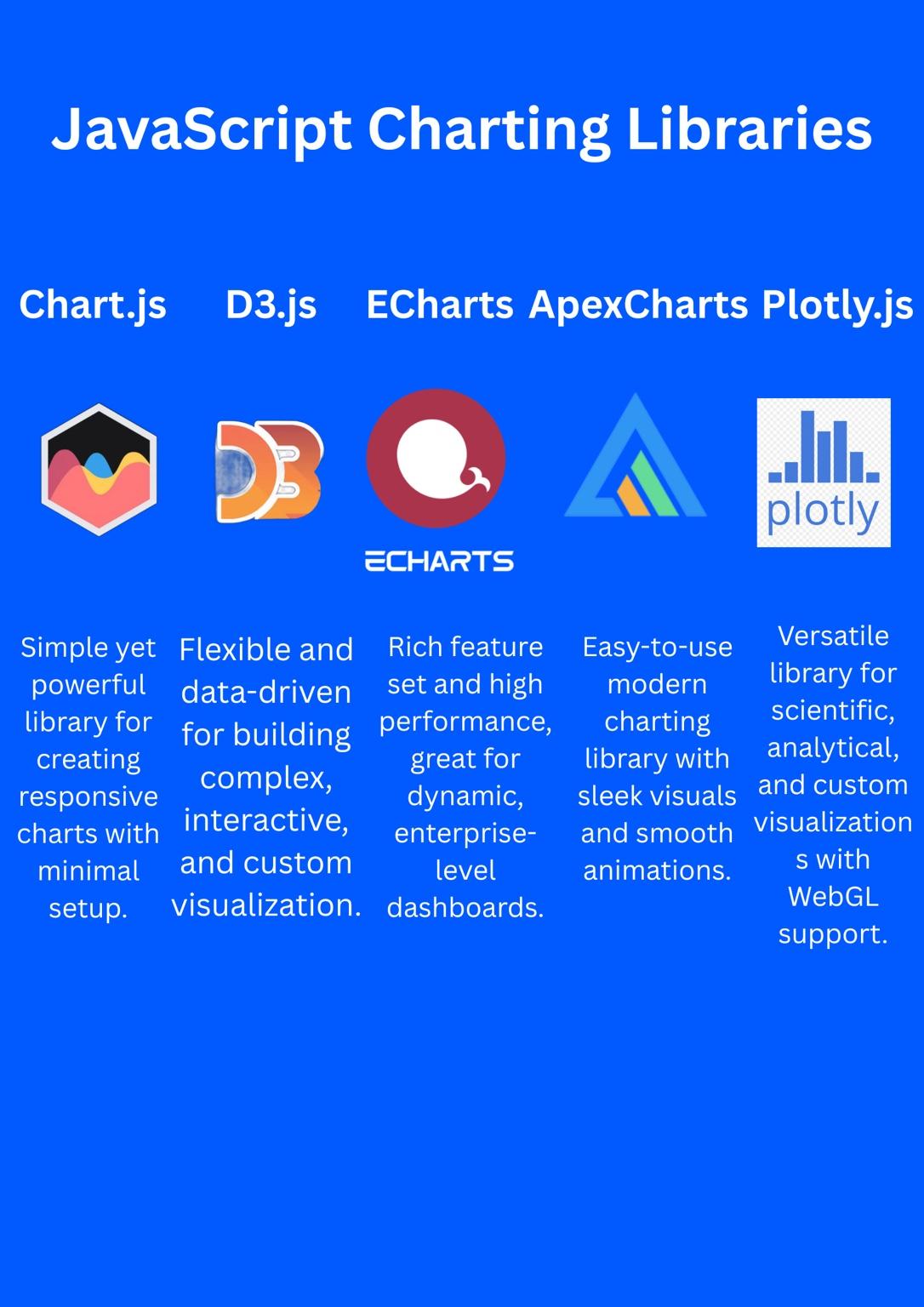
Note: This image summarizes the strengths of the most popular JavaScript charting libraries which is ideal for quick visual comparison.
Each feature listed is grounded in practical scenarios. For instance, Chart.js’s ease of use is demonstrated by its minimal setup and declarative configuration, suitable for quick dashboards.
How to Implement Charting Libraries in JavaScript?
Chart.js
Chart.js is one of the easiest libraries to get started with just include the library, add a canvas element, and configure your chart with a simple JavaScript object. It’s ideal for quickly creating interactive charts with minimal code.
For a full guide on using Chart.js in Angular projects, refer to our guide on Angular + Chart.js tutorial, or explore Vue.js with Chart.js for Vue integration examples.
Note: If you want to run this Chart.js example directly in your browser, wrap it inside a complete HTML document and include the Chart.js library using a <script src="https://cdn.jsdelivr.net/npm/chart.js"></script> tag in the <head>. Running it without this will result in a ReferenceError: Chart is not defined.
Example:
const ctx = document.getElementById('myChart').getContext('2d');
const myChart = new Chart(ctx, {
    type: 'bar',
    data: {
        labels: ['Red', 'Blue', 'Yellow', 'Green', 'Purple', 'Orange'],
        datasets: [{
            label: '# of Votes',
            data: [12, 19, 3, 5, 2, 3],
            backgroundColor: 'rgba(54, 162, 235, 0.6)'
        }]
    },
    options: {
        responsive: true,
        plugins: {
            legend: { display: true },
            tooltip: { enabled: true }
        }
    }
});
.png)
Key Considerations: Chart.js uses Canvas rendering, which improves performance for moderate datasets but limits per-element DOM manipulation. Its plugin architecture allows extending functionality, and options provide granular control over responsiveness and animations.
Note: Chart.js may struggle with very large datasets (e.g., >10,000 points). For optimal performance, consider manually throttling real-time updates and minimizing redraws to avoid frame drops.
D3.js
D3.js (Data-Driven Documents) is a powerful JavaScript library for building complex, interactive data visualizations using SVG, Canvas, and HTML. It gives developers full control over every element on the page, making it ideal for custom, dynamic charts.
Note: If you want to run this D3.js example in your browser, make sure to include the D3 library using a <script src="https://d3js.org/d3.v7.min.js"></script> tag in your HTML <head>. This code should be placed inside a <script> tag within an HTML document that also contains an element like <svg id="mySvg"></svg> in the body. Running it without these will lead to ReferenceError: d3 is not defined or selection errors.
Example:
const data = [12, 19, 3, 5, 2, 3];
const svg = d3.select('#mySvg').attr('width', 400).attr('height', 200);

svg.selectAll('rect')
   .data(data)
   .enter()
   .append('rect')
   .attr('x', (d, i) => i * 40)
   .attr('y', d => 200 - d * 10)
   .attr('width', 35)
   .attr('height', d => d * 10)
   .attr('fill', 'steelblue');
.png)
Key Considerations: D3.js offers unparalleled flexibility by manipulating the DOM directly, enabling custom transitions, scales, and axes.
Note: SVG rendering in D3.js can become sluggish when visualizing thousands of elements. To maintain smooth performance, consider using techniques like virtual scrolling or switching to Canvas rendering for large datasets.
ECharts
ECharts is a high-performance, feature-rich charting library developed by Apache, known for its interactive dashboards and powerful data exploration tools.
Note: To run this ECharts example in a browser, make sure you include the ECharts library using a <script src="https://cdn.jsdelivr.net/npm/echarts@5/dist/echarts.min.js"></script> tag inside your HTML <head>. The chart code should be placed in a <script> block, and your HTML body must contain a container element like <div id="main" style="width: 600px;height:400px;"></div>. Without these, you may encounter echarts is not defined or rendering issues.
Example:
const chart = echarts.init(document.getElementById('main'));
const option = {
    xAxis: { type: 'category', data: ['Mon', 'Tue', 'Wed', 'Thu', 'Fri'] },
    yAxis: { type: 'value' },
    series: [{
        data: [120, 200, 150, 80, 70],
        type: 'bar'
    }],
    tooltip: { trigger: 'axis' },
    toolbox: { feature: { saveAsImage: {} } }
};
chart.setOption(option);
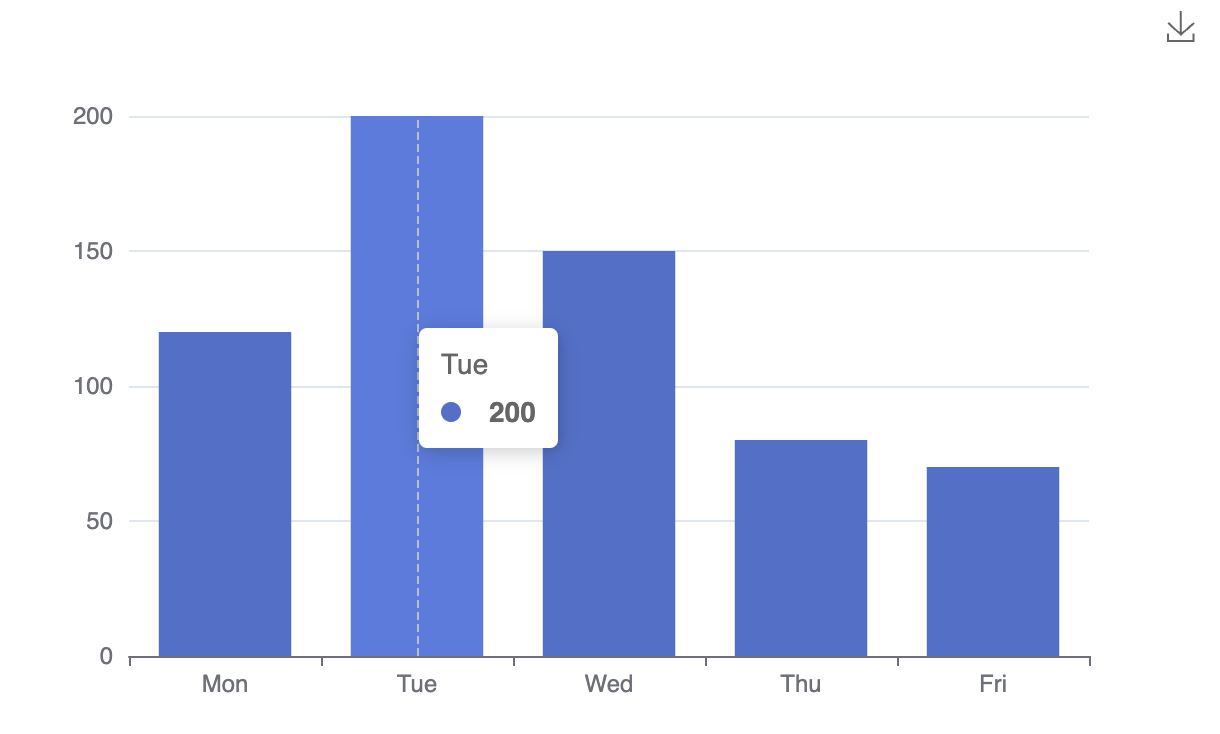
Key Considerations: ECharts supports Canvas rendering with built-in interactions like data zoom, brushing, and toolboxes for exporting, while its JSON-based configuration enables rapid customization without imperative code.
Note: Complex charts with many series can increase memory usage in ECharts. Ensure you properly dispose of chart instances to avoid memory leaks, especially in single-page applications.
ApexCharts
ApexCharts delivers smooth, real-time charts with easy integration and minimal config perfect for fast-paced dashboard development.
If you’re working with SolidJS, here’s a complete tutorial on How to add Charts to SolidJS using ApexCharts that walks through real implementation.
Note: To run this ApexCharts example in your browser, ensure you include the ApexCharts library using a
<script src="https://cdn.jsdelivr.net/npm/apexcharts"></script>tag inside the HTML<head>. The chart code should go inside a<script>tag in the body, and your HTML must contain a container element such as<div id="chart"></div>. Without these, you may encounterApexCharts is not definedor empty chart containers.
Example:
var options = {
    chart: { type: 'line', height: 350 },
    series: [{ name: 'Sales', data: [30, 40, 35, 50, 49, 60] }],
    xaxis: { categories: ['Jan', 'Feb', 'Mar', 'Apr', 'May', 'Jun'] },
    tooltip: { enabled: true },
    responsive: [{ breakpoint: 480, options: { chart: { height: 300 } } }]
};
var chart = new ApexCharts(document.querySelector("#chart"), options);
chart.render();
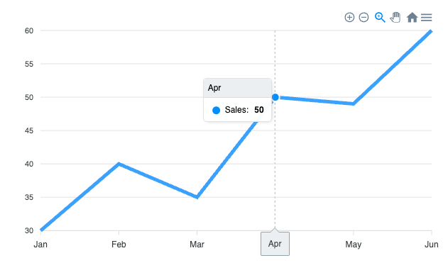
Key Considerations: ApexCharts leverages SVG and Canvas hybrid rendering for smooth animations and responsive layouts. It provides built-in support for real-time updates and integrates well with popular frameworks.
Note: While ApexCharts’ animations enhance visual appeal, using them on large datasets may degrade performance. Consider disabling animations or limiting data points to maintain smooth rendering.
Plotly.js
Plotly.js is a high-level charting library known for its ability to render scientific, statistical, and 3D visualizations with ease. It supports both WebGL and SVG rendering, offering rich interactivity and clean aesthetics out of the box.
Note: To run this Plotly.js example in your browser, include the Plotly library using a
<script src="https://cdn.plot.ly/plotly-latest.min.js"></script>tag in the HTML<head>. Place your chart code inside a<script>block in the body, and ensure you have a container element such as<div id="plot"></div>. Without this setup, you may encounterPlotly is not definedor rendering issues.
Example:
var data = [{
    x: [1, 2, 3, 4],
    y: [10, 15, 13, 17],
    type: 'scatter'
}];
Plotly.newPlot('plot', data);
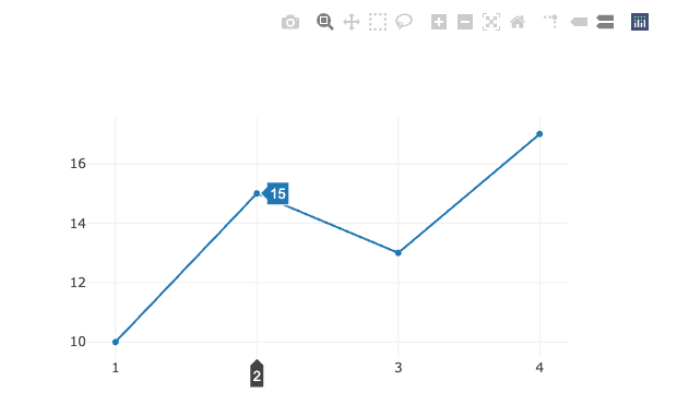
Key Considerations: Plotly.js supports WebGL-accelerated 3D charts, complex statistical plots, and uses a declarative JSON syntax that simplifies defining multi-dimensional data.
Note: Plotly.js has a relatively large bundle size, which may slow initial load times. For simple use cases, this overhead might be unnecessary. Additionally, WebGL support can vary across browsers and devices.
FAQs and Common Mistakes to Avoid
1. What causes performance issues in JavaScript charts?**
Performance problems often stem from unnecessary re-renders or frequent reinitialization of chart instances, especially with rapidly updating data. To avoid lag, use throttling or debouncing to limit update frequency. Prefer Canvas rendering over SVG for large datasets, and offload heavy computations to Web Workers when possible.
2. How do I make my charts responsive across devices?
Avoid fixed pixel dimensions for chart containers, as these can break layouts on mobile devices. Use relative sizing (percentages), CSS media queries, and libraries with native responsiveness (like Chart.js or ApexCharts). Always test across devices and consider maintaining aspect ratios.
3. What are common accessibility mistakes with charts, and how can I address them?
Failing to provide ARIA labels, descriptions, or keyboard navigation can make charts inaccessible. Always add appropriate ARIA attributes, ensure sufficient color contrast, enable keyboard navigation, and offer alternative data representations like tables or summaries.
4. Is it okay to display very large or complex datasets in a single chart?
Overloading charts with too much data or excessive complexity can overwhelm users and degrade performance. Implement data aggregation or sampling to reduce rendered points, use Canvas-based libraries for better performance, and consider server-side processing or virtualization for extremely large datasets. Sometimes, summarizing data or using tables for details is more effective.
5. What should I watch out for when updating chart data?
Yes. Not testing charts across browsers and devices can lead to unexpected rendering issues. Neglecting to optimize for large datasets (e.g., by using Canvas rendering or data sampling) can result in sluggish charts. Also, not cleaning up chart instances when integrating with frameworks (like React or Vue) can cause memory leaks—always clean up on component unmount.
Conclusion
The choice of the best JavaScript charting library mainly depends on the complexity of your project, its performance needs and resources of the development team. Chart.js and ApexCharts are easy to use and responsive, which is a requirement by beginners and dashboard-driven applications. Serious end-users in need of custom visualizations would be well advised to lean on the flexibility that D3.js offers. ECharts is a powerful middle ground with solid enterprise capabilities whereas Plotly.js is a scientific and 3D visualization.
No single library is universally perfect. The right choice is the one that fits your specific data, audience, and development workflow.
Still deciding which library to use?
Test libraries with your real-world datasets and workflows, and explore community examples to inform your choice.
Want to go deeper? Sharpen your fundamentals with our comprehensive JavaScript Coding Series.
Further Reading
- Angular Chart.js with ng2-charts → - Learn how to integrate Chart.js with Angular using the ng2-charts wrapper library for dynamic data visualization
- Add Charts to SolidJS with ApexCharts → - Build interactive charts and graphs in SolidJS applications using the powerful ApexCharts library
- Creating Tables in HTML → - Master the fundamentals of creating and styling data tables in HTML for structured content presentation
- JavaScript Coding Series → - A comprehensive guide covering JavaScript fundamentals, advanced concepts, and best practices for modern web development
Thanks for learning with the DigitalOcean Community. Check out our offerings for compute, storage, networking, and managed databases.
About the author
Building future-ready infrastructure with Linux, Cloud, and DevOps. Full Stack Developer & System Administrator. Technical Writer @ DigitalOcean | GitHub Contributor | Passionate about Docker, PostgreSQL, and Open Source | Exploring NLP & AI-TensorFlow | Nailed over 50+ deployments across production environments.
Still looking for an answer?
This textbox defaults to using Markdown to format your answer.
You can type !ref in this text area to quickly search our full set of tutorials, documentation & marketplace offerings and insert the link!
 This work is licensed under a Creative Commons Attribution-NonCommercial- ShareAlike 4.0 International License.
Become a contributor for community
Get paid to write technical tutorials and select a tech-focused charity to receive a matching donation.

DigitalOcean Documentation
Full documentation for every DigitalOcean product.

Resources for startups and AI-native businesses
The Wave has everything you need to know about building a business, from raising funding to marketing your product.
The developer cloud
Scale up as you grow — whether you're running one virtual machine or ten thousand.

Start building today
From GPU-powered inference and Kubernetes to managed databases and storage, get everything you need to build, scale, and deploy intelligent applications.