By Joe Morgan and Timothy Nolan

The author selected Creative Commons to receive a donation as part of the Write for DOnations program.
Introduction
In this tutorial, you’ll create wrapper components with props using the React JavaScript library. Wrapper components are components that surround unknown components and provide a default structure to display the child components. This pattern is useful for creating user interface (UI) elements that are used repeatedly throughout a design, like modals, template pages, and information tiles.
To create wrapper components, you’ll first learn to use the rest and spread operators to collect unused props to pass down to nested components. Then you’ll create a component that uses the built-in children component to wrap nested components in JSX as if they were HTML elements. Finally, you’ll pass components as props to create flexible wrappers that can embed custom JSX in multiple locations in a component.
During the tutorial, you’ll build components to display a list of animal data in the form of cards. You’ll learn to split data and refactor components as you create flexible wrapping components. By the end of this tutorial, you’ll have a working application that will use advanced prop techniques to create reusable components that will scale and adapt as you application grows and changes.
Note: The first step sets up a blank project on which you will build the tutorial exercise. If you already have a working project and want to go directly to working with props, start with Step 2.
Prerequisites
-
You will need a development environment running Node.js; this tutorial was tested on Node.js version 10.20.1 and npm version 6.14.4. To install this on macOS or Ubuntu 18.04, follow the steps in How to Install Node.js and Create a Local Development Environment on macOS or the Installing Using a PPA section of How To Install Node.js on Ubuntu 18.04.
-
In this tutorial, you will create an app with Create React App. You can find instructions for installing an application with Create React App and general information about how it works at How To Set Up a React Project with Create React App.
-
You will be using React components, which you can learn about in our How To Create Custom Components in React tutorial. It will also help to have a basic understanding of React props, which you can learn about in How to Customize React Components with Props.
-
You will also need a basic knowledge of JavaScript, which you can find in our How To Code in JavaScript series, along with a basic knowledge of HTML and CSS. A good resource for HTML and CSS is the Mozilla Developer Network.
Step 1 — Creating an Empty Project
In this step, you’ll create a new project using Create React App. Then you will delete the sample project and related files that are installed when you bootstrap the project. Finally, you will create a simple file structure to organize your components. This will give you a solid basis on which to build this tutorial’s wrapper application in the next step.
To start, make a new project. In your command line, run the following script to install a fresh project using create-react-app:
- npx create-react-app wrapper-tutorial
After the project is finished, change into the directory:
- cd wrapper-tutorial
In a new terminal tab or window, start the project using the Create React App start script. The browser will auto-refresh on changes, so leave this script running while you work:
- npm start
You will get a running local server. If the project did not open in a browser window, you can open it with http://localhost:3000/. If you are running this from a remote server, the address will be http://your_domain:3000.
Your browser will load with a simple React application included as part of Create React App:

You will be building a completely new set of custom components, so you’ll need to start by clearing out some boilerplate code so that you can have an empty project.
To start, open src/App.js in a text editor. This is the root component that is injected into the page. All components will start from here. You can find more information about App.js at How To Set Up a React Project with Create React App.
Open src/App.js with the following command:
- nano src/App.js
You will see a file like this:
import React from 'react';
import logo from './logo.svg';
import './App.css';

function App() {
  return (
    <div className="App">
      <header className="App-header">
        <img src={logo} className="App-logo" alt="logo" />
        <p>
          Edit <code>src/App.js</code> and save to reload.
        </p>
        <a
          className="App-link"
          href="https://reactjs.org"
          target="_blank"
          rel="noopener noreferrer"
        >
          Learn React
        </a>
      </header>
    </div>
  );
}

export default App;
Delete the line import logo from './logo.svg';. Then replace everything in the return statement to return a set of empty tags: <></>. This will give you a valid page that returns nothing. The final code will look like this:
import React from 'react';
import './App.css';

function App() {
  return <></>;
}

export default App;
Save and exit the text editor.
Finally, delete the logo. You won’t be using it in your application and you should remove unused files as you work. It will save you from confusion in the long run.
In the terminal window type the following command:
- rm src/logo.svg
If you look at your browser, you will see a blank screen.

Now that you have cleared out the sample Create React App project, create a simple file structure. This will help you keep your components isolated and independent.
Create a directory called components in the src directory. This will hold all of you custom components.
- mkdir src/components
Each component will have its own directory to store the component file along with the styles, images if there are any, and tests.
Create a directory for App:
- mkdir src/components/App
Move all of the App files into that directory. Use the wildcard, *, to select any files that start with App. regardless of file extension. Then use the mv command to put them into the new directory:
- mv src/App.* src/components/App
Next, update the relative import path in index.js, which is the root component that bootstraps the whole process:
- nano src/index.js
The import statement needs to point to the App.js file in the App directory, so make the following highlighted change:
import React from 'react';
import ReactDOM from 'react-dom';
import './index.css';
import App from './components/App/App';
import * as serviceWorker from './serviceWorker';

ReactDOM.render(
  <React.StrictMode>
    <App />
  </React.StrictMode>,
  document.getElementById('root')
);

// If you want your app to work offline and load faster, you can change
// unregister() to register() below. Note this comes with some pitfalls.
// Learn more about service workers: https://bit.ly/CRA-PWA
serviceWorker.unregister();
Save and exit the file.
Now that the project is set up, you can create your first component.
Step 2 — Collecting Unused Props with ...props
...propsIn this step, you’ll create a component to display a set of data about a group of animals. Your component will contain a second nested component to display some information visually. To connect the parent and nested component, you’ll use the rest and spread operators to pass unused props from the parent to the child without the parent needing to be aware of the names or types of the props.
By the end of this step, you’ll have a parent component that can provide props to nested components without having to know what the props are. This will keep the parent component flexible, allowing you to update the child component without having to change the parent.
Creating an AnimalCard Component
To start, create a set of data for your animals. First, open a file containing the data set in the components/App directory:
- nano src/components/App/data.js
Add the following data:
export default [
  {
    name: 'Lion',
    scientificName: 'Panthero leo',
    size: 140,
    diet: ['meat']
  },
  {
    name: 'Gorilla',
    scientificName: 'Gorilla beringei',
    size: 205,
    diet: ['plants', 'insects']
  },
  {
    name: 'Zebra',
    scientificName: 'Equus quagga',
    size: 322,
    diet: ['plants'],
  }
]
This list of animals is an array of objects that includes the animal’s name, scientific name, weight, and diet.
Save and close the file.
Next, create a directory for the AnimalCard component:
- mkdir src/components/AnimalCard
Open a new file in the directo:
- nano src/components/AnimalCard/AnimalCard.js
Now add a component that will take the name, diet, and size as a prop and display it:
import React from 'react';
import PropTypes from 'prop-types';

export default function AnimalCard({ diet, name, size }) {
  return(
    <div>
      <h3>{name}</h3>
      <div>{size}kg</div>
      <div>{diet.join(', ')}.</div>
    </div>
  )
}

AnimalCard.propTypes = {
  diet: PropTypes.arrayOf(PropTypes.string).isRequired,
  name: PropTypes.string.isRequired,
  size: PropTypes.number.isRequired,
}
Here you are destructuring the props in the parameter list for the AnimalCard function, then displaying the data in a div. The diet data is listed as a single string using the join() method. Each piece of data includes a corresponding PropType to make sure the data type is correct.
Save and close the file.
Now that you have your component and your data, you need to combine them together. To do that, import the component and the data into the root component of your project: App.js.
First, open the component:
- nano src/components/App/App.js
From there, you can loop over the data and return a new AnimalCard with the relevant props. Add the highlighted lines to App.js:
import React from 'react';
import './App.css';

import animals from './data';
import AnimalCard from '../AnimalCard/AnimalCard';

function App() {
  return (
    <div className="wrapper">
      {animals.map(animal =>
        <AnimalCard
          diet={animal.diet}
          key={animal.name}
          name={animal.name}
          size={animal.size}
        />
      )}
    </div>
  );
}

export default App;
Save and close the file.
As you work on more complex projects, your data will come from more varied places, such as APIs, localStorage, or static files. But the process for using each of these will be similar: assign the data to a variable and loop over the data. In this case, the data is from a static file, so you are importing directly to a variable.
In this code, you use the .map() method to iterate over animals and display the props. Notice that you do not have to use every piece of data. You are not explicitly passing the scientificName property, for example. You are also adding a separate key prop that React will use to keep track of the mapped data. Finally, you are wrapping the code with a div with a className of wrapper that you’ll use to add some styling.
To add this styling, open App.css:
- nano src/components/App/App.css
Remove the boilerplate styling and add flex properties to a class called wrapper:
.wrapper {
    display: flex;
    flex-wrap: wrap;
    justify-content: space-between;
    padding: 20px;
}
This will use flexbox layout to organize the data so it will line up. padding gives some space in the browser window, and justify-content spreads out the extra space between elements.
Save and exit the file. When you do, the browser will refresh and you’ll see some data spaced out.
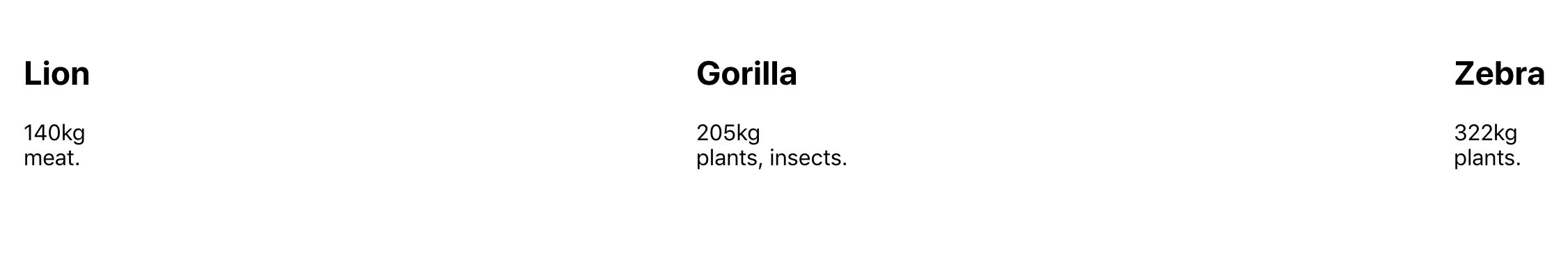
Creating a Details Component
You now have a simple component that displays the data. But let’s say you wanted to give the diet data a little flair by converting the text to an emoji. You can do this by converting the data in your component.
React is designed to be flexible, so when you are thinking about how to convert data, you have a few different options:
- You can create a function inside the component that converts the text to an emoji.
- You can create a function and store it in a file outside the component so that you can reuse the logic across different components.
- You can create a separate component that converts the text to an emoji.
Each approach is fine when applied to the right use case, and you’ll find yourself switching between them as you build an application. To avoid premature abstraction and complexity, you should use the first option to start. If you find yourself wanting to reuse logic, you can pull the function out separately from the component. The third option is best if you want to have a reusable piece that includes the logic and the markup, or that you want to isolate to use across the application.
In this case, we’ll make a new component, since we will want to add more data later and we are combining markup with conversion logic.
The new component will be called AnimalDetails. To make it, create a new directory:
- mkdir src/components/AnimalDetails
Next, open AnimalDetails.js in your text editor:
- nano src/components/AnimalDetails/AnimalDetails.js
Inside the file, make a small component that displays the diet as an emoji:
import React from 'react';
import PropTypes from 'prop-types';
import './AnimalDetails.css';

function convertFood(food) {
  switch(food) {
    case 'insects':
      return '🐜';
    case 'meat':
      return '🍖';
    case 'plants':
    default:
      return '🌱';
  }
}

export default function AnimalDetails({ diet }) {
  return(
    <div className="details">
      <h4>Details:</h4>
      <div>
        Diet: {diet.map(food => convertFood(food)).join(' ')}
      </div>
    </div>
  )
}

AnimalDetails.propTypes = {
  diet: PropTypes.arrayOf(PropTypes.string).isRequired,
}
The AnimalDetails.propTypes object sets up the function to take a prop of diet that is an array of strings. Then inside the component, the code loops over the diet and converts the string to an emoji using the switch statement.
Save and close the file.
You are also importing some CSS, so let’s add that now.
Open AnimalDetails.css:
- nano src/components/AnimalDetails/AnimalDetails.css
Add some CSS to give the element a border and margin to separate the details from the rest of the component:
.details {
    border-top: gray solid 1px;
    margin: 20px 0;
}
We use .details to match the rule to elements with a className of details.
Save and close the file.
Now that you have a new custom component, you can add it to your AnimalCard component. Open AnimalCard.js:
- nano src/components/AnimalCard/AnimalCard.js
Replace the diet.join statement with the new AnimalDetails component and pass diet as a prop by adding the highlighted lines:
import React from 'react';
import PropTypes from 'prop-types';
import AnimalDetails from '../AnimalDetails/AnimalDetails';

export default function AnimalCard({ diet, name, size }) {
  return(
    <div>
      <h3>{name}</h3>
      <div>{size}kg</div>
      <AnimalDetails
        diet={diet}
      />
    </div>
  )
}

AnimalCard.propTypes = {
  diet: PropTypes.arrayOf(PropTypes.string).isRequired,
  name: PropTypes.string.isRequired,
  size: PropTypes.number.isRequired,
}
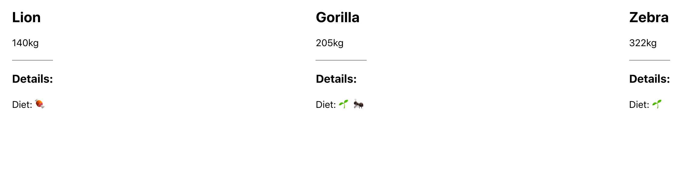
Save the file and you’ll see the new details in the browser.
Passing Details Through a Component with ...props
The components are working well together, but there’s a slight inefficiency in AnimalCard. You are explicitly pulling diet out from the props argument, but you aren’t using the data. Instead, you are passing it through to the component. There’s nothing inherently wrong about this—in fact, it’s often better to err on the side of too much communication. But in doing this, you make your code more difficult to maintain. Whenever you want to pass new data to AnimalDetails, you need to update three places: App, where you pass the props, AnimalDetails, which consumes the prop, and AnimalCard, which is the go-between.
A better way is to gather any unused props inside AnimalCard and then pass those directly to AnimalDetails. This gives you the chance to make changes to AnimalDetails without changing AnimalCard. In effect, AnimalCard doesn’t need to know anything about the props or the PropTypes that are going into AnimalDetails.
To do that, you’ll use the object rest operator. This operator collects any items that are not pulled out during destructuring and saves them into a new object.
Here’s a simple example:
const dog = {
    name: 'dog',
    diet: ['meat']
}

const { name, ...props  } = dog;
In this case, the variable name will be 'dog' and the variable props will be { diet: ['meat']}.
Up till now, you’ve passed all props as if they were HTML attributes, but you can also use objects to send props. To use an object as a prop, you need to use the spread operator—...props—surrounded with curly braces. This will change each key-value pair into a prop.
Open AnimalCard.js:
- nano src/components/AnimalCard/AnimalCard.js
Inside, remove diet from the destructured object and instead collect the rest of the props into a variable called props. Then pass those props directly to AnimalDetails:
import React from 'react';
import PropTypes from 'prop-types';
import AnimalDetails from '../AnimalDetails/AnimalDetails';

export default function AnimalCard({ name, size, ...props }) {
  return(
    <div>
      <h3>{name}</h3>
      <div>{size}kg</div>
      <AnimalDetails
        {...props}
      />
    </div>
  )
}

AnimalCard.propTypes = {
  name: PropTypes.string.isRequired,
  size: PropTypes.number.isRequired,
}
Notice that you can remove the diet PropType since you are not using the prop in this component.
In this case, you are only passing one prop to AnimalDetails. In cases where you have multiple props, the order will matter. A later prop will overwrite earlier props, so if you have a prop you want to take priority, make sure it is last. This can cause some confusion if your props object has a property that is also a named value.
Save and close the file. The browser will refresh and everything will look the same:
To see how the ...props object adds flexibility, let’s pass the scientificName to AnimalDetails via the AnimalCard component.
First, open App.js:
- nano src/components/App/App.js
Then pass the scientificName as a prop:
import React from 'react';
import './App.css';

import animals from './data';
import AnimalCard from '../AnimalCard/AnimalCard';

function App() {
  return (
    <div className="wrapper">
      {animals.map(animal =>
        <AnimalCard
          diet={animal.diet}
          key={animal.name}
          name={animal.name}
          size={animal.size}
          scientificName={animal.scientificName}
        />
      )}
    </div>
  );
}

export default App;
Save and close the file.
Skip over AnimalCard; you won’t need to make any changes there. Then open AnimalDetails so you can consume the new prop:
- nano src/components/AnimalDetails/AnimalDetails.js
The new prop will be a string, which you’ll add to the details list along with a line declaring the PropType:
import React from 'react';
...
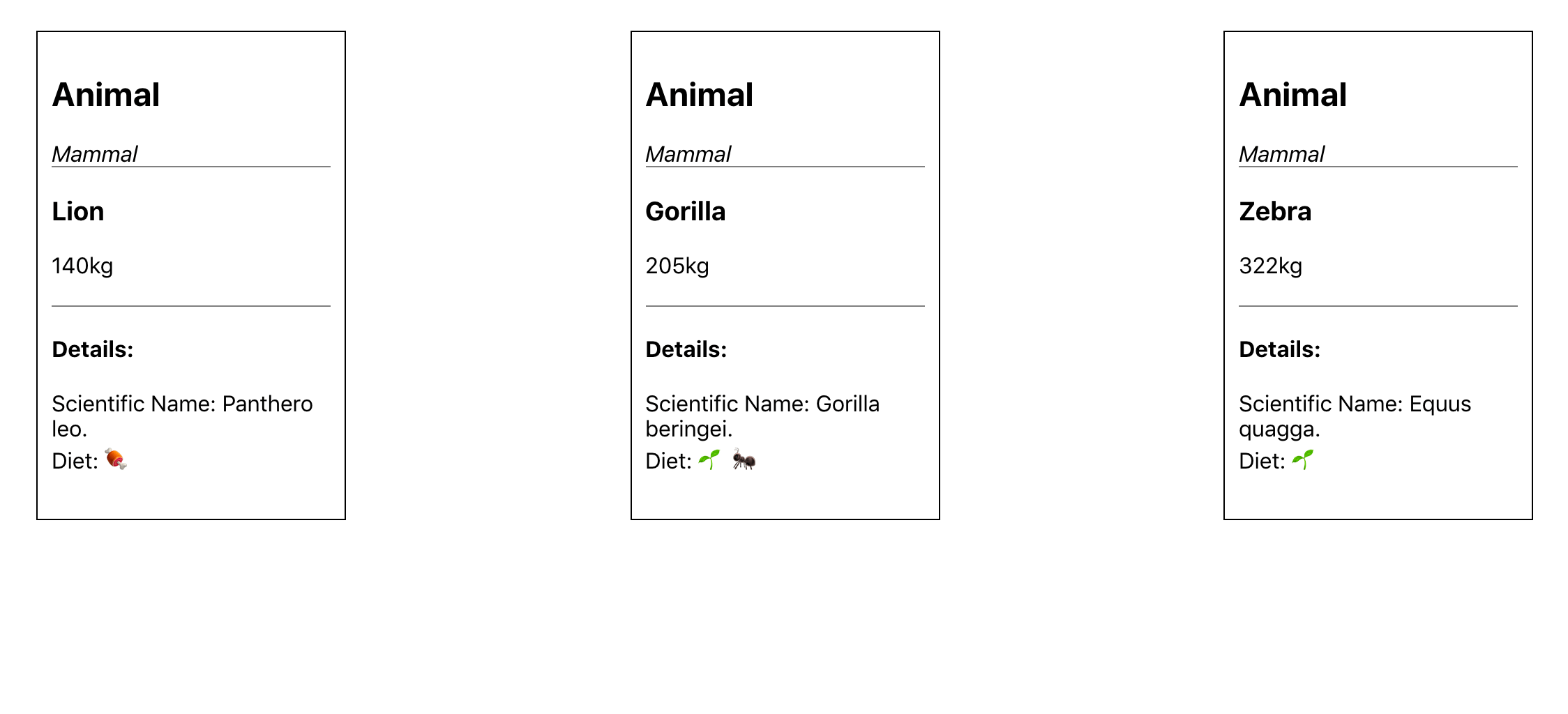
export default function AnimalDetails({ diet, scientificName }) {
return(
<div className="details">
<h4>Details:</h4>
<div>
Scientific Name: {scientificName}.
</div>
<div>
Diet: {diet.map(food => convertFood(food)).join(' ')}
</div>
</div>
)
}
AnimalDetails.propTypes = {
diet: PropTypes.arrayOf(PropTypes.string).isRequired,
scientificName: PropTypes.string.isRequired,
}
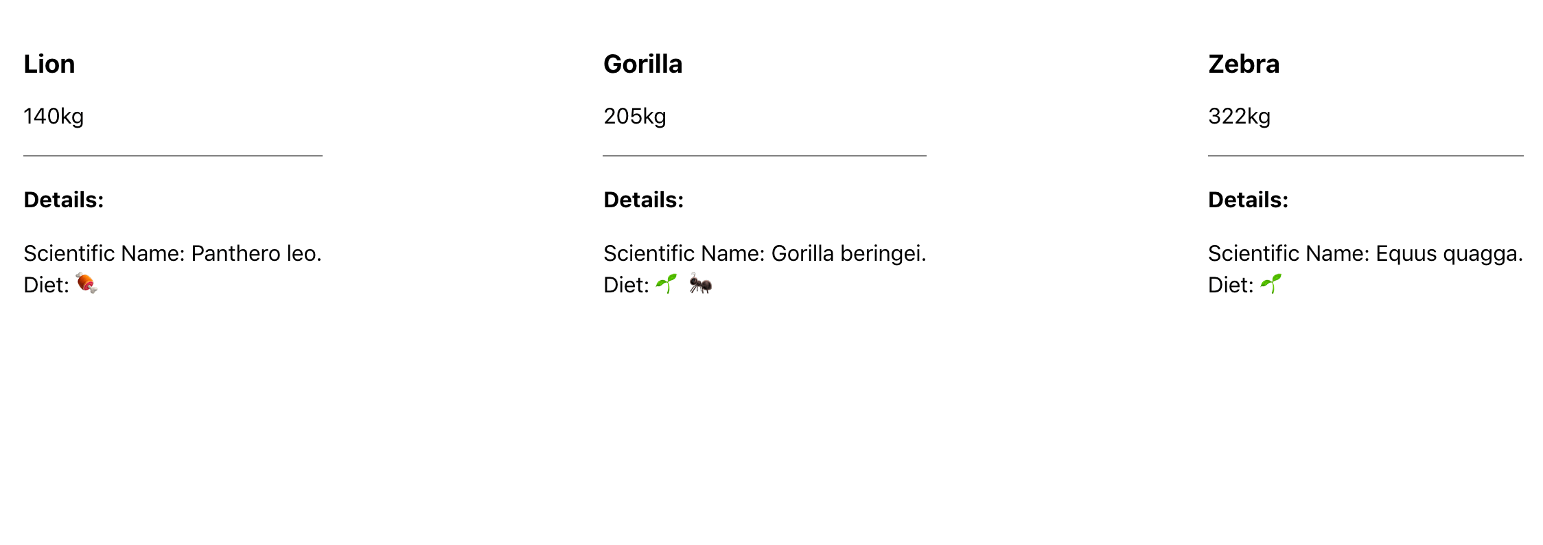
Save and close the file. When you do, the browser will refresh and you’ll see the new details without any changes to the AnimalCard component:
In this step, you learned how to create flexible parent props that can take unknown props and pass them into nested components with the spread operator. This is a common pattern that will give you the flexibility you need to create components with focused responsibilities. In the next step, you’ll create components that can take unknown components as a prop using the built in children prop.
Step 3 — Creating Wrapper Components with children
childrenIn this step, you’ll create a wrapper component that can take an unknown group of components as a prop. This will give you the ability to nest components like standard HTML, and it will give you a pattern for creating reusable wrappers that will let you make a variety of components that need a common design but a flexible interior.
React gives you a built-in prop called children that collects any children components. Using this makes creating wrapper components intuitivie and readable.
To start, make a new component called Card. This will be a wrapper component to create a standard style for any new card components.
Create a new directory:
- mkdir src/components/Card
Then open the Card component in your text editor:
- nano src/components/Card/Card.js
Create a component that takes children and title as props and wraps them in a div by adding the following code:
import React from 'react';
import PropTypes from 'prop-types';
import './Card.css';

export default function Card({ children, title }) {
  return(
    <div className="card">
      <div className="card-details">
        <h2>{title}</h2>
      </div>
      {children}
    </div>
  )
}

Card.propTypes = {
  children: PropTypes.oneOfType([
    PropTypes.arrayOf(PropTypes.element),
    PropTypes.element.isRequired
  ]),
  title: PropTypes.string.isRequired,
}
The PropTypes for the children are new. The children prop can either be a JSX element or an array of JSX elements. The title is a string.
Save and close the file.
Next, add some styling. Open Card.css:
- nano src/components/Card/Card.css
Your card will have a border and a line under the details.
.card {
    border: black solid 1px;
    margin: 10px;
    padding: 10px;
    width: 200px;
}

.card-details {
    border-bottom: gray solid 1px;
    margin-bottom: 20px;
}
Save and close the file. Now that you have your component you need to use it. You could wrap each AnimalCard with the Card component in App.js, but since the name AnimalCard implies it is already a Card, it would be better to use the Card component inside of AnimalCard.
Open up AnimalCard:
- nano src/components/AnimalCard/AnimalCard.js
Unlike other props, you don’t pass children explicitly. Instead, you include the JSX as if they were HTML child elements. In other words, you just nest them inside of the element, like the following:
import React from 'react';
import PropTypes from 'prop-types';
import Card from '../Card/Card';
import AnimalDetails from '../AnimalDetails/AnimalDetails';

export default function AnimalCard({ name, size, ...props }) {
  return(
    <Card title="Animal">
      <h3>{name}</h3>
      <div>{size}kg</div>
      <AnimalDetails
        {...props}
      />
    </Card>
  )
}

AnimalCard.propTypes = {
  name: PropTypes.string.isRequired,
  size: PropTypes.number.isRequired,
}
Unlike a React component, you do not need to have a single root element as a child. That’s why the PropType for Card specified it could be an array of elements or a single element. In addition to passing the children as nested components, you are giving the card a title of Animal.
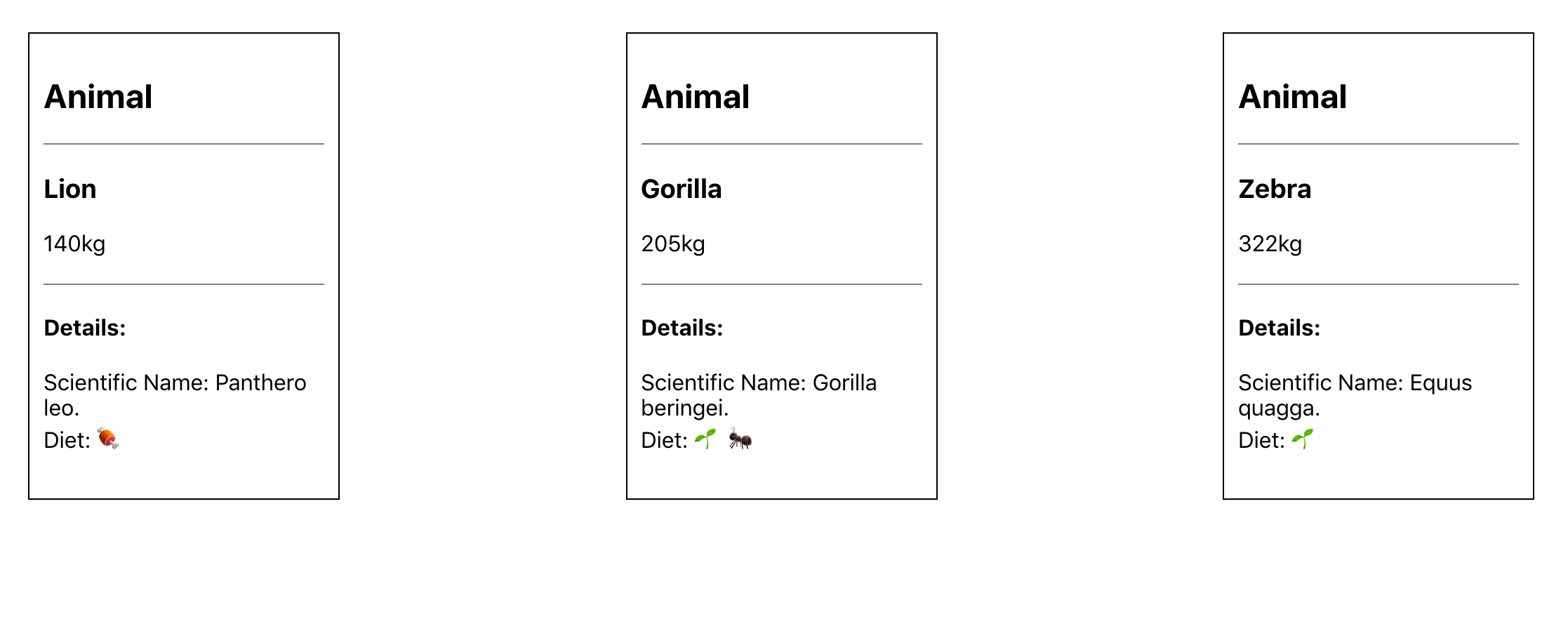
Save and close the file. When you do, the browser will refresh and you’ll see the updated card component.
Now you have a reusable Card component that can take any number of nested children. The primary advantage of this is that you can reuse the Card with any arbitrary component. If you wanted to make a Plant card, you could do that by wrapping the plant information with the Card component. It doesn’t even need to relate at all: If you wanted to reuse the Card component in a completely different applications that lists things like music or account data, you could do that, too. The Card component doesn’t care what the children are; you are just reusing the wrapper element, which in this case is the styled border and title.
The downside to using children is that you can only have one instance of the child prop. Occasionally, you’ll want a component to have custom JSX in multiple places. Fortunately, you can do that by passing JSX and React components as props, which we will cover in the next step.
Step 4 — Passing Components as Props
In this step, you’ll modify your Card component to take other components as props. This will give your component maximum flexibility to display unknown components or JSX in multiple locations throughout the page. Unlike children, which you can only use once, you can have as many components as props, giving your wrapper component the ability to adapt to a variety of needs while maintaining a standard look and structure.
By the end of this step, you’ll have a component that can wrap children components and also display other components in the card. This pattern will give you flexibility when you need to create components that need information that is more complex than simple strings and integers.
Let’s modify the Card component to take an arbitrary React element called details.
First, open the Card component:
- nano src/components/Card/Card.js
Next, add a new prop called details and place it below the <h2> element:
import React from 'react';
import PropTypes from 'prop-types';
import './Card.css';

export default function Card({ children, details, title }) {
  return(
    <div className="card">
      <div className="card-details">
        <h2>{title}</h2>
        {details}
      </div>
      {children}
    </div>
  )
}

Card.propTypes = {
  children: PropTypes.oneOfType([
    PropTypes.arrayOf(PropTypes.element),
    PropTypes.element.isRequired
  ]),
  details: PropTypes.element,
  title: PropTypes.string.isRequired,
}

Card.defaultProps = {
  details: null,
}
This prop will have the same type as children, but it should be optional. To make it optional, you add a default value of null. In this case, if a user passes no details, the component will still be valid and will not display anything extra.
Save and close the file. The page will refresh and you’ll see the same image as before:
Now add some details to the AnimalCard. First, open AnimalCard.
- nano src/components/AnimalCard/AnimalCard.js
Since the Card component is already using children, you’ll need to pass the new JSX component as a prop. Since these are all mammals, add that to the card, but wrap it in <em> tags to make it italic.
import React from 'react';
...

export default function AnimalCard({ name, size, ...props }) {
  return(
    <Card title="Animal" details={<em>Mammal</em>}>
      <h3>{name}</h3>
      <div>{size}kg</div>
      <AnimalDetails
        {...props}
      />
    </Card>
  )
}
...
Save the file. When you do, the browser will refresh and you’ll see the update, including the phrase Mammal.
This prop is already powerful because it can take JSX of any size. In this example, you added only a single element, but you could pass as much JSX as you wanted. It also doesn’t have to be JSX. If you have a complicated markup for example, you wouldn’t want to pass it directly in the prop; this would be difficult to read. Instead, you could create a separate component and then pass the component as a prop.
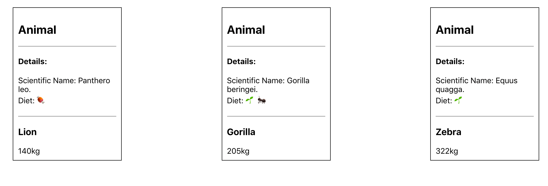
To see this at work, pass AnimalDetails to the details prop:
import React from 'react';
...

export default function AnimalCard({ name, size, ...props }) {
  return(
    <Card
      title="Animal"
      details={
        <AnimalDetails
          {...props}
        />
      }
    >
      <h3>{name}</h3>
      <div>{size}kg</div>
    </Card>
  )
}
...
AnimalDetails is more complicated and has a number of lines of markup. If you were to add it directly to details, it would increase the prop substantially and make it difficult to read.
Save and close the file. When you do, the browser will refresh and the details will appear at the top of the card.
Now you have a Card component that can take custom JSX and place it in multiple spots. You are not restricted to a single prop; you can pass elements to as many props as you want. This gives you the ability to create flexible wrapping components that can give other developers the opportunity to customize a component while retaining its overall style and functionality.
Passing a component as a prop isn’t perfect. It’s a little more difficult to read and isn’t as clear as passing children, but they are just as flexible and you can use as many of them as you want in a component. You should use children first, but don’t hesitate to fall back to props if that is not enough.
In this step, you learned how to pass JSX and React components as props to another component. This will give your component the flexibility to handle many situations where a wrapper component may need multiple props to handle JSX or components.
Conclusion
You have created a variety of wrapping components that can display data flexibly while keeping a predictable look and structure. You created components that can collect and pass unknown props to nested components. You also used the built-in children prop to create wrapper components that can handle an arbitrary number of nested elements. Finally, you created a component that can take JSX or React components as a prop so that your wrapper component can handle multiple instances of different customizations.
Wrapper components give you the ability to adapt to unknown circumstances while also maximizing code reuse and consistency. This pattern is useful for creating basic UI elements that you will reuse throughout an application including: buttons, alerts, modals, slide shows, and more. You’ll find yourself returning to it many times.
If you would like to look at more React tutorials, check out our React Topic page, or return to the How To Code in React.js series page.
Thanks for learning with the DigitalOcean Community. Check out our offerings for compute, storage, networking, and managed databases.
Tutorial Series: How To Code in React.js
React is a popular JavaScript framework for creating front-end applications, such as user interfaces that allow users to interact with programs. Originally created by Facebook, it has gained popularity by allowing developers to create fast applications using an intuitive programming paradigm that ties JavaScript with an HTML-like syntax known as JSX.
In this series, you will build out examples of React projects to gain an understanding of this framework, giving you the knowledge you need to pursue front-end web development or start out on your way to full stack development.
Browse Series: 21 tutorials
About the author(s)
Author of Simplifying JavaScript. Writing featured in Slate, FreeCodeCamp, and here! I like to break things and put them back together. 🛠
Former Senior Technical Editor at DigitalOcean, fiction writer and podcaster elsewhere, always searching for the next good nautical pun! Areas of expertise include Node.js, PostgreSQL, CSS, JavaScript.
Still looking for an answer?
This textbox defaults to using Markdown to format your answer.
You can type !ref in this text area to quickly search our full set of tutorials, documentation & marketplace offerings and insert the link!
 This work is licensed under a Creative Commons Attribution-NonCommercial- ShareAlike 4.0 International License.
Become a contributor for community
Get paid to write technical tutorials and select a tech-focused charity to receive a matching donation.

DigitalOcean Documentation
Full documentation for every DigitalOcean product.

Resources for startups and AI-native businesses
The Wave has everything you need to know about building a business, from raising funding to marketing your product.
The developer cloud
Scale up as you grow — whether you're running one virtual machine or ten thousand.

Start building today
From GPU-powered inference and Kubernetes to managed databases and storage, get everything you need to build, scale, and deploy intelligent applications.
