By Adrien Payong and Shaoni Mukherjee

Introduction
Vision-Language Models (VLMs) are multimodal AI models that understand both visual data (images, videos) and natural language text. These models enable joint visual-language tasks such as image captioning, visual question answering, and cross-modal retrieval by connecting and interpreting images and text together. Recent large VLMs have achieved strong performance across a wide range of tasks, from generating image descriptions to answering detailed questions about image content. Yet these models are still “black boxes” internally – their inner workings are not well understood. This lack of transparency limits their reliability, fairness, and robustness for high-impact applications. Experts agree we need more interpretability to build trustworthy VLMs. By visualizing and explaining the internals of vision-language models, we can better interpret model reasoning, diagnose errors or biases, and guide future model design and user trust.
In this article, we will go over how vision-language models work internally and the importance of visualization. Next, we will introduce various techniques for visualizing VLMs and provide resources for tools that implement them. Case studies will show what visualizations can reveal about multimodal reasoning or model idiosyncrasies. We will conclude with best practices for visual explanations. By making VLMs more explainable, engineers and researchers can better debug models, detect biases, improve performance, and gain conceptual insights into how these models align and reason about images and text.
Key Takeaways
- Visualization techniques are particularly important to open the black box of VLMs. This allows practitioners to gain insights into which regions models attend to, how they align modalities, and whether their predictions are based on visual evidence rather than linguistic biases.
- Different visualization techniques answer different interpretability questions: attention maps show cross-modal focus, Grad-CAM highlights causal influence, embedding projections reveal global semantic structure, and token/patch-level analyses expose internal mechanisms of heads and neurons.
- Visualizations are often used to diagnose failure cases or hallucinations. For example, we can detect that attention is drifting to irrelevant image regions or the embedding space is clustering around spurious patterns. Such analyses can be important for debugging models and increasing their reliability.
- Combining multiple visualization methods provides more trustworthy insights because no single technique is definitive; agreement across attention, saliency, embeddings, and causal masking signals robust explanations.
- Tools for visualizing the inner workings of VLMs, including Captum, Grad-CAM libraries, VL-InterpreT, and TensorBoard Projector, can be used to detect biases in a model, debug, and fine-tune a model’s architecture. This will help to build more interpretable and transparent multimodal systems.
How Vision-Language Models Process Data
At a high level, a VLM typically comprises three main components: an image encoder, a text encoder, and a mechanism for cross-modal fusion or alignment. The image encoder, usually a convolutional network or Vision Transformer, encodes the visual input (pixels) into a set of image features or embeddings. The text encoder, often a Transformer-based model, similarly encodes the natural language input (words or captions) into a sequence of textual embeddings. The key is how the two are combined: some models learn a shared or joint embedding space, others do cross-modal fusion using attention mechanisms or gating.
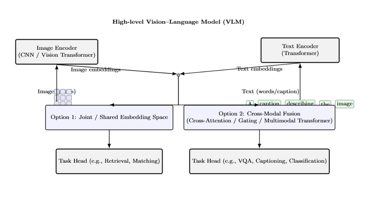
The above diagram provides a high-level architectural overview of VLMs. It describes how an image encoder (CNN or Vision Transformer) and a text encoder (Transformer) extract embeddings from images and texts. It then enlists two primary approaches to multimodal fusion.
Other VLM architectures adopt a tighter coupling between vision and language. Some models use a unified transformer that processes image regions alongside text tokens through a cross-attention layer. Models such as UNITER, VinVL, or BLIP-2 use a cross-modal encoder that allows the text to attend to visual features (and vice versa), to fuse the modalities inside the network.
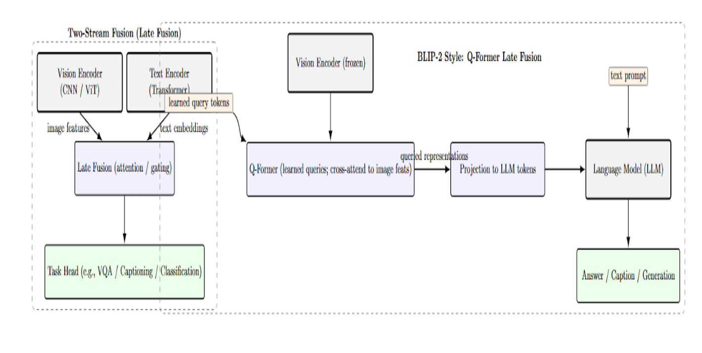
There are other approaches, such as “two-stream” fusion architectures with separate streams for vision and text, using late fusion via attention or gating. For example, BLIP-2 features a lightweight Query Transformer (Q-Former) that queries image features and provides the output to a language model.
Understanding the details of the processing pipeline – image encoding, text encoding, feature alignment/fusion – is the first step towards demystifying a VLM’s behavior. However, to really understand a model, you need to look under the hood and see what it is actually doing with a given image and text. This is where visualization comes in. By looking at the internal activations (attention patterns, embedding clusters, etc.), we can start answering questions such as: Which regions of the image are relevant for the model’s interpretation of the caption? How do image patches relate to words in the latent space? Is the model attending to the right objects for the right reason? In the following sections, we will see why these questions are important and how we can visualize the answers.
Why Visualize Vision-Language Models?
- Explainability and Trust: Today’s state-of-the-art VLMs are powerful, with billions of parameters, making them effective but also opaque black boxes. Visualization is a form of explanation, it provides insight into how a model makes a prediction. This can help make models more interpretable by “opening up” the black box of how they align vision and language. Visualizations can show where a model is “looking” in an image, or what words it attends to when given a sentence or image. This will allow us to better understand (and trust or distrust) its reasoning.
- Understanding Failure Cases: Visualization is a particularly useful tool for understanding when a vision-language model fails, when it generates an incorrect caption, produces a wrong answer, etc. By visualizing the internals of the model – its attention or activation maps, it is often possible to diagnose the cause of failure. Is the model focusing on an incorrect (background) region of the image instead of the main subject? Did it incorrectly associate a word with the wrong region, etc?
- Bias Detection: Vision-language models can (unwittingly) learn biases or spurious associations from their training data. Visualization can help detect them. For example, if a model attends to gender/racial cues in an image when they are not relevant for the caption/task, this would be highlighted in the attention heatmap. Visualizing and plotting the learned image–text embeddings can also reveal image or text clusters formed along attributes that should not be predictive of the label/task.
- Better Model Fine-tuning and Design: Visualizing the internals of a VLM can also help in designing or fine-tuning them. If we can understand which parts of the model ( layers, heads, neurons, etc.) correspond to good or bad behavior, it will help fine-tune or edit the model to improve it. For example, if we find that some attention heads specialize in aligning particular image and text features (e.g., one head always associates color words with color regions in the image), we can learn to monitor or amplify those during fine-tuning.
We have established the “why”: visualization is important for many practical tasks when developing and using VLMs. Let’s now see the “how”. The following section surveys various visualization techniques for VLMs.
Visualization Techniques for VLMs
Two common questions when interpreting a vision-language model are: (1) Where is the model looking at? and (2) How are images and text encoded internally? Different visualization methods approach the two questions from different angles. We will review several major visualization techniques in this section. Each technique gives a unique perspective on the model’s multimodal reasoning.
Attention Maps and Cross-Modal Alignment
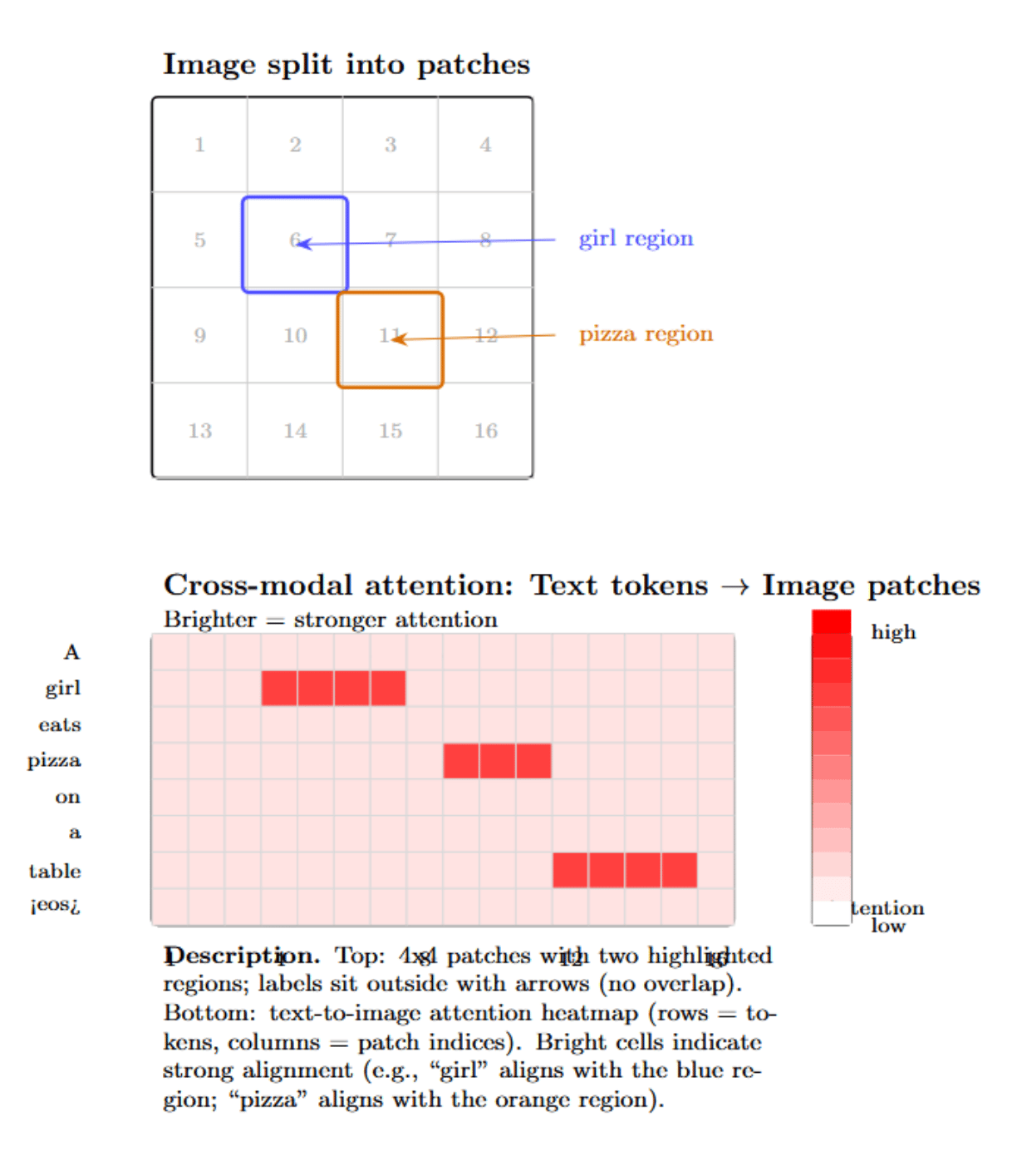
A fairly straightforward approach to understanding a VLM is to visualize its attention mechanisms. Many VLMs are based on transformer architectures that include self-attention layers (and often cross-attention layers) that specify which tokens “attend to” or “look at” which other tokens. This attention information can be extracted and converted into a heatmap indicating, for example, how strongly each image patch “looks at” each word (or, in the other direction, how strongly each word attends to each image patch).
Attention between vision and language (for those models that have it) can be laid out in a matrix with one axis representing image regions (or patch indices) and the other axis being text tokens. A heatmap of this matrix can immediately show alignment: which words are strongly related to which parts of the image.
Tools like VL-InterpreT are designed to produce cross-modal attention visualizations in a human-readable form that highlight the links between image patches and text tokens. For example, if a model is captioning an image, by inspecting the cross-attention from the decoder’s & last layer, we could see that the word “pizza” highly attends to an image patch covering a round object on a table, whereas “girl” highly attends to a patch around a human figure.
We can also get similar visualizations for models like CLIP, which do not have explicit cross-attention (because the image and text are encoded separately). We can do this by computing the similarity between each image patch embedding and each word embedding in a given description. Then, plotting these similarities as a grid. This will produce a heatmap of image–text alignment.
Attention map visualization is a fundamental technique of probing the alignment between image and text modalities. This visualization can answer the questions of “who attends to what”, providing some insights into the model’s reasoning process. However, the attention is only a small part of the underlying deep latent space where multimodal information is embedded in VLMs. We will now move to a more global view of this representation space.
Embedding Space Projections (Latent Space Visualization)
Vision-language models typically learn to represent images and text in a shared latent space. Dimensionality reduction can provide insight into the geometric properties of this space. In particular, we can project high-dimensional image/text embeddings from a V-L model into a 2-dimensional space for visualization. This is usually done with methods such as t-SNE or UMAP, which attempt to produce a 2D scatter plot in which similarity is preserved as much as possible; points that cluster together in 2D should ideally correspond to embeddings that were near in the original space (i.e., the model views them as semantically similar).
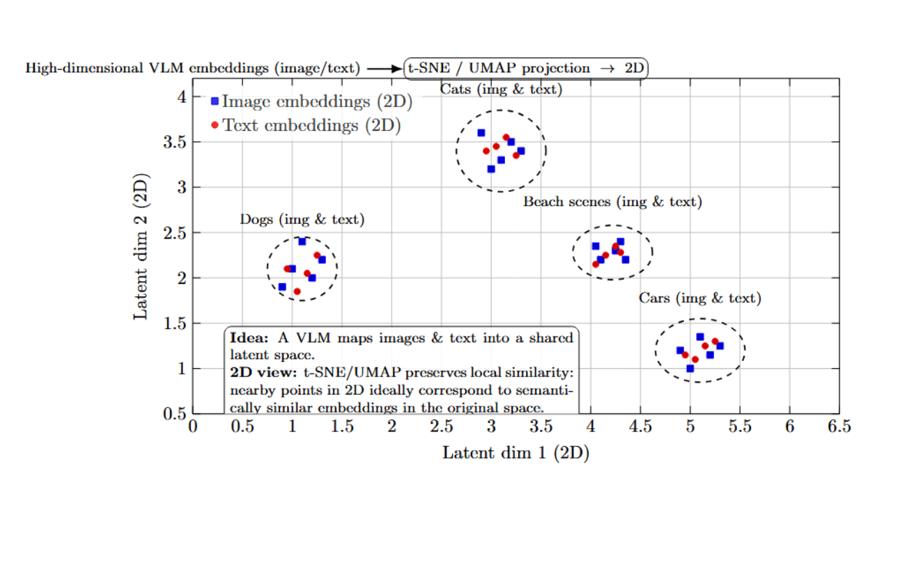
It is often possible to visualize a striking structure in these kinds of projections. It is common to see well-separated clusters of semantically related points, even across modalities. For instance, suppose we embedded a set of images of different animals along with a few descriptive words. In this case, we might see all the images of dogs and the word “dog” form a tight cluster in one part of the space, and all the images of cats and the word “cat” form a separate cluster nearby.
With an embedding projector (e.g., the TensorBoard Projector, or a similar tool), we can interactively explore clusters of points in this space, even hover over individual points to find out which image/text they correspond to. This can be used to answer qualitative questions about what different points in the space represent: Does the model treat this image of a zebra as more similar to a horse or more similar to a striped object? If we find the embedding for this zebra image near “horse” and far from unrelated terms, that’s encouraging. But if it ends up in a strange part of the space that seems close to, say, “striped dress” images, we might suspect unusual behavior in the model’s interpretation of patterns.
Visualizations of multimodal embeddings with t-SNE/UMAP provide a high-level map of the model’s “knowledge space.” By inspecting the clusters and neighbors in these plots, we can check that the model is organizing information in a meaningful way. Remember that dimensionality reduction distorts some distances, but it can still be a useful exploratory tool. A best practice is to use multiple methods (PCA, t-SNE, UMAP) and look for consistent structures.
Visual Explanations with Saliency and Grad-CAM
Attention maps are derived from the model’s internal weights. Gradient-based saliency maps provide an alternative. Rather than highlighting which parts of the model pay attention to which parts of the input, we ask which parts of the input would most change the output if we perturbed them. A common example of this is Grad-CAM (Gradient-weighted Class Activation Mapping), which was initially developed for CNNs but can be adapted to VLMs. Grad-CAM involves computing the gradient of a target output (such as the score for a certain class or the probability of a generated text token) with respect to an intermediate feature map (such as convolutional feature maps or transformer patch embeddings), and using those gradients to weight the feature map activations. The result is a heatmap of the image, with brighter regions indicating they contributed more strongly to that output.
For VLMs, we might run Grad-CAM on the image encoder to explain a zero-shot classification prediction, or on the cross-attention to explain why a certain answer was generated. For example, suppose CLIP predicts the most likely label for an image to be “a dog”. We can backpropagate from the “dog” similarity score to the last convolutional layer of the image encoder, and visualize the Grad-CAM.
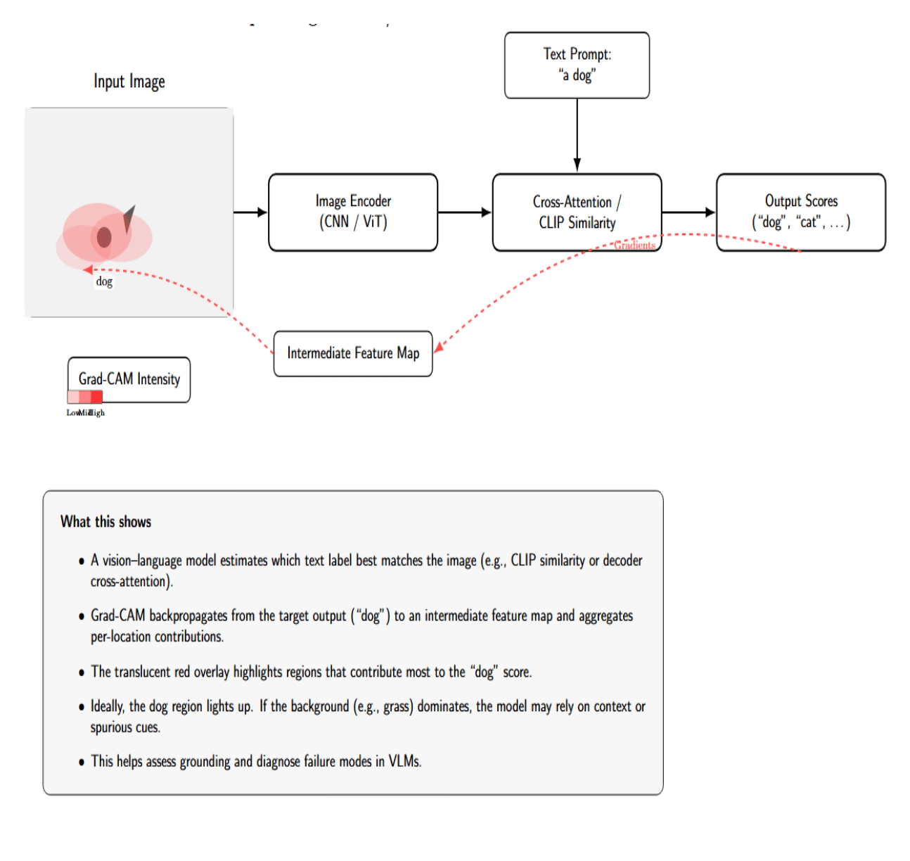
This would generate an attention heatmap over the image, which we’d hope would be focused on the dog in the photo if that’s what caused the classification. If the heatmap instead highlighted the background (such as a patch of grass) more than the dog, that could suggest the model relied on context or a spurious correlation (such as having learned that dogs are often on grass).
Grad-CAM and similar saliency methods (such as Guided Backpropagation, SmoothGrad, and Integrated Gradients) can be applied to the text side of a VLM. For instance, if I want to know which words in a prompt affect an image retrieval result, I can see how slightly perturbing each word affects the output.
Another application of Grad-CAM to multimodal models is to explain image captioning or VQA answers. Instead of using the model’s image region classification, we can treat the generated text token probabilities as the model’s output and backpropagate to the image. If a VQA model answered “Yes, the person is holding a pizza.” We could compute which pixels most contributed to the output “pizza” token. The resulting heatmap would (hopefully) highlight the pizza that the person is holding in the image. If it instead highlighted something else, we’d have reason to suspect that the model’s internal reasoning was misguided (or the answer was a lucky guess). This technique is related to the interpretation of attention maps, but doesn’t depend only on attention weights. We use the gradients of the model, which can sometimes provide different information than attention weights (as not all information comes from large attention weights).
Token and Patch-level Interpretability
Beyond high-level attention/saliency maps, sometimes people are interested in token-level or even patch-level interpretability of VLMs’ internals. This can be token/attention head-level analyses of what individual neurons or heads are meant to do semantically. In NLP, it has been observed that different transformer heads often specialize in different roles, such as syntactic roles (heads that attend from verb to subject, etc). We can have a look at the diagram below:
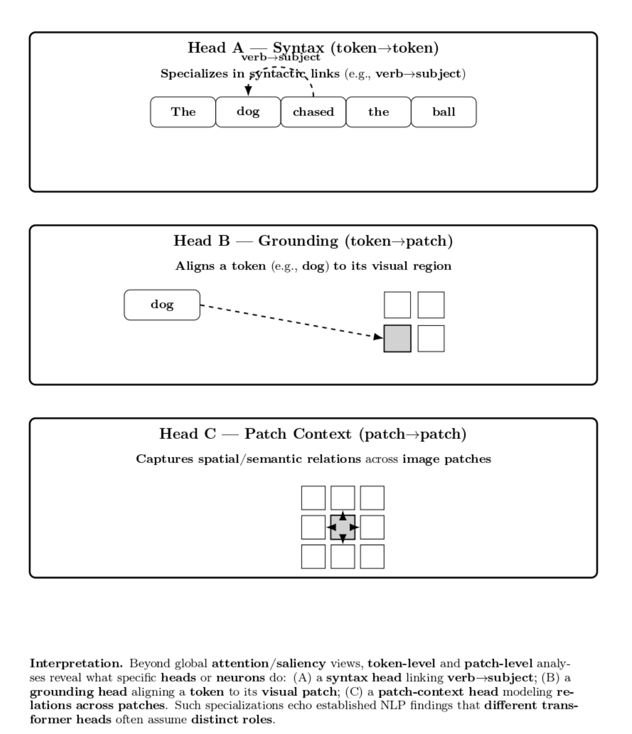
Some more advanced interpretability analyses use methods such as probing classifiers: pass the hidden embeddings of a VLM through a small trainable classifier to predict some attribute (e.g., does this patch contain an animal?). If the classifier achieves good performance, that indicates the concept is encoded in that layer’s representation. Visualization could be mapping the probe’s confidence to a heatmap on the image, showing the parts of the image the model detected as containing the concept. E.g., a probe can show that by layer 5, the image encoder of a VLM has learned neurons that highly activate on regions containing text in the image (before the model’s language module sees the text).
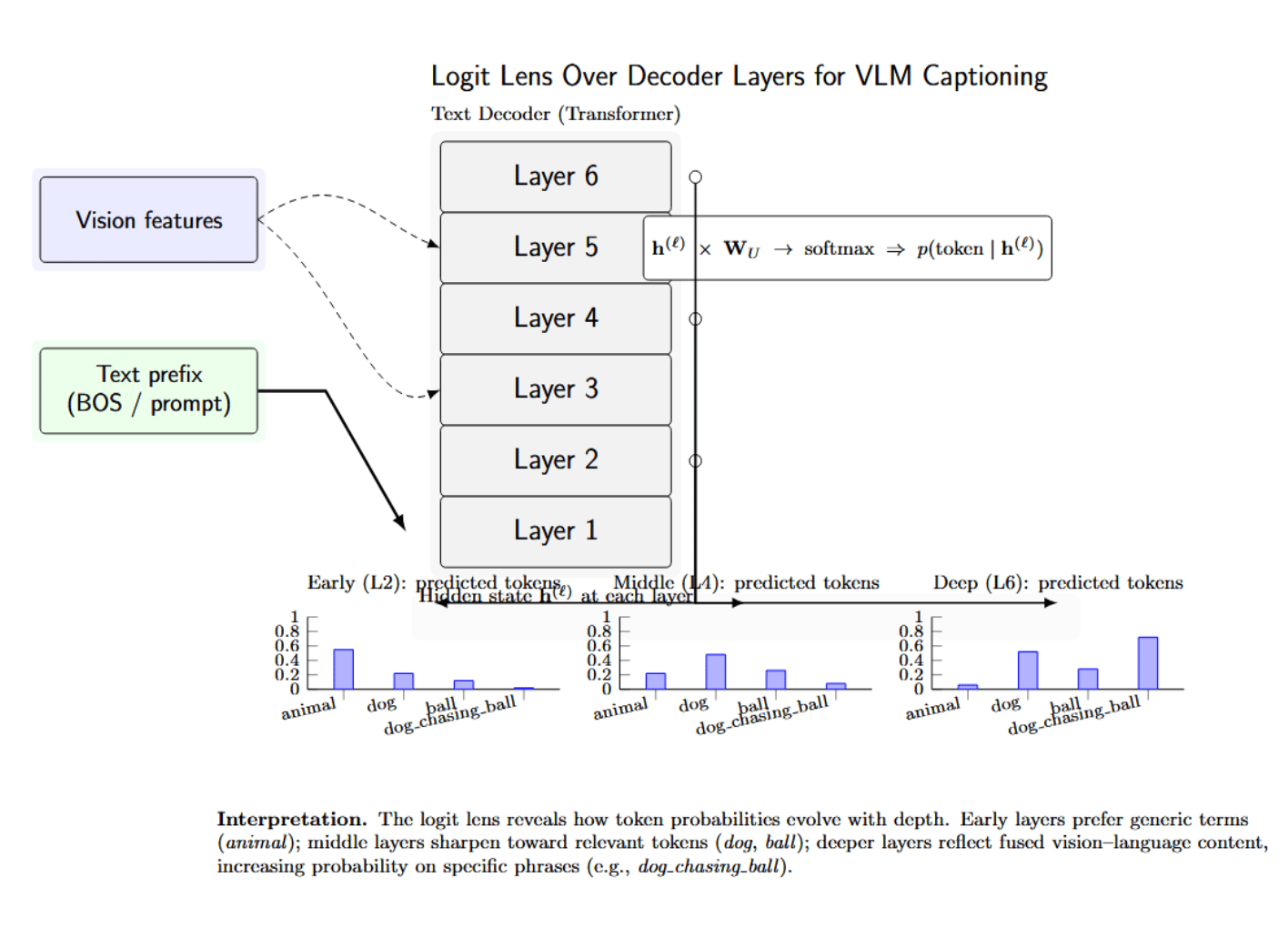
Another line of work instead visualizes how representations progress across layers. The logit lens technique backprojects each transformer layer’s intermediate hidden states into the vocabulary space by multiplying by the final unembedding matrix of the model, and applying a softmax function. This produces an interpretable visualization of the model’s evolving prediction distribution across layers.
In vision-language models, the logit lens can be applied to the captioning process to see how predicted words change as the model “reasons” and incorporates more visual information, layer by layer. For example, early layers may predict general or uncertain terms such as “animal”, while deeper layers that combine vision and language features may predict more confident and specific phrases such as “dog chasing ball”. This layer-by-layer visualization can be an effective means of illustrating the model’s “thought process” or reasoning as it decodes from visual inputs to natural language.
In the more practical setting of using a VLM for a particular application, token-level interpretations can provide feedback about which parts of the model to trust, prune, or adjust. For instance, if you find a particular neuron that always fires when there is snow in an image (context-free), you might use that information to bias the model to include that in the caption. If an attention head attends to irrelevant tokens (e.g., it always focuses on the first word of the caption regardless of context), that might be a candidate you want for pruning or further training.
Alignment and Similarity Heatmaps
We mentioned this in the attention section, but we wanted to make a special note of visualization techniques that help to illustrate this explicit alignment. In two-tower models such as CLIP, a simple but informative visualization is a similarity matrix between a batch of image embeddings and a batch of text embeddings. Suppose you have N images and M text queries (captions or labels).
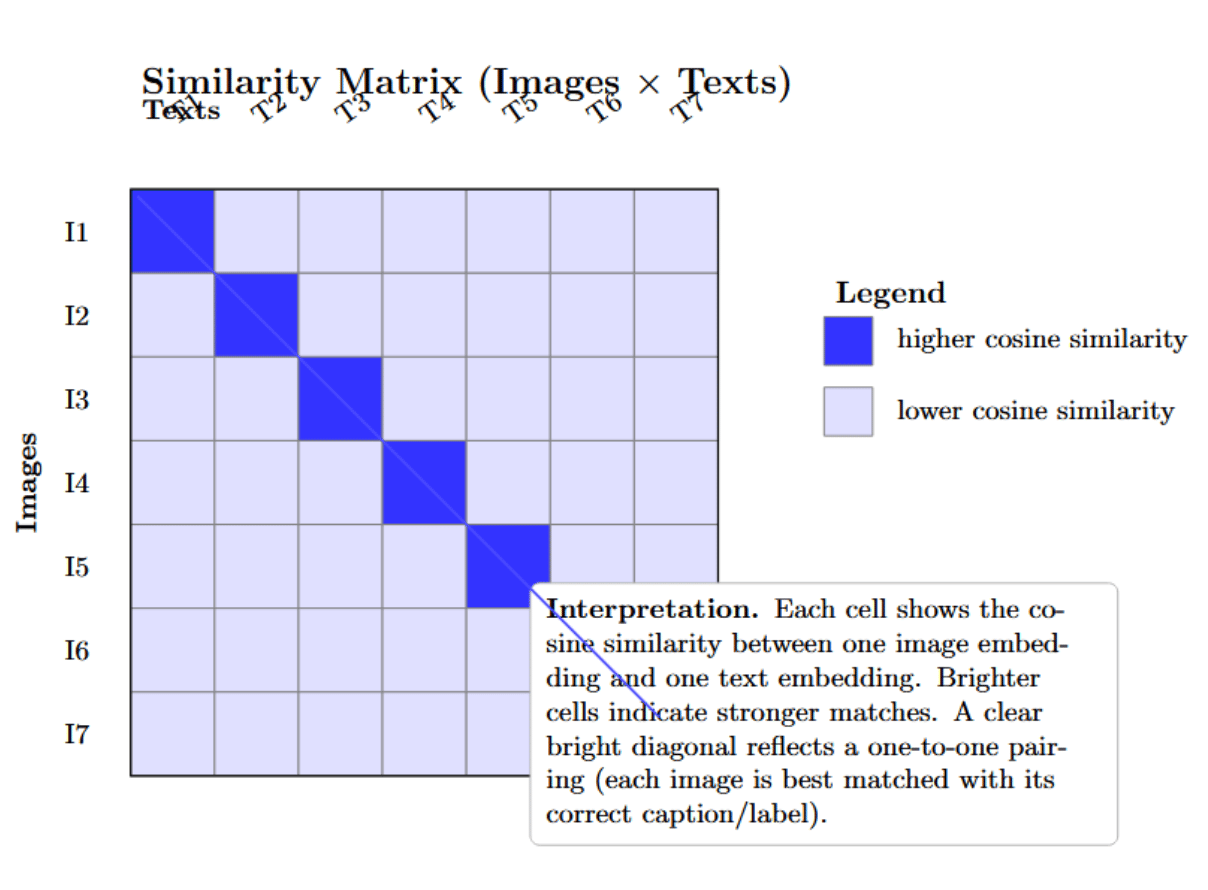
You can calculate the N×M matrix of pairwise cosine similarities. A visualization of this matrix (with brighter colors indicating higher similarity scores) immediately shows which image was matched to which caption/label. You would hope to see a clean block-diagonal or a one-to-one matching if every image is correctly paired with the corresponding text. In the CLIP paper, this was used to illustrate zero-shot classification: you can compute the similarity of a single image to many possible labels’ embeddings, obtaining a single row of the matrix, and see that the highest similarity corresponds to the correct label.
An alternative visualization of alignment is image–text retrieval ranking: given an image, return the top-n matching texts (and vice versa). Show this together with the actual content, and it’s a great way to visualize the ordering in the model’s latent space. Many CLIP demo notebooks do this – you upload an image and the model returns its top N guesses in text ( “the model thought this image was most similar to the caption ‘a group of people hiking up a mountain’”). If those guesses are plausible, it means the model is aligning well; if not, there are strange cross-modal alignments for you to spot.
Heatmaps for matching scores are another tool in VQA or multi-hop reasoning. For example, in a VQA question that requires reading a chart, you could plot attention between the question text and regions of the chart image as a matrix. This would show whether the year in question is attending to the right place on the chart. Alignment heatmaps like these have been useful for diagnosing failure modes - e.g., perhaps a model is fixating on a wrong keyword in the question and then attends to a wrong region of the image, which will look like an off-diagonal or spurious bright spot in the alignment matrix.
Alignment visualizations (through similarity matrices, or explicit match highlightings) give a global perspective on the quality of the model’s multimodal alignment. They are particularly intuitive for models whose main purpose is to retrieve or match images with the correct text (retrieval, matching tasks).
Comparison of Visualization Techniques for Vision-Language Models
The table below summarizes key visualization techniques used to interpret vision-language models (VLMs). It contrasts their main strengths and limitations, helping practitioners choose the most appropriate method for tasks such as explaining individual predictions, inspecting global latent structure, or analyzing fine-grained token and patch-level behavior.
| Technique | Major Strengths | Major Limitations / Risks |
|---|---|---|
| Attention maps & cross-modal alignment | Intuitive “where is it looking” view; good for captioning/VQA reasoning; directly tied to Transformer structure. | Not causal; different heads/layers can disagree; can be misleading if over-interpreted. |
| Embedding projections (latent space) | Reveal global structure, clusters, and semantic neighborhoods; good for sanity checks over a dataset. | Projection artifacts; choice of t-SNE/UMAP parameters matters; not informative at the per-decision level. |
| Grad-CAM & saliency | Output-specific, more closely linked to causality; highlights influential regions in image or text; useful for explaining single predictions. | Can be noisy; different saliency methods may disagree; still only an approximation of causal influence. |
| Token/patch-level interpretability (heads, probes) | Provides deep insight into internal mechanisms; can reveal specialized heads/neurons and emergent concepts. | Requires extra experiments (probes, manual inspection); more research-oriented and less plug-and-play for practitioners. |
| Similarity heatmaps & retrieval views | Clear view of cross-modal matching quality; useful for retrieval and zero-shot tasks; block-diagonal patterns are easy to interpret. | Operate only on final embeddings; do not explain why embeddings are aligned that way internally. |
Tools & Libraries for VLM Visualization
The table below presents a tabular view of the most important of these libraries and tools. A suite of tools for simplifying the visualization of VLMs is slowly emerging. Captum and Grad-CAM libraries abstract away most of the work in saliency, Hugging Face and PyTorch make it easy to access internal states, and research demos provide templates for more involved analyses. With these tools, even a small team can conduct fairly in-depth probes of the behavior of a vision-language model.
| Tool / Library | Description & Features | Usage/Application |
|---|---|---|
| Hugging Face Transformers | Provides access to pretrained VLMs like CLIP, BLIP, and ViLT. Supports output of attentions and hidden states for visualization. An active community shares notebooks and scripts. | Visualize cross-modal attention, extract attention weights, and explore embeddings. |
| PyTorch Captum | Facebook’s interpretability library supports vision, text, and multimodal models. Offers Integrated Gradients, DeepLIFT, Guided Grad-CAM, and more. Includes interactive Captum Insights. | Generate saliency maps, highlight image/text attributions, and interpret VQA models. |
| Grad-CAM Libraries | Libraries like pytorch-grad-cam simplify Grad-CAM generation for CNNs and ViTs. Allow targeting specific layers and outputs. |
Visualize decision-critical image regions, explain classifier outputs, and overlay heatmaps. |
| TensorBoard Projector | Projects high-dimensional embeddings into 2D/3D using PCA, t-SNE, or UMAP. Enables interactive inspection of semantic clusters. | Analyze multimodal embedding alignment, identify clustering or separation patterns. |
| Research Tools (VL-InterpreT, LVLM-Interpret) | Academic visualization suites for VLMs. Support attention browsing, hidden state plotting, saliency visualization, and causal masking. | Explore attention flow, analyze grounding in image regions, and investigate model internals. |
| OpenAI & Community Notebooks | CLIP and similar repos often provide demo notebooks for visualizing embeddings and attention. Community adds utilities for interpretability. | Perform zero-shot classification analysis, inspect attention maps, and explore feature similarity. |
Case Studies in Visualizing VLMs
To solidify these concepts, here are a few concrete examples of visualizations that have led to insights into vision-language models:
Visualizing CLIP’s text–image alignment – CLIP (Contrastive Language–Image Pretraining) consists of a vision encoder and a text encoder that project inputs into a shared embedding space; a contrastive loss is used for matching pairs closer together. Visualization of CLIP embeddings using t‑SNE shows that images from the same class group together and align with the embeddings of their class name. Grad‑ECLIP heatmaps can be used to understand which parts of the image and which words in the sentence most influence the similarity score. The heatmaps often correspond to salient objects (e.g., a cat’s head) rather than background pixels.
However, mechanistic analyses can also expose weaknesses. Cross‑modal attention maps in CLIP are sparse, and individual neurons in the vision encoder show superposition—they encode to multiple visual concepts, leading to errors in binding together visual elements in compositional tasks. Visualization both highlights CLIP’s strength (semantic alignment) and its weakness (entangled representations).
Case Study 2: BLIP-2’s Cross-Attention in Vision-to-Language – BLIP-2 is a recently released model that bridges a vision encoder and language model with a Q-Former (named so because it uses cross-attention to query image features). Visualizations of BLIP-2 cross-attention can show what queries attend to in the image. In one experiment with BLIP-2 generating a caption for an image, the authors looked at the attention for queries corresponding to each generated word. In a caption generated by BLIP-2, which was “a cat sitting on a chair”, the query for “cat” had high attention weights for the region of the cat in the image, and the query for “chair” had high attention for the chair behind the cat (visualized by bounding highlights on the image for each word).
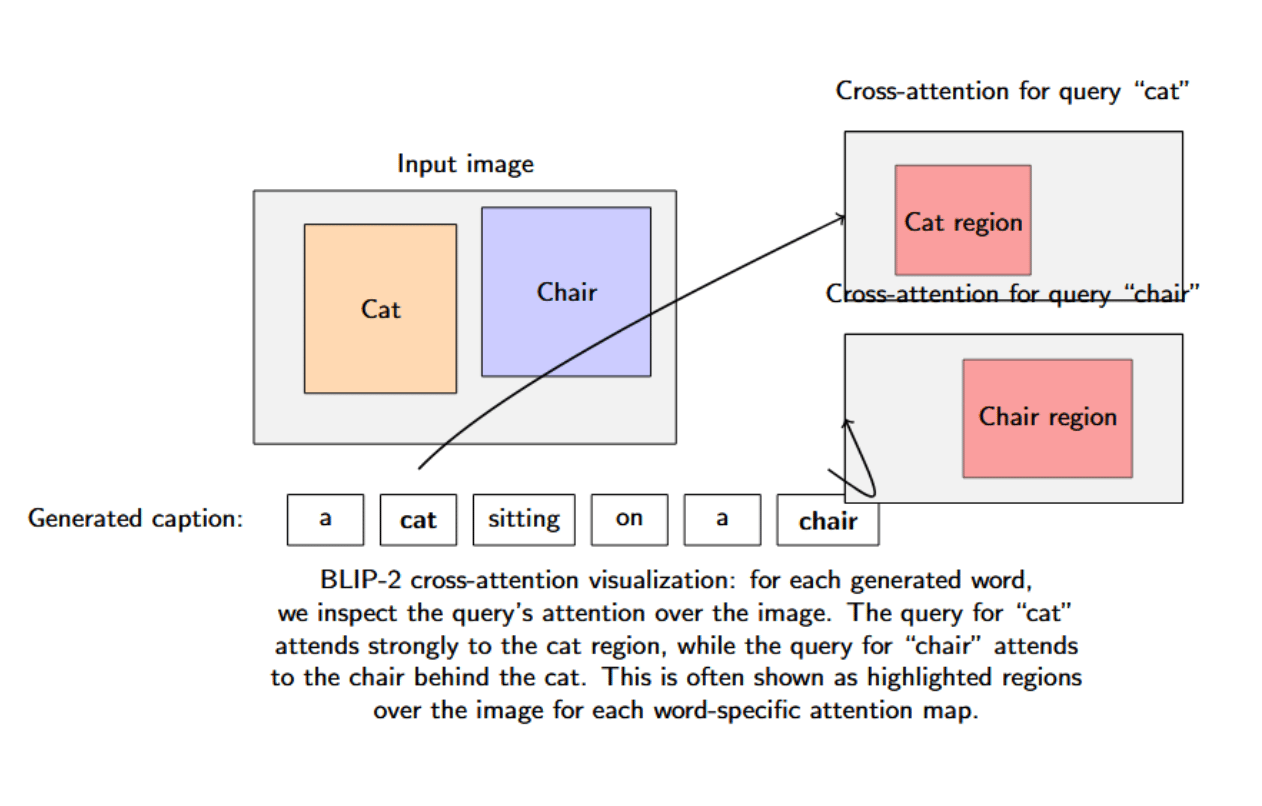
It could be verified that the intermediate queries of BLIP-2 were indeed grounding the language to specific visual content (the model was not hallucinating “chair” - it had actually attended to a chair in the photograph).
Case Study 3: Visualizing Hallucinations in Multimodal GPT-4V – For example, large multimodal models like GPT-4V (GPT-4 with vision) or Google’s PaLM-e have been shown to hallucinate (generate visual details that do not exist). A recent interpretability case study with LVLM-Interpret involved LLaVA (an open multimodal model) hallucinating an answer to a question asked about an image. The question asked something that was not visible in the image, but LLaVA hallucinated an answer.
Visualizing raw attention maps and relevancy heatmaps with their tool, researchers found that the model’s attention was scattered and attributed weight to an irrelevant area of the image when hallucinating the detail. In short, it did not have local focus - a red flag clearly seen by the viewer. They also applied a causal intervention method (masking out certain patches to see if the answer would change) and found that masking out the actually relevant patch did not change the model’s answer (which was the hallucinated one), which is evidence that it was not well grounded.
This led to a hypothesis about a failure mechanism: the model was not relying on the image but instead on the language prior (patterns in Q&A pairs), and the visualization can serve as evidence for that conclusion (attention not on the right things, and causal masking not affecting outcome). This case study shows how visualization tools can inform debugging: the first step to fixing a model is to understand why it is hallucinating (bad attention grounding, etc.).
Best Practices for Interpretability and Visualization
While visualizations are powerful, they must be used carefully. Here are some best practices to ensure meaningful and accurate interpretations of vision-language models:
| Best Practice | Description |
|---|---|
| Don’t Over-Trust Attention | Attention weights offer one perspective but aren’t definitive explanations. A high attention value doesn’t guarantee causal influence. Interpret attention as a heuristic and verify using complementary methods like masking or Grad-CAM. |
| Combine Multiple Methods | Different visualization techniques provide different insights. Use a combination (e.g., attention maps, saliency maps, causal masking) to cross-validate interpretations and identify consistent patterns in model behavior. |
| High Resolution and Proper Scaling | Ensure heatmaps and overlay visuals are rendered at a high enough resolution to capture detail without introducing artifacts. Label axes and use meaningful color scaling to avoid misinterpretation. |
| Avoid Misleading Color Maps | Use perceptually uniform color schemes (like viridis) and avoid exaggerated contrasts. Pair visual interpretations with quantitative data to avoid overstating subtle differences. |
| Context Matters | Visualizations without context (full image, full sentence, or input conditions) can mislead. Always map coordinates or tokens back to their visual or textual reference and clarify layer/head details used in visualization. |
| Validate Interpretations with Experiments | Test your hypotheses by perturbing input (e.g., occlude, shuffle, or replace parts of the input). Check whether the model’s outputs or attention shift accordingly to confirm meaningful interpretations. |
| Be Aware of Model Limitations | Unexpected patterns in visualizations might reveal model biases or quirks (e.g., over-attending to certain regions). Know the training data and architecture to interpret these appropriately. |
| Keep Humans in the Loop | Discuss visualizations with peers or domain experts. Collaborative interpretation can help spot overlooked signals or prevent misjudgment, ensuring a more robust understanding. |
Conclusion
Vision-language models (VLMs) are powerful AI systems that combine vision and language capabilities, performing tasks such as image captioning, visual question answering, and text-image alignment. Visualization techniques for VLMs help explain their inner workings and multimodal intelligence. Popular methods include attention heatmaps, embedding projections, and saliency maps that translate the model’s computations into visual formats that can be understood by humans.
In fact, as VLMs proliferate (search engines, medical image understanding, creative design, etc.), explainability will be an increasingly important factor for widespread adoption and market fit. Requesters will demand to know: Why did the AI generate this statement given this image? Is there anything in the output I should question? Is it biased or hallucinated? Visual interpretability will be a crucial component of that answer, and in some cases, it can even be directly incorporated into user-facing features (an AI assistant for your camera that can point out which region of the photo it’s referring to in its response, etc.).
The area of multimodal interpretability and explainability is still very much active and moving fast, with researchers coming up with new methods to deal with the scale and complexity of these large models (thinking about probing at the scale of millions of neurons, or trying to analyze the interaction between multiple images and text, etc.). Another area of research is towards more vision-centric or explanation methods: It’s not just about identifying which part of an image relates to a given word or concept. It also requires articulating, in a logical sequence, the visual evidence that leads to the model’s ultimate decision.
References
- What Are Vision Language Models
- Mechanistic Interpretability Meets Vision Language Models: Insights and Limitations
- A Dive into Vision-Language Models
- How do CLIP and other vision-language embedding models work?
- SigLIP 2 GradCAM Attention Visualization
- VL-InterpreT: An Interactive Visualization Tool for Interpreting Vision-Language Transformers
- LVLM-Interpret: An Interpretability Tool for Large Vision-Language Models
Thanks for learning with the DigitalOcean Community. Check out our offerings for compute, storage, networking, and managed databases.
About the author(s)
I am a skilled AI consultant and technical writer with over four years of experience. I have a master’s degree in AI and have written innovative articles that provide developers and researchers with actionable insights. As a thought leader, I specialize in simplifying complex AI concepts through practical content, positioning myself as a trusted voice in the tech community.
With a strong background in data science and over six years of experience, I am passionate about creating in-depth content on technologies. Currently focused on AI, machine learning, and GPU computing, working on topics ranging from deep learning frameworks to optimizing GPU-based workloads.
Still looking for an answer?
This textbox defaults to using Markdown to format your answer.
You can type !ref in this text area to quickly search our full set of tutorials, documentation & marketplace offerings and insert the link!
 This work is licensed under a Creative Commons Attribution-NonCommercial- ShareAlike 4.0 International License.
Become a contributor for community
Get paid to write technical tutorials and select a tech-focused charity to receive a matching donation.

DigitalOcean Documentation
Full documentation for every DigitalOcean product.

Resources for startups and AI-native businesses
The Wave has everything you need to know about building a business, from raising funding to marketing your product.
The developer cloud
Scale up as you grow — whether you're running one virtual machine or ten thousand.

Start building today
From GPU-powered inference and Kubernetes to managed databases and storage, get everything you need to build, scale, and deploy intelligent applications.