By Joe Morgan and Timothy Nolan

The author selected Creative Commons to receive a donation as part of the Write for DOnations program.
Introduction
In this tutorial, you’ll learn three different ways to style React components: plain Cascading Style Sheets (CSS), inline styles with JavaScript-style objects, and JSS, a library for creating CSS with JavaScript. These options each have advantages and disadvantages, some giving you more protection against style conflicts or allowing you to directly refer to props or other dynamic data. But all the options have one thing in common: They let you keep your component-specific styles close to the component, making components easier to reuse across a project or even across many unrelated projects.
Each of these options relies on CSS properties. To use plain CSS without any runtime data, you can import style sheets. If you want to create styles that are integrated with the component, you can use inline style objects that use CSS property names as keys and the style as the value. Finally, if you want a combination, you can use a third-party library such as JSS to write your CSS in JavaScript syntax, a software concept known as CSS-in-JS.
To illustrate these methods, you’ll build an example alert component that will either show a success style or an error style depending on the prop. The alert component will take any number of children. This means you will need to be cautious about style conflicts, since you have no way of knowing what styles the children components will have. After making the alert component, you will refactor it using each of the styling options so that you can see the similarities and differences between the approaches.
Prerequisites
-
You will need a development environment running Node.js; this tutorial was tested on Node.js version 10.20.1 and npm version 6.14.4. To install this on macOS or Ubuntu 18.04, follow the steps in How to Install Node.js and Create a Local Development Environment on macOS or the Installing Using a PPA section of How To Install Node.js on Ubuntu 18.04.
-
You will need to be able to create apps with Create React App. You can find instructions for installing an application with Create React App at How To Set Up a React Project with Create React App.
-
You will be using React components, which you can learn about in our How To Create Custom Components in React tutorial.
-
You will also need a basic knowledge of JavaScript, which you can find in the How To Code in JavaScript series, along with a basic knowledge of HTML and CSS. A good resource for HTML and CSS is the Mozilla Developer Network.
Step 1 — Creating an Empty Project
In this step, you’ll create a new project using Create React App. Then you will delete the sample project and related files that are installed when you bootstrap the project. Finally, you will create a simple file structure to organize your components. This will give you a solid basis on which to build this tutorial’s sample application for styling in the next step.
To start, make a new project. In your terminal, run the following script to install a fresh project using create-react-app:
- npx create-react-app styling-tutorial
After the project is finished, change into the directory:
- cd styling-tutorial
In a new terminal tab or window, start the project using the Create React App start script. The browser will auto-refresh on changes, so leave this script running while you work:
- npm start
You will get a running local server. If the project did not open in a browser window, you can open it with http://localhost:3000/. If you are running this from a remote server, the address will be http://your_domain:3000.
Your browser will load with a simple React application included as part of Create React App:

You will be building a completely new set of custom components, so you’ll need to start by clearing out some boilerplate code so that you can have an empty project.
To start, open src/App.js in a text editor. This is the root component that is injected into the page. All components will start from here. You can find more information about App.js at How To Set Up a React Project with Create React App.
Open src/App.js with the following command:
- nano src/App.js
You will see a file like this:
import React from 'react';
import logo from './logo.svg';
import './App.css';

function App() {
  return (
    <div className="App">
      <header className="App-header">
        <img src={logo} className="App-logo" alt="logo" />
        <p>
          Edit <code>src/App.js</code> and save to reload.
        </p>
        <a
          className="App-link"
          href="https://reactjs.org"
          target="_blank"
          rel="noopener noreferrer"
        >
          Learn React
        </a>
      </header>
    </div>
  );
}

export default App;
Delete the line import logo from './logo.svg';. Then replace everything in the return statement to return a set of empty tags: <></>. This will give you a valid page that returns nothing. The final code will look like this:
import React from 'react';
import './App.css';

function App() {
  return <></>;
}

export default App;
Save and exit the text editor.
Finally, delete the logo. You won’t be using it in your application and you should remove unused files as you work. It will save you from confusion in the long run.
In the terminal window type the following command:
- rm src/logo.svg
If you look at your browser, you will see a blank screen.
Now that you have cleared out the sample Create React App project, create a simple file structure. This will help you keep your components isolated and independent.
Create a directory called components in the src directory. This will hold all of your custom components.
- mkdir src/components
Each component will have its own directory to store the component file along with the styles, images, and tests.
Create a directory for App:
- mkdir src/components/App
Move all of the App files into that directory. Use the wildcard, *, to select any files that start with App. regardless of file extension. Then use the mv command to put them into the new directory:
- mv src/App.* src/components/App
Next, update the relative import path in index.js, which is the root component that bootstraps the whole process:
- nano src/index.js
The import statement needs to point to the App.js file in the App directory, so make the following highlighted change:
import React from 'react';
import ReactDOM from 'react-dom';
import './index.css';
import App from './components/App/App';
import * as serviceWorker from './serviceWorker';

ReactDOM.render(
  <React.StrictMode>
    <App />
  </React.StrictMode>,
  document.getElementById('root')
);

// If you want your app to work offline and load faster, you can change
// unregister() to register() below. Note this comes with some pitfalls.
// Learn more about service workers: https://bit.ly/CRA-PWA
serviceWorker.unregister();
Save and exit the file.
Now that the project is set up, you can create your first component.
Step 2 — Styling a Component with Plain CSS
In this step, you’ll build a sample Alert component that will display an alert on a web page. You’ll style this using plain CSS, which you will import directly into the component. This will ensure that the component’s styles remain closely coupled with the component’s JavaScript and JSX. You’ll also create a component that will implement the Alert component to see how styles can affect children and how you can use props to change styles dynamically.
By the end of this step, you’ll have created several components that use plain CSS imported directly into the component.
Building an Alert Component
To start, create a new Alert component. First, make the directory:
- mkdir src/components/Alert
Next, open Alert.js:
- nano src/components/Alert/Alert.js
Add a basic component that returns the string Alert:
import React from 'react';

export default function Alert() {
  return <div>Alert</div>
}
Save and close the file.
Next, open App.js:
- nano src/components/App/App.js
Import the Alert component and render it inside a <div> by adding the highlighted code:
import React from 'react';
import './App.css';

import Alert from '../Alert/Alert';

function App() {
  return (
    <div className="wrapper">
      <Alert />
    </div>
  )
}

export default App;
In this code, you gave the <div> a className of wrapper, which will be used for styling later.
Save and close the file. When you do, the browser will refresh and you’ll see your component:

Next, you will style the App component to give it some padding so that the Alert component is not so close to the edge. Open the App.css file:
- nano src/components/App/App.css
This file uses standard CSS. To add padding to the wrapper, replace the default code with a rule as you would for CSS in a plain HTML project. In this case, add a padding of 20px:
.wrapper {
    padding: 20px;
}
Save and close the file. When you do, the page will refresh and you’ll see the extra padding:

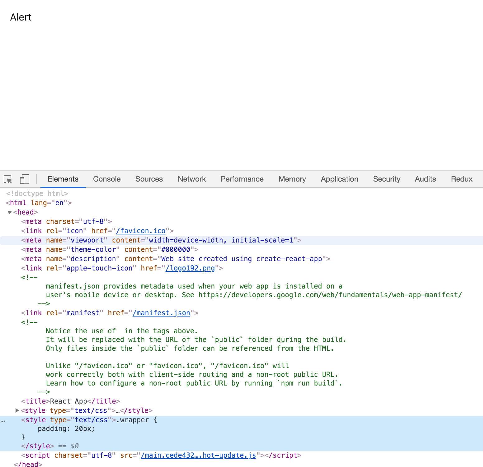
When you use Create React App, webpack will take the imported CSS and add it to a style tag at the top of the file rendered in the browser. If you look at the <head> element in your page source, you’ll see the styles:
This means that you can keep the CSS alongside the component and it will be collected together during the build phase. It also means that your styles are global in scope, which can create potential name conflicts. With this method, each class name will need to be unique across all components.
To explore this problem, you will make some changes to the Alert component.
First, open the file:
- nano src/components/Alert/Alert.js
Then add some React code that will take children, type, and title as props:
import React from 'react';
import PropTypes from 'prop-types';

export default function Alert({ children, title, type }) {
  return (
    <div>
      <h2>{title}</h2>
      {children}
    </div>
  )
}

Alert.propTypes = {
  children: PropTypes.oneOfType([
    PropTypes.arrayOf(PropTypes.element),
    PropTypes.element.isRequired
  ]),
  title: PropTypes.string.isRequired,
  type: PropTypes.string.isRequired,
}
The title in this code is in a <h2> tag, and children will allow you to display child components. You will soon use the type prop to set a success and an error alert based on the PropTypes typing system.
Save and close the file. Next, update the Alert component in App to use the new props.
First, open App.js:
- nano src/components/App/App.js
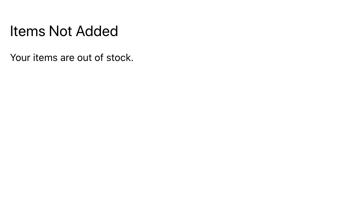
Make an alert that notifies a user that an attempt to add items to a shopping cart has failed:
import React from 'react';
import './App.css';

import Alert from '../Alert/Alert';

function App() {
  return (
    <div className="wrapper">
      <Alert title="Items Not Added" type="error">
        <div>Your items are out of stock.</div>
      </Alert>
    </div>
  )
}

export default App;
In this code, you updated the title and children with a fail message, then added a type of error.
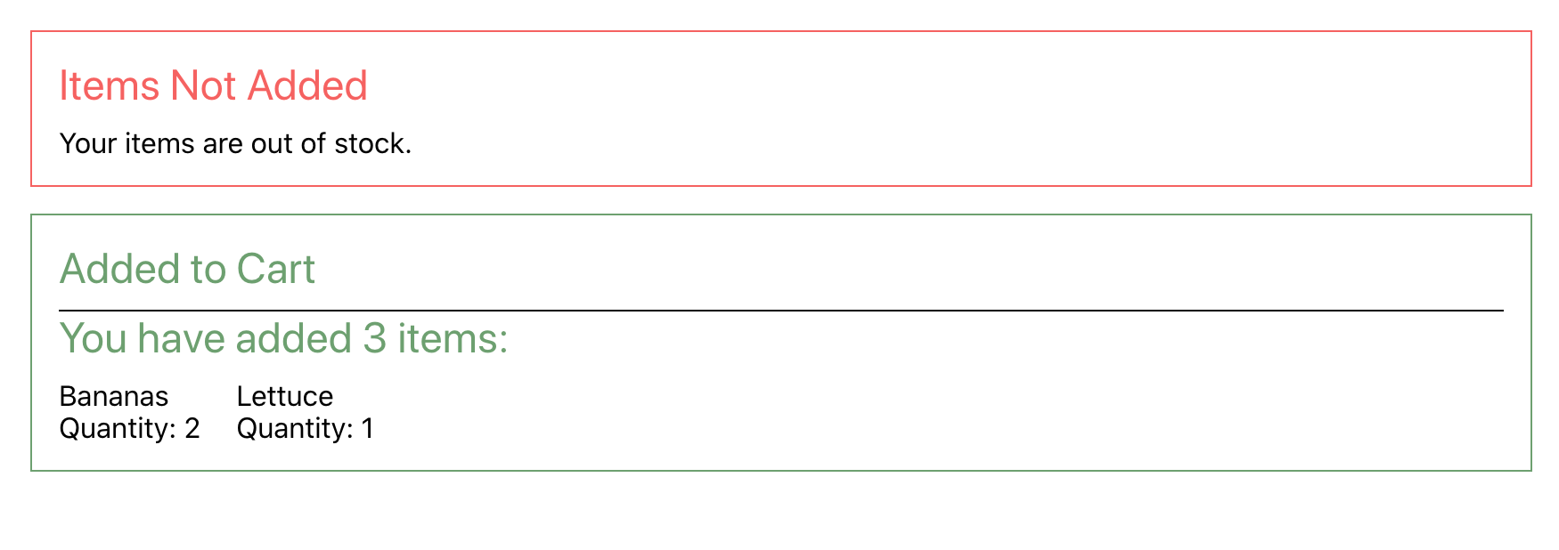
Save and close the file. When you do, the browser will refresh and you’ll see your new component:
Your alert is rendering, so the next step is to style the component with CSS.
Adding CSS to the Alert Component
Since the Alert component dislays an error, you will add a border and set the color of the border to a shade of red. You’ll also give the <h2> tag the same color. But this presents a problem: You can’t use the name wrapper on the outer <div> in your Alert component, because that name is already taken by the App component.
Class name conflicts aren’t a new problem in CSS, and there have been a number of attempts to solve it using naming conventions such as BEM. But naming conventions can become verbose, and can still occasionally lead to conflicts in projects with a large number of components.
Rather than using a specific set of rules separated by naming convention, in this tutorial you will prefix the wrapper class name with the name of the component. Your new class name will be alert-wrapper. In addition, you will add the type of the alert as a class.
Open up the Alert component:
- nano src/components/Alert/Alert.js
Next, add the following highlighted code:
import React from 'react';
import PropTypes from 'prop-types';
import './Alert.css';
...
export default function Alert({ children, type, title }) {
  return(
    <div className={`alert-wrapper ${type}`}>
      <h2>{title}</h2>
      {children}
    </div>
  )
}
...
In this case, you’re combining alert-wrapper and the type variable into a single string using a template literal.
Save and close the file. Now you have a unique class name that changes dynamically based on the prop. The JSX in this code will resolve to a div with the class names of alert-wrapper and error. The compiled mark up would be this: <div class="alert-wrapper error">.
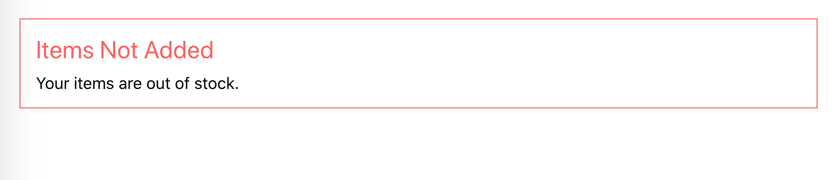
Now add the styles. First, open the CSS for the Alert component:
- nano src/components/Alert/Alert.css
Add the following CSS to the alert-wrapper, success, and error classes:
.alert-wrapper {
    padding: 15px;
    margin-bottom: 15px;
}

.alert-wrapper h2 {
    margin: 0 0 10px 0;
}

.alert-wrapper.success {
    border: #6DA06F solid 1px;
}

.success h2 {
    color: #6DA06F;
}

.alert-wrapper.error {
    border: #F56260 solid 1px;
}

.error h2 {
    color: #F56260;
}
This code adds some margins and padding to the alert-wrapper. It then adds a border with a shade of red for the error class using the hexidecimal color code #F56260, and a shade of green (#6DA06F) for the success class. It also updates the <h2> color to red or green depending on the parent.
Save and close the file. When you do, the browser will refresh and you’ll see the new styles:
Now that you have a styled Alert component, you can create a new component that displays a list of items within the Alert component. Since the children will be more complex, there will be greater possibilities for style conflicts.
Creating a Success Message Component
First, create a directory for for the new component CartSuccess:
- mkdir src/components/CartSuccess
Open CartSuccess.js:
- nano src/components/CartSuccess/CartSuccess.js
Inside the component, import the Alert component and pass a <div> containing a series of items that a user has added to the cart:
import React from 'react';
import Alert from '../Alert/Alert';
import './CartSuccess.css';

export default function CartSuccess() {
  return(
    <Alert title="Added to Cart" type="success">
      <div className="cart-success-wrapper">
          <h2>
            You have added 3 items:
          </h2>
          <div className="item">
            <div>Bananas</div>
            <div>Quantity: 2</div>
          </div>
          <div className="item">
            <div>Lettuce</div>
            <div>Quantity: 1</div>
          </div>
      </div>
    </Alert>
  )
}
Notice how you needed to create a unique class name—cart-success-wrapper—for the outer <div>. Save and close the file.
Next, add some CSS to the custom message. Open CartSuccess.css:
- nano src/components/CartSuccess/CartSuccess.css
Add a display of flex to the wrapper. You’ll want most of the items to wrap, except for the <h2> element, which should take up the whole width:
.cart-success-wrapper {
    border-top: black solid 1px;
    display: flex;
    flex-wrap: wrap;
}

.cart-success-wrapper h2 {
    width: 100%;
}

.item {
    margin-right: 20px;
}
Here, you gave the <h2> a width of 100%. In addition to flexing the element, you also added a small border to the top of the message, and added a margin to the item class to provide some space between items.
Save and close the file.
Now that you have a styled component, add it to your App component.
Open App.js:
- nano src/components/App/App.js
Import the component and add it after the current Alert component, as shown in the highlighted code:
import React from 'react';
import './App.css';

import Alert from '../Alert/Alert';
import CartSuccess from '../CartSuccess/CartSuccess';

function App() {
  return(
    <div className="wrapper">
      <Alert title="Items Not Added" type="error">
        <div>Your items are out of stock.</div>
      </Alert>
      <CartSuccess />
    </div>
  )
}

export default App;
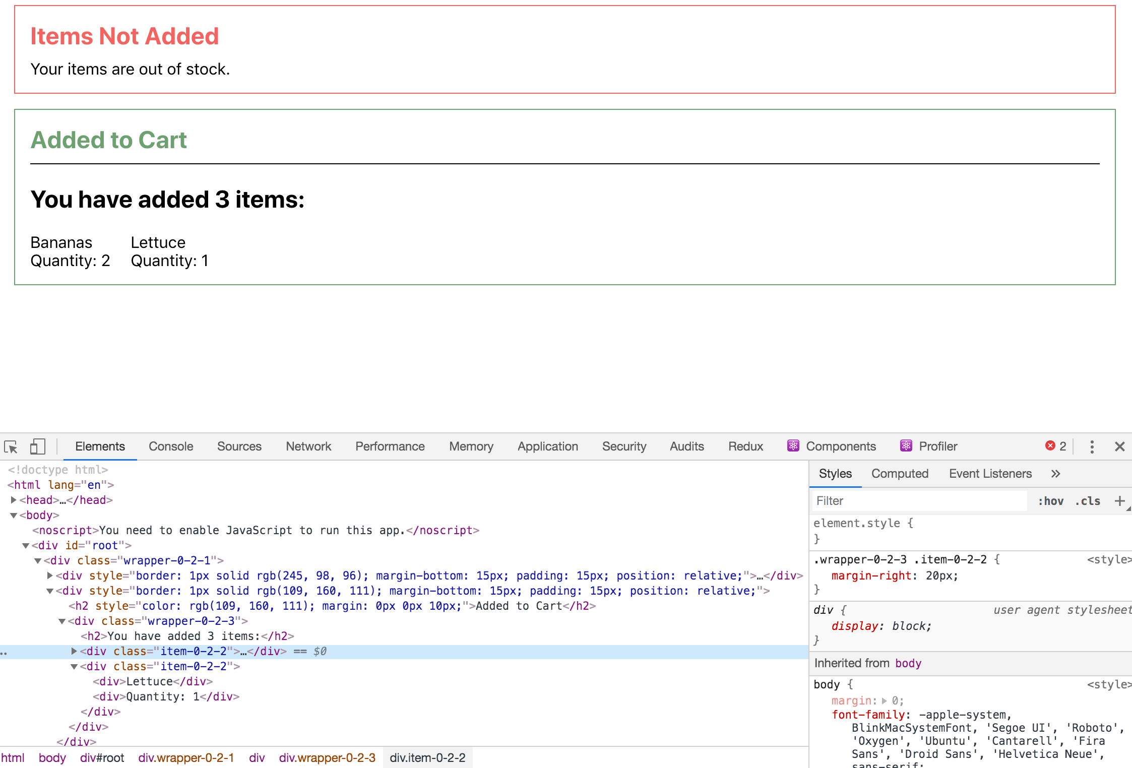
Save and close the file. When you do, the browser will refresh and you’ll see your new component:
This shows the new color and the message as intended, but the nested component received some unexpected styles. The rule for the <h2> in the Alert component is being applied to the nested <h2> tag in the children props.
Unexpected styles cascading to children are a common problem with CSS. However, since React gives you the opportunity to bundle and share components across projects, you have a greater potential for styles to inadvertently flow down to children components.
To fix this with pure CSS, make the <h2> rule for the Alert component a little more specific.
Open the Alert.css file:
- nano src/components/Alert/Alert.css
Change the rules so that the <h2> styling only applies to the direct children of the classes rather than all children using the CSS > child combinator:
.alert-wrapper {
    padding: 15px;
    margin-bottom: 15px;
}

.alert-wrapper > h2 {
    margin: 0 0 10px 0;
}

.alert-wrapper.success {
    border: #6da06f solid 1px;
}

.success > h2 {
    color: #6da06f;
}

.alert-wrapper.error {
    border: #f56260 solid 1px;
}

.error > h2 {
    color: #f56260;
}
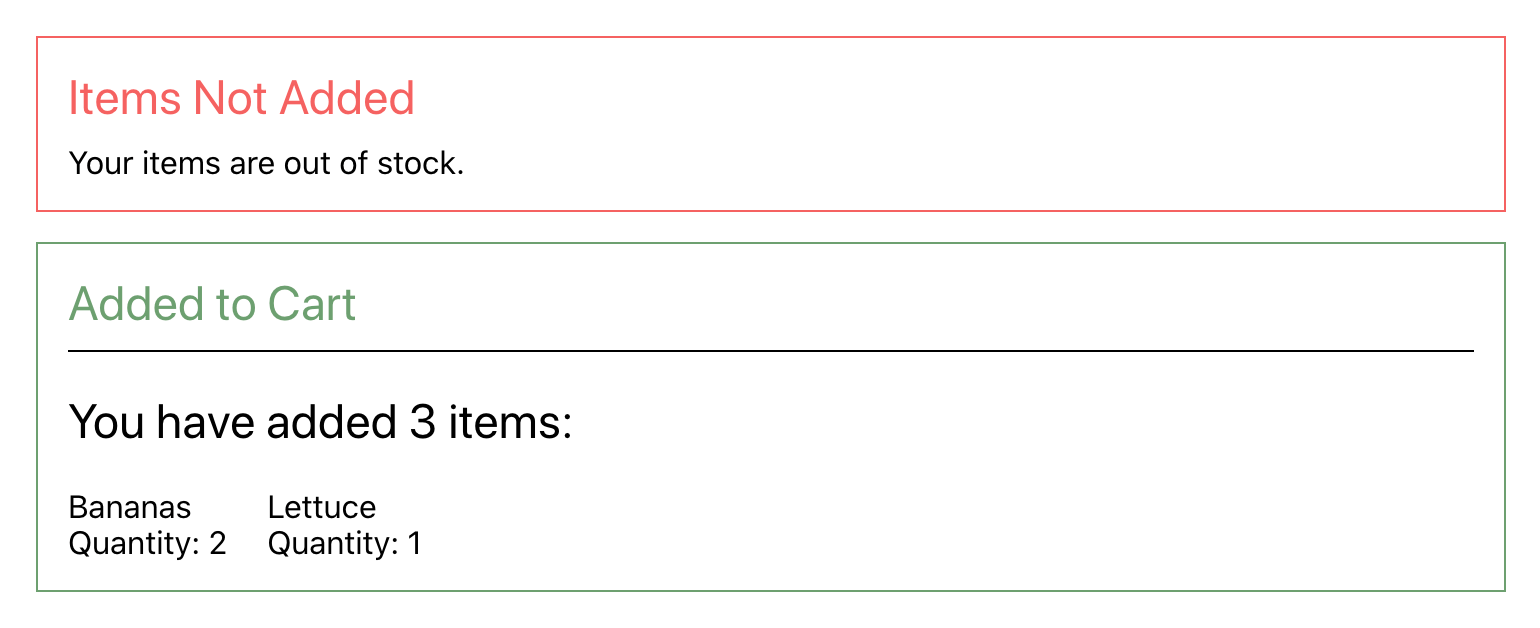
Save and close the file. When you do, the page will refresh and you’ll see the <h2> element in CartSuccess retain the default color:

Now the styles for the Alertcomponent will only affect the immediate children and will not apply to other child nodes or components. This method works well in this case, but in circumstances where components are more complex, it can be difficult to write rules that apply to all cases without leaking outside the component.
In this step, you styled a component using CSS stylesheets imported directly into a component. Styling React elements with standard CSS is a quick way to create components with associated styles using standard CSS files. The ease of use makes it a good first step when you are working on new or small projects, but as the projects grow it can cause problems.
As you built the components, you encountered two common styling problems: class name conflicts and unintended style application. You can work around them with standard CSS, but there are other styling approaches that give you tools for handling these problems programmatically instead of with naming conventions. In the next step, you will explore solving these problems with style objects.
Step 3 — Styling with Style Objects
In this step, you’ll style your components using style objects, which are JavaScript objects that use CSS properties as keys. As you work on your components, you’ll update keys to match the JavaScript syntax and learn how to dynamically set style properties based on component props.
Separate CSS is the most common way to style HTML. This method is fast, and browsers are efficient at applying styles quickly and consistently. But this is not the only option for styling HTML. In standard HTML, you can set inline styles directly on an element using the style attribute with a string containing the styles you wanted to apply.
One of the best uses of style objects is for calculating styles dynamically. This is particularly useful if you need to know the element’s current position, since this is not determined until the elements are rendered and thus can only be handled dynamically.
Writing style strings manually is difficult to do and can introduce bugs. A missing color or semicolon will break the entire string. Fortunately, in JSX, you aren’t limited to just a string. The style attribute can also accept an object containing the styles. These style names will need to be camelCase rather than kebab-case.
The biggest advantage to using inline styles like this is that, since you are building styles with JavaScript, you can dynamically set CSS properties instead of dynamically setting classes. This means you can write code without CSS classes at all, avoiding any potential name conflicts and allowing you to calculate styles at runtime.
To use style objects, start by refactoring App.js. First, open the file:
- nano src/components/App/App.js
Inside the component, remove the imported App.css file, and then create an object that has a padding of 20 and pass the object to the <div> using the style attribute:
import React from 'react';

import Alert from '../Alert/Alert';
import CartSuccess from '../CartSuccess/CartSuccess';

function App() {
  const wrapper = {
    padding: 20
  };

  return(
    <div style={wrapper}>
      <Alert title="Items Not Added" type="error">
        <div>Your items are out of stock.</div>
      </Alert>
      <CartSuccess />
    </div>
  )
}

export default App;
Notice that you do not have to specify pixels as the unit for padding. React will convert this to a string of pixels by default. If you want a specific unit, pass it as a string. So if you wanted the padding to be a percentage for example, it would be padding: '20%'.
Most numbers will be automatically converted to pixels. There are exceptions, however. The property line-height can take plain numbers without a unit. If you wanted to use the pixels unit in that case, you’d need to specify pixels as a string.
Save and close the file. When you do, the browser will refresh and you’ll see the page as it was before:
Next, refactor CartSuccess. First, open the file:
- nano src/components/CartSuccess/CartSuccess.js
As with App.js, remove the imported CSS (CartSuccess.css) and create a style object for each item that previously had a class:
import React from 'react';
import Alert from '../Alert/Alert';

export default function CartSuccess() {
  const styles = {
    header: {
      width: '100%'
    },
    item: {
      marginRight: 20
    },
    wrapper: {
      borderTop: 'black solid 1px',
      display: 'flex',
      flexWrap: 'wrap'
    }
  }

  return(
    <Alert title="Added to Cart" type="success">
      <div style={styles.wrapper}>
          <h2 style={styles.header}>
            You have added 3 items:
          </h2>
          <div style={styles.item}>
            <div>Bananas</div>
            <div>Quantity: 2</div>
          </div>
          <div style={styles.item}>
            <div>Lettuce</div>
            <div>Quantity: 1</div>
          </div>
      </div>
    </Alert>
  )
}
In this case, you didn’t create multiple, separate objects; instead, you created a single object that contains other objects. Notice also that you needed to use camel case for the properties of margin-right, border-top, and flex-wrap.
Save and close the file. When you do, the page will refresh and you’ll see the page with the same styles:
Since you are not using classes, you don’t have to worry about any name conflicts. Another advantage of creating styles with JavaScript is that you can take advantage of any JavaScript syntax such as variables and template literals. With modern CSS, you can use variables, which is a major improvement, but may not be fully available depending on your browser support requirements. In particular, they are not supported in any version of Internet Explorer, although you can use a polyfill to add support.
Since style objects are created at runtime, they are more predictable and can use any supported JavaScript.
To see how style objects can help in this situation, refactor Alert.js to use style objects. First, open Alert.js:
- nano src/components/Alert/Alert.js
Inside Alert.js, remove import './Alert.css'; and create an object called colors that has a property for the error color and a property for the success color. Then convert the CSS to a JavaScript object using the type prop to dynamically set the color:
import React from 'react';
import PropTypes from 'prop-types';

export default function Alert({ children, type, title }) {
  const colors = {
    success: '#6da06f',
    error: '#f56260',
  }

  const style = {
    heading: {
      color: colors[type],
      margin: '0 0 10px 0',
    },
    wrapper: {
      border: `${colors[type]} solid 1px`,
      marginBottom: 15,
      padding: 15,
      position: 'relative',
    }
  }

  return(
    <div style={style.wrapper}>
      <h2 style={style.heading}>{title}</h2>
      {children}
    </div>
  )
}

...
There are a few changes here. First, you use a single style declaration for wrapper and then dynamically set the color based on the type. You are not styling <h2> elements in general, but instead are styling these particular elements, which happen to be <h2> elements. Since you are not applying styles to an element type, there is no danger that the styles will flow down to child elements.
Save and close the file. When you do, the browser will refresh and you’ll see the applied styles.
Style objects solve many problems, but they do have disadvantages. First, there is a performance cost for inline styles. Browsers were designed to handle CSS efficiently, and styles objects that apply inline styles can not take advantage of these optimizations. The other problem is that it’s more difficult to apply styles to child elements with style objects. In this case, you did not want a style to apply to children, but it is often the case that you do want styles to cascade. For example, setting a custom font family on every element or applying a custom size to every <h2> element would be easier if you used a less specific styling strategy.
There is, however, a middle ground between these approaches. Several third-party libraries are designed to find this middle ground. In the next step, you’ll create styles using a hybrid approach called CSS-in-JS using a library called JSS.
Step 4 — Styling with JSS
In this step, you’ll style objects using the popular library JSS. You’ll install the new library and convert your style objects to JSS objects. You’ll then refactor your code to use dynamically generated class names that will prevent conflicts between class names across modules. You’ll also build JavaScript style objects that dynamically set styles and use nested properties to create specific style rules.
JSS is a library for creating CSS-in-JS. This methodology has many different use cases and options, but the main advantage in this tutorial is that it will create dynamic class names that avoid conflicts between components. You also will be able to take advantage of JavaScript syntax, which means you will be able to use variables and create styles based off of React props.
To begin, install the React specific version of JSS. This tutorial will use version 10.1.1:
- npm install react-jss
The package will install several dependencies, including a number of JSS plugins that will give you the ability to write concise style rules.
When the installation is complete, you’ll see a success message:
Output+ react-jss@10.1.1
added 281 packages from 178 contributors, removed 142 packages, updated 1392 packages and audited 1025251 packages in 144.872s
Your output will vary slightly depending on your Node version and other dependencies.
Now that the library is installed, convert App.js to use JSS. First, open App.js:
- nano src/components/App/App.js
There are two steps to use JSS. First, you have to import a function to create a custom hook. Hooks are functions that React will run on every component render. With JSS, you have to create a hook by passing in the style definitions, outside of the component. This will prevent the code from running on every re-render; since the style definitions are static, there’s no reason to run the code more then once.
Create the hook and the style object by making the highlighted changes:
import React from 'react';
import { createUseStyles } from 'react-jss';

import Alert from '../Alert/Alert';
import CartSuccess from '../CartSuccess/CartSuccess';

const useStyles = createUseStyles({
  wrapper: {
    padding: 20,
  }
});

function App() {
  return(
    <div>
      <Alert title="Items Not Added" type="error">
        <div>Your items are out of stock.</div>
      </Alert>
      <CartSuccess />
    </div>
  )
}

export default App;
Notice in this case that your style object contains another object called wrapper, which contains the styles using the same camel case format. The name of the object—wrapper—is the basis for creating the dynamic class name.
After you create the hook, you consume it by executing the function inside the component. This registers the hook and creates the styles dynamically. Make the following highlighted change:
import React from 'react';
import { createUseStyles } from 'react-jss'

import Alert from '../Alert/Alert';
import CartSuccess from '../CartSuccess/CartSuccess';

const useStyles = createUseStyles({
  wrapper: {
    padding: 20,
  }
});

function App() {
  const classes = useStyles()
  return(
    <div className={classes.wrapper}>
      <Alert title="Items Not Added" type="error">
        <div>Your items are out of stock.</div>
      </Alert>
      <CartSuccess />
    </div>
  )
}

export default App;
In this code, you call the function and assign the results to a variable called classes. The new variable classes will be an object that contains the dynamic class names. You then apply the appropriate class name to your element by using the same name that you defined on the object. Here you used classes.wrapper.
Save and close the file. When you do the browser will refresh and you’ll see the same styles as before. But if you look at the console, you’ll see that the class name does not perfectly match the one you defined in your object:
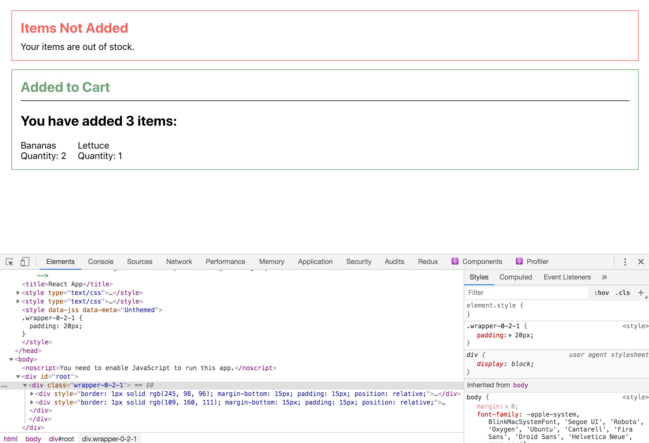
In this case, the class name is wrapper-0-2-1, but your class name may be different. You’ll also see that the styles are converted from an object to CSS and placed in a <style> tag. Contrast this to the inline styles, which are not converted to CSS and do not have any class names.
JSS creates the class names dynamically so they will not conflict with similar names in other files. To see this at work, refactor CartSuccess.js to use JSS styling.
Open the file:
- nano src/components/CartSuccess/CartSuccess.js
Inside the file, create a custom hook using createUseStyles. Instead of applying a class to the <h2> element, you’ll create a rule for the <h2> elements inside of a wrapper. To do that with plain CSS, you add a space between the class and the element—.wrapper h2. This applies the style to all <h2> elements that are children of the .wrapper class.
With JSS, you can create a similar rule by creating another object inside of the containing element. To link them up, start the object name with the & symbol:
import React from 'react';
import { createUseStyles } from 'react-jss';
import Alert from '../Alert/Alert';

const useStyles = createUseStyles({
  item: {
    marginRight: 20
  },
  wrapper: {
    borderTop: 'black solid 1px',
    display: 'flex',
    flexWrap: 'wrap',
    '& h2': {
      width: '100%'
    }
  }
})

export default function CartSuccess() {
  const classes = useStyles();
  return(
    <Alert title="Added to Cart" type="success">
      <div className={classes.wrapper}>
          <h2>
            You have added 3 items:
          </h2>
          <div className={classes.item}>
            <div>Bananas</div>
            <div>Quantity: 2</div>
          </div>
          <div className={classes.item}>
            <div>Lettuce</div>
            <div>Quantity: 1</div>
          </div>
      </div>
    </Alert>
  )
}
In addition to creating rules for the wrapper, you also created a rule for item. After creating the custom hook, you passed the custom class names to the className property.
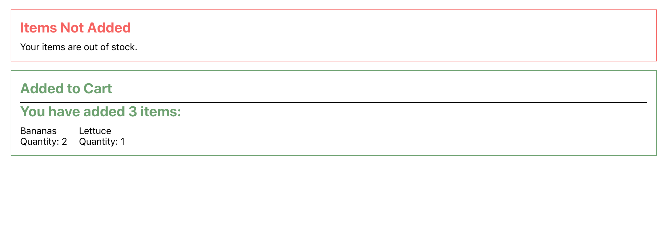
Save the file. Notice that you are using the same name—wrapper—in both this component and the App component. But when the browser reloads, there will be no naming conflict; everything will look correct. If you inspect the elements in your browser, you’ll see that even though they started with the same name, they each have a unique class:
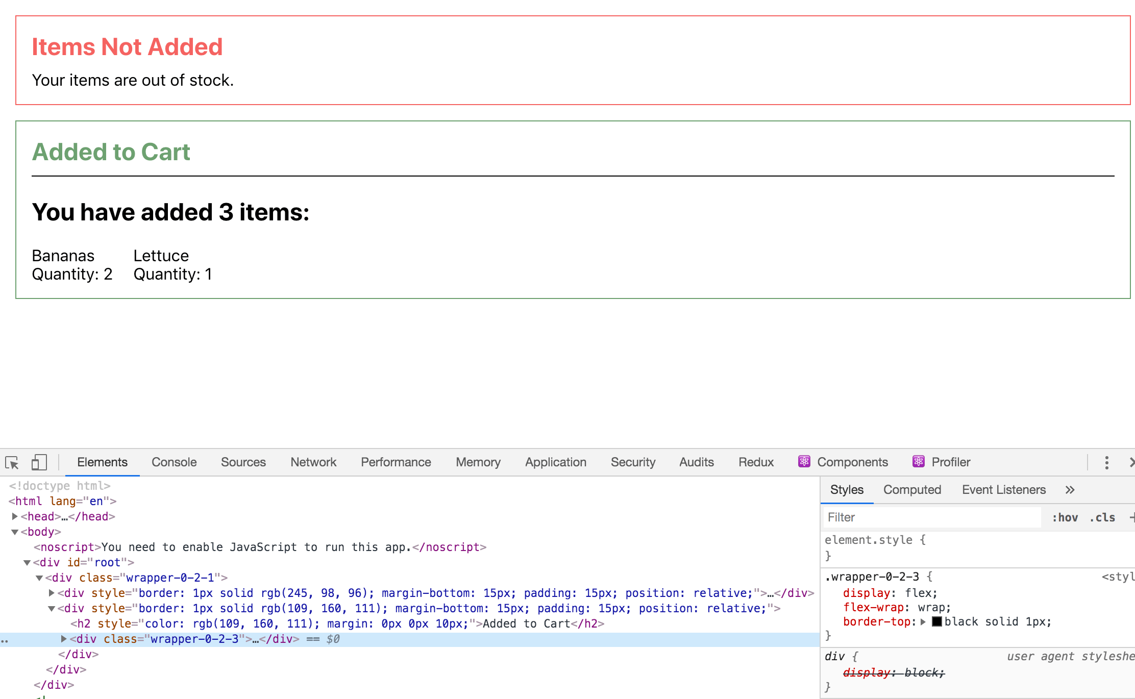
In this case, the class for the outer component is wrapper-0-2-1, which was generated in the App component. The class for CartSuccess is wrapper-0-2-3. Your component names may be slightly different, but they will be unique.
In some situations, you may need to make a specific selector to override other styles. For example, let’s say you only want the item styling to apply when the element is a child of the wrapper class. To do this, first create the class on the object with no properties. Then inside the wrapper class, reference the new class with a $ symbol:
import React from 'react';
import { createUseStyles } from 'react-jss'
import Alert from '../Alert/Alert';

const useStyles = createUseStyles({
  item: {},
  wrapper: {
    borderTop: 'black solid 1px',
    display: 'flex',
    flexWrap: 'wrap',
    '& h2': {
      width: '100%'
    },
    '& $item': {
      marginRight: 20
    }
  }
})

export default function CartSuccess() {
  const classes = useStyles()
  return(
    <Alert title="Added to Cart" type="success">
      <div className={classes.wrapper}>
          <h2>
            You have added 3 items:
          </h2>
          <div className={classes.item}>
            <div>Bananas</div>
            <div>Quantity: 2</div>
          </div>
          <div className={classes.item}>
            <div>Lettuce</div>
            <div>Quantity: 1</div>
          </div>
      </div>
    </Alert>
  )
}
Save and close the file. When the browser reloads, the page will look the same, but the item CSS will be applied more specifically to items under the wrapper component:
JSS gives you the ability to create rules with the same level of focus that you’d create with regular CSS, but will do so while creating unique class names that won’t clash.
One final advantage of JSS is that you have the ability to use variables and other JavaScript language features. Since you are using react-jss, you can pass props to the style object to create dynamic styles. To test this out, refactor the Alert.js component to use props and variables to create dynamic properties.
First, open the file:
- nano src/components/Alert/Alert.js
Create a style object like you did in the last refactored code. Be sure to move the object defining the colors outside of the component function so it is in the same scope as the createUseStyles function:
import React from 'react';
import PropTypes from 'prop-types';
import { createUseStyles } from 'react-jss';

const colors = {
  success: '#6da06f',
  error: '#f56260',
};

const useStyles = createUseStyles({
    wrapper: {
      border: ({ type }) => `${colors[type]} solid 1px`,
      marginBottom: 15,
      padding: 15,
      position: 'relative',
      '& h2': {
        color: ({ type }) => colors[type],
        margin: [0, 0, 10, 0],
      }
    }
});

export default function Alert({ children, type, title }) {
  const classes = useStyles({ type })
  return(
    <div className={classes.wrapper}>
      <h2>{title}</h2>
      {children}
    </div>
  )
}

...
To pass props, you make the style rule a function. The function accepts the props as an argument then returns a rule. To create a dynamic border, you add border as the property name and an arrow function that takes type and returns a string: ({ type }) => `${colors[type]} solid 1px`,. Then after you create your hook, you pass in the props you want to reference when creating the classes object. As before, you style the <h2> tag by element instead of creating a specific class. You also pass an array of values for margin rather than a string such as 0px 0px 10px 10px.
Save the file. Notice that you don’t have to pass all the props into the function. In this case, you only want to use type, so that’s all you need to pass. However, you can pass more or even pass unknown props using the rest operator to collect props and then pass them as a group. You do need to pass it as an object; however, since that’s the standard way to pass props, it will make extending the arguments easier in the future.
When the page reloads, you’ll see the correct colors, but there will be a slight problem: the green success color is now updating the <h2> element in CartSuccess:
JSS solves many problems, but it still creates standard CSS. That means that styles can apply to child elements if you are not careful. To fix this, add the > symbol to make the CSS only apply to immediate children:
import React from 'react';
...
const useStyles = createUseStyles({
    wrapper: {
      border: ({ type }) => `${colors[type]} solid 1px`,
      marginBottom: 15,
      padding: 15,
      position: 'relative',
      '& > h2': {
        color: ({ type }) => colors[type],
        margin: [0, 0, 10, 0],
      }
    }
});

export default function Alert({ children, type, title }) {

...

}

...
Save and close the file. When you do the browser will reload and you’ll see the correct styles:
There is much more to JSS beyond what is covered in this tutorial. One important advantage that we haven’t touched on is theming. JSS gives you the ability to create styles based off of pre-defined theme objects. That means that instead of creating a color red from a hard coded value, you can make the alert border the alert color, which will likely be a shade of red, but could be different depending on the theme definition. This is useful when creating white label products or creating reusable components that need to work across projects.
In this step, you styled components using a third-party library called react-jss. You also created style object and used JSS to convert those objects into dynamic classes to avoid conflicting with other components. Using this method, you can safely reuse simple class names without worrying about conflicts later in the code. Finally, you learned how to create styles using functions and props to build dynamic styles that reference component props.
Conclusion
Throughout this tutorial, you have developed several reusable components that use different style techniques. You’ve learned how style objects and JSS create objects using names that closely mirror standard CSS properties, and have created components that can dynamically set styles based on incoming properties. You also learned how different approaches provide different options for handling name conflicts and reusability.
As with most React techniques, there is no single best solution. Instead, you can choose the styling option that is the best fit for your project. With these options in hand, you can start with something simple and refactor as the project grows or the requirements change, while remaining confident that your components will continue to meet your style goals.
If you would like to look at more React tutorials, check out our React Topic page, or return to the How To Code in React.js series page.
Thanks for learning with the DigitalOcean Community. Check out our offerings for compute, storage, networking, and managed databases.
Tutorial Series: How To Code in React.js
React is a popular JavaScript framework for creating front-end applications, such as user interfaces that allow users to interact with programs. Originally created by Facebook, it has gained popularity by allowing developers to create fast applications using an intuitive programming paradigm that ties JavaScript with an HTML-like syntax known as JSX.
In this series, you will build out examples of React projects to gain an understanding of this framework, giving you the knowledge you need to pursue front-end web development or start out on your way to full stack development.
Browse Series: 21 tutorials
About the author(s)
Author of Simplifying JavaScript. Writing featured in Slate, FreeCodeCamp, and here! I like to break things and put them back together. 🛠
Former Senior Technical Editor at DigitalOcean, fiction writer and podcaster elsewhere, always searching for the next good nautical pun! Areas of expertise include Node.js, PostgreSQL, CSS, JavaScript.
Still looking for an answer?
This textbox defaults to using Markdown to format your answer.
You can type !ref in this text area to quickly search our full set of tutorials, documentation & marketplace offerings and insert the link!
 This work is licensed under a Creative Commons Attribution-NonCommercial- ShareAlike 4.0 International License.
Become a contributor for community
Get paid to write technical tutorials and select a tech-focused charity to receive a matching donation.

DigitalOcean Documentation
Full documentation for every DigitalOcean product.

Resources for startups and AI-native businesses
The Wave has everything you need to know about building a business, from raising funding to marketing your product.
The developer cloud
Scale up as you grow — whether you're running one virtual machine or ten thousand.

Start building today
From GPU-powered inference and Kubernetes to managed databases and storage, get everything you need to build, scale, and deploy intelligent applications.
