Full-Stack Software Developer

The author selected the Internet Archive to receive a donation as part of the Write for DOnations program.
Introduction
Like many popular Static Site Generators, Gatsby embraces the use of dynamic web frameworks, using React on the frontend and Node.js on the backend. But Gatsby can also pull in static files and assets, like images, CSS files, and JavaScript files.
This tutorial covers the situations in which you might want to use static files with your Gatsby site. It will show you how to best go about adding images, stylesheets globally and as modules, JavaScript files, and arbitrary files like PDFs for your users to download.
Prerequisites
Before starting, here are a few things you will need:
- A local installation of Node.js for running Gatsby and building your site. The installation procedure varies by operating system, but DigitalOcean has guides for Ubuntu 20.04 and macOS, and you can always find the latest release on the official Node.js download page.
- A new Gatsby project, scaffolded from
gatsby-starter-default. For satisfying this requirement and building a new Gatsby project from scratch, you can refer to Step 1 of the How To Set Up Your First Gatsby Website tutorial. - Some familiarity with React and JSX, as well as with HTML elements, if you want to customize the user interface (UI) of your posts beyond what is covered in this tutorial.
- A program to unzip a zip archive file. On most operating systems,
unzipis the command of choice, which you can download on Linux with your local package manager. - Access to the demo files repository used to provide sample files for this tutorial. You can access it at the DigitalOcean Community GitHub repository, and Step 1 will instruct you on how to download it.
This tutorial was tested on Node.js v14.16.1, npm v6.14.12, Gatsby v3.13.1, and flexboxgrid v6.3.1.
Step 1 — Preparing Example Files
For the purposes of this tutorial, you will be working with a pre-arranged collection of static assets, which will be used throughout the following steps. The collection of files is available as a GitHub repository, and the first step of this tutorial is to download them and place them within your Gatsby project.
First, you will extract the sample files to src/sample-assets, which you can either do manually by downloading the zip file and using an unzipping tool of your choice, or by running the following commands in your terminal at the root of your Gatsby project:
- wget -O ../sample-assets.zip https://github.com/do-community/gatsby-static-files-tutorial-assets/archive/refs/heads/main.zip
- unzip ../sample-assets.zip -d ./src
The above command downloads an archive of the entire repo as a single zip archive file with wget, and then unzips the contents to the source directory.
Once the files are unzipped, the next step is to create an empty Gatsby page component that will serve as the demo page for this tutorial. Create an empty file at src/pages/static-files-demo.js, then open the file in your editor of choice and add the following code:
import * as React from "react"

import Layout from "../components/layout"
import Seo from "../components/seo"

const StaticFilesDemo = () => (
  <Layout>
    <Seo title="Static Files Demo" />
    <h1>Static Files Demo</h1>
  </Layout>
)

export default StaticFilesDemo
This code serves as a Gatsby page component file that you will use to generate a public page at https://localhost/static-files-demo/. The StaticFilesDemo function is a React component that returns JSX, which becomes the page content. You use export default StaticFilesDemo as the final line, since Gatsby’s build system expects the default export of page components to be the React component responsible for rendering the page.
After adding the page code, save the file, but keep it open as the following steps will add to it.
In this first step you downloaded the static asset files that will be used throughout the tutorial and set up a demo page to build inside of. In the next step, you will add one of the most common forms of static assets: image files.
Step 2 — Adding Images
A common need for websites is to embed image files in a way that doesn’t impact the loading experience of the site. In this step, you will find out how to do this with Gatsby, using gatsby-plugin-image as well as some HTML to embed images into your Gatsby pages, while also optimizing for load time and bandwidth usage.
Since gatsby-plugin-image is included in the gatsby-starter-default prerequisite, it is already installed as a dependency and ready for use. If you did not start your project from the gatsby-starter-default template, you can learn about installing and configuring gatsby-plugin-image in the official Gatsby docs.
Open up the demo page component file that you created in the previous step and add the following highlighted code:
import * as React from "react"
import { StaticImage } from "gatsby-plugin-image"
import Layout from "../components/layout"
import Seo from "../components/seo"
const StaticFilesDemo = () => (
<Layout>
<Seo title="Static Files Demo" />
<h1>Static Files Demo</h1>
<section className="demo">
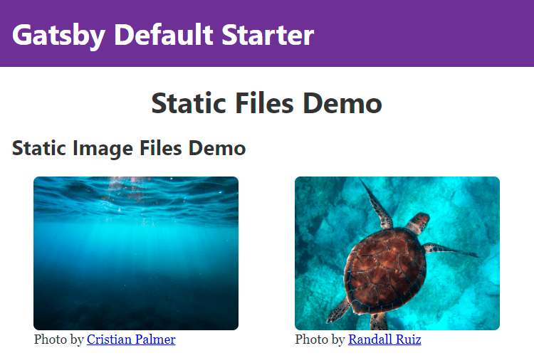
<h2>Static Image Files Demo</h2>
<figure className="image-demo">
<StaticImage
src="../gatsby-static-files-tutorial-assets-main/images/water.jpg"
width={1000}
quality={90}
alt="Underwater view of clear, blue body of water"
/>
<figcaption>
Photo by{" "}
<a target="_blank" rel="noreferrer noopener" href="https://unsplash.com/@cristianpalmer">
Cristian Palmer
</a>
</figcaption>
</figure>
<figure className="image-demo">
<StaticImage
src="../gatsby-static-files-tutorial-assets-main/images/turtle.jpg"
width={1000}
quality={90}
alt="Overhead view of a turtle floating over blue water"
/>
<figcaption>
Photo by{" "}
<a target="_blank" rel="noreferrer noopener" href="https://unsplash.com/@ruizra">
Randall Ruiz
</a>
</figcaption>
</figure>
</section>
</Layout>
)
export default StaticFilesDemo
Instead of using the standard HTML img tag directly and pointing it to a public image URL, in this code you are using the StaticImage component from gatsby-plugin-image and passing in the path to your local static images. This is the best practice approach, as StaticImage will generate multiple resized versions of your source images (using gatsby-plugin-sharp under the hood) and deliver the closest match to the visitor of your webpage (using the srcset feature), resulting in a faster page load and smaller download size.
For the images passed to StaticImage, you used a quality of 90 to override the default value of 50, showing how gatsby-plugin-image can still offer improvements in filesize while preserving quality. You also specified a width of 1000, which serves as a cap on the maximum width, since both of the source images have an original width that far exceeds it. For the purposes of the demo and many web pages, 1000 pixels in width is more than enough. These two options have a substantial impact on performance, but there are many other options for gatsby-plugin-image that are worth exploring, which you can find in the Gatsby docs.
In this page, the original versions of the two images take up roughly 4 MB combined, no matter what size screen they are viewed on. But with StaticImage, and on a small mobile phone, they will be compressed down to only 100kB, or roughly 2.5% of the original size. The loading time drops from almost 2 minutes on a 3G internet connection down to seconds. The gatsby-plugin-image plugin also takes advantage of modern image formats that are better suited to compressed web delivery, such as webp and avif.
Save the file before moving on.
Note: If you ever need to bypass gatsby-plugin-image and load images completely as-is, Gatsby offers a way to do this via the static folder, but this is generally advised against since this would not include the image optimizations mentioned earlier.
You have now added several new images to your site, using best practices within Gatsby to provide an optimal user experience to visitors of your web pages. In the next step, you will focus on the styling component of web pages by adding static CSS files to your site.
Step 3 — Adding CSS Stylesheets
As with embedding images, there is more than one way to add CSS-based styling to a Gatsby site. Although inline styling and CSS-in-JS are always an option with Gatsby, for site-wide or component styling it is often a better practice to use dedicated static stylesheets. In this step, you will add your own custom CSS file to your Gatsby project, as well as a third-party CSS file, using an approach that follows Gatsby best practices.
Start by creating a CSS file in the same folder as your demo page, at src/pages/static-files-demo.module.css. You are using the .module.css suffix to mark that this file is meant to be used as a CSS Module, which ensures that the styling will end up scoped to the component it is imported into and not other areas of the user interface (UI).
After opening the newly created file, add the following code:
.headerText {
  width: 100%;
  text-align: center;
}
.container img {
  border-radius: 8px;
}
In this CSS, you are center-aligning the text in any element with the class of .headerText and making it full width, as well as giving a rounded edge to any img element inside an element with a .container class.
Save the CSS file and close it. Now open back up the demo page component and add the following highlighted code:
import * as React from "react"
import { StaticImage } from "gatsby-plugin-image"

import Layout from "../components/layout"
import Seo from "../components/seo"
import * as DemoStyles from "./static-files-demo.module.css"

const StaticFilesDemo = () => (
  <Layout>
    <Seo title="Static Files Demo" />
    <h1 className={DemoStyles.headerText}>Static Files Demo</h1>

    <section className={'demo ' + DemoStyles.container}>
      <h2>Static Image Files Demo</h2>

      <figure className="image-demo">
        ...
      </figure>
      <figure className="image-demo">
        ...
      </figure>
    </section>
  </Layout>
)

export default StaticFilesDemo
The first change you made in this file is to add an import statement that imports the CSS file you just created. Instead of using a CSS @import statement, your are using the standard ES Module import statement, assigning the value of this import to the DemoStyles variable. Under the hood, Gatsby processes this CSS file with webpack, treating it as a CSS Module.
You also updated the JSX in the component to use the classes from the CSS module file. You did this by updating the className attributes in strategic locations with the precise scoped class names from the DemoStyles import.
Save your file.
The next step involves the opposite scenario: adding static CSS code that you want to affect the entire site. An example of the kind of CSS you might want to load in this way is a small set of utility classes that help when designing flexbox-based layouts: flexboxgrid.
Install this third-party CSS as a dependency by running this command in the root of your Gatsby project:
- npm install flexboxgrid
Next, instead of importing the CSS that this library provides within the same demo page as before, you will import it at the highest level of your project so that it gets applied globally. In the starter template, this level is in the layout.js file, as every other component wraps its content inside it.
Note: Another option for global CSS imports is in the gatsby-browser.js file, but Gatsby does not recommend this as the primary approach in most situations, as mentioned in the Gatsby docs about global styling. You can also use traditional <link> elements to import internal or external stylesheets, but that is also not recommended as it bypasses webpack.
Open src/components/layout.js, and make the following change:
/**
 * Layout component that queries for data
 * with Gatsby's useStaticQuery component
 *
 * See: https://www.gatsbyjs.com/docs/use-static-query/
 */

import * as React from "react"
import PropTypes from "prop-types"
import { useStaticQuery, graphql } from "gatsby"

import Header from "./header"
import "./layout.css"
import "../../node_modules/flexboxgrid/dist/flexboxgrid.min.css"

const Layout = ({ children }) => {
  const data = useStaticQuery(graphql`
    query SiteTitleQuery {
      site {
        siteMetadata {
          title
        }
      }
    }
  `)

  return (
    <>
      ...
    </>
  )
}

Layout.propTypes = {
  children: PropTypes.node.isRequired,
}

export default Layout
You have just added an import statement that directly imports the CSS file from the flexboxgrid library under node_modules. Since the CSS file is meant to be applied to the entire site, you are not assigning it to a variable, and because you don’t want to use it as a module, the filename does not end in .module.css.
Save and close layout.js to complete the process of globally importing the CSS across your Gatsby site.
With the CSS globally imported, you will now use the classes from flexboxgrid in your demo page, without having to import the CSS file again. Open the demo page component file and update the code:
import * as React from "react"
import { StaticImage } from "gatsby-plugin-image"

import Layout from "../components/layout"
import Seo from "../components/seo"
import * as DemoStyles from "./static-files-demo.module.css"

const StaticFilesDemo = () => (
  <Layout>
    <Seo title="Static Files Demo" />
    <h1 className={DemoStyles.headerText}>Static Files Demo</h1>

    <section className={'demo row around-xs ' + DemoStyles.container}>
      <h2 className="col-xs-12">Static Image Files Demo</h2>

      <figure className="image-demo col-xs-10 col-sm-5">
        ...
      </figure>

      <figure className="image-demo col-xs-10 col-sm-5">
        ...
      </figure>
    </section>
  </Layout>
)

export default StaticFilesDemo
You have just added some classes to your demo page that use rulesets from the flexboxgrid CSS file. The row and around-xs class on the section element turn it into a wrapped flex element with justify-content set to space-around, and the col-* classes are used to control how much of the row each element takes up.
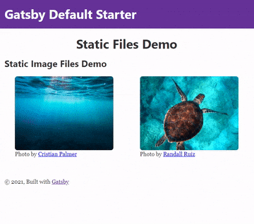
Make sure to save your changes to the demo file before closing it. With this change, the page has become more responsive and the images will appear side-by-side on a large enough display.
To preview your changes so far, run this command:
- npm run develop
This will start a local development server for your Gatsby site at http://localhost:8000/static-files-demo. Navigate to this URL and you will find your site rendered with your new styling:
Note: Since Gatsby ships with React out of the box, in addition to the static CSS options outlined here, you also have the option of applying styling through React and React-based frameworks.
In this step, you used static CSS files to add additional styling to your site. In the next step, you will use a similar approach to add static JavaScript files for added functionality.
Step 4 — Adding JavaScript Files
Gatsby already uses JavaScript in both the backend and frontend, but this is used as either Node.js code that only runs during the build process or React components for generating the static HTML output. In this step, you will include JavaScript files that are neither Node.js- or React-based, but still get pulled into every page generated by Gatsby.
For this tutorial, you are adding a file that prints a message to any visitor to your site that opens their developer console. You can inspect the JavaScript that will run by opening the file at src/gatsby-static-files-tutorial-assets-main/js/every-page.js.
Rather than importing this file directly into a Gatsby file via an ES Module import (as you did with the CSS files), you will add it to the page via a Gatsby server-side rendering (SSR) API. This approach gives you fine-grained control over where in the DOM the JavaScript file is pulled in, and also prevents your code from being executed as part of Gatsby’s build process.
However, before using the Gatsby SSR API, you need to make the static JavaScript file accessible to the public. To do this, use the special static folder that Gatsby supports by making a folder named static in the root of your Gatsby project. Then, copy the static JavaScript file to this folder. You can do both of these actions manually in your file browser, or with the following commands ran from the root of your project:
- mkdir static
- cp src/gatsby-static-files-tutorial-assets-main/js/every-page.js static/every-page.js
With this action, the JavaScript file is now publicly accessible at https://localhost:8000/every-page.js. The next part of this step is to trigger it to load via HTML.
Open up gatsby-ssr.js in the root of your Gatsby project, as that is where Gatsby will allow you to hook into the server-rendering APIs. Now add the following code:
/**
 * Implement Gatsby's SSR (Server Side Rendering) APIs in this file.
 *
 * See: https://www.gatsbyjs.com/docs/ssr-apis/
 */

import * as React from "react"

export const onRenderBody = ({ setPostBodyComponents }) => {
  setPostBodyComponents([
    <script type="text/javascript" src="/every-page.js" key="every-page-js" defer></script>,
  ])
}
The first line of code you added is a statement that imports React, which is necessary to enable the use of JSX in the file. Next, you export a function called onRenderBody, which takes an object as an argument with a nested function of setPostBodyComponents, which you call from within your own function. You call this function with a script tag that will load your static JS file, while using the best practices of adding a unique key property, and defer, since in this case it does not matter when the JavaScript executes.
The setPostBodyComponents will take any React components inside the array passed as its first argument, in this case a single script tag, and render it as part of the body, thereby triggering the loading of your script file in the browser. Save the file, but keep it open for the next step.
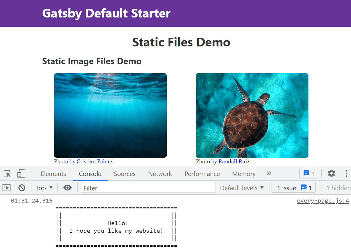
Now navigate to your https://localhost:8000/static-files-demo URL and open up a JavaScript console. You will find the message created by the JavaScript file, as shown in the following image:
Note: If you are using the live development feature of Gatsby, you might need to halt and restart npm run develop before changes to this file take effect.
You have now added a local static JavaScript file using the Gatsby SSR API, but the same strategy can also be used for loading external JavaScript from other domains, also known as 3rd-party scripts. To make the images in your demo easy to zoom in on, you will add a third-party lightbox library called Fancybox. In the same gatsby-ssr.js file, add the following lines:
/**
 * Implement Gatsby's SSR (Server Side Rendering) APIs in this file.
 *
 * See: https://www.gatsbyjs.com/docs/ssr-apis/
 */

import * as React from "react"

export const onRenderBody = ({ setPostBodyComponents }) => {
  setPostBodyComponents([
    <script type="text/javascript" src="/every-page.js" key="every-page-js" defer></script>,
    <script
      src="https://cdn.jsdelivr.net/npm/@fancyapps/ui@4.0.5/dist/fancybox.umd.js"
      integrity="sha256-B34QrPZs5i0CQ3eqywkXHKIWw8msfAVH30RWj/i+dMo="
      crossOrigin="anonymous"
      key="fancybox-js"
      defer
    ></script>,
    <link
      rel="stylesheet"
      href="https://cdn.jsdelivr.net/npm/@fancyapps/ui@4.0.5/dist/fancybox.css"
      integrity="sha256-WIieo0WFPkV7kcA2lQ4ZCO5gTg1Bs/SBX5YzEB4JkyM="
      crossOrigin="anonymous"
      key="fancybox-css"
    ></link>,
  ])
}
In this code, you have added both the JavaScript and CSS for Fancybox, the third-party library, through the same onRenderBody Gatsby SSR API as you are using for the local every-page.js file. Two extra attributes are used this time, both of which help with security. The crossOrigin="anonymous" explicitly tells the browser not to share credentials with a domain that does not match your own, and the integrity attribute is used to enforce Subresource Integrity (SRI), which protects against sudden changes to a file after it has been added.
Warning: As a rule of thumb, treat third-party scripts and styles as untrusted. In addition to inspecting them before use, always use SRI. In general, loading third-party assets via URL instead of bundling with imports is something that should be avoided when possible, but is sometimes necessary for analytics, embed widgets, and error-logging services.
This completes the task of getting the third-party code to load, but for this specific library, there is another step to trigger the new UI features.
Save and close gatsby-ssr.js, then open src/pages/static-files-demo.js back up and make the following edits:
import * as React from "react"
import { StaticImage } from "gatsby-plugin-image"

import Layout from "../components/layout"
import Seo from "../components/seo"
import * as DemoStyles from "./static-files-demo.module.css"

const StaticFilesDemo = () => (
  <Layout>
    <Seo title="Static Files Demo" />
    <h1 className={DemoStyles.headerText}>Static Files Demo</h1>

    <section className={"demo row around-xs " + DemoStyles.container}>
      <h2 className="col-xs-12">Static Image Files Demo</h2>

      <figure className="image-demo col-xs-10 col-sm-5">
        <StaticImage
          data-fancybox
          src="../gatsby-static-files-tutorial-assets-main/images/water.jpg"
          ...
        />
        <figcaption>
          ...
      </figure>

      <figure className="image-demo col-xs-10 col-sm-5">
        <StaticImage
          data-fancybox
          src="../gatsby-static-files-tutorial-assets-main/images/turtle.jpg"
          ...

        />
        <figcaption>
          ...
        </figcaption>
      </figure>
    </section>
  </Layout>
)

export default StaticFilesDemo
Adding data-fancybox tells the fancybox library where to find images to trigger the lightbox effect on, and with that, your users can start using the lightbox viewer by clicking on a demo image, as shown in the following GIF:
Note: For loading scripts or styles in the <head> of the page, both your own and third-party, the recommended approach is with the gatsby-plugin-react-helmet plugin. This plugin is bundled with the starter template, and you can add to an existing usage of it in src/components/seo.js.
You just used two different ways to pull local and remote JavaScript into your Gatsby site, each with its own use cases and trade-offs. For file types not covered by this step or previous ones, the next section in this tutorial will address how to include arbitrary files in your Gatsby site.
Step 5 — Adding Arbitrary Static Files
You have now implemented three common types of static assets in web development: images, CSS, and JavaScript. But that still leaves lots of other file types that might be part of a website. In this step, you will explore adding arbitrary static files to your Gatsby site, so that they can be embedded or offered as downloads to your visitors.
The first way to add arbitrary static files so that users can access them is to import them inside of JavaScript files and use webpack to generate a public link for you. This strategy is recommended by the official Gatsby docs on importing assets, since webpack will help prevent typos in paths, avoid unnecessary disk space usage for files that are never imported, and in some cases, even inline the contents of the file as a data URI.
Open the demo page component file and add the following edit:
import * as React from "react"
import { StaticImage } from "gatsby-plugin-image"

import Layout from "../components/layout"
import Seo from "../components/seo"
import * as DemoStyles from "./static-files-demo.module.css"
import helloWorldPdf from "../gatsby-static-files-tutorial-assets-main/hello-world.pdf"

const StaticFilesDemo = () => (
  <Layout>
    <Seo title="Static Files Demo" />
    <h1 className={DemoStyles.headerText}>Static Files Demo</h1>

    <section>
      <h2>Arbitrary Static Files</h2>
      <a href={helloWorldPdf} title="Download the Hello World file">
        Access the Hello World file by clicking here.
      </a>
    </section>

    <section className={"demo row around-xs " + DemoStyles.container}>
      <h2 className="col-xs-12">Static Image Files Demo</h2>
      ...
    </section>
  </Layout>
)

export default StaticFilesDemo
In this code, you are importing the static file (a PDF file) directly in JavaScript, which will get parsed by webpack and will generate a unique link. That link will populate as the value of helloWorldPdf, which is what your a tag is pointing to.
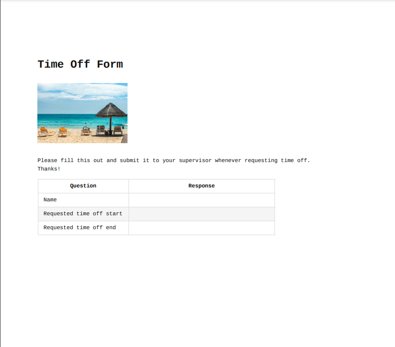
Due to the way assets are handled with this method, the final link will look rather random, like /static/hello-world-2f669160afa9b953cbe496f2d6ccb046.pdf. This works for most scenarios, but if you need a permanent readable link, Gatsby offers another option in the form of the special static folder. Pretending that you are an employer that wants your employees to be able to bookmark the link of your_domain.com/time-off-form.pdf, you will add a new file using this static folder.
First, copy the static file time-off-form.pdf from the demo files directory to the root static folder. You can do this manually, or with the following command:
- cp src/gatsby-static-files-tutorial-assets-main/time-off-form.pdf static/time-off-form.pdf
Next, add a link to it in the page file:
import * as React from "react"

...

import helloWorldPdf from "../gatsby-static-files-tutorial-assets-main/hello-world.pdf"

const StaticFilesDemo = () => (
  <Layout>
    <Seo title="Static Files Demo" />
    <h1 className={DemoStyles.headerText}>Static Files Demo</h1>

    <section>
      <h2>Arbitrary Static Files</h2>
      <a href={helloWorldPdf} title="Download the Hello World file">
        Access the Hello World file by clicking here.
      </a>
      <br />
      <a href="/time-off-form.pdf" title="Time Off Form">
        Request Time Off - Form to fill out and submit.
      </a>
    </section>

    <section className={"demo row around-xs " + DemoStyles.container}>
      ...
    </section>
  </Layout>
)

export default StaticFilesDemo
Save the changes to this file and close it.
With the static folder approach, you get to provide your users with a permanent path of /time-off-form.pdf, but you lose the benefits of cache-busting for file changes and having webpack’s compilation step catching typos in filepaths.
Navigate to https://localhost:8000/time-off-form.pdf to view the following PDF:
Thanks to your efforts in this step, visitors to your site can now access extra static file types enabled by your new code. This is convenient for your site visitors, as they don’t have to leave your domain to access these files, and beneficial for you, as it makes them less likely to leave the site entirely.
Note: If you are using Markdown as a source within Gatsby and want to automatically copy files that are linked inside Markdown links to the public part of your site so that users can download them, please take a look at the gatsby-remark-copy-linked-files plugin.
Conclusion
Through following the steps in this tutorial, you have added new types of static files and assets to your website, integrating them into the Gatsby system and your existing content. These approaches can be applied to almost any new or existing Gatsby site and across hundreds of use-cases and file types, so you are now well-equipped to handle static files in Gatsby for the future.
Static files are involved with many parts of web development, and impact or are impacted by related design decisions. Some topics that are worth further consideration are:
If you would like to read more on Gatsby, check out the rest of the How To Create Static Web Sites with Gatsby.js series.
Thanks for learning with the DigitalOcean Community. Check out our offerings for compute, storage, networking, and managed databases.
Tutorial Series: How To Create Static Web Sites with Gatsby.js
Gatsby is a React framework that allows you to create static and serverless apps. Gatsby websites are different from traditional websites because they are usually deployed on a content delivery network (CDN) and are content agnostic. In this tutorial, you will learn the basics of creating a site with Gatsby, allowing you to create static sites that are optimized for your users.
About the author
I love learning new things and sharing knowledge along the way!
Still looking for an answer?
This textbox defaults to using Markdown to format your answer.
You can type !ref in this text area to quickly search our full set of tutorials, documentation & marketplace offerings and insert the link!
 This work is licensed under a Creative Commons Attribution-NonCommercial- ShareAlike 4.0 International License.
Become a contributor for community
Get paid to write technical tutorials and select a tech-focused charity to receive a matching donation.

DigitalOcean Documentation
Full documentation for every DigitalOcean product.

Resources for startups and AI-native businesses
The Wave has everything you need to know about building a business, from raising funding to marketing your product.
The developer cloud
Scale up as you grow — whether you're running one virtual machine or ten thousand.

Start building today
From GPU-powered inference and Kubernetes to managed databases and storage, get everything you need to build, scale, and deploy intelligent applications.
